|
Penpal posted:
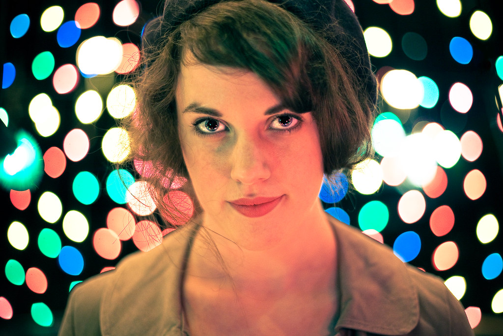
Those catchlights in the eyes are awesome. It makes me want to replicate it without the lights in the background -- though I like those as well.
|
 #
?
Nov 28, 2009 20:26
#
?
Nov 28, 2009 20:26
|
|

|

|
| # ? May 14, 2024 02:15 |
|
|
 He used to be a photographer in the Navy during the 70's, and was impressed by my Yashica-D. They were at the beach to work some crabtraps.  I quite like this one, though when I print it I might preflash the paper a bit to give it a touch more whiteness. Paragon8 posted:Why is it I'm somewhat abelivient about every portrait I go out of my way to take, but fall in love with the pictures I just snap on the spur of the moment? You're probably over thinking in those serious settings, and are more in touch with your emotions with spur of the moment stuff. This usually translates to more 'human' responses from subjects, and technique that is a little looser. 365 Nog Hogger fucked around with this message at 06:49 on Dec 2, 2009 |
|
#
?
Dec 2, 2009 06:45
|
|

|
They won't inspire anyone to greatness or win any awards, but the client is happiest with the first one (me too) and a handful of others came out well. This is (potentially) to be used as the author's photo on a book jacket.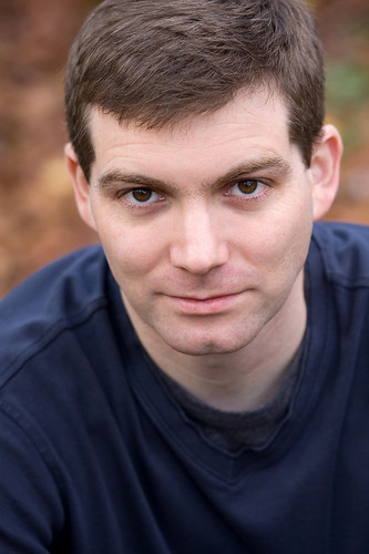 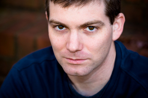 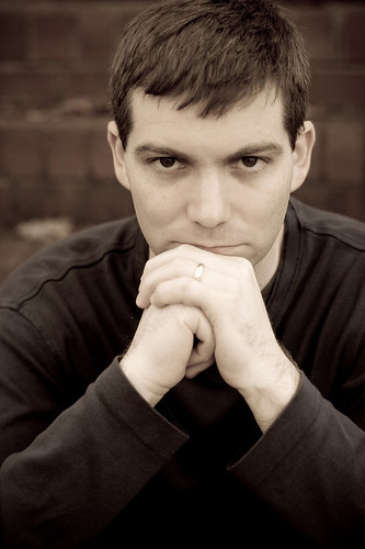 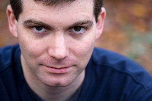
|
|
#
?
Dec 2, 2009 17:39
|
|

|
Took this one on my wedding night, it was the only time I was allowed to touch a camera that day. ") There's a few things I would do differently (not make her look like a double hand amputee, for one), but I think that drat lampshade bugs me the most. When I crop it out it feels like I'm losing too much of the rest of the room. 
|
|
#
?
Dec 2, 2009 17:48
|
|
|
jackpot posted:They won't inspire anyone to greatness or win any awards, but the client is happiest with the first one (me too) and a handful of others came out well. This is (potentially) to be used as the author's photo on a book jacket. It's not bad, but I'm not sure the "looking down at" perspective suits an author photo that well. They're all pretty tight shots, if you get a chance to shoot again you may want to try getting some wider ones, maybe a few environmentals and see if anything jumps out at you. If it's any consolation, I picked ten books off my shelf at random and only 1-2 of them were any better than a snapshot that the authors friend/wife/husband took.
|
|
#
?
Dec 2, 2009 21:27
|
|
|
Pompous Rhombus posted:It's not bad, but I'm not sure the "looking down at" perspective suits an author photo that well. Yeah, I'd agree. The photo should exude authority and that perspective makes the subject seem submissive, which is why you see a lot of pin-up and glamour photography done that way. Eye-level or even having the subject looking down slightly would give the subject a more "powerful" persona in the photo. That plus him looking up makes him wrinkle his forehead a little. The one that both you and your client like is closest to eye-level of the ones you've posted.
|
|
#
?
Dec 2, 2009 22:29
|
|

|
Reichstag posted:
I like this photo on it's own, but the subject is also p hot, and I like that.
|
|
#
?
Dec 3, 2009 00:01
|
|

|
Here are some examples of stuff I've done recently. Christmas is a good time to prospect for business in the retail market. This family really liked this shot and I felt kind of OK about it. The kids were really not into it at all, and the hardest part of it was getting them to cooperate. This is inside their home. 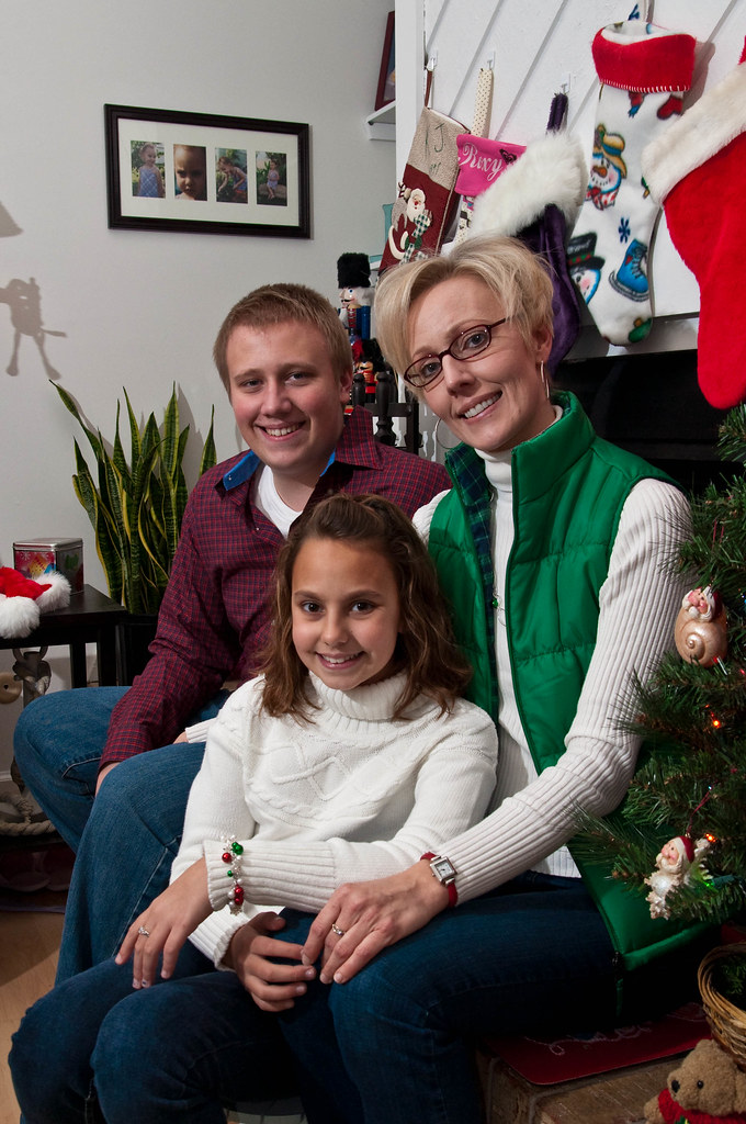 These kids were all over the place, they were bouncing off the walls. The only thing that keeps them in one spot and smiling is you inflict pain upon yourself. I wore an elf hat with a jingle bell at the end, my wife just kept smacking the bell into my head and the kids loved it. Children are so masochistic. This was taken in a convention center lobby. The walls are really that orange. 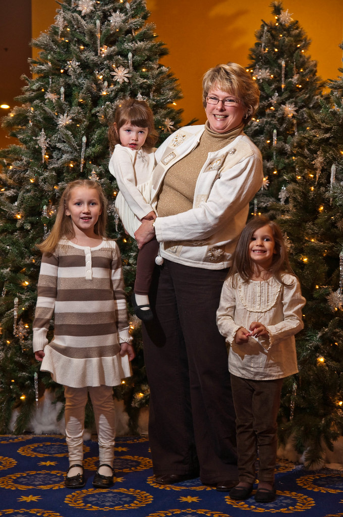 This was a corporate Christmas party for a local business. I went the whole night avoiding a group shot, just as I was about to make my goodbyes with the owner, he asked for a group shot. I scrambled got everyone to crowd around and stood on a chair. I think I did pretty good. I only had time to take 3 shots and this was the middle one. 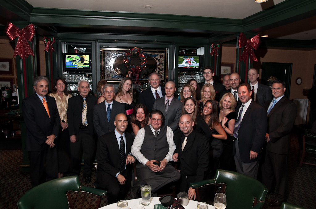
|
|
#
?
Dec 8, 2009 05:09
|
|

|
AIIAZNSK8ER posted:Here are some examples of stuff I've done recently. Christmas is a good time to prospect for business in the retail market. Those are some damned fine photos. If I were to pick apart anything, it's that the kids in the first photo look like they'd rather be stabbing themselves in the eye with a red-hot poker. Heh. Poker face.
|
|
#
?
Dec 8, 2009 06:31
|
|
|
Well, if you're going for a standard holiday portrait for the christmas card deal, you've pretty much got it. I'd advise lighting it a little less, it's too bright and evenly lit for my eye. I think they would look much better if the wall wasn't lit to the same degree, I don't want to see the wall right there. Sports portraiture? 
|
|
#
?
Dec 8, 2009 07:56
|
|
|
Reichstag posted:Well, if you're going for a standard holiday portrait for the christmas card deal, you've pretty much got it. I'd advise lighting it a little less, it's too bright and evenly lit for my eye. I think they would look much better if the wall wasn't lit to the same degree, I don't want to see the wall right there. Really loving this, but I can't help but think if the photographer had changed their standing height, or even position, it could have put the guys head in front of a more contrasting tone. That's my main dislike is how lost his head gets on the dark part of the horizon line. The canoe as leading line and contrast of the overall image own hard though.
|
|
#
?
Dec 8, 2009 09:30
|
|
|
AIIAZNSK8ER posted:In the first shot, they seem tilted a bit...caused in part by the angle of the head of the mother...but added to the impact is the actual slight tilt of the photo. Use the perpendicular line of the wall above their heads. In the second, they're all looking at the camera, and giving a camera smile...the best you'll ever get out of that group as you describe them. Finally, I feel your pain. I'm shooting my son's daycare classes on Thursday, and group shots suck. You've hidden two women almost completely, and if it was a formal, "we want a group shot of all of us" that's unacceptable.
|
|
#
?
Dec 8, 2009 14:30
|
|

|
poopinmymouth posted:Really loving this, but I can't help but think if the photographer had changed their standing height, or even position, it could have put the guys head in front of a more contrasting tone. That's my main dislike is how lost his head gets on the dark part of the horizon line. The canoe as leading line and contrast of the overall image own hard though. Whereas I like that feature alot. I read the horizon, come to the man, my eyes get lead down the canoe, and points me to the little surprise of what looks like a human shadow in the bottom corner. To me the photo has a feeling of the man being small versus nature, like he about to go out and battle it. I think it works well as a portrait because of this connection to the subject.
|
|
#
?
Dec 8, 2009 16:47
|
|
|
jackpot posted:They won't inspire anyone to greatness or win any awards, but the client is happiest with the first one (me too) and a handful of others came out well. This is (potentially) to be used as the author's photo on a book jacket. I like this first one the best, too. It seems well suited for a book jacket photo. However, I don't like that the top of his head is cut off (also to varying degrees in all of the other pics). Just something you may want to keep an eye out for in the future.
|
|
#
?
Dec 8, 2009 19:12
|
|
|
I took a few shots of my boss today for some corporate headshots. Overall I was fairly pleased with the results but I did find out half way through the shoot that my Tamron 17-50 2.8 was front focusing.   
|
|
#
?
Dec 8, 2009 21:23
|
|

|
PlasticSun posted:Sharp on the nose, soft at the eyes. 
|
|
#
?
Dec 8, 2009 21:53
|
|

|
McMadCow posted:Sharp on the nose, soft at the eyes. Yeah unfortunately that was the sharpest eyes I got out of that batch. Next time around I'm going to put the AF point on just the eye.
|
|
#
?
Dec 8, 2009 21:58
|
|
|
You can't really do that on people with glasses.Verman posted:This is when you manual focus or ask him to lift his glasses to get a focus point. evil_bunnY fucked around with this message at 23:03 on Dec 8, 2009 |
|
#
?
Dec 8, 2009 22:21
|
|

|
evil_bunnY posted:You can't really do that on people with glasses. This is when you manual focus or ask him to lift his glasses to get a focus point.
|
|
#
?
Dec 8, 2009 22:39
|
|
|
Verman posted:This is when you manual focus or ask him to lift his glasses to get a focus point. Or tighten up the aperture a tad.
|
|
#
?
Dec 8, 2009 23:01
|
|
|
Good to know thanks guys!
|
|
#
?
Dec 8, 2009 23:04
|
|
|
PlasticSun posted:I took a few shots of my boss today for some corporate headshots. Overall I was fairly pleased with the results but I did find out half way through the shoot that my Tamron 17-50 2.8 was front focusing. There's a big difference between the camera auto-focusing on a point closer to the camera than you might wish and front-focusing
|
|
#
?
Dec 9, 2009 02:21
|
|


|
ConfusedUs posted:There's a big difference between the camera auto-focusing on a point closer to the camera than you might wish and front-focusing I used two different lenses for the shoot my Tamron was definitely front focusing with the entire subject out of focus despite the AF points locking onto some part of the face. With the Sigma 70-200 2.8 I think I just had the wrong points selected.
|
|
#
?
Dec 9, 2009 02:31
|
|
|
Reichstag posted:Sports portraiture? This is excellent. What a great subject. I really like the shot of him without a shirt as well.
|
|
#
?
Dec 9, 2009 04:56
|
|

|
Glad you like it, this is my last portrait from the coast, Ektar for portraits: eh.
|
|
#
?
Dec 9, 2009 09:04
|
|
|
Reichstag posted:Glad you like it, this is my last portrait from the coast, Ektar for portraits: eh. It looks like she has a furry piece of luggage rather than an actual dog.
|
|
#
?
Dec 9, 2009 12:55
|
|
|
PlasticSun posted:I took a few shots of my boss today for some corporate headshots. Overall I was fairly pleased with the results but I did find out half way through the shoot that my Tamron 17-50 2.8 was front focusing. First one is best, but wooowee, some things to change for next time. I'm assuming this is a white shoot through umbrella? Get a tungsten gel and match the white balance of the other bulbs, because right now the soft flattering main light with yellowy orange fill isn't very flattering. The background is also a bit chaotic. It's not enough visual clues to be a specific place, but too crowded and in focus to be generic background for a formal portrait. I'd either blur it more with a lower aperture, or watch how I position myself so that a more neutral background is behind. A white reflector to help fill in the yellowy shadows would have helped too. Old people faces tend not to look good when photographed from below. It emphasizes any turkey wattle that might be present on the neck.
|
|
#
?
Dec 9, 2009 12:58
|
|
|
Can I have some critique on these two pictures? They are for the hoodies you get if you donate enough money for a charity event on Saturday. I was going for an 'American Apparel' feel. Click here for the full 1000x665 image.  Click here for the full 1000x665 image. TeMpLaR fucked around with this message at 14:54 on Dec 9, 2009 |
|
#
?
Dec 9, 2009 14:28
|
|

|
TeMpLaR posted:Can I have some critique on these two pictures? They are for the hoodies you get if you donate enough money for a charity event on Saturday. Why so little light? they look underexposed and a bit yellow ish. You will most likely want bright and happy to move products. I'd white balance it better and boost exposure, possibly fill light too. Contrasty shadows are only good when you engineered them to be there. Black hard edged shadows are like a ginsu knife fresh off the grinder. Great tool if you need it and know how to use it, but it will gently caress you up if you don't.
|
|
#
?
Dec 9, 2009 14:33
|
|
|
poopinmymouth posted:Why so little light? they look underexposed and a bit yellow ish. You will most likely want bright and happy to move products. I'd white balance it better and boost exposure, possibly fill light too. I see what you mean regarding the shadows ( for the jump picture, they just kind of started jumping). The other one I white balanced and raised brightness on both, but I can't really fix the shadows in the first picture in post. Thanks for the critique, I'll be using these two pictures and next time I will learn better, I think a third light on right side to my side would have helped with what I was doing.  
|
|
#
?
Dec 9, 2009 15:10
|
|
|
Here is another thing to keep in mind, the guy on the right jean's don't fit and it makes him look squat and not very commercially. He kind of also looks a zombie. The second picture looks really posed in an awkward way. Her camera-left hand is awkward looking and you've sort of cut off him in a weird way too. It works for the first one to cut in a weird way, but not the second. Also that couch is hideous, which might not be that big of a deal if it weren't such a big part of it. Also the frame on the left is really distracting. poopinmymouth covered the lighting, but another thing to keep in mind is you have a very shiny wall behind them.
|
|
#
?
Dec 9, 2009 15:44
|
|


|
poopinmymouth posted:First one is best, but wooowee, some things to change for next time. I'm assuming this is a white shoot through umbrella? Get a tungsten gel and match the white balance of the other bulbs, because right now the soft flattering main light with yellowy orange fill isn't very flattering. The background is also a bit chaotic. It's not enough visual clues to be a specific place, but too crowded and in focus to be generic background for a formal portrait. I'd either blur it more with a lower aperture, or watch how I position myself so that a more neutral background is behind. A white reflector to help fill in the yellowy shadows would have helped too. Thanks! I'm a bit light on equipment, this was shot with just a 550 EX camera left at 1/125 power with the rest of the room exposed about a stop dark. 550 was pointed straight up at a cream colored ceiling with a Lumiquest 80/20 on it. Should I be looking more towards the reflector or the gel for the next piece of gear? I don't often shoot portraits but it looks like work is going to be asking me to do more of it soon.
|
|
#
?
Dec 9, 2009 16:57
|
|
|
You can't see nearly enough nipple for the American Apparel look. The hood up on the guy isn't very flattering. It makes the hoody look like it barely fits and he gives off a look of being very uncomfortable. Were this an ad, I wouldn't want to buy the product.
|
|
#
?
Dec 9, 2009 17:57
|
|
|
PlasticSun posted:Thanks! I'm a bit light on equipment, this was shot with just a 550 EX camera left at 1/125 power with the rest of the room exposed about a stop dark. 550 was pointed straight up at a cream colored ceiling with a Lumiquest 80/20 on it. I would say save for a cheapish strobe, stand, and umbrella. You could have added some off camera fill to the picture and evened out the shadows so they are lighter and less menacing.
|
|
#
?
Dec 9, 2009 17:59
|
|
|
PlasticSun posted:Should I be looking more towards the reflector or the gel for the next piece of gear? I don't often shoot portraits but it looks like work is going to be asking me to do more of it soon. Gels are so cheap it's not even worth debating over whether to buy or not. It's more of a matter of exactly which ones to buy.
|
|
#
?
Dec 9, 2009 18:01
|
|
|
TeMpLaR posted:I was going for an 'American Apparel' feel.
|
|
#
?
Dec 9, 2009 18:17
|
|

|
TeMpLaR posted:( for the jump picture, they just kind of started jumping) haha, what? this sounds like what happens when I try to take pictures of my two year old.
|
|
#
?
Dec 9, 2009 19:24
|
|
|
PlasticSun posted:Thanks! I'm a bit light on equipment, this was shot with just a 550 EX camera left at 1/125 power with the rest of the room exposed about a stop dark. 550 was pointed straight up at a cream colored ceiling with a Lumiquest 80/20 on it. get a cheapo reflector. I learned from a really experienced guy you actually want your reflectors square, and as close to the camera lens as possible. I haven't gotten one yet, but I suggest one of those ones with a handle, and you can literally hold it yourself, or clip it to a light stand. The idea of having it right where you are, is that there are now no shadows that you can see, that it cannot see, whereas if you put it off to the side opposite of the main light, you can have pockets of shadow on the face you can see but neither light can. Something a bit different from me. Coworker has tons of light stuff, so I borrowed a softbox and flash plus a seamless background. It's the exact softbox I'm interested in from ebay, but it seemed to give the whole image a magenta tint. I'm guessing this is because of the cheapness of the fabric? Since my main light is expensive and daylight balanced at all power levels, and it's tiny softbox is chimera, I'm guessing my other softbox should be chimera also to keep color consistency. I was able to zero out saturation for purple and magenta on this image to fix it, but if he'd had anything purple on it would have ruined it. 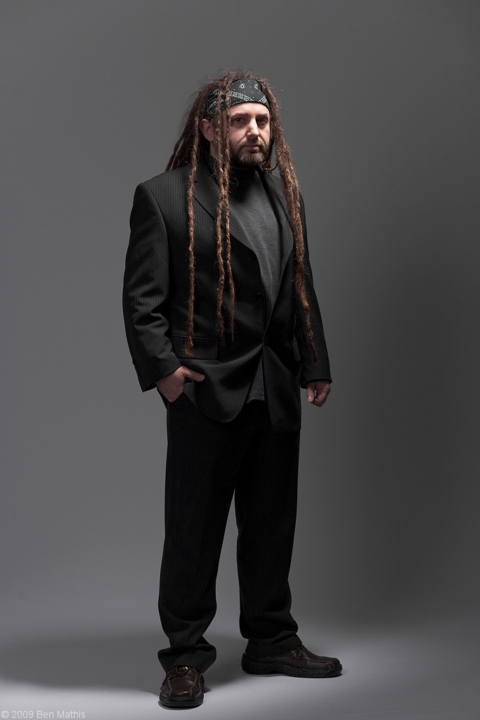
|
|
#
?
Dec 9, 2009 20:27
|
|
|
poopinmymouth posted:I learned from a really experienced guy you actually want your reflectors square, and as close to the camera lens as possible. ... The idea of having it right where you are, is that there are now no shadows that you can see, that it cannot see, whereas if you put it off to the side opposite of the main light, you can have pockets of shadow on the face you can see but neither light can. I've always used the distance of the reflector to change its effective size/the quantity and spread of light reflected. poopinmymouth posted:It's the exact softbox I'm interested in from ebay, but it seemed to give the whole image a magenta tint. I'm guessing this is because of the cheapness of the fabric?
|
|
#
?
Dec 9, 2009 21:39
|
|


|

|
| # ? May 14, 2024 02:15 |
|
|
This is from a sports shoot, but this one with no basketball I like quite a bit. One big umbrella to the right, another light on the white wall. 
|
|
#
?
Dec 10, 2009 01:32
|
|