

|
AIIAZNSK8ER posted:The sharpening style didn't really bother me here because of the strength of the concept and execution. I think it overcomes the nitpicks. When I try to add some wacky editing to my photos they still just suck because its a bad photo to begin with. Oh I agree, he could selective-colour/HDR/etc these and they'd still be better pictures than anything I've shot. The Dorkroom has just trained my eyes to loathe Topaz Adjust 
|
 #
?
Jul 1, 2010 01:50
#
?
Jul 1, 2010 01:50
|
|


|

|
| # ? Apr 23, 2024 08:01 |
|
|
Moist von Lipwig posted:I'm really wondering how you get away with shooting fire like that, or was it added later?
|
|
#
?
Jul 1, 2010 03:22
|
|


|
guidoanselmi posted:I'm really wondering how you get away with shooting fire like that, or was it added later? Photographing fire isn't very hard, you just need a somewhat slow shutter speed like 1/20.
|
|
#
?
Jul 1, 2010 03:35
|
|
|
Found this while looking for a new desktop wallpaper.  http://www.fraglab.at/tmp/ingo/site/index.html
|
|
#
?
Jul 1, 2010 04:14
|
|
|
AIIAZNSK8ER posted:
Excellent concepts that are ruined in post for me by the overdark micro contrast. Why does he have such a strong vision for the shoot but then thing that kind of contrast looks pleasing? I feel like my retinas were punched. (by nice designer Gucci gloves, but punched no less)
|
|
#
?
Jul 1, 2010 11:36
|
|


|
poopinmymouth posted:Excellent concepts that are ruined in post for me by the overdark micro contrast. Why does he have such a strong vision for the shoot but then thing that kind of contrast looks pleasing? I feel like my retinas were punched. (by nice designer Gucci gloves, but punched no less) This is what I was trying to get at but my semi-limited technical vocabularly just spat out "topaz adjust". Thanks PiMM.
|
|
#
?
Jul 2, 2010 00:02
|
|
|
AIIAZNSK8ER posted:The sharpening style didn't really bother me here because of the strength of the concept and execution. I think it overcomes the nitpicks. When I try to add some wacky editing to my photos they still just suck because its a bad photo to begin with. It's also good to keep in mind that for commercial photography you need an image that people will notice. Obviously asthetics are important but consider the target audience. I think he does great work.
|
|
#
?
Jul 2, 2010 21:46
|
|

|
poopinmymouth posted:Excellent concepts that are ruined in post for me by the overdark micro contrast. Why does he have such a strong vision for the shoot but then thing that kind of contrast looks pleasing? I feel like my retinas were punched. (by nice designer Gucci gloves, but punched no less) You dislike things for the weirdest reasons. Not all shadows need to be exercises in subtlety. What does "micro contrast" even mean, it's just contrasty light + a curve or whatever.
|
|
#
?
Jul 2, 2010 21:49
|
|

|
brad industry posted:You dislike things for the weirdest reasons. Not all shadows need to be exercises in subtlety. What does "micro contrast" even mean, it's just contrasty light + a curve or whatever. I dunno, I agree with PIMM. Look at the left side (our left, her right) of the woman's shirt -- it fades from light to dark, then suddenly it's white at the division, and then fades back to a more neutral tone. I find that hard to look at. It's how all sharpening algorithms work, but when you use too large a frequency your eyes stop seeing the edges as sharp and instead see them as areas of light and dark gradients. The "microcontrast" he's talking about means providing areas of high contrast without changing the overall contrast of the image, which CAN be very effective, but if you overdo it you end up with...this. What I see when I look at those images is an unpleasant dirty-looking mess of light and dark. It has that same shiny-dirty look that you get when someone goes in way too aggressively with the dodge and burn tools.
|
|
#
?
Jul 2, 2010 22:12
|
|

|
I see strong work with strong halos. A WIZARD SHOULD KNOW BETTER.
|
|
#
?
Jul 2, 2010 22:43
|
|

|
orange lime posted:Iit fades from light to dark, then suddenly it's white at the division, and then fades back to a more neutral tone. The background and subject are lit separately, did not know this was so strenuous for so many people's poor eyes. These discussions always seem so nitpicky to me, I understand not being into the aesthetic or whatever (some of you seem like you hate everything that isn't broadly/flatly lit or meets some weird personal technical litmus test). My first reaction to strong work executed well is not to look at the MICRO-CONTRAST HALOS of a shirt fold I guess.
|
|
#
?
Jul 2, 2010 22:50
|
|
|
brad industry posted:The background and subject are lit separately, did not know this was so strenuous for so many people's poor eyes. Contrast is too broad of a word, and most photographs you want good contrast. Micro contrast is stuff that happens within a much smaller radius within the photo, like a cheek or nose vs the entire face. It's something that is impossible to have in real life, and it's used very oddly in most photos. It's not at all nitpicky to say you don't like over saturation to the point of clipping, or micro contrast upped to the point that every single fold, bulge, and volume in the image goes from pure 255,255,255 white to pure 0,0,0 black. Taste is subjective, and in my subjective taste, I hate when people take small scale contrast to this extreme, it's as grating as tone mapped images taken to 11, and adds literally nothing to the image aesthetically, they would be so much more pleasing and just as strong with more normal contrast.
|
|
#
?
Jul 3, 2010 17:42
|
|
|
I'm not a fan of the style, I don't like seeing it in his portraiture, personal, or commercial work but I know that Wired magazine is going to cut a fat check to whatever advertiser uses him to sell their product so in the argument of whether or not he is right or wrong to do it that way I think he is very very right. Contemporary micro-zeitgeist etc
|
|
#
?
Jul 3, 2010 19:09
|
|

|
Twenties Superstar posted:I know that whatever advertiser uses him to sell their product is going to cut a reasonable check to Wired magazine Fixed. I think the execution is great, and the concept is cool, I'm just not a fan of this pseudo-HDR fad in commercial photography these days, and he's one in thousands doing this kind of work, so I'm not gonna fault him personally. But consumers eat it up, so w/e. Gotta pay the bills. and "micro"? I'm with Brad on that term. I submit "local" in its place. Subjunctivitis fucked around with this message at 22:00 on Jul 7, 2010 |
|
#
?
Jul 7, 2010 21:58
|
|
|
Gorgeous work. http://www.guidomocafico.com/se17.html
|
|
#
?
Jul 9, 2010 13:15
|
|
|
poopinmymouth posted:Gorgeous work. Neat idea but drat that's a lot of pictures that are very similar.. after 7 or 8 photos I started quoting Samuel L Jackson, angrily stating that them motherfuckin snakes need to get out of that motherfuckin box. Also that site is a slow piece of poo poo... that might have contributed to boredom settling in faster.
|
|
#
?
Jul 9, 2010 16:36
|
|
|
RangerScum posted:Neat idea but drat that's a lot of pictures that are very similar.. after 7 or 8 photos I started quoting Samuel L Jackson, angrily stating that them motherfuckin snakes need to get out of that motherfuckin box. I'm pretty sure this is the kind of work you have to see in a gallery to properly appreciate. I'm sure I would sit just soaking in the tones, colors and details in the prints.
|
|
#
?
Jul 9, 2010 19:18
|
|
|
Some of his still life stuff is also amazing: http://www.guidomocafico.com/om1.html
|
|
#
?
Jul 9, 2010 22:02
|
|

|
poopinmymouth posted:I'm pretty sure this is the kind of work you have to see in a gallery to properly appreciate. I'm sure I would sit just soaking in the tones, colors and details in the prints. Yeah and working in a series like that is sometimes the only way to convey those things. One photo is just a snake as a rectangle, a series is a study on color and texture since it becomes about the differences. aka a typology  Bernd & Hilla Becher
|
|
#
?
Jul 10, 2010 22:37
|
|
|
brad industry posted:Yeah and working in a series like that is sometimes the only way to convey those things. One photo is just a snake as a rectangle, a series is a study on color and texture since it becomes about the differences. aka a typology I've never seen "new topographics" work I've liked as much as this piece. Finding houses so slightly dissimilar almost seems too good to be true.
|
|
#
?
Jul 11, 2010 05:36
|
|

|
I really like Peter Beste    
|
|
#
?
Jul 11, 2010 16:38
|
|
|
Lachlan Bailey does some pretty amazing stuff. His colour stuff is wonderful.   
|
|
#
?
Jul 12, 2010 20:58
|
|

|
Found randomly on Flickr, felt need to share:
|
|
#
?
Jul 17, 2010 00:16
|
|
|
brad industry posted:
The first show at Pier24 in SF had their series of water towers. With the subject matter that straightforward, you find yourself looking at them longer to find the differences.
|
|
#
?
Jul 17, 2010 00:18
|
|

|
I just discovered Michael Wesely's work. He uses a large format pinhole camera he made himself to take exposures lasting up to three years. He has some really beautiful images. These are the kind of images I would absolutely love to display on my wall.  
|
|
#
?
Aug 4, 2010 16:08
|
|

|
Koth posted:I just discovered Michael Wesely's work. He uses a large format pinhole camera he made himself to take exposures lasting up to three years.
|
|
#
?
Aug 4, 2010 16:10
|
|


|
Koth posted:I just discovered Michael Wesely's work. He uses a large format pinhole camera he made himself to take exposures lasting up to three years. That is amazing
|
|
#
?
Aug 6, 2010 22:29
|
|
|
Koth posted:I just discovered Michael Wesely's work. He uses a large format pinhole camera he made himself to take exposures lasting up to three years. I am now inspired
|
|
#
?
Aug 8, 2010 02:51
|
|

|
Totally wrong thread.
downtown_man fucked around with this message at 03:23 on Aug 8, 2010 |
|
#
?
Aug 8, 2010 03:15
|
|
|
We can't have this thread hit the second page. I really wish I could see larger prints of this guys stuff. https://www.ethanhill.com , these are lovely screen grabs, but his black and whites are so amazing to me.   Really like the concept on this one  And this is a super wicked band photo of the Flaming Lips. This one in particular I'd like to see larger. 
|
|
#
?
Aug 12, 2010 19:57
|
|

|
Back when I was getting started one of the biggest pushes to try out portrait photography was a fella I found on flickr named Merkley. I love his style... .it consistently interests me, makes me laugh, etc. Even his photo names are funny. 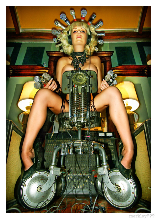 http://www.flickr.com/photos/merkley/ - NWS
|
|
#
?
Aug 12, 2010 20:17
|
|
|
Those are really really weird, but I think I like them.
|
|
#
?
Aug 12, 2010 20:31
|
|
|
I'm not really a fan but that mega pickles is beyond irony.
|
|
#
?
Aug 12, 2010 20:36
|
|
|
Foreign Policy generally has great photo stories on their website This one is from last week about the wildfires in Russia, some of the shots are incredible: http://www.foreignpolicy.com/articles/2010/08/06/red_dawn?page=full    Here is there entire photo story section: http://www.foreignpolicy.com/category/section/photo_essay Some have great moments, others are Light Room nightmares, but overall I think its a good place for inspiration. Especially for anyone that does documentary work
|
|
#
?
Aug 12, 2010 21:27
|
|
|
wow that last one is loving amazing
|
|
#
?
Aug 13, 2010 08:40
|
|
|
I purchase the magazine GUP and it had this website in it: http://www.in-public.com I couldn't find my favorite photo Joel Meyerowitz but I found these instead:  Matt Stuart Matt Stuart Richard Bram Richard BramI think Richard Bram's photo here may not be very strong in some respects, but the atmosphere just makes me love it. ")
|
|
#
?
Aug 19, 2010 14:07
|
|
|
The gloomy atmosphere combined with all those lights makes for a nice contrast- I like it. The first picture doesn't speak to me at all though- looks like a snapshot.
|
|
#
?
Aug 19, 2010 22:14
|
|
|
Cross_ posted:The gloomy atmosphere combined with all those lights makes for a nice contrast- I like it. The first picture doesn't speak to me at all though- looks like a snapshot. i looked through the inpublic monthly best ofs over breakfast - good street photos with some cute visual puns here and there. not much i was blown away by. guess i'm a harsh critic v v
|
|
#
?
Aug 19, 2010 23:11
|
|
|
Justin Benzel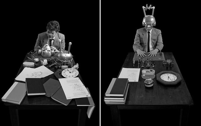 A mask to conquer entropy. The Universe finally in order whether it likes it or not 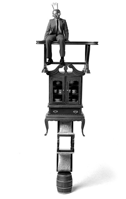 Probability is reversed; what is built strives to stay together. 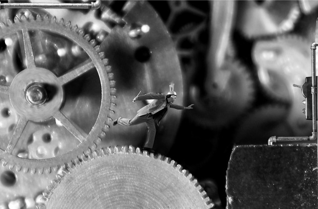 Boredom begets desire to improve and recreate, but the Universe now conspires against those wishing to dismantle, interrupt, or turn off their creations. The set is not finished yet and I know he is looking for feedback and critiques on his flickr. Cassie Doumas 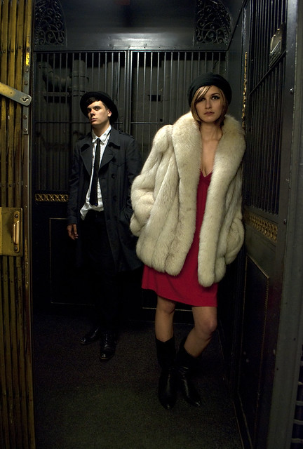   Sarah Davis   These are the people that taught me a lot about shooting so I am a bit biased.
|
|
#
?
Aug 20, 2010 05:07
|
|
|

|
| # ? Apr 23, 2024 08:01 |
|
|
ZoCrowes posted:Sarah Davis I really, really like this a lot.
|
|
#
?
Aug 20, 2010 06:15
|
|
