


|
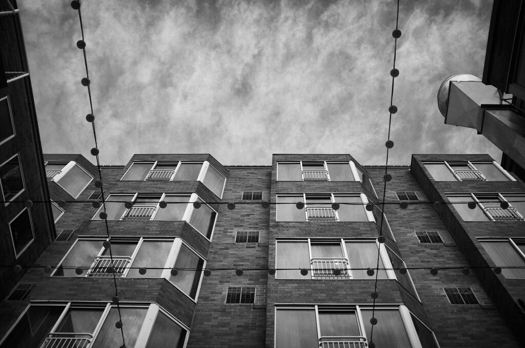
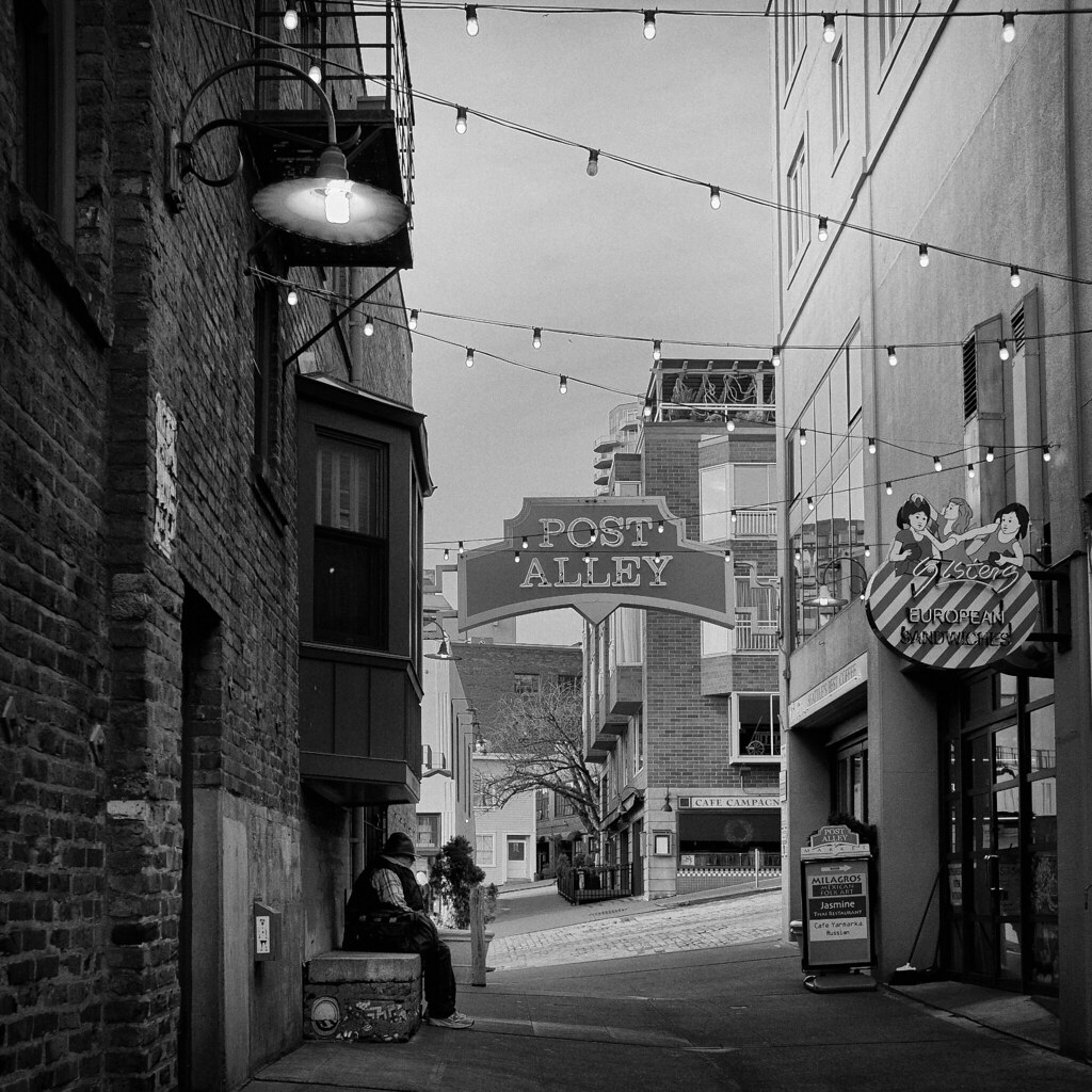
krackmonkey posted:I'm gonna cross-post 2 of mine from SAD, as they weren't intended as snapshots either, and I may as well put my money where my mouth is with a little bit of self critique thrown in I really like both of these. The first one is appealing, and I've been trying to figure out why I like it, but I still can't articulate why. I think it's because the black and white conversion/constrast is very nice, and it's symmetrical and has repeating elements without being perfectly symmetrical/repeating. While I think the lights add some interest, I would be interested to see what it looks like without them (beyond your control, I'm sure) as they're slightly out of focus and that contrasts with the in-focus building but not in a good way. I think I would really like it without the lights. The second one is really interesting. Again, I think you did a good job on the conversion, and there is a lot of interesting elements to look at without being overly busy. The guy adds a lot of story to the picture, and really makes it a lot stronger. I don't think the flat sky hurts this one - I think if it were a busy, cloudy sky, the picture would become too busy and distract from the scene below. Not really sure what could be improved on that one - I think it's really nice.
|
 #
?
Jan 3, 2012 20:17
#
?
Jan 3, 2012 20:17
|
|


|

|
| # ? Apr 25, 2024 06:33 |
|
|
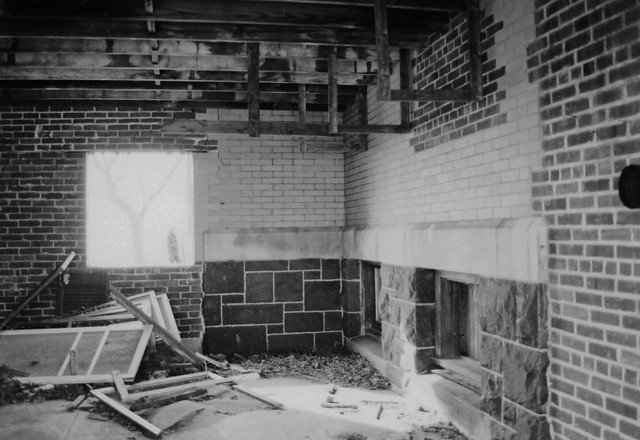 abandonedSH-1 by ZakuTempest, on Flickr 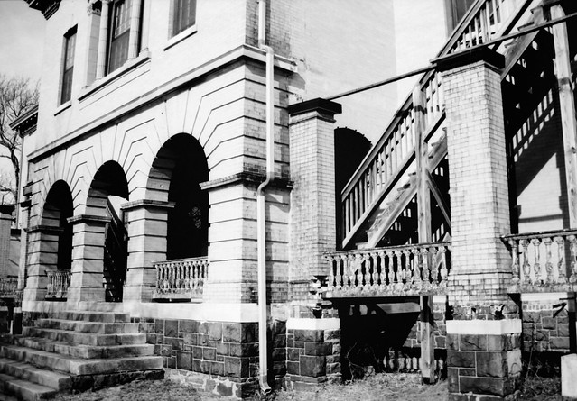 abandonedSH-10 by ZakuTempest, on Flickr 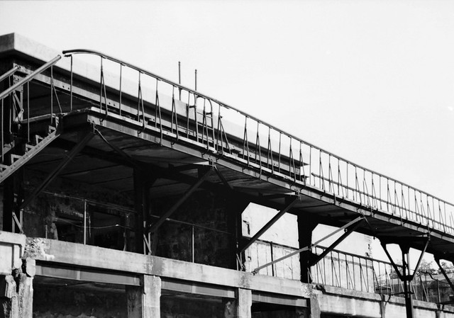 abandonedSH-11 by ZakuTempest, on Flickr Just some stuff from a run through of an old military installation for coastal defense. I did like the broken lines and shadows all over, and the asymmetry on the building exterior caught me. I haven't done a lot of post work because I'm not very good at it yet, and I'm working on a basic film scanner. These are all on Efke 25.
|
|
#
?
Jan 3, 2012 21:15
|
|

|
I re-edited a picture that I posted in SAD. I am trying to work on my post, and while this picture has a lot of motion blur and isn't something I will look back on and enjoy technically, I like the shot anyway. I think pulling out a lot of the orange in the first one helped a lot, and I tried to edit the branch away from her face (oh god do not look at that close up), and it was good practice, even if it's not perfect yet. I'm mostly looking for advice on whether the post on this one is more on the right track than the last one. It's still quite heavy for me, but I think it's better than the first go. I am concerned it may be too drab, though that muted look was what I wanted. I also prefer the new crop, as I didn't like the big tree on the right, and I was able to put a darker emphasis on the left. However, now I'm concerned she's pushed to far to the right. New edit:  IMG_2296-2 by Breanne Unger, on Flickr Original edit:  IMG_2296 by Breanne Unger, on Flickr
|
|
#
?
Jan 4, 2012 03:27
|
|
|
CarrotFlowers posted:New edit: Pushed too far. Non-contributing space to the left of the subject and she's looking right into the short part of the frame. Not sure if you can do what you want with this one.
|
|
#
?
Jan 4, 2012 08:48
|
|

|
I like the balance of the new edit better, more dynamic. Tones are much nicer too.
|
|
#
?
Jan 4, 2012 11:38
|
|


|
Okay, let me have it. I know this is one of those pictures that is interesting only because of the subject, and not because of any compositional storytelling. That being said, I'd still like an honest opinion on the way I presented it.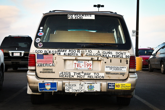 Tinfoil Minivan by Winston85, on Flickr
|
|
#
?
Jan 4, 2012 18:25
|
|
|
It's clearly the focus of the picture, and your composition reinforces that.
|
|
#
?
Jan 4, 2012 18:35
|
|

|
Mightaswell posted:Okay, let me have it. I know this is one of those pictures that is interesting only because of the subject, and not because of any compositional storytelling. That being said, I'd still like an honest opinion on the way I presented it. Is the horizon straight? If not, did you intend this? Also, maybe you can adjust crop to cut the small bit of car popping out on the left? I would also clone out the light fixture sticking out of the top of the car. But it really isn't that bad if cars in parking lots are your thing.
|
|
#
?
Jan 5, 2012 00:56
|
|
|
Mightaswell posted:Okay, let me have it. I know this is one of those pictures that is interesting only because of the subject, and not because of any compositional storytelling. That being said, I'd still like an honest opinion on the way I presented it. Here are 3 of the last photos I took in 2011, taken on the last day of the year (these were posted in the archived SAD thread originally, but they really aren't snapshots and I wanted to get some critique):  ladies by Trip Sixes, on Flickr 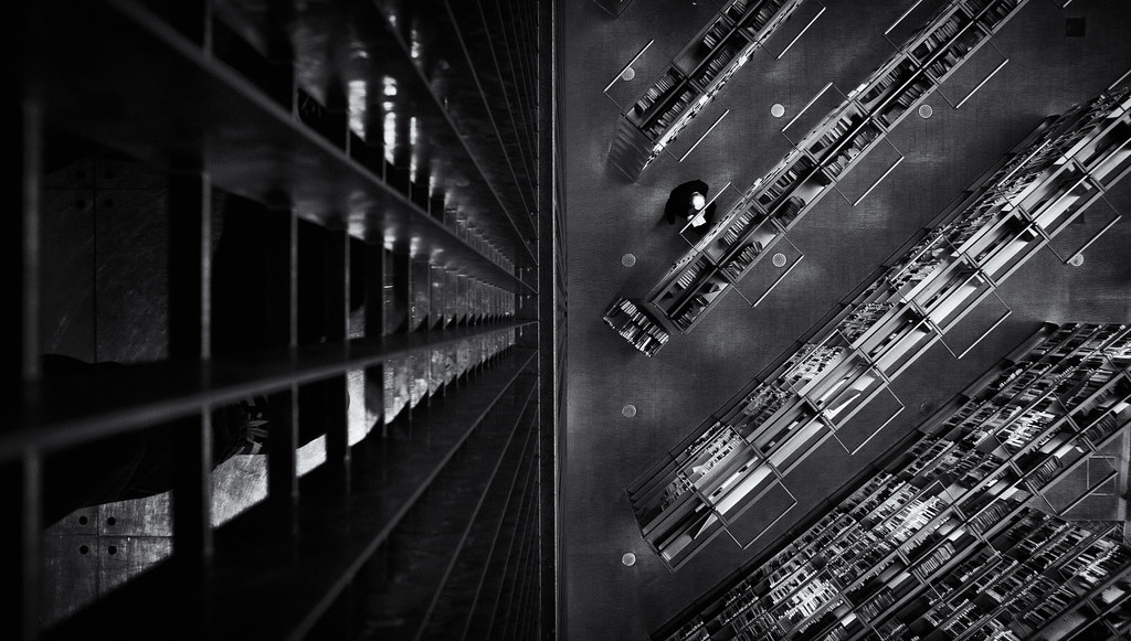 over the edge by Trip Sixes, on Flickr 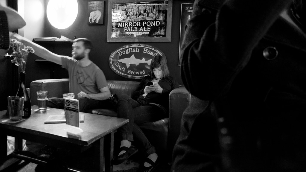 the glow of someone elses' conversation by Trip Sixes, on Flickr The last one is interesting to me because it ends my year the same way my year started - in a bar ( http://www.flickr.com/photos/trip_sixes/5331764301/in/photostream ) It's no secret that I'm really awkward at photographing people, hence all my subjects tend to be isolated and overpowered by their surroundings. Much of my pictures convey loneliness and isolation, which probably reflects back on me more than it accurately portrays the people I've photographed. The girl in the bar fascinated me, lost in her own little world- even while surrounded by friends. I'm not sure I managed to capture that moment and convey it anywhere near as well as witnessing it did for me, it's something I'm really striving to improve on in the coming year, along with my awkwardness about people in general. Anyhow, just an observation and a little explanation for what that picture in particular was trying to be about...
|
|
#
?
Jan 5, 2012 06:48
|
|
|
Had a photo session with the neighbors grand kids. It was pretty fun, but I'll never have a shoot past 10 am with a kid that age. He was tired from the get go. M�re Fils by Maxime Theriault, on Flickr
|
|
#
?
Jan 5, 2012 19:14
|
|
|
dukeku posted:It's clearly the focus of the picture, and your composition reinforces that. Evilkiksass posted:Is the horizon straight? If not, did you intend this? Also, maybe you can adjust crop to cut the small bit of car popping out on the left? I would also clone out the light fixture sticking out of the top of the car. But it really isn't that bad if cars in parking lots are your thing. krackmonkey posted:I think alone it's a pretty pedestrian image, other than in a "people with tons of bumper stickers are so wacky" kind of way. Where this Image would gain strength would be in a series of similar interestingly decorated vehicles - if you're up for the challenge, you could take this photo and make it better by making it part of a greater sum, but if you're only looking for what this photo does, it really doesn't do much. There's not much left to the imagination, and it doesn't say much, despite the abundance of words. Thanks for taking the time to come up with something to say about an image that I admit, isn't terribly compelling. It actually gave me some things to think about. krackmonkey posted:Here are 3 of the last photos I took in 2011, taken on the last day of the year (these were posted in the archived SAD thread originally, but they really aren't snapshots and I wanted to get some critique): Your second picture is by far my favorite. The perspective, contrast, and structural elements of the photo combine to become very pleasing. If I took this I would hang it in my office. First picture is good, third isn't doing anything for me. I mean, I see what's going on in this picture, but I think the concept would be more powerful if the girl's fixation on her phone were more strongly contrasted with nearby activity. There's just not much going on around her, so who can blame her for checking her phone, really. Also feels very snap-shotty. I bet with patience you could really nail this concept with another group of people.
|
|
#
?
Jan 5, 2012 19:31
|
|
|
krackmonkey posted:I think alone it's a pretty pedestrian image, other than in a "people with tons of bumper stickers are so wacky" kind of way. Where this Image would gain strength would be in a series of similar interestingly decorated vehicles - if you're up for the challenge, you could take this photo and make it better by making it part of a greater sum, but if you're only looking for what this photo does, it really doesn't do much. There's not much left to the imagination, and it doesn't say much, despite the abundance of words. On a positive note for the third image - I can see that you're striving towards a particular kind of candid image, but this doesn't quite make it. Good candid is actually really, really, really hard, in my opinion. I have impossibly high standards for a good candid, both in my own and others' work. I think there are a ton of pitfalls in candid stuff. First, it's a very popular area of photography, so cliches are hard to avoid. You don't want too much of yourself to come through in the image and I feel like your influence is too prevalent and obvious in this image. For example, the person in coat framing the right side of the image feels too deliberate, and I can see you framing the shot so it could be included to add interest to the image. So now I'm not thinking about the people in the picture or the story that you're trying to tell. I also think this is bolstered by naming the image so heavily. The title of the image is arguably more evocative than the image itself. Also, the fact you had to describe what you saw in taking the image to us shows us another weakness to the image. As QPZIL said in the Portraits thread, every picture HAS a story, but a good picture TELLS a story. Does that all make sense? Or am I gibbering somewhat? I don't really know what to say about the first one by way of critique. I can tell you my initial reactions to it, though, if you like. I was drawn to it initially for its colour but, after looking more closely, the potential magic of it as an abstract shot sort of fades. I usually can't take a photo without a human interest in it, as I'm a portrait guy, but I really think this shot would've been a lot better with nobody in it, or, looking again, with just the reflection of someone in it on that left hand wall. Saving the best for last, I really like the second one. I don't know how good you are with Photoshop, but your shoe in the photo is the one thing spoiling it. If your foot wasn't in that image, I would absolutely love it, because I really like everything else about it but all I can see is your foot. Please get rid of your foot ") OK, so three from me. I'm exclusively a portraits man, so I thought I'd bring you some of my horrible landscape / architecture / whatever work for you to rip to bits, seeing as this is thread in which to improve. I took these in a (currently rare, due to having a baby daughter person) visit to our local park. I've got five I want to show, but the rules only allow three, so maybe I'll post the other two tomorrow.  Weird and overprocessed?  Massive cliche.  Kinda dull. So I'm feeling positive about them. Anyway, yes, further deconstruction / destruction and tips would be great. The problem is, I find classic landscape quite boring and I always try too hard to do something different. Except none of these are particularly different.
|
|
#
?
Jan 5, 2012 20:56
|
|

|
Mightaswell posted:Okay, let me have it. I know this is one of those pictures that is interesting only because of the subject, and not because of any compositional storytelling. That being said, I'd still like an honest opinion on the way I presented it. I really like the colours and tones in this shot. I agree with cloning out the light post coming out the top of the car, but I don't mind the crop/framing of the rest of the image. I like the feeling that the rest of the normal cars add to the parking lot. It also usually bothers me to no end when pictures are crooked, but I think the slight angle actually adds something to this one. It adds to the wack-job feeling that the bumper stickers give. I agree that it may not be a really strong photo on it's own - it's interesting to look at and read, but a several of this style of images together could be quite strong and really interesting I think. ---------------------- I went back to these shots of the girl in the woods. Processed new ones and re-processed old ones. Since these were shot a while ago and I've since had critique on the composition, I'd like to focus on the post work. I'm not trying to salvage these in any way, just trying to practice my post skills for when I can get out again and do a similar style. I think I am getting closer to what I want. I can't decide if I want the colours more drab or more saturated, but I like the lower contrast in these ones, and the cooler tones. Sometimes when I look at them I like the The first one was posted already, but much more orange. The other two are new, and the third one is my favourite. I feel like I may have pushed the first one too far on the low-contrast, but I can't decide and I keep waffling.  IMG_2455-2 by Breanne Unger, on Flickr  IMG_2438 by Breanne Unger, on Flickr  IMG_2444 by Breanne Unger, on Flickr Getting sick of this shoot yet? :P I am working on getting new stuff!
|
|
#
?
Jan 6, 2012 04:11
|
|
|
krackmonkey posted:
This one just trips me right out, I love the abstract quality you've given it - if the person wasn't in the photo looking at the book (?) i'd have no idea what this was. Sort of a right place, right time thing. My only real complaint is that you can see your shoe / leg in the corner of the shot, but that's a minor detail that I didn't actually notice until i looked at it a second or third time. Just figured out my scanner can do negatives (the last two are HP5) so i scanned some of my older stuff in. I'll eventually wet print them where i can imagine they'll look better.  Union Square, NYC by whereismyshoe, on Flickr  Untitled by whereismyshoe, on Flickr  Untitled by whereismyshoe, on Flickr whereismyshoe fucked around with this message at 04:50 on Jan 6, 2012 |
|
#
?
Jan 6, 2012 04:47
|
|

|
whereismyshoe posted:
I like these, and especially like the last one; industrial abstract photos are awesome. There is a crescent mark that you should clone out in the lower left.
|
|
#
?
Jan 6, 2012 10:12
|
|
|
CarrotFlowers posted:---------------------- I like the new post on these. I think it doesn't quite work on the second, close up image, but the lower contrast and sat work great on the other two. I think it looks more artificial on the second one, especially at the point where the hair ends and the background begins. I don't think you need any more desat, but you might want to try taking some of the yellowish tint out of the snow (but not all), just to see if it adds to that isolated feeling. Might not work, but worth a go, I reckon. I'm guessing that no crit from yesterday means what I feared - that the shots are neither here nor there. I have the last two I was to put up, just in case someone has anything to say about them. I want to feel like I can make an exciting image out of any scene and that it shouldn't have to be rolling hills and impressive vistas. Obviously it's not something that comes overnight and landscape isn't my area, but I would like to get at least a little better in it, because it is fun. I just end up bored of a landscape shot 24 hours after I've taken it. Here are the last two for your perusal:  
|
|
#
?
Jan 6, 2012 11:37
|
|
|
Gazmachine posted:
I agree that your scenes aren't the most exciting, but I do love the feeling and colors. Any special post-processing techniques that you want to share?
|
|
#
?
Jan 6, 2012 20:23
|
|
|
Gazmachine posted:
|
|
#
?
Jan 6, 2012 22:44
|
|
|
Agreed on removing the people - they don't really stand out properly, do they? I think the main concern I have with those pics otherwise is that they have no point of focus. As for the processing, I'm actually shooting into a low sun to camera right which is where most of the lighting is coming from. I used one of my own presets I usually use for studio model shots and altered some of the settings. So there's a touch of yellow/blue split toning in there, some lowered contrast, some careful sharpening and some shadow burn-in, from what I can remember. I like shooting into the light a little, but I need some bloody composition or points of interest. It's not like I don't know how to compose an image, I just never find anything interesting about the ones I take, which is why I keep trying to do something different, except I haven't shot enough "safe" landscape stuff to do that effectively. So I guess the answer is, do some safe stuff and take it from there.
|
|
#
?
Jan 7, 2012 00:15
|
|
|
Gazmachine posted:
#1. I don't think the processing is over the top, other the fact that you seemed to have pushed the recovery slider way too hard. If you look at the clouds, parts of them are blown out - which is fine in itself - but the parts that are blown out aren't white but are this murky shade of grey, which you should avoid. I also think the composition could have been a lot more interesting, if you had tried to align the lamp-posts to the pillars of the gate. Moving so that the the concrete path is right in the center in the image (and its lines converge in the middle of the image), would have also yielded a stronger image. Everything is almost symmetrical, but not quite, which is driving my brain crazy. Sometimes this can be desirable, but I don't feel this is one of those times. Overall, I think out of the three pictures you posted this is your strongest one (just push the recovery slider back a little bit, please). #2. Yeah, it's a huge cliche, but it's well executed. The road is nice and centered. The tree provides a good frame for the couple. The light is nice, and the colors are warm, which suits the image. I can almost see this being a poster for a romantic comedy. Like a picture of a waterfall at low shutter speed, or a suset over the ocean, you won't be breaking any artistic ground, but you'll still get something pretty. #3. This picture, along with a huge collection of pictures of door-frames, benches, etc, mentally goes into a file I call "pictures that do nothing for me, but seem to have some following, which I will leave alone". My turn. I took some photos on Christmas day, when I went for a walk with my father and my uncle, I'd like to get some critique on. The first was more of a snapshot, and I'm not terribly happy with the framing, but looking at it a little later, I noticed a single seagull in the sky, which really endeared the picture for me.  A Walk by Victor's adorable world of pixels This is my dad. Hi, dad.  Father by Victor's adorable world of pixels
|
|
#
?
Jan 7, 2012 12:56
|
|
|
 IMG_0348 by turb0charged4g63, on Flickr Here's a photo from a random shoot I showed up too. It's my first real shooting with a DSLR after I got a T3i with the kit lens for Christmas. This is probably the only shot I really like from the whole thing and would like to work on. I know now to set my auto-focus point myself and in the center. Not sure what else I can change in this image and also how I shoot because it's been a really long time since I took a photo class. Thanks P-A-D thread.
|
|
#
?
Jan 8, 2012 18:38
|
|

|
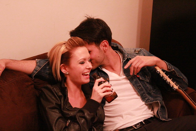
KidDynamite posted:
All in that said, though, good for you for not using the popup flash. Compositionally: it's just not a very interesting photo. The dude's hand is cut off awkwardly. The angle isn't very interesting. The interaction between the two isn't very interesting. Even if everything was technically perfect, it would be a mediocre snapshot at best. The girl is pretty, but that's pretty much it, and as a photographer, that's not something you can take credit for. As per the OP, why don't you tell us what you think makes this photo good?
|
|
#
?
Jan 9, 2012 01:18
|
|
|
KidDynamite posted:
I feel like this photo holds value to you, and maybe to the people in it, but it has no chance of holding value to anyone else. This is a random shoot? It looks like a snapshot from a party. The composition is sloppy in that we don't really know what's going on. The girl is drinking beer, dude has a guitar, she's laughing. With his face obscured as such we don't know what he's doing. What's this supposed to show?
|
|
#
?
Jan 9, 2012 20:21
|
|

|
Yeah I really see now I failed to capture something good in the shot. It's not apparent but the dude is sticking his tongue in her ear that's why I liked it her reaction. I'm new to portraits as when I was in high school I stuck to inanimate objects. I guess I have a lot more reading to do in the portrait thread. My end goal is to start shooting boxing and MMA.
|
|
#
?
Jan 9, 2012 22:12
|
|
|
Ok I'm going to count my last critique towards this photo. I'm kind of stuck with this image. I need something to make it a bit more memorable... but I'm not having a lot of ideas pop into my head. The only thing I can think of is to darken the whole scene and throw some directional light from the light fixture hanging above the pool table and give all of that a warmer hue... but that would probably look stupid with the massive bright windows in the back of the scene. Anyone have any ideas? 
|
|
#
?
Jan 10, 2012 02:33
|
|
|
RangerScum posted:You're fighting the whole room on that one: The dark vs light wall, that horribly placed ceiling light and the bright spot on the wall it causes, the bright windows, the plants/mirror/reflection/ball-rack, and the bright specular highlight on the table. If you shot at night and used all your own lights you could probably pull it off, but it just seems light finding another location would be easier. There's also way too much headroom. Edit: If you still want to shoot in this location, this is how I would approach it: Shoot it late so you aren't fighting the windows; keep the camera set up relatively the same, though try to get back further to minimize distortion; set up your ambient lighting, keep it diffuse to deal with the dark varnished table and floors; remove or lift the over table light if possible; Shoot each model separately, keep the one on the right where she is, move the middle one forward so she isn't tiny and try to keep her from intersecting poorly with the background, shoot the girl on the left with her to the right of the table and then mirror the entire right half of the room over the left; shift the antlers lower (in photoshop) and crop to the top of the square part of the windows. TheLastManStanding fucked around with this message at 03:04 on Jan 10, 2012 |
|
#
?
Jan 10, 2012 02:49
|
|
|
It's actually two completely different wall colors- white on the right and grey on the left, though light-wise yes it does get progressively darker as it goes to the left. This was a rented location picked out by some clients and there were about 2 hours of makeup and hair involved, so I won't be re-shooting this one. I could probably get rid of that weird ceiling light without too much work and I could probably fix 90% of the highlights on the table, but I am not going to go to that much work if it's not going to be a very interesting shot anyway. I shot it with a lot of room at the top of the photo because I liked the size of the room / windows. I think I'll probably have to do some exposure combining and darken everything and try to pump up the light coming in through the windows or something.
|
|
#
?
Jan 10, 2012 03:16
|
|
|
KidDynamite posted:Yeah I really see now I failed to capture something good in the shot. It's not apparent but the dude is sticking his tongue in her ear that's why I liked it her reaction. I'm new to portraits as when I was in high school I stuck to inanimate objects. I guess I have a lot more reading to do in the portrait thread. My end goal is to start shooting boxing and MMA. Warning: The following advice is from someone who's getting back into the SLR game after a long hiatus. Don't get discouraged - this place has a high standard and even pictures bordering on great get nit-picked. Cockwhore (delightful name!) covered the technical stuff pretty well. I'd put a fast prime 35 or 50mm next on your shopping list if you're going to be doing more shoots like this. Compositionally, a few things could have made the shot better: Stepping a few steps to the right would have got the guy's face in the shot, maybe with his tongue visibly in her ear. Such a comical situation, along with the girl's reaction, might have been the golden shot you saw in your mind. We're assuming the bottle isn't covering her face at the time of course. You're basically on the wrong side of the event. You'd probably feel self concious jumping to the right and shoving a camera in their faces during a semi-private moment, but keep snapping around your friends and they'll get used to you doing it and you'll get more comfortable doing it. Getting closer to the subjects or cropping tight to their faces would get rid of superfluous detail. The picture is about the guy's action and the girl's reaction to it. Everything else is noise - especially considering their body language isn't telling us much and the environment isn't particularly exciting. Try cropping some of the pics you took that night - you will probably find improvements. Good luck! (edit) Also keep in mind that candid shots are very hit and mostly miss. You can increase the percentages with skill and practice, but in the end you'll end up with a lot of crap shots. truncated aardvar fucked around with this message at 07:16 on Jan 10, 2012 |
|
#
?
Jan 10, 2012 06:59
|
|
|
Cockwhore posted:#1. I don't think the processing is over the top, other the fact that you seemed to have pushed the recovery slider way too hard. If you look at the clouds, parts of them are blown out - which is fine in itself - but the parts that are blown out aren't white but are this murky shade of grey, which you should avoid. I also think the composition could have been a lot more interesting, if you had tried to align the lamp-posts to the pillars of the gate. Moving so that the the concrete path is right in the center in the image (and its lines converge in the middle of the image), would have also yielded a stronger image. Everything is almost symmetrical, but not quite, which is driving my brain crazy. Sometimes this can be desirable, but I don't feel this is one of those times. Overall, I think out of the three pictures you posted this is your strongest one (just push the recovery slider back a little bit, please). These didn't get any critique, so I thought I would throw some out. 1st picture. I don't usually like pictures where people aren't facing the camera, but I think it works here. They are both turned facing each other and it looks like they were really enjoying their conversation. On top of that, the lighting is great and it really adds a great feeling to the picture, like 2 people leaving at the end of the day. One thing I would change about this picture is the flare, mainly the green part of it that is hitting the guy's back and the grass in front of him and to the left. It doesn't look difficult to clone out, and I think the picture would be better without it. The second picture. I don't have much to say about this one. Again, I like the lighting and the expression on his face. However, this one suffers greatly because of the branch that looks like it is coming from his mouth, as well as the shadow that is falling on his face. Not much you can do about that, unless you want to spend hours meticulously cloning it out  Also, the second time I looked at this picture, I thought that the branches really take up most of the frame, he is much smaller compared to the bush, or whatever it was. Also, the second time I looked at this picture, I thought that the branches really take up most of the frame, he is much smaller compared to the bush, or whatever it was.
|
|
#
?
Jan 10, 2012 17:00
|
|

|
Cockwhore posted:
Second shot: Branches over face ruin it for me, unfortunately. krackmonkey posted:
I've been ignoring photography for a few months - my flat got burgled and I temporarily got rid of all my gear out of paranoia (they took my laptop but left the 5D and lenses ). Time to post here and force myself to take more photos.Here's a couple of old Kodachromes I just got round to scanning: 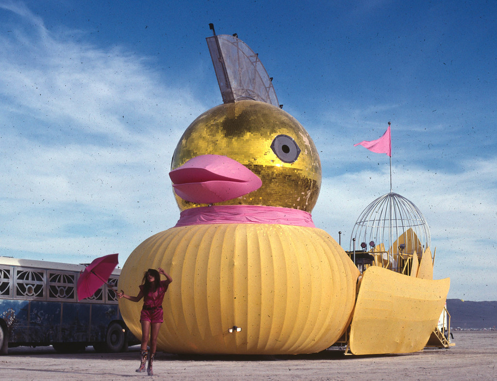 Duck by atmz, on Flickr 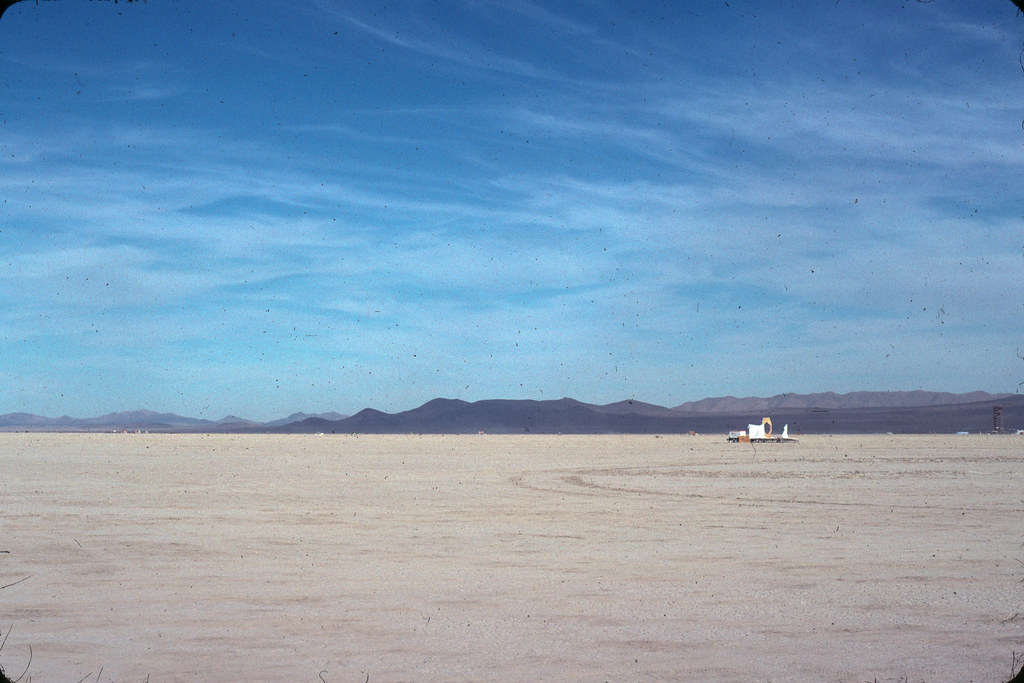 Dusty Kodachrome by atmz, on Flickr Does the dust hurt or help the feel? And here's a stalkery shot from my roof: 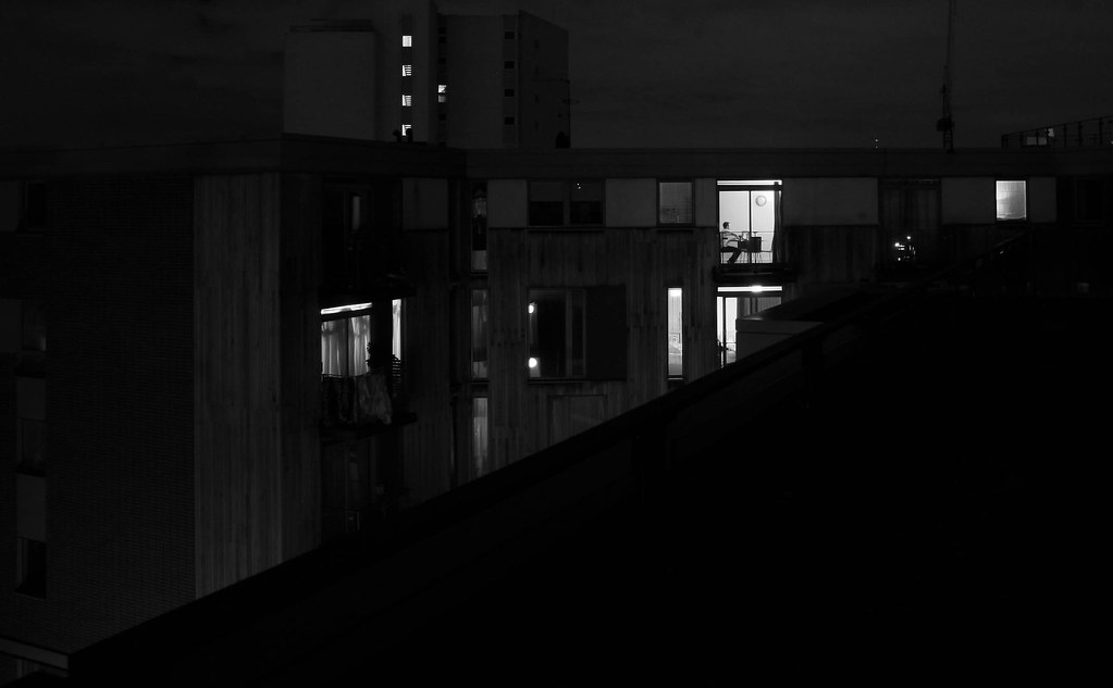 Alone, the city by atmz, on Flickr Not enough going on?
|
|
#
?
Jan 10, 2012 22:00
|
|
|
I know kodachrome is cool and all but clean your slides, those are disgusting.
bellows lugosi fucked around with this message at 02:36 on Jan 11, 2012 |
|
#
?
Jan 10, 2012 22:06
|
|
|
TMZ posted:And here's a stalkery shot from my roof: The big black triangle is too big. edit: on second thought, I like how it cuts the photo in half, so I guess I'm partial on the big black triangle. You should have moved a bit further, closer to the edge. I like the shot though, and I like the person sitting in their apartment. Provides nice detail/human element. How did get access to the roof though? Is there some kind of unlocked hatch you go through? bobmarleysghost fucked around with this message at 02:10 on Jan 11, 2012 |
|
#
?
Jan 11, 2012 02:07
|
|


|
dukeku posted:I know kodachrome is cool and all but clean your slides, those are disgusting. It looks like he was at Burning Man, and if so it means cleaning his lens would have been impossible. Playa gets everywhere and you cough it up days after you have left. It looks kinda cool imo. @TMZ The shot with the girl is awesome. The one thing is that I wish the head of the duck had more colour. I mean its head is a giant flashy ball, but my eyes are attracted more toward the body. I don't know if you did it on purpose, but it kinda cool if the head popped out a bit more. This was sort of an impromptu shot. Was at a friends place and saw the plane. The contrail was pink, and the sun setting was sort of pink with a blue background. I thought it was kinda neat. When I was fooling around with the colours, I noticed that putting stronger blacks kinda made it neat looking but I am not really sure. 
|
|
#
?
Jan 11, 2012 11:09
|
|

|
Enigma89 posted:It looks like he was at Burning Man, and if so it means cleaning his lens would have been impossible. When I see this image, the chimney seems to be the main focus, maybe cropping it differently would help?
|
|
#
?
Jan 11, 2012 11:40
|
|
|
Enigma89 posted:It looks like he was at Burning Man, and if so it means cleaning his lens would have been impossible. Those are spots on the film, not on the lens. If that's what they're like after cleaning (if the dust was there pre-exposure there's no hope), but if any of it is post-exposure dust it can be cleaned.
|
|
#
?
Jan 11, 2012 17:16
|
|
|
These are awesome. I haven't seen many film shots from the playa. What year was this? And yes, dust gets in everything forever and will never completely leave whatever you expose it to. I still have playa caked into the tiny crevices of my 5D after having the whole thing professionally cleaned.
|
|
#
?
Jan 12, 2012 15:30
|
|
|
RangerScum posted:Ok I'm going to count my last critique towards this photo. I'm kind of stuck with this image. I need something to make it a bit more memorable... but I'm not having a lot of ideas pop into my head. I think the problem your having is actually creating a mood. When I saw this photo, I enjoyed seeing primary colors on the dresses, but I don't see a solid concept or vision. Are you trying to show a lifestyle or culture or tell any kind of story? Making the chandelier look like it's lighting the scene would help set the mood. Right now the light looks like a spotlight to me with a hard edge all around the frame. The distortion in the ceiling and the one yellow bright dot are distracting me from enjoying the rest of the frame because it seems so carefully set up. You said you can't go back and re-shoot, but could you have moved the pool table between the two windows and center the moose head. Then get closer and only show the two windows and the top half of the pool table? Unless the full bodies are important to you I think you should get closer. Would like some crit on the following: 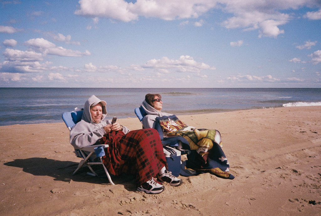
|
|
#
?
Jan 12, 2012 17:19
|
|

|
AIIAZNSK8ER posted:I think the problem your having is actually creating a mood. When I saw this photo, I enjoyed seeing primary colors on the dresses, but I don't see a solid concept or vision. Are you trying to show a lifestyle or culture or tell any kind of story? Making the chandelier look like it's lighting the scene would help set the mood. Right now the light looks like a spotlight to me with a hard edge all around the frame. The distortion in the ceiling and the one yellow bright dot are distracting me from enjoying the rest of the frame because it seems so carefully set up. You said you can't go back and re-shoot, but could you have moved the pool table between the two windows and center the moose head. Then get closer and only show the two windows and the top half of the pool table? Unless the full bodies are important to you I think you should get closer. This picture baffles me. Everything about it seems good, and it also seems bad at the same time. The composition is good, colors are good though there is quite a bit of a magenta cast. The grain works well with it also. They look bored. It looks set up, they are facing away from the water, it looks cold, and they look completely uninterested. Fix the color also.
|
|
#
?
Jan 12, 2012 20:13
|
|
|
AIIAZNSK8ER posted:I think the problem your having is actually creating a mood. When I saw this photo, I enjoyed seeing primary colors on the dresses, but I don't see a solid concept or vision. Are you trying to show a lifestyle or culture or tell any kind of story? Making the chandelier look like it's lighting the scene would help set the mood. Right now the light looks like a spotlight to me with a hard edge all around the frame. The distortion in the ceiling and the one yellow bright dot are distracting me from enjoying the rest of the frame because it seems so carefully set up. You said you can't go back and re-shoot, but could you have moved the pool table between the two windows and center the moose head. Then get closer and only show the two windows and the top half of the pool table? Unless the full bodies are important to you I think you should get closer. I disagree with Sevn. I really like this picture. I like the colours and the light. I like that they're sitting on a beach, but away from the water - makes me wonder why they are doing that; what's opposite the water that's so interesting? I think that creates a story. I also love that they're bundled up and bored looking because it's so atypical for a beach scene and also reminds me of several days when my family has gone to the beach on freezing days and had to bundle up. I think the contrast of "they're facing away from the water so something must be interesting" vs the bored faces and the guy checking his phone is really nice. I don't think it looks set up in the least. In summary, I think it creates a really neat story and makes me ask a lot of questions, which in turn makes me look at it longer and holds my interest. I don't think a picture has to have everyone looking super engaged and happy for it to be a good photo - I really like the feel that you captured in this one.
|
|
#
?
Jan 12, 2012 20:40
|
|
|

|
| # ? Apr 25, 2024 06:33 |
|
|
CarrotFlowers posted:I disagree with Sevn. I really like this picture. I like the colours and the light. I like that they're sitting on a beach, but away from the water - makes me wonder why they are doing that; what's opposite the water that's so interesting? I think that creates a story. I also love that they're bundled up and bored looking because it's so atypical for a beach scene and also reminds me of several days when my family has gone to the beach on freezing days and had to bundle up. I think the contrast of "they're facing away from the water so something must be interesting" vs the bored faces and the guy checking his phone is really nice. I don't think it looks set up in the least. Sorry, I didn't mean it was a bad thing that they look uninterested, I rambled a little bit. I still think he should fix the color though. I took a look at it, and correcting the color makes it a lot better, in my opinion. Edit: I can see that my wording was quite bad. My only critique is the magenta cast on the picture. It looks a lot better if that is edited out.
|
|
#
?
Jan 12, 2012 21:05
|
|