|
If we are still mentioning spectacular taglines:
|
 #
?
Mar 30, 2012 00:00
#
?
Mar 30, 2012 00:00
|
|


|

|
| # ? Apr 25, 2024 01:41 |
|
|
"Whips Out" should never be printed, anywhere.
|
|
#
?
Mar 30, 2012 05:02
|
|

|
Lemon posted:If we are still mentioning spectacular taglines: He just loves relieving victims of their pesky heads.
|
|
#
?
Mar 30, 2012 06:48
|
|

|
Aatrek posted:"Whips Out" should never be printed, anywhere. "He whips it out and his victims give him head!"
|
|
#
?
Mar 30, 2012 08:53
|
|

|
So it seems they decided to make a new poster for Dark Shadows: Still not good. 
|
|
#
?
Mar 31, 2012 01:18
|
|


|
Desperado Bones posted:So it seems they decided to make a new poster for Dark Shadows: I think a few of the other ones--the Eva Green and Chloe Moretz ones particularly--pull off the dark pop-art vibe a little better.
|
|
#
?
Mar 31, 2012 01:23
|
|
|
These ones?   Mmm...maybe. Edit: These probably look much different and better in real life, now that I think about it. Desperado Bones fucked around with this message at 01:33 on Mar 31, 2012 |
|
#
?
Mar 31, 2012 01:30
|
|
|
Those are godawful. And I cannot believe someone got money for making something that ugly and downright inept. This isn't for someone's high school project. This is for a multi-million dollar Tim Burton movie starring Johnny Depp, amongst several other big celebrities. Those posters are MySpace user quality.
|
|
#
?
Mar 31, 2012 01:34
|
|
|
Desperado Bones posted:These ones? These ones.   
|
|
#
?
Mar 31, 2012 01:37
|
|
|
LesterGroans posted:That's pathetic. Is she supposed to be resting her hands on the hood of the car?
|
|
#
?
Mar 31, 2012 01:40
|
|
|
HoldYourFire posted:That's pathetic. Is she supposed to be resting her hands on the hood of the car? Vampira homage? 
|
|
#
?
Mar 31, 2012 01:42
|
|
|
LesterGroans posted:These ones. I like this one,a little. Depp's one looks terrible. Dissapointed Owl, but wait! There are more:   
|
|
#
?
Mar 31, 2012 01:42
|
|
|
Meet The Nomi's
|
|
#
?
Mar 31, 2012 01:44
|
|
|
Dissapointed Owl posted:Vampira homage? More like Lisa Marie homage. At least, that's who I thought it was when I saw the trailer for the first time.
|
|
#
?
Mar 31, 2012 02:59
|
|

|
Those character posters could work if they came off as Warholesque but they just look like bad colorization of a black and white photo.
|
|
#
?
Mar 31, 2012 07:29
|
|

|
I think Jay Dub said to me that they looked like they wanted to make them like an Warhol painting and then forgot what a Warhol painting looked like. That about sums up the first round of posters. The newer ones are a tad better (They still paled the hell out of Helena despite her character looking fairly normal in the trailer) because they prefer to let the character shine and then do wacky color poo poo to the background instead.
|
|
#
?
Mar 31, 2012 08:55
|
|

|
You would have to pay me to watch another film where Johnny Depp plays a pale-faced eccentric. And as monotonous as he is in these roles, he's still the best part of most Tim Burton films.
|
|
#
?
Mar 31, 2012 11:56
|
|

|
They're not good posters but it's also pretty clear they're working with some lovely source material.
|
|
#
?
Mar 31, 2012 13:40
|
|
|
TheBigBudgetSequel posted:I think Jay Dub said to me that they looked like they wanted to make them like an Warhol painting and then forgot what a Warhol painting looked like. That about sums up the first round of posters. The newer ones are a tad better (They still paled the hell out of Helena despite her character looking fairly normal in the trailer) because they prefer to let the character shine and then do wacky color poo poo to the background instead. Tyle Perry did it better. Not so surprising because the posters for his movies are usually well done: 
Desperado Bones fucked around with this message at 14:00 on Mar 31, 2012 |
|
#
?
Mar 31, 2012 13:56
|
|
|
Shanty posted:"He whips it out and his victims give him head!" ") http://en.wikipedia.org/wiki/Hanzo_the_Razor
|
|
#
?
Mar 31, 2012 17:19
|
|


|
Desperado Bones posted:Tyle Perry did it better. Not so surprising because the posters for his movies are usually well done: Most of them seems to be lovely copies of better posters though:    
|
|
#
?
Mar 31, 2012 19:38
|
|


|
Desperado Bones posted:Tyle Perry did it better. Not so surprising because the posters for his movies are usually well done: Having seen the Warhol work like the Marilyn screenprint up close when my printmaking class toured an exhibit of his work, not only is the effect is ridiculously easy to replicate in Photoshop, but replicating Warhol's technique in actuality isn't that hard to do. Warhol's big "secret" was that painted the colors on canvas before hand, then silkscreened the photo image on top of it. The fact that, like Big Budget Sequel or Jay Dub said, the marketers wanted a Warhol-esque work without actually referencing one is pretty atrocious to me. I mean, that's basic art school poo poo.
|
|
#
?
Mar 31, 2012 19:52
|
|

|
Alhazred posted:Most of them seems to be lovely copies of better posters though: I always hate defending Tyler Perry, but surely the fact that they are parody posters with a man in drag replacing whatever serious actor the original poster had is the textbook definition of burlesque.
|
|
#
?
Mar 31, 2012 19:58
|
|
|
Aren't parody posters supposed to be funny though?
|
|
#
?
Mar 31, 2012 20:06
|
|
|
If you think a straight faced, closeted Southern Baptist in drag doing a fuckin' Straw Dogs parody isn't funny, I don't know what to tell you.
|
|
#
?
Mar 31, 2012 20:11
|
|
|
Alhazred posted:Aren't parody posters supposed to be funny though? I think homage might be a better word.
|
|
#
?
Mar 31, 2012 20:26
|
|
|
HUNDU THE BEAST GOD posted:If you think a straight faced, closeted Southern Baptist in drag doing a fuckin' Straw Dogs parody isn't funny, I don't know what to tell you. How about "I commend you on your excellent taste"?
|
|
#
?
Mar 31, 2012 20:30
|
|


|
They're nice posters. You don't have to like the humor, but at least try and appreciate it. The ladies at my work go nutso over Madea, and it's nice that the Tyler Perry movies actually have some decent looking homage posters instead of the standard "Hey, black people!" Let's not turn this into a whole thing. Is there any good articles on the way that movie posters have changed over the years? There's a classroom at my college completely covered with movie posters, and it's interesting to see the different trends.
|
|
#
?
Mar 31, 2012 23:23
|
|


|
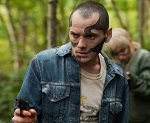
My local thrift store had a copy of this poster for sale. I didn't buy it because it's atrocious, but I did immediately look it up online when I got home so I could share it with this thread. It's somehow much worse in person, the girl's head literally looks like it was physically pasted on to a picture of someone else. 
|
|
#
?
Mar 31, 2012 23:50
|
|

|
I think we're going to need a bigger version of that beauty.
|
|
#
?
Mar 31, 2012 23:53
|
|
|
Did somebody drag the lipstick from the corner of her mouth to her ear?
|
|
#
?
Apr 1, 2012 00:20
|
|

|
"My name? Oh, Sterling Knight  " "I hate that more than the giant space guitar.
|
|
#
?
Apr 1, 2012 00:59
|
|

|
Her face. Jesus Christ, her face.
|
|
#
?
Apr 1, 2012 03:56
|
|
|
Young Freud posted:The fact that, like Big Budget Sequel or Jay Dub said, the marketers wanted a Warhol-esque work without actually referencing one is pretty atrocious to me. I mean, that's basic art school poo poo. I want to see a Warhol in real life  Anyways,it's easy,like you said. All I can think is that the designers for this were just being lazy by not doing their homework. Anyways,it's easy,like you said. All I can think is that the designers for this were just being lazy by not doing their homework.And Perry's posters are a nice, and well done parody. That's why I like them. Dissapointed Owl posted:I think we're going to need a bigger version of that beauty. Cosmetic surgery gone wrong. Oh dear...
|
|
#
?
Apr 1, 2012 04:17
|
|
|
Hey, it's Mrs. Lowry from Brazil!
|
|
#
?
Apr 1, 2012 06:06
|
|


|
Her hair is quite clearly stuck in her lipstick, which is just nasty.
|
|
#
?
Apr 1, 2012 06:29
|
|

|
I like how the dude just saw something next to the photographer and is thinking like, "heh, whattaya know."
|
|
#
?
Apr 1, 2012 09:08
|
|


|
Dissapointed Owl posted:I think we're going to need a bigger version of that beauty. I can't tell if it's poor lighting or Mr. Knight is sporting one hell of a subtle pedostachue.
|
|
#
?
Apr 1, 2012 11:09
|
|

|
Dissapointed Owl posted:I think we're going to need a bigger version of that beauty. This should go on the wall of fame. Holy poo poo
|
|
#
?
Apr 1, 2012 18:55
|
|


|

|
| # ? Apr 25, 2024 01:41 |
|
|
TheJoker138 posted:Not anymore. They've gotten lazy. Now it's all "This Ain't Star Trek!" and "The Avengers: A XXX Parody" I miss the days when my idea of "Aeon Fux" starring Charlize Hard-On would have gotten made. One of the biggest lost opportunities I can remember is when they made a 30 Rock porn parody. Predictably it was called "THIS AIN'T 30 ROCK: A XXX PARODY" or something lame like that, when it could have been called XXX Rock. I mean think about it. GOD drat.
|
|
#
?
Apr 2, 2012 08:55
|
|