

|
First, hey rigeek, good to see you. ") Here's a quick and dirty guide to a way of sharpening images that can give you punch where you need it. In a sense, it's actually very similar to HDR images, except... well, not. Basically, Photoshop's layer masks are very powerful tools, and let you do things that, with a little work, give you a lot of rewards. Often times when you sharpen an image, you'll wind up with hard/jagged edges or strange moire artifacts. It means you've sharpened too much. Yet, what if other areas of the image need that amount of sharpening? Well, you're in the right place.For me (and probably many others), sharpening is a two-step process. There's capture sharpening, which is meant to remove the natural softness that the antialiasing filters on our camera sensors introduce. There is also output sharpening, where you apply sharpening to best reveal your details on your output device. Sharpening for the screen/web is similar, but different than going to print. Here's a quick walkthrough on an image I recently posted on PaD.  The first thing I need to do is perform capture sharpening, and this occurs in one of two places - in your camera (for JPEGs) or in your favorite RAW converter. For this particular one, here's the settings panel in LR. 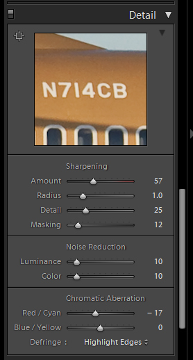 More often than not, the settings of 50/1.0/25/0 make a good starting point (and happen to be the default of Lightroom and Adobe Camera Raw for my a700). This step of sharpening is intended to bring back the often subtle microcontrasts that can be hidden via antialiasing filters. It's not really meant to bring out what most of us consider "sharpness," which is better referred to as acutance, or edge contrast. That step is generally performed right before output. Once I've adjusted the capture sharpening to my liking (often times it only takes some minor tweaking or using the masking slider to preserve skies), I then export the image full size to Photoshop. I don't downsample on export from LR, because although LR2 provides the ability to turn its output sharpening off, it still uses a downsampling algorithm similar to Photoshop's "Bicubic Sharper," which I dislike. It tends to create jagged edges on high contrast areas. Once the image opens up in PS from Lightroom, I downsample it to the desired size (if I'm going on Airliners.net for instance, I usually go to 1024 or 1280 wide depending on the image). Generally, larger images in pixel terms will be easier to sharpen simply because you have more area to work with between the edges. Unfortunately, you can't keep 12+mpx images on the web. So we need to downrez them and sharpen properly in Photoshop. Once I downsample it, I duplicate the current background layer. It doesn't have a key command, so you right click on the bg layer and choose duplicate layer. Name it whatever you like. In most cases, there are probably large sections of the image you don't want to sharpen at all. For example, in this image, we don't want to sharpen the sky at all; it'll just reveal noise. This is where layer masks come in. First, I'll select the sky and other relevant areas with the magic wand. Then I'll go to the Select Menu and choose Inverse (or press shift-ctrl-I on Windows).  The next step is to generate a layer mask from this selection. So long as you have an area selected it will get knocked out of the mask (Photoshop by default makes the mask filled) and it'll be the area that will get sharpened. Look in the layers palette and you'll see this little button (which I've conveniently circled for you).  Click on it and it will generate the mask. It'll show up in the row of the layer. Black areas are the masked areas, meaning that the layer underneath will show up through it. White areas are the unmasked areas, which will allow the content of the masked layer to show up.  Once you've created the mask, click on the thumbnail of the layer (not the mask) to select it for editing. The next step is to sharpen. I've largely migrated away from old Unsharp Mask to Smart Sharpen. Smart Sharpen automates what used to be a lot of old layer tricks into one convenient plugin to make sure that shadow areas don't get sharpened, for example. It also has tools to eliminate motion blur and other types of blur, though I've never really found them particularly useful. However, the lens blur removal is quite useful, more often so than the standard Gaussian (which is akin to normal USM and very similar to LR's sharpening method).  These are the settings I generally use for screen-sized images. I've used the Advanced tab for print sharpening, but only if it's a very tough image and the standard highlight/shadow separation fails to sharpen the right areas. You can tweak the separation between shadow areas and highlight areas to determine where to sharpen, but more often than not the default works pretty well. The large preview in the plugin window gives you a great overview of what will happen. The old click-and-hold on the image to disable the preview makes a great one-two check for seeing the original state and the post-sharpened state while you adjust your sliders. Once you're happy with the overall sharpening (even if some areas appear to have halos or jagged edges), click OK to apply the filter. At this point, you have to start thinking about the details of the sharpening. All too often some areas of the image need more sharpening than others. This is what we're looking to fix. By sharpening this top layer and masking off areas that are too "hot," we'll have a composite where the areas that need the sharpening most will get it. Now you need to click on the layer mask in your layers palette to activate it. Next, choose the pencil tool (or the brush tool, whatever floats your boat), and if you use a mouse set the color of the brush to pure black (0R 0G 0B) and set your opacity slider to ~30%. If you have a tablet, go to the brushes tab, choose Other Dynamics, set opacity jitter to 0%, and set control to pen pressure. This will allow you to control the flow of opacity via your brush tip pressure and avoid doing several brushstrokes with the mouse to get the opacity where you want. Next, you just paint on the image where you see jagged edges or halos. By varying the opacity of your brush, you'll allow the unsharpened under layer to show through, disguising these artifacts and allowing only the level of sharpening that you need. Since this method is completely non-destructive, you can go and use the eraser tool on the areas that you masked off to reveal them if you went too far - which is why you're doing it via the mask method instead of simply erasing the oversharpened ares on the layer. By default, PS will not show the mask in the image. You have to go to the channels tab to enable it. Turn it on like any other channel and you'll see your affected mask areas light up like a Christmas tree.  You can see that the sky is completely solid (masked out) since we want the unsharpened background layer to show through. The cheatlines, flap edges, registration, titles are all masked out to varying degrees of opacity so that they have just the right amount of sharpness. At this point, when I'm satisfied, I then go to Save for Web and save the image. All in all, it takes about ten minutes to sharpen the average image and do other misc things in PS. I also take this opportunity to eliminate dust spots by using the Equalize command to make them stick out and then undo and clone them out as I see them. It would be nice if Equalize was an adjustment layer type, but that's a topic for another post. I don't use this method just for airplanes, of course - it's great for portraits when you want to sharpen eyes and hair but leave delicate skintones alone. It's also excellent for architecture to keep askew edges from going totally jagged on you. I also use this method for sharpening prints, although the general settings I use in the actual sharpening differ depending on the device and size of the print. The general workflow is about the same. I know this tutorial probably isn't as easy to read as the other ones in this thread, but if you have questions you're more than welcome to ask. kefkafloyd fucked around with this message at 04:29 on Jan 16, 2009 |
 #
¿
Jan 16, 2009 04:27
#
¿
Jan 16, 2009 04:27
|
|


|

|
| # ¿ Apr 27, 2024 13:44 |
|
|
jhoc posted:Yeah I would like to know a good anti-CA technique as well. My method of sponge tool and strained wrist is not sufficient. I can write up a detailed explanation in a bit, but here's a gist. 1. Lightroom's Detail panel has all of our relevant tools in one convenient place. The sharpening tools behave similarly in their UI to the sharpening tools you've used before, except they're designed specifically to remove the softness applied by antialiasing filters. quote:Thanks for that Kefka. But, if I'm in a bit more of a hurry / I'm feeling lazy -- could someone go through some of the sharpening stuff within lightroom? Specifically how much sharpening / detail is 'enough' (I generally have a hard time telling its even doing much a lot of the time). Also, could someone do a write up on the chromatic aberration correction sliders and the edging? In LR, you're basically sharpening for 1:1. You want to increase the differentiation between details and edges without introducing jagged edges, moire, excessive noise, or artifacts. "Enough" in my book is as sharp as you can get without revealing these nasties. You can't sharpen lens softness too much without reveailing said artifacts, for example. I tend to pick what I can see at baseline settings are pretty sharp and just tweak it from there. Often times I only adjust the masking slider. The Noise reduction sliders in LR aren't that great. The real issue is that LR applies some kind of base noise reduction even if they're set at 0. It's a dirty secret that Adobe doesn't really want to address. It can cause blotchiness. Many people just set these to 0 and use a third party plugin after export to reduce the noise. The CA sliders work to resolve axial chromatic aberration (x/y red/cyan or blue/yellow) by expanding individual color channels anamorphically. It's actually pretty cool how it works but it can't correct all kinds of CA, specifically longitudinal CA (or bokeh CAs) where you get green/purple fringing in areas out of the focus plane. You basically just slide left/right to bias for the kind of CA you're getting (red/cyan or blue/yellow respectively) and 9 times out of ten it will resolve any CA problems I have with my kit. The fringing command is meant to reduce purple fringing and moderate bloom from sensors. I use highlight edges by default because it actually works pretty well in concert with any CA corrections I need to do. Rarely I will have to set it to all edges because the threshold for highlight edges is too high. It would be nice if this had a slider instead of just two settings, but the All Edges is great for CA that the CA sliders just can't remove. Worse comes to worse you will need to use the sponge tool in PS to correct anything this can't, but I have not had to do that since I migrated to LR for my RAW processing. These sliders are also available in Bridge and Adobe Camera RAW, btw. I can write up something more detailed with screengrabs and such later.
|
|
#
¿
Jan 16, 2009 17:46
|
|
|
jhoc posted:^ Thanks. Without sounding too lazy, what are the big advantages of using Lightroom over Bridge->PS ? Bridge sucks, that's a big reason to use LR. They all use the same underlying engine (ACR) so there really isn't image quality concerns as long as you're on the same versions across everything. The issue is that Bridge's workflow is just terrible. It's bad. At least, for me it's bad. If someone uses it and it does the job, power to them I guess. It's just too cumbersome for me.
|
|
#
¿
Jan 16, 2009 19:25
|
|
|
quazi posted:The only advantage Bridge has over Lightroom is its Curves function. It's pretty much a copy of the one in Photoshop, rather than being limited to 3 points like Lightroom. It's actually the ACR point curve function, which is not exposed in LR for some reason. ACR has two curves, a parametric one (the same one in LR) and a point curve. The Parametric curve actually works pretty well once you know what it's meant for. They both do the same thing in the end, but IMO the parametric curve is easier and faster to use. No futzing around, just move the shadow or highlight slider. This is speaking from someone who uses the curves tool in PS nearly every day. You're using the parametric curve to basically restore the tone distribution that we expect in the image that isn't revealed in a RAW capture, since the RAW image is just a linear expression of the light that the sensor captured. You don't need to use it for crazy wacky corrections because the rest of the tools in LR do that for you. We expect light to behave in a logarithmic fashion, which is what that curve helps restore. Use the exposure/brightness sliders to adjust your overall exposure, for example. Use the contrast slider (which is not the same as PS' contrast tool!) to adjust the overall gap between shadows and darks. Use black point and highlight tools to accomplish moving the 0 and 100% points... and so on.
|
|
#
¿
Jan 16, 2009 23:47
|
|
|
quazi posted:What I means is you can't do this in Lightroom: I said Bridge sucks because its workflow is bad. You could do the same exact thing by opening up the RAW in PS in ACR and using the point curve in that. The reason LR uses the parametric curve by default is that it's to give a quick shortcut for the overwhelming use of the tone curve, and that's to restore the logarithmic tone mapping to make the image look good. It won't let you go to crazy extremes but honestly 99% of the time it's unnecessary to do so. I still think that the point curve should be an option in LR but for whatever reason it's unavailable.
|
|
#
¿
Jan 17, 2009 01:29
|
|


|
quazi posted:AH HA! That's where I'm getting lost.. I thought ACR was Bridge! I never used it for its workflow anyway -- because it sucked. Well, Bridge uses ACR for its raw conversion, just like Lightroom. So, there you go.
|
|
#
¿
Jan 17, 2009 01:34
|
|
|
Bridge has only become semi-usable because they made it more like Lightroom in CS3, and much more so in CS4. It's like some crazy file browser on steroids, while Lightroom is meant to really keep you organized and apply edits across many images at once.
|
|
#
¿
Jan 17, 2009 02:35
|
|
|
If you like the looks that the B&W adjustment layer gives you, flatten and then convert to grayscale. Otherwise you'll get ugly four-color black.
|
|
#
¿
Feb 2, 2009 13:49
|
|
|
quazi posted:The Epson 9900 is pretty nice. It also costs an arm and a leg. Consider the 4900 (17 inches wide) or 7900 (24 inches wide) before buying a 48 inch monstrosity of the 9800.
|
|
#
¿
Feb 17, 2009 21:56
|
|
|
To be clear, here is a quick gist of how this stuff works. Let's say you have an image in Photoshop that's tagged with Adobe RGB. The tagged profile describes the colorspace that the image resides in. To get accurate color, you have to do an ICC transform to a destination colorspace. In the case of displaying it on your monitor, it will be the ICC profile generated by the Huey, or EyeOne, or whatever spectro you use. The Huey software will automatically set said ICC profile as the monitor's colorspace, and ICM-aware applications will honor that. Windows uses generic profiles by default which may or may not reflect any kind of reality. There's just too many monitors out there. So now that you've got your profile set up properly, what really happens? Open up the tagged image in Photoshop. Photoshop will see that the image is in AdobeRGB, and it knows that your monitor has an assigned profile. Behind the scenes it does a conversion of the image to LAB format, and then does a transform using one of four methods to the destination space, which you then see on the monitor. These four methods are: Perceptual - colors from the source space are translated to the destination, and if they're outside of the destination space, they are compressed (numerically changed) to preserve appearance. However, the numbers will be changed dramatically, so this is not the method you want to use if you want accuracy above all else. Saturation - used for pie charts and stuff. Generally only for solids. Photographers will almost never use this. Relative / absolute colorimetric - Generally used in prepress, this is when you translate from one space to another where knowing about a lack of color reproducibility is critical. Colors that fall outside the gamut of the destination will be clipped to the nearest color, while colors that are common to both gamuts will be rendered appropriately. Absolute colorimetric is the same as relative, except that substrate tint will be reproduced in the proof. Most use relative colorimetric unless they are proofing to a brighter stock and need to simulate the original tint. The reason you can't just set AdobeRGB, for example, as your monitor's ICC profile is that odds are your monitor can't display the entire gamut! Even after calibration there will probably be colors out of the gamut. Color management is designed to let you know when the colors don't fall into the reproducability realm, basically telling you to fix things. This is how softproofing works, btw - you can softproof your Adobe RGB image to your working CMYK space or your proof colorspace (say, Epson 4800 with semimatte proofing paper). The image gets translated from Adobe RGB to CMYK, which is then displayed according to your monitor's gamut. If you want to know more, pick up Real World Color Management by the late Bruce Fraser. You could also ask me questions, I suppose! 
|
|
#
¿
Mar 4, 2009 21:12
|
|
|
To be a little more clear about what Brad is saying, technically there is nothing "different" between a complete colorspace like Adobe RGB and, say, your monitor's gamut, in terms of the profile itself. The ICC profile standard doesn't really make a distinction in this regard. The difference lies in what the file actually contains in describing your gamut. Profiles that describe a device's behavior have all of the standard profile fields PLUS some extra tags embedded in them, like the video card tone curve tables and chroma adaption matrices that the calibration software creates. These are obviously missing from Adobe RGB. There is a whole separate category of profiles called Devicelinks where it describes a one-way conversion from one space to another, skipping the LAB step. You can do a lot of powerful things when making this, like setting gray component reduction and preserving pures. The downside is that you have to know what you're doing to make them, number one, and number two, they're less flexible than the old method of taking two profiles and a transform method. But if you know you're always using your Komori 40 inch cooated GRACOL profile as a source and your Epson 9900 semimatte proofing stock, you can save a lot of grief by making a good devicelink. That's a bit out of the scope for photographers though. kefkafloyd fucked around with this message at 22:53 on Mar 4, 2009 |
|
#
¿
Mar 4, 2009 22:47
|
|
|

|
| # ¿ Apr 27, 2024 13:44 |
|
|
Sebastian Flyte posted:Yep, it's for web. I'm converting to sRGB using "Convert to profile" with the "sRGB IEC61966-2.1" profile selected, and with conversion options: Adobe (ACE) Engine, relative colourimetric intent, and black point compensation and dithering both checked. Use a perceptual transform instead of a relative CM one. Your numbers will have no relation with the Adobe RGB original but it'll look right.
|
|
#
¿
Apr 28, 2009 00:08
|
|