|
Mr. Despair posted:Have you considered burning your camera and finding a new job/hobby that you actually enjoy? or at least be willing to improve at
|
 #
?
Oct 15, 2014 01:04
#
?
Oct 15, 2014 01:04
|
|


|

|
| # ? Apr 26, 2024 00:13 |
|
|
Jesus christ, what is it with this loving thread?
|
|
#
?
Oct 15, 2014 01:09
|
|

|
William T. Hornaday posted:Jesus christ, what is it with this loving thread? The Dorkroom isn't a hugbox. Critique (and scorn for those who can't handle it gracefully) is the norm and that's a big reason the standard of work here is so much higher than on most internet photography forums. It's a good thing unless all you want from us is validation.
|
|
#
?
Oct 15, 2014 01:30
|
|

|
Wooten posted:I love my job. It is my passion in life. I think I'll stop posting about it though. Later Dorkroom. EDIT: Not because you're leaving but because you're pretty exceedingly mediocre at your passion in life.
|
|
#
?
Oct 15, 2014 01:35
|
|

|
MrBlandAverage posted:The Dorkroom isn't a hugbox. Critique (and scorn for those who can't handle it gracefully) is the norm and that's a big reason the standard of work here is so much higher than on most internet photography forums. It's a good thing unless all you want from us is validation. I was more referring to the fact there seems to be a meltdown/squabble like this every ten pages.
|
|
#
?
Oct 15, 2014 01:39
|
|
|
I am very new to photography, like started 6 months ago new. I shot this at a cousin's wedding a few weeks ago. I post-processed it and think the girl's skin tone is blue but I don't know how to fix that. How is it otherwise? Flower Girl by atalentedmonkey, on Flickr Flower Girl by atalentedmonkey, on Flickr
|
|
#
?
Oct 15, 2014 02:29
|
|
|
You cooked it a bit too long in post. While subtle edits can certainly add more punch to a photo, going overboard with the sliders looks really tacky and is easily noticed. She's got a distinct halo around her entire body, and the grass is an unnatural type of neon green. Post the original so we can get a look at what you're working with here.
|
|
#
?
Oct 15, 2014 02:39
|
|
|
Whirlwind Jones posted:You cooked it a bit too long in post. While subtle edits can certainly add more punch to a photo, going overboard with the sliders looks really tacky and is easily noticed. It looks like a nik plugin that I remember seeing a long time ago. Called glamour or something.
|
|
#
?
Oct 15, 2014 02:42
|
|
|
deaders posted:Are you talking about this? IMO Flash fill vs natural light are two entirely separate photography techniques and classifying them according to geographical region seems really weird to me. They both have their specific use cases and they work better sometimes more than others. They can both be done poorly too.
|
|
#
?
Oct 15, 2014 03:48
|
|

|
Like I said, nothing wrong with fill light when it's done well. In this case it was pretty visibly bad and when he got called on it he was super defensive and dismissed all criticism.
|
|
#
?
Oct 15, 2014 03:55
|
|

|
Don't get me wrong, I am not saying there is anything wrong with fill light, was just asking him why he was using it in every shot with the intention of opening up the possibility of talking about other ways you could approach those same shots. People can be kind of dicks in this forum at times and it's not always justified, but these flare ups usually happen when someone asks for "honest critique and feedback" then gets very upset when people point out the flaws in their photos.
|
|
#
?
Oct 15, 2014 04:00
|
|

|
1st AD posted:Like I said, nothing wrong with fill light when it's done well. In this case it was pretty visibly bad and when he got called on it he was super defensive and dismissed all criticism. I don't think it's fair to say he dismissed all criticism. Some people are better than others at providing useful and tactful feedback.
|
|
#
?
Oct 15, 2014 04:29
|
|

|
 EDIT: Forgot words. She spray tanned the day before for a competition. Continuing my streak of working with subjects with fake tans, I feel like I made it work.
|
|
#
?
Oct 15, 2014 05:25
|
|
|
iSheep posted:
I hate it less than I thought I would. That's a good thing by the way. edit: and yeah the spray tan isn't too obvious, after having worked some bodybuilding competitions that left permanent stains on painted-wood equipment racks, I've seen a LOT worse. edit2: the person next to me on the couch indicates "drat. that's really, really good." SoundMonkey fucked around with this message at 06:05 on Oct 15, 2014 |
|
#
?
Oct 15, 2014 05:54
|
|


|
I think it looks great and I didn't notice the spray tan until you pointed it out.
|
|
#
?
Oct 15, 2014 06:01
|
|
|
SoundMonkey posted:I hate it less than I thought I would. 1st AD posted:I think it looks great and I didn't notice the spray tan until you pointed it out. I had to work some brush magic as well, Some of the tan washed off so I had to retouch in some areas. She said there was orange everywhere in her tub, I asked if it looked like an oompa loompa was murdered in there. The joke fell flat. If you guys remember, I was gonna try to do a Terry Richardson style shoot with her, I opted for a studio instead and holy poo poo am I so happy I did. There are definitely things I could have done better. But she is pleased as punch with the photos I delivered and I have some incredibly solid shots for my portfolio.
|
|
#
?
Oct 15, 2014 06:13
|
|
|
iSheep posted:I had to work some brush magic as well, Some of it washed off so I had to retouch in some areas. Yeah the lighting is loving top-notch, and I can't imagine it working very well without really good lighting. We're just gonna assume that by "Terry Richardson style" you mean direct on-camera flash, and yeah, this would not have looked good like that.
|
|
#
?
Oct 15, 2014 06:16
|
|
|
iSheep posted:
I think overall the lighting is good, but the tutu is too dark in the front. If I was going to nitpick, I'd say the highlights on the left (her right) side of her face are too hot / off balance with the opposite side, but it's not really too big a deal. smooth.operator posted:I am very new to photography, like started 6 months ago new. I shot this at a cousin's wedding a few weeks ago. I post-processed it and think the girl's skin tone is blue but I don't know how to fix that. How is it otherwise? Oh sorry, forgot- you need to slide your white balance to the right. That coloring is caused by a WB that's too cold. How is it otherwise? Well it's nothing special. The lighting in it is less than ideal and there isn't really anything particularly interesting or appealing going on. Also I think the editing you did to the photo made the colors look bad. RangerScum fucked around with this message at 14:58 on Oct 15, 2014 |
|
#
?
Oct 15, 2014 14:47
|
|

|
RangerScum posted:I think overall the lighting is good, but the tutu is too dark in the front. If I was going to nitpick, I'd say the highlights on the left (her right) side of her face are too hot / off balance with the opposite side, but it's not really too big a deal. Trust me, the light on her cheek bothers me like all hell. The things I could have done better thing mostly involves that main light that I neglected to re-position when the pose called for it.
|
|
#
?
Oct 15, 2014 17:38
|
|
|
Whirlwind Jones posted:You cooked it a bit too long in post. While subtle edits can certainly add more punch to a photo, going overboard with the sliders looks really tacky and is easily noticed. RangerScum posted:Oh sorry, forgot- you need to slide your white balance to the right. That coloring is caused by a WB that's too cold. How is it otherwise? Well it's nothing special. The lighting in it is less than ideal and there isn't really anything particularly interesting or appealing going on. Also I think the editing you did to the photo made the colors look bad. Here's the original. It looked really washed out and not framed well so I cropped it and tried to colour it. I'll go back and have another go at it starting with the white balance and then using more subtle edits.  IMG_4818 by atalentedmonkey, on Flickr IMG_4818 by atalentedmonkey, on Flickr
|
|
#
?
Oct 16, 2014 02:27
|
|
|
I hope you don't mind me editing your original, but here is how I would edit it: To get rid of the blue cast in the shadows your best tool is individual channel adjustments using the curves tool in Lightroom (or PS). I brought up the yellows in the shadows by adjusting the blue channel. Try to go easy on the saturation and vibrance sliders, especially in portraits.
|
|
#
?
Oct 16, 2014 03:03
|
|
|
...an improvement.
|
|
#
?
Oct 16, 2014 03:14
|
|
|
I didn't know we were all gonna try to do this.
|
|
#
?
Oct 16, 2014 03:19
|
|
|
I'm already editing a wedding right now so might as well :P Hope you don't mind! flower girl by Breanne Unger, on Flickr flower girl by Breanne Unger, on Flickr
|
|
#
?
Oct 16, 2014 03:41
|
|

|
meh 
vxsarin fucked around with this message at 03:51 on Oct 16, 2014 |
|
#
?
Oct 16, 2014 03:46
|
|
|
I was going to try but iSheep killed it other than maybe pushing the highlights a little too hard on the dress but the color and subject separation are perfect. Good crop, too.
|
|
#
?
Oct 16, 2014 03:57
|
|


|
Thanks for the examples to compare to, goons!
|
|
#
?
Oct 16, 2014 14:58
|
|
|
iSheep posted:
The focus seems a little soft. Is that from the motion?
|
|
#
?
Oct 17, 2014 02:46
|
|

|
 img004 by LargeHadron, on Flickr 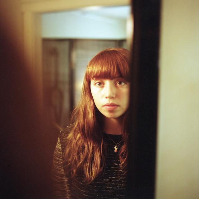 img006 by LargeHadron, on Flickr 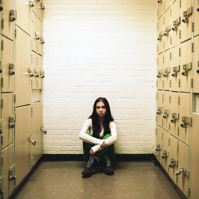 img005 by LargeHadron, on Flickr
|
|
#
?
Oct 18, 2014 04:36
|
|

|
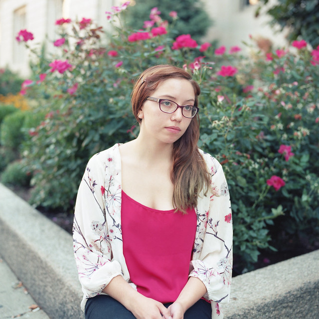
I don't really feel like you're connecting with or revealing anything about your subject with any of those. What were you going for?
|
|
#
?
Oct 18, 2014 04:44
|
|
|
People sitting there
|
|
#
?
Oct 18, 2014 04:52
|
|
|
LargeHadron posted:People sitting there Nailed it. Also the coordination between the clothing and the background on the first one owns.
|
|
#
?
Oct 18, 2014 05:45
|
|


|
Really nice depth to each shot too. Excellent use of your environments.
|
|
#
?
Oct 18, 2014 12:27
|
|

|
I like them, following you now on flickr ") Great colors
|
|
#
?
Oct 18, 2014 12:52
|
|
|
I think the blacks are pushed too far in the 3rd photo but that's really nitpicky, nice shots.
|
|
#
?
Oct 18, 2014 16:03
|
|
|
To continue the theme, here is one of my mom sitting there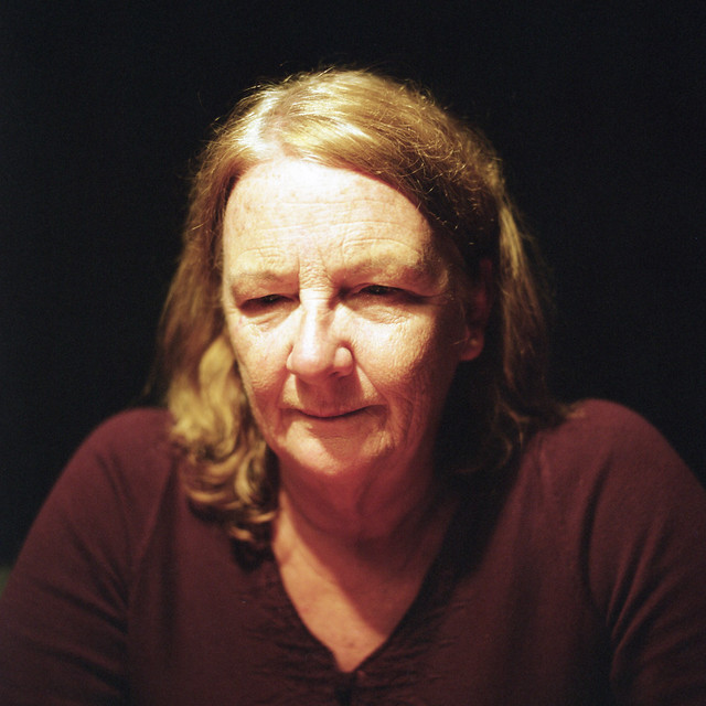 img019 by LargeHadron, on Flickr e: mr mephisto, I didn't mean to dismiss your critique. I appreciate the honesty, and it's something I'll have to think on.
|
|
#
?
Oct 18, 2014 17:58
|
|
|
My first experimental attempt at large format portraiture in the studio. Should have added 1-2 stops more DOF though.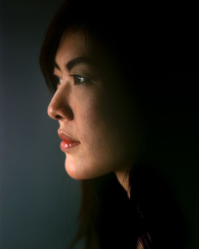 Valerie 3 by alkanphel, on Flickr
|
|
#
?
Oct 20, 2014 06:13
|
|

|
LargeHadron posted:To continue the theme, here is one of my mom sitting there Nah, man, it's all good, everyone else liked them so I may be off base. This one has what I feel was missing in the last set.
|
|
#
?
Oct 20, 2014 06:22
|
|
|
alkanphel posted:My first experimental attempt at large format portraiture in the studio. Should have added 1-2 stops more DOF though. really cool subject and i like the coloring, but yeah agreed on a wider DOF
|
|
#
?
Oct 20, 2014 19:45
|
|


|

|
| # ? Apr 26, 2024 00:13 |
|
|
 
|
|
#
?
Oct 21, 2014 00:20
|
|