


|
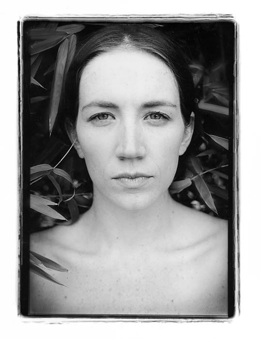
Acc-Risk posted:I have a lot of trouble with posing, and will usually only get lucky with quantity. I'm anxious to hear what others do... Here's two that I think turned out well... I'll tell you what, you did a stellar job on that first pic minimizing her nose. I think the shardows are a bit harsh and that a secondary light about 1/2 power to the keylight to camera right about 45 would make it perfect.
|
 #
¿
Jul 16, 2009 12:49
#
¿
Jul 16, 2009 12:49
|
|


|

|
| # ¿ Apr 26, 2024 01:00 |
|
|
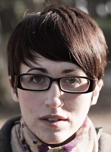
psylent posted:Any hints on shooting someone with almost no chin? Shoot slightly above eye level, butterfly lighting, avoid profile and be careful with 3/4 shots.
|
|
#
¿
Dec 27, 2009 16:06
|
|
|
Please, please, please work on your temperature adjustment.
|
|
#
¿
Dec 30, 2009 13:36
|
|
|
JaundiceDave posted:I love this, but I wanted to see it in black and white, so I did a quick conversion in cs4. Jesus Christ, you just made zombie grandma.
|
|
#
¿
Feb 24, 2010 05:40
|
|

|
McMadCow posted:I posted this one in the Feb PAD thread. Shot this about 3 years back, but printed it for the first time last week. All of your shots are really nice and your style is very distinct. Cut/paste crosspost from the Photo-a-Day thread: From a few hours ago, a friend of mine who is usually very apprehensive about having her picture taken. ") Pleased with how they came out, probably will xpost in the portrait thread. My hosting. Pleased with how they came out, probably will xpost in the portrait thread. My hosting.   Kind of bummed her other eye is so out of focus, but oh well.
|
|
#
¿
Mar 4, 2010 06:49
|
|
|
Looking at it now, the third is a little cold (she wanted a "clean" bed shot). The turquoise background was actually the paint on her wall which she really liked.
|
|
#
¿
Mar 4, 2010 18:06
|
|
|
AIIAZNSK8ER posted:You said this was done on the spot, what equipment did you use to light? I agree that you could've improved the shots with a dedicated background light and maybe a reflector to camera left, but if you only had a speedlite to work with then there's not much you can do. fronkpies posted:What time were you shooting? The light is pretty harsh on this - maybe next time you go out you can take a makeshift reflector deal and have her in the shade and just bounce the light in. The same comments as others - the glasses through the eyes, etc. Few more from yesterday, buddy wanted a few shots so I went over and shot for about 20 minutes. Guy pretty much refused to smile!  The shadow on the right side of his face (our right) is a bit distracting.  I'll prob re-crop to not cut off his hand. Oprah Haza fucked around with this message at 03:20 on Mar 8, 2010 |
|
#
¿
Mar 8, 2010 03:09
|
|


|
Have you guys... tried reading portraiture books? A lot of the more recent ones are pretty bad, almost as if it's not even really trying.
|
|
#
¿
Apr 2, 2010 21:21
|
|
|
Paragon8 posted:Are you talking about portraiture books being bad, or the pics in here? Some of the pics lately. I understand that you're not professionals and that it's a learning experience, but a lot of these have no composition and are really flat. I'm not saying that I'm great either, but please put some thought into your work guys!
|
|
#
¿
Apr 2, 2010 22:11
|
|
|
Paragon8 posted:
I actually think these are pretty well done for a two-strobe setup. The second is better imo. I've taken great portraits with using a single speedlite, it's just all about thinking about how you're going to shoot instead of just clicking away. You can get stellar results with a reflector if you're low on strobes (I personally have two and use a reflector, would like a third). The main gripe I have is that we're seeing portraits with bad posing/angles and in some we're just cutting people's faces off unintentionally.
|
|
#
¿
Apr 3, 2010 00:11
|
|


|
fronkpies posted:take away the blemishes and there's not much left. While we get what you mean, don't say that to her ever, hahah. "All you are photo-wise are... your pimples." It was a good attempt, next time make the lighting a little broader to get her right side also (move her since the light source seemed mostly stationary) to get a closer look to the second inspiration photo you posted. Hop Pocket posted:Nice shot. I also did some shooting today with the f/4. I really do like this lens. Nice, would have been nice if you were able to bounce a reflector 45 degrees from her right but I'm pretty sure this was more of a candid. Did an impromptu shoot for a friend yesterday - she needed full length swimsuit photos for her dance auditions so we did it the next day. Due to her availability we had to shoot at pretty much high noon with a cloudless sky. It took a while to find a suitable spot. I really need a larger reflector as I'm not 100% pleased with the uneven lighting on this - I rarely do full length, and when I do, I do it closer to the better hours so I use my current reflector for highlights - we shot this in the shade and had almost no light. 
Oprah Haza fucked around with this message at 16:11 on Apr 11, 2010 |
|
#
¿
Apr 11, 2010 15:33
|
|
|
Ric posted:Trying something new, comments welcome: Keep this in landscape. If you're going to crop, crop out the negative space on the right as well. Some pics from a short and quick session with a friend. Three images with three different syles.  I wish there was more space in the room so I could've moved the key light back a bit for a less detailed reflection. Too lazy to shop it out.   In retrospect, wish I had a black card to camera left for some definition but I think it works. Oprah Haza fucked around with this message at 04:29 on Apr 27, 2010 |
|
#
¿
Apr 27, 2010 02:58
|
|

|
McMadCow posted:These all need a bit of work, but the things that pop out the most at me are: Thanks a lot for the crit, I know many people don't handle it well but you make valid points and I enjoy your work soooooooooooooooooooooooooooooo... yeah. Not much to say other than I need to shoot more often.
|
|
#
¿
Apr 27, 2010 12:34
|
|
 you cut her arm off at the elbow!
|
AtomicManiac posted:
While I'm glad you're interested in portraits, these are actually pretty bad. The wrinkled bedsheet (as mentioned) is not a good look. You could put more distance between the bedsheet and the subject for a darker background (would work well with her light features) - that would help with the wrinkles also. If you really wanted white background and only had the sheet you could blast it with light. The shadow of the girl on the sheet is also not good - it's very distracting. Again, separation and/or additional lighting will solve that. For reflectors, it's pretty simple, just point where you want light. The difficulty is in distance and angle. Play around with them a bit and you'll see how you can make do with fewer lights. I know this sounds discouraging but don't give up!
|
|
#
¿
May 31, 2010 02:50
|
|


|
AIIAZNSK8ER posted:I'm glad your work is improving because... quite frankly there was a lot of room to improve at first. Are you being compensated well by the mag?
|
|
#
¿
Jun 9, 2010 04:34
|
|
|
McMadCow posted:< Don't you know that photogs should only use artificial light? CHRIST. Order your Profoto Artificial Sun now!
|
|
#
¿
Sep 17, 2010 18:19
|
|
 >
>
|
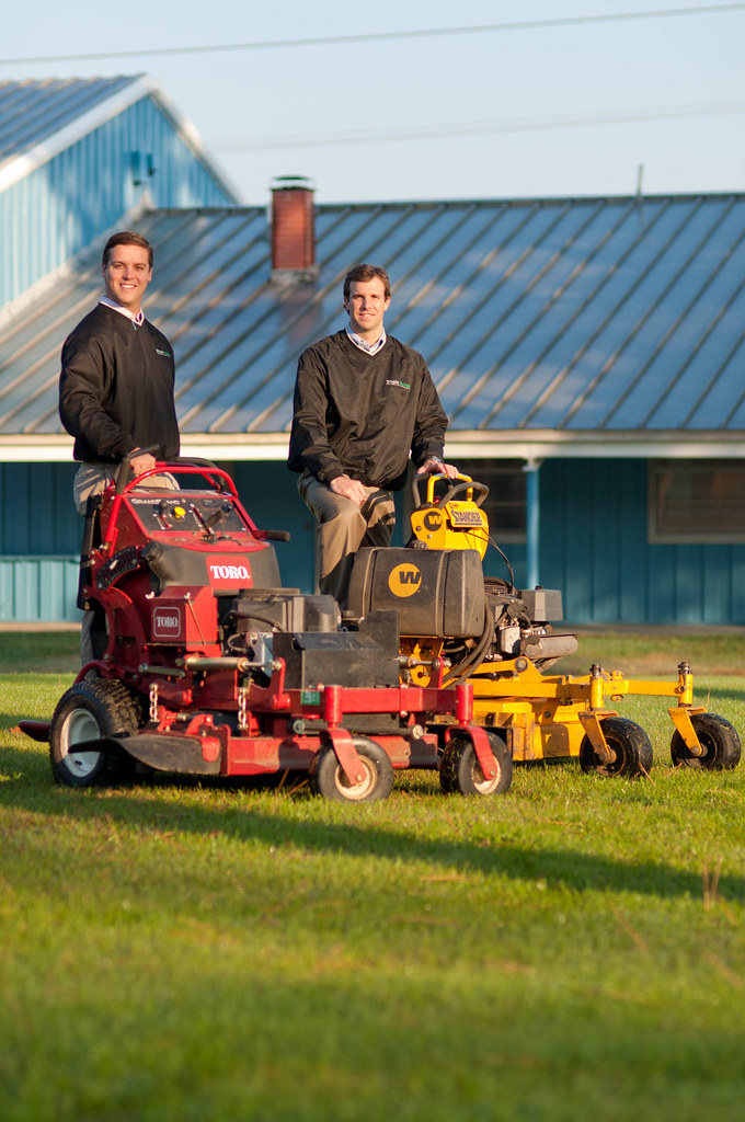
I'm going to throw out some critique as I'm waiting for class to start. Hopefully it'll help!AIIAZNSK8ER posted:
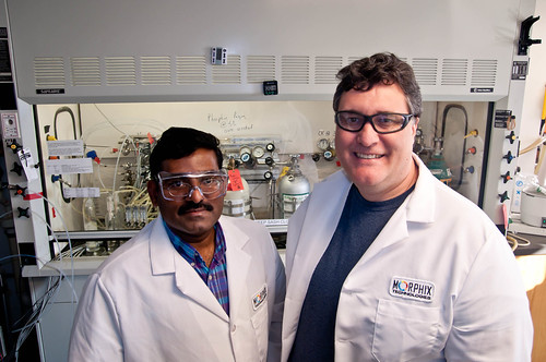
Too much negative space on top. Don't worry about cutting into the frame behind him, it doesn't have any significant meaning to add to the photo and "tilts" the image pretty heavily anyway. There are a few distracting splotches of light on the left side of his face that could easily be healing brushed out. Consider also cloning out the buttonhole on his jacket. AIIAZNSK8ER posted:
I may be reading too into this, but the placement of the two subjects, given their ethnicities and difference in expression make me think "outsourcing". If you had shot more at eye level and perhaps had them sort of near the same height in the image with similar expression it would be a better convey the feeling of a "team". The second one is kind of goofy cool. AIIAZNSK8ER posted:
You can definitely crop from the top and bottom. This is essentially a portrait of the two and the empty space don't do the image any favors. You'll still see the large warehouses and grass, which keep the idea of landscaping and equipment relevant. If they are going to be dressed up, it may have been good to clean the mowers as well. Having the guy on the right in the direct sunlight is forcing an unflattering squint and make him seem "weaker" than the one on the right. AIIAZNSK8ER posted:
Not much to say, perhaps heal the gleam on her upper gumline?
|
|
#
¿
Dec 2, 2010 01:36
|
|


|
I don't remember posting these but here are some of my teammates for a head-shave we did for cancer research. 10 minutes to shoot the four of us + group shot. It was fun but a little annoying to have so little time.  
|
|
#
¿
Dec 3, 2010 18:05
|
|
|
On that picture underneath the pier, if your lens doesn't have a wide enough aperture to render the background OOF, use the background to your advantage. See how the legs of the pier could have been used to frame the family? Stick them under that.
|
|
#
¿
Dec 7, 2010 13:52
|
|
|
Doo doo doo - some pics for a local fitness instructor. LOTS OF LIQUIFY.   A few more @ my blog.
|
|
#
¿
Dec 24, 2010 04:41
|
|
|
McMadCow posted:Ack! Shots 1 and 3 have some piece of fabric sticking out of the bottom of her shorts. This is why you bring along an assistant. As weird as it seems, the shorts are actually made that way. I was very confused.
|
|
#
¿
Dec 24, 2010 14:47
|
|

|
In business, the thing that matters is final product. If you're sending out your photos for PP in order to get that, it's simply a cost of doing business. Business and pleasure aren't always the same if that makes sense. I don't know how to do hover-over images on the forums but here is a link with a recent example (from a few posts up) - click I wouldn't send her that first picture... there was a bit (not a whole lot) of PP to be done. If I didn't have the knowledge of how to do it or if I simply didn't have the time/motivation to do it myself I would have definitely contacted a retoucher to do the job. It's simply a choice of whether or not the PP work is something you are capable of doing or even want to do. Oprah Haza fucked around with this message at 14:36 on Jan 1, 2011 |
|
#
¿
Jan 1, 2011 14:22
|
|
|
I have found that the simplest and easiest thing to do is to give the model a list of references that are willing to talk to new models.
|
|
#
¿
Jan 7, 2011 21:18
|
|
|
AtomicManiac posted:1) It's not a composite. I shot it at like f13, and I don't know if the sun from behind is making her pop out so hard or what. I guess Shallower depth of Field or maybe a not-so-busy background next time. I was hoping that pushing the light harder would get her to pop, which she does but not enough. 1. We know it's not a composite, we're saying it looks very unnatural and not in a good way. 2. I don't know why you bothered writing this out, all you are confirming is that you're sloppy. 3. Learn to crop. 4. Sandbags.
|
|
#
¿
Feb 15, 2011 01:15
|
|
|
Dorkroom: models are not real people. I get what you mean though.
|
|
#
¿
Feb 16, 2011 19:35
|
|
|
AIIAZNSK8ER posted:Ok, how did I do with this one? Crop out the top/bottom. If you remove the brown part of the desk at bottom it makes the image have more of an impact. Same for cropping out the top. No one wants to look at blinds/blind pully things. Why were the blinds left open? Level the picture, it seems off by a degree or two. Why are the books there? Are they significant? If not, then why are they there? If only for a prop, you should have used a less prominent pair. The red is very distracting. If they are important, why can't you see what they are? It also took a while to see that she's holding glasses... you would assume a pen but there isn't one so it is kind of off-putting. What does she do? Does she even work there? What is her position? The portrait says nothing about the person, which in some cases is fine... but I'm sure you're trying for more. The light is nice and not as flat as the others though.
|
|
#
¿
Feb 23, 2011 01:02
|
|

|
Cyberbob posted:Ended up doing a shoot for my friends band. I think that it was worth it to add the first pic to your port. I would suggest that next time you take the time to move the lights for their shots, the last two it really shows that you kind of just stood them there. If you're gonna do it, have some fun with it!
|
|
#
¿
Feb 24, 2011 02:37
|
|
|
Shooting up into nostrils is unflattering for anyone, but especially so with those who have... bigger ones.
|
|
#
¿
Feb 24, 2011 13:03
|
|
|
Dude, don't do that to your photos. If you want to achieve that "hipster film look" then look into split-toning, not just obliterating the overall temp. Subtlety works best.
|
|
#
¿
Feb 28, 2011 04:12
|
|
|
RizieN posted:Yea you guys are right, I guess I should've been shooting at a higher F-Stop to avoid the blurry arm thing. Are you saying crop it out at that line that is coming straight up from her wrist, or the bigger black blur to the far left? What do you process with? Perhaps making a few virtual copies and then doing a bit of something to each... give it a day or even a few hours and revisit. It just takes time to develop your style.
|
|
#
¿
Feb 28, 2011 20:16
|
|
|
AIIAZNSK8ER posted:
Yeah... elements of a photo, one should try and make sure everything is in for a reason. I would crop a bit from the first there to crop out the speakers and next time close the blinds - the left side of the frame in both have light coming in that draws the eye from the focus (the woman). Crosspost from PAD: Three of the girlfriend today - the thing I'm happiest about is the fact that she's now getting comfortable in front of the camera (she's very self-conscious). I found that it helps to direct her 100% for now so she doesn't have to worry about how she looks. Straight OOC except for a bit of touch-up, WB and dodge/burn on the second.   
|
|
#
¿
Mar 6, 2011 03:12
|
|


|
torgeaux posted:All three are fine, the second one looks like you lost some detail in the highlights. Thanks for the comments - do you mean the highlights on the ridge of the nose, cheeks, or chest? I did a bit of dodging on the nose to even out the exposure (leaf shadow I think) but may have overdone it. Hopefully we'll be shooting a bit more often - she really likes these. Paragon8 posted:tighten your aperture to get both eyes in focus - the face positioning in the last one isn't flattering. It seems like it's close to dead on but that half her face is larger than the other half. I have a few shots at a tighter aperture but those had horrible trees growing out of her head. We also liked the "lighter" aesthetic of the wider aperture. I didn't see what you meant by the face positioning but sort of see it now. I didn't want the chin to align too much with her neck and blend in but didn't want her face to be turned any further. What would you have recommended?
|
|
#
¿
Mar 6, 2011 19:59
|
|
|
I think the door is okay - the girl has enough variation/contrast to pull the eye. The spot in the top left really needs to go though.
|
|
#
¿
Mar 11, 2011 03:24
|
|
|
RangerScum posted:I guess it depends on what type of work the MUA does but if it's beauty, I'd go with very soft lighting on the face with rim lights in the back. If you are shooting on location, try to find a background that compliments the model/makeup- think color/texture/pattern. One thing that I have been doing a lot of is rough sketches of shots I would like. That way I am more focused and get more variety in the poses as I don't have to linger/wait for poses to hit me.
|
|
#
¿
Apr 4, 2011 22:40
|
|
|
It always helps to look at the catchlights for info.
|
|
#
¿
Apr 20, 2011 12:52
|
|
|
I have no idea how many people I'd kill for a digital MF camera, but I'd be good for at least one brutal slaying.
|
|
#
¿
Apr 21, 2011 06:14
|
|
|
Depending on the style of the shoot - if it's more of a commercial/fashion type shoot I will draw out the poses I want beforehand and will *know* when it's captured. For a lifestyle type portrait even though I'll know when I have the shot I'll keep going for an additional 5-10 minutes. Sometimes you'll be surprised by what comes up. For formal/executive headshots it's pretty cut and dry.
|
|
#
¿
Apr 26, 2011 19:24
|
|
|
Cyberbob posted:You don't wanna know.. It was shot with a 70-200 f2.8 Sigma on a Nikon D60. Cheap and nasty but it does the trick until I can afford to upgrade. I'm pretty sure this is a sterling example of how gear doesn't mean poo poo when talent is there.
|
|
#
¿
Apr 28, 2011 00:14
|
|
|
AIIAZNSK8ER posted:Here's another corporate shot, boring, but I like it. Do you ever apply sharpening to your photos? It's hard to tell if you leave them as is or if it's more subtle. Were you slightly above the subject in the first photo? It looks as if you're slightly off horizon and he's leaning back a bit unnaturally to compensate. I would probably clone out the reflection on the table and the outlet on the left side. The second has a bit of a sliced head effect, which I usually don't care that much about but since it's such a tight composition it is a bit more pronounced. I would consider adding a reflector camera left to give some fill. These are all opinions though so feel free to ignore certain parts.
|
|
#
¿
Apr 28, 2011 21:44
|
|


|

|
| # ¿ Apr 26, 2024 01:00 |
|
|
Probably will cross-post this to PAD once I am awake enough to form critiques. Taken a few hours ago - if you click on this link it'll take you to a blog entry with six images where you can view the SOOC images as well.    I realize I hosed up the exposure on the last one, which is why her skin tone is off. Oprah Haza fucked around with this message at 07:57 on Jun 9, 2011 |
|
#
¿
Jun 9, 2011 06:54
|
|