


|
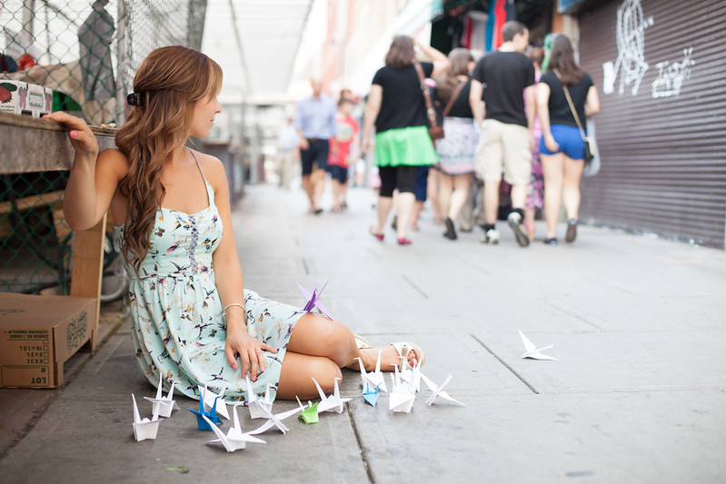
xenilk posted:
Guys come baaaaaaaaack I made you all these craaaaaaaaanes
|
 #
¿
Aug 20, 2013 15:06
#
¿
Aug 20, 2013 15:06
|
|


|

|
| # ¿ Apr 29, 2024 02:35 |
|
|
Speaking of backdrops what do people use? I bought a medium gray muslin and a stand for it. It was wrinkly as poo poo and I read you can't iron them so I got the cheapest steam cleaner Target had and steamed it out. It's pretty good now. I never managed to find any official wisdom regarding muslins. Is what I did a normal thing?
|
|
#
¿
Aug 22, 2013 21:15
|
|
|
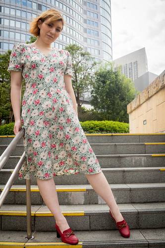
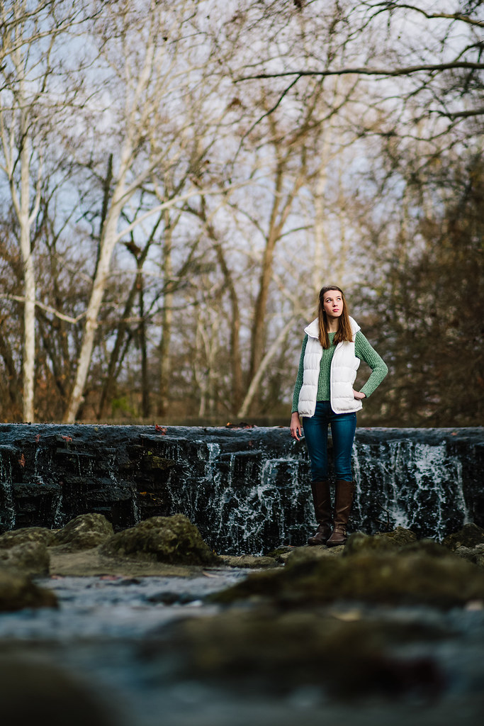
Drop Database, in 2805 and 2804 where you did an outdoor tight crop headshot there's not enough separation between the foreground and background in your shots so the backgrounds end up being really distracting. It's like oh, there's some girl and... stairs? Having a smaller DoF or a light on the model would have helped. Also, I'm not really digging the posing. What is she looking at in 2805? 2881 is the best shot but the light is sort of... flat. And it's sort of awkward that she's in the center of a square crop with that pose she has. The pose suggests placing her toward the left and the bottom of the frame. Besides that square crops are sort of awkward for portraiture because people's proportions are more 3:2 than 1:1. I feel like you should photoshop her out of 2881 and put her in the bottom left of a 3:2 photo with a huge negative space (big blue sky or something) filling the middle/top/right. 2804 has a similar issue with placement. The way she's posed she'd be more at home toward the top right so that she'd be looking at negative space in the bottom left. But then again what the hell do I know.
|
|
#
¿
Dec 3, 2013 16:48
|
|
|
Drop Database posted:
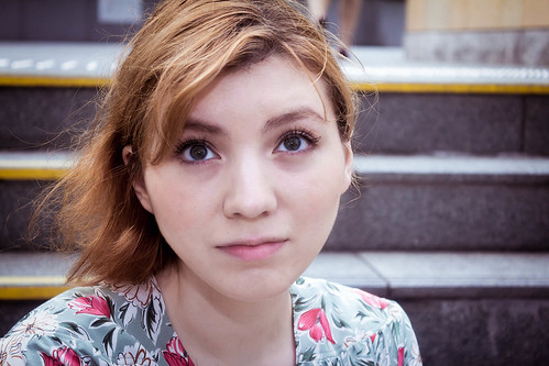
I like those first two stairs pictures probably the best out of anything you posted. Face is a little dark in the one where she's looking down, maybe you could dodge it a bit. The crop of 2881 works better for me. And on negative space, it's a personal decision what to do with negative space and there are no right or wrong answers but it's not working for me in 2804. I think it's something about the setting and the dress... there's nothing discordant about a floral print dress in the middle of the day. I guess what I'm saying is that the setting, the dress, and even her smile don't really work with the ideas of awkwardness and uncomfortableness that off camera looks and unbalanced negative space create. It ends up looking like an outtake or something, as if you grabbed a test frame while the model's attention was diverted. So to me it looks more like a mistake but such is the danger of breaking the "rules". RangerScum posted:Thanks and good points. I will see about evening up the lighting on the face later. I think you could've gone with on-axis lighting for your key rather than camera left. Or, if you weren't committed to using two lights on the backdrop, you could've tried to light the backdrop on-axis and freed up a second light for fill. Above the backdrop and pointed straight down could have worked. You could also have tried to put the backdrop light on the floor behind him since the shots you showed were all upper body.
|
|
#
¿
Dec 4, 2013 14:52
|
|
 I didn't think this through enough, but you're right of course. The stairs made sense to me because I had processed a few photos (full-body ones) in a row with them, but I can see how it's confusing when you're only looking at one photo..
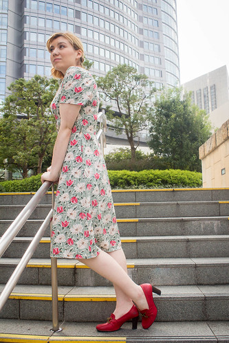
")

|
Try some starch. It tends to hang in the air a bit and if you light it from behind the backscatter will obscure stuff a bit. Try both a pressurized can of spray starch and a non-pressurized one, I'm not sure which works better.
|
|
#
¿
Dec 6, 2013 20:40
|
|
|
deaders posted:Totally agree that that photo would be way stronger with her dead center, as is it's a bit awkward. The motion of the hood is moving camera right. Photo would be more balanced with her placed further camera left.
|
|
#
¿
Dec 7, 2013 15:40
|
|
|
I feel like the lights were a bit hot.
|
|
#
¿
Dec 9, 2013 15:29
|
|
|
Tricerapowerbottom posted:That rocks is this in profile because pun?
|
|
#
¿
Apr 29, 2014 18:03
|
|

|
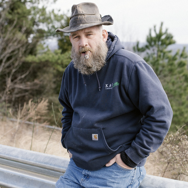
pootiebigwang posted:I never have a clue when it comes to portraits, but here's Karl. Having seen the photo you made of Karl would you tell Karl to do something different now?
|
|
#
¿
Jan 8, 2015 17:19
|
|
|
hi liter posted:otherwise boring This but also, what is going on with his sweater? Why is half of the collar tucked into the front? Is that intentional? If not, you should haven given your portrait subject a heads up that his sweater was all jacked up.
|
|
#
¿
Jan 12, 2015 18:41
|
|
|
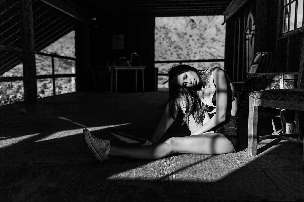
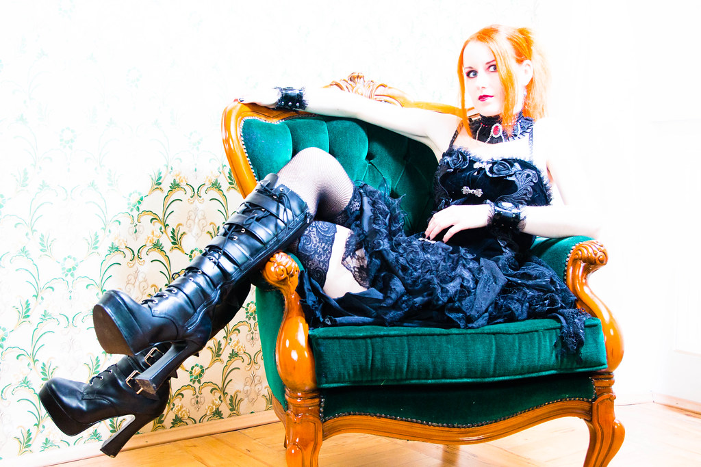
TheAngryDrunk posted:Can I get some feedback on which you like better? (Assuming you like one or the other!) I'm torn on the post processing and the pic themselves. In the second one I like that her necklace pops out as the focal point and I like it's more contrasty, which draws the focus to her really well. But in the first one the overall composition is stronger. In the second the model's leg looks too big and so does the chair, which throws things off a bit. Was this shot with a wide angle?
|
|
#
¿
Jan 26, 2015 17:48
|
|

|
this whole page is pretty =/
|
|
#
¿
Mar 13, 2015 22:22
|
|
|
1st AD posted:No smoothing/sharpening, and no clarity or fill. still some green in the mids, you can see it in his neckbeard, around his eye sockets, and in the shadow gradient on his forehead might be better if you desaturate green a bit
|
|
#
¿
Apr 10, 2015 18:11
|
|

|
Pukestain Pal posted:I guess this is a portrait. Sorry, it's street
|
|
#
¿
May 3, 2015 19:04
|
|

|
fwiw, starch (the kind used for ironing that comes in spray bottles) hangs in the air better than misted water Those shots you linked with the reflective umbrella are more about the subject distance being close and a big light source than the quality of reflected umbrella light versus shoot thru umbrella light. A reflected umbrella, even a partially collapsed one, likely will not restrict the light as much as you might hope. It sounds like you have a softbox or a plan to make one, use that if you want controlled light that doesn't spill all over the environment. It seems like the typical thing for a portrait of a tough athlete is Rembrandt (or just a key) for the face and torso with gridded or even unmodified rim lights at side-back.
|
|
#
¿
May 4, 2015 15:24
|
|
|
RangerScum posted:i wish you had taken another picture of the scene with out the chair there, and edited it out so it looked like she was floating... sorry i have brooke's work on my mind lately, she's really brilliant!!! what if he took a second picture of her outstretched arms and photoshopped them in as the seat she's sitting on?
|
|
#
¿
Jul 16, 2015 14:37
|
|
|
MrBlandAverage posted:That's just, like, your opinion, man. He's right, dude. You converted the overly warm, saturated sun beam lens flares into pale yellow beams of horse piss.
|
|
#
¿
Sep 13, 2015 06:51
|
|
|
8th-snype posted:Time to recalibrate your monitor man because MBA'd edit is loads better color wise, pity he couldn't do anything about the rest of the image. this might be one of those the dress is blue no it's yellow things because now that I look at it with daylight in the room MrBlandAverage's edit looks ok
|
|
#
¿
Sep 13, 2015 13:49
|
|
|
dorkasaurus_rex posted:
you turned his hair red
|
|
#
¿
Sep 15, 2015 01:58
|
|
|
owns
|
|
#
¿
Oct 3, 2015 09:54
|
|
|
What kind of white material do you baby photographers use. I have tried paper and muslin and they both suck.
|
|
#
¿
Oct 3, 2015 09:56
|
|
|
Yeah get rid of the hair light and balance the key light to be at or just above the room lights. The room being like 2 or 3 stops below the subject isn't doing that photo any favors.
|
|
#
¿
Nov 25, 2015 21:34
|
|
|
Judge Schnoopy posted:Did some family pictures for a friend. If there's anything about this portrait particularly heinous let me know. I just started portraits and I'm trying to move from amateur to intermediate. She's kissing the kid with her head tilted, from below, and with eyes apparently closed. Not only is that more romantic than playful, neither her face not her profile are visible and the part in her hair is featured largely which is not really desirable. Not loving the unbalanced vertical crop, tight framing, or vignette either but those are more a matter of taste.
|
|
#
¿
Nov 28, 2015 04:10
|
|

|
Judge Schnoopy posted:Thanks for the feedback on this. You've convinced me that my main focus for now should be on studying posing. Any recommendations on a good book or website that gives more than "Don't make these 10 stupid posing mistakes"? peep the OP of this thread: ConfusedUs posted:Portrait photography is everywhere. Our lives usually revolve around other people, so it's no wonder that nearly everyone who picks up a camera will snap a photo of someone else.
|
|
#
¿
Nov 30, 2015 20:16
|
|


|
Helen Highwater posted:Was one of your friends a blue gel filter? yes. thetzar blue gelled everything except the subject
|
|
#
¿
Jan 18, 2016 15:28
|
|
|
dakana posted:on that second one? word. I agree. I liked this light better, but the facial expression was pretty much identical to the one with the straight-behind rim On all of the studio headshots. In the first one it looks like some kind of bad photoshop artifact around where you cut his head out and comped in a background. Like you originally shot it on white.
|
|
#
¿
Feb 1, 2016 03:17
|
|
|
MrBlandAverage posted:
Is it available on Amazon subscribe and save?
|
|
#
¿
Feb 2, 2016 02:06
|
|

|
David Hobby felt a chill. It could only mean one thing. Somewhere on the Internet someone was wrong about off camera flash. He called Zack Arias. Zack had felt it too.
|
|
#
¿
Feb 18, 2016 02:16
|
|
|
8th-snype posted:Joe McNally slides down a pole and he doesn't know why There's a shipment with a D500, some SB-5000s, and some SB-920s at the bottom of the pole. A note is attached: "make us look good, Joe"
|
|
#
¿
Feb 18, 2016 02:34
|
|
|
and I would take five-hundred-photos and I would take five-hundred more just to be the man who took a thousand photos each one an eyesore
Dren fucked around with this message at 22:00 on Oct 26, 2016 |
|
#
¿
Oct 26, 2016 21:26
|
|
|
Helen Highwater posted:I feel it's missing something though and I'm stuck trying to figure out if it actually does look like a cool effect or just like I pushed all the sliders to the right and said gently caress it. what it is missing is the right hand side of the histogram
|
|
#
¿
Dec 7, 2016 22:22
|
|
|
Helen Highwater posted:I shot it 1.5 EV over exposed to try for a high key effect. The model is super pale anyway so her skin just vanishes under studio light against any light background and I wanted to try to capitalise on that. This sums things up. http://www.diyphotography.net/high-key-low-key-or-just-badly-exposed/
|
|
#
¿
Dec 8, 2016 02:09
|
|
|
Sneeze Party posted:These are high school senior photos. We did them at a Southern California beach, where it was totally overcast. At first I wasn't sure about the lighting. But it turned out pretty good. It was like having a soft box in the sky. She's happy with how they turned out, which makes me happy with how they turned out. The colors are cranked up in all of them. The darks are probably too dark since all the detail in her clothes is gone. In addition to that #1 is blurry because of camera shake (try to keep shutter speed faster than 1/focal length and keep yourself steady when you shoot) and #1 and #2 have blown highlights. Also each shot has a different cheesy processing effect which I guess is fine but I think it triggered 8th-samurai. I don't like that the white balance and skin tones are inconsistent from shot to shot but I guess that's fine if it's what you want.
|
|
#
¿
Dec 24, 2016 20:49
|
|
|
dakana posted:very fair point. how about this one Did you apply a tilt shift effect to this? The way the focus is makes it look kinda like she's a miniature figure. Same thing is true for the b&w stairs shot.
|
|
#
¿
Dec 29, 2016 00:25
|
|
|
ReverendHammer posted:
expose for the subject's face
|
|
#
¿
Oct 31, 2017 19:34
|
|
|

|
| # ¿ Apr 29, 2024 02:35 |
|
|
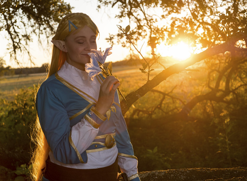
ReverendHammer posted:Yeah, that is one thing I could have done better. Mostly by cranking up the power on the strobe I was using. That's something I need to get better at. There was something about how it wasn't fully exposed that I kinda liked (and the cosplayer was super happy with the pic). But that's more of a taste thing and I can see why some people wouldn't like it. The way it’s exposed there’s a tremendous focus on the sunset to the exclusion of the cosplayer. At first glance I see a sunset and a silhouette, not a portrait showcasing a costume and makeup.
|
|
#
¿
Nov 5, 2017 21:22
|
|