


|
Hollywood usually knows better re: movie posters/ads/whatever. http://www.ignitioncreative.net/
|
 #
¿
Jul 20, 2009 02:31
#
¿
Jul 20, 2009 02:31
|
|


|

|
| # ¿ Apr 29, 2024 18:16 |
|
|
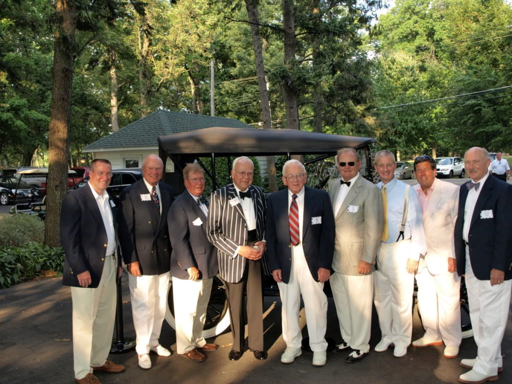
DJExile posted:My first portrait shooting experience was interesting to say the least. My dad wanted me to shoot an outdoor party (with a Great Gatsby theme, which was a lot of fun) in the evening. While having the sun behind me is nice, the problem was that it was going through a tree, and as the night went on, it got away from the tree and blew out about half the area I was shooting. Ordinarily, "change the shooting area!" is the order of the day, but this was in front of a friend's 1914 Model T (which was loving gorgeous) and he didn't want to move it if he didn't absolutely have to. 1) shoot raw 2a) meter between sunlit and shadow, adjust histogram in post to maximize the camera's dynamic range and have real shadows and highlights. 2b) if you have a good working knowledge of your camera's meter and dynamic range, then meter off the sunlit white clothing and meter for +X where X is the max amount of stops above neutral your camera can capture. you can recover somewhat blown highlights in post even if your camera is flashing the clip warning.
|
|
#
¿
Aug 18, 2009 17:42
|
|

|
I had a total of 15 minutes to take these, from arrival. I had to move a heavy podium and figure out who was who and what to do in front of a large crowd  I am happy I got close to usable results, they are going to be printed tiny like. all the crookedness, all the drat chairs i had to contort around, panicing to somehow get all the people in the group photo IN THE GROUP PHOTO (samples)    (intentionally flat and not stylized in any way) LESSON: Ask what the hell you're doing BEFORE you show up
|
|
#
¿
Oct 28, 2009 21:10
|
|
|
squidflakes posted:15 minutes and people expect half-way decent portraits? think they are below average? i really can't judge these right now as they weren't on my terms and too little time has passed... torgeaux posted:Dude on the far left of the group portrait is suffering from some radical lens distortion. 
notlodar fucked around with this message at 21:32 on Oct 28, 2009 |
|
#
¿
Oct 28, 2009 21:30
|
|
|
jackpot posted:Woman second from left in the group portrait is just suffering squidflakes posted:I don't know if I'd say below average. You at least took the time to pose everyone, even if the lighting makes them flat and boring. The people themselves look like they would like to be anywhere but right there, but if this was a work thing I'm surprised you even got the hint of a smile.  Oh, there was actually a MIRRORED WINDOW thing behind some books, WHY, its actually what's in front of those fan things jackpot posted:Haha if you scroll up the page from the bottom you notice this woman actually blends in with the books, it's like she's wearing some kind of librarian camo. I sorta fixed the distortion I failed to notice, kinda, to a "good enough" state, but it totally warped the background, i don't know what was going on, i think i had one food on a chair for the last one so I was somewhat off balance. 
|
|
#
¿
Oct 28, 2009 22:03
|
|
")
|
I am now a big fan of the unconventional approach. High contrast film + hard light from a flash I played with as a child... I hated this style a couple of years ago when I was dumber (may be related)      i like metal backgrounds that can PROPERLY reflect my flash.
|
|
#
¿
Nov 3, 2009 08:04
|
|
|
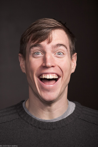
I think it looks soft because I pushed it in post (and I increased the light output of my "softbox"), so the combined effect of too much scattered light and underexposed details probably made it a bit soft. also these aren't really a series, I wasn't sure which one of the two scrunch face pictures was stronger... I actually like the other one but mostly because it's funnier to me
|
|
#
¿
Nov 3, 2009 16:53
|
|
|
TeMpLaR posted:I was going for an 'American Apparel' feel.
|
|
#
¿
Dec 9, 2009 18:17
|
|
|
Dial it down in production and dial it up in post and see how it looks. If you mess with curves: bump up highlights without clipping, you might get the same effect without losing all that detail
|
|
#
¿
Dec 19, 2009 19:16
|
|
|
poopinmymouth posted:I love having my 2nd light to control density.  , it's nice to know your face doesn't shatter if you smile , it's nice to know your face doesn't shatter if you smile
|
|
#
¿
Jan 2, 2010 03:09
|
|
|
HPL posted:I like the way the green banner bulges a bit. Makes it look kind of like a button. A jolly, candy-like button.
|
|
#
¿
Feb 11, 2010 01:16
|
|
|
HPL, I think those are a little bit too contrasty. maybe because they are too warm/red, I mostly see it in the more yellow areas (which effects the red areas...)
|
|
#
¿
Apr 2, 2010 18:23
|
|
|
HPL posted:I had to crank up the contrast a bit because of the white seamless. I was getting light spill around the edges of the models because there wasn't enough space to get them far enough from the background plus it was rather foggy in there so the whole room was diffusing light. I agree with you about the yellow areas. One culprit in the third photo was that I was using hard light (gridded 285HVs) so that made the transition from light to dark a lot harsher. Plus by the time I was doing the black seamless shots, it was even more foggy in there as you can see from the light area on the right side of the photo. I don't know why, but every studio-type of shoot I've done seems to end up as a huge foggy haze by the end.  Getting a perfectly white seamless is tough with a limited space, even worse when you have less than 4 lights without the right modifiers. A few photoshop masks (curves and saturation) may be able to do what you want with the photos while maintaining control, but I don't know if that's more work than you want to do.
|
|
#
¿
Apr 3, 2010 09:19
|
|
|
In Lightroom: Try reducing clarity, use a mask for skin only
|
|
#
¿
Apr 5, 2010 16:36
|
|
|
That's what I figured when I first saw his photos. Then me and a friend mimicked it with my 5D, too easy  is the new is the new  right? right?
|
|
#
¿
Apr 28, 2010 08:35
|
|
|
It's probably an art school final project. Some photo teachers love this kind of poo poo (not knocking it, don't fool yourselves if you think they always let you do whatever you want and like... drat you MY TEACHER
|
|
#
¿
May 12, 2010 17:09
|
|
|
Also, art school: the last place to take some real risks until you are actually successful 
|
|
#
¿
May 13, 2010 04:23
|
|
|
Anyone who wants to make a good print bigger than 8x10!
|
|
#
¿
Jun 29, 2010 02:08
|
|
|
Intentional or not, this photo really works with some of your prior work, but posting it alone is just asking for it to be critiqued on its own, where the possible meaning is lost.
|
|
#
¿
Aug 2, 2012 16:55
|
|

|
dukeku posted:Floating head portraits are very en vogue While a rim light would help, there IS separation.
|
|
#
¿
Nov 5, 2013 00:02
|
|
|
Day one of photographing my stupid girlfriend's outfit for the day before she goes to work. That'll teach her for asking me how she looks.  I told her to wear the skirt she had on before this, but nooooo notlodar fucked around with this message at 23:29 on Feb 21, 2014 |
|
#
¿
Feb 21, 2014 23:23
|
|
|
evil_bunnY posted:Did you tell her to make her least attractive face for that second one? Also I'm not even gonna ask where that's acceptable workwear LargeHadron posted:Skinny Mom Jeans Emporium 1st AD posted:Yeah those jeans are really high waisted, nice photo otherwise though. It's like... where the hell is your belly button you alien.
|
|
#
¿
Feb 21, 2014 23:49
|
|

|
The bulb on the left is cooler. I think it adds to the photo's interestingness and authenticity.
|
|
#
¿
Feb 27, 2014 02:07
|
|
|
I mean, it was supposed to be fashion but dude lost his shirt.
|
|
#
¿
Mar 7, 2014 20:35
|
|
|
Dudes, just find an albino dude.
|
|
#
¿
Mar 8, 2014 03:51
|
|
|
rcman50166 posted:I've been learning photoshop lately. My buddy has a green screen backdrop so I just went nuts. Admittedly not the greatest, but I'm still learning. deaders posted:That photography shirt... wow. gently caress the haters, those photos are fun as poo poo it's apparent. Now, I wouldn't pick up a camera and try to make a bunch of money with it, but you're having fun, you're doing it right. If your images are fun, bonus!
|
|
#
¿
Mar 14, 2014 01:09
|
|


|
Outtake from some lookbook thing. Fuji GSWIII. Provia 100 with a '97 expiration date and little to no fridge time that I got off craigslist a few years ago.
|
|
#
¿
May 31, 2014 17:00
|
|
|
365 Nog Hogger posted:Like it a lot. I'm fine with the shadow, but seeing where the seamless curves to the ground bugs me a little. On the seamless, I am torn about seeing the curve, but it does bother me that it's at an angle...
|
|
#
¿
May 31, 2014 17:52
|
|
|
There is something about these that feels like a missed moment, I think it's her expression. Or I am just projecting because it's the same face my girlfriend makes 95% of the time when I photograph her.
|
|
#
¿
Jun 9, 2014 12:41
|
|


|
 
|
|
#
¿
Jun 27, 2014 21:19
|
|
|

|
| # ¿ Apr 29, 2024 18:16 |
|
|
Yall are trippin, that adolescent girl is the best dressed of them all and that sweater is dope.
|
|
#
¿
Oct 13, 2014 05:33
|
|