

|
A lot of stuff used to get taken down on red bubble with no warning for ip complaints, so be aware of that I guess.
|
 #
?
Apr 30, 2015 09:49
#
?
Apr 30, 2015 09:49
|
|


|

|
| # ? Apr 25, 2024 15:13 |
|
|
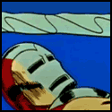
What I gathered from threadless' approach is that the artwork shouldn't closely resemble the actors of the IPs. Like they want you to draw the character, not the actor. And infringing on brand names or logos (especially companies like disney or apple) is strictly verboten, even if the artwork is satire or heavily modified. This design of mine was hilariously banned from just about everywhere: 
|
|
#
?
May 4, 2015 07:26
|
|

|
KinkyJohn posted:What I gathered from threadless' approach is that the artwork shouldn't closely resemble the actors of the IPs. Like they want you to draw the character, not the actor. Can I get one though?
|
|
#
?
May 4, 2015 20:47
|
|

|
I was going to say that since you can't use darth or mickey due to trademark issues you could caption it as dickie, then i remembered that even that is trademarked in the clothing class
|
|
#
?
May 4, 2015 22:04
|
|
|
I've recently been using redbubble myself lately, there's been some minor success but if I want to make any money I'll need to cater the designs towards t-shirts and other products they offer more.
|
|
#
?
May 5, 2015 02:03
|
|

|
Arthil posted:I've recently been using redbubble myself lately, there's been some minor success but if I want to make any money I'll need to cater the designs towards t-shirts and other products they offer more. T-shirts and stickers are pretty much all i've sold. And the profit margin on stickers is so small that it's barely noticeable.
|
|
#
?
May 5, 2015 14:54
|
|
|
Where's some good places to learn to get better at typography? It's always been something I've sucked majorly at. Also, comments? 
|
|
#
?
Jun 11, 2015 21:25
|
|
|
Keket posted:Where's some good places to learn to get better at typography? It's always been something I've sucked majorly at. It seems to be a three-dimensional 7. Better at typography you say? I think the best and most concise reference I've come across lately is practicaltypography.com
|
|
#
?
Jun 12, 2015 02:39
|
|

|
 This will be a serious of viewbooks, one for each campus, 13 total. Each campus will have it's own set of photos. Link to full pdf Couple of notes:
|
|
#
?
Jul 11, 2015 00:31
|
|
|
I like on the typography usage on pages 3 and 6 (5 reasons, Apply for Admission). Maybe try to utilize that fun style to the other headings? Also, the brownish sepia tone is a little off-putting, looks kinda dirty. Might just be me though. Maybe a bit brighter/little more cream?
|
|
#
?
Jul 13, 2015 17:50
|
|

|
JoeWindetc posted:
Looks good overall � I'll agree that the cover sepia looks a bit off. Did you try a version with the girl in full colour? Could leave the background sepia to match the turn page � Not sure what you have to choose from, but the photo of the art student's back on the "5 reasons" page is pretty dull � You should probably use commas in all the 1,000+ numbers on the stats page, since 150,000 has one. But maybe you're just doing it for numbers over 10,000 , not sure what the proper style is there. � I find all the images of money on the stats page a bit off putting. Like I'm not sure people want to see big sacks of money when they think of what the average tuition is. � There's something I don't like abut the typesetting for the intro blurbs. It looks like it's only 1-2 pts bigger than the body copy, but obviously leaded out way more. Something about the font sizes being so close doesn't jive with me. � I would try linking the icons & the names of the Intercollegiate Sports more closely. As it is they don't really line up or anything, so it's a bit of a stretch to tie them together. That's all nit picky subjective stuff though, feel free to take or disregard anything. Overall it looks professional.
|
|
#
?
Jul 13, 2015 18:06
|
|

|
On the icons and costs page, students might be more interested in how the money breaks down into a final tuition cost so that they can be reassured that their money will be well-accounted. They might also like to know how long it takes an average graduate to find a job and pay off a loan, or how much debt their peers will be racking up alongside them, but this is probably not information that goes into a sales booklet gracefully.
|
|
#
?
Jul 28, 2015 22:25
|
|

|
I'm trying to do a stylized tachometer for a logo. Thoughts?
|
|
#
?
Aug 14, 2015 08:13
|
|

|
Above Our Own posted:I'm trying to do a stylized tachometer for a logo. Thoughts? I stared at this forever and thought it was a sickle/nod to communism. Only after I read your post did I get tachometer. I'm tired though, so maybe I'm just being an idiot.
|
|
#
?
Aug 14, 2015 08:37
|
|
|
Maybe don't have the indicator be all the way rotated? It will read better as one object (indicator) in front of another (stylized dial) if you can see that the dial continues beyond/underneath the pointer. Right now they merge in to one object. If you want to go further, you could change up the colors (white pointer maybe?) or add a shadow under the pointer. Because right now, even knowing what it's supposed to be, it flips in my mind to being some sort of stylized capital "D".
|
|
#
?
Aug 14, 2015 23:11
|
|

|
Might be as easy as just not connecting the indicator to the line, like this
|
|
#
?
Aug 15, 2015 13:25
|
|
|
I don't think I've ever seen a tach with pink/salmon sections so that throws me off a bit
|
|
#
?
Aug 18, 2015 15:16
|
|
|
Hey all, I'm redesigning my website and I'd love to get your general impressions. http://thesavvybackpacker.com
|
|
#
?
Sep 30, 2015 00:05
|
|
|
Omits-Bagels posted:Hey all, I'm redesigning my website and I'd love to get your general impressions. http://thesavvybackpacker.com Ok so quick glance through the site, couple of small things I would change so please bare with me: 1. Layout of Landing: 1.1 .1 Its refreshing that you want to put your navigation on the left, I understand that this is a lot of stuff, however, with Responsive and Bootstrap being what it is these days, your UX instinctively should include all of this info in a top navigation bar, even if you create a burger menu icon which expands on click. - You can get away with doing this, as there are no fly-outs or additional menus in any of your navigation items. People generally look for things on the right hand side of the page as far as search bars and menus go. Keep your Search out of the burger menu, though. 1.1.2 Menu text: Because you've already established yourself as a back-packing website, anyone visiting the page will either know what they want to read, or will have an understanding of travel, I feel that for ease of use, you could shorten your menu text IE: Trip Planning becomes Planning, Packing Tips & Lists > Packing, etc. Short, quick descriptions better direct and retain attention while browsing. Don't make it difficult or too lengthily. 1.2 The site would feel a lot cleaner and more modern if you have your top banner spanned across the width of the site, further to this, I would add text or a call to action (IE: link through to a main article etc) onto that banner. At the moment, the image itself is poorly cropped and it's lost some of the impact of what looks like a beautiful photo. Where was this taken, BTW? 1.3 I personally LOVE the magazine layout you've gone for for all the other articles, this is so inviting and I want to click on everything and read everything! The little intro / welcome blurb is perfect and makes you guys seems like a fun and quirky couple. 1.4 Span your footer links across the site again to match your banner. Also, remember that your footer links is sorta a last ditch effort to keep people on the site, ideally you should have non-critical information here, or quick links to the main sections of your site and contact. Saying this because you want people to scroll through the site, but be engaged and click as they go - or have the information easily accessible / searchable in your top nav. I kinda feel like your Start here should be front and center, not buried in your footer. Also, loving the little back to top auto scroller - FAB idea and I wish people would do this more. 2. Layout for content pages: 2.1 Same changes to spanning and navigation 2.2. Give yourself a little padding from the edge of the browser to the start of the content - everything sitting super flush is slightly unbalanced at the moment - I do feel this will be improved with the spanning changes. 2.3 Images need to be meaningful to the article, enticing and while they should include SOME text, text should not be the main focus, unless you are using them as titles - which you are not. There's an inconsistency with having text in the image as a title and actual article titles on your pages: EG: http://thesavvybackpacker.com/backpacking-through-europe-planning/ VS: http://thesavvybackpacker.com/backpacking-europe-guide/. The text on Through Europe is heavy, the image tinting is un-appealing and makes the photo look cold, the weighting on the text is very crunched and more than a little hard to read. 2.4 Images in-line with articles - This is a purely personal gripe, feel free to ignore: I personally do not like having images on the right of content areas when they are part of an article. It throws off your text formatting, and causes your text to wrap badly. When the images are on the left, I feel like its easier to read. Again, purely personal! I would, however, have a look at your text formatting where you have done this and ensure your images are all the same size, it will help with the optical weighting.  Ok, no other comments! Cute, great content. Overall nice little site!
|
|
#
?
Sep 30, 2015 18:15
|
|

|
PrincessPANTS posted:Ok so quick glance through the site, couple of small things I would change so please bare with me: Awesome! Thanks so much. 1.1.1 Layout Yeah, my thinking was to place all my "categories" up front to encourage people to click and discover. On my previous I had my categories along the top and it felt like they were being overlooked. I guess I want to keep this site as simple as possible. It does do the hamburger menu thing on smaller screens. 1.1.2 Menu Text Good call. I agree. 1.2 Spanned top menu I think I'm going to keep my side menu so I don't know how I could span the banner. But I do want to overlay something on the image and make the image taller. I had the image go to the bottom on the screen but I wasn't sure if visitors knew there was more content on the home page. Once I figure out what to overlay on the image I will make that change. I thought about putting a video background there � like this site: http://paris.fattirebiketours.com/ And the photos is from Honfleur, France. 1.3 Thanks! 1.4 Footer Good call. I already have a "start here" on the "most popular articles" section. I just threw it in there in case someone missed it. 2.2. Padding I'm not sure what this means or how to do it (sorry, I'm new to all this). 2.3. Lead Images Yeah, I need to change a lot of these. There are too many inconsistencies. The main pain is Pinterest. I gets me a lot of traffic and images with text get a lot more attention on pinterest. That's why I started putting text on images. I'm sure there is a better solution. 2.4 Images on Left. Yeah, I agree. Thanks!
|
|
#
?
Oct 1, 2015 06:10
|
|
|
You're welcome, look forward to seeing it all finished up. That fat tire bike tours site is absolutely gorgeous, I can see why you'd want to emulate it. Im not a dev, but google says these might be helpful: https://www.gavick.com/blog/make-video-header-background https://wordpress.org/support/topic/best-way-to-put-video-in-header Padding refers to the space you've given yourself around and across elements, I'm referring to how the content is riiight up against the top of my browser window, but nothing else is aligned / in line.  You know, your pics are stunning, I would really just use your photos as headers and have heading text. Good luck with the rest of the polishing and please let us know when you're done ")
|
|
#
?
Oct 1, 2015 13:04
|
|
|
So I've done a little more tweaking to my design. I'd love to get your options! http://thesavvybackpacker.com
|
|
#
?
Nov 20, 2015 21:30
|
|
|
Not crazy about the link font. It's whatever the opposite of crisp is. Title fonts on the subpages ("TRIP PLANNING STRATEGIES AND ADVICE", et al) are a bit much. They overpower everything else on the page Logo needs a complete redo Navigation links should be aligned Something is lacking with the navigation links but I can't put my finger on it. It could use some color blocking maybe. A better logo would be a great start. Maybe make that entire section orange and use a white font. Maybe not, that might fight too much with the homepage images. I think I would like to see some color or design element that adds a bit of structure in there, though.
|
|
#
?
Nov 21, 2015 04:10
|
|
|
Yip Yips posted:Not crazy about the link font. It's whatever the opposite of crisp is. Thanks! Do you have a better suggestion for the link fonts? I'd love to hear them! I'm working with a designer for a new logo and I'll have some initial concepts next week � it's long overdue. I agree about the title fonts. Any idea what a better size would be? Are the navigation links not aligned? They look aligned to me but maybe it displays differently on different screens. As for the navigation styling... yeah, I'm not sure what to do yet.
|
|
#
?
Nov 21, 2015 05:00
|
|
|
Omits-Bagels posted:I agree about the title fonts. Any idea what a better size would be?
|
|
#
?
Nov 24, 2015 09:40
|
|

|
I've made a few changes to my site so I'd love some more feedback � http://thesavvybackpacker.com I'm just looking for general ways to improve the design, layout, colors, etc. Any help would be great.
|
|
#
?
Feb 18, 2016 02:11
|
|
|

|
| # ? Apr 25, 2024 15:13 |
|
|
Omits-Bagels posted:I've made a few changes to my site so I'd love some more feedback � http://thesavvybackpacker.com My main critique is that I think it's a little too dense on desktop. Elements should have a bit more white space around them, headers should have more room, and body copy should be a smidgen larger. I tried changing the font-size to 18px and found it much more readable. Keep in mind that you need to balance font-size and container-width to maximize readability, which means that the wider an article is the larger its font-size should be to compensate and vice-versa. A good rule of thumb is 8-12 words per line; right now you're at more like 15+. Here's a great article on the subject (which is also quite readable, note the larger font-size and just a smidgen more whitespace between things). Headers should have a bit more breathing room, enough that they're not butting right up against their paragraphs but still provide a clear visual separation between sections of the page. I noticed that you're using some semantic HTML like <header> and <footer> but not <main>, <article>, <section>, or <figure>. I'm no SEO expert but stuff like that can impact how Google crawls your site so it's worth a look. You do rank pretty well in Google results for "backpacking europe" so kudos there! Some things seem a little inconsistent, likely due to how the site has evolved over time. You might want to clean up some things like tables of contents (some articles hyperlink the ToC to the sections, some don't), using <strong> tags in some places where you should probably use headers, etc. It's good that you're organizing your articles in the left sidebar, but I notice that the articles themselves are part of categories (like "Product Reviews") which are a bit obfuscated from the user. For example, there is no way to go directly to "Product Reviews" from the main page or sidebar. Instead I have to click on "Packing Tip and Lists", then "Best Hiking Socks", and then click on the "Product Reviews" category tag on the hiking socks page. Something as simple as a link to a page with all of the categories listed might help with that. Finally, clicking on the "XX Comments" link in an article just scrolls to the bottom of the page, but there aren't any comments! Maybe it's just broken and you're fixing it?
|
|
#
?
Apr 30, 2016 07:22
|
|