


|
How about OCR-A (extended)?
|
 #
?
Nov 5, 2012 22:11
#
?
Nov 5, 2012 22:11
|
|


|

|
| # ? Apr 20, 2024 00:13 |
|
|

|
|
#
?
Nov 5, 2012 22:17
|
|


|

|
|
#
?
Nov 6, 2012 23:31
|
|

|
I must call upon the knowledge of this thread again to help me find the name of a font or one similar: Any ideas what it could be? I know I've seen it on other packaging before but I've yet to find it in Photoshop.
|
|
#
?
Jan 2, 2013 16:07
|
|

|
I think it's Carlos Bold
|
|
#
?
Jan 2, 2013 17:26
|
|

|
Ah thanks, seems to be a rather pricey font (I guess. I don't know how much fonts usually run for but it's $59 at cheapest) but I found a suitable workaround to that problem. I could have sworn it was one of the ones that comes with Photoshop though.
|
|
#
?
Jan 3, 2013 00:43
|
|
|
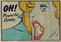
That font is so mid-90s comic books it hurts.
|
|
#
?
Jan 3, 2013 05:01
|
|

|
pipes! posted:That font is so mid-90s comic books it hurts. Its from the front of the Pokemon Red box.
|
|
#
?
Jan 4, 2013 08:30
|
|

|
I would totally play a Pokemon mod where you catch fonts.
|
|
#
?
Jan 4, 2013 16:25
|
|
|
neonnoodle posted:I would totally play a Pokemon mod where you catch fonts. Then Mechanes would be super effective against Humanist type. At least if we stick to Vox.
|
|
#
?
Jan 5, 2013 01:48
|
|

|
Sorry about breaking the funny thread going on.  Could someone please recommend good serif and sans-serif combos (i.e., one of each) for print?
|
|
#
?
Jan 8, 2013 17:41
|
|
|
I've always liked Univers and Caslon and Avenir and Clarendon.
|
|
#
?
Jan 10, 2013 02:24
|
|


|
Oh I like that second pair a lot! Thank you ")
|
|
#
?
Jan 10, 2013 15:44
|
|
|
Sure thing! Before we stop this font rec train, can anyone suggest a modern tech-type that isn't gimmicky or silly-futuristic? Something along the lines of Neo Sans but maybe less rounded/soft would be cool.
|
|
#
?
Jan 10, 2013 21:58
|
|
|
Eurostile never goes out of stile 
|
|
#
?
Jan 10, 2013 22:35
|
|
|
Perhaps you would like HFJ's latest: Tungsten
|
|
#
?
Jan 10, 2013 23:41
|
|
|
Anybody have any alternatives to the Ralph Steadman (Hunter S. Thompson, Fear and Loathing in Las Vegas) style font? I'm working with a new band called Filthy Beast, and they like that style, but I don't want to bite that style too hard. I feel it'll detract from their unique sound. Their whole appeal is this weird desert-rock pulp style grit. Any ideas?
|
|
#
?
Jan 11, 2013 02:57
|
|


|
neonnoodle posted:I would totally play a Pokemon mod where you catch fonts. Well, speaking of font games, I just found this today. It's called Kern Type. Have fun ripping your hair out, OCD people. 
|
|
#
?
Jan 13, 2013 07:32
|
|


|
RizieN posted:Anybody have any alternatives to the Ralph Steadman (Hunter S. Thompson, Fear and Loathing in Las Vegas) style font? I'm working with a new band called Filthy Beast, and they like that style, but I don't want to bite that style too hard. I feel it'll detract from their unique sound. Here's a list of similar fonts from Identifont: http://www.identifont.com/similar?IDN I'm kind of partial to Bleeding Cowboys. It's not exactly in the same vein but it does have a grungy Western feel. It may be a little too... cliched, maybe? for what you're trying to do though.
|
|
#
?
Jan 13, 2013 07:52
|
|


|
toby posted:Perhaps you would like HFJ's latest: Tungsten Forza is another good one, basically an updated Eurostile. Zamboni_Rodeo posted:I'm kind of partial to Bleeding Cowboys. It's not exactly in the same vein but it does have a grungy Western feel. It may be a little too... cliched, maybe? for what you're trying to do though. Friends don't let friends use Bleeding Cowboys. EVErrrrrrrrrrrrrrrrrrrrrrrr
|
|
#
?
Jan 13, 2013 16:58
|
|

|
Fayez Butts posted:Friends don't let friends use Bleeding Cowboys. EVErrrrrrrrrrrrrrrrrrrrrrrr I think Bleeding Cowboys is getting to be right up there with Comic Sans. On that note, I think Comic Sans should be banned from all computers in any professional setting. One of the designers at my company uses goddamn Comic Sans in her emails that she sends out to vendors outside the company. I think this reflects really poorly on our design team. I use Eurostile for everything. My resume and portfolio are both written in it and I love it.
|
|
#
?
Jan 13, 2013 19:10
|
|

|
Zamboni_Rodeo posted:Here's a list of similar fonts from Identifont: http://www.identifont.com/similar?IDN Oh my god why would you ever recommend Bleeding Cowboys. The only valid use of it is pamphlets for fly-by-night clubs that change name/ownership every 4-6 months. Bleeding Cowboys: "I want my text to look distressed/grunge but don't want to do anything more than typing the words"
|
|
#
?
Jan 14, 2013 17:16
|
|

|
Yoshi Jjang posted:Well, speaking of font games, I just found this today. It's called Kern Type. Forgot about this. Just did it, 97 out of 100, works for me. Zamboni_Rodeo posted:I'm kind of partial to Bleeding Cowboys. Isn't this grounds for exile from CC or something? Jesus dude.
|
|
#
?
Jan 14, 2013 19:28
|
|
|

|
|
#
?
Jan 14, 2013 21:11
|
|
|
RizieN posted:Anybody have any alternatives to the Ralph Steadman (Hunter S. Thompson, Fear and Loathing in Las Vegas) style font? I'm working with a new band called Filthy Beast, and they like that style, but I don't want to bite that style too hard. I feel it'll detract from their unique sound. How much type are you setting in that font? You might be smart just to pick up a bunch of paper and a calligraphy pen + ink, and go to town yourself.
|
|
#
?
Jan 16, 2013 08:02
|
|
|
Disreputable Dog posted:How much type are you setting in that font? That's my main plan right now, I haven't had too much time to work on it lately though. I'm trying to talk the band into straying away from the Steadman style, I don't think it's a good marketing move at all especially not long term.
|
|
#
?
Jan 18, 2013 23:00
|
|
|
Top tip: eye dropper a little ink onto the page then blow on it with a straw.
|
|
#
?
Jan 19, 2013 01:13
|
|
|

|
|
#
?
Jan 24, 2013 06:48
|
|

|

|
|
#
?
Jan 24, 2013 07:17
|
|

|

|
|
#
?
Jan 26, 2013 23:16
|
|

|

|
|
#
?
Jan 27, 2013 01:20
|
|
|
Are you serious about "web safe?" That poo poo hasn't been relevant in over a decade.
|
|
#
?
Jan 28, 2013 00:25
|
|

|
qirex posted:Are you serious about "web safe?" That poo poo hasn't been relevant in over a decade. It matters in emails.  Seriously, though, licensing Segoe UI costs quite a bit.
|
|
#
?
Jan 29, 2013 01:48
|
|
|
Segoe UI is actually a rip-off of Frutiger, not Helvetica (according to Spiekermann) because once again MS were too cheap to license a font and got someone to copy it. On the plus side, Frutiger/Segoe is a definite step in the right direction as regards overall legibility. As long as the font is properly hinted -- and the hinting on Segoe isn't too bad -- it's actually significantly more legible than Helvetica. That's part of why I'm so disappointed to see Apple start using Helvetica Neue for iTunes... it's a display typeface, not a body typeface, and anyway Helvetica isn't what it should be (you'll want Christian Schwartz's Neue Haas Grotesk for that...)!
|
|
#
?
Jan 29, 2013 03:47
|
|
|
ExtraNoise posted:It matters in emails. Also for audiences where the majority don't have JS capabilities
|
|
#
?
Jan 31, 2013 00:57
|
|
|
I get so pissed when I look at an email I sent to a co-worker on their PC, and my loving teal papyrus 16pt email shows up as some loving Verdana bullshit. ESPECIALLY when I sign with bright blue comic sans and an animated gif of the CUTEST emoticon! Or like on MSN when my authentic typewriter font doesn't show up on their PC and only mine... I downloaded these for a reason!
|
|
#
?
Jan 31, 2013 03:33
|
|
|
Does anyone know of any free fonts that have a similar style to ITC Century Bold. I'm working on a project with a 0 dollar budget and good, free, serifs are really hard to find.
|
|
#
?
Feb 13, 2013 00:30
|
|
|

|
|
#
?
Feb 25, 2013 05:05
|
|

|

|
|
#
?
Feb 25, 2013 07:19
|
|
|

|
| # ? Apr 20, 2024 00:13 |
|
|
And then of course there is Gill Sans Infant
|
|
#
?
Feb 25, 2013 14:06
|
|