|
slardel posted:^^ might be kind of nitpicky but I think the title "regular people" is a little awkward, like there might be a better word you could use. Like, what's the difference between a regular person and a fashionable person? Are street people not regular people? I understand what you mean but the average visitor might not. It is nitpicky but it isn't invalid. I'm open to suggestions. I considered "just people" at one point but that seemed to be just making it different without making it any less awkward. Maybe just "people" with no modifier? I honestly only have as many categories as I do because it was symmetrical for the main page. I don't have any actual fashion photography so my fashionable people are more just people in dressier clothes or looking more "modely" than the people in my regular portraits. It is a vague difference, but it at least breaks it up into more manageable amounts. Street people is just street portraits of people who mostly weren't aware of me and admittedly needs more to make it distinct.
|
|
|
|

|
| # ? Apr 26, 2024 05:08 |
|
I know, like I said, I understand what you mean - you don't have to explain it to me. But it may not be as obvious to other people. IMO it might be a good idea to just combine some of the categories and let the viewer decide what is "modely" and what isn't. real nap shit fucked around with this message at 07:09 on Jul 19, 2013 |
|
|
|
slardel posted:I know, like I said, I understand what you mean - you don't have to explain it to me. But it may not be as obvious to other people. Sorry, didn't mean to be patronizing. To keep the symmetry I'd have to cut it down to four, which I really don't want to do. Bare minimum I want standard portraits, professional headshot type, a kids one, and an animal one, which leaves me with five even if I combine wedding and engagement type photos into a single category and it will look dumb because I had that many at one point when I was putting it together. I appreciate the feedback, it just doesn't really go in the direction I want to move in. I like the eight squares, it makes it look neat and clean while filling the page space and giving a feeling of there being a lot of content to look through. I wouldn't mind changing some squares to other conceptual ideas, but I had trouble just getting to eight so I'm not sure what I could add or alter that wouldn't have the same problems of being only vaguely dissimilar. I showed my mom the site and she thought "street people" meant homeless people, so there is certainly a possibility for more concise labels. And I'm still very open to any suggestions for a better label than "regular people" if you have any. E: And full disclosure I think "lovey people" flat out sucks but I haven't been able to think of anything better yet. "Engaged people" seems lame and would preclude photos of couples that aren't engagement or wedding photos. mr. mephistopheles fucked around with this message at 08:29 on Jul 19, 2013 |
|
|
|
mr. mephistopheles posted:I appreciate the feedback, it just doesn't really go in the direction I want to move in. That's fine obviously it's your website you can do what you want with it. quote:giving a feeling of there being a lot of content to look through. Be careful about this? Giving off that vibe and actually having a lot of content are two different things, although I'm sure you already know this. I don't have a better name than regular people, but I'll let ya know if I think of anything.
|
|
|
|
slardel posted:Be careful about this? Giving off that vibe and actually having a lot of content are two different things, although I'm sure you already know this. Yeah, I'm making a lot of decisions with how I want the site to be in the future and not necessarily how it is right now, which is why I'm not really promoting it much even though it's essentially as complete as it's going to be for the time-being. My goal at the moment is to get it so when that little hover slider pops up at the bottom of a gallery, the photos extend all the way to the other side for every category, which so far only 3 of the 8 do at 1920x1200. I had two photographer friends launch websites in the last week so I've been using them as my main barometer as to where I should be. One has a really solid design and a lot more content, but I feel like he let his standards slide a lot to fill it out (not to say my work is perfect, but I think I've at least stuck to the best examples of what I have personally done without throwing in some of the junk I might put on flickr or facebook but not in a serious portfolio), and the other friend, well, here is his homepage. How am I supposed to compete with this? 
|
|
|
|
Don't think of your website as a competition with your friends? Also that looks like a pretty disgustingly processed image so it looks like he owned himself, if you actually do want to make it a competition. Also he used a free website builder and misspelled professional. unless you're totally kidding in which case it was completely lost on me and I'm really tired and about to go to sleep. real nap shit fucked around with this message at 09:10 on Jul 19, 2013 |
|
|
|
^^^ Haha, night man. Thanks again for the feedback.slardel posted:Don't think of your website as a competition with your friends? Also that looks like a pretty disgustingly processed image so it looks like he owned himself, if you actually do want to make it a competition. Also he used a free website builder. I was kidding about competing with him. His site is horrible and I feel bad because he's a nice guy and I don't know how to tell him without hurting his feelings. He was posting "working on my website" facebook statuses almost daily weeks before he actually linked the website, so I don't know if he was trying for something better and got frustrated and did a half-assed free thing, or this is genuinely the best he is capable of and spent weeks working on.
|
|
|
|
I actually had pretty similar branding to you - "NAME takes pictures!" but when I started meeting with agencies they all told me to ditch it. Admittedly we shoot different things and the cute/intimate tone might work better for your market. It is always a tough thing because I hate feeling generic with just throwing my name on my portfolio. Your "about me" is fairly decent but does come across as a bit "like me, like me!" as does your contact form. I always like incorporating bio with an email (I hate forms). I don't think you need to stand out with "funny" subtitles. Not to mention you should explicitly say you're doing weddings/engagements etc. just so it gets crawled by google or however that works. People are searching for wedding and engagement photographers not lovey people photographers. You should be a lot more selective about the pictures you put on and have intent behind it. Think about where you're placing pictures and pairing them with each other so there is some flow. You've got a couple of places where you've got pictures from the same shoot separated by other pictures. It's good to show you can take more than one good picture a shoot so don't be afraid of putting more than one shot per thing up. Paragon8 fucked around with this message at 11:38 on Jul 19, 2013 |
|
|
|
I think the retouching page is a little misleading. It's more showing off your editing style than traditional retouching, or at least how I think of retouching. I was expecting more of a beauty portrait before and after. The suit shot doesn't really fit in that category at all, though the others could have arguments made for their inclusion.
|
|
|
|
CarrotFlowers posted:I think the retouching page is a little misleading. It's more showing off your editing style than traditional retouching, or at least how I think of retouching. I was expecting more of a beauty portrait before and after. The suit shot doesn't really fit in that category at all, though the others could have arguments made for their inclusion. I think the big miss on that section is the steve jobs before and the asian woman after. Unless you literally retouched the Steve Jobs picture into a woman it shouldn't be there.
|
|
|
|
Paragon8 posted:I think the big miss on that section is the steve jobs before and the asian woman after. Unless you literally retouched the Steve Jobs picture into a woman it shouldn't be there. Also I wouldn't use examples of your own shots in the "retouching" section. Having that one bald guy in both your professional shots and in your retouched shots just makes it look like you can't take pictures right in the first place. Also, I would definitely work on filling out some of the categories a bit more.. only two shots in "lovey people" seems really iffy. Also: http://thesaurus.com/browse/love?s=t Passionate maybe? Bonus points for an alliteration. RangerScum fucked around with this message at 17:04 on Jul 19, 2013 |
|
|
|
Mr Mephistopheles, here's how to keep the 8 blocks but reduce the number of categories: 8 blocks but not all 8 blocks are categories, some are solid colored placeholders. Some of your categories are really thin, e.g. Lovey people only has two photos in it. Combine a few categories so that the distinctions between them are more clear and the number of photos in them is larger. One more thing, after I clicked on a category I wasn't sure what to click on to go back to the main page so I ended up hitting the back button. I felt like there should have been an obvious way back to the front page. I liked your photography and I like the design of the site. It shows off the photos without getting in the way. Nice work.
|
|
|
|
Okay, so far I've changed retouching to style to make it clearer, deleted some photos from multiple sections, grouped photos from the same shoots, and dropped the contact page for an e-mail line on my about page. I'll keep tweaking. Thanks for all of the feedback so far.Paragon8 posted:I think the big miss on that section is the steve jobs before and the asian woman after. Unless you literally retouched the Steve Jobs picture into a woman it shouldn't be there. It's there to be funny.  I figured it was a famous enough photograph that nobody is going to take it as me trying to claim I shot the original photo. I'll get rid of it. I figured it was a famous enough photograph that nobody is going to take it as me trying to claim I shot the original photo. I'll get rid of it.CarrotFlowers posted:I think the retouching page is a little misleading. It's more showing off your editing style than traditional retouching, or at least how I think of retouching. I was expecting more of a beauty portrait before and after. The suit shot doesn't really fit in that category at all, though the others could have arguments made for their inclusion. Yeah, that's a fair point. RangerScum posted:Also, I would definitely work on filling out some of the categories a bit more.. only two shots in "lovey people" seems really iffy. I am extremely aware I need more content. Dren posted:Mr Mephistopheles, here's how to keep the 8 blocks but reduce the number of categories: 8 blocks but not all 8 blocks are categories, some are solid colored placeholders. Some of your categories are really thin, e.g. Lovey people only has two photos in it. Combine a few categories so that the distinctions between them are more clear and the number of photos in them is larger. What are you viewing it on? There should be a menu bar at the bottom of the screen on all pages, or at least there is on my computer. Are you not seeing it? Also I like the colored block idea and I'll see if I can incorporate it in a way I like the look of. And thanks! mr. mephistopheles fucked around with this message at 21:05 on Jul 19, 2013 |
|
|
|
1920x1200 computer. I wasn't sure what to hit and I didn't spend too much time looking at the bottom bar. It would've been more intuitive for me if there had been a back arrow or a home icon in the top left.
|
|
|
|
Dren posted:1920x1200 computer. I wasn't sure what to hit and I didn't spend too much time looking at the bottom bar. It would've been more intuitive for me if there had been a back arrow or a home icon in the top left. Okay, thanks for the clarification. I'll see if I can add something like that.
|
|
|
|
Here's what I've got so far: http://stu-olsen.500px.com
|
|
|
|
Just wanted to say thanks for all the feedback!
mr. mephistopheles fucked around with this message at 10:04 on Jul 21, 2013 |
|
|
|
Not really a portfolio since I just started taking pictures a few months ago as a hobby. I guess more an opportunity to get some constructive criticism from talented and professional people so I can learn more quickly. http://www.flickr.com/photos/99712822@N03/
|
|
|
|
SpaceGoatFarts posted:Not really a portfolio since I just started taking pictures a few months ago as a hobby. I guess more an opportunity to get some constructive criticism from talented and professional people so I can learn more quickly. Photo a day is a better thread for what you want.
|
|
|
|
mr. mephistopheles posted:Photo a day is a better thread for what you want. Thank you, I'll check it!
|
|
|
|
http://justanother.nichesite.org No contact details on it or anything at the moment because I'm still building it to a level I find acceptable (and then I will need to trim quite a bit of fat). At the moment I'm in the "I sure as hell wouldn't hire me, so why would anyone else" mood, but I stuck up the website since a few friends have bugged me for prints of stuff, so I chucked up a site to give them a selection.
|
|
|
|
Just got myself a new site, so why not show it off! Click link for food, lifestyle and portraits. https://www.christonnesen.com https://www.christonnesen.blogspot.com Let me know if you have any critique!
|
|
|
|
I really like the landing page and photo navigation, it makes for a really easy, fluid user experience. Couple of quibbles that stand out elsewhere, on the video page I think a play icon over the video thumbnail would make it more obvious at a glance that it is click to play. People tend to skim over content unless there is an obvious interaction identifier. I don't know how many videos you intend to display in the future, but larger preview boxes that display more text would be nice- currently there are only a few words per line and requires just a little more effort to read over quickly. Really like the way the instagram feed is implemented. On the blog, I find the font used for the dates quite distracting and out of place, they stand out more than the title of each post and look a bit clumsy. Overall I really like it, the style of the site reflects the style of your photography which I think is really important. fe; Also do you have any social media profiles aside from instagram? If so I didn't notice them, it might be worth slipping them in on the right-hand side by the share/search functions. Creepy Goat fucked around with this message at 21:32 on Aug 6, 2013 |
|
|
|
Since I started getting some commercial work I decided it was time to revamp my homepage: http://highfieldmedia.com/ Any critiques and tips would be much appreciated. I'm thinking about making a press page at some point with links to news articles about my stuff, but I'm not really sure how to format it.
|
|
|
|
Inf posted:Since I started getting some commercial work I decided it was time to revamp my homepage: That motion timelapse is incredible.
|
|
|
|
Inf posted:Since I started getting some commercial work I decided it was time to revamp my homepage:
|
|
|
|
Wario In Real Life posted:Less is more. The backend of your still collection looks a little forced. Having 5-10 great photos does more for potential clients than 25 mediocre ones which can have a negative impact. Hmm, Good point. I haven't really been shooting single stills in a long time either, I may just get rid of that entire section for now. ZippySLC posted:That motion timelapse is incredible. Thanks! That was my first attempt, I've been shooting a lot of much better stuff (better technical execution, anyway) that I'm editing together into an updated reel to be posted soon.
|
|
|
|
As photography is mainly a hobby for me I don't have a portfolio, but I've been posting my (medium format only, film only) photos in my *gasp!* Tumblr on and off... I hope that's okay within the scope of this thread. Here: http://polysynthesism.tumblr.com
|
|
|
|
You guys are very good at making my stuff look like poo poo. Here is mine. https://www.yellowphoto.net
|
|
|
|
Been checking out this thread, there is some great stuff in here. Just did up a portfolio this week. I'm pretty happy with it so far. http://ryanbarlinphoto.com/ Edit: I just started following some of you cool dudes on 500px/flickr. Some of you don't have an easy way to follow you. 
the_lion fucked around with this message at 11:28 on Oct 3, 2013 |
|
|
|
Hi, de-lurking and hoping to post some relevant things in a forum I know a little about. I'm going to try posting something for critique every week or so, if not more, as I'd like to improve my work a bit! Anyway my website is here, I do a lot of pinup/glamour, and a bit of editorial fashion when it pops up. http://www.redbootsphotographic.com
|
|
|
|
Is 4ormat down for anyone else? Every time I've tried to get on lately it's been down...
|
|
|
|
I really need to update it, but this was my term paper-equivalent for my photo business class 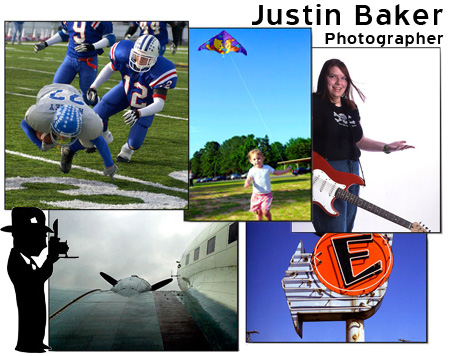
|
|
|
|
Delivery McGee posted:I really need to update it, but this was my term paper-equivalent for my photo business class Did your teacher grade on the amount of drop shadow?
|
|
|
|
Provocative!
|
|
|
|
The proportions on that clipart guy are really creeping me out.
|
|
|
|
Wario In Real Life posted:The proportions on that clipart guy are really creeping me out. I dislike you so much, I spent 10bux to report your rear end.
|
|
|
|
Edit: NVM, not going with Cargo.
ZippySLC fucked around with this message at 23:48 on Nov 10, 2013 |
|
|
|
http://tomogden.co.uk/ Constructive criticism greatly appreciated!
|
|
|
|

|
| # ? Apr 26, 2024 05:08 |
|
Waarg posted:http://tomogden.co.uk/ Constructive criticism greatly appreciated! You have some great landscapes, but they are drowned in a sea of very uninspired music and whatever photos. Focus your port around those landscapes.
|
|
|















 Bad Angus! Bad!


