


|
Fonts are cool. Most of the time they're transparent, vanishing into the background, but a good font can make you pay attention, though not always in a good way. A great font can elevate a design, or be a design all on its own. I get excited when I see something novel or beautiful in type; its an art form with a lot to appreciate all on its own, but one that tends to be very practical too. So here are a few fonts. Some of them are notorious, some are my favourites, and some are just neat ones I've picked up lately. You should post yours too, I want more cool fonts in my life.  I have to start with this one - Helvetica. You've seen it before, it's one of the most widely used fonts in the world and is prized for its clarity, legibility, and mixture of businesslike straight-forwardness and carefully crafted forms. It appears in everything from signage in public places to magazine ads to fine art galleries - it even adorned the outside of the space shuttle. It comes in a million different variations that are wider, narrower, thicker, thinner, you name it. Not only that, but the ubiquitous Arial typeface is a derivative of Helvetica meant for better legibility on screens. Helvetica itself is also a descendant of a font which still sees some use today, Akzidenz Grotesk, which was created late in the late 19th century.  I'm posting this here because if I don't post it, it's going to be the second post. It's still going to be the second post, and that won't be the last time either. That's okay. Comic Sans was made to be used as lettering in comic panels, where it's a serviceable if not excellent, and has mostly gained notoriety by being used in places where its somewhat crude & lighthearted appearance is inappropriate. My personal bugbear of a font, rather than Comic Sans, is Beyond the Mountains, which has seen substantial overuse in small shops and grocers in the last decade, and is becoming quite tiresome.  There are a ton of fonts I could pick as my favourite, but Microgramma is definitely near the top. It's mostly known for it heavy and wide variants, and has seen tons of use in technical and industrial illustration and design. I'm a sucker for type like this; a more modern font I've been enjoying recently which activates the same parts of my brain is Druk.  This one is Brushot, a dry brush style font. I'm normally not crazy about this kind of thing, but I needed one for a project at work recently and I really like this one. It's got style and energy; if you want to pick it up for personal use you can get it here, which also links to the author's site where you can get a fancier version licensed for commercial use. Speaking of where to get fonts, I haven't linked a lot of the above fonts simply because they're not free, it'd be  to do so, regardless of the ethics of depriving ITC of continued rent on something that is a century old. What I do recommend is sites like https://www.dafont.com/ which have a shitload of cool fonts that are free for personal use, and a lot that are free for commercial use too. Most of the ones that aren't free for commercial use are pretty cheap to license, and support small font designers, which is cool. to do so, regardless of the ethics of depriving ITC of continued rent on something that is a century old. What I do recommend is sites like https://www.dafont.com/ which have a shitload of cool fonts that are free for personal use, and a lot that are free for commercial use too. Most of the ones that aren't free for commercial use are pretty cheap to license, and support small font designers, which is cool.If you're looking to identify a font you found somewhere, good news! There are tools for that; personally, I use these: https://www.fontsquirrel.com/matcherator https://www.myfonts.com/pages/whatthefont http://www.identifont.com/ And if you're looking to find out things like what kinds of fonts were popular in the 80s, there's a site with a ton of cool designs archived here: https://fontsinuse.com/ Finally, if you want to learn more, there are a bunch of resources on the internet that can teach you. Fontmaking is a really technical art with a lot of terms that are used precisely; as a subset of graphic designers, a lot of font creators are anal retentive, but even more than usual. For example, technically most of what I've been referring to above are typefaces, not fonts - a typeface refers to an entire family of fonts. So Arial would be a typeface, and it includes Arial Bold, Arial Narrow, Arial Thin, etc., all of which are fonts. Personally, I don't give a poo poo; especially since computers have made access to type common, everyone just says font. If you want a glossary of type concepts and terms, the google crash course on type is a good place to start. It's surprisingly comprehensive, and includes a lot of illustrations. aniviron has a new favorite as of 08:07 on Dec 5, 2022 |
 #
?
Dec 3, 2022 06:45
#
?
Dec 3, 2022 06:45
|
|


|

|
| # ? Apr 28, 2024 10:51 |
|
|
Akzidenz Grotesk looks great. How does something that old look completely contemporary? My favourite font- mostly for sentimental reasons- is trebuchet. My first guess at how to pronounce it ended up as my user name on the forums... But yeah, Over The Mountains is a plague.
|
|
#
?
Dec 3, 2022 14:32
|
|

|
 Does this font have a proper name? That's just what the fontpack I got was called.
|
|
#
?
Dec 3, 2022 15:22
|
|
|
aniviron posted:
I'm always nostalgic for one of Helvetica's other descendants - Rail Alphabet: 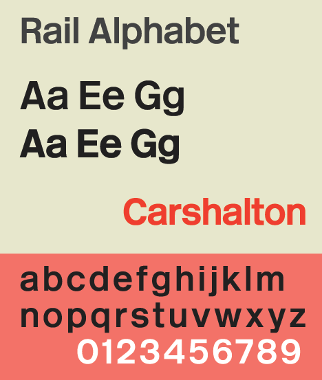 I say 'nostalgic', but it's very much still in use in its original purpose as the 'do anything, go anywhere' font for use on the British railway network, for which it was specifically designed in the 1960s. But it spread from the (then-nationalised) rail system to other nationalised/public service applications - the NHS hospitals and surgeries, a lot of schools, bus systems, cross-Channel ferries, airports, the military and more all ended up adopting it, and it often cropped up haphazardly in other government/state contexts where it wasn't an official standard but it had clearly been easier to get the signage done in Rail Alphabet than something else. Liberalisation of design and procurement, devolution of service provision and privatisation of many of the businesses mean that Rail Alphabet lost its dominance in the 1990s but I'm old enough to remember when it was everywhere and was a literal sign that 'you are now interacting with some arm of the British public sector'. Rail Alphabet also included a complete suite of pictograms which have mostly survived even when the font has been superseded, and even found their way into contexts (and even other countries) where the font was never used. Rail Alphabet was part of the Design Research Unit's top-to-bottom overhaul of the British Railways corporate identity in the mid-1960s, which resulted in the BR Corporate Identity Manual - imo one of the great works of graphic design and corporate identity. It's been reproduced online and has recently been reprinted in full. It's currently being replaced on the railways by Rail Alphabet 2, which is a slightly less 'weighty' and oppressive version that I don't like as much for reasons I can't really pin down:  Other British transport fonts include the obviously-named Transport (used on road signage): Johnston, developed in 1913 as the standard font for the London Underground:  and the classic Gill Sans which wasn't designed for transport use but was adopted by a railway company shortly after it was released and was the standard font of the nationalised network before Rail Alphabet. It has also been used as the cover type for Penguin Books, the Ordnance Survey mapping agency, London Transport (when not using Johnston) and until very recently was the standard font used by the BBC: 
|
|
#
?
Dec 3, 2022 17:32
|
|

|
BalloonFish posted:British public sector fonts I love this, this is my favourite kind of font knowledge. And those pictograms! I adore them, look at this cute thing. 
|
|
#
?
Dec 3, 2022 18:31
|
|

|
I have a soft spot for Comic Sans because my mother has really, really terrible handwriting, so when I was little she would print out notes (stuff like "Don't forget to wear your Girl Scouts uniform to school tomorrow") in Comic Sans. Another font I am interested in is the Doves Type. Here is an interesting podcast about the "the most beautiful typeface in the world." It's the first half of the podcast, only about 20 minutes. I really suggest listening to it, Greg Ross manages to cram a ton of interesting information into a short amount of time and includes a lot of quotes and details from print sources that aren't available online.  summary for those who don't want to listen: Bookbinder Thomas James Cobden-Sanderson and engraver Emery Walker founded a press called Doves Press around 1900 and collaborated on a typeface, which they used to make many beautiful handset, handprinted, and handbound books. Their partnership dissolved acrimoniously in 1908 and came to an agreement that Cobden-Sanderson would retain exclusive use of the type until he died because he wanted to reserve it for projects at his press (which he did for 17 years), at which point Walker would get ownership and could use the type for other uses, like newspapers and other commercial projects. Cobden-Sanderson did not want this to happen, so he managed to get hold of all the existing type and all the matricies and punches to create more and then spent months taking batches of the type and dumping it into the river Thames over 170 trips, destroying it. This led to a lot of lawsuits between him and Walker as well as a number of failed attempts to recut the type. In 2010, an art student named Robert Green started creating a digital recreation of the Doves Type by studying Doves books. He released a digital version in 2013, but was unsatisfied by it. He then studied Cobden-Sanderson's diaries to determine exactly where the type was dumped and eventually managed to find 151 pieces of type in the Thames 100 years after they were dumped. Green used these to update his digital font. He kept half the type pieces he found and donated the rest to the Emery Walker Trust, which runs Walker's house as a museum. Cobden-Sanderson is, presumably, spinning in his grave, because now the Doves Font is available for purchase here. There's a lot of pictures and articles about the type and the recreation there, too.
|
|
#
?
Dec 3, 2022 20:11
|
|
|
Ahh, the Yakuza font  Ahh, the FFXIII font Ahh, the SA2 font
|
|
#
?
Dec 3, 2022 21:38
|
|

|
Really cool thread, though I know nothing about design I've always had a bit of an interest in fonts. Great stories, I love the British railway stuff (also love a tree bucket origin story). Anyway, I'm really partial to Monaco. I'm a sucker for Susan Kare's work in general. I guess monospaced fonts are designed for readability rather than beauty, but this has a kind of unique comfy feeling for me. Something to do with the curve on lowercase a, d, q, g. Maybe someone with design knowledge can explain it. This shipped with old Mac stuff but I still use it as my text editing font all the time on other operating systems. 
|
|
#
?
Dec 4, 2022 11:59
|
|

|
BalloonFish posted:and the classic Gill Sans which wasn't designed for transport use but was adopted by a railway company shortly after it was released and was the standard font of the nationalised network before Rail Alphabet. It has also been used as the cover type for Penguin Books, the Ordnance Survey mapping agency, London Transport (when not using Johnston) and until very recently was the standard font used by the BBC: a morally inept nonce In the late 90s typefaces really started taking off thanks to Macromedia Fontographer and things like Adobe Illustrator and those early to the scene managed to reap popularity - though not really monetary compensation.  Fortunately, Dafont allows sorting by upload date so you can jump to the last page and witness transparent N64 and peak Designer�s Republic perfection. Laserjet 4P has a new favorite as of 01:12 on Dec 5, 2022 |
|
#
?
Dec 5, 2022 01:05
|
|
|
Rappaport posted:
I looked this up because I was curious, and if it's based on a real font, I can't find it. https://fontsinuse.com/tags/299/1970s is a neat site where I failed to find this thing, but it does still have a fuckload of cool fonts and is very useful if you want to design something that harkens back to a specific era though so I'm linking it anyway. Also here are a bunch of other sites that can be used to identify fonts, just, you know, as a general resource. I should add these to the OP. https://www.fontsquirrel.com/matcherator https://www.myfonts.com/pages/whatthefont http://www.identifont.com/ BalloonFish posted:British rail facts I knew about some of these, but it's cool to see the lineage unfolded like that! It's also fun to see stuff that I recognize immediately but never knew the name of, like Johnston. Funny that the British infrastructure fonts are so recognizable to me, even though I've never been to the UK. I also highly recommend the corporate identity design document that was linked in that post, it's an interesting read. In a similar vein, I love the 1976 NASA graphics standards manual: https://www.nasa.gov/sites/default/files/atoms/files/nasa_graphics_manual_nhb_1430-2_jan_1976.pdf. Gives great insight into the design process, and has some cool images too. Incidentally, their font choices are all classics as well: Helvetica, Garamond, Times New Roman, and Futura. You know what? I'm gonna post Futura too. I loving love Futura It looks like this, you've probably seen it too:  It's iconic as one of the trendy typefaces of the 50s and 60s, and was used all over the place in advertising, technical manuals, and US government buildings, among other places. While it does have some associations with those decades, it's a timeless and elegant font that has a lot of variations and deserves a place in every designer's font library. A lot of designers like to use it in all caps to really emphasize its sleek geometric properties.
|
|
#
?
Dec 5, 2022 08:02
|
|
|
aniviron posted:In a similar vein, I love the 1976 NASA graphics standards manual: https://www.nasa.gov/sites/default/files/atoms/files/nasa_graphics_manual_nhb_1430-2_jan_1976.pdf. Gives great insight into the design process, and has some cool images too. Incidentally, their font choices are all classics as well: Helvetica, Garamond, Times New Roman, and Futura. Ohhhh, what a find! I'm in love with this thing already. e: how to lay out book covers! And shirts! And signs and buses and spacecraft! Aw heck yes. Tree Bucket has a new favorite as of 08:52 on Dec 5, 2022 |
|
#
?
Dec 5, 2022 08:41
|
|
|

|
|
#
?
Dec 5, 2022 10:50
|
|

|
Comic Serif is the most impertinent font I've ever seen
|
|
#
?
Dec 5, 2022 10:52
|
|
|
Tree Bucket posted:Ohhhh, what a find! I'm in love with this thing already. Yeah, isn't it great? Lovely that it has a bunch of copies of the NASA red swatch too, so you can cut them out and take them with you for reference! Holy poo poo lmao
|
|
#
?
Dec 5, 2022 12:08
|
|
|
https://www.huffingtonpost.co.uk/entry/comic-papyrus_n_6315258 Comic Papyrus
|
|
#
?
Dec 5, 2022 16:10
|
|


|
aniviron posted:Comic Sans...has mostly gained notoriety by being used in places where its somewhat crude & lighthearted appearance is inappropriate. comic sans is the People's font
|
|
#
?
Dec 5, 2022 16:28
|
|

|
I enjoy Aksidenz-Grotesk, which despite the name is quite a pleasing font. https://en.wikipedia.org/wiki/Akzidenz-Grotesk I think it's also one of those fonts you see on the cover of academic texbooks or those criterion collection type things.
|
|
#
?
Dec 5, 2022 18:12
|
|
|
Glad people are liking the post about transport fonts of the UK. aniviron posted:I knew about some of these, but it's cool to see the lineage unfolded like that! It's also fun to see stuff that I recognize immediately but never knew the name of, like Johnston. Funny that the British infrastructure fonts are so recognizable to me, even though I've never been to the UK. I also highly recommend the corporate identity design document that was linked in that post, it's an interesting read. It is interesting how fonts/typefaces can become so familiar and so 'of a place', even if you've never been there. That NASA-style Helvetica really summons up '1990s America' to me, simply because that was the decade I devoured books about the Space Shuttle, and we went on a family holiday to the E. Coast of the US involving both a flight with American Airlines, using the NYC subway, a trip on Amtrak and a visit to Kennedy Space Centre so there was lots of Helvetica (or Helvetica-like) wording on unpainted stainless steel to absorb. Thanks for the link to the NASA Graphics Standards manual - very like the BR one in scope. I do like a good corporate identity document. Dunno why, because I personally have zero graphical/artistic ability but something about how everything is made 'the same but different' pleases me very much. Here's another UK transport font:  Most of the major UK airports started in their modern jet-age form using Rail Alphabet because they were nationalised. When the British Airport Authority was privatised it was at liberty to come up with its own font and in the early 1990s this serif font was created, which seems to go under the name of BAA Sign Bembo. I believe that the pictograms pre-existed the font, and were developed in the 1960s by Jock Kinneir and Margaret Calvert (who had also designed Transport, Motorway and Rail Alphabet and all the associated pictograms and signage) for use alongside Rail Alphabet in airports. Seeing this font always puts in me in mind of a strange sense of tired excitement because we only ever went to an airport for a rare family trip which involved getting up at some ridiculously early hour. Bembo has now been replaced by a much more generic sans serif font. Speaking of fonts being 'of a place', naturally the Germans came up with an entire national standard font. No, not Fraktur...the brilliantly named DIN 1451:  This was, and is, a specially-developed typeface for all official purposes - road signs, car number plates, government documents, technical drawings, machinery instructions and warning notices, public monuments, building and office signage and so on. Its design emphasises legibility (both at distances and on poor-contrast surfaces), versatility (it works at all sizes and can be printed both by and on various materials) and ease of construction in the days of metal type. I believe it also had its origins on the railways before being developed into a national standard.
|
|
#
?
Dec 5, 2022 23:15
|
|
|
As much as I love how it's become easy to pick an appealing font from an archive of thousands, I have to say that I do miss what the British transit and DIN 1451 typefaces represent: the commission of a custom font specifically for the purpose of meeting the needs of an organization. Most of the time it's impossible to justify the cost, but it's a wonderful way to establish a distinct personality for a place or company or idea, and makes sure that the type suits the role it will fill. It's part of the reason I can't really bring myself to dislike the new discord font which was rolled out a few days ago; for those of you not on the platform, it looks like this:  Does it have its issues? Sure; I think it's a little harder on the eyes with extended reading than the one it replaces, even if I like its somewhat more geometric approach to making shapes. But really, I just appreciate the fact that they were willing to commission a custom font for their UI. It remains to be seen if this design will stick around, or if the griping about the UI change is just the usual grumbling that happens every time any organization changes their interface. Oh, and it's got support for some weird unicode characters! I don't know why it supports strange oddballs like one of my favourites, the multiocular O, but the designers apparently had the mandate to include these, so, hell yeah.
|
|
#
?
Dec 6, 2022 00:10
|
|
|
Well and the USA does its own thing, which is inconsistent itself, due to bureaucracy more or less. Highway Gothic, which was the original standard:  Then there�s Clearview, which was commissioned to be an improvement on the above (in the early 2000�s iirc) Of course regional transportation varies. NYC has used a handful over the years. SEPTA in Philadelphia is supposed to change to �Conduit�, I guess  Curious enough, MARTA in Atlanta uses Times New Roman 
|
|
#
?
Dec 6, 2022 02:39
|
|
|
aniviron posted:Oh, and it's got support for some weird unicode characters! I don't know why it supports strange oddballs like one of my favourites, the multiocular O, but the designers apparently had the mandate to include these, so, hell yeah. I am absolutely not surprised that Discord has prioritised meme characters. Which has tripped them up already, actually: https://twitter.com/geo_vitya/status/1598517035902078977
|
|
#
?
Dec 6, 2022 11:26
|
|

|
ebrima
|
|
#
?
Dec 7, 2022 05:03
|
|

|
Serif, don't like it...
|
|
#
?
Dec 7, 2022 07:03
|
|

|
Vulfpeck may be the only band in the world to not only have their own bespoke fonts, but have promotional videos just for them: https://www.youtube.com/watch?v=axrf_RPBJ6g https://www.youtube.com/watch?v=HJEn7HcpfXE
|
|
#
?
Dec 10, 2022 19:51
|
|


|
They also have their own compressor plugin. While having your own plugins is more common having your own typeface really puts you up there.
|
|
#
?
Dec 11, 2022 02:58
|
|
|
I have to admit, I write every first draft in Comic Sans. I find it really easy to read, and it helps me pick out errors. My favorite font might be Frutiger, but it's absent in most software I have to work with at the office, and so I tend to use Verdana or other sans serif fonts. I genuinely like Verdana more than Helvetica. Georgia, Verdana's counterpart, might be my fave serif font. I just really like fonts, even if I have no formal training with them. They're just fun! If you love fonts and "just think they're neat," then Linus Boman on YouTube is a must-subscribe. He's delightful and extremely knowledgeable. Restricting myself to some fun hits: Yakuza's "Terrified" Scotch, Redesigned: https://www.youtube.com/watch?v=CIwYtqNy2ik Design Crit: Business cards from American Psycho: https://www.youtube.com/watch?v=QKc54z5SsEs Hyperlegible: an approach to accessible type design: https://www.youtube.com/watch?v=wjE5eHLICzc <-- I've actually used Atkinson Hyperlegible for months, as I have trouble reading certain fonts. Highly recommend it or OpenDyslexic for anyone with low vision, dyslexia, or focus issues. How this font became the face of Chinese food in America: https://www.youtube.com/watch?v=YP9gEeVQZ2U Treguna Mekoides has a new favorite as of 10:50 on Dec 11, 2022 |
|
#
?
Dec 11, 2022 09:38
|
|
|
Angepain posted:I am absolutely not surprised that Discord has prioritised meme characters. Which has tripped them up already, actually: Fuckin lmao https://twitter.com/geo_vitya/status/1598751947762569216 What is it with tech bros and forgetting other cultures exist? Especially Japanese; you know these fuckers watch anime.
|
|
#
?
Dec 11, 2022 15:57
|
|


|
If you like funky fonts, I recommend checking out https://velvetyne.fr/! They do stuff that seems pretty out there on first glance, but is actually pretty solid when you want something with some oomph.
|
|
#
?
Dec 11, 2022 18:29
|
|

|
Doll House Ghost posted:If you like funky fonts, I recommend checking out https://velvetyne.fr/! They do stuff that seems pretty out there on first glance, but is actually pretty solid when you want something with some oomph.  
|
|
#
?
Dec 11, 2022 21:41
|
|
|
Doll House Ghost posted:If you like funky fonts, I recommend checking out https://velvetyne.fr/! They do stuff that seems pretty out there on first glance, but is actually pretty solid when you want something with some oomph. God drat, these are awesome, and the website is a ton of fun to play with.  Love the O from Lithops. Would be hard to work into a design as text, but as artwork? 
|
|
#
?
Dec 12, 2022 06:32
|
|
|
The first font I ever fell in love with was Tecton (Techton?) And ever since those early Mac days I've never found it or a relative again. Though honestly my memory is probably blowing it out of proportion
|
|
#
?
Dec 12, 2022 09:57
|
|

|
Evilreaver posted:The first font I ever fell in love with was Tecton (Techton?) And ever since those early Mac days I've never found it or a relative again. 
|
|
#
?
Dec 12, 2022 15:55
|
|


|
hell yea that's my boy probably one of those fonts you have to pay to get
|
|
#
?
Dec 13, 2022 00:10
|
|
|
I like Goudy Old Style. I use it for my resumes. It's classy ")  (the 0 and 1 look weird though)
|
|
#
?
Dec 13, 2022 04:20
|
|


|
I'm fond of Lato. I have to do a lot of Google slides for my job, and it's rated as an easy-to-read font
|
|
#
?
Dec 13, 2022 08:33
|
|


|
Copenhagen Municipality commissioned a design language including icons, logios, and fonts a couple years ago https://design.kk.dk/designguide/skrifttype-kbh not a huge fan of the numeral 2, but generally it's pretty good.
|
|
#
?
Dec 13, 2022 15:03
|
|


|
Iosevka is sweet. I just swapped over to the extended one in my home and Work VSCode and Notepad++! Just using Expanded for my editors and Term Expanded for my terminal.
|
|
#
?
Dec 13, 2022 18:12
|
|


|
There's a font thread :o Paint me as someone who is really into fonts but has no design sense. Carthag Tuek posted:Copenhagen Municipality commissioned a design language including icons, logios, and fonts a couple years ago Big fan of the g and a. Echophonic posted:Iosevka is sweet. I just swapped over to the extended one in my home and Work VSCode and Notepad++! Just using Expanded for my editors and Term Expanded for my terminal. I really like Iosevka too. If it wasn't for JetBrains Mono and MonoLisa It'd be my go to.
|
|
#
?
Dec 13, 2022 20:16
|
|

|
ajkalan posted:I like Goudy Old Style. I use it for my resumes. It's classy Awww, don't be so hard on the 0 & 1! I agree that Goudy is very classy, it and Garamond are the go-to standbys when you need to class up a document - I prefer Garamond when there's a lot of text, but Goudy to make headlines. Both of them have what are called old-style figures or numerals; there's a short summation here, if you're interested. If that's tl;dr then I will shamelessly steal an image from their article that does a wonderful job representing what makes weird numbers like this so appealing:  While at first pass having a few of the digits vary in size like Goudy does can seem weird, look at how graceful the figures are which vary with the type! I don't have a solid source to cite on this, but my understanding has been that 0, 1, and 2 are usually small in old-style figures because they're the most likely digits to start a numeral as quantities of 10-20 are very common, as are dates like 1997, and in documents 009, and it looks pleasant to start with a smaller character. I know that this style of numeral looks really weird to most of the generations alive right now, as computers haven't really supported this style of character until recently, so nobody is used to seeing it; but that can be a real advantage in design, and can also really help make something look distinctive! Oh, and Garamond - I'm sure you've seen it, but I might as well post it while we're talking about it.  Bogus Adventure posted:I'm fond of Lato. I have to do a lot of Google slides for my job, and it's rated as an easy-to-read font It is easy to read, I'd agree! And specifically, I think what does this is what is called the x height. I'm going to steal someone else's image to illustrate this again:  It's not a fancy situation where x stands for something, x height means the height of the lowercase x in a typeface. This generally sets the baseline for the straight lines that run through almost every typeface and delineates both the base of where letters that don't have poo poo below them goes (i.e. not q, g, y, j, etc.) as well as how tall most of the small letters will be, again excluding stuff like h & l. Fonts with a high x height relative to the height of a capital letter tend to be easy to read at small sizes and when you have a lot of text in one place, because it means you get more effective letter surface area on the page or screen. Carthag Tuek posted:Copenhagen Municipality commissioned a design language including icons, logios, and fonts a couple years ago Thanks for sharing this, it's lovely! I agree with 101, the g & a are primo stuff. I also love a typeface that looks as good in the lightest font weights as the heaviest, and goes from thin to black, that makes it really versatile. Also very kind of Copenhagen to provide a download link for anyone to use, and in opentype format as well.
|
|
#
?
Dec 14, 2022 00:21
|
|
|

|
| # ? Apr 28, 2024 10:51 |
|
|
aniviron posted:Thanks for sharing this, it's lovely! I agree with 101, the g & a are primo stuff. I also love a typeface that looks as good in the lightest font weights as the heaviest, and goes from thin to black, that makes it really versatile. Also very kind of Copenhagen to provide a download link for anyone to use, and in opentype format as well. Well on the one hand, they say you're only allowed to use it as an employee of the muni while communicating on behalf of the muni, but on the other they didn't keep it on the internal network so... Yeah the g is good. I think there was an earlier version with a different g with a disconnected descender, or I'm thinking of some other danish font. e: I'm thinking of the The National Archives started using a bit ago. Not sure it's available, but can be seen below. I don't like it much, it's a bit confused, switching too much between round and angular imo https://www.rigsarkivet.dk e2: I use EB Garamond a lot in my personal stuff Carthag Tuek has a new favorite as of 00:54 on Dec 14, 2022 |
|
#
?
Dec 14, 2022 00:40
|
|