


|
Carthag Tuek posted:Well on the one hand, they say you're only allowed to use it as an employee of the muni while communicating on behalf of the muni, but on the other they didn't keep it on the internal network so... I probably won't ever use Skrifttypen KBH for anything, I just like sleeping atop a huge pile of good fonts like a dragon or scrooge mcduck. It's a real problem, sometimes when I am working professionally I find something that's perfect and then have no idea if I actually have a license to use the font or where I got it. I think I agree with your assessment on The National Archive's font. It's a really cool idea, and the execution is lovely in some places. I do think that the pairing of curves and angles is a great idea, it's a nice contrast and I suspect it looks great in situ where old-style class with ornamentation is paired with minimal postmodern glass and slim steel. But it feels like they lacked the confidence to really implement the motif and show off the angular forms more prominently. Another great share though, so thanks!
|
 #
?
Dec 14, 2022 01:48
#
?
Dec 14, 2022 01:48
|
|


|

|
| # ? Apr 28, 2024 11:21 |
|
|
aniviron posted:It is easy to read, I'd agree! And specifically, I think what does this is what is called the x height. I'm going to steal someone else's image to illustrate this again: That's really interesting, I never knew that about the "x height." Thank you for sharing. ^_^
|
|
#
?
Dec 14, 2022 10:03
|
|


|
Yeah knowing x-height is very practical for laying out stuff Here's another width: em means the width of the letter M. you can get weird but i only think about it when deciding whether to use an n- or an m-dash call the --- and tell them dash -- - and -- and --- - --- - --- - --- -- -
|
|
#
?
Dec 17, 2022 04:14
|
|


|
aniviron posted:Speaking of where to get fonts, I haven't linked a lot of the above fonts simply because they're not free, it'd be Dunno if this has been mentioned before, but in the UK fonts have separate copyright laws that basically allows use / derivative use after 25 years: https://www.legislation.gov.uk/ukpga/1988/48/part/I/chapter/III/crossheading/typefaces IANAL though!
|
|
#
?
Dec 17, 2022 21:53
|
|


 to do so, regardless of the ethics of depriving ITC of continued rent on something that is a century old. What I do recommend is sites like
|
Fonts-wise, I absolutely adore Atkinson Hyperlegible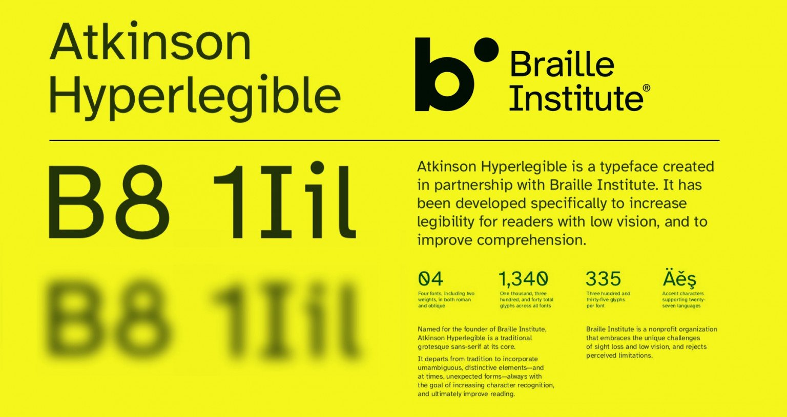 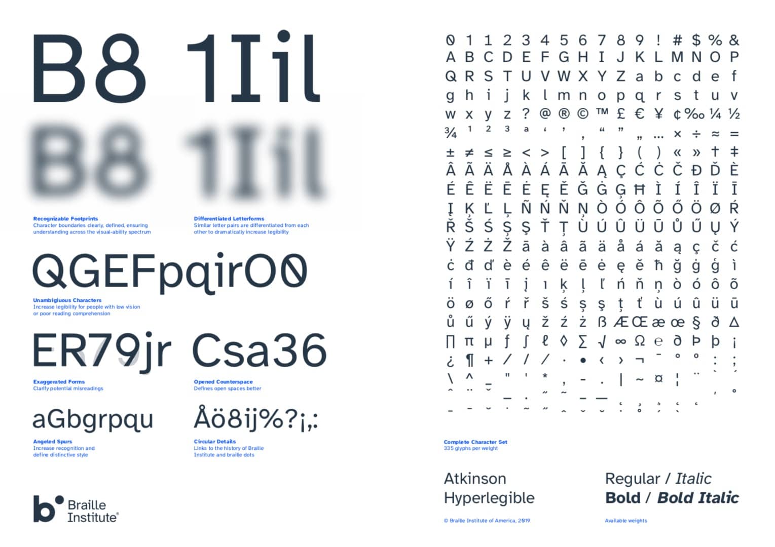 It allows me to set my font size super small and really cram the data into my screen, and my only complaint is there isnt a monospace version  e: forgot to link it — https://brailleinstitute.org/freefont
|
|
#
?
Dec 17, 2022 21:57
|
|
|
thats a great goal to have, and its also not ugly
|
|
#
?
Dec 18, 2022 00:46
|
|
|
aniviron posted:I think I agree with your assessment on The National Archive's font. It's a really cool idea, and the execution is lovely in some places. I do think that the pairing of curves and angles is a great idea, it's a nice contrast and I suspect it looks great in situ where old-style class with ornamentation is paired with minimal postmodern glass and slim steel. But it feels like they lacked the confidence to really implement the motif and show off the angular forms more prominently. Another great share though, so thanks! i didnt actually think of that juxtaposition until you mentioned it. shameful. but that makes a lot of sense for an institution that handles new and old, and i too think it probably looks on site. tbh my immediate problem is how the lowercse t is angular and the lowercase f is rounded. idk. you can get around that, but the whole is too unfocused
|
|
#
?
Dec 18, 2022 00:49
|
|
|
I have a fair amount of misplaced nostalgia for Fixedsys: This was the default font (and initially, the only font) for Notepad in Windows 95. It was a bitmap font, which allowed it to be very carefully designed to work at 12 points, while also being unable to be scaled to any other font size. Except maybe 24 but that wasn't an option at the time. Nowadays precisely 16 pixels is not everyone's cup of tea, though the blown-up pixelated version is now possible thanks to some guy who made his own Fixedsys Excelsior version (current version seems to be here). This also expanded the font, including... hylian? sure. nerds. You can even use it at other sizes outside multiples of 12 because it's just a vector image of squares now, though it'll probably look screwy.
|
|
#
?
Dec 18, 2022 02:29
|
|

|
I'm just old enough to remember Fixedsys, cool that someone carries the torch.alexandriao posted:Dunno if this has been mentioned before, but in the UK fonts have separate copyright laws that basically allows use / derivative use after 25 years: https://www.legislation.gov.uk/ukpga/1988/48/part/I/chapter/III/crossheading/typefaces Hey, if it's legal for you to post poo poo here don't let me stop you, I'm always down. I just don't want the thread to get in hot water, and ideally it's nice when people support artisanal font makers too.
|
|
#
?
Dec 18, 2022 04:34
|
|
|
alexandriao posted:Fonts-wise, I absolutely adore Atkinson Hyperlegible I too love Atkinson Hyperlegible, as I said earlier in the thread, I've been daily-driving it on my home PC, browsers, etc. Linus Boman and his team who made it have truly made an accessible font. The font has literally reduced headaches and eyestrain for me, and helps me read numbers more easily whereas no other fonts really can.
|
|
#
?
Dec 19, 2022 08:54
|
|
|
i know very little about fonts but when i think "my favorite font" there is one* that stands out and it's the ubiquitous "computer" font of 70s computing  trying to find what the font was called i ran into a whole bunch of near-identical fonts with various names and if anyone better at fonts can tell me the history behind these i'd love to hear it! https://fontsinuse.com/typefaces/40392/westminster https://fontsinuse.com/typefaces/7324/moore-computer https://fontsinuse.com/typefaces/4334/data-70 https://fontsinuse.com/typefaces/12054/orbit-b what i could gather on my own is that all of these seem to be imitating the style of old magnetic ink character recognition (MICR) because it was seen as cool and futuristic and heck, i agree. it also hurts to read which is a bonus!
|
|
#
?
Dec 22, 2022 10:56
|
|


|
Oh man, yeah! I love that one, it's part of a lot of classic designs. I don't know the original name either, but it's not too surprising that it's part of a lineage. I've seen Westminster and Data70 before though, but never snagged them; maybe it's time. It also gives me a chance to post a related font that I think most people will recognize; it shows in a lot of 90s media for some reason, particularly The Matrix:  OCR is designed for optical character recognition by computer systems that are visually scanning media, a similar concept to the MCR types. Just like the MCR stuff, it winds up being very distinctive and cool on its own, though!
|
|
#
?
Dec 22, 2022 11:29
|
|
|
A very long time ago, when I was starting out as a computer janitor, a company I worked for used SecureCRT for terminal emulator software. The default fixed width font in it was called VT100. I don't know if it is a pixel for pixel reproduction of the actual font used on hardware terminals of the same name, but I do know that I grabbed the font off that work computer for my own personal use. It has followed me to every single daily driver computer I've used since, and PuTTY and Vim don't look right to my eyes at this point unless they're using it, green on black. I react to people who see my work setup and say "Big fan of The Matrix, huh?" the same way I would if they heard Let Me Stand Next To Your Fire and said something about "never having heard this Lenny Kravitz track before". It's just a chunky pixely fixed width font, but it's an old friend to me at this point. Example
|
|
#
?
Dec 24, 2022 15:48
|
|


|
You will take AMI-BIOS EGA 9x14 from my cold dead hands outside of that if you can't execute what you're trying to do with some combination of Rockwell, Futura, Adobe Garamond Pro, Century Schoolbook and Caslon Antique you need to git gud
|
|
#
?
Dec 26, 2022 03:46
|
|

|
I think it was here that I found it, but Sütterlin is IMHO a really distinct but pretty font style. It's like Norse runes & Tolkien's elvish had a weird little whimsical cursive baby
|
|
#
?
Dec 28, 2022 20:00
|
|

|
That reminds me, ligafaktur.de has a bunch of classic germanic typefaces and handwriting fonts (including Sütterlin, here called Hermersdorf), complete with opentype features for ligatures, symbols such as long s, and word initial/medial/final variants. Fonts are under Frakturſchriften. Click the font names to see specimens: http://www.ligafaktur.de/Startseite.html Also they're generally UNZ-compatible, which is a character set placed in the open Private Use Area of Unicode: https://www.bfds.de/bund-fuer-deutsche-schrift-und-sprache-e-v/normung-von-sonderzeichen-unicode/ Ensisheim is  http://www.ligafaktur.de/Fontbild-ensis.html
|
|
#
?
Dec 28, 2022 21:25
|
|
|
Carthag Tuek posted:That reminds me, ligafaktur.de has a bunch of classic germanic typefaces and handwriting fonts (including Sütterlin, here called Hermersdorf), complete with opentype features for ligatures, symbols such as long s, and word initial/medial/final variants. Fonts are under Frakturſchriften. Click the font names to see specimens: you had me at opentype ligatures
|
|
#
?
Dec 28, 2022 22:23
|
|
|
https://www.youtube.com/watch?v=3t1D3ebc6h0
|
|
#
?
Dec 30, 2022 17:08
|
|


|
Carthag Tuek posted:That reminds me, ligafaktur.de has a bunch of classic germanic typefaces and handwriting fonts (including Sütterlin, here called Hermersdorf), complete with opentype features for ligatures, symbols such as long s, and word initial/medial/final variants. Fonts are under Frakturſchriften. Click the font names to see specimens: omg, now my computer german can be as incomprehensible as my real german!!!!
|
|
#
?
Dec 30, 2022 22:31
|
|
|
I am so happy that this thread exists that I went and created these two images about a couple of my favorite typefaces I've recently started using.  I pretty much just limit myself to the fonts available on Adobe, as I know that will keep my company out of any legal trouble. And I know if someone else starts working on one of my projects, they will have the same access. Adobe might not have Helvetica, but at least my go-to's Futura, Garamond, and Caslon are available. My personal favorite font finder is https://www.whatfontis.com/. It's full of ads and terrible to use, but it's the only one where I consistently get the right results and good alternatives.
|
|
#
?
Jan 2, 2023 18:05
|
|


|
I was cleaning out my bookmarks and found this https://twitter.com/zckrf/status/1188842577472212992?s=20
|
|
#
?
Jan 9, 2023 20:55
|
|


|

|
|
#
?
Jan 9, 2023 21:19
|
|
|
I somewhat resent the accusation that Cooper Black is generic! It's a timeless standard for a reason:  Okay yeah it's been used a ton, but again, classic not overused! New Kansas is handsome though, I will give you that, and would be a nice alternative.
|
|
#
?
Jan 12, 2023 05:03
|
|
|
Just came across a free font made by the country of Moldova(?) It's really quite nice, and the website is fantastic https://onest.md/en
|
|
#
?
Jan 12, 2023 17:12
|
|

|
That is a very handsome font!
|
|
#
?
Jan 12, 2023 23:23
|
|
|
aniviron posted:I somewhat resent the accusation that Cooper Black is generic! It's a timeless standard for a reason: You're right. Generic is not the right word. I just think it's a bummer that you only ever seen the Black weight and it's nice to have a subtle update with all the weights that stays true to the original!
|
|
#
?
Jan 13, 2023 02:31
|
|
|
MokBa posted:You're right. Generic is not the right word. I just think it's a bummer that you only ever seen the Black weight and it's nice to have a subtle update with all the weights that stays true to the original! Yeah that's totally fair, when I think Cooper I think Black. New Kansas looks quite handsome in all its weights, which I do agree is valuable in a typeface, especially if it's part of a brand standard; it makes design so much less tedious.
|
|
#
?
Jan 13, 2023 03:21
|
|
|
Rappaport posted:
I remembered this when I saw something the other day - apparently it's a form of Davison Art Nouveau. There's a writeup on it here, if anyone is interested. https://fontsinuse.com/uses/43515/the-mystery-of-the-dune-font
|
|
#
?
Feb 12, 2023 08:36
|
|

|
aniviron posted:I remembered this when I saw something the other day - apparently it's a form of Davison Art Nouveau. There's a writeup on it here, if anyone is interested. https://fontsinuse.com/uses/43515/the-mystery-of-the-dune-font  Kull wahad! Kull wahad!Thank you for this post, this is great!
|
|
#
?
Feb 12, 2023 09:15
|
|
|
I'd been meaning to do a big cool effortpost on some stuff but life is hard. Instead, here's Stop, a font that is basically impossible to use but I love. You see it in sci-fi and other audacious uses like album covers sometimes though.
|
|
#
?
Feb 19, 2023 05:03
|
|
|
So I was looking for some kind of abstract fonts, basically something I could use as 'Lorem Ipsum' for poster design. Where I can use large amounts of texts just as filler for parts of an illustration and overlapping images but without the text actually meaning anything and distracting from the art. Two good solutions I've found so far are going on a website like https://www.npmjs.com/ and just copying and pasting large segments of code that look cool without understanding them. A cool font I came across on my search was this font of dummy numbers. https://www.ideo.com/blog/use-these-dummy-numbers-when-prototyping-with-data Basically a font that looks like numbers but aren't actual numbers when you don't want to make a mockup distracting by containing actual data. I think basically I'm looking for more stuff like that. Font's that are supposed to look like a foreign/unusual language but aren't actually anything when you look close, or lorem ipsum type text that isn't as clearly dummy text as using latin.
|
|
#
?
Feb 19, 2023 13:01
|
|
|
what an incredibly niche and high effort way to make someone feel like theyve had a stroke
|
|
#
?
Feb 19, 2023 15:59
|
|
|
Sexual Lorax posted:what an incredibly niche and high effort way to make someone feel like theyve had a stroke I wish I'd had it a couple jobs ago. Those users were so distractible they'd already be looking at wrong numbers and not hear my explanation of why the numbers are wrong and this demo is just for the layout and oh my god you fuckers don't make me say it again.
|
|
#
?
Feb 19, 2023 16:27
|
|
|
I wish I could say that I didn't understand this problem, but damned near everyone I demo anything to loses the forest for the trees. I have to start every pitch with, "This is a mockup, meant to visualize..." and repeat it a half-dozen times throughout a given presentation so that the audience understands that we're just looking at concepts which can be easily changed at this stage, and the specific details don't matter yet. As for a font that does what you ask, I'm afraid I don't have anything quite like that. I've seen some things which do glyph substitution into really abstract stuff, but I think people tend to stay away from making things familiar but illegible for the stroke-feeling reasons outlined above.
|
|
#
?
Feb 19, 2023 23:40
|
|
|
I hate when I find a unique font and then it costs an arm and a leg to actually use. I just discovered Noe today and it has these beautiful stroke ends, where at first glance it looks like a classic serif typeface but then it’s got these really sharp corners that you don’t see a lot. Haven’t been able to find any Adobe or free alternatives that are going for the same thing. https://www.schick-toikka.com/noe-display 
|
|
#
?
Feb 20, 2023 05:28
|
|
|
Sexual Lorax posted:what an incredibly niche and high effort way to make someone feel like theyve had a stroke Seriously looks like the symbols on the Predator's wrist bomb when he blows himself up
|
|
#
?
Feb 20, 2023 19:42
|
|
|
MokBa posted:I hate when I find a unique font and then it costs an arm and a leg to actually use. I just discovered Noe today and it has these beautiful stroke ends, where at first glance it looks like a classic serif typeface but then it’s got these really sharp corners that you don’t see a lot. Haven’t been able to find any Adobe or free alternatives that are going for the same thing. IvyPresto Bold is fairly close. Similar vibes, at least, if a bit more traditional. Blacker is another commercial font that looks super similar.
|
|
#
?
Feb 20, 2023 22:05
|
|
|
BOOTY-ADE posted:Seriously looks like the symbols on the Predator's wrist bomb when he blows himself up Funny, I thought the same thing. There's a font for that, of course: https://www.fontspace.com/predator-font-f5510
|
|
#
?
Feb 21, 2023 00:19
|
|
|
feedmyleg posted:IvyPresto Bold is fairly close. Similar vibes, at least, if a bit more traditional. Blacker is another commercial font that looks super similar. That IvyPresto is beautiful but it's not quite the same thing. I'm still gonna use it though so thank you!
|
|
#
?
Feb 21, 2023 02:12
|
|
|

|
| # ? Apr 28, 2024 11:21 |
|
|
some folks have been adding bunch of missing flowery initials to EB Garamond over the last week: https://github.com/georgd/EB-Garamond/pulls?q=is%3Apr+is%3Aclosed some of them look a bit auto-vectorized, might have a go at cleaning up the beziers
|
|
#
?
Feb 24, 2023 08:44
|
|