|
Laserjet 4P posted:The typography on Oneohtrix Point Never’s “Age Of” is just amazing: I've been seeing a fair bit of good 70s revival lately. The precision of computerized design tends to go really nicely with old-school design principles.
|
|
|
|

|
| # ? Apr 27, 2024 23:01 |
|
I love the UK Motorway font somethin’ fierce, and I’ve never been anywhere close to the UK. It’s got that special something.
|
|
|
|
|
madmatt112 posted:I love the UK Motorway font somethin’ fierce, and I’ve never been anywhere close to the UK. It’s got that special something. Hell yeah thats always been one of my favourites. Agreed it looks just like a Helvetica type font but its got that something special. https://en.wikipedia.org/wiki/Motorway_%28typeface%29 https://en.wikipedia.org/wiki/Transport_%28typeface%29
|
|
|
|
If you want a more versatile version of Motorway, I’d recommend DIN. It’s a font that, once you know it, you start seeing absolutely everywhere. It just looks good in pretty much any context.
|
|
|
|
Annabel Pee posted:Hell yeah thats always been one of my favourites. Agreed it looks just like a Helvetica type font but its got that something special. Hearty agree, I really like it. It's just really nice.
|
|
|
|
Annabel Pee posted:Hell yeah thats always been one of my favourites. Agreed it looks just like a Helvetica type font but its got that something special. MokBa posted:If you want a more versatile version of Motorway, I’d recommend DIN. It’s a font that, once you know it, you start seeing absolutely everywhere. It just looks good in pretty much any context. Hell yeah, those are all great. I'll add Agency FB to the list. Goddamn do I love how clean it is while still having an interesting style.
|
|
|
|
Zamboni Rodeo posted:Hell yeah, those are all great. I'll add Agency FB to the list. Goddamn do I love how clean it is while still having an interesting style. I really like how it looks but I find it quite hard to read.
|
|
|
|
Annabel Pee posted:Hell yeah thats always been one of my favourites. Agreed it looks just like a Helvetica type font but its got that something special. I love that the word "toll" is its own character in the character set for motorway, that's very fun.
|
|
|
|
One of the best things I convinced the owner to buy when I worked at a weekly newspaper was a copy of Adobe Font Folio 11. And when the paper went out of business, I walked away with the license to it with the owner's permission, along with my copy of CS 5.5 and Office 2010 that I still use today.
|
|
|
|
rndmnmbr posted:One of the best things I convinced the owner to buy when I worked at a weekly newspaper was a copy of Adobe Font Folio 11. And when the paper went out of business, I walked away with the license to it with the owner's permission, along with my copy of CS 5.5 and Office 2010 that I still use today. Did they go out of business because they spent too much money on fonts and font accessories?
|
|
|
|
Tree Bucket posted:Did they go out of business because they spent too much money on fonts and font accessories? Still counts as a win for fonts, and Random Number!
|
|
|
|
It's a pro move, I've picked up a few licenses this way when the business is done, and I get to support designers. I've had a thing for this guy's stuff lately, some of them are fun, and they're almost all well-featured opentype options.
|
|
|
|
Hi font goons! Any recommendations for a font that maximizes legibility of large blocks of text on a screen, for quickly scanning through the text and picking out key words and phrases? For context, I run a roleplaying game over Discord with a notes document that is now extremely dense. I do my best with navigation headings, highlights, disciplined bold/italic/underline use, etc., but I've recently realized that there are probably fonts made for exactly this sort of use case: glancing quickly over at my notes and plucking out a bit of information without breaking my stride while describing something, that sort of thing.
|
|
|
|
Atkinson Hyperlegible, maybe?
|
|
|
|
Not a useful answer to your question, but I thought about it for me and I'm starting to suspect that the answer would be Roboto for me regardless of the font design just because I'm so drat trained on it these days, being an Android and Google Services user.
MikeJF has a new favorite as of 10:01 on Apr 9, 2024 |
|
|
|
Maybe some font genius can help me: I have this idea for a sign to bring to protests, and want to fit the Palestinian flag into the word "all". The thought I'm exploring is fitting the red triangle of the flag into the negative space of the A. This crude drawing should hopefully show the basic idea: However, I think this approach looks kinda bad and might not parse as an A. I'm wondering if there are any fonts with an A design that could work for this concept, or if it's just a bad idea to begin with.
|
|
|
|
Woebin posted:Maybe some font genius can help me: I have this idea for a sign to bring to protests, and want to fit the Palestinian flag into the word "all". The thought I'm exploring is fitting the red triangle of the flag into the negative space of the A. This crude drawing should hopefully show the basic idea: Why not cut out a triangle (leaning left) in the A piece to make it more obviously an A? With the colors it'll read for sure.
|
|
|
|
Deep Glove Bruno posted:Why not cut out a triangle (leaning left) in the A piece to make it more obviously an A? With the colors it'll read for sure. 
|
|
|
|
i mean keep the triangle shape of the flag how you had it first, but leave a little cut out hole/background color in that area to give the A it's negative space. i wish image posting was easier on phone cause i could draw it, but basically the cut out could go with the shape of the A without moving or altering the flag's design
|
|
|
Woebin posted:Maybe some font genius can help me: I have this idea for a sign to bring to protests, and want to fit the Palestinian flag into the word "all". The thought I'm exploring is fitting the red triangle of the flag into the negative space of the A. This crude drawing should hopefully show the basic idea: I think if you add a little smoke coming out of the L’s, it’ll parse just fine
|
|
|
|
|
Deep Glove Bruno posted:i mean keep the triangle shape of the flag how you had it first, but leave a little cut out hole/background color in that area to give the A it's negative space. madmatt112 posted:I think if you add a little smoke coming out of the L’s, it’ll parse just fine I was kinda looking for a response along the lines of "oh yeah, Dipshit Sans has a capital A with asymmetrical negative space that could work" rather than feedback on my drawing skills.
|
|
|
|
more drawings
|
|
|
|
Woebin posted:I'm sure there's a very funny joke here that I'm not picking up on. I'm glad my crude sketch amuses you, I guess? the joke is 9/11 Right now it looks like a Greek lambda, but that gave me an idea - the black triangle would work way better with “y’all”.
|
|
|
|
Woebin posted:I was kinda looking for a response along the lines of "oh yeah, Dipshit Sans has a capital A with asymmetrical negative space that could work" rather than feedback on my drawing skills. Honestly, what you want is simple enough that I think you could just make the vector yourself. Like I just spent less than 10 minutes on this:  But you probably will get something with a little more personality if you start with a font. I just don't think you're gonna find the right A if you don't make it yourself.
|
|
|
|
MokBa posted:Honestly, what you want is simple enough that I think you could just make the vector yourself. Like I just spent less than 10 minutes on this:
|
|
|
|

|
|
|
|
I'd maybe try turning the red triangle in to A, something like this:
|
|
|
|
Doll House Ghost posted:I'd maybe try turning the red triangle in to A, something like this:
|
|
|
|
SNL did a sequel to the Papyrus skit: https://youtu.be/Q8PdffUfoF0?si=DTZ7KwUkM0KiNHm4
|
|
|
|
HelloIAmYourHeart posted:I have a soft spot for Comic Sans because my mother has really, really terrible handwriting, so when I was little she would print out notes (stuff like "Don't forget to wear your Girl Scouts uniform to school tomorrow") in Comic Sans. This lives up to the story, it's good as Garamond. The fist
|
|
|
|
I got a weird question for all you font perverts out there: I recognize that most font freaks are into it for graphic design but this is strictly textual so ice your boners. I'm formatting a list for print where the two writers of the list should be distinguishable. I imagine doing different colored ink wouldn't be as readable as just doing two fonts, alternating between them in chunks of the list that one or the other writer contributed. a) is it unconscionably ugly to use two different fonts? are there fonts that work well together stacked up like that (i.e. all else being equal in terms of size, color and format)? b) if it isn't ugly, or at least not always, what might you sit alongside Times New Roman? I feel like another serif font would work best, but maybe they wouldn't be distinguishable enough from each other. Is there a serif font that might look good alongside TNR but not look too much like it? Maybe I'm overthinking it and should just go italic vs. non-italic TNR. I dunno.
|
|
|
|
Italic and non-italic was my first thought. Super easy to distinguish, but would feel of a kind. My mind also goes to a font family which has a serif and a sans-serif variant, like Adelle Sans and Adelle.
|
|
|
|
You could do something with weights, too.
|
|
|
|
If it's acceptable to use a form that might imply a stronger emphasis on text from one of the two writers, then you could give one of them a higher weight, underlines, or render it in small caps. Italics would be a little more neutral than those, but it would still carry the implication that one is the default and the other is aberrant. Using different variants for both might solve that problem; I'd suggest making sure that neither of them is weight in that case, though, since weight carries a much greater emphasis. If you are using separate typefaces, it would be important to make them very easy to distinguish by choosing ones that have very different features.
|
|
|
|
Largely concur with the others; I think using italics, a heavier or lighter weight, hell even small caps, would be my first go-to. Aside from that, I would disagree with your gut instinct to use a second serif if your primary is Times. Distinguishing the typefaces will be important, and generally speaking unless this work is a presentation for some kind of design conference in every other setting 99% of your audience will not notice or care when the font changes unless it's very apparent. Generally speaking it's good practice to pair serifs & sans serifs anyway, and I think that's true here too. It's more important to match the personality than the form language.
|
|
|
|
Times New Roman is pretty ugly. Must it be TNR? Other more modern typefaces with both serif and sans variants are https://fonts.adobe.com/fonts/museo and https://fonts.adobe.com/fonts/museo-sans or https://www.myfonts.com/collections/ff-meta-font-fontfont and https://www.myfonts.com/collections/meta-serif-font-fontfont .
|
|
|
|
comic sans and comic serif
|
|
|
|
I'll chime in with a contrary opinion in that I think having entire sentences in italics is bad for readability (same with all caps, even if they're small). I'm coming at this as an accessibility specialist without a strong sense of aesthetics, though. As you yourself said, using different colors probably wouldn't be the best choice, especially if there's any chance of readers with visual impairments or color blindness. To me the idea of pairing a serif and sans-serif font sounds like a good approach, but I don't know my fonts well enough to suggest a particular pairing.
|
|
|
|
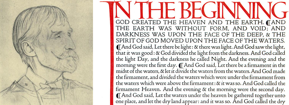
Thanks all for the suggestions. I'll look into serif and sans suggestions, Museo etc. for sure. I am finding italics does suggest one writer is the exception. To give you guys more information, because it's funny how serious about readability and how helpful you've all been when it's such a ridiculous, stupid project: - It's for custom publishing into book form I will distribute to a handful of family members - I've used Times New Roman thus far because it's closest my untrained eye could find to the typeface of the English edition of Quotations From Chairman Mao  - This is because I intend it to closely resemble the little red book in every way (I'm trying to track down Lin Piao to do some calligraphy for the frontispiece but he's been a hard man to find since his mysterious disappearance when he conspired to overthrow Mao) - the content is a giant, giant list of thousands of dumbass gibberish phrases, inside jokes, fake band names etc my cousin and I have been sending each other tranches of for 25 years, since we were early teens. He wants our contributions to be distinguishable in some way, and I want it to be as smooth-reading as possible. They are mostly not full sentences, but they aren't all really short phrases. Some will be long enough to wrap and indent into a second line and such. If TNR sucks, I'm open to suggestions of fonts better than it but that can still fit the feel/era of the little red book as you see in the scan. I'd like to balance accuracy to the red book (which is 90% down to the size and the execution of the cover by the bookbinder, really) and readability with the two types of writing alternating. Now don't you feel like saps for helping with such a stupid idea? Sorry.
|
|
|
|

|
| # ? Apr 27, 2024 23:01 |
|
If you just want a very classic serif, use Garamond instead. One of my general rules-of-thumb is to never ever use any of the 90s default Windows fonts. They were all designed for legibility on a low-res screen which is no longer an issue, and they carry a lot of baggage that makes them look cheap. Personally, I think if you want to separate the two voices, your best bet, as suggested above, is to pick a serif and sans serif that look good together. Unfortunately, that will make it look less like the Little Red Book, but it’s essentially the only way to do it where neither looks more important than the other.
|
|
|


