|
Beffer posted:I don�t follow it closely, but there has been quite a bit of debate about the judging approach to golden demons in the past few years. The artist on his instagram said he took the time to make sure the reflection looked correct even from angles you don't normally look at so it makes sense.
|
 #
?
Mar 27, 2024 23:33
#
?
Mar 27, 2024 23:33
|
|

|

|
| # ? Apr 28, 2024 23:20 |
|
|
Beffer posted:
Having seen it in person (albeit inside the case, so I couldn't see a 360� view) it looked "correct" from every angle I could view it at.
|
|
#
?
Mar 28, 2024 00:28
|
|


|
The winning work is amazing and deserved to win even if it looked correct from a golden angle. The creator making sure it looks right from other points of view just speaks to their dedication and work put into the piece. As the guys on cult of paint said a good piece of art will have more depth and detail than you will be able to see at first viewing.
|
|
#
?
Mar 28, 2024 00:35
|
|

|
I saw a thread of criticism where people were complaining that the vampire armour suit was a scan and print. "Why couldn't he just use another copy of the model and scratch out the head and arms? This is cheating. etc". People who apparently have never noticed that things are reversed in a reflection.
|
|
#
?
Mar 28, 2024 01:17
|
|
|
Lumpy posted:Having seen it in person (albeit inside the case, so I couldn't see a 360º view) it looked "correct" from every angle I could view it at. His Instagram has a video showing most of its angles. It REALLY pops on the black background photos he took. He has a photo of it upside down that looks like it could have been submitted that way too.
|
|
#
?
Mar 28, 2024 01:23
|
|

|
Ravus Ursus posted:His Instagram has a video showing most of its angles. Yeah, on black it goes from amazing to AMAAAAAAZZZZZINNNGGGGG
|
|
#
?
Mar 28, 2024 01:28
|
|
|
I lost an entire plastic Chaos fleet for BFG to a hot car interior one summer. Never again.
|
|
#
?
Mar 28, 2024 02:11
|
|
|
Ravus Ursus posted:His Instagram has a video showing most of its angles. @alexdoesminis on insta, if anyone is curious!
|
|
#
?
Mar 28, 2024 05:54
|
|

|
Vampire Pond is possibly the coolest model/ dio I�ve ever seen. Absolutely deserves the win. Glad to see Ninjon got something- he�s been really worming towards it
|
|
#
?
Mar 28, 2024 09:57
|
|
|
While technically, all these painters are so out of my league their playing another sport, (a fancy one where you need to own a horse), I personally find them most of them to busy, I cant really focus on what I'm looking at in the picture. The pool 100% deserves to win though.
|
|
#
?
Mar 28, 2024 10:58
|
|
|
Grey Hunter posted:While technically, all these painters are so out of my league their playing another sport, (a fancy one where you need to own a horse), I personally find them most of them to busy, I cant really focus on what I'm looking at in the picture. Well here's an easy example: 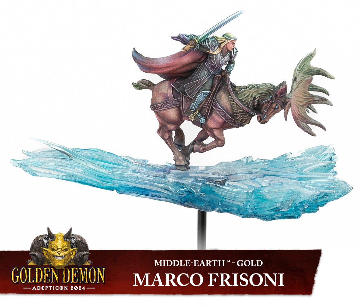 This one won based on (imo) the clarity of movement in the piece. The ice bridge is rougher in front and flows out into smooth lines at the back which intuitively gives you an idea of where the model is moving. The fur in the front is painted with diagonally downwards lines, to evoke the feeling of the elk pushing powerfully with its front legs and the fur further to the back is more horizontal, to indicate the movement of the body itself. The cloak too has highlight lines starting sharper to the front and diffusing out towards the back. It's also highlighted in warmer colours towards the front and ends up in a cold blue towards the back, kind of like a comet trail (the bright is where it's going, the darker is where it's leaving). Everything is done to indicate to you that Thranduil on his elk is charging forward.
|
|
#
?
Mar 28, 2024 11:50
|
|
|
Eej posted:Well here's an easy example: I appreciate this breakdown, and comparing it to the model, I buy it completely. But haha it also tells me that I am basically doing paint by numbers in comparison, both in terms of painting a model and how I look at painted models
|
|
#
?
Mar 28, 2024 12:41
|
|
|
Eej posted:Well here's an easy example: Knowing Marco he probably finished that in an afternoon
|
|
#
?
Mar 28, 2024 12:44
|
|
|
Spanish Manlove posted:Knowing Marco he probably finished that in an afternoon Hey guys! Do you want a tip for faster painting? No sleeping is my number one trick to do my projects faster and with much style.
|
|
#
?
Mar 28, 2024 13:00
|
|
|
Going a day without sleep sure drives me crazy, and that's what it takes to produce some real art right?
|
|
#
?
Mar 28, 2024 15:28
|
|
|
Lostconfused posted:Going a day without sleep sure drives me crazy, and that's what it takes to produce some real art right?
|
|
#
?
Mar 28, 2024 15:53
|
|


|
a touch of mental illness always helps creative work as well
|
|
#
?
Mar 28, 2024 16:46
|
|

|
Crossposting from the kitbash thread:  Possibly I should do the lining of the cape a different colour? Maybe just black. The white at the back could so with more work, I hit the zenithal base with Dreadful Visage contrast which I think knocked it back too far, thinning it with medium would probably have been best. As it is I've been building back a lot of the lightness with Pro Acyrl white glazes. Looks better in the photo though.
|
|
#
?
Mar 28, 2024 17:42
|
|
|
Nessus posted:I believe you also need to buy more paints. Marco will just plop down about 8 basic colors onto his pallet and mix that poo poo together to get what he wants. But he also will work with oil filters and stuff like that as well.
|
|
#
?
Mar 28, 2024 17:57
|
|

|
Spanish Manlove posted:Knowing Marco he probably finished that in an afternoon hey guysss here's handy tips on how to create a fast workflow for your golden demon winner But seriously what I love about Marco is how much saturated colours he uses. Nothing wrong with desaturated colours but I like how he uses them and creates wonderful visual interest, especially since LOTR seems to often favour more muted schemes and tones. I will say the one bit of golden demon controversy I have seen is that the single model 40k winner apparently used AI art for the background of the base. I assume it wasn't judged with that background but I guess since it was photographed with the background it rubs some people the wrong way.
|
|
#
?
Mar 28, 2024 20:30
|
|
|
Feels extremely weird to allow printed backdrops in a painting competition. AI or not.
|
|
#
?
Mar 28, 2024 21:17
|
|

|
Anyone have much experience with desert bases? I'm making some arrakis bases for some dune miniatures and am planning on using the ak terrains sandy desert and using a sculpting tool to make gentle sand waves. I did think about incorporating other elements into the bases, stones? But I'm not sure how to go about it. I've been using references of the Sahara and parts of back home (Somalia) as reference but I'm not sure how well it would translate into 28mm.
|
|
#
?
Mar 28, 2024 21:31
|
|

|
Arrakis also had its share of black stone which would also be a logical place where poo poo happened, since running around in the desert seems like it calls Shai-Hulud, who can be portrayed by slapping a flexible heating duct on the table. So that could add visual diversity, even if maybe not to each individual base.
|
|
#
?
Mar 28, 2024 21:42
|
|
|
Flipswitch posted:planning on using the ak terrains sandy desert and using a sculpting tool to make gentle sand waves. yep, pretty much nailed it. That stuff rules. remember you can also shade it with washes, and highlight it too! Once you've done your basing I'd also highly recommend using a pigment powder on your figures feet to marry it to the base even more.
|
|
#
?
Mar 28, 2024 22:29
|
|

|
Yeast posted:yep, pretty much nailed it. That stuff rules. remember you can also shade it with washes, and highlight it too! Nessus posted:Arrakis also had its share of black stone which would also be a logical place where poo poo happened, since running around in the desert seems like it calls Shai-Hulud, who can be portrayed by slapping a flexible heating duct on the table. ")
|
|
#
?
Mar 28, 2024 23:09
|
|
|
Well, I wanted this guy to be done, but I see from these pics I need to do another round on the flamer tube and revisit the base- I can�t seem to find a muddy brown method I�m happy with.   
|
|
#
?
Mar 29, 2024 15:49
|
|
|
Professor Shark posted:Well, I wanted this guy to be done, but I see from these pics I need to do another round on the flamer tube and revisit the base- I can’t seem to find a muddy brown method I’m happy with. Hey, it's still a great job on one of my favorite Ork models ever! The newer scheme works just as well on him as it does the current Orks, which speaks to just how well they nailed the aesthetic back then, I think.
|
|
#
?
Mar 29, 2024 16:06
|
|

|
I love that guy. One of the challenges I find with mud is that it's very much not a uniform brown. It's got definite pools of darker and lighter mud, both where the dirt has been mixed in different ways (and with different liquids) and where it's dried differently. So consider trying some black and brown washes in various places as well as limited drybrushes of lighter brown. Possibly a reddish wash followed by a brown wash to tone down the red.
|
|
#
?
Mar 29, 2024 16:11
|
|

|
Y'all probably know this already but I just found them - There are a ton of textured panels on thingiverse and printables that you can use for testing paint on your brush when drybrushing.
|
|
#
?
Mar 29, 2024 18:14
|
|
|
Virtual Russian posted:Art contests involving high levels of skill aren't judged on flaws. Flaws will count against you extremely heavily, to the point of essentially being disqualifing. It is far more likely they are judging concept and execution. Basically, what was the artist's original concept, and how do all the elements of design and painting support that concept. Cease to Hope posted:i don't know how they score but all three of those strike me as better compositions than what they're compared to. on the same level technically but clearer lines of movement and focus Thanks, this really helps. Taking another look I think I see what you mean. Taking the silver and bronze from the Aos Large Miniature for examples, here's what I see now and people can tell me if I'm totally missing the mark: 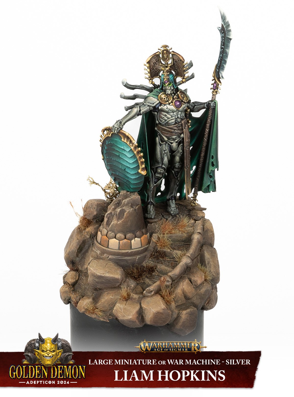 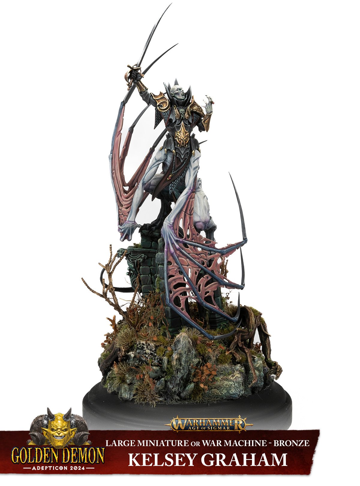 Overall impression of the scenes is that the bone reaper is standing guard at a pass, and the flesh eater is rallying troops for a charge or delivering a Shakespearean monologue. Both models are elevated relatively high off of the base. The bone reaper is off-center with the stairs circling up to them in the upper-right which creates a nice impression, while the flesh eater is centered which has a neutral effect. The shield resting on the rock, the chipping on the shield, and the destroyed banister give an eternal guardian vibe. These details, the spread body language of the mini, its sight line, and the stairs/framing all complement and reinforce each other. The flesh eater's pose calls to mind fantasy movies where the general strikes a dramatic pose before leading the charge. But they're standing on the ruins of a building, on a rocky outcrop, which is a bit at odds with the story of the pose because that doesn't meld with where most armies would do battle. Centering the mini also gives it a more static impression as if it were urging the troops forward, but if that were the case the sight line wouldn't match because then it should be looking forward. The raised arm and sword are telling one story and implying motion while the rest of the composition creates a more static impression instead of accentuating the impression of motion (or imminent motion). I could be reading too much into this arm and head pose as saying "let's charge", but the only other reference I have for that body language is dramatic theater productions.
|
|
#
?
Mar 29, 2024 19:00
|
|

|
Behold, a ham     Definitely see a bunch of things I could improve, but this is a clear step up from anything I've painted before so for that I'm quite happy with it. Bark! A Vagrant fucked around with this message at 19:08 on Mar 29, 2024 |
|
#
?
Mar 29, 2024 19:05
|
|
|
Just found the one I did for Orktober. Just a good fun time
|
|
#
?
Mar 29, 2024 19:15
|
|


|
Professor Shark posted:Well, I wanted this guy to be done, but I see from these pics I need to do another round on the flamer tube and revisit the base- I can�t seem to find a muddy brown method I�m happy with. Looks great to me, I don't know if orks would worry about perfectly painted hazard stripes but I could see why it'd bother you. The details on the horns 
Bark! A Vagrant fucked around with this message at 19:35 on Mar 29, 2024 |
|
#
?
Mar 29, 2024 19:22
|
|
|
All orks are beautiful.
|
|
#
?
Mar 29, 2024 19:30
|
|
|
armorer posted:Y'all probably know this already but I just found them - There are a ton of textured panels on thingiverse and printables that you can use for testing paint on your brush when drybrushing. While better than nothing, you really want the material to be wood, because the idea is to let you balance moisture and paint load in the drybrush. If you use tissue/kitchen paper you take out all the moisture and your drybrushed paint will go on too dry resulting in chalky finish. If you use plastic you just take out paint but leave moisture in the brush. Textured wood will let you take out water until it feels right, and then add paint and take that off until you're depositing the right amount.
|
|
#
?
Mar 29, 2024 19:38
|
|

|
Lovely Joe Stalin posted:While better than nothing, you really want the material to be wood, because the idea is to let you balance moisture and paint load in the drybrush. If you use tissue/kitchen paper you take out all the moisture and your drybrushed paint will go on too dry resulting in chalky finish. If you use plastic you just take out paint but leave moisture in the brush. Textured wood will let you take out water until it feels right, and then add paint and take that off until you're depositing the right amount. Ah, good to know. Given my general lack of skill I think I can still improve by using these ~$0.20 bits of plastic. Previously I just used some scrap cardboard. It sounds like using both might get me closer though since the cardboard will still soak up a bit of moisture.
|
|
#
?
Mar 29, 2024 19:44
|
|
|
Lovely Joe Stalin posted:While better than nothing, you really want the material to be wood, because the idea is to let you balance moisture and paint load in the drybrush. If you use tissue/kitchen paper you take out all the moisture and your drybrushed paint will go on too dry resulting in chalky finish. If you use plastic you just take out paint but leave moisture in the brush. Textured wood will let you take out water until it feels right, and then add paint and take that off until you're depositing the right amount. /me looks at all the scrap wood in my shop Guys, I'm starting a bespoke texture palette business.
|
|
#
?
Mar 29, 2024 19:59
|
|
|
Bark! A Vagrant posted:Looks great to me, I don't know if orks would worry about perfectly painted hazard stripes but I could see why it'd bother you. The details on the horns Thanks everyone! The horns have been something I�ve been thinking about for a while- the local steakhouse has a pair on the wall that I�ve been looking at for years and have really wanted to replicate in my painting 
|
|
#
?
Mar 29, 2024 20:32
|
|
|
Bark! A Vagrant posted:Thanks, this really helps. Taking another look I think I see what you mean. Taking the silver and bronze from the Aos Large Miniature for examples, here's what I see now and people can tell me if I'm totally missing the mark: Not an art student here so I can't be as clinical in my analysis but I agree with most of yours. One thing is that the setting of the flesh eater's diorama is fine, standing on top of a ruined building to give a little bit more height to rally your weird vampire beasts to battle is perfectly in setting. You're right that it's too "centered", when you look at it you just see the flesh eater as is, mid action in a scene. The bone reaper's base makes you want your eyes to walk around and up the stairs to arrive at the bone reaper itself which gives the piece more movement than the flesh eater. Also another thing to note, the bone reaper is cold and saturated while the base is warm and desaturated. It's this cold metal thing standing in the middle of a hot desert. The flesh eater is roughly the same as the rest of the scene, so it's more like a still from an action scene than a painted piece.
|
|
#
?
Mar 30, 2024 00:22
|
|
|

|
| # ? Apr 28, 2024 23:20 |
|
|
Eej posted:Not an art student here so I can't be as clinical in my analysis but I agree with most of yours. One thing is that the setting of the flesh eater's diorama is fine, standing on top of a ruined building to give a little bit more height to rally your weird vampire beasts to battle is perfectly in setting. You're right that it's too "centered", when you look at it you just see the flesh eater as is, mid action in a scene. The bone reaper's base makes you want your eyes to walk around and up the stairs to arrive at the bone reaper itself which gives the piece more movement than the flesh eater. I also think the Vengarian Lord's pose is not all that great. The motion it seems to convey is kind of confusing. I think this is more of a sculpting issue than a painting issue. But it seems like the big flying creature has just landed and is now turning back and looking high up. It doesn't really make a lot of sense for a "Rallying the troops" pose as he is probably looking above his troops, unless he flew downhill a significant amount, but that doesn't seem to make much sense. I mean we might also surmise that if he was stopping to give encouragement he would have just landed facing the right way. The composition may have been better if it accentuated the odd curves/torso twist. Perhaps one thing they could have done would be to place the figure slightly off center from the base and slightly off kilter or on less that stable footing, and adjusted the sword to either make it a little more defensive or a little more threatening, like this bad guy was just flying along and all the sudden now the Stormcast dragon dudes are trying to ruin his weekend, so he stopped abruptly to square off with them. All that said, it is significantly better than anything I could do, so there is that.
|
|
#
?
Mar 30, 2024 01:04
|
|