


|
|
I'm feeling huge on photoshop today, what are we still lacking right now?
|
 #
?
Apr 7, 2019 13:11
#
?
Apr 7, 2019 13:11
|
|


|

|
| # ? Apr 26, 2024 10:18 |
|
|
|
Once this is finished I absolutely would like to sponsor a byob banner ad with it by the way, so if you got suggestions!!
|
|
#
?
Apr 7, 2019 13:11
|
|
|
|
Goons Are Great posted:I'm feeling huge on photoshop today, what are we still lacking right now? most immediately, we could use upper-case f, q, and v! that way we would at least have a full alphabet of upper case.
|
|
#
?
Apr 7, 2019 14:30
|
|


|
|
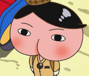
working on F, work in progress as i try to move an dstretch his arms
|
|
#
?
Apr 7, 2019 14:53
|
|


|
|
lol i did the top arm but not the bottom yet and it looks like some crazy gravity poo poo is going on with the drips
|
|
#
?
Apr 7, 2019 14:53
|
|
|
|
alnilam posted:working on F, work in progress as i try to move an dstretch his arms lol, fantastic
|
|
#
?
Apr 7, 2019 14:54
|
|
|
|
Going to start work on a Q in a bit! Also that F looks amazing already
|
|
#
?
Apr 7, 2019 14:58
|
|
|
|
hmm something seems a little off here
|
|
#
?
Apr 7, 2019 15:01
|
|
|
|
okay how is this, open to constructive criticism e: changed to timg, i feel like some of the imperfections are less visible when it is smaller size as it probably will be whene making letters
|
|
#
?
Apr 7, 2019 15:12
|
|
|
|
or does this look more like an F
|
|
#
?
Apr 7, 2019 15:16
|
|
|
|
whoa, I like them both! the second one does look a bit more efflike, at least to me, but let's let others weigh in
|
|
#
?
Apr 7, 2019 15:18
|
|
|
|
At the very first glance it looked less like an F but as the guy himself, but that shouldn't be less of a problem inside a text. The second pictures however improves this clearly, so I'd go for that one. If possible and if it doesn't break the letter, I'd maybe try to distort the head a tiny bit to bring it closer to the upper arm, that should make the F very clear. However I might be very wrong on that!
|
|
#
?
Apr 7, 2019 16:03
|
|
|
|
alnilam posted:or does this look more like an F I like this one better. Can some of the bubbles be made into  dudes, or is that too much work for too little gain? dudes, or is that too much work for too little gain?
|
|
#
?
Apr 7, 2019 19:03
|
|


|
|
Robot Made of Meat posted:I like this one better. Can some of the bubbles be made into Oh my God that is a lovely idea
|
|
#
?
Apr 7, 2019 20:38
|
|
|
|
Sorry for the delay, I was really having a hard time coming up with a fun idea, after I figured that we already have like four pizzas. Instead I thought, let's do a fun BYOB the font collaboration project for the letter that gets used almost as rarely as X! It's not all of them, in no particular order other than the file names and they are not proportionally sized. Let me know what you think!
|
|
#
?
Apr 9, 2019 13:01
|
|
|
|
cosnpirabcy confirmed@!Goons Are Great posted:Sorry for the delay, I was really having a hard time coming up with a fun idea, after I figured that we already have like four pizzas. Instead I thought, let's do a fun BYOB the font collaboration project for the letter that gets used almost as rarely as X!
|
|
#
?
Apr 9, 2019 14:37
|
|


|
|
Goons Are Great posted:Sorry for the delay, I was really having a hard time coming up with a fun idea, after I figured that we already have like four pizzas. Instead I thought, let's do a fun BYOB the font collaboration project for the letter that gets used almost as rarely as X! it's great! it's very, uh, meta.
|
|
#
?
Apr 9, 2019 15:29
|
|
|
|
It really is, hence why I was unsure if you'd like it but other concepts I had were either bad or not like a Q at all, so I figured this may at least be something! I still have the PSD though so if you'd like anything to be changed, I'm open for it!
|
|
#
?
Apr 9, 2019 15:31
|
|
|
|
okay i turned his head a little, which ws a good sugegstion, and i tried to do it with gimp tricks and ended up finding it easier to just cut, rotate, and manually draw back in the gaps bc it's a cartoon. i was afraid to try bc i'm bad at drawring but it turned out fine i think added the to the drips but they will probably not really be noticeable when the letter is in use, still we will know the secret 
|
|
#
?
Apr 9, 2019 15:57
|
|
|
|
alnilam posted:okay i turned his head a little, which ws a good sugegstion, and i tried to do it with gimp tricks and ended up finding it easier to just cut, rotate, and manually draw back in the gaps bc it's a cartoon. i was afraid to try bc i'm bad at drawring but it turned out fine i think very cool! op updated accordingly okay, who's up for designing a capital v?
|
|
#
?
Apr 9, 2019 16:02
|
|
|
|
lmao that my lovely B is one of the most used letters since it's in BYOB
|
|
#
?
Apr 9, 2019 16:09
|
|
|
|
this font is so good i want to write all my work suff in it
|
|
#
?
Apr 9, 2019 16:09
|
|
|
|
by the way I tried to see if fontforge could be used to make a real font out of the images, I posted questions in a couple of forums but nobody answered  my assumption is that fontforge can't do it and it's a fairly niche need that the devs are unlikely to implement |
|
#
?
Apr 9, 2019 16:19
|
|
|
|
I have an idea |
|
#
?
Apr 9, 2019 16:25
|
|
|
|
i think i could write a python script that wil take text and read the images and produce a big image with the font images stitched together the simplest version, which i could try first, would just be taking a singly string, no line breaks, and just making an image then that function could be built out to read a whole text file or something and put line breaks where appropriate python scripts can be compiled into executables so you din't have to have python installed, which i haven't messed around with yet but could try, and this would end up requiring that people download the executable somehow, trust me not to make a virus, probably would require simple command line use, etc OR if anyone here is a Web Wizard, i know you can make like web applets that use python code on the back-end so we could mke like a web based byob text image generator, which would be even cooler. i def don't know how to do that part so that would have to fall to someone else
|
|
#
?
Apr 9, 2019 16:31
|
|
|
|
alnilam posted:i think i could write a python script that wil take text and read the images and produce a big image with the font images stitched together if you want to do that feel free! I mean, the blender thing I did could be polished and used by anyone who wanted to accomplish the same thing, and the text is editable and positionable and whatnot however the version of blender I did it in is the beta of the upcoming major new release, the beta is actually impressively stable but for some reason it has a crash associated with the font thing
|
|
#
?
Apr 9, 2019 16:38
|
|
|
|
If no one else wants to get their hands on it, I'm happy to try a capital V! Got an idea already, but maybe it turns out rather bad like my original ideas with the Q. I could get on that after work! Also, that script sounds amazing!!
|
|
#
?
Apr 9, 2019 16:54
|
|
|
|
alnilam posted:okay i turned his head a little, which ws a good sugegstion, and i tried to do it with gimp tricks and ended up finding it easier to just cut, rotate, and manually draw back in the gaps bc it's a cartoon. i was afraid to try bc i'm bad at drawring but it turned out fine i think I love the byobuddies but you're right they will probably not be discernable I noticed something else when your character gets shrunk to text size: the lines around frink get really thin, almost disappear, most noticeably on a white background what would you think of a slightly thicker outline to make up for this? e.g.  . . . or . . . 
|
|
#
?
Apr 9, 2019 18:28
|
|
|
|
 good point, both look fine to me use your judgement good point, both look fine to me use your judgement
|
|
#
?
Apr 9, 2019 18:29
|
|
|
|
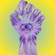
Jeez, sorry for the delay, completely forgot about my assignment for a V. Design featuring the double bong concept from byob the corporation: 
|
|
#
?
Apr 23, 2019 12:54
|
|
|
|
Goons Are Great posted:Jeez, sorry for the delay, completely forgot about my assignment for a V. very good! everyone knows "V" is for sharing.
|
|
#
?
Apr 23, 2019 16:17
|
|
|
V is for vape bong x2, clearly
|
|
#
?
Apr 24, 2019 20:05
|
|

|

|
| # ? Apr 26, 2024 10:18 |
|
|
|
Manifisto posted:oh god dippy needs to be added to the byob font
|
|
#
?
Sep 5, 2019 18:37
|
|