


|
I'd say if you were trying to go for a clean, stylized look, all that's missing is the ground and roof textures. And maybe do something about the lamps, they look wierd as hell.
|
 #
?
Jul 14, 2008 13:05
#
?
Jul 14, 2008 13:05
|
|


|

|
| # ? Apr 19, 2024 01:55 |
|
|
My mudbox trial has run out but I still really want to use it at work (for learning and portfolio, not profit). Its about �150 for the learning edition which is a lot of money so its a tough decision but zbrush looks like even more money and I didn't really get in to using it. Does anyone know the best way to buy these products or well I'm not really sure specifically what kind of advice I'm looking for; I just feel like I need some advice.
|
|
#
?
Jul 15, 2008 15:22
|
|

concerned mom posted:My mudbox trial has run out but I still really want to use it at work (for learning and portfolio, not profit). Its about �150 for the learning edition which is a lot of money so its a tough decision but zbrush looks like even more money and I didn't really get in to using it. You could buy a used license, or if you are in some kind of schooling you could get an educational discount. It won't be much cheaper, but it'll be less.
|
|
|
#
?
Jul 15, 2008 20:46
|
|
|
SynthOrange posted:I'd say if you were trying to go for a clean, stylized look, all that's missing is the ground and roof textures. What do you find weird about the lamps?
|
|
#
?
Jul 15, 2008 21:03
|
|

|
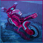
Hey cubicle, that's 2 weekends ") I made this:  Click for big. Done in a couple hours, vray with vraysky/sun/cam, original res 4000 something by 1900 something. I already got some complaints that the CA is too hard. Maybe they are right. International Log fucked around with this message at 23:24 on Jul 15, 2008 |
|
#
?
Jul 15, 2008 21:32
|
|
|
The only thing that stands out to me is the door on the immediate right, probably because of the handle. Other than that, it's amazing ")
|
|
#
?
Jul 16, 2008 00:25
|
|

|
spottedfeces posted:What do you find weird about the lamps?  The cylindrical white light source makes them look like electric garden lamps to me. concerned mom posted:My mudbox trial has run out but I still really want to use it at work (for learning and portfolio, not profit). Its about �150 for the learning edition which is a lot of money so its a tough decision but zbrush looks like even more money and I didn't really get in to using it. I feel that I get more milage out of zbrush, because it's not just a sculpting package, but can also be used to texturing and paint as well and for roughly the same amount as the full Mudbox Pro. Zbrush does have a 30 day trial if you want to try it out. Synthbuttrange fucked around with this message at 02:32 on Jul 16, 2008 |
|
#
?
Jul 16, 2008 02:28
|
|
|
Martytoof posted:The only thing that stands out to me is the door on the immediate right, probably because of the handle. Other than that, it's amazing Thanks, yeah that's because of the perspective. It's a small space so my boss wanted me to use a high FOV which borks with the proportions... 
|
|
#
?
Jul 16, 2008 07:46
|
|
|
spottedfeces posted:New scene with no textures save the sky and the trees, and only a half-assed lighting set-up, but this is essentially what it's going to look like. Comments and crits would be well appreciated. I would remove the lamps altogether. They don't add anything to the scene, they're not even casting light in that example (Although maybe they cast interesting lights when finished? Who knows), and their architectural style is completely dissociated with the rest of the scene. If you have them in there to break up empty spots in your composition, I'd replace them with some shrubs or something. Try lots of small short versions of your trees.
|
|
#
?
Jul 16, 2008 08:45
|
|


|
International Log posted:Thanks, yeah that's because of the perspective. It's a small space so my boss wanted me to use a high FOV which borks with the proportions... I honestly just think it's the handle that looks a little CG-polygony -- otherwise that door would look fine. The FOV thing was secondary as far as I'm concerned.
|
|
#
?
Jul 16, 2008 14:14
|
|
|
Hello 3D thread! Long time, no see. I recently rendered these Scrabble-like tiles for the splash screen of a iPhone game called Tile Sudoku that a friend developed:  I learned how to use Reactor to make the tiles look like they fell on each other realistically. Then, I had to try an animation, even though it won't be used for anything. That is here: http://youtube.com/watch?v=05TIAMez7Jw In the animation you may notice that two of the tiles on the left intersect... I had this problem a lot when rendering the stills, too. Is there a better way to have Reactor 'recalculate' the scene without lifting one of the objects off the ground, starting the simulation again, and hoping it falls into a better position?
|
|
#
?
Jul 16, 2008 23:35
|
|

|
concerned mom posted:My mudbox trial has run out but I still really want to use it at work (for learning and portfolio, not profit). Its about �150 for the learning edition which is a lot of money so its a tough decision but zbrush looks like even more money and I didn't really get in to using it. Studica.com has zbrush for like 388$ if you are a student. Has anyone seen opacity.us before? http://www.opacity.us/ Great reference for landscapes.
|
|
#
?
Jul 17, 2008 07:14
|
|


|
It's my secret childhood dream to be a 3D Environment artist in the gaming industry. I'm majoring in (questionably) Game Design at SCAD, and having just finished my first year I haven't gotten out of a studio full of naked fat people and into a computer lab yet, but I'm trying to learn the ropes of 3D modeling so when I do get into my major courses I don't waste any time fumbling around in the dark. I've watched a few training videos and followed along with a few tutorials to get my feet wet. However, it's really maddening to sit through tutorials that take time to explain how to press Alt in combination with another key, or the difference between left clicking and right clicking (oh hi I wasn't aware that Lynda.com was actually John Scherer's Video Professor teaches 3ds Max 9 for Grandmas), so I decided to just start making something and see where I got. These are the first couple of (decent) models I've made without any kind of instruction. Please don't be gentle -- I'm a hooker for your feedback.  I made this Victrola last night, based mainly on this reference photo. I can't say much about it other than that it took me several hours and was a hell of a learning experience. Also, the panel on the front looks kinda weird, there's a lack of detail on the sides, and the molding looks off, but practice is practice. Tonight I decided to make something low-poly, so I modeled the axe seen in this excellent Blizzard concept drawn by Mark Gibbons. I hope I'm not breaking any unwritten rules or being ungentlemanly by using someone else's work for practice, but I obviously take absolutely no credit for the design.   Tonight was the point at which this stuff just sort of clicked for me, and it ceased to be frustrating and just became fun. So I'm happy about that, although organic modeling is still an agonizing enigma to me. After getting where I am now and taking a look at what I have, I notice a few things that bug me. I know I'm rambling to myself and answering my own questions, but if you could either vindicate me or tell me I'm wrong, I'd really appreciate what feedback you can offer. 1. The GeoSphere on the tail end looks a little too... non-uniform. That's why I used it instead of a regular Sphere, but looking at the silhouette turnaround it seems like the shape isn't very well-defined. I'm considering changing it to a regular sphere, but maybe roughing it up a bit to make it not so perfect. 2. The big spike is supposed to be the pointy, gnarled horn of a whale, but I think it reads too much like a flat blade or spike, partially because the base is indeed wider on one side. I'm considering a) adding in a loop or two and making the shape a bit more parabolic and/or b) making the spike truly round/square, which would entail doing the same to the base it's sitting on. 3. I don't like the way the blade pretty much forms a 90-degree angle. I'm considering a) adding some more detail to the inner part of the blade to make it curve into the outer part more, and/or b) slanting the top edges of the inner part of the blade downward some. 4. That weird middle triangle/spike on the inner part of the blade bugs me. I feel like it's awkwardly subdivided and that I haven't really executed the detailing that well for the amount of polys it cost. Since this is low-poly (I'm aiming for WoW spec, more or less), do I need that division at all, or can I get along fine making it flat and letting the texture do the talking? 5. The extruded band near the back of the pole seems a little simple to me, even for low-poly. I'm thinking of just adding one more loop in the center and kind of bowing it inward. In addition, in the concept it has four spikes that I overlooked, so I'll have to go back and add those, and probably rotate that piece 45 degrees so they can rest flat on those faces. Am I on the right track?
|
|
#
?
Jul 18, 2008 09:40
|
|

wasabimilkshake posted:Am I on the right track? Looks pretty good, if you're looking to be an environmental artist I'd recommend also getting into texturing and matte painting even. Even the shittiest low poly models can look amazing with some skilled texture work.
|
|
|
#
?
Jul 18, 2008 18:14
|
|
|
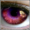
Here's a recent ZBrush sculpt of mine. Working on stuff for my reel at the moment, let me know what you think. Click here for the full 960x720 image.  Click here for the full 960x720 image.
|
|
#
?
Jul 18, 2008 20:33
|
|

|
Looks great to my untrained eye, but the lighting on the mouth area in the first shot is really creeping me out for some reason  I think it looks OK through the hair in the second (it is hard to see though) so I think its just some weird shadow play maybe?
|
|
#
?
Jul 18, 2008 21:31
|
|
|
Yeah, I see what you mean. I think it has something to do with the Matcap material I'm using which has light baked into it. I haven't really decided on how I'm gonna show this one yet, I just quickly threw those ones on there to make some quick renders.
|
|
#
?
Jul 18, 2008 21:49
|
|
|
Adawait posted:Yeah, I see what you mean. I think it has something to do with the Matcap material I'm using which has light baked into it. I haven't really decided on how I'm gonna show this one yet, I just quickly threw those ones on there to make some quick renders. Why do I get the feeling you spent a looooot of time on that rear end? But yes, I'm familiar with the whole baked lighting thing metcap gives, I seem to recall there being a bunch of workarounds, but what they were seems to escape me at the moment.
|
|
#
?
Jul 18, 2008 22:52
|
|

|
Apart from the mouth, it looks like her right hand isnt properly clutching her side. Yeah it's in full contact, but the hand lacks any feeling of tension or grip.
|
|
#
?
Jul 19, 2008 01:23
|
|
|
Adawait: It is hard to tell because of the pose but the face looks like it needs more work. Is zbrush the only package you have access to? Why not texture and light and render in a package which is better at those things? (Maya, XSI etc) Overall pretty good job though. Did you pose her in zbrush too? Using the transpose tool? I always have problems posing characters with the transpose tool . . .
|
|
#
?
Jul 19, 2008 05:47
|
|
|
I haven't played with Maya in a while, and tonight decided to fresh up on some of my 3D skills. And holy poo poo. The hypershade is so bad. I don't remember it being this bad, but now that I'm so used to node based workflow (shake, combustion, nuke) it's so so terrible. Makes me want to go play with Houdini instead, haha. Or maybe XSI's new ICE node thing.
|
|
#
?
Jul 19, 2008 06:34
|
|

|
Adawait, the model looks nice in general but I agree that the face has some serious scary-issues. Hard to point out why exactly, could be in the geometry too. Gromit, yeah, that's very much possible. It gets hard to see the work with fresh eyes after having stared at it for hours, so it may actually look completely different than originally intended. Using reference photos would be a useful practice, probably. Continuing my RenderMan experiments... not finished, but it's something:  This one's about all kinds of translucency stuff like SSS. The interesting feature (for me) is that skeletal structure that's showing through the skin... the bone geometry is rendered as a separate pass and then accessed (by screen/NDC coordinates) in the shader and blurred according to the surface distance from the skin. Of course it could be done with distributed ray tracing, but that would add either a lot of noise or a lot of rendering time. Done this way, it adds maybe half a minute even with large renders. I guess this is the kind of trickery that is preferred in actual production (this was inspired by some Siggraph RenderMan course notes by Pixar). The effect is more interesting in animation, because the internals actually move in parallax with the viewing angle, so it makes the volume look much more 3D and translucent than with SSS only. It might be a bit too dark in this one and the modeling isn't too good, though. The nose looks weird at least. The whole thing is controlled from Houdini, which is a really interesting and powerful package as people here have said. For example, it doesn't appear to support RenderMan SSS out of the box, but it was really easy (well, once I got the hang of it) to set up a rendering operator network that automatically renders the irradiance passes and runs the point cloud filter programs when needed. I can imagine it's pretty powerful with the particle and dynamics stuff, but I haven't got that far yet.
|
|
#
?
Jul 19, 2008 22:48
|
|
|
poo poo, that looks fantastic. Where/what are you studying, if anything? This is the kind of stuff I'm wanting to get into at SCAD. Under two months now till I start.
|
|
#
?
Jul 20, 2008 03:39
|
|

|
Looks wierd, but awesome. Like a frog shaped lamp with a weak bulb inside.
|
|
#
?
Jul 20, 2008 03:46
|
|
|
sinc posted:Adawait, the model looks nice in general but I agree that the face has some serious scary-issues. Hard to point out why exactly, could be in the geometry too.
|
|
#
?
Jul 20, 2008 04:35
|
|

|
Not exactly the right look, but gently caress, the coding you're decribing behind the scenes is pretty fantastic. I'd love to get into some renderman stuff, but none of the studios in my area use it. Adawait: Looks nice, that is one seriously big booty. Face needs a bit of work, she looks a bit like a dude with that shading/lighting. Hands just need some atentive posing, and the satin looks kinda too crumply. Other than that, looks sweet.
|
|
#
?
Jul 20, 2008 04:38
|
|

|
So I ended up buying Digital Tutors' "Introduction to Maya" four disc set. It did a pretty good job of showing off the basics of the interface, some good examples of modeling and tool usage, but one thing that drives me crazy is how half-assed some of the examples are done. I mean, I didn't expect feature animation quality output in a beginner's tutorial and I realize that the point is more to get the user acquainted with the UI and workflow, but there was a lot of approximation, eyeballing, and corner cutting that went into modeling the demo. On the upside, at least as I'm working through it I'm taking it upon myself to go beyond what they're teaching and find ways to make it look cleaner. For $50 I guess I can't complain much, but I won't say I learned substantially more than I could have by following various free online tutorials. Convenience fee for not having to hunt them down I guess. It's a good tutorial set, but I really wish I could afford some real classroom training nearby That being said, I AM thinking about picking up their "Introduction to Modeling in Maya" set too 
some kinda jackal fucked around with this message at 04:56 on Jul 20, 2008 |
|
#
?
Jul 20, 2008 04:53
|
|
|
I'm a Max user and I've picked up Maya's PLE a few times to try and get into it. Eyeballing and approximation seems to be a main feature of Maya, at least until you get a ton of plugins.
|
|
#
?
Jul 20, 2008 05:23
|
|
|
Yeah approximation is fine. I used to do my modeling in Rhino (nurbs), since it's all mathematical and very exact- with an awesome snapping system I used to waste SO much time being anal and making sure things were aligned. Now I'm used to snapping stuff in Max (though it's nowhere near as good) and just getting things in the correct place, not exact. The switch from nurbs to poly modeling helped a lot too, since it just 'feels' different and more approximate.
|
|
#
?
Jul 20, 2008 06:04
|
|
|
Did some more work on the indoors, still a lot of temp textures (or none at all). Still not happy with the texture on the front wall - the cracks just don't feel right but no matter how much I play with it I'm never happy. Comments/crits welcome.  Click here for the full 1280x720 image.
|
|
#
?
Jul 20, 2008 08:34
|
|
|
Useless posted:Did some more work on the indoors, still a lot of temp textures (or none at all). Still not happy with the texture on the front wall - the cracks just don't feel right but no matter how much I play with it I'm never happy. Wow this looks stunning so far. The crit I would give on the cracks is that they seem to be almost random. While cracks need chaos, they spawn from external forces. The lower right edge of the wall (next to the table) feels like the crack should run horizontally. The forces applied to bring down that piece of wall next to it would have extered more lateral pressure along the wall. All in all it looks spectacular and is really starting to hold some feeling in the scene.
|
|
#
?
Jul 20, 2008 09:15
|
|
|
quote:Did some more work on the indoors, still a lot of temp textures (or none at all). Still not happy with the texture on the front wall - the cracks just don't feel right but no matter how much I play with it I'm never happy. It's looking really great man. The only things I can see that are a bit wierd is that there seems to be a bit of texture stretching on the rubble on the right. Also, the wall on the left should probably have a couple of cracks/be a bit dirtier too. Apart from that, the rest of the texturing and lighting is fantastic. Wish I could do it that well.
|
|
#
?
Jul 20, 2008 11:23
|
|

|
Thanks for the comments, glad you liked it. I guess I need to work on the "achieving a specific look instead of just something cool" aspect though, it certainly isn't intended to look like a light bulb. Heintje, I'm studying computer science somewhere in the backwoods of Europe, but I wouldn't mind ending up in the CG business once I graduate. That makes me pretty comfortable with the technical side of things I guess. IHeartBoobs, I'm currently using Houdini more as something that feeds the geometry and settings to RenderMan and manages the passes and things like that. The actual shading is done in RenderMan Shading Language. It renders a simplified pass with some special shaders that measure the distance from the skin geometry to the bone surface along the slightly refracted viewing direction, and stores it in a non-blurred texture that is colored according to the distance. At the actual render time, it blurs different color channels at different filter sizes and adds them together as black. The color trickery is used because it gives a sufficient effect and doesn't require any intense special convolution calculations. And yeah, in a relatively straightforward case like this, it could probably be achieved as a post effect too if I was outputting a bunch of different shading components and compositing them afterwards (which could be a good idea anyway). Useless, that's looking really good. I can't really see any major flaws that would give it away as CG. For minor nitpicks, some texture blurrines and stretching here and there might be a bit distracting. With some post processing as a final touch - maybe punchier color correction and some subtle faux lens defects - it could look very convincing.
|
|
#
?
Jul 20, 2008 11:41
|
|
|
I'm trying to follow Autodesk's tutorial for building a skeleton in Maya 2008. When I first placed the leg joints, I forgot to include a pelvis, which I need for Full Body IK to work. So I followed the instructions for the Insert Joint Tool and it seems to work differently than the tutorial says it does. I selected the tool from the skeleton menu, then clicked the intended parent joint (the root) and dragged to where I wanted the new joint to be (between the root and the knee). Instead of inserting a joint, Maya made a new one, as if I were using the regular joint tool. Does anyone know what I'm doing wrong? Should I not be using FBIK on my first rigged model?
|
|
#
?
Jul 20, 2008 19:03
|
|

|
I've started working on my sequel Oz short again, and I'm contemplating doing everything in HD. Has anyone worked on an animation in higher resolutions and can comment on it? I wasn't really happy with the quality of the Tin Woodman at the end of it. It was in NTSC. I just have normal hardware, nothing super amazing but adequate. I'm not rendering the backdrops, and all of my characters will be lit with a fairly non-intensive process. I'm more concerned with all of the post processing, compositing my backdrops, and in the end editing it. Everything will be meticulously storyboarded and timed out before I hit the render button. I'm just more curious in a general sense of people's experiences and thoughts on working in HD.
|
|
#
?
Jul 20, 2008 21:51
|
|
|
Hinchu: I don't have any experience in HD animation per se but from a logistics standpoint you can always go down in resolution from HD. It is render times for your passes I would worry about mostly. Rendering optimization is your friend. Portable Staplefrog: I would say learn how to make your own rigs work first before worrying about FBIK. It would help you to learn how to make a good FBIK rig but the main reason to do it is to use motionbuilder IMHO. There are other advantages of FBIK but that is the main one. EDIT: Although I suspect you know this, parenting bones will connect them. sinc: I am taking a stab at learning Houdini and I went to a SideFX class talking about one of the VFX shots for the Hulk and my head almost exploded. Really cool stuff but intimidating to learn. I noticed that Houdini 9.5 had renderman in the rendering menu. Your work with that shader is fascinating. I have been told only old school Renderman artists can really use Mantra because of how similar they are. Rendering in Mantra seems to be a pretty hot area to pursue in Houdini too. sigma 6 fucked around with this message at 23:23 on Jul 20, 2008 |
|
#
?
Jul 20, 2008 23:05
|
|
|
goomblet, sinc, A Sober Irishman - thanks for the comments. I've got to get some good references and completely redo the cracks - they were pretty much randomly placed as you guys can see. More foreground work - messed up the concrete mesh, probably will completely scrap and redo. Worked to try and at least match the staining on the full plaster wall - next step is redoing cracks and blemishes on the entire wall(s). Comments/crits welcome as always.  Click here for the full 1280x720 image.
|
|
#
?
Jul 20, 2008 23:11
|
|
|
sigma 6 posted:
This is what I'm trying to animate. It's supposed to look like the parts are made of glass or something inflexible.
|
|
#
?
Jul 21, 2008 15:28
|
|
|
Useless posted:
This would be a fantastic front page for a portfolio website. The rest of the content could show up in the background.
|
|
#
?
Jul 21, 2008 16:38
|
|
|

|
| # ? Apr 19, 2024 01:55 |
|
|
Portable Staplefrog posted:I just want objects to move with the bones inside them, but not deform at all. Anytime you want to rig a robot or something inflexible, you just need to group your geometry under your bones. The individual pieces of the geometry under each corresponding bone that is.
|
|
#
?
Jul 21, 2008 20:11
|
|