

|
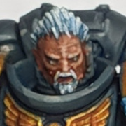
Before I start highlighting this bitch, do the colours look ok? It's my variation on the Nordland Blue/Yellow. (White primer was a success this time, thanks to the tips from PV) 
|
 #
?
Mar 27, 2010 22:11
#
?
Mar 27, 2010 22:11
|
|

|

|
| # ? Apr 19, 2024 08:24 |
|
|
Look poppin, as only white primer does  . white prime owns time qtiyd . white prime owns time qtiyd
|
|
#
?
Mar 27, 2010 22:42
|
|

|
I don't think you should use green for both the feathers and the laurels but other than that it's looking nice.
|
|
#
?
Mar 27, 2010 22:50
|
|

|
Fyrbrand posted:This is my monthly "washes own, best thing GW's put out in years" post, qtiyd Also, anyone know a place to get cheap cart wheels, around the same size as the ones in the empire cannon/mortar kit? edit: richyp posted:Before I start highlighting this bitch, do the colours look ok? It's my variation on the Nordland Blue/Yellow. ")
Spacefrog fucked around with this message at 23:40 on Mar 27, 2010 |
|
#
?
Mar 27, 2010 23:37
|
|

 X
X 
|
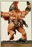
Woops posted in the other thread, didn't notice this one. Click here for the full 916x687 image. Made a greater chaos demon, kind of sloppy with the green stuff but I'm happy (first time using it). I'll probably mess with it a little more. Kinda hard to tell but I cut out its stomach and filled it with skulls, cause hey, that's pretty chaos.
|
|
#
?
Mar 28, 2010 00:45
|
|

|
Thats a pretty sweet use of the extra Stegadon head, nice job. Some of the greenstuff looks a bit rough, especially the transitions to regular plastic. You did say that you were still working, you can probably sand or fill for a smoother border.
|
|
#
?
Mar 28, 2010 03:07
|
|

|
I said it was top heavy before. I didn't mean that it's unbalanced, I mean it looks goofy. His head is loving huge and he has a skinny rear end body. I really like the stomach full of skulls, but the proportions are still a little comical. Who cares though, it's chaos.
|
|
#
?
Mar 28, 2010 03:33
|
|

|
Zombie #246 posted:Woops posted in the other thread, didn't notice this one. Get some fine grit sandpaper. The kind you use to finish with (microfine grit is best), and a wool buffer. Sand the rough parts on the green stuff smooth, then buff out to get a nice, seamless blend.
|
|
#
?
Mar 28, 2010 04:50
|
|

|
richyp posted:Before I start highlighting this bitch, do the colours look ok? It's my variation on the Nordland Blue/Yellow. After a quick test in photoshop I think orange feathers would look better as they contrast the blue but doesn't clash with the yellow. Also make the feathers multi-tonal, few birds have feathers of unbroken colour. http://www.islandemu.com.au/orange-emu-feathers-pi-106.html
|
|
#
?
Mar 28, 2010 13:03
|
|

|
richyp posted:Before I start highlighting this bitch, do the colours look ok? It's my variation on the Nordland Blue/Yellow. How'd you do the yellow and blue on this? It looks really good.
|
|
#
?
Mar 28, 2010 13:44
|
|

|
Catfishenfuego posted:How'd you do the yellow and blue on this? It looks really good. The best way to do yellow for me is Iyanden Darksun, wash with Sepia, highlight with golden yellow and then extreme highlight with sunburst yellow. Keep the yellow very thin and resign yourself to painting a lot of layers.
|
|
#
?
Mar 28, 2010 16:41
|
|
|
Catfishenfuego posted:How'd you do the yellow and blue on this? It looks really good. On white it's, VMC Sand Yellow and a Sepia Wash. Blue is Mordian + Ice blue, no highlights or wash. It'll likely be lighter for both after highlights. I'll see what orange feathers look like later when I get back to my hovel/painting room.
|
|
#
?
Mar 28, 2010 16:50
|
|
|
richyp posted:On white it's, VMC Sand Yellow and a Sepia Wash. Blue is Mordian + Ice blue, no highlights or wash. Hmmm, not sure about the orange: 
|
|
#
?
Mar 28, 2010 18:23
|
|
|
Brightened it a bit so I can see some details. I love it so far yeah the orange needs more highlights
|
|
#
?
Mar 28, 2010 18:27
|
|
|
I think it looks like it needs to be more orange.  It's kind of red at the moment. It's kind of red at the moment.
|
|
#
?
Mar 28, 2010 18:38
|
|
|
I liked it better green. Now it's distracting.
|
|
#
?
Mar 28, 2010 18:40
|
|


|
crime fighting hog posted:Brightened it a bit so I can see some details. I love it so far yeah the orange needs more highlights The highlights are fine, it just needs to be darklined and maybe shaded a bit darker towards the hat
|
|
#
?
Mar 28, 2010 20:18
|
|


|
I don't think it's highlighted ENOUGH!  Especially the blue and the horse. They both look fairly plain, maybe just do to the picture, a bit more dramatic of a highlight will really get them to pop.
|
|
#
?
Mar 28, 2010 20:38
|
|
|
Hell Diver posted:I don't think it's highlighted ENOUGH! It's not really highlighted yet anyway I always go overboard with highlights, thats just basecoat, one layer and a wash. As for the orange, I'm still torn as I preferred the green too.
|
|
#
?
Mar 28, 2010 21:19
|
|
|
richyp posted:It's not really highlighted yet anyway Oh my, I thought you had highlighted it.  Carry on then, soldier.
|
|
#
?
Mar 28, 2010 21:21
|
|
|
richyp posted:It's not really highlighted yet anyway Orange looks a lot better.
|
|
#
?
Mar 28, 2010 21:40
|
|
|
How do y'all recommend highlighting Blood Red to make it 'pop' without making it look pink or more orangey than it already is?
|
|
#
?
Mar 28, 2010 21:45
|
|


|
uncle jimbo posted:How do y'all recommend highlighting Blood Red to make it 'pop' without making it look pink or more orangey than it already is? Shade with purple. I just push my darks really far and take the red up to.. uh, I guess like blood red? Then edge with yellow or orange. I think I usually use: Base- Gory Red Shade- Imperial Blue/Sombre Grey Highlight- Bloody Red Edge Highlight- Sunblast Yellow with a tip of Bloody Red
|
|
#
?
Mar 28, 2010 21:52
|
|
|
Also, you can highlight by mixing dwarf flesh w blood red, or mixing orange and white into the red, so it doesnt get too pink or orange. Thin edge highlights
|
|
#
?
Mar 28, 2010 22:00
|
|
|
Mix bleached bone with blood red
|
|
#
?
Mar 28, 2010 22:43
|
|
|
My oath is nearly done, just some washing and the claws to do no pretty much. And the base... not sure where I'm going with that.  Claws... green, turquoise, or blue ?
|
|
#
?
Mar 29, 2010 03:14
|
|

|
Hawk Turq
|
|
#
?
Mar 29, 2010 03:26
|
|
|
green with lightning if you can. It'll offset everything else.
|
|
#
?
Mar 29, 2010 03:37
|
|
|
crime fighting hog posted:green with lightning if you can. It'll offset everything else. Seconding this. Blue or turquoise won't stand out enough from the power armour.
|
|
#
?
Mar 29, 2010 05:17
|
|

|
Green lightning it is then. Which is nice as it echoes the power weapons on my old Wolves.
|
|
#
?
Mar 29, 2010 05:26
|
|
|
Rapey Joe Stalin posted:
White to yellow to red to brown like a heating element
|
|
#
?
Mar 29, 2010 05:32
|
|
|
Rapey Joe Stalin posted:sniktsniktbubsniktbubbubsniktbubsniktsniktsniktbubbubsniktbubbubsnikt I ain't finished with you yet, bub. bubbubsniktbubsniktsniktbubsniktbubbubsniktsniktsniktbubbubbubsniktbub
|
|
#
?
Mar 29, 2010 06:46
|
|
|
Blade_of_tyshalle posted:sniktsniktbubsniktbubbubsniktbubsniktsniktsniktbubbubsniktbubbubsnikt he's the best at what he does.
|
|
#
?
Mar 29, 2010 06:50
|
|
|
Can someone far more experienced than me go over the plusses and minuses of Gesso vs. Spray Primer when it comes to the actual painting process? I understand the benefits as far as convenience vs. coverage and whatnot, but when it comes to paint are they basically the same? I hate spray primers because of the pooling and the general hassle of dealing with them, but I want to make sure Gesso isn't going to affect my paintjobs in the long run. Also - is Gesso... mixable? I got a gray gesso for painting Menoth in Warmachine and it's slightly darker than I like - can I just mix it with a little white to thin the color out like paint?
|
|
#
?
Mar 29, 2010 06:53
|
|

|
sicarius posted:Questions about gesso When you paint atop of gesso, you have in my experience two things that are different than with a simple spray primer: one, the base coat is slightly more elastic, which is handy for metal models. It's harder to chip, in other words. The other difference is texture. Gesso has less "tooth" to it, which can be a bitch on wide, flat areas. As for mixing gesso, it should be okay. The only difference between the colors of gesso are, of course, the pigments.
|
|
#
?
Mar 29, 2010 07:14
|
|
|
sicarius posted:Can someone far more experienced than me go over the plusses and minuses of Gesso vs. Spray Primer when it comes to the actual painting process? If you're pooling your spray primer you're probably holding down the nozzle too long. I've never had any pooling issues and I use cheap 99c poo poo!
|
|
#
?
Mar 29, 2010 08:46
|
|


|
Anphrax posted:If you're pooling your spray primer you're probably holding down the nozzle too long. I've never had any pooling issues and I use cheap 99c poo poo! Seconding this, you should never spray for more than a fraction of a second or something stupid like that. Basically, when you're spraying, aim for: Psshh... Psshh... Psshh... Psshh... and not: PsssssSsSssSsshhhHhhHhhHhhHhhHh Also, never hold it in one spot, keep moving back and forth with the spray over the model(s) in a kind of sweeping motion. Lastly, don't feel that you need to cover the whole model in one spraying session. If you've noticed spots you've missed and the model is already heavy with primer, just go do something else and come back and lay down a second coat when they're dry.
|
|
#
?
Mar 29, 2010 08:59
|
|


|
enri posted:Seconding this, you should never spray for more than a fraction of a second or something stupid like that. I agree with this 100%. Short bursts with a sweeping motion. Usually my process, is spray one side, leave it to dry, rotate and repeat until you have primer on most of the surfaces. I wouldn't worry if you miss the hard to get places either as you should really touch the model(s) up with a brush after.
|
|
#
?
Mar 29, 2010 09:21
|
|
|
Had a free hour yesterday so I got the urge to paint one of the metal Catachan I had laying around. It was already primed when I got it, so I completely missed the mold line on the back of the rifle.      Tried to go for a M-16 style blacked rifle, with the bluing worn off from use. I think it looks pretty neat with minimal effort and looks infinitely better than the bright shiny rear end steel barrels. Still need to finish his boots, base, and combat knife on his back, but I'm pretty happy with the Time to Result ratio on this guy. Should be able to crank a squad out pretty quickly. Not completely sold on the camo though, thoughts? Hell Diver fucked around with this message at 15:22 on Mar 29, 2010 |
|
#
?
Mar 29, 2010 15:16
|
|
|

|
| # ? Apr 19, 2024 08:24 |
|
|
Hell Diver posted:Had a free hour yesterday so I got the urge to paint one of the metal Catachan I had laying around. It was already primed when I got on it, so I completely missed the mold line on the back of the rifle. He is glorious, loving the flesh-tones.
|
|
#
?
Mar 29, 2010 15:22
|
|