


|
Bimtob posted:I'm just starting to learn about photography (light, composition, etc), so I don't have much to offer as far as critique. Anyway, I really like this. I kinda feel like I want the figures to be a tiny bit sharper to stand out against the haziness of the rest of the image, but overall a nice photo. I like this, but I wish the dog was exposed a bit more. Maybe use a mask or something to expose the bottom half of the picture more to even things out? Here's about the only picture I've taken in the past month that's not a bird. 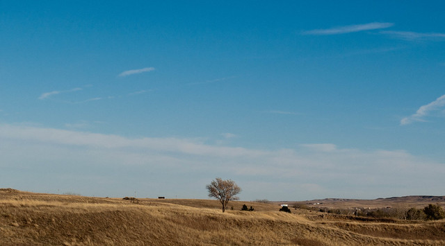 DSC_0966.jpg by MrDespair, on Flickr And here is a bird. 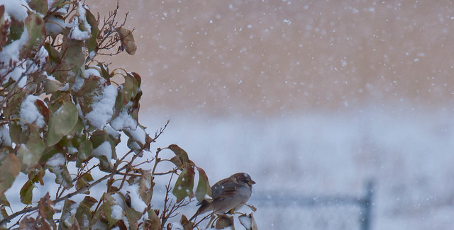 Settling In by MrDespair, on Flickr
|
 #
?
Nov 29, 2011 22:56
#
?
Nov 29, 2011 22:56
|
|


|

|
| # ? Apr 16, 2024 14:07 |
|
|
Bimtob posted:I took several shots of this dog on the porch, this one I ended up liking the best. I agree that this is underexposed. I would have tried exposing for the dog and seeing where that got me with the light through the window (because I'd like to see that more blown out) and the light cast from above the door (exposing for the dog might wash the top of the door out too much). Compositionally, the biggest problem that jumps out at me is the huge area of porch boards. I can see you were trying to divide the frame up in thirds, but making a full third of the frame porch is really hurting you here-- what is that much porch adding to the picture that a third as much wouldn't be able to? Show that the porch is there, but don't make it a major subject. The dog gets lost the way you've composed the shot, because he seems like an afterthought; he's not placed as deliberately as the other elements are. I wonder if you could have gotten more symmetry or just more balance and less busyness out of the door area. The pillars on the left don't make a lot of visual sense, and the plant probably should have been removed before you took the shot. Mr. Despair posted:I like this, but I wish the dog was exposed a bit more. Maybe use a mask or something to expose the bottom half of the picture more to even things out? What was your focus with the first shot? I see the whole "tree on the prairie under a vast sky" thing, but you have so many things cluttering up the shot that you can't pull that look off. Even the sky is too busy. Also, wherever you live looks suspiciously like Colorado in the winter! I like the second one a lot more, but the line of the fence frame in the background intersecting the bird is distracting, and I'd rather not see the bird positioned in the lower center like that with all the visual weight of the bush on the left side; it looks a bit awkward. I like how you've captured the falling snow, though. My most recent: 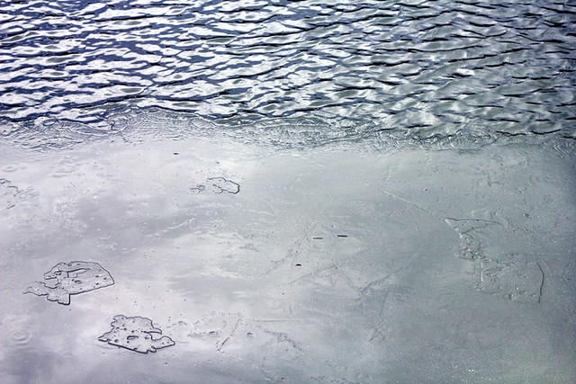 Thaw and Flow by E Banker, on Flickr
|
|
#
?
Nov 29, 2011 23:45
|
|
|
Kingdom of Sin posted:I agree that this is underexposed. I would have tried exposing for the dog and seeing where that got me with the light through the window (because I'd like to see that more blown out) and the light cast from above the door (exposing for the dog might wash the top of the door out too much). Compositionally, the biggest problem that jumps out at me is the huge area of porch boards. I can see you were trying to divide the frame up in thirds, but making a full third of the frame porch is really hurting you here-- what is that much porch adding to the picture that a third as much wouldn't be able to? Show that the porch is there, but don't make it a major subject. The dog gets lost the way you've composed the shot, because he seems like an afterthought; he's not placed as deliberately as the other elements are. I wonder if you could have gotten more symmetry or just more balance and less busyness out of the door area. The pillars on the left don't make a lot of visual sense, and the plant probably should have been removed before you took the shot. Thanks for the input. Interesting how different it looks to me now after you pointed all that stuff out. The porch looks huge now! Poor Coco is swallowed by porch. Also I actually underexposed it a bit in post, the original was a bit lighter, guess I took it too far.
|
|
#
?
Nov 30, 2011 00:10
|
|

|
robertdx posted:The first image is pretty bad. Why is everything hazy and out of focus? Why is the image in black and white? Why are the bases of the glasses and wine bottle cut off? Why are none of the labels or names clearly pointed towards the camera? Why is everything off level and not aligned? Why the blurry hand in the background? Sure I get this was some kind of dinner or party, but this just looks haphazard. Thanks for the feedback! This is my 2nd week with my first camera so I appreciate it. For the first image, I think this expands the self-debate that I have been having. When I am out to parties that I bring my camera (NEX-3) with me, what mode should I put it on? I really want to get into the habit of putting it on manual focus, but I realize when I get a bit drunk I gently caress things up. Especially with the NEX-3 which doesn't have a little area you look into but a wide screen. I thought about Digital manual focus which I thought would be better, but clearly with this photo it did not work. Auto focus, seems like a bit cheating. So what method is better when you are out partying with friends and you have a camera with you? I thought the shadow on the far right looked neat. As for the third photo, I did feel a bit that the colours were a bit muted. But what did you mean by, " Cutting things off in portraits is almost never a good idea. " I did not quite understand this? As for the condensnding look, I was actually aiming for it (I guess I did something right :iamafag: ) This girl is a friend of mine and she is known for her very condescending look, which is something I was looking for in this picture.
|
|
#
?
Nov 30, 2011 00:23
|
|

|
Enigma89 posted:Thanks for the feedback! This is my 2nd week with my first camera so I appreciate it. There's nothing wrong with autofocus. It's fast and let's you get nice, in-focus pictures. Manual exposure, on the other hand, is where you want to play around. I don't know if there's many people here who would actually say manual focus is better than autofocus..to me there's no point in manual focus, especially in a fast paced place like a party. I mean, it's a good skill to have probably, but I would spend my time learning things like composition/exposure first. I don't mean to speak for robertdx, but I assume what he means when he says "cutting things off in portraits..." is because you disembodied her hand away from her face. There is her head, then a hand in the middle of the frame, and nothing to connect the two. To you, obviously you knew it was her hand, but to an objective viewer who wasn't there, it looks a little funny. It's something to watch for. I know the feeling of having a new camera and taking pictures of everything because it's super fun, but try to keep in mind what would be interesting to an outside viewer, and frame your photos based on that. That's not to say pictures of lights or wine glasses can't be interesting, it's just the way that you choose to frame them and compose the shot that will bring interest to those objects. Keep practicing ")
|
|
#
?
Nov 30, 2011 03:34
|
|

|
CarrotFlowers posted:I don't know if there's many people here who would actually say manual focus is better than autofocus.. In my opinion, manual focus is better than autofocus if you have a camera with a focusing aid and a big viewfinder.
|
|
#
?
Nov 30, 2011 04:35
|
|
|
I think he meant manual exposure not focus, based on the exif data (it was taken in auto exposure mode).
|
|
#
?
Nov 30, 2011 04:45
|
|
|
atomicthumbs posted:In my opinion, manual focus is better than autofocus if you have a camera with a focusing aid and a big viewfinder. I knew there would definitely be some people that prefer manual focus, but especially at this stage in the game, I would spend my time focusing (hurr) on composition and getting the exposure right, and then move on to manual focus if it's something you feel you want to learn. Just seems like it's a bit unneccessary as something to try to battle right off the start, especially with a camera that isn't the easiest to work with in that regard.
|
|
#
?
Nov 30, 2011 04:52
|
|
|
Mr. Despair posted:I like this, but I wish the dog was exposed a bit more. Maybe use a mask or something to expose the bottom half of the picture more to even things out? Though I hate to use the word, the first shot feels a bit gimmicky. Even with that sentiment, though, I do like it in terms of the layering of the ground, that layer of clouds, and then the sky. I think I might have preferred a crop that made the blue sky less dominant in proportion to the ground and the cloud layer. I guess the thing that I actually am finding myself not care much about is the tree itself, but still I don't mind it at all. The bird shot is cool. I can't really offer any reasons why other than some observations - the bird looks cold, the composition with the foliage and snow is interesting (though I might have cropped out some of that foliage, maybe taken out the left 1/6th of the photo), and you've isolated some of the falling snow. The line between the beige part and the white of the snow is nice as well, though I do see the earlier point made about the fence. ---- Thanks for the advice on the earlier shot. I think that I was shooting for something symmetrical in my mind and just didn't execute it. Pretty frustrating, but good to recognize the problem. This is another shot that I was struggling with, and I think it might have the same issue, but because the fountain itself may not have been symmetrical (along with the shadow on the water) and I didn't recognize that when I was standing in front of it. Anyhow, here is the original, and then a crop.   Does the crop work? Would there have been another option to salvage the shot and do something interesting? Lame even with the crop? rio fucked around with this message at 05:29 on Nov 30, 2011 |
|
#
?
Nov 30, 2011 04:53
|
|

|
CarrotFlowers posted:There's nothing wrong with autofocus. It's fast and let's you get nice, in-focus pictures. Manual exposure, on the other hand, is where you want to play around. I don't know if there's many people here who would actually say manual focus is better than autofocus..to me there's no point in manual focus, especially in a fast paced place like a party. I mean, it's a good skill to have probably, but I would spend my time learning things like composition/exposure first.
|
|
#
?
Nov 30, 2011 11:12
|
|
|
rio posted:Thanks for the advice on the earlier shot. I think that I was shooting for something symmetrical in my mind and just didn't execute it. Pretty frustrating, but good to recognize the problem. I think any symmetry you were hoping for here is ruined by the diagonal line of the cloud edge. The crop is actually better because you've moved away from symmetry with it. I can tell you're working on getting a handle on symmetry, which is a great skill, but while you're doing that, think about how you can also convey a SENSE of symmetry without actually trying to force it on subjects that don't lend themselves to it. I think the shot also suffers from "look, it's a thing" syndrome-- I can see that you deliberately framed it with symmetry in mind, but you've also shot it from eye level in a very straightforward way, which gives me the feeling that I am just walking around looking at things, if you see what I mean. Try to engage with your subject in an unusual way-- play with angles, get up high, crouch down, get up in its face, do whatever you can to show us this everyday thing in a way we haven't seen before. There are leaves and various debris under the the water, there are clouds reflected on the water's surface, there's a contrast between the shadow cast by the fountain and the reflection of the sky, there's a slight breeze rippling the surface of the water... these are all things you can play with and put together in different ways. Also, dirt and dilapidation can be fantastic elements, but make sure they're intentional. The crap in the background isn't helping the picture out; it just looks like you either weren't paying a lot of attention to what was behind the fountain, or weren't paying attention to your aperture.
|
|
#
?
Nov 30, 2011 18:35
|
|
|
^ Thank you for the excellent advice - that's really helpful!
|
|
#
?
Nov 30, 2011 19:13
|
|
|
Brewdog posted:
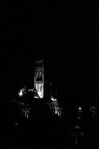
I know this is deliberately high contrast, but all that does is emphasize how little of the picture is filled with the actual subject. The sign at the bottom is distracting and the treeline is cutting off what is actually a pretty detailed part of the building (archways etc). The tower is also a lot more impressive than that and as a result of the contrast coupled with the lighting (or lack of it, I know it's beyond control, but still), you've cut off quite a bit of gothic architecture. I'd recommend going back and re-shooting, at this time of year you'll get near-darkness at a point when you can still wander into university grounds even if you're not a student/employee (at the moment a good time to shoot would be around 15:50). The best spot for shooting that particular part of the main building is the north stairs of the Wolfson/Davidson link building. If you're not comfortable with entering uni grounds for whatever reason, another good spot is about 20yrds past the southern gates beside the anderson/pontecorvo complex - this will allow you to include the Kelvin in your shot and reduce negative space.
|
|
#
?
Dec 1, 2011 04:00
|
|

|
Kingdom of Sin posted:
OK, cool concept. I think you should have killed the glare, it would be interesting to see the photo broken into sections of blue with the little islands of ice in the bottom left raised up more. Maybe a dark gradient coming up from the bottom with put them into relief a little bit more. I like where you've started going with this. Adjusting the black levels might also help to make things a bit more interesting. I wish there was a leaf or something was stuck in the ice. Maybe a dead fish? Could you go back? Use your hand to melt the ice, put a playing card or something funny into it, spray some water over it and let it freeze again. Could be fun!  The lonely raven. by Nathan Harburn, on Flickr  The moon rises over Vancouver. by Nathan Harburn, on Flickr  The Start of Winter. by Nathan Harburn, on Flickr
|
|
#
?
Dec 1, 2011 05:26
|
|
|
Tactical Mistake posted:OK, cool concept. I think you should have killed the glare, it would be interesting to see the photo broken into sections of blue with the little islands of ice in the bottom left raised up more. I am a complete noob so take my comments with a grain of salt (I actually encourage someone else to also make comments), but I only have 2 things to comment. On the bird photo, I sort of wish the angle was a bit different. You have two different cloud layers behind the crow, if you were a bit closer and lower, then the bird would be under one solid cloud layer. I think it may look better, but I am a noob. The other comment is on the one with the city. I just sort of wish there was more exposure on the left side of the photo. Seeing a bit more of the outline of the other hills on the left side would give the photo a more complete feeling.    Just one note, I realized in dark situations the little plastic thing that I can take off the front of my lens is creating a little shadow when I shoot flash. So I finally realized what it was and will stop using it (this explains the dark area on the third photo towards the bottom). Also, I didn't want to be cliche about shooting all B&W but some girl demanded that she be shot in B&W, so I thought it was a good excuse to try a B&W night.
|
|
#
?
Dec 3, 2011 16:05
|
|
|
Enigma89 posted:quote:quote:I'm not sure why you think B&W is clich�... when it feels like the right thing to do, go for it! Some images are much better in B&W than colour. I very rarely take portraits. This was done to commemerate this guy's Movember effort. I led him a merry dance through the office to try and find somewhere with decent light, but couldn't find anywhere without hard shadows. 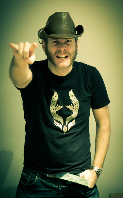 Lemmy Purbrick 2 by fuglsnef, on Flickr
|
|
#
?
Dec 3, 2011 20:30
|
|
|
David Pratt posted:I very rarely take portraits. This was done to commemerate this guy's Movember effort. I led him a merry dance through the office to try and find somewhere with decent light, but couldn't find anywhere without hard shadows. ). The light is alright for dealing with ambient. I would have gone a bit tighter, or moved the camera down (pointing up) a little more to remove the nuisances in the bottom left and right of the subject. The hand out of focus is a shame, but I bet he was moving it. Expression is good etc. You've done good for an impromptu shot!
|
|
#
?
Dec 3, 2011 21:12
|
|
|
IsaacNewton posted:The hand out of focus is a shame, but I bet he was moving it.
|
|
#
?
Dec 3, 2011 21:47
|
|
|
David Pratt posted:The light really feels like it's in the way here. I would have composed it so that it's either in the top-right or the bottom-left, with the centre of the light hitting one of the third intersection lines. It would help the flow of the image if the light was in line with the road. At the moment it blocks it and feels awkward. Thank You! e: Here is what the cropped image looks like now if you are at all curious (no need for critiques, just to satisfy your own curiousity) 
Enigma89 fucked around with this message at 22:34 on Dec 3, 2011 |
|
#
?
Dec 3, 2011 22:19
|
|
|
Enigma89 posted:I am a complete noob so take my comments with a grain of salt (I actually encourage someone else to also make comments), but I only have 2 things to comment. On the bird photo, I sort of wish the angle was a bit different. You have two different cloud layers behind the crow, if you were a bit closer and lower, then the bird would be under one solid cloud layer. I think it may look better, but I am a noob. I agree with you, those are my thoughts on the pics as well. David Pratt posted:
I see that someone has covered this above but I'd like to toss in my thoughts as well. You've got to get more light up under that hat, but you mentioned it was poor lighting. The vignette is pretty high for this kind of shot but I like the drama. I would rather have everything in focus instead of the fist blurred, but since you mentioned you like it, it really doesn't matter. Maybe crop a bit higher to get rid of the desk/lamp, and his hand could be on his hip instead of in his pocket, especially for a rockin' out pose like that. I'd get a nicer flash for your camera and do adjustments in lightroom, it would really help out impromptu shots like this and you'd be surprised with the results! I took three shots of the same lighthouse, thoughts on which is strongest, comments on any of them?  '3 Treatments Project' 500px. by Nathan Harburn, on Flickr  '3 Treatments Project' 500px. by Nathan Harburn, on Flickr  '3 Treatments Project' 500px. by Nathan Harburn, on Flickr
|
|
#
?
Dec 4, 2011 00:59
|
|
|
Tactical Mistake posted:I agree with you, those are my thoughts on the pics as well. Overall your shots are considered and have a good zone 5 range and warm, unified colours which are working very well. However, in the top and bottom one, the island/subject matter breaks the negative space in quarters and halves which isn't the strongest. Watch your ratio of negative space to positive space and you'll see that the edges of the islands and lighthouses hit the centre points of the composition.
|
|
#
?
Dec 4, 2011 01:57
|
|

|
Tactical Mistake posted:I agree with you, those are my thoughts on the pics as well. I like your first one the best because the clouds almost match the look of the mountains. I like the panorama style better as well. The last one looks more lonely and empty, so I think it depends on which sort of feeling you're going for and the theme if it's an ongoing series.  First attempt at a flash composite with someone other than myself in the photo. This was a difficult shot for me because the lights were constantly changing colors. Would love a detailed critique on this one and some insight on improving it
|
|
#
?
Dec 4, 2011 01:59
|
|
|
Disreputable Dog posted:However, in the top and bottom one, the island/subject matter breaks the negative space in quarters and halves which isn't the strongest. Watch your ratio of negative space to positive space and you'll see that the edges of the islands and lighthouses hit the centre points of the composition. Nice, thank you for pointing that out! I'm going to take another look at them. Tamgerine posted:I like your first one the best because the clouds almost match the look of the mountains. I like the panorama style better as well. The last one looks more lonely and empty, so I think it depends on which sort of feeling you're going for and the theme if it's an ongoing series. Thanks. I like this photo and I took a look at it, here's some thoughts; The lighting is a bit wonky in the areas I circled here.  I think everything is great but it's dark in between the two girls, one girls thigh looks like raw chicken breast and then her shin is weird. The other girl looks fantastic! The blue lighting and the background turned out really well, in my opinion. Could you bring up the exposure between them to even it out a bit and change the lighting on the girl on the right? I feel like that would help bring the photo together more into the same style, she stands out right now. Sorry for drawing on your picture.
|
|
#
?
Dec 4, 2011 02:46
|
|
|
Enigma89 posted:The crop improves the image, but personally I think it would have been better if we could see what the model was looking at below the balcony. I would have liked to see a bit more of the street scene below as a backdrop. Failing that, it would have been good to see more of the models face, since she is now the focus of the image. A few images of my own. I decided to play around with angles while shooting some urban architecture, just to make things more interesting. Does it work? 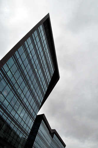 RL5 by Tom.Plk, on Flickr Here is an attempt at a still-life: 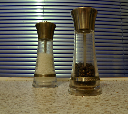 condiments by Tom.Plk, on Flickr I'm not sure about the post-processing on the above pic. Can't quite put my finger on what the problem might be though.
|
|
#
?
Dec 4, 2011 23:50
|
|
|
Pickman posted:The crop improves the image, but personally I think it would have been better if we could see what the model was looking at below the balcony. I would have liked to see a bit more of the street scene below as a backdrop. Failing that, it would have been good to see more of the models face, since she is now the focus of the image. I am still very new when it comes to photography so, take my critique with a grain of salt. I feel like the still shot would benefit a lot from some isolation. The blinds in the background are too distracting. I feel like if you had used a wider aperture to get a shallow DOF or shot it to a single colored background/foreground than it would help out. Also the composition of the shakers could use some work. I'm not really sure but the shot seems like it could use a better angle. I also find the fact that the shakers don't have an even level of salt to pepper to be distracting, though I think I am just being nitpicky with that one. I honestly couldn't tell you what to do in post as I only shoot film so hopefully someone else can chime in on that. In reference to the first photo, I find the Pac-man in the window to be far more interesting than the building itself. The Angle isn't really helping you out there and I feel like the shot would benefit in having more of the building in it as the top of the building is not very interesting. I have never had a critique done for me so I just kind of went into flickr and chose 3 random shots. Please rip them to pieces 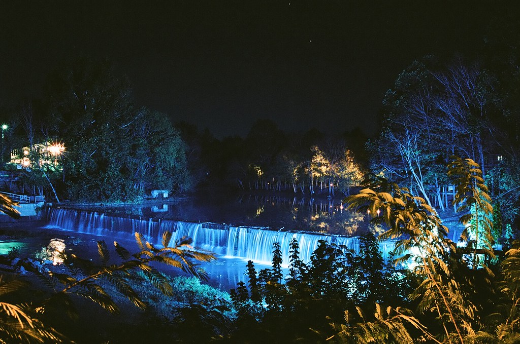 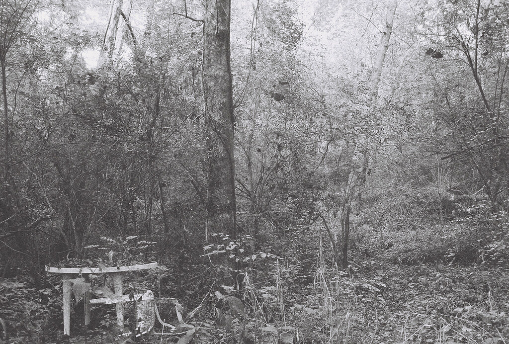 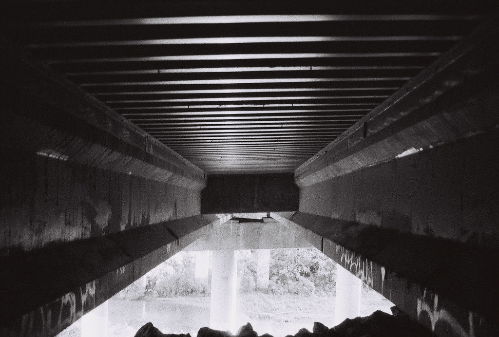
|
|
#
?
Dec 5, 2011 03:34
|
|

|
Pickman posted:Here is an attempt at a still-life: I think you need to put more thought towards your subject in this. This is a dead-on picture of a salt and pepper shaker on your counter in front of some window blinds. When you're taking a picture of something so mundane, try and at least come up with a more interesting composition that gives people something to look at. I would be surprised if anyone finds this photo interesting. Keep at it.
|
|
#
?
Dec 5, 2011 05:29
|
|

|
pootiebigwang posted:I have never had a critique done for me so I just kind of went into flickr and chose 3 random shots. Please rip them to pieces Welcome to the Dorkroom, in that case! Just about everyone here has some great knowledge so please keep taking those photos! As for your three, my favorite of them is definitely the second. I actually really, really enjoy it. It looks almost like something you would see in those creepy photos from the 1930's or so. It could use a slight bit more contrast for my tastes, though, as a lot of the foliage starts to blend together. It's also slightly off-kilter so maybe straighten that up. However, whatever you do, don't clean up the noise! It suits the photo and adds a ton to that creepy, mysterious vibe. The other two could stand to have the noise reduced just a little, though (more in the first than on the third). The first is ok, but I feel like it's very busy and doesn't focus enough on the waterfall. The colors seem to be all over the place, and the light on the left end is distracting. Maybe do some cropping to bring the focus back onto the waterfall. The third is much better composed, but the rock or whatever that is at the bottom could stand to be cropped out and the whole photo straightened a bit if possible. Otherwise, it's a great detail shot. Black and White seems to be your strong suit just judging from these three. Finally got a chance to visit Saguaro National Park. Nature and Environment photography is still, by far, my weakest genre but I feel like I'm slowly improving! Waiting on a Graduated ND filter to help me with overexposed skies. Lots of good info in the thread here, but I'm trying to avoid masking, merging, etc that feels a little too "Photoshop," even though it would probably help my photos a bit for now. Anyway, here were my 3 favorites from the weekend: 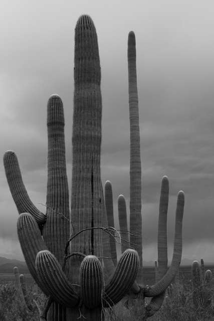 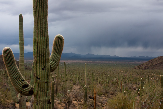 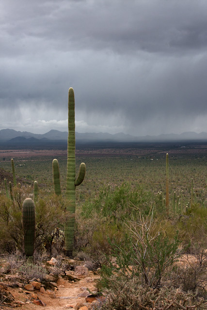
|
|
#
?
Dec 5, 2011 07:16
|
|

|
RangerScum posted:I think you need to put more thought towards your subject in this. This is a dead-on picture of a salt and pepper shaker on your counter in front of some window blinds. When you're taking a picture of something so mundane, try and at least come up with a more interesting composition that gives people something to look at. I would be surprised if anyone finds this photo interesting. Thanks. That was actually my attempt at a more interesting composition - the first attempts at this pic had the two shakers level, filling the frame. I think what pootie said earlier was right about the background - I might have been more interested in the background than the subject. I saw the shakers against the blinds and thought "that would look good". Back to the drawing board I guess.
|
|
#
?
Dec 5, 2011 12:06
|
|
|
Axel Serenity posted:I get your intentions with the black and white, but that sky is way too perfect to not be in color.
|
|
#
?
Dec 6, 2011 05:54
|
|
|
TheLastManStanding posted:I get your intentions with the black and white, but that sky is way too perfect to not be in color. Really, that's a fantastic colour sky.
|
|
#
?
Dec 6, 2011 05:59
|
|
|
Mr. Despair posted:And here is a bird.
|
|
#
?
Dec 6, 2011 06:06
|
|

|
Pickman posted:I'm not sure about the post-processing on the above pic. Can't quite put my finger on what the problem might be though. In addition to composition (already mentioned), the two colours that are mixing -- the purple-blue and yellow-green aren't very flattering to the subject. The blacks cross-processed to ultramarine ads a sci-fi hue, which can be cool in some cases, but not this one. Also, they are very sickly colours that don't compliment the subject (food-related). In addition to composition, lighting -- good lighting -- is your friend. Chase it relentlessly. 3 Photos I took recently on a trip to SF: 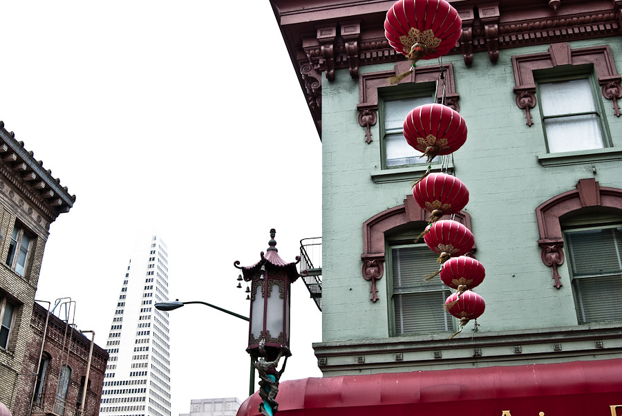 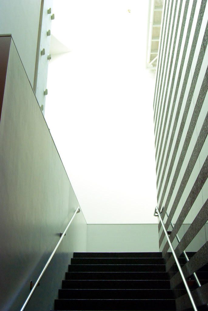 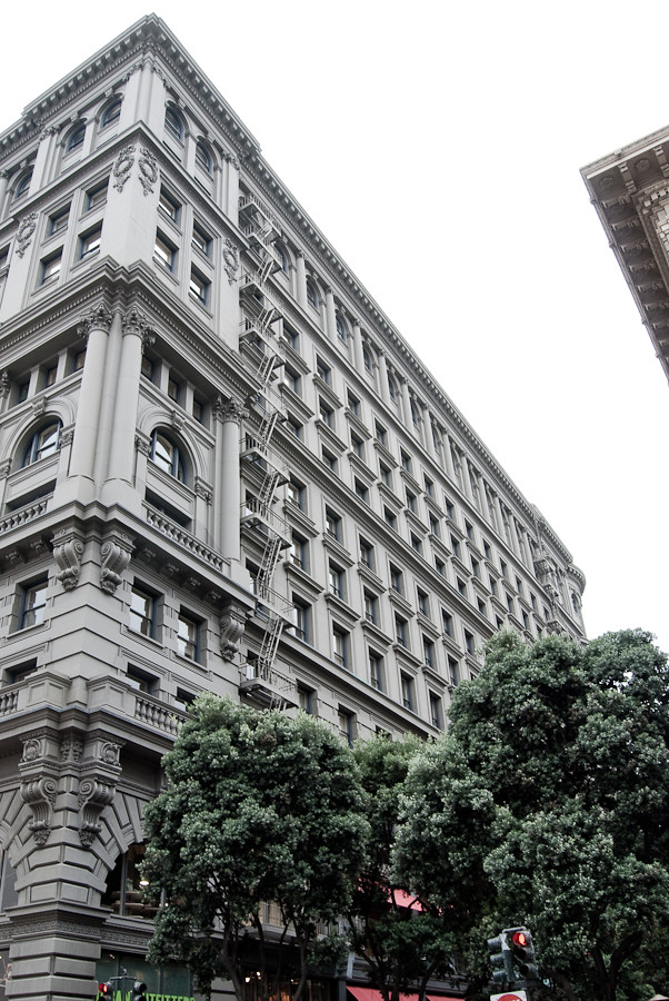 I'm pretty slow and infrequent when it comes to photography (just got a digital 2 years ago), and I'm just mostly focusing on basic composition. Would love to know what more experienced eyes see. Disreputable Dog fucked around with this message at 07:35 on Dec 6, 2011 |
|
#
?
Dec 6, 2011 07:28
|
|
|
pootiebigwang posted:I am still very new when it comes to photography so, take my critique with a grain of salt. I feel like the still shot would benefit a lot from some isolation. The blinds in the background are too distracting. I feel like if you had used a wider aperture to get a shallow DOF or shot it to a single colored background/foreground than it would help out. Also the composition of the shakers could use some work. I'm not really sure but the shot seems like it could use a better angle. I also find the fact that the shakers don't have an even level of salt to pepper to be distracting, though I think I am just being nitpicky with that one. I honestly couldn't tell you what to do in post as I only shoot film so hopefully someone else can chime in on that. In reference to the first photo, I find the Pac-man in the window to be far more interesting than the building itself. The Angle isn't really helping you out there and I feel like the shot would benefit in having more of the building in it as the top of the building is not very interesting. #1 - Pretty sweet. My only complaint is that it seems like a snapshot of what you were seeing - that they set up the lighting and you shot from wherever you were at the time. It is pretty, but reminds me of something I might see in a photo album. (I should also mention what you did...I am fairly new at this, so these are just a newbie's impressions). There was clearly a contrast of the yellow lighting and blue - I think I would have liked to see more playing between those two colors in the composition. #2 - Man. This looks good. There is so much going on in a good way. You found a good spot and nailed it with this style. #3 - I also like this one. This might just be my own attention to symmetry in my own self-improvement, but the little non-symmetrical things are bugging me a bit. The lack of straightness with the lines up top and the slight offset of the things below are noticeable to me. This might be totally fine! But I have been scrutinizing symmetry lately, so it is on my mind. Here are a bunch of words about what I shot today and yesterday! Feel free to ignore them, because I am just trying to sort out my thoughts here. But I would, as before, greatly appreciate any advice because this has really been an outlet for me lately and I want to try to improve. So, I had another 10 minutes to go out for a walk at work today. This is a kust a shot of the environment, just to give you an idea of what is around. Not so much a shot for critique.  There is SO much interesting poo poo outside of this frame. Old buildings, a stone overlook, a loving biodome greenhouse thing of some sort. But I want to get something in this courtyard. I feel like I am missing something here and need to learn.  That loving fountain. That thing is not symmetrical. I want to get some shot I like of it, but for the short time I had today, I tried to get the stuff below it, which is had been all dried out. I think this shot feels forced, but perhaps there was a way to salvage it. I don't think I noticed the second subject when shooting it, which is why I can't seem to frame it properly now. I have only had the 50 1.8 lens for 3 days now (at least attached to this camera) so I am trying to get acquainted.  This was another shot from under that fountain. More potential, I think, but I should have shot further to the upper right - that spot the cord left on the floor continued and would have been interesting I think.  Here is a random shot that was not planned out. I don't know if it is amateurish and trite or cool, and why it is one or the other. It is my iphone catching a reflection.
|
|
#
?
Dec 6, 2011 08:56
|
|
|
Tactical Mistake posted:
Really likin this but to me the bright red path detracts a little from the overall feel of the picture. Toning down the reds a little (but not too much) would really bring it together, I'd think. A faster shutter speed would have helped with the snow trails but then again I kind of like it that way  taken with a nikkormat ft2 and fuji natura 1600, it's a neat film. This was a spur of the moment shot and I'm pretty pleased with how it came out but something feels off to me, I can't quite place it. eventually I'm going to edit out that speck on her head
|
|
#
?
Dec 6, 2011 09:18
|
|

|
greatest gatsby posted:Really likin this but to me the bright red path detracts a little from the overall feel of the picture. Toning down the reds a little (but not too much) would really bring it together, I'd think. A faster shutter speed would have helped with the snow trails but then again I kind of like it that way I actually like the reds in his shots. Onwards - in your shot, perhaps what feels off is the focus. The buds in the lower right feel more in focus that what the viewer would consider to be the focus of the picture - the flower eyes. Still pretty cool, but I might defocus those buds to draw attention from that misfocus.
|
|
#
?
Dec 6, 2011 09:26
|
|
|
rio posted:
rio posted:Onwards - in your shot, perhaps what feels off is the focus. The buds in the lower right feel more in focus that what the viewer would consider to be the focus of the picture - the flower eyes. Still pretty cool, but I might defocus those buds to draw attention from that misfocus.  Sweet digs by Krakkles, on Flickr Krakkles fucked around with this message at 14:32 on Dec 6, 2011 |
|
#
?
Dec 6, 2011 14:28
|
|

|
Krakkles posted:
I like this a lot. I'd just build a mask for the building and hit it with a touch of a curves adjustment to make it pop out a bit. (I prefer curves adjustments for dodging/burning than the dodge/burn tool or exposure adjustment layer.) Something about the sky doesn't feel right, but I can't tell -- like, I want to desaturate the blues a bit. A wider crop would help, I think, with a touch more room on each side. Can't really offer anything, since I don't know what your goal was. --------------------------------------------------------------------------- EDIT: There is a portrait thread for this. Subjunctivitis fucked around with this message at 07:42 on Dec 8, 2011 |
|
#
?
Dec 7, 2011 03:10
|
|
|
quote:I get your intentions with the black and white, but that sky is way too perfect to not be in color. quote:Really, that's a fantastic colour sky. Here you go! Wasn't sure the subject was solid enough to be in color vs. the stark detailing of B&W, but I'm glad you guys liked the sky. All I wanted on the trip was a little rain, and thankfully we got there during one of the few times a year it happens. 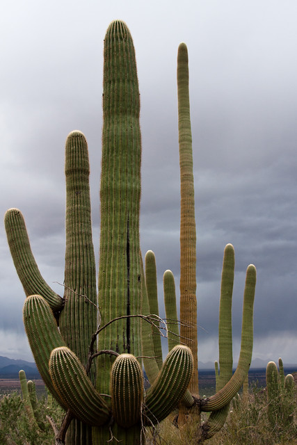 rio posted:So, I had another 10 minutes to go out for a walk at work today. This is a kust a shot of the environment, just to give you an idea of what is around. Not so much a shot for critique. Dude, there's nothing to be shy about with this. Yes, it's a mundane subject, but you've made it very interesting. I'm not sure if the framing was intentional or not, but what really made this photo for me were the evergreens in the background. They turned what normally would be a snapshot into an extremely interesting image when contrasted with the winter trees that cover the background. Yeah, the shot's a little asymmetrical, but mostly because of the bushes behind the fence to not go across the whole image and instead lean on the left side. If you have a chance to get more shots of it, I really think you're onto something, and it's the most interesting of the ones you posted in my opinion.
|
|
#
?
Dec 7, 2011 07:27
|
|
|
Tactical Mistake posted:OK, cool concept. I think you should have killed the glare, it would be interesting to see the photo broken into sections of blue with the little islands of ice in the bottom left raised up more. Thanks for the input. I love the idea of sticking something in the ice, although I can't go back and reshoot that particular area because the paper-thin sheet of ice was gone by that afternoon. I may tuck that idea away for the future. I haven't worked with gradients before, so that may be why I couldn't seem to get it to come out right; instead, I just focused on trying to tone the glare down and even out the color. I did bump the blacks up considerably even in the original image, and I'm not 100% sure how far I can take it without it looking silly. I don't know that this is a picture I'll ever be wild about, but here's my attempt at improving on it: 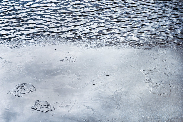 Thaw and Flow (remix) by E Banker, on Flickr Disreputable Dog posted:3 Photos I took recently on a trip to SF: I really love your processing on all these, but I'd like to see you compose a little more deliberately. You have clear subjects, but also random things cluttering up the frame without adding a lot. For example, the lanterns against the building are gorgeous and the balcony and ornate lamp are cool, but the buildings on the left are just kind of hanging out. Combined with the skewed angle, things look haphazardly mushed into the frame. Similar issue with the third shot-- cool architecture really standing out against the blown-out sky, trees make for a nice overall color palette, but then you've got a little corner of a random building sticking out, and traffic lights poking up from the bottom of the frame like they just snuck in there somehow. I think the second shot is the strongest, because those are some incredible lines you have going. I think it still suffers from the same problems as the others in that the top half of the picture becomes a little less coherent; however, if you cropped about the top half out right around where that little nub is peeking out from the edge of the wall on the left, I think it would be solid. My tendency for these shots would be tighten, isolate, simplify. I know that can be hard in a big city, but here you're teetering on the edge between isolating your subject and including background and context information. If you're going to put a lot of stuff in a shot, just make sure it needs to be there. Axel Serenity posted:Here you go! Wasn't sure the subject was solid enough to be in color vs. the stark detailing of B&W, but I'm glad you guys liked the sky. All I wanted on the trip was a little rain, and thankfully we got there during one of the few times a year it happens. I'm going to have to say I actually really prefer this shot in black and white. It makes the growth patterns on the saguaro pop out much more.
|
|
#
?
Dec 8, 2011 21:13
|
|
|

|
| # ? Apr 16, 2024 14:07 |
|
|
Tighten, crop, simplify. I can work on that. Thanks Kingdom of Sin, I'll take that forwards into new shots, and more seriously consider elements that can be lifted out.
|
|
#
?
Dec 9, 2011 04:40
|
|