


|
donut posted:Coming across this thread has inspired me to revisit some stuff I did in the past. Being the most visually artistic person in my band, I've been tasked with doing most of the visual stuff, and given our target audience and subject matter, I've been doing my best to do pixel art. I've decided to redo our website, which was pretty rushed and I'm not terribly proud of, and the first piece I'm working on for it is a re-do of the character I made for our business card. I'm no artist, but I feel either the right knee should be closer to the body or the left knee should be partially visible. Currently the perspective feels off. Again, I'm no artist.
|
 #
?
Jan 31, 2013 20:34
#
?
Jan 31, 2013 20:34
|
|


|

|
| # ? Apr 27, 2024 20:26 |
|
|
I have no idea why this is giving me such trouble. But this is a pretty low traffic thread so imma' keep postin' And thank you everyone for your critiques, I think they're helping! 
|
|
#
?
Feb 1, 2013 01:49
|
|

|
I was feeling really inspired by Vic Nguyen's work tonight and decided to jump in and start creating some "population heads" for my next game based on his style. I wanted to get some feedback from tonight's doodles:  It's essentially a paperdoll, this style representing "middle class". On the left is "1920s", the center is "Present" and to the right is the base. Thoughts?
|
|
#
?
Feb 1, 2013 09:43
|
|

|
I've been trying to make a bear myself. As I mentioned before, pretty much all the pixel art I've ever made is in this thread, so I'm open to any comments.
|
|
#
?
Feb 1, 2013 21:47
|
|

|
TemporalParadox posted:I've been trying to make a bear myself. I'm stealing your art (again) to make a prototype.
|
|
#
?
Feb 1, 2013 22:16
|
|


|
ExtraNoise posted:I was feeling really inspired by Vic Nguyen's work tonight and decided to jump in and start creating some "population heads" for my next game based on his style. These are real cool. I'd love to offer critique but since you're going for a certain style, thats tough. One thing it looks like is Vic's stuff seems to be bigger, and therefore a bit more detailed, but that's really all I got. Like, the earhole bothers me a bit because its kind of a uniform hole, and theres no definition of the Concha vs the "Antihelix" http://www.virtualmedicalcentre.com/uploads/VMC/TreatmentImages/2192_ear_outside_300.jpg TemporalParadox posted:I've been trying to make a bear myself. I am jealous of your tiny bear. Quetzal-Coital fucked around with this message at 23:23 on Feb 1, 2013 |
|
#
?
Feb 1, 2013 23:17
|
|
|
poemdexter posted:I'm stealing your art (again) to make a prototype. Oh? Sorry the perspective isn't really consistent, but let me know what comes from it. Quetzal-Coital posted:I am jealous of your tiny bear.
|
|
#
?
Feb 2, 2013 01:35
|
|
|
Title screen and sprites from a game I've been tinkering with for a bit. It's about programming and poking things with swords.   I'm going for a somewhat more colorful look than my usual.
|
|
#
?
Feb 2, 2013 06:07
|
|

|
Little sample of something I've been tinkering with - made with GIMP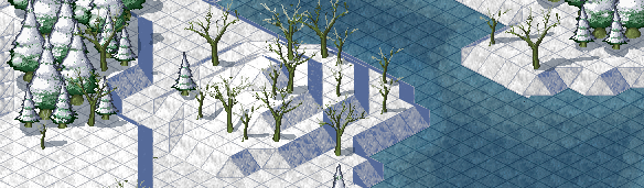 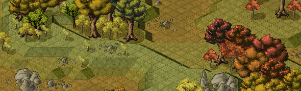 MikeJF posted:You're making Roller Coaster Tycoon 1.5? Nothing quite so grand, but it should be pretty cool when finished. McKilligan fucked around with this message at 14:49 on Feb 4, 2013 |
|
#
?
Feb 4, 2013 08:35
|
|

|
You're making Roller Coaster Tycoon 1.5?
|
|
#
?
Feb 4, 2013 10:20
|
|


|
Is there some reason most people use such tiny sprites instead of something like bigger like a fighting game (SF3, Guilty Gear, etc)? More trouble than it's worth?
|
|
#
?
Feb 4, 2013 16:16
|
|

|
JellyLOL posted:Is there some reason most people use such tiny sprites instead of something like bigger like a fighting game (SF3, Guilty Gear, etc)? More trouble than it's worth? That depends on the space. Most fighting games have bigger spaces and dimensions to work with. Games like FF or platformers really dont' benefit with huge sprites at all.
|
|
#
?
Feb 4, 2013 19:51
|
|
|
Yeah, in fighting games you're really only looking at two giant sprites the entire game--the rest is just fluff. It makes sense for them to be huge. There's way too much other stuff in platformers to be focusing on.
|
|
#
?
Feb 4, 2013 19:54
|
|
|
Shindragon posted:That depends on the space. Most fighting games have bigger spaces and dimensions to work with. Couldn't you just zoom out further? The game only has as much "space" as you give it, right? Or is this a screen resolution thing?
|
|
#
?
Feb 4, 2013 20:17
|
|
|
JellyLOL: Drawing large, detailed sprites, especially animated ones, is extremely labor-intensive. Small sprites, on the other hand, can be done relatively quickly. I often go for pixel-art in my games because a "retro" look provides a consistent and visually pleasing aesthetic which is feasible within the limits of time and skill available for my projects. It's important to strike a balance between "as good as I can possibly make this look" and "I can do the whole game in this style without spending a decade working on it", especially when you are the sole developer. There are also sometimes technical limitations. Large animated sprites can eat up a fairly surprising amount of video RAM despite being "lower tech" than 3D.
|
|
#
?
Feb 4, 2013 20:43
|
|
|
Some games will zoom in and out on pixel objects. But when I think of that, I think of, like, the jet bike racing sequence in Chrono Trigger. The "cell size" of objects becomes inconsistent. It's ugly. It's good to think about the base resolution of your game window and how much of it a single object is supposed to take up before you draw anything. If you need it the character at a different size after that, say, for an world map screen in an RPG, you should redraw it instead of shrinking it down. Pixel art tends to look gross when you fuss with the camera. It's easier for someone inexperienced with pixel art to make something cool if they make it as big as they want without worrying about constraint, but unless it's a giant boss enemy it's probably too big for the game window. And large pixel art at, say, 12 frames per second, is going to look a lot choppier than tiny stuff at the same framerate. The workload is also a nightmare.
|
|
#
?
Feb 4, 2013 20:54
|
|

|
There is a reason why games like Street Fighter 3rd Strike or KOF take a long time to come out. Sprite animation takes a loooooong time to do. Hell that walk cycle I did took about half a day or two. And that's a small sprite. Also to add, yeah making big pixel characters is not really a benefit at all when doing platformers. Too much labor for a platformer. You might call me lazy but I'm the artist who does the animation and the level design. And size does have a factor. You have more rules to follow once you have bigger sprites, like the stance, the animation, etc. Small sprites do have rules but it's a smaller list compared to huge sprites. I enjoy doing pixel art because it's a good test limit on what you can as an artist. A limited color palette and restrictions make this a really fun and exciting thing to do as an artist/animator. I don't necessarily do it for the "retro" design but I do enjoy the chiptunes more than anything. Shindragon fucked around with this message at 21:37 on Feb 4, 2013 |
|
#
?
Feb 4, 2013 21:35
|
|
|
Shindragon posted:There is a reason why games like Street Fighter 3rd Strike or KOF take a long time to come out. Sprite animation takes a loooooong time to do. Just to add to this, the sprite process for KOF XII took so long that it actually caused the released game to be incomplete (honestly the game should've never been released), but they made up for it in XIII. Especially since the things they were doing with the sprites hadn't been doing in any fighter before (rending in 3d then back to 2d, dynamic lighting). A single character, from start to finish, takes about 16 months. http://kofaniv.snkplaymore.co.jp/english/info/15th_anniv/2d_dot/creation/index.php It delves into the process and if you hop into the gallery you can see some of animations and play them frame-by-frame. While the video below expands upon the process as well. https://www.youtube.com/watch?v=Re-MX_TJFg4 Admittedly Nona isn't my favorite artist, but what they managed to achieve is nothing short of amazing.
|
|
#
?
Feb 4, 2013 22:23
|
|
|
I just started trying pixel art in the last week or two, and have been working on this game mockup for a couple days. It's pretty simplistic, but I'm fairly happy with it so far. I'm really having trouble with these cliffs, though. For some reason, I can't get the colors quite right.   The tiles:   Any tips or criticism would be really appreciated.
|
|
#
?
Feb 16, 2013 23:03
|
|

|
I'm not sure if it's universally known, but if you ever find yourself resizing pixel images in Photoshop, select Nearest Neighbour as the Resample Image method and it'll keep everything nice and crisp.
|
|
#
?
Feb 16, 2013 23:41
|
|
|
gredgie posted:I'm not sure if it's universally known, but if you ever find yourself resizing pixel images in Photoshop, select Nearest Neighbour as the Resample Image method and it'll keep everything nice and crisp. I used the "none" setting in GIMP, and I thought the resizes looked okay. Is there something I'm not noticing?
|
|
#
?
Feb 16, 2013 23:51
|
|
|
Not sure then, it could just be my colour blindness making things look fuzzier than they actually are :P
|
|
#
?
Feb 17, 2013 23:21
|
|
|
Sounds like "None" is just the GIMP term for Nearest Neighbor (Paint.NET also uses the term Nearest Neighbor). You do still want to avoid the ones like bicubic or bilinear, where a pixel bleeds out of its purview and everything gets blurry.
|
|
#
?
Feb 18, 2013 00:13
|
|
|
Ok. I cleaned up the previous sprite I made, because I really didn't like the style and size. I know there's something wrong with the walk cycle, especially the left and right facing walk, but I can't figure out how I can fix it. Any body have suggestions?
|
|
#
?
Feb 22, 2013 12:16
|
|
|
stegoceras posted:Ok. I cleaned up the previous sprite I made, because I really didn't like the style and size. I know there's something wrong with the walk cycle, especially the left and right facing walk, but I can't figure out how I can fix it. Any body have suggestions? I think it's the arms. The walking seems fine. Walking upwards looks a little goofy but not too bad. Also super neat sprite!
|
|
#
?
Feb 22, 2013 15:31
|
|

|
Honestly for such a small sprite with extremely few frames I think it's pretty darn good. Thinking back to old SNES Final Fantasy games, they used animations analogous to this right?
|
|
#
?
Feb 22, 2013 15:42
|
|

|
The legs go forward so much that the dude seems to kick / moonwalk, maybe? I think that with limited animations like that they usually just opt for making the legs go upwards, and the motion of moving forward does the job of making it look like the sprite is walking. I'm no expert though so I might be way wrong. just a thought.
|
|
#
?
Feb 22, 2013 16:01
|
|

|
Maybe it's that his head dips down as his leg kicks out, try reversing that.
|
|
#
?
Feb 22, 2013 18:31
|
|
|
Jewel posted:I think it's the arms. The walking seems fine. Walking upwards looks a little goofy but not too bad. Also super neat sprite! Agreed, it's a great little sprite! Also agreed that it's the arms that are causing the wonkiness. They look like they're bouncing because they're returning to the "stand" position in intermediate frames rather than an intermediate swinging position. I've done a quick edit to demonstrate what I mean: 
|
|
#
?
Feb 22, 2013 19:55
|
|

|
Besesoth posted:Agreed, it's a great little sprite! Thanks to everyone that replied so quickly. I had a friend also look at it, and he pointed out that the arm bends a lot more when walking to the left/right than it does when walking up or down. I really like the edit you did here, I'm going to try and tweak it a bit more when I get home from work. Thanks everyone! Also I hope it's ok that I post more stuff in here, I don't want to clog the thread with my questions but it gets so little traffic anyways... stegoceras fucked around with this message at 21:28 on Feb 22, 2013 |
|
#
?
Feb 22, 2013 21:17
|
|
|
I don't know if this really counts but I used to love drawing pixel by pixel in paint. Sometimes I would draw something on paper and then color it one pixel at a time. I ended up making a simple sprite for a byond game I used to play. The main sprite being 8-bit I think (I can't remember what the battle sprite was)   I would love to get back in to pixel art but the new MS paint really turns me off... e: vv Whoops, I'm an idiot. I forgot to check when I got them off my image host. Unfortunately I lost my originals a couple re-formats ago 
Lunimeow fucked around with this message at 21:31 on Mar 6, 2013 |
|
#
?
Mar 6, 2013 20:52
|
|

|
Don't save pixel art as a jpg.
|
|
#
?
Mar 6, 2013 21:02
|
|

|
If you don't like MS Paint, try Pyxel Edit.
Scut fucked around with this message at 06:22 on Mar 9, 2013 |
|
#
?
Mar 9, 2013 06:16
|
|
|
Don't save as .bmp either, most image hosts jpeggerise them. Pixelling with a tablet is an interesting experience! 
|
|
#
?
Mar 13, 2013 10:42
|
|

|
Exclamation Marx posted:Don't save as .bmp either, most image hosts jpeggerise them. Really nice. What tablet/app combo did you use to achieve create it?
|
|
#
?
Mar 13, 2013 14:29
|
|
|
So I'm trying to be more creative in 2013, so here is an attempt at pixel art. I'm sure it contains several newbie mistakes.
|
|
#
?
Mar 15, 2013 02:43
|
|
|
I am far from a pixel professional, but the Dynamars mockups look like an unreleased Virtual Boy game. I loved the Virtual Boy back in the day, so it kinda triggered some nostalgia. Just putting my two cents in.
|
|
#
?
Mar 16, 2013 19:47
|
|

|
Oh man some lovely lovely things in this thread. I don't know the first thing about the rules of game sprites but I do find drawing tiny, tiny people pretty relaxing after a week of ZBrushing:  I'd love to pursue this and make something cool 
|
|
#
?
Mar 16, 2013 20:21
|
|

|
Those are great!
|
|
#
?
Mar 16, 2013 20:26
|
|
|

|
| # ? Apr 27, 2024 20:26 |
|
|
Zvezda: Really nice stuff! you should try putting together a point-and-click adventure or something. If I was going to criticize anything it would be that using a large number of subtly different colors makes things look a little muddy- those characters probably wouldn't stand out well against a similarly detailed background. Try restricting your pallette a bit or using contrasting colors to provide a sharper silhouette.
|
|
#
?
Mar 16, 2013 20:31
|
|