


|
Scut posted:Here's a timelapse of some work I did recently for an indie dev. The music isn't my choice, but I thought you folks might like to see some of my process. Do you decide your shading in the planning phase (pencil & paper) or after you draw on the screen? It looks pretty. Also if you are using Open Source software you might be interested in Krita painting program. It works on Windows now and they've been doing a funding campaign to improve it even more. They have an edition called Krita Gemini which you can buy on Steam that has better tablet integration if that's your thing.
|
 #
?
Jul 18, 2014 01:01
#
?
Jul 18, 2014 01:01
|
|


|

|
| # ? Apr 27, 2024 16:49 |
|
|
Chipp Zanuff posted:Is this for a game? I really liked the palette on it and how you dealt with windows and their reflections. I don't know if i could work that fast or finish anything in one session :S Yeah it's for a game called Temporus that unfortunately looks like it won't meet its kickstarter goal. The dev is really motivated to finish so he'll be fine but he would have completed the project much faster if the campaign had met its goal. As for the session speed, that video compresses 3 hours into 7 minutes. Not bad but I'd love to be faster! Chip, I think your sprite animation is looking smoother btw. Just draw, you've hit a new level and should worry less about nitpick details now. Shinku ABOOKEN posted:Do you decide your shading in the planning phase (pencil & paper) or after you draw on the screen? It looks pretty. I mostly draw from scratch right on the screen. When I'm going for speed I try to block out rough shapes using my mid-tones then start refining silhouettes and then I push in highlights alternating with shadow. Once I have my forms blocked out I go into smaller details and complete them in the same manner as the larger forms (lay the silhouette, add shadow and highlight). I've seen Krita and it looks great as a Painter alternative. Honestly though for pixel art, I still use Gimp more than anything. It's not optimized for pixel art but it does a little bit of EVERYTHING. Pyxel Edit is really shaping up and I hope the devs keep on it. It's the most promising pixel-dedicated tool I've used so far.
|
|
#
?
Jul 18, 2014 01:28
|
|

|
My previous post was all words and no pictures. Let me rectify that with this unfinished chibi motorcyclist:
|
|
#
?
Jul 18, 2014 02:56
|
|
|
Chipp Zanuff posted:Reminds me of Final Fantasy Tactics Advance! This would be so cool to use in a tactical rpg. Just an update on this, since i was updating the two-handed attack: 
Ash Crimson fucked around with this message at 15:33 on Jul 18, 2014 |
|
#
?
Jul 18, 2014 15:28
|
|


|
Chipp Zanuff posted:Just an update on this, since i was updating the two-handed attack: The sword swing looks really slow for some reason and doesn't match the slash. It looks like you have a frame during the slash where the sword points northeast? Try getting rid of just that frame and it might speed up the swing so the slash looks realistic.
|
|
#
?
Jul 18, 2014 15:35
|
|


|
poemdexter posted:The sword swing looks really slow for some reason and doesn't match the slash. It looks like you have a frame during the slash where the sword points northeast? Try getting rid of just that frame and it might speed up the swing so the slash looks realistic. Thanks for the advice! I tried removing it, but it looked too sudden for me, so i sped up the 2nd slash frame, hopefully it doesn't look too slow: 
|
|
#
?
Jul 18, 2014 15:48
|
|
|
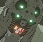
     A second player for Cybershark, a Crocodile Skink woman!
|
|
#
?
Jul 18, 2014 19:41
|
|

|
Shoehead posted:
hubba hubba!
|
|
#
?
Jul 18, 2014 20:01
|
|
|
Chipp Zanuff posted:Thanks for the advice! I tried removing it, but it looked too sudden for me, so i sped up the 2nd slash frame, hopefully it doesn't look too slow: Hey that looks a ton better! Shoehead posted:
All of this owns. Is that a punch combo I see?
|
|
#
?
Jul 18, 2014 20:46
|
|
|
poemdexter posted:Hey that looks a ton better! Yeah I sent it to you on like Tuesday!
|
|
#
?
Jul 18, 2014 21:04
|
|
|
Shoehead posted:Yeah I sent it to you on like Tuesday! Ahhhhhh I missed it. You draw too fast. Guess I'll post our little friend in action: 
|
|
#
?
Jul 18, 2014 21:46
|
|
|
In my continuing efforts to update my attack animations so they're consistant i've gone back to the spear thrust. Here's a before and after: Before (last un-edited version)  After:  I am worried that it doesn't have the same impact as before, but i wanted to solve the issue of the awkward jump and keep it consistant. I didn't add the "lean back on one leg" thing that i did with previous animations, as i assume that is appropiate for when you're trying to do a slashing attack, rather than a piercing one? If not, just say and i will make changes. Shoehead + Poemdexter: You making a game together? Ash Crimson fucked around with this message at 23:16 on Jul 18, 2014 |
|
#
?
Jul 18, 2014 23:13
|
|
|
poemdexter posted:Ahhhhhh I missed it. You draw too fast. Guess I'll post our little friend in action: Oh that reminds me I really should redo that red footpath to match the perspective. I wonder if other cities other than mine do that with footpaths and pedestrian areas? Chipp Zanuff posted:
Heck yeah.
|
|
#
?
Jul 19, 2014 10:38
|
|
|
Shoehead posted:Oh that reminds me I really should redo that red footpath to match the perspective. I wonder if other cities other than mine do that with footpaths and pedestrian areas? Cool! The size of it makes me think it's for an ios-like device? Updated the spear attack because i fear that it lacked impact and the build up was way too short: 
|
|
#
?
Jul 19, 2014 15:41
|
|
|
Chipp Zanuff posted:Cool! The size of it makes me think it's for an ios-like device? PC/Arcade Cabinet/Possibly XBone if I feel like hassling ID@XBox finally.
|
|
#
?
Jul 19, 2014 22:15
|
|
|
poemdexter posted:PC/Arcade Cabinet/Possibly XBone if I feel like hassling ID@XBox finally. Hassle the poo poo out of them, that other job I told you about fell through I got lots of time to work on CYBERSHARK PUNCHER
|
|
#
?
Jul 19, 2014 22:32
|
|
|
Shoehead posted:Hassle the poo poo out of them, that other job I told you about fell through I got lots of time to work on CYBERSHARK PUNCHER YES YES YES YES YES. I thought it was funny that my dropbox was constantly updating.
|
|
#
?
Jul 20, 2014 00:42
|
|
|
 I just realised that I hosed up the perspective... After an hour.
|
|
#
?
Jul 20, 2014 02:33
|
|
|
gently caress up the perspective... or an unwitting tribute to a recent blockbuster movie?  
|
|
#
?
Jul 20, 2014 06:43
|
|

|
  E: Oh wow I missed a bunch of stray pixels. Oh well. Humboldt Squid fucked around with this message at 09:53 on Jul 20, 2014 |
|
#
?
Jul 20, 2014 07:45
|
|

|
So I was thinking of doing a CYOA game on the forums and this is what I have so far. It's not much, but it's a start. edit: made it 2x because it was looking a little small Mom with a blog fucked around with this message at 14:41 on Jul 20, 2014 |
|
#
?
Jul 20, 2014 12:44
|
|
|
Humboldt Squid posted:
For such a low amount of colours (9 in total i think?) it looks really good! The only thing I'd say is possibly make the highlight colour on the letters stand out a bit more? It sort of blends in with the middle colour, but that's just my opinion. A bit burnt out from animating (I was finding it more of a chore than something i actually enjoyed) so decided to give animating a rest for now whilst back to my bigger bases that i left behind sometime ago and see if i can improve on them with what i've learnt, here's a small update (Increased in size by X2 just in case it's difficult to see):  (Original in blue, edit in various shades) I'm sort of wanting it to be a bigger, yet more detailed version of the smaller ones i did, but that may not be possible nor practical. I'm also unsure about : The chest; i tried making it asymmetrical as i was given advice on another forum to do that to for this perspective. I am unsure if it works and i am still unsure about it in general. The arms; i don't want them to look straight and boring but at the same time i don't want them to look unnaturally curved. Also not sure if the hands work.
|
|
#
?
Jul 20, 2014 13:07
|
|
|
I redid a lot of the environments from my last post, making sure they're all using the same level of slant for the perspective and going for a consistent top down perspective for anything not touching the wall.    I'm kind of iffy about the teacher's desk since the long part of it that's slanted isn't touching the wall, but I think it's close enough to the wall that such a long object would look really distracting if it was purely top-down. I'm probably going to re-do the couch and the TV in the living room because now that I look at it they're pretty out of place with the stricter perspective. Also how about the wood panels on the living room floor? Is the perspective effect jarring with the furniture or should I leave it in?
|
|
#
?
Jul 20, 2014 14:58
|
|


|
I too am having perspective woes...
|
|
#
?
Jul 20, 2014 15:20
|
|
|
Shoehead posted:I too am having perspective woes...  MikeJF fucked around with this message at 15:49 on Jul 20, 2014 |
|
#
?
Jul 20, 2014 15:44
|
|


|
Woah! Such a simple and easy solution yet it works. A further (small) update:  I feel like im running back into the problems i had with the chest last time; although i liked the solution in the original i still feel it looks flat and uninteresting. I guess this is my attempt to "fix" it but then I'm faced with the matter of all the muscle and bone detail being difficult to read, not complying with the perspective of the chest, basically reading as noise and as well as the added issue of it being such a small canvas to work on as well. I guess i am worried that if i don't make it clear that it's a chest with the muscles and bones showing it won't read as such. This is probably a dumb question, but is it worth going for the "shaded" option (implying muscles through shading as well as chest like in the original) rather than just putting in the lines and hoping they resemble a chest? I'm still having issues with it, especially since the chest isn't supposed to be symmetrical and my attempts at shading it so far are guesswork, as well as when i do shade it, it makes the chest look out of odds with the perspective and appear straight-on. I am also wary of simply copying what i did before, as i am worried i won't learn anything, but i still like the original, unedited version. Ideally i would like to make it look similar to the smaller ones, whilst keeping what i found good about it. Ash Crimson fucked around with this message at 17:56 on Jul 20, 2014 |
|
#
?
Jul 20, 2014 16:32
|
|
|
Chipp Zanuff posted:I feel like im running back into the problems i had with the chest last time Your torso feels to thin/placed wrong compared with your hips/legs. Try it wider and get your pecs off center again: /  Your blue arm should get covered a bit more by your chest anyway to help make it feel less straight-on. If you want to keep the width of your torso as is, move the blue arm and pink leg over to the left a bit.
|
|
#
?
Jul 20, 2014 18:04
|
|

|
westborn posted:Your torso feels to thin/placed wrong compared with your hips/legs. Thanks for the edit! Incorporated it into my current version;  Edited head, changed arm sizes, tried the shading approach.
|
|
#
?
Jul 20, 2014 18:36
|
|
|
Mash posted:So I was thinking of doing a CYOA game on the forums I'm shamelessly advertising this, because it's my first attempt and this and yeah. http://forums.somethingawful.com/showthread.php?threadid=3652022&userid=0&perpage=40&pagenumber=1 Done for today, but have a look!
|
|
#
?
Jul 20, 2014 21:58
|
|
|
Mash posted:I'm shamelessly advertising this, because it's my first attempt and this and yeah. Looking good! Another small update with two edits: changed chest and feet in the first one but in the second one kept them relatively the same  Worried that i might be messing the perspective up
|
|
#
?
Jul 20, 2014 23:57
|
|
|
Re: Perspective: I made an isometric game!
|
|
#
?
Jul 21, 2014 01:30
|
|

|
Tight animation, Chaos Engine! I guess this was the result of your Battletoads research?
|
|
#
?
Jul 21, 2014 01:42
|
|
|
Scut posted:Tight animation, Chaos Engine! I guess this was the result of your Battletoads research? Biker Mice! Only realised afterwards that I did that, but looking back, definitely. Expanding on the concept more thoroughly now (iOS maybe) and I definitely have a VGmaps tab open. Also congrats dude!
|
|
#
?
Jul 21, 2014 01:53
|
|
|
poo poo! Yeah it was Bikermice. Crazy good iso-art.
|
|
#
?
Jul 21, 2014 02:25
|
|
|
Chipp Zanuff posted:Looking good! Another update! Sorry that it's not really a major one, but im trying to get it to look right.  Made the legs slightly thinner, since they seemed out of proportion to the body and thinned the waist. I guess the reason i am going back to this is because i pretty much suck at anatomy and my best bet is to practice. It'd also be good to one day make bigger characters and possibly even animate them.
|
|
#
?
Jul 21, 2014 16:26
|
|
|
I reworked an old logo today
|
|
#
?
Jul 21, 2014 17:43
|
|
|
Chipp Zanuff posted:Another update! Sorry that it's not really a major one, but im trying to get it to look right. First off: It's been great watching your progress over the past few weeks. You've come a long way in a very short amount of time, and it's quite apparent that you're willing to really work hard to improve your art. With that in mind, I'd take a look at something like this: http://www.posemaniacs.com/archives/583 and make a few character poses based off some of those. A few things that pop out right away when looking at your characters: - The limbs look super skinny - Lack of muscle definition These two things make your characters look quite androgynous. Don't be afraid to exaggerate differences a bit. If it's a male character, give it a bit of extra muscle in the biceps, triceps, lats, quads, deltoids, and calves. If they're nude, you'll want to include more definition in the pecs and abdominals as well.
|
|
#
?
Jul 21, 2014 18:10
|
|

|
Gearman posted:First off: It's been great watching your progress over the past few weeks. You've come a long way in a very short amount of time, and it's quite apparent that you're willing to really work hard to improve your art. Thanks for the link! I appreciate it. I guess my main problem is translating what i see in anatomy books to the screen. In my first edit: Notice my attempts at putting in the muscle + bone lines and how bad it looks (to me at least). I've tried putting in the knee caps in the latest edit but i am constrained by the size of the character itself. I guess that's where my problem truly lies; fitting in the detail but ensuring it reads as muscles or bone lines, rather than just noise. Ash Crimson fucked around with this message at 20:21 on Jul 21, 2014 |
|
#
?
Jul 21, 2014 18:51
|
|
|
No problem. Honestly, I'd do what you did with the animations earlier, and just trace over a few images with your pixellated style instead. Don't worry about smaller details for now like knee caps and nipples, just worry about getting the correct proportions and large shapes in place first. Even if you want to make your characters stylized (with larger heads or longer legs or what have you) it's important that you know what a properly proportioned human is supposed to look like. Also, I'd work much larger, at least for your anatomy exercises. It's much easier to identify problem areas, and it'll give you more room to work with. You can always scale it down later and have a good guide to work from for your final frames.
|
|
#
?
Jul 21, 2014 20:19
|
|
|

|
| # ? Apr 27, 2024 16:49 |
|
|
Gearman posted:No problem. Honestly, I'd do what you did with the animations earlier, and just trace over a few images with your pixellated style instead. Don't worry about smaller details for now like knee caps and nipples, just worry about getting the correct proportions and large shapes in place first. Even if you want to make your characters stylized (with larger heads or longer legs or what have you) it's important that you know what a properly proportioned human is supposed to look like. Thanks! I'll definitely start doing that! Another edit; I mainly focused on legs this time: Broadened them, made the calves more prominent and basically tried to make them look more like legs. I also broadened shoulders, changed feet and made arms less thin.  I'm currently using this book for help with proportions, since i found it easy to understand: http://www.amazon.co.uk/Figure-Human-Proportions-Christopher-Hart/dp/1936096730
|
|
#
?
Jul 21, 2014 20:23
|
|