


|
Well, I gave it a go...
|
 #
?
Feb 10, 2015 07:01
#
?
Feb 10, 2015 07:01
|
|

|

|
| # ? Apr 28, 2024 04:42 |
|
|
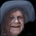
Aneurexorcyst posted:Well, I gave it a go...  That's just great. I think you've managed to capture the vibe from the game very well. That's just great. I think you've managed to capture the vibe from the game very well.Sophism posted:What that means is that I require two sprite sheets so I can have both sets of armor reflect on the character's appearance. So here's the two versions of armor I'm thinking of going with. I tried to keep some elements from the skimpy original, to try to illustrate that the second version is an upgrade. I just need to settle on a design so that I can work on the more interesting animation cycles. I'm already afraid I made the armor too ornate for that Valis/Phantasy Star vibe.  I'm not sure I'm happy with the way the breastplate is moving though. I tried to make it look like a looser, secondary layer of metal, but it kind of looks like it's jiggling. Ruby Prism fucked around with this message at 12:02 on Feb 10, 2015 |
|
#
?
Feb 10, 2015 11:58
|
|

|
Sophism posted:
I think part of the reason it looks off is that when the breastplate animates, it seems to swivel with her right shoulder and ignore her left. If it's loosely bound to the rest of the armor, you should consider where it's connected. Most likely it'd be resting on her shoulders so the whole thing might tilt up when she raises an arm but it wouldn't dip below where it's resting on the other shoulder. You may also be able to make it look a bit less jiggly by flattening the shading a bit to make the metal plates appear flatter.
|
|
#
?
Feb 10, 2015 15:15
|
|
|
Invisible Ted posted:That looks so much better! So what it looks like to me is that you've grouped up the dithered pixels into aforementioned clusters, just so I'm understanding. It also looks like you did away with the outline, which I also think makes it look much better, but I was also wondering what situations that outline works in and when should I skip it? For the most part you can do away with an outline if the thing you are outlining is just as thick, or nearly as thick as the outline itself. It's related to the whole 'banding' thing which a lot of pixel artists get huffy about. The way I see it, you want to 'break the grid' by not having identical strips of pixels right next to each other. This also relates to clustering.
|
|
#
?
Feb 10, 2015 18:15
|
|

|
 Blood Dragon.
|
|
#
?
Feb 12, 2015 07:25
|
|
|
 palette good? haven't messed with something like this before
|
|
#
?
Feb 13, 2015 00:07
|
|

|
You could probably do away with the light yellow and just use the teal instead.
|
|
#
?
Feb 13, 2015 03:00
|
|
|

|
|
#
?
Feb 13, 2015 03:03
|
|
|

|
|
#
?
Feb 13, 2015 21:43
|
|

|
Aneurexorcyst posted:
Is good but needs more giant lasers.
|
|
#
?
Feb 13, 2015 22:12
|
|

|
Cool
|
|
#
?
Feb 14, 2015 06:59
|
|

|
sounds like he'd say unghh all the time
|
|
#
?
Feb 14, 2015 14:30
|
|

|
Aneurexorcyst posted:
minus  = = Here's an idea for the thread: sprite mash ups.
|
|
#
?
Feb 14, 2015 15:36
|
|

|
I frikkin love that goofy face.
|
|
#
?
Feb 14, 2015 15:38
|
|
|
Shinku ABOOKEN posted:plus This made my night 
|
|
#
?
Feb 15, 2015 02:52
|
|
|
Wanna get drunk and ride this thing.
|
|
#
?
Feb 15, 2015 04:46
|
|

|
I'm ready, spirit animal
|
|
#
?
Feb 15, 2015 20:43
|
|
|
Holy gently caress, that thing is magestic. New big pillars for my super nintendo thing, which may be too detailed for the style but probably not 
|
|
#
?
Feb 15, 2015 21:58
|
|

|
Muh pixel daily...
|
|
#
?
Feb 17, 2015 07:13
|
|
|
 Redid a base, is his head too big?
|
|
#
?
Feb 17, 2015 08:56
|
|

|
Shoehead posted:
The head is only too big if you feel like it is, if everyone looks the same then it won't even matter. That affords you the luxury of facial expressions without resorting to subpixel animating. On another note I like the arms a lot more. Do you have a particular sprite you base your stuff off of or do you just freeball it?
|
|
#
?
Feb 17, 2015 14:36
|
|

|
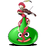
Needed a break from working on the player character, so I decided to start creating some of the enemies. This one looks like it might be a nightmare to animate, but it only really has one idle cycle and a self-destruction animation. (Oh God making that bubble burst will take me a month.  ) ) Anyway, I'm not sure if I need the black outline. I tried some alternatives and didn't care for any of them that much. It still looks out of place for the small bubbles, at least in my eyes. My biggest issue right now is finding a way to make the orb in the middle look like it's half-submerged in the slime body, while the other half is within the larger, thinner bubble. I'm trying to keep it under 16 colors, and I'm currently at 13 counting the alpha. Ruby Prism fucked around with this message at 18:37 on Feb 17, 2015 |
|
#
?
Feb 17, 2015 17:14
|
|
|
FraudulentEconomics posted:The head is only too big if you feel like it is, if everyone looks the same then it won't even matter. That affords you the luxury of facial expressions without resorting to subpixel animating. I eyeball everything, to my loss TBH. 
|
|
#
?
Feb 19, 2015 06:52
|
|
|
Shoehead posted:I eyeball everything, to my loss TBH. How do you get the pixels into the syringe?  quote:This looks great, although I wonder if it's bouncing a little too much. I feel like the legs aren't straightening enough to produce such an exaggerated lift in the rest of the body. (I could be wrong, though!)
|
|
#
?
Feb 19, 2015 12:13
|
|

|
Did anyone here get involved with the Pixel-Logic Indiegogo campaign at the tail end of last year? I've been looking into making my own stuff for some game development I do as a hobby and I'm curious how it was received here. On a related note, is there an ongoing gamedev forum or thread? I don't hang out here too often and I haven't been able to locate one so far.
|
|
#
?
Feb 19, 2015 16:33
|
|


|
Warbird posted:On a related note, is there an ongoing gamedev forum or thread? I don't hang out here too often and I haven't been able to locate one so far. Yup, there's a thread, and it's right here.
|
|
#
?
Feb 19, 2015 17:12
|
|

|
Must have cruised right past that one and not noticed. Thanks man.
|
|
#
?
Feb 19, 2015 17:38
|
|
|
Shoehead posted:I eyeball everything, to my loss TBH. The green arm looks like its too long to me. Otherwise I like it, even though the other one as a placeholder looked like some sort of silly legoman.
|
|
#
?
Feb 19, 2015 20:09
|
|


|
Jyrraeth posted:The green arm looks like its too long to me. Otherwise I like it, even though the other one as a placeholder looked like some sort of silly legoman. It definitely is!     Shoehead fucked around with this message at 17:54 on Feb 20, 2015 |
|
#
?
Feb 20, 2015 17:00
|
|
|
Shoehead posted:It definitely is! Holy crap that shark. Whoa.
|
|
#
?
Feb 20, 2015 17:11
|
|


|
I've been thinking about what's been bugging me about these, and I think it's the stiff, upright torso.
|
|
#
?
Feb 20, 2015 17:51
|
|
|
poemdexter posted:Holy crap that shark. Whoa. He's gonna kick butt eventually! Edit: Oh yeah I should post these     wayfinder posted:I've been thinking about what's been bugging me about these, and I think it's the stiff, upright torso. Yeah I gotta add some sort of squish or swing to it
|
|
#
?
Feb 20, 2015 17:55
|
|
|
Blast from the 6 month past. Are you going to revisit all the animations Shoehead?
|
|
#
?
Feb 20, 2015 18:20
|
|
|
poemdexter posted:Blast from the 6 month past. Well yeah I'll have to if the sprites are bigger probably in my spare time in between my regular job and the kickstarter stuff.
|
|
#
?
Feb 20, 2015 19:46
|
|
|
I'm glad he's gotten bigger so you can see his sharkiness more, you kinda lost that in the smallest one.
|
|
#
?
Feb 21, 2015 02:02
|
|


|
Fellow goon and rad animator DicktheCat did the wireframe/colorblocking - I did the detailing. Longest animation in the game. Wheeew.
|
|
#
?
Feb 21, 2015 18:42
|
|
|
 I'm pretty happy with the movement atm but I'm thinking the purple leg needs to be pushed out farther
|
|
#
?
Feb 22, 2015 04:13
|
|
|
I think the problem with the purple leg is the lower leg/calf/foot looks backwards or twisted, and I can't quite figure out where the knee is supposed to be. If I'm reading the red leg correctly I think the calves are slightly too short compared to the thighs.
|
|
#
?
Feb 22, 2015 09:58
|
|

|
Gaspy Conana posted:Fellow goon and rad animator DicktheCat did the wireframe/colorblocking - I did the detailing. Longest animation in the game. Wheeew. Seeing this makes me wonder why more traditional animation grads don't make games instead of short films. Their talents would probably reach a wider audience and they can still be as crazy as they want.
|
|
#
?
Feb 22, 2015 16:03
|
|
|

|
| # ? Apr 28, 2024 04:42 |
|
|
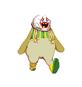
the clown dosn't look like it's tripping at all
|
|
#
?
Feb 22, 2015 16:38
|
|

