


|
wayfinder posted:A very interesting article! (follow the links too) I think this is kind of bad. You don't need to be this servile and desperate for approval for any reason, even to make money. The bits about rules in the pixel art scene and metacritic scores make me think that the guy has internalized like 3 different incompatible sets of values and is driving himself crazy trying to conform to all of them.
|
 #
?
May 18, 2015 00:50
#
?
May 18, 2015 00:50
|
|

|

|
| # ? Apr 27, 2024 14:53 |
|
|
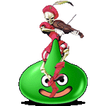
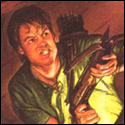
Supernorn posted:Yeah it's trying so hard to not be pixel art that they might as well not bother. Those gradients on the interface..The whole game looks like a confused, noisy mess. There are some really nice art assets to be sure (I love the jester guy sprite, especially its animation), but it feels like they're all from different games. It reminds me of people who get overly caught up in details when drawing, making a 40 hour life drawing and ending up with every part that they focus on being really well drawn (nose, eyes, arm muscles, etc) but with no regard to each part's consistency with the overall picture.
|
|
#
?
May 18, 2015 03:29
|
|

|
a hole-y ghost posted:Well, and it's not just because of that. The art direction in the game is kinda inconsistent in just about every way, from what I've seen in gameplay videos. Yeah, dude is technically skilled but he doesn't seem to have the right eye for game art. The splash screen at the top could have had a third of the time spent on it and it would barely look any different, and consistency rules all unless you have a really good reason for breaking it.
|
|
#
?
May 18, 2015 07:28
|
|

|
Red Mike posted:I think the reason why it falls so flat for me is that, for example, it's doing dithering on nearly everything, but because it's dithering with huge pixels and huge gaps, it looks wrong. There's no way that dithering's going to actually show you a different shade like it's meant to, you're just gonna see the pattern itself.
|
|
#
?
May 18, 2015 09:57
|
|

|
 Did most of this on a lovely win8 tablet last night while watching wrasslin.
|
|
#
?
May 18, 2015 13:09
|
|

|
This thread has way too much cool and good stuff. Time to poo poo it up! I am a complete beginner at art and animation in general, but have been messing with pixel art for a little while. Just grasping the basics of animation has been a handful. Made this yesterday, started with a two frame animation as my first attempt:  It looks too much like he's skipping and the illusion of each foot coming forward separately doesn't work. Decided to try a four frame animation and ended with this:  I'm not too keen on it but it's way better than my previous attempts at four frame walking. Been playing Dragon Quest IV, so I made this just to practice animating a bit:  This was then my first attempt at animating some time ago, using the Final Fantasy sprites as a base:    The idea for this game is to switch between top down rpg and platformer, Gargoyle's Quest style. Here are some very rough stuff I did a while back, with Link's Awakening as inspiration:  This was my first attempt at a tileset.   Skeletons like to dance and party.  
|
|
#
?
May 21, 2015 00:08
|
|
|
You should resize it without blurring the pixels. If you're using photoshop, this tutorial shows how.
|
|
#
?
May 21, 2015 01:23
|
|

|
Tunicate posted:You should resize it without blurring the pixels. Thanks! I had no idea how to do this in a better way.
|
|
#
?
May 21, 2015 17:21
|
|
|
Bout to dump all over this thread. Faaartt 
|
|
#
?
May 24, 2015 22:54
|
|
|
I know this isn't what it is but I would totally play a game about clownfighting.
|
|
#
?
May 25, 2015 09:47
|
|


|
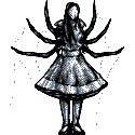
I've been working through a pile of ideations for player tokens. Here's most of my worksheet. I progressed roughly right to left. I wanted the player represented in a manner that made her/him larger than an average enemy for visual clarity, as well as a way to give more space for drawing details later like facial expressions and equipment. I put a star next to what I feel reasonably satisfied with. Bear in mind it's more of a maquette for scale / lighting / proportion and not a fleshed out character.
|
|
#
?
May 25, 2015 21:01
|
|

|
wayfinder posted:A very interesting article! (follow the links too) This article has been everywhere lately, geez. Overall it has its heart in the right place, but I can't say I agree with all of it. (I'm not sure why he expects so much from IGN reviews) I agree that KOF XIII had some of the best sprites in recent memory, for sure. SupSuper posted:I'd take this with a grain of salt since Dino Farm Games has an ugly history. Pik fucked around with this message at 15:40 on May 28, 2015 |
|
#
?
May 28, 2015 15:27
|
|

|
Scut posted:I've been working through a pile of ideations for player tokens. Here's most of my worksheet. I progressed roughly right to left. I wanted the player represented in a manner that made her/him larger than an average enemy for visual clarity, as well as a way to give more space for drawing details later like facial expressions and equipment. I put a star next to what I feel reasonably satisfied with. Bear in mind it's more of a maquette for scale / lighting / proportion and not a fleshed out character. I know it's probably not what you want to hear, but they kind of regress the further left you go. The first two rows on the right are the only ones that actually look like they're in perspective, the further you get leftwise the more they look like they're struggling to stay on a surfboard. When you get to the starred figure, they're drawn basically head-on. I actually really like the top-left of the dummy-style models on the far right because it actually looks like a simple figurine you'd see in a tabletop game, but if you need more detail I'd definitely go back to one of the other three that are around it (though you could bring their left legs in a little). They have more character and personality than any of the others there save for a few in the middle, I'm sorry to say.
|
|
#
?
May 28, 2015 16:47
|
|


|
I'm partial to the blocky one on the right side of the image, it's the most stylized.
|
|
#
?
May 28, 2015 20:44
|
|
|
I'll just shift the blame onto The Chaos Engine as he nixed the steeper perspective on the right. Mind you that was when we were imagining this to be a realtime game with lots of animations and now it is headed towards a turn based game that wouldn't need to be so fancy.
|
|
#
?
May 29, 2015 03:16
|
|
|
ill fite u scut  I don't have the time to work on this project so I'm still not sure where I stand on how the maquettes should be designed, but I do know that the stuff scut did looks a lot better when shown on the tiles we've made. I don't really want to make a digital board game, I far prefer the idea of the "pieces" being stuff that couldn't exist as a board game piece.
|
|
#
?
May 29, 2015 13:48
|
|

|

|
|
#
?
May 30, 2015 01:48
|
|
|
Really haven't been pixellin' much lately... maybe it shows ")  (done for the 1 hour game jam) (playable here)
|
|
#
?
May 31, 2015 15:37
|
|
|
I like the use of simple hatch lines for the platforms. The colour border makes me think of VIC-20 games.
|
|
#
?
May 31, 2015 20:47
|
|
|
Aneurexorcyst posted:Really haven't been pixellin' much lately... maybe it shows someone watched the vlambeer talk on game feel
|
|
#
?
Jun 1, 2015 00:23
|
|


|
Cool minimalist aesthetic. Reminds me a bit of one of my old prototypes: 
|
|
#
?
Jun 1, 2015 03:50
|
|

|
oddium posted:someone watched the vlambeer talk on game feel Internet Janitor posted:Cool minimalist aesthetic. Reminds me a bit of one of my old prototypes:  ...I really should finish that update :p Aneurexorcyst fucked around with this message at 07:55 on Jun 1, 2015 |
|
#
?
Jun 1, 2015 07:40
|
|
|
Internet Janitor posted:Cool minimalist aesthetic. Reminds me a bit of one of my old prototypes: Dude this looks so cool! Make this into an arcade game!
|
|
#
?
Jun 1, 2015 16:35
|
|
|
oddium posted:someone watched the vlambeer talk on game feel I still think screen shake is really dumb for every shot. It just looks like the game is shaking around erratically
|
|
#
?
Jun 1, 2015 19:53
|
|

|
zolthorg posted:I still think screen shake is really dumb for every shot. It just looks like the game is shaking around erratically Same. It's really awful in Nuclear Throne. (thank god you can turn it off)
|
|
#
?
Jun 1, 2015 23:45
|
|

|
Scut posted:Dude this looks so cool! Make this into an arcade game! Well, it is at least open source. I suppose I could have a go at rewriting it in JavaScript for easier distribution, but I never felt like the gameplay really clicked.
|
|
#
?
Jun 2, 2015 07:22
|
|
|
 Vroom vroom I'm a Cobra II I immediately decided that I drew this at too low an angle.
|
|
#
?
Jun 2, 2015 12:04
|
|
|
Animating more Starbound stuff. This is for the new shipyard area on the outpost. 
|
|
#
?
Jun 2, 2015 15:46
|
|
|
Looks good out of context. What's the background?
|
|
#
?
Jun 2, 2015 18:56
|
|
|
Love them welding flashes! Okay so I'm brushing my nose gently to the grindstone with these player character concepts. Hopefully these help show what my intent was with the generic maquette design:  I want something that can have distinctive features applied on top. The maquette below can have different faces painted on, as well as adjusted poses but I need this neutral pose as a sort of benchmark.  
|
|
#
?
Jun 3, 2015 03:46
|
|
|
Scut posted:Love them welding flashes! One thing to be on the lookout for are waist tangents (like on the soldier) that can make it look as if the figure were bisected by the tile boundaries of the ground (which in turn can make it feel like stickers on the floor instead of figures in a space, especially with the figures and the ground drawn at different angles)
|
|
#
?
Jun 3, 2015 08:09
|
|
|
Good observation. I'll tweak it some more.
|
|
#
?
Jun 3, 2015 12:34
|
|
|
Scut posted:Love them welding flashes! I feel like there is too much of that green color...the sprite and the background kind of blend together for me
|
|
#
?
Jun 3, 2015 14:16
|
|

|
angel opportunity posted:I feel like there is too much of that green color...the sprite and the background kind of blend together for me Maybe it's camouflage? 
|
|
#
?
Jun 3, 2015 14:28
|
|


|
Have you considered using different subsets of colors for background and foreground? I find it much easier to maintain readability when the limited color count is combined with predefined palettes for sprites and tiles. I generally don't limit myself to a color count for game art unless I'm making graphics for a specific 8-bit system, so that's my masochistic side speaking.
|
|
#
?
Jun 3, 2015 16:12
|
|
|
Jackard posted:Looks good out of context. What's the background? Here's a shot of it placed ingame. Still want to add some lights to the crane section but pretty happy with it so far. 
|
|
#
?
Jun 3, 2015 17:48
|
|
|
I like it. Are you adding any verticality to these premade areas, like platforms on top the buildings and making the crane climbable in some way?
|
|
#
?
Jun 3, 2015 18:56
|
|
|
Hi I'm Shoehead, I have no sense of consistency at all
|
|
#
?
Jun 3, 2015 21:46
|
|
|
Arachne posted:Have you considered using different subsets of colors for background and foreground? I find it much easier to maintain readability when the limited color count is combined with predefined palettes for sprites and tiles. I generally don't limit myself to a color count for game art unless I'm making graphics for a specific 8-bit system, so that's my masochistic side speaking. I have considered that. It would definitely allow me to design a palette that offsets against the background, though I'm not entirely sure it's necessary. I mean, assuming you are looking at the full size image and not the thumbnail, is it /really/ so hard to tell what's a sprite and what's a wall? Another option is to do an outline to make the sprites pop. Anyway I'll play around with an alternate palette and see what Chaos Engine says. I'm definitely not opposed to it from the standpoint of work effort, more that I like the challenge of keeping this project squeezed within some constraints.
|
|
#
?
Jun 3, 2015 21:56
|
|
|

|
| # ? Apr 27, 2024 14:53 |
|
|
I built up a companion palette for use on sprites. Thematically similar to the base palette but much more saturated with the shadows favouring red. Here are a few tests of it in use with some variants of no sprite outline, a black outline, and a pink outline.
|
|
#
?
Jun 6, 2015 02:56
|
|