|
Fangz posted:like, say Subnormality.
|
 #
?
Jul 7, 2015 19:46
#
?
Jul 7, 2015 19:46
|
|


|

|
| # ? Apr 19, 2024 11:26 |
|
|
For my current project I've started hand lettering on 10 boxes to an inch graph paper. Since the art is intentionally a little rough it fits a lot better than any digital lettering I can think of. But on my superhero pastiche things unless I went all in with a Ames lettering guide it would look super weird. I'll post some pages when I get home if anyone's interested. I'm phone posting at the moment.
|
|
#
?
Jul 7, 2015 19:48
|
|


|
it's almost like there's no one proper way to do things...
|
|
#
?
Jul 7, 2015 19:50
|
|
|
Scribblehatch posted:Good lord, it's like reading magic eye. TBH Subnormality would be fine if it wasn't the length of War And Peace in one comic.
|
|
#
?
Jul 7, 2015 19:52
|
|


|
I would just forgo lettering , add spoken dialogue, maybe some music, and maybe sequence panels to be shown one before the other in the same space, like one panel for every thirtieth or twnty-fourth of a second.
|
|
#
?
Jul 7, 2015 21:05
|
|

|
Drawing comics is the purest suffering so if you're doing digital lettering out of convenience, or if your handwriting is atrocious, or both, I'm sorry but you are required to letter by hand in order to legitimize your work. edit: One loophole you can use to get around this is using particular fonts in Manga Studio 5 and have it consistently cut off the tops of your exclamation points no matter what you do. It's infuriating and you'll never be happy 
Fortis fucked around with this message at 21:13 on Jul 7, 2015 |
|
#
?
Jul 7, 2015 21:10
|
|

|
I did hand lettering for awhile, and I think I really benefited from it. For me, the opposite of Subnormality happened, where I realized how much dialogue I was trying to cram into a page and it really forced me to scale it back. Hand lettering also makes you really aware of how your dialogue is a part of your comic page, not just a separate layer floating on top of it. If you aren't, you really should be planning your dialogue and balloon placement in your thumbnailing stages. Dialogue is the first thing I put in before I move on to inking. I had to switch to a font starting here though, because the more careful inking needed for writing dialogue was causing my arthritis to flare up pretty badly. It's a font made from my handwriting, though, and even though it's all caps, I wrote each letter twice to have some variety in double letters.
|
|
#
?
Jul 7, 2015 22:07
|
|


|
Mercury Hat posted:I did hand lettering for awhile, and I think I really benefited from it. For me, the opposite of Subnormality happened, where I realized how much dialogue I was trying to cram into a page and it really forced me to scale it back. Hand lettering also makes you really aware of how your dialogue is a part of your comic page, not just a separate layer floating on top of it. If you aren't, you really should be planning your dialogue and balloon placement in your thumbnailing stages. Dialogue is the first thing I put in before I move on to inking.
|
|
#
?
Jul 7, 2015 22:12
|
|

|
Yeah, hand lettering isn't an option for me. My handwriting is miserable. Besides, I like the font I've picked - save for the capital G's, it's just what I wanted.
|
|
#
?
Jul 8, 2015 04:36
|
|
|
I've never drawn a comic before and could use a brutal critique from people who know what they're doing. I'm lost and dum. This is the first page of Jeffrassic Park: 
|
|
#
?
Jul 8, 2015 06:22
|
|

|
neonnoodle posted:Not everyone agrees with this dogma, but please hand-letter your comics. Fonts suck. They never kern right and they always look crappy. If you work digitally, you can use type as a guide to help you keep your lettering neat. My hand lettering never kerns right and always looks crappy. HPLovecraft posted:I've never drawn a comic before and could use a brutal critique from people who know what they're doing. I'm lost and dum. The page design is really clean and colorful, I really like it! The main thing that's bringing it down I think is the contents of the panels themselves--they feel kind of inert, and the angles/framing kind of random. It's a long way from unreadable, though. Haledjian fucked around with this message at 19:23 on Jul 8, 2015 |
|
#
?
Jul 8, 2015 19:12
|
|
|
HPLovecraft posted:This is the first page of Jeffrassic Park: Uh how many pages is this joke going to go on for?
|
|
#
?
Jul 8, 2015 19:36
|
|


|
Fangz posted:Uh how many pages is this joke going to go on for? Not sure. It's mostly to make me giggle and for practice. Haledjian posted:
Yeah I think that's where I was at with it too. If you crop out the top half it looks good enough for me to be satisfied with it. The top panels are giving me problems. My background is character and graphic design so character illustration like the blumasaurus is my jeremy jamm. Storytelling is where I need practice. Do you have any suggestions for how I can make it less boring? Should I avoid the weird angles?
|
|
#
?
Jul 8, 2015 20:52
|
|
|
HPLovecraft posted:I've never drawn a comic before and could use a brutal critique from people who know what they're doing. I'm lost and dum. I think the lack of backgrounds and the fairly subdued shadows in most panels really hurt this.
|
|
#
?
Jul 8, 2015 22:14
|
|

|
Here's a hot hand-lettering tip for dumbos like yours truly: use a font, figure out your wording and spacing and when you're happy with all your edits flatten your font layers, drop the opacity and then hand-letter overtop of the font, using it like an Ames guide to keep it level and maintain consistent kerning or whatever. You can use this method to both take advantage of all the conveniences a font offers while also correcting the capital-i having or lacking crossbars within a given font (the sideways-H looking I is only for the pronoun I, and not for general-purpose capital-vowel use).
Reiley fucked around with this message at 02:05 on Jul 9, 2015 |
|
#
?
Jul 9, 2015 02:02
|
|


|
For those who want real high quality fonts, Comicraft is doing a half-off sale during Comic Con. Not as good as their new year's sale, but still a hefty discount.Reiley posted:You can use this method to both take advantage of all the conveniences a font offers while also correcting the capital-i having or lacking crossbars within a given font (the sideways-H looking I is only for the pronoun I, and not for general-purpose capital-vowel use). Any half-decent comic font will have a crossbar and not-crossbar I.
|
|
#
?
Jul 9, 2015 02:08
|
|

|
HPLovecraft posted:I've never drawn a comic before and could use a brutal critique from people who know what they're doing. I'm lost and dum. More please.
|
|
#
?
Jul 9, 2015 03:14
|
|

|
First timer here! I've been doing some silly comics in past, but they have been around one page gags and all. I haven't done anything for few years, but I want to try bit longer formats (at first, like 12 to 20 pages stories) before going full on graphic novel-long ones. However, I loving hate designing the pages. I tend to do the storyboarding on post-it-notes and trying to figure out there how to put on pages, but so far I've been just going through those post-it-notes without getting one single page design done. I know few tricks - like give a reader an argument to read the next page (of course every page doesn't have to end with annoying cliffhanger) and the storytelling layout should guide the reader from the page, but it's pretty slim pickings, when I get the craving to tweak it more and more and more, because they always look so fugly. Is there some more practical tips, guides and/help to actually design the panel lay outs on e page so that they work with the pictures? Or is it just something you have to do and hope for the best?
|
|
#
?
Jul 9, 2015 20:49
|
|
|
To get a little Scott McCloud for a moment: have you experimented with different sized pages and layouts? A comic page doesn't have to fit neatly on an A4 sheet of paper these days (though it's best to keep in mind printing size if that's something you'd want to do). You can try horizontal, rather than vertical, overlap panels, chop up panels, whatever. In my experience, it's much easier to layout a page if I lay it all out at once. What might help is thinking of your page as one big panel, with multiple smaller ones breaking it up. The action on the page flows much the same way as the action in a panel. I do all my layouts digitally these days, for the most part, and I think it's helpful to have multiple pages side by side. 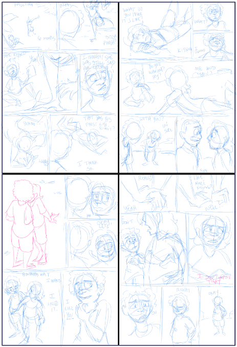 As for where to end a page, you sort of learn that by doing, there's no hard and fast rule. Luckily comics are a pretty fluid medium and you can get away with a lot, just experiment.
|
|
#
?
Jul 9, 2015 22:02
|
|
|
simplyhorribul posted:First timer here! It's something you have to feel out and study because the layout drives the flow of your story. Although I think a good challenge is the format Frank Santoro heralds. There's something to be said about a 4x4 grid of landscape oriented panels and I think 14 pages is an ideal number for a short story format. Here are the entries for 2013 and 2014 to see what other people are creating. Definitely start small and move up. See what kind of story you can create in 3 pages or 8 or anything fewer than 24-32. Think about the mood you want to impart on the reader and how to best accomplish that. More importantly read other comics and study what worked for them and why it affected you in the way it did. Hell, redraw scenes from comics you enjoy with your own characters or whatever. There's really no tip you could understand without both practice and studying.
|
|
#
?
Jul 9, 2015 23:02
|
|

|
Clip Studio Paint (aka Manga Studio) is on sale for the next 5 days. Worth checking out: http://www.clipstudio.net/en
|
|
#
?
Jul 9, 2015 23:15
|
|
|
Divide a page into thirds vertically if you want to talk a lot or divide it into fourths if there's more action than talking. These horizontal lines are your main visual break points and will frame the horizontal spaces around them as strings of moments. Subdivide your rectangles into smaller rectangles. Remember the eye reads from left to right, top to bottom; if you have two subdivisions on top of each other on the left side of the page you're going to need a way to visually convey that you're meant to Z back to the lower panel before your eye goes / up to the top-left corner of the right panel. You can usually do this by ensuring the vertically-stacked panels are wider than they are tall. Take your page, divide, subdivide, tinker as needed. End the page on a moment, to make sure there's a reason for this page existing at all. Pace your pages from moment to moment.
|
|
#
?
Jul 9, 2015 23:23
|
|
|
Mercury Hat posted:Clip Studio Paint (aka Manga Studio) is on sale for the next 5 days. Worth checking out: http://www.clipstudio.net/en Ooh, I was all mopey because I lost my SAI version after my old computer blew up. This seems like a good replacement. Thanks, nerd!
|
|
#
?
Jul 10, 2015 06:32
|
|
|
Mangastudio, Clipstudio, Illuststudio and Sai all have a very similar pool of UI.
|
|
#
?
Jul 10, 2015 08:29
|
|
|
Yeah, but, are there any tips how paneling - the sizing/form of them works? I mean don't get me wrong, I have sketched ton of pages but problem is that I'm rarely happy with them. At all. I've tried rigid page designs (2 by 3 thou, ended up using similar page layouts), going mental with the panel sizes (it almost always ends up with either awkward panel spaces or or completely useless panels), post-it notes (decision fatigue), computer and good ol' pen and paper, A3's with different sized margins, so on. And I have no intrest to finish crappy designs simply because, well, they are poo poo and world need no more lovely pages. I know you should feel how they go, but I'm only feeling when it's poo poo and don't have clue how to fix it up in given space.
|
|
#
?
Jul 10, 2015 11:17
|
|
|
simplyhorribul posted:Yeah, but, are there any tips how paneling - the sizing/form of them works? In general the larger a panel is the more important the moment is compared to other moments on the same page. A larger panel can also be a longer moment compared to a smaller panel. Take a look at some comics you like, think about what the most important parts of the page are, and see how they are paneled
|
|
#
?
Jul 10, 2015 11:58
|
|
|
Early Bleach (please note: EARLY) is like a godsend of paneling lessons.
|
|
#
?
Jul 10, 2015 12:06
|
|
|
simplyhorribul posted:Yeah, but, are there any tips how paneling - the sizing/form of them works? I mean don't get me wrong, I have sketched ton of pages but problem is that I'm rarely happy with them. At all. I've tried rigid page designs (2 by 3 thou, ended up using similar page layouts), going mental with the panel sizes (it almost always ends up with either awkward panel spaces or or completely useless panels), post-it notes (decision fatigue), computer and good ol' pen and paper, A3's with different sized margins, so on. And I have no intrest to finish crappy designs simply because, well, they are poo poo and world need no more lovely pages. It's an art, not a science. In the end there are no hard rules. Some things I have been told 1. Aim to have one (or more, if you have time) INTERESTING panel per page. Like an establishing shot, or a neat pose, or a perspective shot. The reader will notice and remember that one cool panel even if the rest of the page is just talking heads with no background. Also it helps build morale to draw one panel well, than to draw 9 mediocrely. 2. Large panels = slow, small panels = fast, square panels = steady and calm, angled panels = surprise and frantic action. 3. If you are considering colour, make sure to have gutters to stop things from looking muddy. 4. Remember to have a clear panel flow. Never have the reader be in doubt as to which panel to read next. So if you have a 2x1 tall panel next to two 1x1 panels on top of each other, the tall panel goes on the LEFT. 5. If you want an action to look fast or smooth, if possible have it take place going left to right.
|
|
#
?
Jul 10, 2015 12:26
|
|
|
Paneling is very much a science as its rooted in the physiology of how a reader- presumably an anglophone- actually engages in the act of scanning and decoding information on a flat surface. There's a lot of little tricks to it and it's easy to gently caress up but at the heart of it it's "top left to bottom right", snaking from visual point to visual point of interest, side to side like an ambling typewriter. Art is an abstract fusion of many scientific disciplines, and how a human being's eyes and brain work is one of those fields. This is why things like dead space in panels where there's no visual anchor and poor panel layout actually exist, because they conflict with the science of how a reader naturally consumes the information in front of them.
|
|
#
?
Jul 10, 2015 21:58
|
|
|
Quoting myself from the previous thread:quote:I'm taking Ty Templeton's Laying out the Page class on designing page layouts, which is great stuff. I don't know if this is any help at all, but he broke down the basic panel language that he sees in modern comics. ( this may be in a Scott Mcloud book too, but I haven't read 'em! ). Templeton runs a lot of comicbook bootcamps at the cons he hits every year, so try and get signed up for one of those if you can! Incredibly valuable stuff.
|
|
#
?
Jul 10, 2015 22:04
|
|

|
 Page 1 Page 2 Page 3 Page 4 Page 5 This is the last comic project that I've done. The artist I was working with got too busy, so it couldn't continue. I really would like to finish it at some point, but I've never really gotten any feedback on it.
|
|
#
?
Jul 10, 2015 23:14
|
|

|
AdamSandlerRobocop posted:This is the last comic project that I've done. The artist I was working with got too busy, so it couldn't continue. I really would like to finish it at some point, but I've never really gotten any feedback on it. I ... don't know what feedback to give you? She's a horndog, he's depressed, they argue. That's a conversation, but it's hardly a concept. Where would the story go from here? Its tone (as such) is resting somewhere between sex comedy and depression drama ... sex dramedy? Having it drawn in binary with flat shading lends it a weird, lo-fi quality. It's reminiscent of our CYOA forum games actually, is that intentional? The characters are expressive, but pretty generic anime style, and the panel layout isn't interesting. Top to bottom, lots of centered and symmetrical composition, you could stand to change those up. The lighting isn't terribly inventive either - it's dark, so it's shaded a pale navy gray? The artist can do better than that, for sure. That's really all I can glean from just 5 comics, is there any more to show or tell?
|
|
#
?
Jul 11, 2015 01:58
|
|
|
John Liver posted:I ... don't know what feedback to give you? She's a horndog, he's depressed, they argue. That's a conversation, but it's hardly a concept. Where would the story go from here? Its tone (as such) is resting somewhere between sex comedy and depression drama ... sex dramedy? The rest of the story arc is written out and all the thumbnails/layout stuff is complete, but the artist herself is busy with other stuff so I'd have to do it myself (which isn't a problem, but it's time consuming). As for the color palette stuff, I hadn't really thought about it. I didn't give the artist enough direction on how that should be presented, but then again, I didn't even realize until now how drab it looks. I will say that having it look lo-fi was intentional, but it could be lo-fi and still be colorful.
|
|
#
?
Jul 11, 2015 04:23
|
|
|
The storytelling is very weak. I have no sense of space at ALL and the artist didn't seem to have any idea where to put the camera. Everything feels more like "this is how I draw this" than "I'm viewing a scene from an angle." The mix of art and content is a bit disconcerting too, since this feels like a high school kid's art project, but there's nudity and all that's happened so far is that they talk for a second and have sex. And he has to be up in seven hours? Does he have a terrible commute? Did he go out for dinner with friends before coming home? Did they gently caress for six hours? The dialogue is better than the art, but it's not exactly strong. "Sex is awesome" sounds a bit like the "boobs feel like bags of sand" thing from 40 Year Old Virgin. The conflict doesn't feel real at all. I've been in versions of this argument IRL and this doesn't feel "real" at all. I want to be positive, but this just really doesn't grab me. Maybe I'm less forgiving since there's a separate artist and usually with this level of quality it's all one person, but this feels more like a learning experience than something you can salvage. And hey, I wrote a full 120K word novel I've shelved forever. Making things and then chucking them is not a crime.
|
|
#
?
Jul 11, 2015 08:13
|
|
|
The first three pages read like this: https://www.youtube.com/watch?v=607j7e-Z94U Also you shouldn't have to bluntly state the purpose of the comic up front; it should tell you that in the course of the comic itself! The last two pages are starting to go somewhere, but "man doesn't want to talk after sex" is a minor soap opera talking point at best and needs to be a catalyst or sign of a wider story, not the story itself - does it lead into a wider story, and is that story interesting and memorable? Is there a wider story? Be honest with yourself! Like GeekBoy said, there are only five pages, so maybe take this as an opportunity to go back and make a fresh start on it, or even scrap it if there isn't anything better to be made of it. You'll have learned something either way, and that's what counts.
|
|
#
?
Jul 11, 2015 09:58
|
|


|
What kind of a name is Ersatz? Is that German?
|
|
#
?
Jul 11, 2015 18:41
|
|


|
Nessa posted:What kind of a name is Ersatz? It means substitute in German so take whatever symbolism from it you want.
|
|
#
?
Jul 11, 2015 19:12
|
|
|
 edit: Content. This page is going up tomorrow morning-- 
neonnoodle fucked around with this message at 22:59 on Jul 11, 2015 |
|
#
?
Jul 11, 2015 19:51
|
|

|
Just wanted say thanks for thousandcranes, Fangz, Reiley and Squidster for the tips on paneling! I know I was being picky of what sort of help I wanted but paneling have always been a major problem on my planning follow-through. I finally got it going without feeling overwhelmed and stuck, so yay, thanks again! 
|
|
#
?
Jul 12, 2015 00:51
|
|
|

|
| # ? Apr 19, 2024 11:26 |
|
|
For people who do autobiographical comics, how do you decide how to portray yourself? I'm thinking that I'd like to do a journal sort of webcomic, but I don't feel quite right sticking as ridgidly to my appearance. What do you guys do? How do you decide?
|
|
#
?
Jul 12, 2015 20:08
|
|