


|
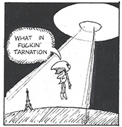
Is this a graph? I don't know what this is.   Thanks to SAL Venting about Students
|
 #
?
Jan 27, 2016 15:31
#
?
Jan 27, 2016 15:31
|
|


|

|
| # ? Apr 18, 2024 16:54 |
|
|
AlphaKretin posted:Is this a graph? I don't know what this is.
|
|
#
?
Jan 27, 2016 15:55
|
|


|
AlphaKretin posted:Is this a graph? I don't know what this is. See, if I were to criticize this, I'd first need to know what the gently caress is actually going on within context. And no, I have no idea even with context. Especially with context.
|
|
#
?
Jan 27, 2016 15:59
|
|


|
Ramos posted:See, if I were to criticize this, I'd first need to know what the gently caress is actually going on within context. And no, I have no idea even with context. Especially with context.
|
|
#
?
Jan 27, 2016 16:13
|
|
|
Hey, if anyone wants to lay it out in Layman's terms what all is going on on that webpage, I'd be glad to hear about it.
|
|
#
?
Jan 27, 2016 16:16
|
|
|
Ramos posted:Hey, if anyone wants to lay it out in Layman's terms what all is going on on that webpage, I'd be glad to hear about it.
|
|
#
?
Jan 27, 2016 16:27
|
|
|
Cool, so there was nothing to actually get.
|
|
#
?
Jan 27, 2016 16:29
|
|
|
Ramos posted:Cool, so there was nothing to actually get. You could try asking someone in physics thread to give you a short summary on what exactly that mess is about, or at least on where does it fail, but do not be surprised if a request like that will not be met with enthusiasm, really.
|
|
#
?
Jan 27, 2016 16:39
|
|
|
Based on poking around the site, I think the graph is supposed to be a representation of what happens when an electron undergoes quantum tunneling, the creation of holons and spinons. Of course there's also a big chunk of text linking it all to the Yin Yang and chi potency, so its probably just new age quantum woo gibberish.
|
|
#
?
Jan 27, 2016 17:40
|
|

|
No ring.
|
|
#
?
Jan 27, 2016 17:45
|
|


|
 lol alright ally, gently caress off.
|
|
#
?
Jan 27, 2016 19:54
|
|

|
Coohoolin posted:
Wow, at first I thought they just distended the scale to only show the upper end but  they just made up the bar heights. they just made up the bar heights.
|
|
#
?
Jan 27, 2016 23:29
|
|

|
 The Nolan Chart is silly enough as it is, but when you use it to claim that a moderate social democrat actually holds the most left-wing positions that are humanly possible, you immediately ascend to a lifetime position as mayor of clowntown.
|
|
#
?
Jan 28, 2016 06:07
|
|

|
I think it's more like, Sanders is the most liberal politician in modern American history, so he set the curve.
|
|
#
?
Jan 28, 2016 06:44
|
|

|
Fathis Munk posted:Wow, at first I thought they just distended the scale to only show the upper end but I imagine that guy took over ticket sales in the 12/13 season and he made that poster to make himself look better.
|
|
#
?
Jan 28, 2016 07:04
|
|


|
GottaPayDaTrollToll posted:
This reminds me of the civil war 2 cube.
|
|
#
?
Jan 28, 2016 07:18
|
|

|
To be fair, I don't think that chart was designed to encompass the entire spectrum of human political thought, just American politics.
|
|
#
?
Jan 28, 2016 09:16
|
|

|
Why the hell is it tilted like that, it's so annoying to read. Also, socialist is somehow less gov't intervention in social issues? And more gov't intervention = populism? Huh?
|
|
#
?
Jan 28, 2016 09:41
|
|

GottaPayDaTrollToll posted:
Bernie Sanders: Well-known for not wanting to get the government involved with loving anything, ever.
|
|
|
#
?
Jan 28, 2016 10:26
|
|

|
You dumb shits, that chart isn't hard to read at all, if you bother to read the labels. It's saying that he is in the 0th percentile of US politicians in terms of support for gov't interventions in social issues (at least the regressive views that are considered for that chart) and in the 100th percentile of US politicians in terms of support for gov't intervention in the economy.
|
|
#
?
Jan 28, 2016 23:40
|
|

|
There's also the ideological bent in making "most" 0% and "least" 100%, when it would be more logical the other way around.
|
|
#
?
Jan 28, 2016 23:44
|
|
|
grate deceiver posted:Why the hell is it tilted like that, it's so annoying to read. Libertarianism gets to be on top where it rightfully belongs.
|
|
#
?
Jan 29, 2016 02:59
|
|
|
PleasureKevin posted:
|
|
#
?
Jan 29, 2016 09:29
|
|


|
I imagine this is the process that many chart and graph designers go through before saying "eh, gently caress it" and publishing whatever they've come up with anyway.
|
|
#
?
Jan 29, 2016 13:53
|
|


|
Sinestro posted:You dumb shits, that chart isn't hard to read at all, if you bother to read the labels. It's saying that he is in the 0th percentile of US politicians in terms of support for gov't interventions in social issues (at least the regressive views that are considered for that chart) and in the 100th percentile of US politicians in terms of support for gov't intervention in the economy. Percentile-based actually does explain why Sanders comes out looking so extreme on the chart, but I think it's also because the chart is usually framed as "Social Freedom" and "Economic Freedom." A socialist would score low on "Economic Freedom" because they support freedom limiting things like taxes and consumer protections, and they score high on "Social Freedom" because they try to ease the restrictions on drugs. When you realize the only people who use these charts are internet libertarians whose political stance is basically just a combination of "gently caress you, got mine" and "Smoke weed erryday," you get every politician other than Ron Paul looks like an rear end in a top hat.
|
|
#
?
Jan 29, 2016 17:15
|
|


|

|
|
#
?
Jan 31, 2016 11:07
|
|

|

|
|
#
?
Jan 31, 2016 11:18
|
|

|
Coohoolin posted:

|
|
#
?
Jan 31, 2016 14:47
|
|

|
The problem with that graph isn't that the y-axis is truncated. It's that the heights of the bars bear no relationship at all to the values they represent.
|
|
#
?
Jan 31, 2016 15:41
|
|
|
Telegnostic posted:The problem with that graph isn't that the y-axis is truncated. It's that the heights of the bars bear no relationship at all to the values they represent. It's one of those bar graphs where one bar is stacked on top of the other, like a vertical pie chart.
|
|
#
?
Jan 31, 2016 15:47
|
|


|
Sorry, I was referring to the "over 38000 season tickets" graph. Compare the numbers to the heights of the bars.
|
|
#
?
Jan 31, 2016 15:53
|
|
|
Telegnostic posted:Sorry, I was referring to the "over 38000 season tickets" graph. The larger numbers have the taller bars. The heights don't "bear no relationship at all to the values they represent", the 12/13 bar is just exaggerated in height (the distance between the top of the 12/13 bar and the top of the 10/11 bar should be about 2/3 the distance between the top of the 11/12 bar and the top of the 10/11 bar). And all of this is further exaggerated because the Y-axis is truncated.
|
|
#
?
Jan 31, 2016 16:33
|
|
|
There is no Y-axis, so how do you know it's truncated though ? Clearly they just didn't make bar heights that are proportional to the actual value.
|
|
#
?
Jan 31, 2016 17:05
|
|
|
Fathis Munk posted:There is no Y-axis, so how do you know it's truncated though ? Clearly they just didn't make bar heights that are proportional to the actual value.
|
|
#
?
Jan 31, 2016 17:12
|
|
|
Besesoth posted:The larger numbers have the taller bars. The heights don't "bear no relationship at all to the values they represent", the 12/13 bar is just exaggerated in height (the distance between the top of the 12/13 bar and the top of the 10/11 bar should be about 2/3 the distance between the top of the 11/12 bar and the top of the 10/11 bar). And all of this is further exaggerated because the Y-axis is truncated. Yes, exactly this. Truncated axis or not, you can't just arbitrarily make one bar taller or shorter without changing the other bars.
|
|
#
?
Jan 31, 2016 20:21
|
|
|
Fathis Munk posted:Wow, at first I thought they just distended the scale to only show the upper end but popewiles posted:I imagine that guy took over ticket sales in the 12/13 season and he made that poster to make himself look better. The team in question, the Glasgow Rangers, went bankrupt and liquidated in 2012. They reformed as The Rangers, a new company, and club, but had to start again in the third division of Scottish football, at the time the lowest league possible without counting amateur highland leagues. A lot of pisstaking was going on about them being hosed and not being able to keep up the same crowds, since they went from being the historic winners of the 50 Scottish premiership titles to a new club with no history in the lowest leagues. That's the manager at the time, Ally McCoist, and the "chart" is to show how actually they're doing soooo much better because "WE DON'T DO WALKING AWAY". Here's a funny sketch to help you understand the mentality at play here. https://www.youtube.com/watch?v=q3il9rf6lPE (The Ramsden's Cup is a charity sponsored cup only competed for by the lower leagues. The boycotting joke is a reference to Rangers' preponderance to muscle out through political or legal pressure anyone they feel is being unfair (i.e. critical) about them: http://wingsoverscotland.com/hullo-hullo-we-are-the-bully-boys/ Rangers is also historically a British loyalist club with an anti-Irish history, as you can read about in the above article) Coohoolin has a new favorite as of 22:29 on Jan 31, 2016 |
|
#
?
Jan 31, 2016 22:27
|
|
|
kalstrams posted:Abscissa here is the time, and ordinate - the sales. I meant a labeled, drawn axis. Not just having something in y. Since there is no scale or anything who's to say it's been cut off.
|
|
#
?
Jan 31, 2016 22:41
|
|
|
Coohoolin posted:Rangers is also historically a British loyalist club with an anti-Irish history, as you can read about in the above article) And also just right-wing/racist in general.
|
|
#
?
Feb 1, 2016 01:10
|
|

|
ekuNNN posted:And also just right-wing/racist in general. But that's all footballers.
|
|
#
?
Feb 1, 2016 01:17
|
|


|

|
| # ? Apr 18, 2024 16:54 |
|
|

|
|
#
?
Feb 1, 2016 01:48
|
|

