|
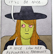
Holy poo poo. I like to do a bit of ballpoint sketching myself but that is unreal.
|
 #
?
Apr 7, 2016 18:28
#
?
Apr 7, 2016 18:28
|
|


|

|
| # ? Apr 24, 2024 12:52 |
|
|
I feel like I can smell that page. I mean that in the best way.
|
|
#
?
Apr 8, 2016 05:32
|
|
|
Hi. I started to make an attempt at being an illustrator in October last year. I've been trying to improve every day since then. I thought I'd share my drawings. Pen, pencil on 150gm paper.    There's more if you want to see them. These are taken from my instagram.
|
|
#
?
Apr 8, 2016 08:26
|
|

|
Freak Magnet posted:Hi. I started to make an attempt at being an illustrator in October last year. I've been trying to improve every day since then. I thought I'd share my drawings. Pen, pencil on 150gm paper. Beautiful work. What is your IG?
|
|
#
?
Apr 8, 2016 13:17
|
|

|
:-) https://www.instagram.com/ashton_creative
|
|
#
?
Apr 8, 2016 15:49
|
|
|
Freak Magnet posted:Hi. I started to make an attempt at being an illustrator in October last year. I've been trying to improve every day since then. I thought I'd share my drawings. Pen, pencil on 150gm paper. 
|
|
#
?
Apr 8, 2016 16:19
|
|
|
Yup, echoing everyone that those are beautiful. I'm still working on developing a confident hand when inking. Do you have any particular tips/suggestions, or is it mostly a matter of practice-practice-practice?
|
|
#
?
Apr 9, 2016 00:35
|
|
|
Erm... I draw practically everything out in a 4h pencil as lightly as I can, then go over it using a set of unipin / pigma micron pens. Erasing the pencil bits as I go. I'm still learning the basics at the moment, so I'm still trying to figure out the best methods. :-)
|
|
#
?
Apr 9, 2016 07:21
|
|
|
pastel and novelty glasses
|
|
#
?
Apr 9, 2016 19:25
|
|
|
Status Epilepticus posted:pastel and novelty glasses I like it!
|
|
#
?
Apr 9, 2016 21:48
|
|
|
Freak Magnet posted:Erm... I draw practically everything out in a 4h pencil as lightly as I can, then go over it using a set of unipin / pigma micron pens. Erasing the pencil bits as I go. I'm still learning the basics at the moment, so I'm still trying to figure out the best methods. :-) I love the ornamental element in your work! What kind of paper do you find yourself using? I keep going between watercolor paper and bristol for my ink drawings. Here's my ink drawing of Rey in her scavenger outfit. Probably going to do the coloring in photoshop to finish it off though. 
|
|
#
?
Apr 11, 2016 07:17
|
|
|
1920s cartoony spider monster v space hotdog.
|
|
#
?
Apr 21, 2016 07:40
|
|
|
Working on perspective and shadows and texture.
|
|
#
?
Apr 24, 2016 02:48
|
|

|
Crypticult posted:Working on perspective and shadows and texture. That's hella cool. It may just be the photo, but it looks like you should push your darks a little bit more. Specifically in the shadow areas around the fingers, especially the pinky finger. It all has basically the same value, so it's confusing. The shadow on the thumb as well is kinda off/too dark with the cast light coming from the r/hand side, but i'm just nitpicking. It's a eally solid piece and well done overall. Some things to be mindful of in the future I guess.
|
|
#
?
Apr 24, 2016 19:55
|
|
|
crop of an oil 
|
|
#
?
Apr 25, 2016 15:43
|
|
|
Status Epilepticus posted:crop of an oil I think that's breath-takingly lovely. What a talent you have.
|
|
#
?
Apr 26, 2016 03:05
|
|
|
Been working on this one for awhile. 'The Whispering in the Trees', 7" X 9" Pen and ink.
|
|
#
?
May 11, 2016 05:14
|
|
|
Everything on this page is dope. Keep it up!
|
|
#
?
May 11, 2016 23:10
|
|
|
Watercolour.
|
|
#
?
May 16, 2016 22:38
|
|

|
 I've been working on some portraits of people eating sour candy. Trying something new.
|
|
#
?
May 19, 2016 19:44
|
|


|
Yoshi Jjang posted:Watercolour. Love how delicately you handled the wrinkles in the face. I always have so much trouble with them. Edit: Here's another drawing of a hoverfly. I've kind of been blowing up this thread, I'm trying to be more productive lately.  Galileo Fingers fucked around with this message at 14:28 on May 22, 2016 |
|
#
?
May 20, 2016 08:29
|
|
|
I found an old Moleskine watercolor book I haven't painted in in a while (the paper quality is ehh) and decided to give it another go. Turns out the paper can hold more layers of color than I thought, and I do like the smooth texture. I got sick for Memorial Day weekend so I've had plenty of free time at home to churn out a few pages:  
|
|
#
?
May 29, 2016 18:08
|
|
|
Double-post for coyote:
|
|
#
?
Jun 2, 2016 05:28
|
|
|
I drank too much coffee     
|
|
#
?
Jun 3, 2016 03:38
|
|


|
^^^: I love it! Here's the first thing I've done in a while, other than a weird BYOB art contest. I don't have a scanner, hence the sepia cast, because it helped smooth out the weird tone differences I got from photographing, rather than scanning, the drawing.  I wish I had a scanner. I wish I had a scanner.
|
|
#
?
Jun 11, 2016 02:01
|
|


|
 Did a bowl of ramen, still learning how to use colored pencils in a satisfactory way that complements watercolor.
|
|
#
?
Jun 13, 2016 01:05
|
|
|
Definitely not cocaine    
|
|
#
?
Jun 15, 2016 14:22
|
|
|
^^^ Fantastic, VP. Tulips in springtime are Chicago's way of saying "I'm sorry about winter, babe. Will you take me back?"
|
|
#
?
Jun 16, 2016 05:58
|
|
|
Galileo Fingers posted:Love how delicately you handled the wrinkles in the face. I always have so much trouble with them. Wow, the detailing in the hairs looks great! Here are a couple of sketches from figure drawing sessions.  
|
|
#
?
Jun 23, 2016 14:36
|
|
|
Pomegranate:
|
|
#
?
Jun 24, 2016 03:18
|
|
|
 3 week drawing
|
|
#
?
Jun 27, 2016 22:26
|
|
|
derg posted:
wow that model is a trooper to stay in that pose for so long..
|
|
#
?
Jun 28, 2016 16:04
|
|
|
Autechresaint posted:wow that model is a trooper to stay in that pose for so long..  yeah the poses are 20 minutes long for about 2 to 3 hours with a 5 minute break
|
|
#
?
Jun 29, 2016 00:11
|
|
|
Made with the finest dollar store acrylics. https://imgur.com/0F709YB Jedrick fucked around with this message at 02:05 on Jul 3, 2016 |
|
#
?
Jul 3, 2016 02:02
|
|

|
Avocados:
|
|
#
?
Jul 3, 2016 04:44
|
|
|
Galileo Fingers posted:Love how delicately you handled the wrinkles in the face. I always have so much trouble with them. That's fuckin great. Nice ink work. Here's a one-eyed cat.
|
|
#
?
Jul 3, 2016 07:04
|
|

|
Avasculous posted:I've been in a rut lately where I feel like I paint something very rough and in progress that I'm optimistic about in a few hours/days, then spend weeks redoing parts of it and trying to add details, working slower and slower until I get fed up and abandon it or stop painting entirely for a while. Most frustrating of all, I feel like it often ends up worse than it was at the in-progress step.This particularly happens when I'm not working directly from a reference where I can at least see if features are in the right place, shadows missing, etc. As soon as I'm getting pretty fatigued any hate filled, I'll stop. I'll let it stew for a day, see how I feel in the morning. Often times adding things without letting stuff settle can make you feel like you went overboard. Eventually I'll wake up, look at it, and feel indifferent or less hate. That's when I decide to stop loving with it. Christ, I'm sorry, I didn't even address your questions. Let me see. I think you colors could be brighter, at least the contrasts. The red running down the fingers and everything is a great texture effect, but could be emphasized more. If you add more contrast inside the 'mouth', that'll help provide more depth to it. ALTHOUGH right now, it has almost a transparency to the roof of the mouth, which is a cool effect you could run with. The white space above the central figure is distracting. Filling it with any lighter color (except white, obviously) would help draw the eye more toward the center. Regarding the specific composition, it might be too centered. There's an arc of energy through it (if you draw a line from the center of the two teeth down around the tongue, and that balance is pretty good. The abstract-ness of the fingers on the left side are highlighted by the fingers on the right side. The ones on the right have more detail, better depth, and an elongated look (which, is like, what, the opposite of foreshortening that happens? Hands can be put into really weird and bizarre positions. Are nails missing on the lower right hand on purpose? The shading on the left hand makes it look like the two lower fingers melt together without a shift in perspective, very -"The Thing"-like. Shading could help draw that distinction more, where the highlight is uninterrupted. Speaking of highlights, a thin line of highlight along the lips or rim of the mouth could help accentuate it without it overtaking the fingers holding it open, back. It also is difficult to tell if the mouth is extending from the palms or are separate. This isn't really a critique though, just a thought. You have some good dark, colors and atmosphere. The white light at the top also washes out the fangs. If you dropped that to a different color, the fangs could stand out as one of the few things that are "white" aside from, maybe highlights. I don't think this is a lost cause or anything. Your results may very. The most important thing in letting stuff settle is really identifying what elements you're displeased with. Proportion? Color? A specific texture or area of the painting? I tend to find I'll hyper focus on one area or thing and walking away from it for a day helps me realize exactly what displeases me. What I messed up, what I'll do differently next time. Where I went overboard. Those kinds of things. I love the smell of modeling paste but used too much on this last one. I'm gonna take a step back from painting for a little and try and let stuff reset or settle. I'm going to overboard. I'm hyper amateur though. I think the most compelling parts of the piece are where the two fingers meet inside the mouth on the top of the tongue, the way the red flows from the top of the mouth across the fingers (flattening them and also incorporating them in a way that gives them a kind of depth). A good amount of shading and contrast, but that detail needs to be brought to the left side of the painting. I'd try to brighten the contrasts more, or something. I'm a sucker for that though. And, as I said, I'm a huge amateur, which I'm about to prove in another post. ziasquinn fucked around with this message at 22:15 on Jul 3, 2016 |
|
#
?
Jul 3, 2016 21:23
|
|
|
Carotid posted:I found an old Moleskine watercolor book I haven't painted in in a while (the paper quality is ehh) and decided to give it another go. Turns out the paper can hold more layers of color than I thought, and I do like the smooth texture. I got sick for Memorial Day weekend so I've had plenty of free time at home to churn out a few pages: How did you find the watercolour moleskine? I've tried the standard sketchbooks from them and Leuchtturm and they both have quite bad bleed with Copic markers.
|
|
#
?
Jul 3, 2016 22:04
|
|
|
I like using the knives more than brushes. I like using lots of heavy body paste. I also like the smell of it. I fail a lot and learn a lot, constantly. I wish I could capture the thickness better. Highlights, I suspect, are key.    This one is still in the "resting" phase so I loathe it and it makes me sick to my stomach to look at. This one is still in the "resting" phase so I loathe it and it makes me sick to my stomach to look at.  Detail Detail
|
|
#
?
Jul 3, 2016 22:35
|
|
|

|
| # ? Apr 24, 2024 12:52 |
|
|
Finished a few blue crab water color paintings. 
|
|
#
?
Jul 13, 2016 22:26
|
|