


|
Shinmera posted:Finally got the time (and inspiration) to draw something again. Yeah - it is a very simplistic style. Nothing wrong with that but it seems more suited to Sunday morning newspaper comics or maybe manga. If you want to improve, then I suggest going for more realism. If it is your intention to stick with a comic style, then I suppose it doesn't matter. What was said about pursuing life studies vs. pursuing a style is very good advice. Don't try and develop your own style. I think it should just come with time, as you pursue realism. But...that's just... like... my opinion man.
|
 #
?
Jan 26, 2018 01:09
#
?
Jan 26, 2018 01:09
|
|


|

|
| # ? Apr 25, 2024 10:55 |
|
|
d3c0y2 posted:What I would really like help with though is learning how to add texture to the things I'm drawing. I think I'm starting to really get the hand of using lighting, negative space and shading to define the shape of objects - but I'm at a bit of a lose of how to combine that with "texturising" the planes without disrupting the definition of the objects themselves? If that makes sense. This goes, I guess, with what Crayon said about having the shape strongly in mind while thinking about texture (lest you make things look flattened-out or inconsistent in terms of perspective, which is very easy to do) e: Jake Snake posted:This is really awesome. 
a hole-y ghost fucked around with this message at 01:56 on Jan 26, 2018 |
|
#
?
Jan 26, 2018 01:47
|
|

|

|
|
#
?
Jan 26, 2018 04:30
|
|

|
My threads up, this ended up being the best drawing so far
|
|
#
?
Jan 26, 2018 06:24
|
|

|
Spinster posted:My threads up, this ended up being the best drawing so far 
|
|
#
?
Jan 26, 2018 07:10
|
|
|
Sharpest Crayon posted:Personally, I usually pick some parts of whatever I want the material to be, and add some definition by drawing texture here and there. Hi man, thanks for the advice. I did this picture of Hagrid whilst trying to take on board what you said. I also tried to keep your advice regarding hair in mind as I drew it; but I think I fell trap to my urge to always take 7 lines when 1 will do.  I think the skin is much better than on my previous drawings, but still some ways to go. Hair, still not happy with though honestly. I also spent a lot of time looking at this picture and trying to work out what techniques etc you might have used. So thanks to you too ") a hole-y ghost posted:drawing apples is good for this since they have the stripey pattern, are relatively simple in shape, and also have the shininess going on, but honestly I'd say you would probably be better off at this point delving more into rendering shapes. putting texture or any other kinds of details on stuff will be much, much easier + natural when you already have a good handle on rendering mass with value. Hi man, sorry I'd already finished this picture before I saw your comment. I know this might be a stupid question but what does "rendering mass with value" mean? d3c0y2 fucked around with this message at 19:32 on Jan 26, 2018 |
|
#
?
Jan 26, 2018 19:29
|
|

|
d3c0y2 posted:Hi man, thanks for the advice. I did this picture of Hagrid whilst trying to take on board what you said. I also tried to keep your advice regarding hair in mind as I drew it; but I think I fell trap to my urge to always take 7 lines when 1 will do. this is definitely a marked improvement from the previous ones you showed, good job i dont really have anything constructive to add unfortunately b/c this is well out of my wheelhouse
|
|
#
?
Jan 26, 2018 20:22
|
|
|
Al! posted:this is definitely a marked improvement from the previous ones you showed, good job Thanks man! I've been watching youtube tutorials and practicing a lot recently; I'm glad its starting to pay off. Someone earlier in this thread also wrote about trying to make sure you use varied line/brush sizes which I think I'd been slacking on. So that definitely helped!
|
|
#
?
Jan 26, 2018 20:35
|
|
|
Shinmera posted:This is pretty embarrassing for me, but here goes anyway: I'd like to ask if anyone has some feedback about my style -- what you dislike and like about it, and if there's anything that confuses you or if you have any suggestions for improvements. I'm aware that style is something very personal, but I often get the feeling that I'm stuck in my own head too much, so I hope to get some new perspectives on things by hearing what others have to say about it. Sorry it took me so long to get to this. First things first, there's something fucky with your tumblr where up in the righthand corner of the blue-lined black band I can sorta half-see my dashboard and messaging options, and clicking on the "follow" link through the upper left text options does nothing but give me the "there's nothing here" error page. I'm not sure if this is an issue with my browser? I use firefox. Others already gave good advice, but I didn't notice anyone mention my slight pet peeve with your drawings - that you don't close your lines on outlines of solid objects. That's ok with light, airy, flighty materials, or defining lines inside the outlines, but it makes things look sketchy and not properly defined despite the very strong shapes you've got. Like there's something breaking the outlines. This might be just my personal preference, I get Opinions about lineart. You obviously enjoy drawing people, so as a suggestion, I'd really like to see you draw different body types. And I don't just mean "draw more fatties", it would be good to see you draw really long, lanky characters, buff or scrawny characters, old or male etc. Vary the proportions a bit. Most of your drawings feature average female bodies. d3c0y2 posted:
You pick stuff up real quick, that skin IS loads better! Shouldn't take you long to get the hair where you want it at this rate. Like two days max. I had to put in effort this time 'cause y'all posting some quality poo poo and I obviously need to up my game. 
|
|
#
?
Jan 26, 2018 22:26
|
|

|
d3c0y2 posted:Hi man, sorry I'd already finished this picture before I saw your comment. I know this might be a stupid question but what does "rendering mass with value" mean?
|
|
#
?
Jan 27, 2018 01:51
|
|
|
a hole-y ghost posted:Poor choice of words, sorry�I just mean wrapping shadows around shapes. I must add though, you're definitely picking up exactly that really well and showing improvement with every drawing, I just think that in general, getting a good sense of 3D form should come before texture if you're going for a more painterly style. Ah now I get you. Yeah I'm never satisfied with my work; and honestly theres so many good artists in this thread that I can learn from that it's really helping. I did another piece today to try and really develop my skin/detail ability. So I decided to try and have a go at Gollum and really focus his wrinkles and defects! I feel like I'm getting a better eye for tone, at least with greyscale. I felt a TON more confident with every stroke with this piece. It actually took less time to do than the Hagrid one.  Sharpest Crayon posted:
This is so god drat pretty. Those colours! That hair! 
d3c0y2 fucked around with this message at 06:30 on Jan 27, 2018 |
|
#
?
Jan 27, 2018 06:08
|
|
|
i went and took this one and redid it 
|
|
#
?
Jan 27, 2018 06:39
|
|
|
Al! posted:i went and took this one Wow. That's such a massive improvement. The animation is so expressive in the second one. You've nailed it man!
|
|
#
?
Jan 27, 2018 06:42
|
|
|
d3c0y2 posted:I also spent a lot of time looking at this picture and trying to work out what techniques etc you might have used. So thanks to you too Aww, that's like the best compliment I've ever gotten. Thanks a lot. Wow! Awesome job! These are such a huge improvement from the first piece you posted. Keep going! You'll soon blow me out of the water at this rate. Btw as for the techniques I used: it's nothing special. I just use the basic round brush in Photoshop, but I check the dual brush option to give it more texture. I did use a downloaded brush for the fur collar though. It's mainly all about blocking in the shadows, highlights, and midtones, then gradually shaping them to make them look like whatever you're painting. The colors are great, and I love the thick brush strokes. It gives it almost a creamy texture, like real paint. More progress. I hate fabric. 
Sk8ers4Christ fucked around with this message at 10:32 on Jan 27, 2018 |
|
#
?
Jan 27, 2018 10:25
|
|
|
Jake Snake posted:Aww, that's like the best compliment I've ever gotten. Thanks a lot. Thank you so much man. I still think I've got a long way to go before I'm near your level. That picture you're working on at the moment looks amazing; I havnt even begun to tackle fabric, hands, or backgrounds etc yet. I love how you've built up the background with simple strokes and yet it looks so real.
|
|
#
?
Jan 27, 2018 20:46
|
|
|
Hi! I've been drawing every day for a while now and I love doing it/I feel like it has really improved me as an artist. Here's the thing I drew for yesterday which I'm really happy with how the coloring came out. https://twitter.com/rainbowfission/status/957169459608936448
|
|
#
?
Jan 27, 2018 20:54
|
|

|
Jake Snake posted:Btw as for the techniques I used: it's nothing special. I just use the basic round brush in Photoshop, but I check the dual brush option to give it more texture. I did use a downloaded brush for the fur collar though. It's mainly all about blocking in the shadows, highlights, and midtones, then gradually shaping them to make them look like whatever you're painting.
|
|
#
?
Jan 27, 2018 22:03
|
|
|
my buddy Superfly posted:Hi! I've been drawing every day for a while now and I love doing it/I feel like it has really improved me as an artist. Here's the thing I drew for yesterday which I'm really happy with how the coloring came out.  https://twitter.com/_inktho/status/956809605014683649 Sharpest Crayon posted:I had to put in effort this time 'cause y'all posting some quality poo poo and I obviously need to up my game.  ambient light on this one ambient light on this one
|
|
#
?
Jan 27, 2018 22:10
|
|
|
Between work and school I don't have as much drawing time anymore, so I only finished one picture this week. I'm actually really happy with it though. I drew a background I don't totally hate (even if it is stupidly simple).
|
|
#
?
Jan 27, 2018 22:25
|
|

|
What is dual brush? I've been using Krita so I'm not sure what it is/whether krita has a similar function
|
|
#
?
Jan 27, 2018 22:43
|
|
|
a hole-y ghost posted:looked thru your twitter a bit. I really like this one good job Thanks! That isn't my art though, I just retweeted that.
|
|
#
?
Jan 28, 2018 00:39
|
|
|
ah drat sorry I don't know how twitter works honest!!!
|
|
#
?
Jan 28, 2018 00:50
|
|
|
venus the gaudy colors on this are starting to give me a headache so I guess that means it's good to go  e: fixed something with composition that was really bugging me a hole-y ghost fucked around with this message at 02:51 on Jan 28, 2018 |
|
#
?
Jan 28, 2018 01:22
|
|
|
ART HAX: take reference pics with blue screen glare on your face, get A+ comments on lighting and colors.  No but seriously thank y'all for the kind words. my buddy Superfly posted:Hi! I've been drawing every day for a while now and I love doing it/I feel like it has really improved me as an artist. Here's the thing I drew for yesterday which I'm really happy with how the coloring came out. Welcome to the thread and  that's so freaking cute and happy! that's so freaking cute and happy!Yeah I draw bunnies when I'm out of ideas. Yeah it went a bit south this time. 
|
|
#
?
Jan 28, 2018 01:22
|
|
|
Sharpest Crayon posted:ART HAX: take reference pics with blue screen glare on your face, get A+ comments on lighting and colors. this reminds me of like, you ever chew bubble gum, and then when you're done with it you spit it into the trash, but then take one last look at it to see what it's shaped like, and sometimes it's an animal? anyways its Good e: and non no I wans't calling the drawing trash, I just reread this and it may have come out like that! I was just thinking of the effect of things like clouds, rocks, twigs, and whatever that look like people or animals when you see them from a certain angle a hole-y ghost fucked around with this message at 05:56 on Jan 28, 2018 |
|
#
?
Jan 28, 2018 01:25
|
|
|
a hole-y ghost posted:this reminds me of like, you ever chew bubble gum, and then when you're done with it you spit it into the trash, but then take one last look at it to see what it's shaped like, and sometimes it's an animal? anyways its Good ART HAX: draw literal garbage for interesting shapes in you art, WALLA!
|
|
#
?
Jan 28, 2018 01:40
|
|
|
that reminds me, I keep meaning to make a series of drawings based on takeoff interpretations of looking at patterns in like, carpet and floor tiles and stuff. I should do that. e: I think you made a big post about just this sometime before, but how do you vary your line weight? do you use tablet pressure or are you like, inking and then digitizing it?? because I dunno if it's just my tablet but I can't seem to get good weight variations in digital without it looking all shaky like I have megaparkinson's or something a hole-y ghost fucked around with this message at 01:45 on Jan 28, 2018 |
|
#
?
Jan 28, 2018 01:43
|
|
|
a hole-y ghost posted:venus This is loving sweet. I love the little details. The body shape, the nose and brow all just scream Grecian art. It really drives home the vibe you're going for.
|
|
#
?
Jan 28, 2018 04:38
|
|
|
d3c0y2 posted:This is loving sweet. I love the little details. The body shape, the nose and brow all just scream Grecian art. It really drives home the vibe you're going for.   e: also decoy I just realized sorry for being hypocritical and saying something that amounted to "no don't do texture until you are ABSOLUTE EXPERT  " while I was, myself, drawing this super texturey thing. Grain of salt with my advice and all that, yeah? " while I was, myself, drawing this super texturey thing. Grain of salt with my advice and all that, yeah?
a hole-y ghost fucked around with this message at 05:54 on Jan 28, 2018 |
|
#
?
Jan 28, 2018 05:23
|
|
|
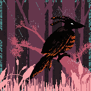
having a fairly gothy evening
|
|
#
?
Jan 28, 2018 08:42
|
|
|
a hole-y ghost posted:e: I think you made a big post about just this sometime before, but how do you vary your line weight? do you use tablet pressure or are you like, inking and then digitizing it?? because I dunno if it's just my tablet but I can't seem to get good weight variations in digital without it looking all shaky like I have megaparkinson's or something You might wanna check if your drivers are up to date, too? IDK Some of my line wobble resolved itself when I switched from my ancient tablet to the new one, but just to recap some ways to smooth it out: 1) Paint Tool Sai has a line-smoothening function that reduces all wobble in you lines, sometimes when I want accuracy I'll use Sai for the linearts, though this is not often because I also think it looks a bit sterile in its neatness. Sai's also got a "lineart" layer function that makes each line its own object so you can correct it by pulling or pushing bits of it, though I practically never use that 'cause that's way too much trouble to correct a line you could just redraw in a blink. 2)Working huge and reducing the pic to 25-30% of original size for viewing hides a lot of mini-wobbles, though for the rabbit I did purposefully do a slightly squiggly line for extra dementedness. However, in the whiskers that I tried to get straight you can still see a few kinks that you just don't notice when you shrink the pic down. You can still see that the full-size is pretty rough colours-wise as well.  In fact just adding this 'cause its all supposed to be smooth but you can clearly see little bits of wobble everywhere  3) Technique. You can either zoom in super far until you can just see the line you need to draw on the drawing area if you want to go slow (having to draw using a big area keeps your hand moving over the tablet quick enough that there's less "points" where it can pick up wobble), or do the opposite and zoom out far so you can get the line you need drawn real quick, which again leaves less time for your tablet to register wobble. Generally though, you should practice pulling your lines quick and confident, and just redoing again and again with ctrl-z if you don't get the line you wanted straight away. I say pulling, 'cause pushing your lines makes them more difficult to control as far as line thickness goes. The quicker you are, the less extra wobble the tablet has time to pick up. I had trouble adjusting to this at first because IRL I was meticulous and slow with all my line art so I could get it perfect, and line wobble is just something you gotta work around with tablets. Al! posted:having a fairly gothy evening If you'll be my bodyguard I can be your long lost pal I can call you Betty And Betty when you call me ... uh. C'mon. Pick up the phone buddy.
|
|
#
?
Jan 28, 2018 14:08
|
|
|
cool, thanks!@
|
|
#
?
Jan 28, 2018 17:09
|
|
|
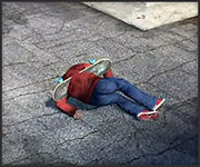
a glowing floating steak in a cave???? im not sure where i was going with this one
|
|
#
?
Jan 28, 2018 19:49
|
|
|
spectral subterranean steak suspended in the air?? now thats a spooky supper if I ever saw one
|
|
#
?
Jan 28, 2018 21:50
|
|
|
I've mostly been doing pen drawing since I started my iPad doodling career a few months ago, but here's a first semi-serious attempt to do something with colors in Procreate. Looked at Caravaggio's The Calling of St Matthew for reference. As usual, I have a persistent feeling that the feature placements are out of whack in a way that's probably glaringly obvious to anyone seeing it for the first time, but I've exhausted all the tricks like that "flip the canvas to get a fresh view" one, so feel free to tell me what I've done wrong (or right).
|
|
#
?
Jan 29, 2018 00:23
|
|
|
Al! posted:a glowing floating steak in a cave???? im not sure where i was going with this one Ssstraight to Flavour Town, located firmly in the Grillomancer Cave. sinc posted:I've mostly been doing pen drawing since I started my iPad doodling career a few months ago, but here's a first semi-serious attempt to do something with colors in Procreate. Looked at Caravaggio's The Calling of St Matthew for reference. As usual, I have a persistent feeling that the feature placements are out of whack in a way that's probably glaringly obvious to anyone seeing it for the first time, but I've exhausted all the tricks like that "flip the canvas to get a fresh view" one, so feel free to tell me what I've done wrong (or right). There's nothing glaringly wrong that I can pick out that's not wrong in the original. I mean, looking at the original, the model is gormless. It looks like someone who was used to painting adults only decided that "teenagers are like babies but with a big nose and long face right?" and then went for it and the result is weird and somewhat flat. If you want to improve it, I would smooth out some of the scratchiness in the skin and eyes, it makes for an interesting texture in the collar but is a bit distracting in the eyes. If you want to start changing the features, you could try bringing the lips up closer to the mouth, and sinking the eyes in a bit by adding shadow to under the brow near the nose. So when you draw essentially every day, you do end up with days where you just draw and worry about the "why" and "what" later. 
|
|
#
?
Jan 29, 2018 00:57
|
|
|

|
|
#
?
Jan 29, 2018 01:42
|
|

|
sinc posted:As usual, I have a persistent feeling that the feature placements are out of whack in a way that's probably glaringly obvious to anyone seeing it for the first time
|
|
#
?
Jan 29, 2018 03:20
|
|
|
Haha, I can see that being the case. Oh and I really like that Venus of yours. Sharpest Crayon posted:There's nothing glaringly wrong that I can pick out that's not wrong in the original. I mean, looking at the original, the model is gormless. It looks like someone who was used to painting adults only decided that "teenagers are like babies but with a big nose and long face right?" and then went for it and the result is weird and somewhat flat. Thanks for these! And yeah, you're right about the original being less than realistic. It's not like there's any shortage of teenage boys in his stuff, but he does like to often paint their faces in that kind of doll-like manner. Not sure if that's a stylistic choice or if people just saw things differently back then. I just happen to have a huge Taschen book of his, and I like it a lot, but it's indeed a good thing to keep in mind when using it as a reference.
|
|
#
?
Jan 29, 2018 03:47
|
|
|

|
| # ? Apr 25, 2024 10:55 |
|
|
im def in a goth phase at the moment
|
|
#
?
Jan 29, 2018 06:47
|
|