


|
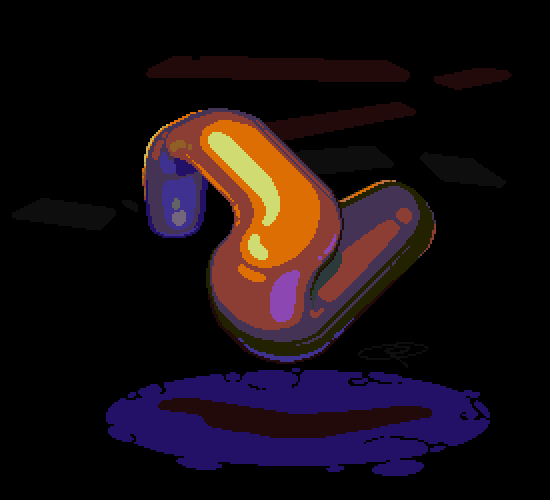
 God I hate cloth. This one will take a lot of fine revisions before I'm done, but overall he doesn't bloat as much as the others so far. I just need to make sure the folds in the cloth move a little more smoothly. I'm also going to have to do something about the pause where the loop repeats - I may add a frame so there's a little more of a pause in the middle, or remove on so that it loops a little more smoothly.
|
 #
?
Feb 20, 2018 08:13
#
?
Feb 20, 2018 08:13
|
|


|

|
| # ? Apr 28, 2024 17:57 |
|
|
You should really make sure that from frame to frame things stay within the realm of possibility. Like currently the waist cord is behaving like a snake, the folds near his feet move like there's an animal running around beneath, etc.
|
|
#
?
Feb 20, 2018 09:17
|
|
|
wayfinder posted:You should really make sure that from frame to frame things stay within the realm of possibility. Like currently the waist cord is behaving like a snake, the folds near his feet move like there's an animal running around beneath, etc. Yeah, that's all definitely on the agenda tomorrow, I'll tackle the folds and belt first. I kind of like the little 'whoosh' at the end of his scarf, but it doesn't fit the motions so that's also gotta go. Edit - progress so far. I'm pretty happy with it but need to take a break and come back at it with fresh eyes so I can find the extra-wobbly bits to smooth out. Double Edit - Damnit, just noticed his left sleeve jumps around at the loop.  A lineup, just so I can see them all next to one another. I recolored the Fighter along Exmarx's example (waaayyyy better! Thanks again) and adjusted the halfling's colors and left dagger animation, then and added some hair highlights.    McKilligan fucked around with this message at 08:24 on Feb 22, 2018 |
|
#
?
Feb 20, 2018 10:38
|
|
|
First try at something a little more dynamic. Given the framerates that I've set up for the idle animation (12 frames, 70ms), I'm going to add a few more tweens to the entire animation so that it's not so quick, it's playing a lot faster than how I want it to look - it's a big heavy sword and I want the swing to reflect that. 
McKilligan fucked around with this message at 09:47 on Feb 23, 2018 |
|
#
?
Feb 23, 2018 09:44
|
|
|
i don�t know much about art but i like your style
|
|
#
?
Feb 23, 2018 17:45
|
|

|
That actually looks pretty cool to me. Maybe look at the attack animations in the GBA Fire Emblem games to see how they do that "heavy" feeling. There is a thing they do where one keyframe holds longer, and it seems that's what your animation is lacking.
|
|
#
?
Feb 23, 2018 18:28
|
|

|
I think a big factor might be lack of windup. For lighter weapons you can swing them quickly like you have currently animated, but for something really heavy you're going to need to prep your swing and put some weight into the initial movement first.
|
|
#
?
Feb 23, 2018 18:37
|
|


|
McKilligan posted:
This is not a suggestion you're going to enjoy, because you've put a lot of work into this already, but: You've got seventeen frames in this animation. Try reducing it to two. (Not permanently.) You can think of the loop as being 50% "inhale" - where your dwarf goes from "minimum" to "maximum" - and 50% "exhale" - where your dwarf goes back from "maximum" to "minimum". The "maximum" and "minimum" frames are what you should be thinking about. Right now I think it's these (frames 1 and 10 of your animation):   Ignore everything else you've drawn and focus on those frames. What's the halfway point between one amd the other? Add two more transitional frames, so you've got 0 (min) - 1 - 2 (max) - 3 - 0 (min). Don't redraw them. Make the minimum necessary changes to the existing frame to get to the halfway point. Frames 0 and 2 are your key frames, which have the important information; frames 1 and 3 are your inbetween frames, the stepping stones, the minimum changes to your drawings that will allow you to get from min to max and back again. Now focus on each pair of frames: 0-1, 1-2, 2-3, 3-0. What's the minimum you need to do to get halfway between each frame? Add a frame between each pair: 0 (min) - 1 - 2 (prev. 1) - 3 - 4 (max) - 5 - 6 (prev. 3) - 7. If you need to, repeat the process; you'll have 16 frames, which is almost what you had before. (Don't be shy about making "halfway" more or less than a 50% split; for action scenes, for example, you might want "halfway" to be 70-80% of the way through the move, to add a sense of quickness; for a heavy weapon, you might want "halfway" to be 30% of the way through the move, to emphasize how hard the weapon is to move. Let the animation linger on a more important frame.)
|
|
#
?
Feb 23, 2018 23:33
|
|

|
Polio Vax Scene posted:I think a big factor might be lack of windup. For lighter weapons you can swing them quickly like you have currently animated, but for something really heavy you're going to need to prep your swing and put some weight into the initial movement first. The entire attack animation is only like 7 frames, 2 of which are windup. The problem is that the whole thing lasts a split second, so they're pretty much invisible. But yeah, I'll definitely emphasize the windup portion more. I want the attack to feel quick enough that it feels tight and responsive, but slow enough that it still emphasizes that this is a big heavy piece of metal. Also, she spins 360 degrees to return to the starting position, but if the player taps attack again, she'll initiate a second slash from the end position of the first slash without spinning. I've been having a lot of fun mentally planning out how the full combo will play out, hopefully I'll have most of it done this week. I also appreciate the advice about the keyframes and tweening, I'm still a novice at animation so I'm still constantly adjusting my workflow to balance between efficiency and results. Right now I've got no deadline so I tend to spend a lot of time tweaking the results, but there's a lot of room for improvement. I actually did design the fighter's swing with keyframes, then filling in the tweens. It's much easier with big dynamic movements, but a pain in the rear end for subtle movements.
|
|
#
?
Feb 24, 2018 05:27
|
|
|
Awww yeah now we're getting somewhere. I'm still getting a feel for the right number of frames/timing, but I think this is just about where i want it to be before I clean it up and adjust the colors/etc. Edit: And a one, and a two:  (Still not finished, needs a few wind-down frames to return to idle) McKilligan fucked around with this message at 13:04 on Feb 26, 2018 |
|
#
?
Feb 26, 2018 04:18
|
|
|
McKilligan posted:Awww yeah now we're getting somewhere. I'm still getting a feel for the right number of frames/timing, but I think this is just about where i want it to be before I clean it up and adjust the colors/etc. whoa this rules
|
|
#
?
Feb 26, 2018 06:25
|
|
 goku i won't do what u tell me
|
yeah I'm not the biggest fan of the shading style personally (not saying it's objectively bad tho) but that animation owns bones
|
|
#
?
Feb 26, 2018 12:18
|
|

|
Hey guys, i'm reviewing my colours and just generally changing them, would like to know whether i should add more or take more away, here they are currently: All the ramps end in the same two darkest colours. Here's them all in context, gradually moving up from the lightest to the darkest colours in each ramp:  I've probably got too many colours at the moment and i recognise the blue's a bit messed up at the moment.
|
|
#
?
Feb 26, 2018 15:40
|
|

|
Your pallette is kinda brown.
|
|
#
?
Feb 26, 2018 15:50
|
|
|
I've made my own edit to your palette, I didn't change any colours, just deleted what I felt were redundant swatches. I've marked your original to point out what I felt were colours that could be condensed. That said, just about everyone is going to have custom palettes with weird redundant swatches because there are particular situations you want those colours for your own particular project. Not every pixel art palette MUST be general purpose. That said I think you have built a very functional general purpose palette here. Scut fucked around with this message at 18:20 on Feb 26, 2018 |
|
#
?
Feb 26, 2018 18:17
|
|

|
Hell yeah. Is there any way we can convince you to stick with cel shading, maybe just one level of shadow and highlight?
|
|
#
?
Feb 26, 2018 18:22
|
|
|
Scut posted:I've made my own edit to your palette, I didn't change any colours, just deleted what I felt were redundant swatches. I've marked your original to point out what I felt were colours that could be condensed. That said, just about everyone is going to have custom palettes with weird redundant swatches because there are particular situations you want those colours for your own particular project. Not every pixel art palette MUST be general purpose. That said I think you have built a very functional general purpose palette here. Thanks Scut, I actually changed a couple of colours since i last posted, with minor changes to the green and red/purple/pink/orange ramps, but i really wanted to re-do the blue, since i felt it was too bland so i made it more sea-greenish at the beginning. I'm gonna get rid of some of the colours (the one's you pointed out) and ideally i'd like to have a smaller palette but i really appreciate your comment about it being functional! McKilligan, i echo Scut's comment on sticking with the cel-shading, not just because it looks good but because it'll also decrease the level of work you have to do on the animations
|
|
#
?
Feb 26, 2018 18:35
|
|
|
Honestly, you don't have to try very hard to convince me to lessen my workload - At worst, it just means that I have to go back and recolor the idle animations again, but given the amount of work it would save me in the future, it would be worth it. I'll try a simple 1 highlight/1 shadow scheme and see how that looks, then I'll decide which route to take. I'm having a lot of fun animating right now, so before I dive into the details of shadows and highlight I'm going to continue make some more animations - I figure that if I tackle each process one at a time, the results will look more consistent. Edit: And a one, and a two, and a three: You wouldn't believe how many frames were redrawn or outright deleted to get it to look right. 
McKilligan fucked around with this message at 12:28 on Feb 27, 2018 |
|
#
?
Feb 27, 2018 00:49
|
|
|
McKilligan posted:Honestly, you don't have to try very hard to convince me to lessen my workload - At worst, it just means that I have to go back and recolor the idle animations again, but given the amount of work it would save me in the future, it would be worth it. I'll try a simple 1 highlight/1 shadow scheme and see how that looks, then I'll decide which route to take. I'll concur that the cel shading lit up the "I want to play whatever this is from" part of my brain much more than the more detailed sprite. That animation looks fantastic in general though, well done.
|
|
#
?
Feb 27, 2018 03:16
|
|


|
|
|
#
?
Feb 27, 2018 14:35
|
|
|
Working on a parry animation - Again, you wouldn't believe how many times I had to scrap and redraw frames, just couldn't get the poses right for the longest time. I think I'll have to adjust the hair as well, it swings a bit too fast for me. Coming next: Riposte. 
|
|
#
?
Mar 1, 2018 12:31
|
|
|
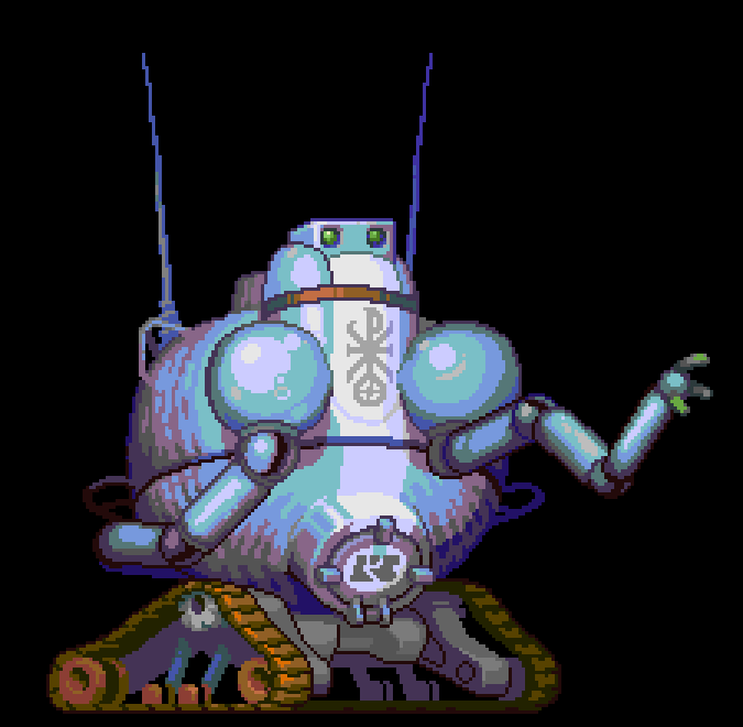 Fan art of Father Stanley, the Catholic priest robot from Simon Roy's 'Griz Grobus' comic. Simon does some of the coolest work in comics right now, and he's Canadian which I am constitutionally-bound to mention with great pride.
|
|
#
?
Mar 1, 2018 18:03
|
|
|
McKilligan posted:Working on a parry animation - Again, you wouldn't believe how many times I had to scrap and redraw frames, just couldn't get the poses right for the longest time. I think I'll have to adjust the hair as well, it swings a bit too fast for me. Coming next: Riposte. All of these new animations look really great. I completely agree with everyone else saying that you would do yourself a huge favor by simplifying your shading model. The fidelity of movement you have going on here more than makes up whatever would be "lost", and it would dramatically simplify the problem you had on the other sprites with the lighting swimming/churning around from frame to frame.
|
|
#
?
Mar 2, 2018 03:18
|
|
|
Scut posted:
Looks great! One small thing that I'm seeing is kind of a big value contrast between the neutral/warmish purple and the light blue, kind of gives it a 'tiger-stripe' effect. I'm not familiar with the character, so I don't know if that was intentional. Looks a bit wrinkly. Taking a page from Dark Souls, with my own adjustments. Parry, Riposte, Rip-Out-Guts-Reverse-Overhead-Swing, then imagine the enemy being launched overhead. I maaaayyy have cheated and reused some frames from the 3-hit combo at the end, but gently caress it, it syncs up perfectly. I'd also like to add a small Spark/Impact effect if the parry is timed correctly, but that will have to be a separate effect. 
McKilligan fucked around with this message at 07:55 on Mar 2, 2018 |
|
#
?
Mar 2, 2018 07:37
|
|
|
These attack animations are delightful. Do you have a background in animation?
|
|
#
?
Mar 2, 2018 08:02
|
|

|
I kind of want to see what it would look like with no outlines at all and just colour contrast to separate out the shapes. edit: gently caress this is actually really hard to do edit 2: something like this? Only, y'know, animated. 
Fuego Fish fucked around with this message at 19:16 on Mar 2, 2018 |
|
#
?
Mar 2, 2018 16:52
|
|

|
I have a degree in sequential art (comics), but I didn't study animation specifically. I've always liked making stuff move and the best way to depict that, but I'm pretty much self-taught when it comes to actually making it happen. I've got a big 'ol folder of sprite animation gifs that I refer to when I want to see how to make an action look like X or Y, then I imitate that. My stuff is all trial-and-error, that Parry sequence took the better part of a week to get right, almost every part of it went through a half dozen revisions before I got it right. Fuego Fish posted:I kind of want to see what it would look like with no outlines at all and just colour contrast to separate out the shapes. That actually looks really cool! Reminds me a lot of Cucumber Quest. I haven't settled 100% on a style yet, and that kind of borderless shading could look really cool. Anyway, I'll worry about presentation after I've finished the sprite sheets.
|
|
#
?
Mar 3, 2018 01:56
|
|
|
I was inspired by Ghost Trick, which has a very unique style to it. They used 3D models to figure out the animations and then sort of rotoscoped them, if I remember correctly. Something like that, anyway. I just like the stark colours and minimalist shading.
|
|
#
?
Mar 3, 2018 11:19
|
|
|
That is amazing. :OMcKilligan posted:I have a degree in sequential art (comics), but I didn't study animation specifically. I've always liked making stuff move and the best way to depict that, but I'm pretty much self-taught when it comes to actually making it happen. I've got a big 'ol folder of sprite animation gifs that I refer to when I want to see how to make an action look like X or Y, then I imitate that. My stuff is all trial-and-error, that Parry sequence took the better part of a week to get right, almost every part of it went through a half dozen revisions before I got it right. I'm going to go against conventional pixel art wisdom here and say just keep going on your hyper detailed buttload-of-frames animation style. I've enjoyed everything you've posted so far, even the scrappier anims. Even though it'll be a LOT of work, and often may not look clean enough to traditional pixel art folk, I think it'll lend your project a super unique feel. Especially if everything is animated like that. That said, if you're bringing on additional animation help at some point, I'd be careful since this style seems pretty unique to you and may be hard to replicate. Gaspy Conana fucked around with this message at 13:28 on Mar 3, 2018 |
|
#
?
Mar 3, 2018 13:26
|
|
|
Fuego Fish posted:I was inspired by Ghost Trick, which has a very unique style to it. Ghost trick was an awesome game. I'd love if the designers of that game did another.
|
|
#
?
Mar 3, 2018 19:18
|
|
|
Gaspy Conana posted:That is amazing. :O Yeah, I'm gonna keep on keepin' on! The work is genuinely enjoyable (though often frustrating) and once the animations are done, there's a decent amount of wiggle room for stylistic adjustments. I doubt I'll seek out any additional help as far as the art goes (aside from critique!), but once I get enough of the animations finished to cobble together some kind of demo or proof of concept I might look for help on the programming front. I'm also considering buying gamemaker and just learning how to do it on my own, but that is till a long way off, a lot of bridges to cross before then. Anyway, I'm a big 'ol Dropsy fan! Anything new in the works? Edit - Starting a run cycle. It's still extremely rough. drat near everything still needs fixing to loop smoothly, but it's a start, and at the very least I'm pretty happy with how the legs move. The upper body...not so much. Might have to start those parts from scratch. 
McKilligan fucked around with this message at 14:07 on Mar 5, 2018 |
|
#
?
Mar 4, 2018 03:50
|
|
|
Current run cycle:  It's not bad, but I'm still trying to figure out how to take it from 'pretty good' to 'just right'. McKilligan fucked around with this message at 08:18 on Mar 8, 2018 |
|
#
?
Mar 8, 2018 08:14
|
|
|
McKilligan posted:Current run cycle: Some more hair bounce and that's probably good to go honestly
|
|
#
?
Mar 8, 2018 11:34
|
|
|
Oh I forgot to post the end result here but I finally got around to finishing my sprite edit of a Cacodemon I can't ever imagine editing a sprite with 16 directions at this size, oh my god
|
|
#
?
Mar 8, 2018 14:20
|
|

|
Shoehead posted:Oh I forgot to post the end result here but I finally got around to finishing my sprite edit of a Cacodemon Would it be possible to show that revolving view alongside the same frames of the original? You gonna release this as a mod? I'm doing graphics for the 7 Day Roguelike jam and decided to release my tileset for free on Itch. Here's a preview link. If you check it out, let me know if there's anything you think I should alter before I publish it. Spelling, format, whatever etc.
|
|
#
?
Mar 9, 2018 02:15
|
|
|
Those sheets are hot to death! Have they been made into anything playable? I think the run animation is pretty much done and dusted, so I'm working on a 'stop' animation now. The last couple frames are just copy-pasted for now so that I can get a feel for the timing - I think I'll make it a little bit faster. The sword, hair, and coat will all be moving of course.   I think I'm also going to have to eventually make a some particle effect animations, make her slide kick up some dust on the ground.
|
|
#
?
Mar 9, 2018 07:13
|
|
|
Firebelly is using my tiles for a 7 Day Roguelike. Should be a playable release in a day or so. https://twitter.com/firebellys/status/971989150982262784 Your animations are looking so good McKilligan. Simple animations on tiny sprites can eat a lot of time, and looking at your huge sprites only makes me imagine all the line edits and clean-up work that demands.
|
|
#
?
Mar 9, 2018 14:24
|
|
|
Scut posted:Your animations are looking so good McKilligan. Simple animations on tiny sprites can eat a lot of time, and looking at your huge sprites only makes me imagine all the line edits and clean-up work that demands. D'aww, thanks! I'm really proud of what I've made so far, even though that barely scratches the surface of what I'll need to make a finished product. ( and I haven't even bug to shade these loving things) Making these animation eats a lot of time, but I feel like this is the minimum resolution for the amount of detail and movement that I want. Despite the frustrations and time-sinkiness of the process, I really enjoy it! Plus, I've got all these crazy ideas in my head about how it will all tie together eventually that keeps me going. I figure that if I animated at least a little bit every day, it'll all add up in the end. The phrase that keeps popping up in my head whenever I get discouraged about the scale of the whole thing is 'nothing gets done without doing'.
|
|
#
?
Mar 9, 2018 15:07
|
|
|
Yeah I struggled with deadlines when I was a student until I left the final product more to my subconscious and used my active mind to accomplish a little chunk each day. I try to work on a single canvas whenever possible because it's a huge ego boost to zoom back once in a while and be reminded of how much work has been accomplished. If you took your drawings and anims for this project and put them all on screen at once it would be very impressive already.
|
|
#
?
Mar 9, 2018 15:18
|
|
|

|
| # ? Apr 28, 2024 17:57 |
|
|
Scut posted:Would it be possible to show that revolving view alongside the same frames of the original? You gonna release this as a mod? Very quick and very dirty 
|
|
#
?
Mar 9, 2018 15:44
|
|