


|
Bogan Krkic posted:I don't even think it would be thaaat bad if it was consistent, but it looks like it's cobbled together from 3 different fonts Like... it wouldn't be so bad if it wasn't so bad?
|
 #
?
Jun 1, 2018 14:01
#
?
Jun 1, 2018 14:01
|
|


|

|
| # ? Apr 19, 2024 07:38 |
|
|
Art decobortion Almost Bauhausian and charming, but comes off as a dafont deep cut instead
|
|
#
?
Jun 2, 2018 07:43
|
|


|
Jerry Cotton posted:Like... it wouldn't be so bad if it wasn't so bad? Well, yah. It'd still be bad tho
|
|
#
?
Jun 2, 2018 08:07
|
|


|
If that was a custom font for 'TWIX' I'd be fine with that, but otherwise urghh
|
|
#
?
Jun 2, 2018 09:36
|
|


|
How the gently caress can a typeface be too round AND too angular simultaneously?????
|
|
#
?
Jun 2, 2018 09:37
|
|


|
I was gonna say it was like gehry tried to do a brutalist building and I think it fits: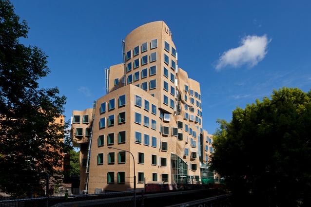
|
|
#
?
Jun 2, 2018 09:40
|
|
|
i like how the guy started off with the A and B having that curve thing and then he got to C and said "oh gently caress" and then forgot about it for the rest of the font
|
|
#
?
Jun 2, 2018 10:15
|
|

|
theflyingexecutive posted:I was gonna say it was like gehry tried to do a brutalist building and I think it fits: I don't often find buildings ugly but this is just disgusting.
|
|
#
?
Jun 2, 2018 15:13
|
|

|
 Any thoughts on what this nice rounded OCR-adjacent face is? Might work nicely for a project I'm working on. Also hey! I started working on a typeface of my own a while ago and it's slow but getting somewhere.
|
|
#
?
Jun 16, 2018 21:02
|
|
|
spider wisdom posted:
Looks a lot like https://www.fontspring.com/fonts/hitype/0arame but for some reason the image makes it look like it has rounded ends
|
|
#
?
Jun 18, 2018 22:56
|
|
|
theflyingexecutive posted:I was gonna say it was like gehry tried to do a brutalist building and I think it fits: Didn't know Gehry was such a fan of Rocko's Modern Life
|
|
#
?
Jun 18, 2018 23:28
|
|

|
Could someone tell me what font is the Gorn, Gorgon Video and Dragonslayer(1981) movie font?
|
|
#
?
Sep 14, 2018 15:44
|
|

|
I�m making a business card mockup for a whimsical book club � can I get alternate recommendations for the Dominican font I used? Preferably ones that includes an entire font family of book, regular, bold and italic fonts (bonus points for small caps) � I'd like to vary the type as much as possible while using the same font. (My mockup is shamelessly based on this masterpiece.)
|
|
#
?
Oct 21, 2018 23:18
|
|
|
If you have Creative Cloud, Freight is a classic option with especially lovely italics https://fonts.adobe.com/fonts/freight-text https://fonts.adobe.com/fonts/freight Though honestly those cards look fine as-is; the only changes I'd make are to reduce the size of the "logo" on the front by about half and remove the underline that doesn't match the aesthetic (or replace it with a scratchy hand-drawn one).
|
|
#
?
Oct 21, 2018 23:27
|
|

|
Thanks for the input, I'll just use Dominican and implement your recommendations. 👍
|
|
#
?
Oct 21, 2018 23:45
|
|
|
The IM FELL family (Dafont.com, Google fonts) is free and has a ton of styles to choose from.
|
|
#
?
Oct 22, 2018 15:40
|
|

|
|
|
#
?
Feb 11, 2019 15:46
|
|

|
https://twitter.com/stephcd/status/1095354199695675392
|
|
#
?
Feb 12, 2019 18:55
|
|

|
Owner of the local comics shop posted on Facebook advertising that they now have Conan & Ehmenainen in stock. (Wonderwoman in Finnish is Ihmenainen.)
|
|
#
?
Feb 23, 2019 21:02
|
|
|
Fontmasters of the internet, does anyone have a clue of what this seemingly easy to find font would be?
|
|
#
?
Jul 16, 2019 19:05
|
|

|

|
|
#
?
Mar 13, 2020 20:24
|
|

|

|
|
#
?
Mar 14, 2020 08:18
|
|


|
Post from a friend hell I'll give you the 20 buxx if you can find it 
|
|
#
?
Mar 29, 2020 11:45
|
|

|
It actually looks like a ligature of a lowercase i and v.
|
|
#
?
Mar 29, 2020 22:33
|
|

|
Did they install external fonts? Cause if not, that should narrow down to what is pre-installed on most OSes.
|
|
#
?
Mar 29, 2020 23:04
|
|
|
kefkafloyd posted:It actually looks like a ligature of a lowercase i and v. Because of the dot they added.
|
|
#
?
Mar 30, 2020 06:50
|
|
|
It's probably a free font off dafont or something. Put it through what the font and what font is with no results. My recommendation? Use your Creative Cloud license to get some better fonts for free.
|
|
#
?
Mar 30, 2020 17:34
|
|
|
Can anyone recommend an attractive(-ish) sans font with the same aesthetic as The Brown? I'm looking for something similar, but also containing the standard diacritics. If not free, I would prefer to buy a copy outright. Any suggestions?
|
|
#
?
May 6, 2020 04:45
|
|
|
https://twitter.com/maredfield/status/1326867986490200064 really interesting thread
|
|
#
?
Nov 14, 2020 03:18
|
|

|
          Hey I'm working on a 3d environment taking place in a university in the 1960s and looking for reference for making my own posters inspired by the period. I'm curious where I would start with identifying the fonts used in these MIT posters? They're from the Library of Congress site if you want to find more. I already know about dafont but I'm curious about what kind of specific keywords I could search to find similarly styled fonts online? Kanine fucked around with this message at 03:47 on Nov 14, 2020 |
|
#
?
Nov 14, 2020 03:34
|
|
|
They�re mostly just helvetica in different weights.
|
|
#
?
Nov 14, 2020 03:51
|
|
|
Oh no the Helvetica Scenario!
|
|
#
?
Nov 14, 2020 10:44
|
|
|
There's a reason they call it the Helvetica standard
|
|
#
?
Nov 15, 2020 03:46
|
|
|
hmm ok i feel really stupid for not realizing those were all pretty much helvetica. thank you goons 🙏 could anybody recommend specific good resources (books/videos/etc) as an intro for someone to start learning about graphic design/typography on their own? this stuff is a really gaping hole in my art understanding
|
|
#
?
Nov 15, 2020 06:06
|
|
|
Goddamn this thread is so old that when I made my post on the first page I was still in my graphic design program in college. So I guess you could do one of those? It didn't help me much. Edit:And this post didn't help you much. Fartington Butts fucked around with this message at 06:19 on Nov 15, 2020 |
|
#
?
Nov 15, 2020 06:15
|
|
|
Getting a degree in graphic design is a great way to ensure that you don't do much graphic design in your life
|
|
#
?
Nov 15, 2020 09:09
|
|
|
Kanine posted:could anybody recommend specific good resources (books/videos/etc) as an intro for someone to start learning about graphic design/typography on their own? this stuff is a really gaping hole in my art understanding The videos in this playlist go over a lot of design concepts in varying detail, with a common thread of typography. Those two channels have a lot of good content between them. They also sell online courses on typography and other creative and business skills for designers if you want to get more comprehensive/structured.
|
|
#
?
Nov 15, 2020 09:33
|
|

|
I kinda miss the sarcastic/honest font samples from the first few pages.
|
|
#
?
Nov 15, 2020 11:34
|
|


|
Fuschia tude posted:I kinda miss the sarcastic/honest font samples from the first few pages. The rest of this thread is excellent too, but once it transitioned from mostly funny jokes to real font talk it stopped being a thread to check when you have two minutes and zero focus. Rad that it's still getting posted in too!
|
|
#
?
Nov 15, 2020 12:08
|
|


|
|
| # ? Apr 19, 2024 07:38 |
|
|
Kanine posted:hmm ok i feel really stupid for not realizing those were all pretty much helvetica. thank you goons 🙏
|
|
#
?
Nov 15, 2020 14:13
|
|