|
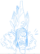
ok, signups are closed! good luck yall
|
|
|
|

|
| # ? Apr 16, 2024 14:26 |
|
A Life Well Lived Micron pens on Bristol board. Original size 7"x7". Some elements drawn from models/photographic references but nothing is traced. 
|
|
|
|
Apologies but the gang tag is presenting problems for dumb radium reasons, we're trying to get hold of lowtax to fix it.
|
|
|
|
Hello kiddo's! The submission deadline is Wednesday at midnight so start posting your stuff! Also I think we still need 2 backup judges. Any volunteers? I'll take one slot if needed. Remember, it's fine if your work is imperfect or if you're still a beginner. The primary point of this thread is first and foremost to learn and grow from others and we respect that you're here making the effort. We're not going to dog-pile you just because you still have more to learn. Plus, if your idea is clever/fun enough you might just beat the pants off of somebody with far superior technical skills (or at least score a sweet HM) so don't just assume you can't win. If you're feeling stuck or unsure of how to proceed try asking for help in the CC Chat or the Stupid Little Questions threads. CC peeps are super chill and will be happy to help you work past any hurdles you're having. Good luck!
|
|
|
|
readingatwork posted:A Life Well Lived I love the detail in this, and the linework was done beautifully. I love how it creates direction and texture. I also enjoy the juxtaposition of the alive and modern things on the top of the side table, and the old and dead things on the bottom shelf. I also like the mood you created, it's peaceful even though there's lots going on.
|
|
|
|
Okay, I think I'm finally done with this. It was a fun challenge! It's a combination of Col-Erase and Faber Castell colored pencils in a Moleskine A4 sketchbook (8.25" x 11.75") 
|
|
|
|
I want to participate. Hopefully not too late. I saw there was a due date to announce interest. Figure I will try anyways. A good exercise is a good exercise.
sigma 6 fucked around with this message at 23:10 on Jun 25, 2019 |
|
|
|
sigma 6 posted:I want to participate. Hopefully not too late. I saw there was a due date to announce interest. Figure I will try anyways. A good exercise is a good exercise. If you think you can finish by the deadline I�d have no problem with it. Al! Has final say though.
|
|
|
|
readingatwork posted:If you think you can finish by the deadline I’d have no problem with it. Al! Has final say though. im ok with it but the deadline for consideration is tonight so get to it edit: it has been brought to my attention that the deadline is tomorrow lol Al! fucked around with this message at 23:54 on Jun 25, 2019 |
|
|
|
Is the deadline for the artwork to be submitted tonight by midnight or tomorrow night by midnight? Thought it was Wednesday night by midnight but I can have *something* tonight if it must be in tonight. As in 12AM tonight right? Sorry for the confusion.readingatwork posted:Hello kiddo's! The submission deadline is Wednesday at midnight so start posting your stuff! This would imply I have tomorrow to work too, or am I misunderstanding? sigma 6 fucked around with this message at 23:54 on Jun 25, 2019 |
|
|
|
sigma 6 posted:Is the deadline for the artwork to be submitted tonight by midnight or tomorrow night by midnight? Thought it was Wednesday night by midnight but I can have *something* tonight if it must be in tonight. As in 12AM tonight right? Sorry for the confusion. i thought it was Wednesday already good thing time doesnt exist
|
|
|
|
Mine's still drying. The humidity's a bitch at the moment.
|
|
|
|
|
Charcoal on Sketch Paper e: Oh geez, if we have more time with it, then I'm making a better one!
|
|
|
Greetings fellow gothics! Acrylic on mdf panel, 30cm square, palette knife
|
|
|
|
|
If anyone's still considering getting a replica skull, I'd really recommend it - I've used McCoy in loads of pictures, he's definitely earned his keep.
|
|
|
|
|
So midnight in what time zone? I have a pic of mine on my phone but I need to tweak it a tiny bit.
|
|
|
|
I'll help judge this one if needed. What does it entail? Just posting critiques and choosing a winner?
|
|
|
|
HungryMedusa posted:So midnight in what time zone? I have a pic of mine on my phone but I need to tweak it a tiny bit. as a resident of the baker islands, i'll be cutting it off at UTC−12:00 :P. basically, try to get it in while 6/26/2019 still exists on the globe.
|
|
|
|
Chernabog posted:I'll help judge this one if needed. What does it entail? Just posting critiques and choosing a winner? Just crits. Only Al! Gets to pick a winner and hand out HMs since they were the last round�s winner. You can say which ones you *want* to win though. Critiques themselves can be anywhere from a few paragraphs per contestant explaining what you thinks works vs what doesn�t to several pages of charts and graphs detailing lots of very specific advice. It�s completely up to you and your comfort level. Just keep in mind that the purpose of a crit is to help the recipient improve, not tear them down. Be honest with any flaws you see, but also be sensitive to the fact that posting your art can be intimidating. HungryMedusa posted:So midnight in what time zone? I have a pic of mine on my phone but I need to tweak it a tiny bit. It�s Al!�s call for this round but going forward I�m going to say the default is PST unless specified otherwise since that gives people the most leeway to submit their work. Good Ol Filbert posted:I love the detail in this, and the linework was done beautifully. I love how it creates direction and texture. I also enjoy the juxtaposition of the alive and modern things on the top of the side table, and the old and dead things on the bottom shelf. I also like the mood you created, it's peaceful even though there's lots going on. I just realized I never responded to this. Thank you for your kind words!
|
|
|
|
Not gonna make the deadline. Just heard that a friend died... and... I am not motivated to draw about mortality ATM. Should have started earlier I guess. Took a ton of reference too. Ugh.
|
|
|
|
sigma 6 posted:Not gonna make the deadline. Just heard that a friend died... and... I am not motivated to draw about mortality ATM. Should have started earlier I guess. Took a ton of reference too. Ugh. im sorry to hear that, i was looking forward to seeing your submission. hope you feel better soon
|
|
|
|
Yeah cant make it either. Work and school blizted me as soon as i said "im In". Im just so tired.
|
|
|
|
|
Oh, no. Sorry Sigma 6. Here is my entry. I bought myself a reference skull and a skeleton hand, too. I am trying to get more loose in my work because my normal stuff is very detailed colored pencil and the colored pencil people are 90% judge on super realism. So this was a fun exercise in trying to draw what I see. 12x9" acrylic markers on Yupo 
|
|
|
|
alright submissions are closed! ill announce a winner this evening, this is an extremely tough one so thank you to everyone involved
Al! fucked around with this message at 15:24 on Jun 27, 2019 |
|
|
|
I like the colors and composition. While I do appreciate that you made the skull darker to separate the planes I think the piece would have benefited from sharper and more directional lighting, the hand feels a bit flat and since it has so much contrast it takes most of the attention away from the skull. I think the ruby would look better without the outline, or at least a really thin one.lofi posted:Greetings fellow gothics! Good Ol Filbert posted:Charcoal on Sketch Paper -Use the light to your advantage to get interesting shadows and shapes. If you darkened the background the skull would instantly pop out. It could even be a circle gradient around the flame to suggest light and brightness. -Watch your lines, they are mostly too thick and rough. If your drawing utensil is too thick then you need to either get a thinner one or draw bigger. I can't make out what the little shapes on the right are. -Why is the skull sitting on a sphere? What is the sphere? Even if it is justified, the top of the skull has a tangent with the table which looks a bit funny. -Be more playful with your compositions, usually you don't want things to sit right in the middle of the canvas. Maybe this sounded a bit harsh but I can guarantee that if you follow these pointers it will improve vastly. I'd even encourage you to do it again. readingatwork posted:A Life Well Lived Observations: -Some of the items are a bit wonky, especially the glass/ceramic things. The books look like they have weird proportions but maybe that's just because they are somewhat covered. -Add thicker outlines to the front stuff to help separate it from the BG. You somewhat did that already but you can push it much further. -Consider adding some cast shadows onto the sofa, floor and wall, it would also help separate the planes. Since the textures make it very busy I think anything that helps with the visual organization is worthwhile. heavy liquid posted:Okay, I think I'm finally done with this. It was a fun challenge! I like that you gave a touch of blue to the shadows but I still feel like the colors could pop a lot more on other places. All that gray shadow on the table just kills it (pun not intended). Speaking of that shadow, it is a bit distracting how it has a hard wavy edge at the top when there's nothing inside the frame to justify it. Finally, the objects seem a bit floaty, I think you should add harder shadows at the contact areas. HMs: Reading at work, Lofi My pick for winner which doesn't matter anyway: Hungry Medusa Chernabog fucked around with this message at 18:00 on Jun 27, 2019 |
|
|
|
ok the winner is drumroll please......... lofi for a fresh and intriguing take on the prompt that i loved for its expressiveness and texture honorable mentions to hungry medusa for excellent layering and color and readingatwork for overall technical excellence so lofi, the prompt is up to you critiques will come later. im not used to providing critique ha ha just kidding i hold a degree in art history im going to be brutal just kidding again but also ill get through them one at a time when i can
|
|
|
|
Chernabog posted:
Not harsh at all! :-) I appreciate the input and I love critique, it's part of growing. Thank you!
|
|
|
|
Congrats, Lofi!
|
|
|
|
Yay! I am the most goth! All is dust, etc. Ohshit now I have responsibility! The next challenge then...  Prompt 3: Album Cover Prompt 3: Album Cover   Music and visual art go together real good. And album covers are/were a quick way to say 'hey, this is what this band does, it's super cool and you should buy (lol) this album'. So we're gonna make album covers!  Of course, I don't want you to be chained to a band's existing covers. To make sure of that, and because it amuses me, we're going to make album covers for a band that doesn't actually exist (yet). Using The first random generator I found, our soon-to-be-legend bands are: Nitro Hitch With The Stately Macaroon Adequate Revelation Deserted Chronicles Sub Peasant Taxi Mandate Not bad, generator! Pick one of them, think about what music they'd play, and make me an appropriate album cover. Signups close on 5th July, and the launch date is the 12th July, midnight GMT. For bonus points, describe the album you're making the cover for. lofi fucked around with this message at 17:56 on Jun 28, 2019 |
|
|
|
|
I'm in! Do I have to pick my album now? If so, I'll take Adequate Revelation.
|
|
|
|
I'm happy for people to declare early or when they post their final piece, whatever works for you.
|
|
|
|
|
Adequate Revelation it is!
|
|
|
|
im in but ill need to think about it
|
|
|
|
Congrats Lofi! I am also in and will also have to think about which band name I will chose. Also people can expect my critiques over the weekend sometime. Chernabog posted:Very neat and clean, and nice job with the patterns and the perspective. Thanks for the crit!
|
|
|
|
Going with Sub Peasant.
|
|
|
|
hm, ok i'll try. In with Deserted Chronicals
|
|
|
|
Since I barely made it last time, I volunteer to back up judge/critique this time. Congrats. Lofi! I liked how stark yours was with the bright white and dark background. The palette knife strokes give it good energy.
|
|
|
Thanks! High-contrast is totally my thing, lots of black and white comics growing up. 
|
|
|
|
|
OK - this time I am starting early. I also love the name "adequate revelation" but really they are all pretty great. "Adequate Revelation" makes me think of this recent music video by Lennon Claypool Delirium "Satori" https://www.youtube.com/watch?v=oG5zRsKMyBc A little angry at myself for not doing the vanitas round but am excited about doing another album cover. I have done a few over the years. Some used. Some not. Also - in regards to the girl who died. She was a new friend and out of state but gently caress heroin. That's four people I have known who have died from opiate abuse within five years, including an ex GF. On a lighter note: Congrats lofi! Reminds me of little of a Francisco Goya painting. EDIT: OK - here is my submission. Adequate Revelation *paranoid post rock* (sounds like Black Mother Super Rainbow meets Mogwai)  Made with Zbrush / Keyshot / Photoshop sigma 6 fucked around with this message at 15:27 on Jun 29, 2019 |
|
|
|

|
| # ? Apr 16, 2024 14:26 |
|
That's a hell of a video, very cool! Which pic are you entering? Only one entry per goon.
|
|
|
|


