


|
Doing reps... Is there not an Inktober thread this year? Krispy Wafer fucked around with this message at 02:52 on Oct 1, 2019 |
 #
?
Oct 1, 2019 01:43
#
?
Oct 1, 2019 01:43
|
|


|

|
| # ? Apr 25, 2024 16:58 |
|
|
I think it is the daily drawing thread. Technically inktober is a daily drawing for all of October.
|
|
#
?
Oct 1, 2019 02:20
|
|

|
What's the cut-off exactly for this contest?
|
|
#
?
Oct 1, 2019 17:08
|
|
|
Flavius Aetass posted:What's the cut-off exactly for this contest? Midnight tomorrow night PST unless Lofi had another time zone in mind.
|
|
#
?
Oct 1, 2019 17:34
|
|

|
It's more 'when you've had long enough' - I'm not going to disqualify anyone over a few hours. ")
|
|
#
?
Oct 1, 2019 19:18
|
|
|
It's a pity but I'll probably miss the deadline, which kinda sucks because I had so many ideas for this specific contest.
|
|
#
?
Oct 2, 2019 06:11
|
|

|
https://i.imgur.com/INg3cvO.mp4 http://pasteall.org/blend/index.php?id=52409 alright here is my entry its a 3d model. Its repeat is bit different basically i started with cube did a boolean cut used that boolean cut as basis of new boolean cut's/additions and repeated that until the blender could not handle more. i was thinking of doing a render but that would have been impossible. especially with lighting
|
|
#
?
Oct 2, 2019 20:45
|
|


|
Awesome! What is a boolean cut?
|
|
#
?
Oct 2, 2019 21:16
|
|

|
Keetron posted:Awesome! What is a boolean cut? its basically taking A object and then taking B object and deleting things that intersect both objects out of A object. here is simple demo of my workflow for repetition https://i.imgur.com/WNkk1V9.mp4
|
|
#
?
Oct 2, 2019 21:33
|
|
|
e: nvm, saw your reasoning. What shortcuts are you using for that? I've always done booleans manually, your way looks SO much faster. Actually, is that even blender? Looks similar but different to mine. lofi fucked around with this message at 01:42 on Oct 3, 2019 |
|
#
?
Oct 3, 2019 01:38
|
|
|
going a little meta here e: changed it slightly within a few minutes. hope that doesn't break the rules Flavius Aetass fucked around with this message at 04:12 on Oct 3, 2019 |
|
#
?
Oct 3, 2019 04:02
|
|
|
Flavius Aetass posted:going a little meta here that's really nice
|
|
#
?
Oct 3, 2019 04:10
|
|


|
Eeeeeeeeeh I can tell I hit art block pretty hard, but it's something. And I didn't yell at Clip Studio while trying to do the animation, so there's that.
|
|
#
?
Oct 3, 2019 04:27
|
|

|
With 3 minutes until deadline... I have 3 repetitions.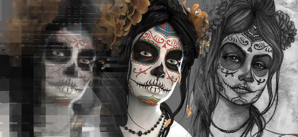 *whew*
|
|
#
?
Oct 3, 2019 07:57
|
|
|
lofi posted:
the best thing in blender is the add-on's those things can change the functionality/ease of use a lot. i was using boxcutter for faster boolean workflow, its pretty amazing but its also paid add-on. Rendering time would have been excessive as well because that thing has over 300k faces. But main reason i didnt do it was the lighting. and even if i did lighting perfectly i would still loose some smaller details. Because i have not figured out how to reproduce excessive ridges and cavities look dev mode has that makes border's of model much clearer. https://i.imgur.com/uTLC4Xd.mp4
|
|
#
?
Oct 3, 2019 08:42
|
|
|
 Time's up! Time's up!This round's winner is... Flavius Aetass  With some gorgeous flowing ink-work, and a 3am expression I know all too well! Congratulations! I'd do honourable mentions, but there were loads of really good entries - seriously well done to everyone, this was a bastard to pick a winner for. I'll have crits for you over the next few days.
|
|
#
?
Oct 3, 2019 17:06
|
|
|
Good choice. I love messy watercolors.
|
|
#
?
Oct 3, 2019 17:16
|
|
|
A worthy victor! Nice work everyone.
|
|
#
?
Oct 3, 2019 17:26
|
|
|
Wow, thanks so much! Looking at the great entries this round, I wasn't expecting to win. I'll submit the next prompt tomorrow morning! *bangs on table* GANG TAG GANG TAG GANG TAG
|
|
#
?
Oct 3, 2019 22:26
|
|
|
Flavius Aetass posted:Wow, thanks so much! Looking at the great entries this round, I wasn't expecting to win. queued it already bb
|
|
#
?
Oct 4, 2019 00:00
|
|
|
Talking of, Readingatwork, please could you update the winners-post with the names of previous winners? Ta!
|
|
#
?
Oct 4, 2019 00:22
|
|
|
lofi posted:Talking of, Readingatwork, please could you update the winners-post with the names of previous winners? Ta! Done! Good catch.
|
|
#
?
Oct 4, 2019 02:53
|
|
|
Round VIII�Caricature Show me your more face! Caricature, a simplified, heavily stylized, and/or exaggerated form of a person, is one of the most common and oldest types of art.  Ancient Roman grafitti These days people think of it as mostly found in semi-professional art and political cartoons.  Modern street art style caricature  Dave Granlund cartoon  One of mine, subject unknown It can also be applied to other forms of art where the human form might be stretched or warped, even if the subject is not supposed to represent a particular person. 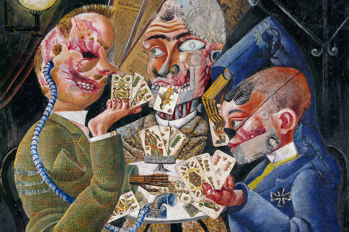 Otto Dix painting 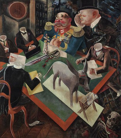 George Grosz painting  My own pale imitation of that sort of thing Be as creative as you like! I won't be holding a strict definition of the term for this contest. You have until October 12th to declare you'll be entering this round. Submissions must be posted by/on October 26th. Good luck!
|
|
#
?
Oct 4, 2019 17:29
|
|
|
Probably won�t make this one since I�m out traveling for most of that timeframe but I�m going to try anyways since that�s an awesome prompt.
|
|
#
?
Oct 4, 2019 18:01
|
|
|
Congrats Flavius Aetass. Consider me in for this round but I probably won't put quite as many hours as I have put into my previous submissions. Way behind on inktober and October is kind of a busy month.
|
|
#
?
Oct 4, 2019 20:12
|
|
|
In! Totally not my style, but that just makes it more fun!
|
|
#
?
Oct 5, 2019 07:36
|
|
|
It's crit time! In order of when you posted. Sorry for all the typos, I changed keyboard layout recently and I'm still getting tons of mistakes when I type with any speed. readingatwork  Your pattern-work is very cool but I think it needs something more to make it pop, something to contrast the work either in the frame or with more variation in the pattern. As-is, my eye kind of slides off it, the ever-lazy brain just goes 'oh yeah, repeating texture, cool, safe to look elsewhere'. Maybe something with colours might work? Or putting the pattern on something, or a fancier border. Compare it to Krisy Wafer's entry, which maintains visual interest by use of a background, that sort of idea would work well here I think. Of course, on the meta-level, you absolutely nailed the prompt - the repetitious nature of the labour involved makes it a far more interesting piece than if you'd done it digitally. Gonna say it again, you're insane doing this by hand. Keetron https://forums.somethingawful.com/showthread.php?threadid=3890426&userid=0&perpage=40&pagenumber=6#post498732760 "The post only works as a whole"  I like your concept, similarities between houses as you zoom out, you've got a sort of fractal thing going on there, but if you want an artwork to include multiple pieces like this, I think it's important to tie them together visually. Currently they feel quite seperate. Your subject is the same in each, and they're linked by the text, but visually they have very little in common; your style changes a lot (especially in the third image), as does your colour palette and viewpoint. If you'd used something like a shared palette to give them more in common I think the entry would be a lot stronger. Also, if you want your entry to include text like that, making it as a pdf might have been a good idea, it would give you greater control than relying on SA's font/formatting/etc.  Another take on this entry could have been to just focus on De Bijlmer, and really put your effort into that; the third piece is by far the strongest, with a more interesting point of view, and a stronger subject. I'd have liked to see different views of the place! The architectural-ennui you write about is definitely a good subject, the horror of modernist architecture appeals to me. If you've not seen it, you might enjoy High Rise Krisy Wafer This is a really fun one, and very well executed - I like how you've leaned into the comic vibe with the colours/linework/textbox. The background adds a bit of spice to stop it being too repetitive. It might sound weird, but I thought the posing of the turtles was great - the way they're treading down on each others' heads gives them a great sense of weight. Bad news, though - looking closely at it, I'm pretty sure those are tortoises and not turtles! Whaever, close enough. The main thing I'd change in your entry is to lose the textbox - it was clear enough what it was, and I think making it so overt robs the viewer of that little moment of discovery. Fun weird format, too, I like a bit of variety there. Dark Off https://i.imgur.com/INg3cvO.mp4 http://pasteall.org/blend/index.php?id=52409 This is hella cool, it's got enough greebles that I keep trying to interpret it as something (weird mutant shipping container? ammo clip?), it really grabs my attention. You used your tools well, I thought, sidestepping the difficulty in rendering. It reminds me a lot of NaissaneE, and that's a good thing. Having said that, the UI being included in your vid really does detract from it, and you might have been better off simplifying your model and doing a full render. An animation would have been sweet, though I don't know how much time that'd take to render. I'd have gone with 'light-source following camera' to show different detail as the PoV moves. Flavius Aetass - Winner!drat, I love your style, I'm an absolute sucker for loose inks and a good wash! 'Going a little meta' is a great interpretation of the prompt, I always prefer art that implies rather than outright states. I think you nailed the exhaustion with the messy hair and tired eyes, and that sells the concept really well. You've got a nice use of light and tones going on, the phone-lit face being the lightest element helps draw the eye there. Nice cast shadows add a bit of realism, keep the image easy to read. Plus you used that turquoise colour which is like crack to my eyeballs. My only real problems are a couple ot loose details: the perspective on the headboard looks a little off, though I can't put my finger on exactly how, and I'd have liked some form-shading on the bed to show her torso. Together, they mean it's a little hard to parse the bed visually, though the context is clear enough to carry it. Well done on the win, I really enjoyed your concept and the execution! Solenna I'm surprised we didn't get more looping gifs this round, it seems an ideal format for repeating! The first crit I've got is don't shoot down your work before you show it to people judging it. Seriously, all you're going to do is sound like you're making excuses and bias people against your work. I know it's only the forums, but it's a bad habit. If you really gotta kvetch, at least put it after the art! The picture (video? gif?) is pretty sweet, it's making me think of... 80s music videos? MTV title cards? Something along those lines, though I can't put my finger on it. It's cool, whatever it is. When they figure out how to do animated tats, I'd get that done. If you were going with a snake for 'repetition', it's weird that you didn't use an ouroboros, but I think a circle might have been a less interesting shape. Why the snake? Is it shedding pattern-skins? Other thing I'd suggest is leaving out the plain-black frame - it's very distinct in the loop, and makes it feel more stilted than it otherwise would. sigma 6 This one didn't work so well for me - I'm not a fan of mixing photoreal/cgi and drawn elements together, it tends to make drawings look very flat. The triptych/religious/death theme is a strong one, but you didn't do enough with it for me. The 3D render in the centre is stunning, as a single image it's great, but it feels very crowded by the distorted version overlapping it on the left, I'd have given them all a bit more room in the composition to breathe, and cropped the left tighter so that the centre/right sections take up a greater proportion of the image. I'd have liked to see a more creative interpretation of the prompt than 'I repeated a thing' - the same subject in different media could have been interesting, but the leftmost section doesn't fit that theme (it's the centre image but hosed up?). The composition feels like 1A-1B-2 rather than 1-2-3, if that makes aky sense? I want to emphasise, though - the individual parts of the picture are very well done. It's just that as a response to the prompt I think the image is lacking.
|
|
#
?
Oct 7, 2019 12:17
|
|
|
lofi posted:Keetron 1. When doing a series, make sure the different pieces are tied together by visuals, palette and other similarities that are obvious to the viewer. (The palette is something I struggle with a lot atm) 2. If you add text to your entry, take control of the layout by making a pdf 3. The pieces that I hate are often the pieces people like most. Number 3 is still a mistery to me. Take this one for example. The washed out colors, the lack of sharp edges and a wild guess what that blob in the middle could be, make me dislike how it came out vs how I wanted it to be. But yeah, the Bijlmer is a special place, I can draw there for hours if it wasn't for the fact that Can someone spoil me what the thing is with the winning entry? I love the piece, really, but why it is fitting the subject is flying completely over my head. Not disputing the winning, I just wanna be in on whatever it is.
|
|
#
?
Oct 7, 2019 12:48
|
|
|
lofi, thanks for the feedback! I really appreciate it and agree completely. me: "I won that contest, and the judge was the guy from the chicken painting on the fridge!" gf: "that's nice, baby"
|
|
#
?
Oct 7, 2019 14:11
|
|
|
Keetron posted:Can someone spoil me what the thing is with the winning entry? I love the piece, really, but why it is fitting the subject is flying completely over my head. Not disputing the winning, I just wanna be in on whatever it is. It's the repetition of being on your phone long after bedtime, checking facebook one more one more time for alerts you don't care about, even though you're knackered. Flavius Aetass posted:me: "I won that contest, and the judge was the guy from the chicken painting on the fridge!" I didn't realise it was you who had that! Yay fridge-chicken! Not a guy though!
|
|
#
?
Oct 7, 2019 14:56
|
|
|
Sorry, old habit!
|
|
#
?
Oct 7, 2019 15:08
|
|
|
Flavius Aetass posted:You have until October 12th to declare you'll be entering this round. I will go and squeeze something in, caricatures was something I did an attempt at a year or so ago, maybe it was more. I was never any good, maybe I improved? lofi posted:It's the repetition of being on your phone long after bedtime, checking facebook one more one more time for alerts you don't care about, even though you're knackered. Keetron fucked around with this message at 19:52 on Oct 9, 2019 |
|
#
?
Oct 9, 2019 19:47
|
|
|
lofi posted:It's crit time! In order of when you posted. I know it's past declaration date, so I might not get a crit, but I'll give this round a shot anyways.
|
|
#
?
Oct 14, 2019 20:38
|
|
|
What's the purpose of declaring? Is it so that people don't go 'oh yeah cool' and then forget about it by the deadline?
|
|
#
?
Oct 14, 2019 21:08
|
|
|
I've been doing thunderdome, which has always had a similar policy, for seven years and I have no idea. Maybe to give people a deadline to sign up and still have time to work? Idk.
|
|
#
?
Oct 14, 2019 21:44
|
|
|
I just based my deadlines on the last one. Tbh it feels like too much time.
|
|
#
?
Oct 14, 2019 21:52
|
|
|
lofi posted:What's the purpose of declaring? Is it so that people don't go 'oh yeah cool' and then forget about it by the deadline? I think so? Also getting someone to commit publicly probably increases the odds that they will actually submit something. Honestly though I put that in because that�s how the TD does things. If people want simpler rules I�m fine with that.
|
|
#
?
Oct 15, 2019 20:28
|
|
|
I thought the TD declaration was an implied toxx? Or was it just a bad icon?
|
|
#
?
Oct 15, 2019 21:18
|
|

|
Pretty sure toxxing is optional (but encouraged) in td. But yeah, the public commitment probably helps for many people either way.
|
|
#
?
Oct 16, 2019 07:29
|
|

|

|
| # ? Apr 25, 2024 16:58 |
|
|
No, toxxes are separate. It's fairly meaningless, though it does maybe increase the completion rate by giving people more time to work? Up to you, art friends.
|
|
#
?
Oct 16, 2019 08:23
|
|