


|
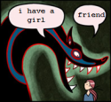
Those are good comics Neon!
|
 #
?
Sep 8, 2019 04:35
#
?
Sep 8, 2019 04:35
|
|


|

|
| # ? Apr 20, 2024 02:00 |
|
|
Stuff looks great, Neon.
|
|
#
?
Oct 2, 2019 17:48
|
|
|
I started a new comic, Tales of Wasted Youth. Its a coming of age story about a slacker. I planned out an entire years worth of updates and am suppose to do 5 pages worth of panels every monday. Without floating all my anxieties, I was hoping to get an honest critique of my fist complete issue. https://www.webtoons.com/en/challenge/tales-of-wasted-youth/list?title_no=334276
|
|
#
?
Oct 14, 2019 22:09
|
|

|
Johnny-on-the-Spot posted:I started a new comic, Tales of Wasted Youth. Its a coming of age story about a slacker. I planned out an entire years worth of updates and am suppose to do 5 pages worth of panels every monday. Without floating all my anxieties, I was hoping to get an honest critique of my fist complete issue. I like it! The art style is very simple but that's enough for the kind of story you're telling. One thing I would say is that you kinda go nuts with the half-tone gradient. I would play around with other textures and brushes to communicate a wider range of emotions.
|
|
#
?
Oct 15, 2019 14:56
|
|


|
Webcomic host Smackjeeves is
|
|
#
?
Nov 20, 2019 01:18
|
|
|
Ouch.
|
|
#
?
Nov 20, 2019 09:56
|
|
|
Oh I thought you striking out that text meant it wasn't going to happen.
|
|
#
?
Nov 20, 2019 12:07
|
|


|
I'm copying all of my site data (templates, etc), important conversations, private messages etc. to my own files because i don't trust this company and don't believe anything will be left "read only" or retrievable at all. It sucks. i was getting on a roll with updating again and this really knocked the wind out of my sails. I know of two other really long-running comics that were ending near (or in one case, actually ON) the day this poo poo is supposed to take place. It really sucks. I'm trying to look on the bright side and think about improvements I can make when I move (likely to ComicFury). Just sucks, I used to recommend SJ to everybody. I could probably check my post history in this thread alone and see 5 recommendations to people looking for hosts.
|
|
#
?
Nov 23, 2019 02:30
|
|
|
sweeperbravo posted:I'm copying all of my site data (templates, etc), important conversations, private messages etc. to my own files because i don't trust this company and don't believe anything will be left "read only" or retrievable at all. It sucks. i was getting on a roll with updating again and this really knocked the wind out of my sails. I know of two other really long-running comics that were ending near (or in one case, actually ON) the day this poo poo is supposed to take place. It really sucks. 
|
|
#
?
Nov 23, 2019 06:36
|
|

|
I'll vouch strongly for comicfury, the forums are a little ehhh sometimes but the site itself and the admin that runs it are fantastic and he's hammered out some kind of smackjeeves-to-comicfury converter also after ending my old comic I have started a new comic
|
|
#
?
Nov 24, 2019 06:56
|
|
|
What�s the general consensus on breaking the Z format of panel reading order? Sometimes on pages I�ll lead try and lead the reader in more of a S shape, if there�s something on the far left side I don�t want them to see yet or if things come together naturally.
|
|
#
?
Nov 25, 2019 15:32
|
|
|
TheHan posted:What�s the general consensus on breaking the Z format of panel reading order? Sometimes on pages I�ll lead try and lead the reader in more of a S shape, if there�s something on the far left side I don�t want them to see yet or if things come together naturally. That sounds like an insanely frustrating decision with no real benefit but I guess anything can work if it's done well enough? Do you have an example you can show us?
|
|
#
?
Nov 25, 2019 15:40
|
|
|
TheHan posted:What�s the general consensus on breaking the Z format of panel reading order? Sometimes on pages I�ll lead try and lead the reader in more of a S shape, if there�s something on the far left side I don�t want them to see yet or if things come together naturally.
|
|
#
?
Nov 25, 2019 16:28
|
|
|
TheHan posted:What�s the general consensus on breaking the Z format of panel reading order? Sometimes on pages I�ll lead try and lead the reader in more of a S shape, if there�s something on the far left side I don�t want them to see yet or if things come together naturally. Do it very very rarely and make it very very obvious that you're breaking the natural flow of the comic. I've done this maybe three times in ~600 pages, and each time I've tried to leave extremely clear and obvious breadcrumbs that the eye is supposed to move down and to the left at the points I need it to. The eye likes to latch on to anchor points, key elements of contrast that stand out loudly, so make sure the next anchor is close to and in the direction of visual momentum from the last. The three times I've done this that I can think of I blacked everything out and used a flashlight cone to define my panels, and then kept the action and the direction the characters are looking/moving/pointing facing the direction I want the eye to lead [http://deadwinter.cc/page/389]; I used an actual animated dotted line like a traintrack throughout the page for the eye to follow [http://deadwinter.cc/page/460]; and just the other day I wanted to fit six panels in unbroken sequence so I used panel borders and contrast points to lead the eye in a C shape before depositing it back into normal reading flow [http://deadwinter.cc/page/589]. Breaking the flow of the reader's eye is not something to be taken lightly and it's not something you want to make a regular habit of. Be very careful with planning your page and make sure the way you want to lead the eye is the loudest possible thing on the page. Good luck!
|
|
#
?
Nov 25, 2019 17:33
|
|


|
readingatwork posted:That sounds like an insanely frustrating decision with no real benefit but I guess anything can work if it's done well enough? Do you have an example you can show us?  The panels here snake, but If I were doing this now I probably would�ve done something like this:  Which I think is what the idea was, but I was a bit worse with breaking beyond static grids. Even now I can�t tell if I�ve just gotten too far in my own head with it. Edit: I took to long to post this! Neon Noodle posted:If your page layout requires you to reverse the standard reading direction, redesign the page. I don�t mean required but more by intention. What had me thinking about it was this sequence:  I like the idea but there was once or twice where I lost the flow, which made me realize I tried pulling it off before too. Reiley posted:Breaking the flow of the reader's eye is not something to be taken lightly and it's not something you want to make a regular habit of. Be very careful with planning your page and make sure the way you want to lead the eye is the loudest possible thing on the page. Good luck! These are great examples! I definitely haven't executed it that well in the few times I've tried it out, but now I do think I've overused it compared to the few pages I've done. Thank you!
|
|
#
?
Nov 25, 2019 18:07
|
|
|
Yeah don�t do that anymore. Sentence this of equivalent comic the basically It�s. It�s good that you�re trying new things but this REALLY isn�t working for you. That page you posted goes directly against how you�d normally read a page and there are no context clues either in the panel layout or in the panel contents themselves to clue you in to the correct order. You could have easily flipped the order and nothing would have been lost. As for switching the layout up to something like: 1_______2 ________3 ____4 5 That doesn�t work either. My eye wants to read the panels from the bottom up before reading them backwards like that. I�d just do something like this instead: 1_______2 3 ____4 ________5 The bottom line is that your toolset is somewhat limited in terms of raw panel layout. If you�re looking to spice things up maybe instead consider having bigger/smaller panels, more/less panels per page, have characters break the panel boarders, or have non-standard panel shapes instead. Hope that was helpful. readingatwork fucked around with this message at 19:18 on Nov 25, 2019 |
|
#
?
Nov 25, 2019 19:16
|
|
|
sweeperbravo posted:Webcomic host Smackjeeves is Somehow it managed to disexceed even my low expectations. The home page is dull and generic but that's more or less what I expected. However- -Try to go to a smackjeeves URL for a specific comic. You can't. There aren't any. All comics now have the smackjeves.com URL followed by a random character string. So you can't tell a friend "Oh yeah you can check out my great buttsex comic at buttsex.smackjeeves.com" You have to be ike "you can check out my great buttsex comic it's smackjeeves.com/1929-s-rje000" or whatever This means any link you had to your comic somewhere will now just link to the SJ homepage, where a reader will then ahve to manually search for your comic using the site search function. Idk about you but if I tried someone's direct url and it redirected to the host homepage I would assume that person had deleted their comic and probably not bother trying to search. Just another way they are trying to redirect people toward the specific comics they're trying to sell -They said the forums would be left up but in "read only" format. This is not true, following smackjeeves.com/forum takes you to an error page  -I deleted every page off my site except a redirect comic. Below that comic is now an ad, followed by my comment section... in reverse chronological order. So the last reply in the comment chain comes first and my author comment is all the way at the bottom of the page. It is designed to facilitate hit-and-run comments/"liking" and not actual interaction between users, which is icky and can't be monetized! -A friend with 860 pages reported that the archive now reads as 860 *chapters* -Another user said that chapters cap at 10 pages. This is a weird small number that doesn't jive with most longform story comics I've ever read! -Apparently the "coins" or whatever can be used to "rent" chapters of popular comics, but something is messed up with that system as well, like you can only rent one chapter at a time (remember 10 pages) and can't rent another one until that first rental expires At first I thought people were making a big deal of changes we knew were gonna suck anyway, but I don't know how it managed to be even worse than I expected. I hope any stakeholders here already moved house. edit : To be FAIR to NHN- apparently the forums are still viewable, but the URL changed. edit edit: You can now no longer pre-schedule updates. Congrats on that 20 page buffer! Enjoy staying up until midnight every Thursday to ensure it uploads when you want! (Or don't- we want you to upload in chapters so we can monetize your content more efficiently!) sweeperbravo fucked around with this message at 02:50 on Dec 4, 2019 |
|
#
?
Dec 4, 2019 01:33
|
|
|
sweeperbravo posted:Somehow it managed to disexceed even my low expectations.  weren't you involved in backstage operations at sj for a while? it must be heartbreaking seeing it run off the rails like this. are they trying to kill it, or just completely woeful at platform design?
|
|
#
?
Dec 4, 2019 02:27
|
|
|
fauna posted:this is so sad I didn't have that much clout, really- I was just a forums moderator. The other remaining mod was a lot more active in terms of coding help etc, I mostly just swept cobwebs and banned spambots and made shitposts people had to read because they couldn't put me on ignore. But neither of us were proper "admins" with any hand in the site-side operations. Going through my PMs to back up and save was the most emotional part for me- conversations I totally forgot I had with people who've long since moved on to other things. I was devastated, then angry, and then packed up and moved to Comic Fury. Weird and wonderful little corner of the internet. A *lot* of people have jumped ship and headed there as well. I'm at the "good riddance" stage of the grieving process now and can kind of just laugh at what's going on. In a weird way I lucked out because I feel the change actually screws over people with popular comics the most- the rest of us could just move without losing too much, but there are people who built their brand on their SJ site who now have this stripped down, embarrassingly broken "host" as a flagship. It seems like they're just removing all the parts that made it feel unique and like a community rather than a store, if that makes sense. The moves they're making are all toward mobilization and monetization of content. I don't think either was inherently a bad goal but the changes came through without any community feedback and we had 2 weeks to copy paste all our poo poo we needed to save. It's clear the site is now "for the buyer" than a host for the creator. The bright side is getting to know a new community and wanting to give the finger to the new sj company has given me a kick in the pants to dig into making comics again, and I've been more productive since the news dropped than I've been in a long time. I hope other folks who got uprooted get to the point where they feel that way as well.
|
|
#
?
Dec 4, 2019 02:49
|
|
|
it's cool to have more goons on comicfury, even if it's not the most ideal circumstances I am taken aback by how rapidly the front page filled with pokemon mystery dungeon comics not a judgement call on the refujeeves, it just genuinely hit me out of nowhere yesterday
|
|
#
?
Dec 10, 2019 05:54
|
|
|
I have had a facebook advertising account for less than 24 hours and the account has already been closed twice slowly coming to terms with the fact that either I'm secretly a robot, or need to legally change my name to Suspicious Activity I just want to plug my webcomic
|
|
#
?
Feb 18, 2020 20:46
|
|
|
Hi guys. Just FYI, this month's Artdome is about creating comic pages so I figured I'd see if anyone here was interested. For those not already aware the Artdome is a monthly art contest where people submit art based on a prompt. The winner gets to pick the next prompt and act as that round's judge. It's basically Thunderdome but for visual stuff and with no penalty for losing. Everyone gets good feedback and winner even gets a neat gang tag made by our own former champion Al!. It's a pretty fun way to get some practice in so if that sounds at all interesting to you please consider checking it out. E: Link to the current prompt: https://forums.somethingawful.com/showthread.php?noseen=1&threadid=3890426&pagenumber=14&perpage=40#post502640914
|
|
#
?
Feb 24, 2020 04:29
|
|
|
fake news
|
|
#
?
Mar 18, 2020 09:59
|
|

|
Hey goons. I couldn't remember if I already posted here but if I did it was a while ago... I make a webcomic called The Contradictions. It won the Eisner for Best Webcomic last summer! https://www.thecontradictions.com I was supposed to be special guest at San Diego Comic Con this year to launch the print collection, but the event was canceled a week ago. :C so I'm doing what I can to self promote more in light of that sadly lost opportunity. Down to chat comix. I remember being on the forums I think 14 years ago when there was a huge Sonic the Hedgehog comics fan who broke into writing for the series. That was a big inspo to me. ")
|
|
#
?
Apr 24, 2020 03:05
|
|

|
trophynano posted:Hey goons. I couldn't remember if I already posted here but if I did it was a while ago... I can see why it won. Bookmarked this thread on a lark for when I finally got the courage/chops to make a comic myself and I saw this thread was back from the dead again. You absolutely nailed the sense of being a young adult, set apart from yourself and everyone around you. Like you're a little excited, but it's masked with fear of the unknown and impostor syndrome. Followed you on instagram and can't wait to see what happens with the anarchist shop. I have a sinking feeling the bike they bought isn't going to be around when they get out. Is this autobiographical? I guess since I posted in this thread, I might as well ask: does anyone have any tips for diving headfirst into making a comic when you haven't done anything approaching that before? I've got a rough draft of my entire story and have wanted to make something since I was sixteen. If my layoff gets extended I'm telling myself that I'll make the first issue, or at least the thumbnails. I don't really feel like I have the skills for it yet, at least not to the level I want, but putting something out, learning as I go is better than sitting on it and risking it never being made, right?
|
|
#
?
Apr 24, 2020 04:58
|
|
|
The Halogens posted:I don't really feel like I have the skills for it yet, at least not to the level I want, but putting something out, learning as I go is better than sitting on it and risking it never being made, right? yes; the best way to start building those skills is to start making something. As you would not learn to ride a bike by reading about people riding bikes or watching videos of people riding bikes, you need to get on the bike yourself. Everyone hates the early stuff in their own archive*. Some people let this negativity prevent them from continuing to create because they become fixated on what they did years ago instead of what they're capable of doing now. A good mindset is to go into it knowing you're doing your best, and if you keep practicing, looking up information on techniques, trying new things, seeking feedback, your "best" will keep getting "better" and the stuff you're doing, especially since you're a beginner, a year or even half a year from now *should* look different from what you're doing today. It's actually one of my favorite things about this medium to be able to look at how much an artist has grown, especially since many comics span years and you can really see improvements. *I guess there's theoretically people that don't Everyone has a system that works for them, so you're probably going to go through a period where you're not sure what your work flow looks like exactly, or you might try something for a while and then need to change it up a few months down the line. You say you have the entire thing already written out in rough form which is a great starting point. Thumbnailing the first issue sounds great. Decide if you want to update as you create, or if you want to have that whole issue done before you start posting online. Each side has pros and cons- updating as you create- + you can potentially start getting reader feedback immediately which I personally have always found to be a tremendous motivator, moreso than anything else - even if you have a buffer of so many pages worth of updates, you might hit a snag where you're unable to upload something new; readers tend to be forgiving especially if they've subscribed to your comic in some way or as long as you don't fly off on hiatuses all the time, but you will lose some every time** updating after you've finished a whole chapter- + if you put up a good chunk of that whole chapter to begin with, a new reader has a lot of material to get invested in; if you're updating page by page, you know you automatically have a buffer for however many pages your issue has divided by how many times you want to post per week - by the time readers see your work, it's likely to have been a long time since you worked on it. I feel like issue updates may also run more into the snag of the "old art" problem above- as a new artist, let's say you thumbnail everything, great, now it's time ot sketch, great, now it's time to ink... but in that time you've learned a bit about composition, so some of your early thumbnailing and sketch work doesn't look right anymore.... or you ink, great, but in that time you've learned about lineart and now your earlier lineart doesn't look right anymore... you can push through this and just deal with it as an artifact of its time, but I know I've had problems in the past when I tried to add new art to old pages, working on old pages that don't show your current best just felt kind of lousy. Could be just me. You could also solve this problem by working on each page or scene to completion in order but holding off on just the posting part until the whole chapter is done. For someone starting out I recommend having like 5-10 pages finished and uploaded, a few more ready to go for the next week or two, and then moving to upload-as-you-create, but you know yourself better (or will get to know yourself better) and will know which option is more likely to motivate you to get more done. **losing individual readers after you've established a body of work- this will happen over time no matter how good your comic is or how much a reader likes it. Your readers' lives change and somebody who was able to keep up with webcomics last year might not be able to do it anymore. I had a few readers who regularly used to comment before i changed hosts, but their activity was a few years ago at least and I don't know if they're even aware the migration happened. What's your story about? Can you post some concept art? maybe you can get us all hooked
|
|
#
?
Apr 24, 2020 16:30
|
|
|
The Halogens posted:I guess since I posted in this thread, I might as well ask: does anyone have any tips for diving headfirst into making a comic when you haven't done anything approaching that before? I've got a rough draft of my entire story and have wanted to make something since I was sixteen. If my layoff gets extended I'm telling myself that I'll make the first issue, or at least the thumbnails. I don't really feel like I have the skills for it yet, at least not to the level I want, but putting something out, learning as I go is better than sitting on it and risking it never being made, right? The story is autobiographical although it's heavily fictionalized. I have taught comics to undergrads and graduate students and agree with sweeperbravo that the best way to learn is to start making something. However, I think a lot of folks aim too high when they first begin. My first attempts at making comics were full-color watercolor pages at 11x17, inked on bristol. I got about 6 pages in and abandoned the project, losing momentum because the pages took too long. The next big project made it to a 32 page one shot issue, but I focused so much on the art and hated the story. The way I usually tell folks to go is to start making the simplest comics possible before diving into anything more complex. Draw yourself a 6 panel grid (easy to do on graph paper and less precious) or print one out: https://comicsclubblog.files.wordpress.com/2017/11/6-panel-grid.pdf Then give yourself a 30 day challenge. Draw one of these pages every day. It could be journal comics or something a little more genre-esque. Don't give yourself more than an hour. This will not only build the muscle of focusing/drawing but you will also figure out what/how you actually like to draw. These can be just for yourself, or you could post them here. And at the end of *that*, start work on this project. Anyway, that's my recommendation!
|
|
#
?
Apr 24, 2020 21:09
|
|
|
drat, lots of great information from you both, thank you. Looks like I need to get on the horse so I can fall off it a few times... Specifically by doing something smaller before jumping into my project which is over 100 pages as a rough draft. The six panel grid seems as good a place to start as any, then once I've got a bunch of those under my belt I'll move onto doing the introductory chapter of my story. Trying to give myself an hour will be probably the hardest part of a 30 day challenge as I'm slow as hell right now. I only "started" drawing in January - before that I drew a bit on and off in high school. After a few existential crises and ten years of telling myself that one day I'd make a comic, I decided that I couldn't let myself die being known solely as some doofus that sold license plates. My goal is to get at least a few pages online by the time I turn 30 in November. I suppose this is all to say that everything is a challenge at this point. My pieces will routinely take me over an hour just to sketch out what I'd like to do. Building focus, clarity, and being less precious is what I'm currently trying to focus on. Having a bit of a buffer with pages sounds like a good idea, as does starting out with 5 to 10 pages to begin with. Consistency has got to be key as I'm the kind of person that can easily get bogged down by day job stress. The closer I can adhere to a routine, the better. sweeperbravo posted:What's your story about? Can you post some concept art? maybe you can get us all hooked The easiest way to describe it is "gig economy superheroes," but it also ended up being a sequel nobody asked for to the Der Ring Des Nibelungen cycle of operas, as well as a story about people being trapped by the choices others have made. The world is so saturated with superheroes so much that they're as common as Uber drivers. You post a contract for something that you want done on the Gungnir app - anything from an assassination to fixing your toilet - and other users submit bids to complete your task. Every user has their abilities and reviews posted on their profiles, and alliances of superpowered people eventually pop up, more resembling small businesses than the Avengers. Things get a bit bonkers, as you can post a contract to assassinate someone, then that person can post a contract to protect them. A lot of organized crime gets done in the open on Gungnir. As far as concept art goes, I've drawn a few characters. Like I said, I'm only a few months into taking art seriously, so these are a bit amateurish. I also came down with a bad case of "terrible art days" in the latter part of this week, so the first two characters turned out pretty iffy. Actually, that's why I've taken so long to respond - I'm not happy at all with how they turned out and I kept hemming and hawing about posting them. Like sweeperbravo said, though, everybody hates their early stuff!   Isla Stone, AKA London Fog, can turn into mist at will. She met Hemalata Narendran in college, who is a hardlight and nanotechnology engineer. Together they engage in corporate espionage as Providence Eyes, LLC. It works out pretty well, as Isla can't transmute items into mist, so Hemalata has specialized her nanobots into a swarm that forms clothing, weapons, whatever's needed for the current job at hand. The nanobot swarm can dematerialize wth Isla and move her around with microscopic fans - otherwise Isla is subject to the same limitations as normal gases. The story begins with a routine job for Providence Eyes when they find that Sophie Miller, AKA Quickhatch, has apparently been dispatched to do the exact same thing, while also eliminating Providence Eyes. Sophie has no powers, she's just in the same line of work as PI, but she's been doing it longer. Conflict ensues. While they're hashing things out, they find that an entire strike force is coming to eliminate whoever is left. The three need to figure out how to get out and why they're being targeted in the first place.  This I made a few weeks ago and is actually polished. The first chapter is partially an homage to Metal Gear. I'm not married to the idea. Later on in the story we meet Barnabas Slattery, a hapless schlub whose only power is that he makes everyone, including himself, believe that he has an octopus for a head. If you take a picture of him, he looks like a normal person. He also possesses telekinesis, as his tentacles aren't real and he manipulates objects with them. Unfortunately, he believes that his tentacles are real, despite being fully aware of how his powers manifest, so he's convinced that he can't really do anything. Most people find his appearance disturbing, so he works from home as a customer service representative for Scraples. He sells warranties for pens.  (Not polished. Tried rushing through this today to see how well I could do with a time limit. Pleased with the results and doing a timed challenge is fun).
|
|
#
?
Apr 26, 2020 03:27
|
|
|
Hey, these drawings are great! The point of the 30-day challenge is *not* to make perfect work. It's really to move from scripting/character drawings to comics. A lot of folks spend time doing character drawings but then they get stuck there. You can clearly draw well. Honestly, even if you're just drawing stick figures *but they're comics* it would be a step in the right direction. Essentially you would be learning to make slightly polished thumbnails. If you want to work with these characters, maybe you could do something where you draw these quick comics about their backstory for the challenge. Them interacting with housemates/family/friends, small moments during their jobs. Things that won't necessarily be in the actual story but will bring to life their backgrounds for you - but through comics, not just static drawings, so you're getting the practice and developing an understanding of pacing and what it takes to make a page. That may be a little ambitious. The nice thing about journal comics is you can just think about your day and make something. The above takes more planning and I wouldn't want you to get bogged down in that part.
|
|
#
?
Apr 26, 2020 19:09
|
|
|
I made a little wordless comic for a drawing class I'm taking   I like doing these haiku-ish 4 panel comics.
|
|
#
?
May 4, 2020 07:36
|
|

|
Hi it's me! I made some posts in here many years back. Someone found my posts and asked me if I had made any more, and that inspired me to make more! I stopped doing them because I started working fulltime and it took a lot out of me. But now, with the quarantines, I really have no excuse in this covid world. So! Third page of my comic.  rest here And this is a preview of the next page I'm working on! Still coloring! DrSunshine fucked around with this message at 02:18 on Jun 8, 2020 |
|
#
?
Jun 8, 2020 01:53
|
|

|
I really like your colour work, it all looks so vibrant and juicy!
|
|
#
?
Jun 9, 2020 04:06
|
|
|
lofi posted:I really like your colour work, it all looks so vibrant and juicy! Aw thanks so much! I get that comment a lot!  
|
|
#
?
Jun 13, 2020 19:02
|
|
|
I don't think I've posted here in a decade or so but MAN have we got some talented folks on SA. Lately I've taken up inking for other people's comics when I just can't get my own stuff to work. Any thoughts would be appreciated.  
Kota fucked around with this message at 21:01 on Jun 29, 2020 |
|
#
?
Jun 29, 2020 20:10
|
|

|
It's so clean and perfect! What do you use? Can you show what the original pre-inked lines look like? Your work looks like digital, but I work using actual ink, so I don't think I'll have too many 'shop tips' for you, but I do like what I see.
|
|
#
?
Jun 29, 2020 20:39
|
|
|
DrSunshine posted:It's so clean and perfect! What do you use? Can you show what the original pre-inked lines look like? Your work looks like digital, but I work using actual ink, so I don't think I'll have too many 'shop tips' for you, but I do like what I see. Thank you! I'm using Clip Studio Paint with the stabilization turned up to account for my shaking. Curse these hands!! And absolutely! Here's the pencils for the next Cosmic Dash page.  and the inks 
Kota fucked around with this message at 21:01 on Jun 29, 2020 |
|
#
?
Jun 29, 2020 20:56
|
|
|
Kota posted:Thank you! I'm using Clip Studio Paint with the stabilization turned up to account for my shaking. Curse these hands!! Interesting. I can definitely see where your inking adds a lot of weight and strength to the images, like with the slight bit of shadow under the eyeball dude's leg in panel 7 and 8. Overall, it's really a good sign of a talented inker where you add substantially to bringing the pictures to life, rather than just tracing over. I can see in the 'pencils' that the pictures would be a bit flat if the line consistency was maintained as it was originally. Great work! Process images for me! Inks:  Still in the process of coloring:  The colors are still muddy because I'm still trying to nail down the shadow contours and stuff, and I am not really sold on the cityscape. There's just so much to color, so many shadows and things to account for, it's kind of driving me nuts. I don't know how to do this in a time frame that won't drive me insane but not have it look 'muddy'.
|
|
#
?
Jun 29, 2020 21:33
|
|
|
Well I love your line work and character designs. Colors, just keep doing it knowing that tomorrow you'll be better than today, next week you'll be better than this week, and next year you'll be amazing.
|
|
#
?
Jun 30, 2020 04:49
|
|
|
DrSunshine posted:Interesting. I can definitely see where your inking adds a lot of weight and strength to the images, like with the slight bit of shadow under the eyeball dude's leg in panel 7 and 8. Overall, it's really a good sign of a talented inker where you add substantially to bringing the pictures to life, rather than just tracing over. I can see in the 'pencils' that the pictures would be a bit flat if the line consistency was maintained as it was originally. Great work! A couple thoughts. First, I love the line art. That city is fantastically designed and the detail is amazing. The coloring though isn�t working for me at all. It�s messily applied, which conflicts with the more precise line art, and feels �muddy�, as you said. A lot of this is caused by the colors you use for base colors and shadows. As a general rule if you are lighting an object with a warm light the shadow will be a cool color, usually a gray-blue of some kind(and the opposite goes for cool lighting). You should NOT be just using a darker version of the base color. Ever. Here�s an incredibly lovely example of what I�m talking about with a yellowish light source.  (I�m drawing with a mouse here cut me some slack!) Also, desaturate your brightest colors a bit. I�m seeing several colors here that are at 100% saturation and that�s generally a big no-no. Particularly regarding blue, which is an attention hog to begin with. If an element isn�t supposed to aggressively dominate a scene consider dragging that color bar a bit more towards gray. Finally, limit your color pallets a bit more. Your cityscape has colors from all over the color wheel. Try instead to find 2 or 3 major colors and a couple slight variations of each and then work with just that. As long as it�s clear what�s light/shadow or warm/cool you can get away with a LOT even if it�s not perfectly accurate to real life. Hope that�s helpful. Feel free to ignore me if somebody who actually knows what they�re talking about chimes in. E: And yes, practice like mad. That�s always the most useful thing.
|
|
#
?
Jun 30, 2020 06:41
|
|
|

|
| # ? Apr 20, 2024 02:00 |
|
|
readingatwork posted:A couple thoughts. Oh man, thanks for this really useful advice. So, for the city colors, I was going for colors inspired by real-life colorful cities, like Guanajuato, Havana, colorful favelas in Rio, etc. But I couldn't quite make it come together!   DrSunshine fucked around with this message at 14:19 on Jul 5, 2020 |
|
#
?
Jun 30, 2020 14:20
|
|