|
Nice!
|
|
|
|
|

|
| # ? Apr 28, 2024 20:54 |
 If the Norse pagans had been in a position to build fancy cathedrals instead of the Christians we could have had stained glass of Yggdrasil the world tree, with the three wells/springs that feed the roots, Odin's ravens Huginn and Muninn, and the Nine Realms in the branches.
|
|
|
|
|
Can you tell me how that was made?
|
|
|
|
Going to bed soon. Deadline is when I wake up I guess, and I'll get critiques posted asap tomorrow.
|
|
|
Flavius Aetass posted:Can you tell me how that was made? Solenna fucked around with this message at 05:51 on Dec 17, 2019 |
|
|
|
|
Everybody�s entries look amazing.
|
|
|
|
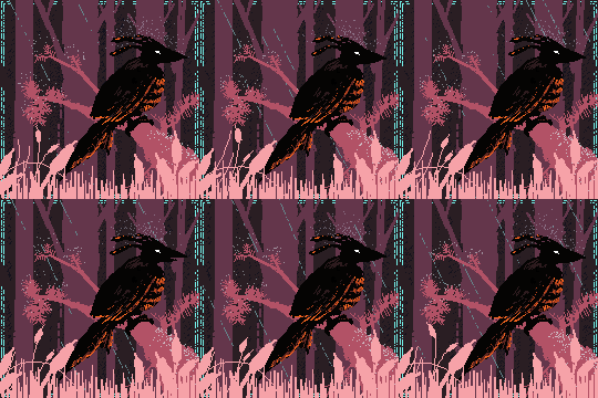
 Round X Critique Round X Critique  It's been hard to keep comments to myself until the deadline. So many cool entries! Rather than an objective scoring system I'm going to separate them into two categories and choose a winner from the latter part.  Thanks for Entering Category Thanks for Entering Category  Makeout Patrol  This would be top-tier if you had taken the time to carefully draw your lines. I love his expression and the general mood of it, but stark black/white woodcut-style drawings suffer badly from sloppy linework. Not much more to say other than how much better it would be if you'd been more patient, making the lines themselves a more uniform design element. Little things could have also been worked on, like how there's no shading on the trident or his robe. lofi  Certain elements of this are very good, so I hesitate to put this entry, but I think it's fair to say that this is not your best work. The mask and the spoke wings are very interesting elements, and if the rest of it had the same level of detail as the nose ring/chain accessories it would have came across much less bare. I also really enjoy the blue and gold colors you used. The arms look especially good. There's also a certain amount of rushing that is obvious, like that the eyepieces are not the same size, the hair texture does not seem to work at all, and the background is distracting because of the differences in well-defined areas. I like the general idea of the composition, but without a stronger foreground figure bringing the focus in (maybe helped by some elements pointing the eye that way), the figure on the bottom seems extraneous and superimposed. dupersaurus  I laughed when I saw this and you nailed the icon look. The only thing holding it back is a major one, though�the bell, the halo, and the key are very strong visual elements in this piece yet they are messy and clash with the strong, clean lines of the rest of the image. If the bell and key had strong black outlines (or more care put into the hatching), and if the gold was smoothed out, this would be a strong contender. Keetron  Not much to say here, since I know this was last-minute. I really appreciate you making an entry anyway! I'd say either take the time to make some clean lines or lean into the contour-line style and really go crazy with the pen and get creative. I think the latter would have worked better since there is not much going on, although you did a good job alleviating that with the very pretty red and blue watercolor. A quick note�it is hard to make a compelling composition with two focuses. Generally you want to have one thing that is the main element and make everything else accompany that. If you're going for something like this where it is more design-oriented, it's usually easier on the eyes to have three items rather than two. That way the eye can move in a circle between them rather than feeling split. Angrymog   This is the cutest little god and I love it. The only reason this isn't in the top-tier this round is because of how relatively simple it is compared to some of the other entries. This is the cutest little god and I love it. The only reason this isn't in the top-tier this round is because of how relatively simple it is compared to some of the other entries.That hat looks gorgeous, and the little trunk and tusks are fantastic. The only things holding this back are the lack of strong value differences. Everything appears to be a light/middle tone and there aren't any deep shadows or highlights. This is especially apparent when looking at the flower, which should be much more three-dimensional but instead looks flat, and the pants, which blur together a bit due to a lack of commitment to value difference. All in all, very good! I just noticed the little mouse and want to move your entry up lol Upmarket Mango 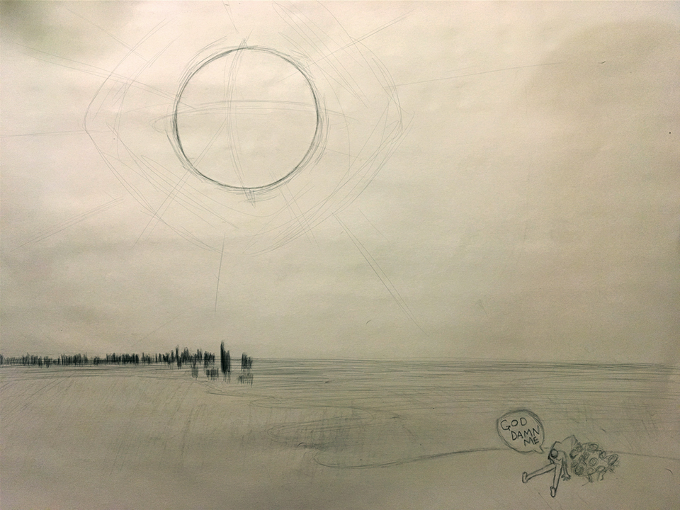 That sun/orb looks really neat. A piece that really leaned into those sketchy geometric elements, reinforced by strong ink or paint lines, would have been great. As it is though, I don't think it really fits together. It seems like three very different styles and levels of effort with nothing in-between to allow them to mesh. Sorry you're hitting a brick wall. I know what that feels like and I hope you try again next time because this had potential and I really enjoyed your last entry.  Competitive Category Competitive Category  Al!  This is one of my favorite pieces I've seen from you, and really matches my intentions for the theme. It's spooky and subtly occult, and Salome for the first time in art history is portrayed with an unprecedented level of not-horny. The glowing effect of the severed head is done really well too, and I absolutely love the mysterious eyes in the window. Composition-wise, there are a couple things holding this back. One, two thirds of the painting is dedicated to a dark space that does not lead the eye whatsoever to the center of interest (Salome). Secondly, the body in the foreground leads the eye out of the painting, again distracting from what is meant to be the focus. gmc9987  The halo is so well-designed, and the skull on the shirt is a perfect level of abstraction and geometry. If I had to critique some element I'd say that the font seems a bit too computer-generated and takes away from the impression that this is stained glass. It's a very minor point, though, and probably just a personal preference. Mar Gar  This is so loving cool. There's something simple and universal about the mystical tone of the Hebrew alphabet, and your design choices reflect that really well. The decision to put it on a security envelope was brilliant. It's hard to believe it works so well but it does. Fishnoise 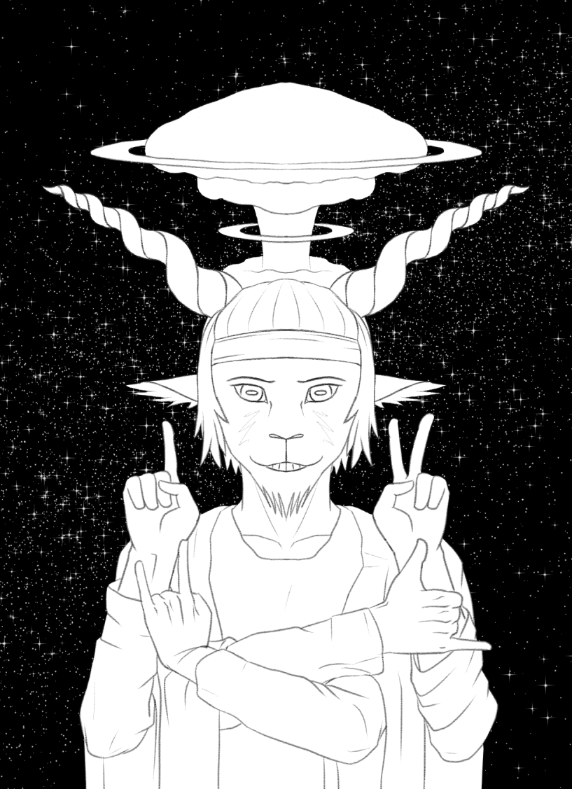 This is great. Every piece of this is well-executed, just a really solid sense of form and mass for each element. Ink line work or paint would have made this a winner. Too bad you're loving DISQUALIFIED for not having announced your intention to enter by the deadline. Hope to see your entry next time! Solenna  This genuinely looks like stained glass, both in texture and composition. If I saw this in a church I'd take some time to sit and stare at it for sure. It's impressive how you kept it asymmetrical, but none of the lines look out of place whatsoever. It just flows.  The winner The winner  This is extremely hard! There are so many great entries, but my gut feeling is coming down to Mar Gar or Solenna. Both entries are flawless and effective, and most importantly seem like actual religious art, odes to something mystical. gently caress this is hard, Solenna, you win! Congratulations!
|
|
|
|
Upmarket Mango posted:Everybody�s entries look amazing. 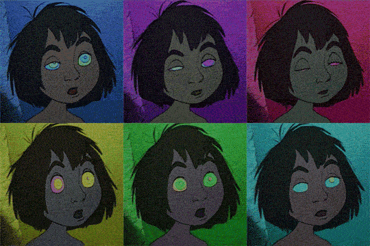
|
|
|
|
Flavius Aetass posted:.A quick note�it is hard to make a compelling composition with two focuses. Generally you want to have one thing that is the main element and make everything else accompany that. If you're going for something like this where it is more design-oriented, it's usually easier on the eyes to have three items rather than two. That way the eye can move in a circle between them rather than feeling split.
|
|
|
|
Ta for the crit! Y'know, I hadn't even noticed the different mask-eye sizes till you mentioned it!
|
|
|
|
|
thanks for the crit!
|
|
|
|
Thanks so much for the crits, and for everyone who made an entry. Ya'll killed it this time!Flavius Aetass posted:If I had to critique some element I'd say that the font seems a bit too computer-generated and takes away from the impression that this is stained glass. It's a very minor point, though, and probably just a personal preference. I completely agree with that sentiment, I don't like it either but I had a serious time crunch (unrelated to the deadline) going on and it was either run with that font or let some other area of the drawing suffer. Hopefully next round I'll have a bit more free time since I'll be taking some time off for the holidays.
|
|
|
|
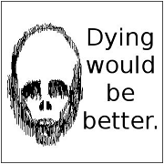
Flavius Aetass posted:This would be top-tier if you had taken the time to carefully draw your lines. I love his expression and the general mood of it, but stark black/white woodcut-style drawings suffer badly from sloppy linework. Not much more to say other than how much better it would be if you'd been more patient, making the lines themselves a more uniform design element. Little things could have also been worked on, like how there's no shading on the trident or his robe. Thanks, quite helpful! The note about patience feels like exactly what I need to hear. I'll make sure to slow it down next round.
|
|
|
|
Flavius Aetass posted:Fishnoise
|
|
|
|
holy poo poo
|
|
|
|
Flavius Aetass posted:holy poo poo you hosed up
|
|
|
|
gently caress me, I didn't notice that, that's loving genius.
|
|
|
|
|

|
|
|
|
that�s art y�all
|
|
|
|
Holy poo poo that's hilarious. Thank you Flavius Aetass! Current circumstances mean no doing stained glass for me anytime soon and I haven't even been doing pattern layouts, so this was a really great challenge to get me back into that sort of mindset. I will write up a prompt tomorrow!
|
|
|
|
|
Fish Noise posted:Ah! So, it's a loss, then? Can you explain this for my friend who doesn't get it?
|
|
|
|
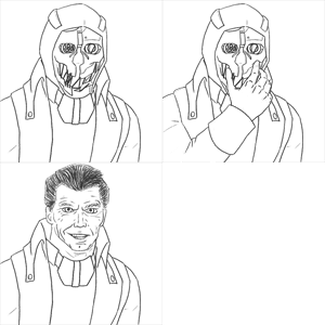
Keetron posted:Can you explain this for my friend who doesn't get it? There is a subtly encoded meme based on a lovely webcomic from several years ago hidden in the fingers of the image. https://knowyourmeme.com/memes/loss
|
|
|
|
Fishnoise you magnificent bastard!
|
|
|
|
A lot of yall would have caught on sooner if you were on the discord
|
|
|
|
1. Thanks for the positive feedback! I definitely needed that this week. 2. God drat IT, FISH NOISE
|
|
|
|
Art prompt: Draw some baby advice! I've having my second kid in just over a month, and while I haven't gotten as much advice this go round (thankfully), people do feel like they need to tell you all kinds of stuff, and they rarely provide helpful pictures. It can be information for the parents   Or it can be information for the kids themselves!   If you don't know much about babies or don't particularly like them, just make something up I'm sure it will be fine.  Let's have the sign up deadline December 26th and the due date Jan 5 because Christmas/New Years is such a mess for people. syntaxrigger posted:A lot of yall would have caught on sooner if you were on the discord
|
|
|
|
|
Nice prompt! This one�s a maybe for me though since I�m out of town for the rest of the year starting Saturday. After that I should be able to participate regularly again.
|
|
|
|
syntaxrigger posted:A lot of yall would have caught on sooner if you were on the discord Solenna posted:Is there a link to the CC discord? Damned if I can find the right channel on the goon server.
|
|
|
|
i just got a really gross idea for this one so im in
|
|
|
|
I'm in. Also Solenna posted:I've having my second kid in just over a month That's a lot of kids in under 6 weeks.
|
|
|
|
Just twins with a long delay. In.
|
|
|
|
|
Goddamn ambiguous grammar
|
|
|
|
|
I'm in
|
|
|
|
Also in
|
|
|
|
Last weekend for this challenge!
|
|
|
|
I'm gonna bail on this one, I've got a bajillion things to do this weekend.  next time! next time!
|
|
|
|
|
I don't have a child so I kind of had to make some assumptions about what you can and cannot do
|
|
|
|
my gross idea was too gross    "do not eat" aesprite
|
|
|
|
I'm going to attempt to put something together tonight but I am going to add the I may have to bow out of this one. I was supposed to have some time today to work on it, but all that time disappeared when 2 family members decided to alter their schedules without notifying me, living me alone the whole day with an angry-about-potty-training toddler. This is my curse, being blessed with a baby-related source of inspiration for this contest right at hand that also prevents me from using any of that inspiration. gmc9987 fucked around with this message at 17:18 on Jan 5, 2020 |
|
|
|

|
| # ? Apr 28, 2024 20:54 |
|
My time out of town really screwed me over this time. However I'm definitely participating in the next prompt regardless of what it is.
|
|
|


