


|
 Friendly reminder that the deadline for submissions is two weeks away on Midnight PST on Sunday March 22nd! Friendly reminder that the deadline for submissions is two weeks away on Midnight PST on Sunday March 22nd!Good luck!
|
 #
?
Mar 8, 2020 19:08
#
?
Mar 8, 2020 19:08
|
|


|

|
| # ? Apr 19, 2024 11:00 |
|
|
Final reminder, the deadline for submissions is tomorrow night at midnight PST!
|
|
#
?
Mar 22, 2020 07:53
|
|
|
I'm gonna bail on this one, I've had other stuff on my mind. e: Sorry, that was a rude way of putting it. Not your fault, just that my enthusiasm for this has kinda dried up with the apocalypse being a thing. lofi fucked around with this message at 15:12 on Mar 22, 2020 |
|
#
?
Mar 22, 2020 11:57
|
|
|
lofi posted:I'm gonna bail on this one, I've had other stuff on my mind. Same.
|
|
#
?
Mar 22, 2020 14:22
|
|

|
lofi posted:I'm gonna bail on this one, I've had other stuff on my mind. No worries, I totally get it. If people have personal stuff they need to attend to or are just not feeling up to this then they'll get no grief from me.
|
|
#
?
Mar 22, 2020 16:53
|
|
|
I went ahead and did the original prompt. Unfortunately, despite my promise in my last entry, I couldn't scan it due to the library shutting down for the """global pandemic""". So, enjoy the phone-photo that I've touched up in GIMP: Original photo if anyone is interested: 
|
|
#
?
Mar 22, 2020 21:33
|
|


|
I procrastinated too long on this and won't finish in time. (Can't find a way to draw the flood water satisfactorily.) Figured I'd at least post my WIP so I didn't leave readingatwork hanging.
|
|
#
?
Mar 23, 2020 03:59
|
|
|
I also procrastinated until like 4 hours ago. You'd think work mandated quarantine would make me productive but nah it's been naps and streaming for 5 days straight. e: ew, had to adjust some levels. al-azad fucked around with this message at 05:56 on Mar 23, 2020 |
|
#
?
Mar 23, 2020 05:52
|
|


|
Ok, submissions closed. I�ll have a verdict once I get home tonight (yes I�m still working in an office despite the plague)
|
|
#
?
Mar 23, 2020 18:39
|
|
|
readingatwork posted:Ok, submissions closed. I�ll have a verdict once I get home tonight (yes I�m still working in an office despite the plague) Whoa whoa I thought we had until midnight? I have a submission that I'm trying to get finished.
|
|
#
?
Mar 23, 2020 18:55
|
|
|
Krispy Wafer posted:Whoa whoa I thought we had until midnight? The deadline was for yesterday but if you think you can get it in tonight I don�t mind pushing back the date until tonight.
|
|
#
?
Mar 23, 2020 18:59
|
|
|
readingatwork posted:The deadline was for yesterday but if you think you can get it in tonight I don�t mind pushing back the date until tonight. Yeah, I can get it in tonight. I just need to put everything on one page and maybe ink the last comic panel.
|
|
#
?
Mar 23, 2020 19:01
|
|
|
I�ve been mulling doing a comic strip about 13th century England because what�s funnier than the Black Death. Yeah, that idea aged surprisingly bad incredibly quickly. 
|
|
#
?
Mar 24, 2020 03:35
|
|
|
 Submissions are now closed! Submissions are now closed!Thanks for your entries everybody! I have nice things to say about everybody's pieces but the winner this time is al-azad because I'm an absolute sucker for cute art depicting horrifying situations. Congratulations! I will have detailed critiques up within a week or so. In the meantime please feel free to go ahead start the next prompt.
|
|
#
?
Mar 24, 2020 04:43
|
|
|
Thank you. I liked Makeout Patrol's dog comic as someone whose family had a large dog that once tore through a screen door in a mad dash to the gardener who was licked to death. So much for guard dogs. I want to keep this simple in troubled times so my prompt is Food. Take an artistic photo of your favorite meal, share an illustrated recipe, papier mache a coconut, paint a meal that would make Hayao Miyazaki drool. Deadline is April 7 @ 23:59 EST. Any later and my rear end will be too busy playing FF7 Remake.  Winner will be arbitrarily decided on who makes my mouth water. There isn't an ingredient I don't enjoy. Except water chestnuts. Water chestnuts are a bullshit lie.
|
|
#
?
Mar 24, 2020 09:09
|
|
|
Hell yeah I'll draw some food
|
|
#
?
Mar 30, 2020 18:10
|
|
|
I'll try and draw food too
|
|
#
?
Apr 1, 2020 08:22
|
|
|
Sure, I'll food. Wanna get back on the horse with this!
|
|
#
?
Apr 1, 2020 10:17
|
|
|
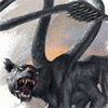
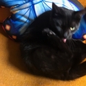
*shows teeth*
|
|
#
?
Apr 1, 2020 11:47
|
|
|
I'll give it a shot
|
|
#
?
Apr 2, 2020 06:54
|
|
|
Sorry for the delay everybody. These past few weeks have been awful. I hope everybody is doing okay out there. Daw... Good boy!  This is a nice little scene with decent tension and a nice little twist at the end. The actions clearly conveyed and the intended emotions come through as you intended. That said there are lots of little details here that hold you back. The biggest offender at a glance is that you use the same line width on everything except the dog, which itself has a line width that's too thin. Really try and be strategic in deciding how thick your lines should be. A thicker line indicates the importance of the element the line represents. Foreground elements are typically more important than background ones so they should be rendered with thicker lines. Similarly, major contours and outlines should be a bit thicker than a subject's interior details since those lines are what most help a viewer understand what they're seeing. If nothing else simply adding more variety to your work would really make your drawings pop. That aside I think you would benefit from doing some texture studies where you draw an item with a just a micron pen and really try to nail how something appears to feel. Work fast and loose and don't be precious with your work. You might also benefit from an exercise I once got from an art teacher back in the day. On a page develop a dozen or so textures in little boxes. The below result isn't mine (I have no idea where that project went) but that's basically what you should end up with. Then, pick your favorite one and force yourself to use it as your main tool to indicate values in your next work.  I found it useful at least. Finally, I'd really focus in on anatomical proportions when drawing a characters with a certain amount of stylization. The elbow in the first panel particularly stuck out to me as stopping too high. Remember, you can get away with murder when your proportions are correct but if they're wrong not even the most careful and precise rendering will save you. On the upside though I really like the hands you drew on the last panel. In fact, kudos to you for designing a scene entirely around hands. Nice job on that front! Thanks for submitting! This may be a work in progress but I have to say I really like your dead rooster in panel 3. The poor thing just pops with personality. If the whole thing was finished and rendered in that same way you might have won. That said though I can still offer a couple bits of advice on this even though it's not done yet. First off, screen tones are tricky business in digital work. They can very easily look out of place if the dot concentration is too compressed or too spread out. In this case I think they're too compressed and could stand to be zoomed into a bit more so you actually see the dots. HOWEVER keep in mind that if you plan on printing this then all the rules will change. In print you can see a much higher DPI than on the web so these particular tones might not be a problem then. The only real way to know is to print the page and find out. This is ultimately my frustration with this is why I ended up dropping screen tones entirely in favor of ink textures or just coloring my pages. Don't let me stop you from experimenting with tones though. They look amazing if you can get them right. As for the water rendering issues I think your best bet might have been just a solid gray with a few small ripples here and there. This is appears to be after the storm has ended so the water would actually be quite still at this point. Use objects/plants sticking out of the water and the waves made as the boat cuts through the flooded farmland to communicate the scene. Thanks for submitting. I see a lot of potential in this one! Of all of the submissions yours was the one I most felt had real characters with real personalities. At a glance I can tell what each character is about and their emotional state without needing to know the context of the scene around them just based on their body types, faces, and expressions. That's unbelievably important and something a lot of comics lack, even professional ones. Your reluctance to draw backgrounds, however, is a bit of a problem. All three comics you posted suffer by having your characters talk to each other in a white void. Not every panel needs a background, true, but several of your panels are composed in such a way that you really should see the surrounding area. The first panel is a good example of this and would really benefit even from just drawing even a simple hill and road with a few clouds in the back. Setting that aside I think you might want to make your non-drawing elements a bit clearer. Text going behind a character's head for no reason doesn't add anything and impairs the reader's ability to understand what's being said. You need to add a bit more space between your text and the bubble edges and avoid skewing the square bubbles to the side like you did in panel three as it's communicating conflicting tones. I definitely like where your art is heading though and you should definitely keep at it. I'd love to see this style developed a bit more. Thanks for sharing this! Your piece made me realize just how much of an impact coloring your work can have. Yes, you did this in just 4 hours but the colors alone really set it apart from the pack. That, combined with the fact that I am an absolute sucker for cute things doing hosed up things is why you won. It's probably also worth noting that yours was the only one I felt had a clear hook to it. Why should I read this? Because I get to see a society of little people use human trash to go on adorable post-apocalyptic adventures. I don't need to be told any of this, the elevator pitch is baked into every frame. With properly finished art I think you might even be able to sell this idea based on this strength alone. That said! There are many elements of this that don't quite work and they're rooted in the fact that this was done very quickly. The backgrounds, for one, look particularly rushed and even a simple layer of color to define the shore/grass would have added a lot to this piece. Also, I'm feeling like you need some space between your panels as they all kind of blend together in a way that doesn't feel natural. Finally, I'm really not liking that I can see the pencil's behind the text. Even if you were going quickly you should have been able to remove those more cleanly. Finally, I'm conflicted about your choice of watercolor as a medium. It helped you for the purposes of this contest because I liked that you were willing to try new things but I worry that it would be exhausting to maintain over the course of a whole graphic novel. Switching so something similar in a digital medium would probably take less time and energy to make while also looking a bit cleaner for print (something about scanned watercolor just never looks quite right in comics for some reason). But yeah, really solid idea you have here and it shines through your rushed execution. If you ever decided to develop this I'd definitely read it. I hope that was useful, everyone. Thanks for sharing your pieces! Expect the front page to be updated soon but I just really need to sleep for now. readingatwork fucked around with this message at 07:15 on Apr 3, 2020 |
|
#
?
Apr 3, 2020 07:06
|
|
|
Thank you for the critques readingatwork, I appreciate it. Al-azad, have you read Beautiful Darkness before? Because your comic reminded me of it alot. If anyone else hasn't, I would strongly reccomend it.
|
|
#
?
Apr 3, 2020 20:47
|
|
|
Thanks so much for the really thoughtful critiques, readingatwork. I find them really useful, and I tried to keep it in mind when I worked on this submission. I might have strayed from the spirit of the prompt, but here is a guy enjoying my old roommate's signature dish, "mustard toast." 
|
|
#
?
Apr 8, 2020 01:35
|
|
|
Never participated in this before, but here's my food submission! I've started playing around with Blender, and took what I learned in Blender Guru's doughnut tutorial and made a cake.
|
|
#
?
Apr 8, 2020 04:55
|
|
|
readingatwork posted:Finally, I'm conflicted about your choice of watercolor as a medium. It helped you for the purposes of this contest because I liked that you were willing to try new things but I worry that it would be exhausting to maintain over the course of a whole graphic novel. Switching so something similar in a digital medium would probably take less time and energy to make while also looking a bit cleaner for print (something about scanned watercolor just never looks quite right in comics for some reason). I wish I could wrap my head around digital coloring even after getting an iPad with a pencil which is a really nice setup but it's like banging a rock on a piece of plastic to my brain. Etuni posted:Never participated in this before, but here's my food submission! I've started playing around with Blender, and took what I learned in Blender Guru's doughnut tutorial and made a cake. I hereby declare this scrumptious cake to be the tastiest of my choices, and I also approve the use of Blender as I've been learning it over the last year starting with the classic donut tutorial. Once you get far enough into PBR materials you can make your own maps to give the frosting a specular coating and the cake part a nice bump map. Makeout Patrol I question the tastiness of Heinz on white bread but if we're talking about a well grilled piece of sourdough slathered with a fine deli mustard I'm probably down.
|
|
#
?
Apr 8, 2020 22:23
|
|
|
Cool, thanks! Materials are definitely neat- there�s sooo much to learn, and I�m in awe at what some artists can accomplish with nodes and some math! Definitely trying to learn more. For the next prompt, make some art about a mystery. It could be a personal mystery: �Who ate all my quarantine snacks?� or something in the vein of Unsolved Mysteries. (Aliens, cryptids, etc. are fair game). Let�s get mysterious until 11:59pm EST on Sunday, April 26th.
|
|
#
?
Apr 11, 2020 15:43
|
|
|
There was supposed to be an Artdome deadline today but no one has participated  Are people not feeling the mystery prompt, or not feeling very artsy in general what with the global pandemic? Are people not feeling the mystery prompt, or not feeling very artsy in general what with the global pandemic?
|
|
#
?
Apr 26, 2020 18:04
|
|
|
for me personally, being cooped up in the house all the time has made me really not want to make art. I would have thought it would be the opposite but  it definitely wasn't the prompt-- drawing cryptids sounds extremely fun. I'm just not in that place rn, sorry
|
|
#
?
Apr 26, 2020 18:13
|
|
|
Also, I think not having a sign-up cut off date doesn't help? Maybe try again, Sign-up by next Sunday, submission deadline by Sunday after? I will sign up for Mystery.
|
|
#
?
Apr 26, 2020 21:08
|
|
|
tbh, I'm just not spending much time on SA anymore.
|
|
#
?
Apr 26, 2020 22:03
|
|
|
Angrymog posted:Also, I think not having a sign-up cut off date doesn't help? This sounds good- Sign up to make art about a mystery by end of day Sunday, May 3rd, and post by end of day Sunday, May 10th.
|
|
#
?
Apr 29, 2020 00:51
|
|
|
Flavius Aetass posted:it definitely wasn't the prompt-- drawing cryptids sounds extremely fun. I'm just not in that place rn, sorry Seconding this. It�s a good prompt, I�m just not in a good place to be doing art at the moment. I�ll probably hop back into things in a month or two when my personal situation calms down a bit.
|
|
#
?
Apr 29, 2020 01:58
|
|
|
I'll try to do something, but it probably won't be any good. It's a good prompt though.
|
|
#
?
May 1, 2020 18:15
|
|

|
I'm in, having a due date might do me some good right now.
|
|
#
?
May 4, 2020 13:58
|
|
|
Reminder that the deadline to submit your art is by tomorrow night! (Let's say 11:59pm EST). Looking forward to seeing some mysteries!
|
|
#
?
May 10, 2020 01:03
|
|
|

|
|
#
?
May 10, 2020 23:43
|
|
|
I'm not too proud to win by default, but...
|
|
#
?
May 11, 2020 22:50
|
|
|
I love it! Angrymog wins. Is it a watercolor? The tie-dye background looks really cool, and a bit... mysterious. It also looks like you used some metallic paint on the wings, which is a great touch! I imagine it looks even better in person.
|
|
#
?
May 12, 2020 00:18
|
|
|
Etuni posted:I love it! Angrymog wins. Is it a watercolor? The tie-dye background looks really cool, and a bit... mysterious. It also looks like you used some metallic paint on the wings, which is a great touch! I imagine it looks even better in person. Mostly watercolour on some strange Lokta paper, which is really thin, but surprisingly tough. Background started with sprinkles of brusho, with added watercolour. Some acrylics on the wings and eye, and yes, lots of gold paint ")
|
|
#
?
May 12, 2020 07:44
|
|
|

|
| # ? Apr 19, 2024 11:00 |
|
|
OK. Now that my life has calmed down it�s time for me to get back on the art horse. I�ll update the OP in the next day or two and participate in the next round no matter what the prompt is. EDIT: Done. Please let me know if I missed anybody. Also just FYI the next round will be #17 readingatwork fucked around with this message at 02:50 on May 13, 2020 |
|
#
?
May 12, 2020 18:14
|
|