


|
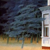
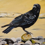
silicone thrills posted:Started on the background of the latest crow friend. The reference photo background kind of sucks and i'm trying to figure out what to do with it. It's sitting on a cherry tree branch so i'm kind of experimenting with adding in some cherry blossoms and I might just cover the whole drat background in them. Hah I've got the cherry blossoms but no crow. Finished this today. It's in acrylic with a few layers of pthalo blue and hooker's/pthalo green glazes over the darker sections which has given it a really nice blue green depth in person, really happy with that bit! Also the birch tree looks way better than last time I tried to paint one. The leaves went abit off course but I think they work OK in the picture anyway!  Small sketch to try out the leaves & glazes, just couldn't recreate the leaf properly in the main painting.. 
|
 #
?
Apr 15, 2020 16:39
#
?
Apr 15, 2020 16:39
|
|


|

|
| # ? Apr 19, 2024 00:56 |
|
|
Angrymog posted:I did the pink sunset too (just Cotman and Sennelier, not with the Kuretakes), on Aldi, Bockingford (sort of equivalent to the paper you used), and Daler Rowney's Langton Prestige (100% cotton) and the mid-range paper came out the worst I think; even did one of them twice on it. Will post if you want. Sure, I'd like to see that. Are size 6 brushes uniform in the US? Everyone recommends those but when I've shopped around here I noticed that depending on manufacturer they range from like 3-8mm, so some size 6 brushes are literally twice as large as others.
|
|
#
?
Apr 15, 2020 22:31
|
|
|
lol expecting standardisation from the US 
|
|
#
?
Apr 15, 2020 23:56
|
|


|
Entenzahn posted:Sure, I'd like to see that. Are size 6 brushes uniform in the US? Everyone recommends those but when I've shopped around here I noticed that depending on manufacturer they range from like 3-8mm, so some size 6 brushes are literally twice as large as others. I have no idea, I'm based in the UK. I'm using Daler Rowney's Diana Kolinsky sable brushes (mainly because a local art shop had a gift pack with 6 brushes and some cotton paper marked down to �30; since the size 6 and 7 brushes are around that price each, I couldn't exactly pass it up), otherwise I'd be using a synthetic or synthetic/sable mix. Will scan them and post in daily doodles thread tomorrow morning.
|
|
#
?
Apr 16, 2020 00:08
|
|
|
Entenzahn posted:Sure, I'd like to see that. Are size 6 brushes uniform in the US? Everyone recommends those but when I've shopped around here I noticed that depending on manufacturer they range from like 3-8mm, so some size 6 brushes are literally twice as large as others. lofi posted:lol expecting standardisation from the US It's not a US thing it's a manufacturer thing. There's no real standard amongst any of them for watercolour brushes so don't worry about size number. The only way to really compare is to either get them in your hand side by side or check out the dimensions provided in the specs. Most have a diameter and longest hair length provided. Often they also include an average hair length. TBH you can do a huge amount with one large squirrel hair/synthetic squirrel or sable hair mop brush. As Shibasaki says, one large mop brush can be shaped to do everything a smaller brush can. I use DaVinci 5598 series. For A4 sized paper or larger I use their size 20 brush. For smaller stuff (like A5 pad size etc) I'd use a 10, with maybe a 6 or 2 for detail. For those demo exercises where you're effectively splitting an A4 (ish) sized piece into 3, I can see why they'd suggest 6/2.
|
|
#
?
Apr 16, 2020 01:18
|
|


|
My latest gear painting. This time I tried something different. https://twitter.com/arianimation/status/1250638824461328384
|
|
#
?
Apr 16, 2020 05:25
|
|
|
Chernabog posted:My latest gear painting. This time I tried something different. I love this. It's like an arty version of one of those mix and match books. re: same tutorial on different papers, I've posted here - https://forums.somethingawful.com/showthread.php?threadid=3908678&pagenumber=20#post504164631
|
|
#
?
Apr 16, 2020 21:55
|
|
|
Lingerie In Red Watercolor on paper. 11" x 14" 
|
|
#
?
Apr 18, 2020 23:18
|
|

|
I got some new gear like this thread recommended, but I also got a Raphael Kolisnky brush. I know I don't need it, but I was curious how it was different from my synthetic brushes. So I dipped it in the pan and painted a column to test it (kind of like a wash). This happened:  (no color on the brush because I recreated the scenario with clear water for the picture) Is this normal, or should I return it? I thought these brushes were expensive because they hold their shape so well.
|
|
#
?
Apr 21, 2020 23:25
|
|
|
That looks pretty dire, I'd return it. I'm not a sable expert though.
|
|
#
?
Apr 22, 2020 11:24
|
|
|
Not even my cheap brushes do that, could be a manufacturing defect. Does it go back into form when you dip it in water?
|
|
#
?
Apr 22, 2020 11:31
|
|
|
It goes back into form after I wet it and tap it a couple times, but it doesn't hold very well as soon as I start moving sideways. I may ask the store to return it for a different one. If I still have the same problem then it's probably me.
|
|
#
?
Apr 22, 2020 14:13
|
|
|
The pandemic made me stop drawing for a while but I've been starting again the last few days. I also have every color of gel pen Sakura makes and every color of acrylic marker Molotow makes being delivered this week  I want to do more of these black paper drawings I want to do more of these black paper drawings    
deep dish peat moss fucked around with this message at 16:47 on Apr 22, 2020 |
|
#
?
Apr 22, 2020 16:27
|
|

|
deep dish peat moss posted:The pandemic made me stop drawing for a while but I've been starting again the last few days. I also have every color of gel pen Sakura makes and every color of acrylic marker Molotow makes being delivered this week Cool stuff.
|
|
#
?
Apr 25, 2020 12:18
|
|
|
i'd like some oil painting advice on getting brush strokes like you see in keevan donahue's stuff:  im brand new to painting and haven't really done anything creative since middle school, so i'm really trying to get my bearings with oil. i'm having a difficult time finding the right medium/ratio to keep a defined brush stroke. i've tried linseed oil and safflower, using hog bristle filberts, and it seems like i'm getting either too much or too little flow on the paint. i saw some advice that was basically "paint like a millionaire" and am i being too stingy with the paint? here's my first painting i've done:  i overblended and got a lot of mud in the skull, and my brushwork looks flat and overworked to me. i know most of my practice needs to center around my values and color matching but if i could get some advice on medium ratios to help me get the style i'm looking for i'd very much appreciate it.
|
|
#
?
Apr 25, 2020 16:16
|
|
|
That's actually pretty good for a first painting. I haven't used oils in years but I can give you some general painting tips. -Don't be afraid to display your brushstrokes. When people first start they tend to over blend everything because they want everything to look "perfect", but those imperfections are what give it life. Look at this sketch for example, DaVinci didn't bother to finish the hair but that's actually what makes it interesting. It also helps to direct all your attention towards the face which is the important part.  So in short, use the textures to your advantage and don't try to outright eliminate them. Smoothness =/= perfection. -Along the same lines, don't be afraid to use more colors. If you look at the plums(?) in the painting you posted they have a lot of reds but also purples and blues. The same goes for the bottle. It is generally olive green, but you can see some blue, brown and gray. More colors is usually better. Obviously these rules are meant to be broken, but if you do so it must be intentional and for a purpose. -It's hard to tell from your picture but it is generally a good rule of thumb to avoid pure black or pure white, or if you are going to use them, do it sparingly just for a few accents. In Donahue's paintings I don't think you can find any pure black and just a very tiny amount of pure white on the highlights. -Compare your background to Donahue's. Which is more interesting? You'll probably agree that the latter. While I like that you used the darkness to really set apart the skull and candle, I think you can still add some detail to it for more visual interest. This goes for the other stuff too, I'm not sure what the box and book(?) are. Since they are at the front of your composition you can afford to put more focus (via details) on them.
|
|
#
?
Apr 25, 2020 17:20
|
|
|
Chernabog posted:That's actually pretty good for a first painting. I haven't used oils in years but I can give you some general painting tips. I appreciate it. I definitely think I'm going to continue working on it and try and get more definition in the detail in the box of weights and the book. I was having a really hard time not muddying everything up painting wet on wet but it's dry now so I can go work back over it now. I've done some reading and I think I'm using too heavy of a hand with the brush and it's over blending when I paint wet on wet. The black is mixed but I think you're right that there's too much and there should be some more tones in the background to make it interesting. Thank you for the advice.
|
|
#
?
Apr 25, 2020 18:18
|
|
|
I forgot about painting on a wet canvas but that's a good point. Oils can blend for several days so if you don't want that you probably need to wait longer.
|
|
#
?
Apr 25, 2020 18:55
|
|
|
Latest gouache painting on 5" x 8" paper. Opera pink still doesn't scan very well.
|
|
#
?
Apr 26, 2020 00:39
|
|
|
I've been messing around with watercolour tutorials this weekend and my goodness I enjoy how little setup and teardown there is compared with oils.
|
|
#
?
Apr 26, 2020 16:36
|
|


|
jarofpiss posted:i'd like some oil painting advice on getting brush strokes like you see in keevan donahue's stuff: I don't think the painter in your examples is using a ton of paint. It looks like he paints the backgrounds using using a thinner like mineral sprirts or galkyd, lets that dry, and then paints a thin layer over it, using a thinner to lift out additional color from the backgrounds. Stuff in the foreground is a bit thicker so you might not be able to do that alla prima. More generally, a sense of paint handling will come with experience and judging from your first painting you are off to a good start. You will get the hang of it soon enough!
|
|
#
?
Apr 26, 2020 21:06
|
|

|
HopperUK posted:I've been messing around with watercolour tutorials this weekend and my goodness I enjoy how little setup and teardown there is compared with oils.
|
|
#
?
Apr 27, 2020 12:46
|
|
|
que sera sera posted:I don't think the painter in your examples is using a ton of paint. It looks like he paints the backgrounds using using a thinner like mineral sprirts or galkyd, lets that dry, and then paints a thin layer over it, using a thinner to lift out additional color from the backgrounds. Stuff in the foreground is a bit thicker so you might not be able to do that alla prima. yeah, i've only been attempting alla prima up to this point and managing the paint feels extremely difficult. i'll try getting a couple of paintings started and coming back to them to build layers up like you described. thanks for the advice! HopperUK posted:I've been messing around with watercolour tutorials this weekend and my goodness I enjoy how little setup and teardown there is compared with oils. i've got a dedicated workspace that i installed an exhaust fan in so i haven't had a ton of setup or teardown. i found out sugar ants love safflower oil so i've got that going for me too. jarofpiss fucked around with this message at 12:59 on Apr 27, 2020 |
|
#
?
Apr 27, 2020 12:56
|
|
|
I got bored and made a felted wool Behelit.     
|
|
#
?
May 1, 2020 18:56
|
|
|
It's been a while since the last one. This time I'm revisiting a classic: https://twitter.com/arianimation/status/1261151014926692353
|
|
#
?
May 15, 2020 05:29
|
|
|
Does bookbinding count as a traditional art? I've been making my own sketchbooks since the quarantine started and getting back in touch with my love of book making. Here are a couple I made over the past few days: Been really intrigued by stab binding lately. Finished up this one this afternoon using the same cover paper as one of the above. I've never seen a stab bound book with a spine covering, so I figured I'd give it a shot:   I think it turned out pretty good!
|
|
#
?
May 18, 2020 01:03
|
|


|
Chip McFuck posted:Does bookbinding count as a traditional art? I've been making my own sketchbooks since the quarantine started and getting back in touch with my love of book making. Here are a couple I made over the past few days: Hey these are excellent! I've seen videos of people doing bookbinding and it looks really satisfying.
|
|
#
?
May 18, 2020 01:08
|
|
|
Hell yeah, I took bookbinding in college and I love it. Super relaxing to make your own sketchbooks. I love the whole sewing the registers together part.
|
|
#
?
May 18, 2020 01:09
|
|
|
Thanks! Books are a super chill thing to make and I love making them. Two more finished pressing yesterday:   Wanted to see how thicc I could make the blue one. Edit: Edges got a little banged up because I dropped them right after taking them out of the press. Oh Well. Chip McFuck fucked around with this message at 22:55 on May 20, 2020 |
|
#
?
May 20, 2020 19:01
|
|
|
I just got some cri 90+, 1600 lumen led lightbulbs after attempting to paint in my dark rear end house, and they are amazing!! Highly recommend, especially if you are like me and like to paint at night.
|
|
#
?
May 20, 2020 19:57
|
|
|
New book finished pressing today! Decided to try accordion binding by making a double-leaved album. Accidentally applied glue to the wrong surface when attaching the covers which crinkled the end pages, but otherwise it turned out great!    Going to use this one for a short comic idea.
|
|
#
?
May 22, 2020 20:52
|
|
|
Finished pressing this flutter book and another accordion book today: What's neat about flutter binding is that the spine isn't actually bound to anything so the pages can be spread out, like this: 
|
|
#
?
May 28, 2020 19:58
|
|
|
Time for another art damp! Oil on BFK Rives. Just quick fun paintings.      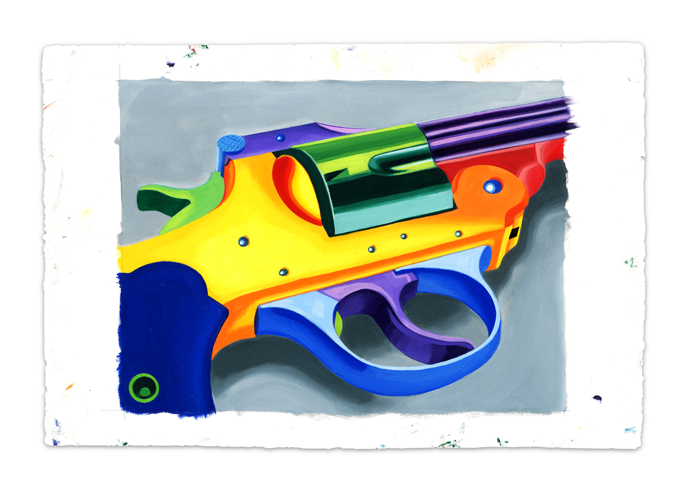 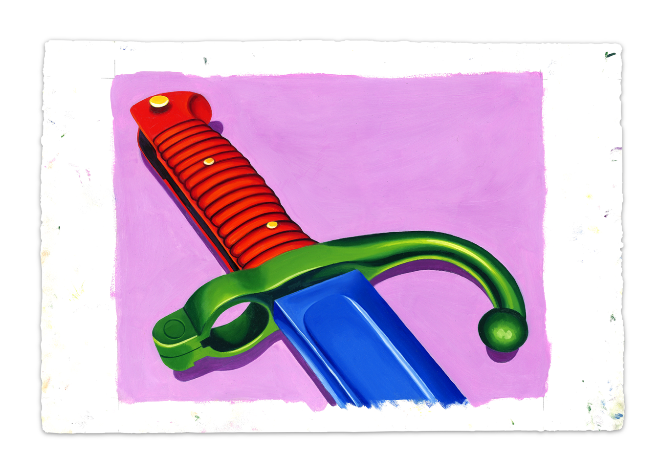 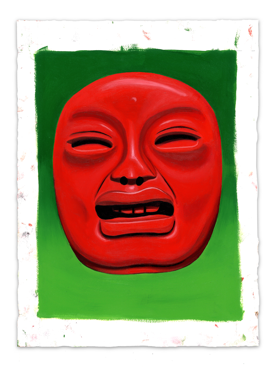 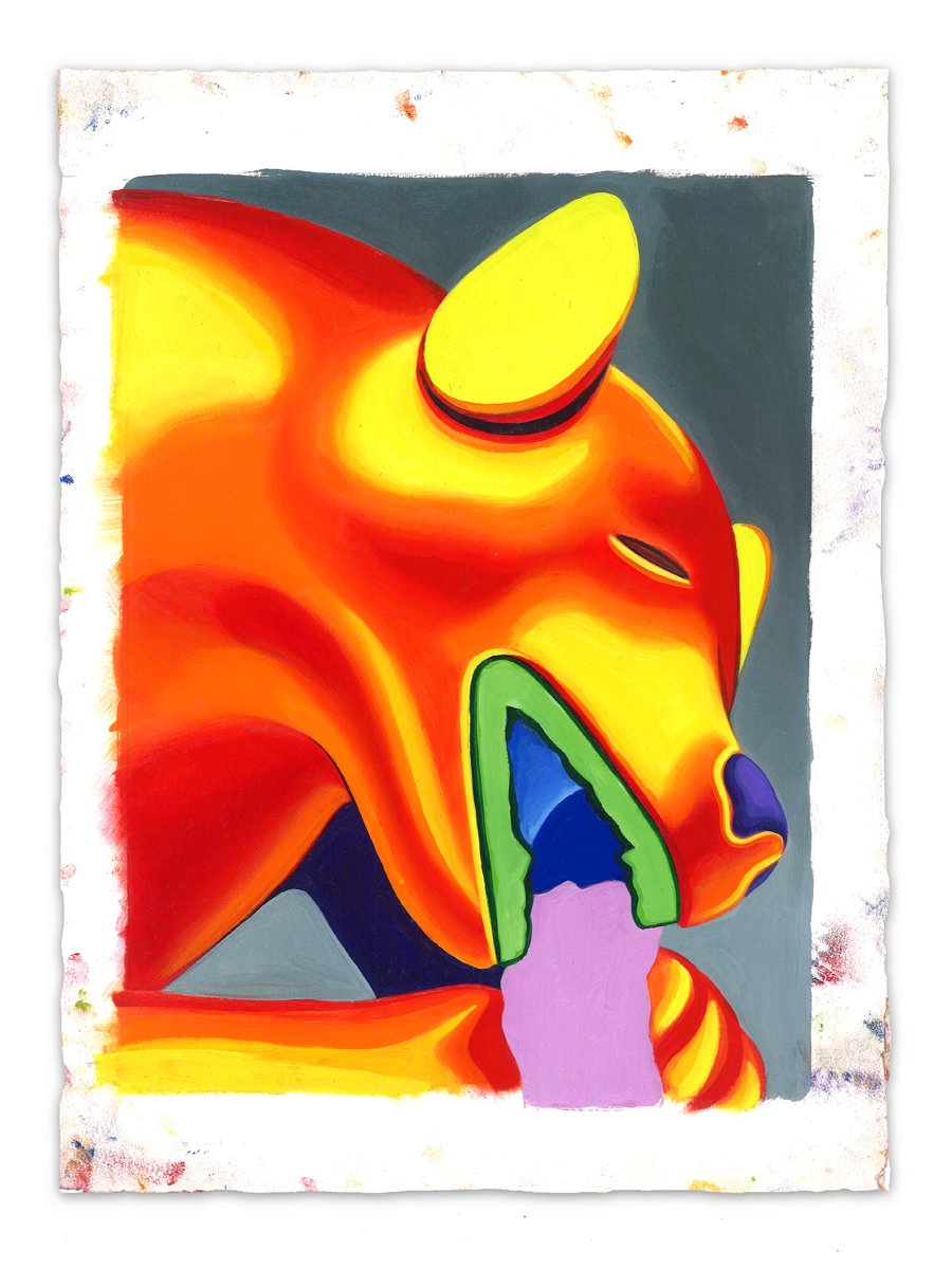     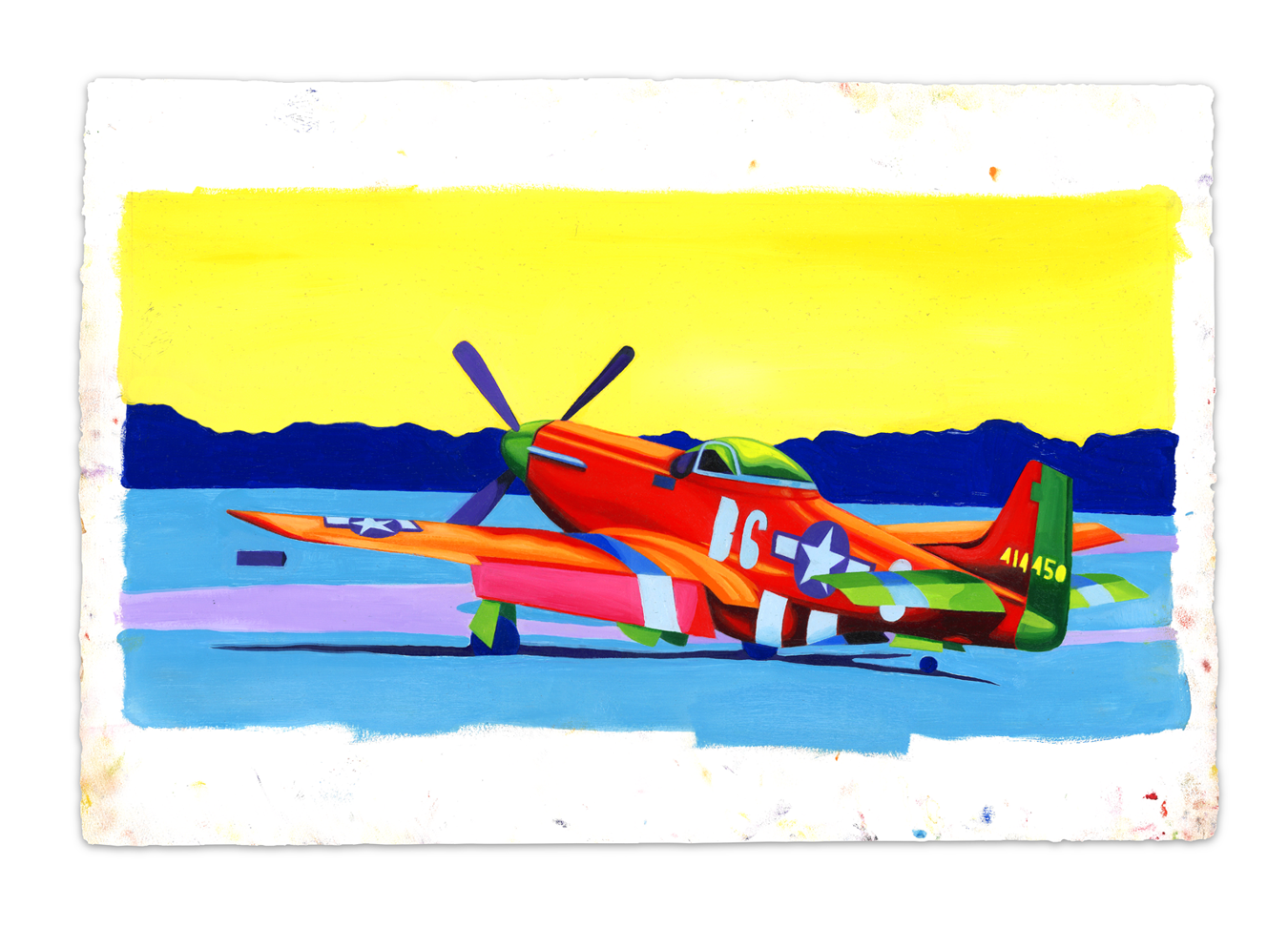
Cartyisme fucked around with this message at 22:22 on May 29, 2020 |
|
#
?
May 29, 2020 22:20
|
|

|
Cool. Love the planes
|
|
#
?
May 30, 2020 00:32
|
|


|
Really like the gun and the quetzalcoatl.
|
|
#
?
May 30, 2020 01:37
|
|
|
Thanks guys! I meant to post this in the daily drawing thread. I totally goofed. Sort of messed up this thread flow by dumping. My apologies.
|
|
#
?
May 30, 2020 02:44
|
|
|
KittenofDoom posted:I got bored and made a felted wool Behelit. I love this, the light flare in the iris is perfect  I have not been drawing nearly as much lately and it sucks! But some things I have done recently:  Sometimes I Feel Like a Virtual Boy (red ink on black paper and 9"x12" - it's hard to get this thing to look as good in a picture as it does in person)  (White ink on black paper) the rest are all fineliner on various papers (and a little bit of acrylic marker)  Everyday Summertime Phoenix  No Good Title  This isn't the final version, I unfortunately left the final version halfway across town and can't get it until later. Complete with amigara faultline reference I need to get better at not smudging things  I do most of my drawing with a sketchbook on my lap while sitting in weird places so I don't tend to have a clean area set aside to draw in and my grubby mitts smudge things a lot. I do most of my drawing with a sketchbook on my lap while sitting in weird places so I don't tend to have a clean area set aside to draw in and my grubby mitts smudge things a lot. And there's a jpeg of a spaceship that I'm drawing that has a city in the basement ??? And some smaller stuff:      I abandoned this because I have no idea what I'm doing with it but it still catches my eye all the time:  I end up repeating motifs constantly but I've been trying to force myself to break my habits and draw completely new things lately. edit: also: Franchescanado posted:Latest gouache painting on 5" x 8" paper. I really love the color on the roof here and the whole transition from blue to purple on the wall 
deep dish peat moss fucked around with this message at 03:30 on May 30, 2020 |
|
#
?
May 30, 2020 02:48
|
|
|
https://twitter.com/arianimation/status/1268256161775489025
|
|
#
?
Jun 3, 2020 20:00
|
|
|
Tony Tony Chopper, felted wool
|
|
#
?
Jun 5, 2020 22:12
|
|
|

|
| # ? Apr 19, 2024 00:56 |
|
|
Some seriously colourful & high contrast work in the thread since I last popped in, it's great! This painting is from the end of spring, the canopy has filled in in the woods now so I think it's time to start a different type of painting approach that fits in better with that. I have really enjoyed this stint of dotting leaves amongst glazed paint though.
|
|
#
?
Jun 8, 2020 09:51
|
|