|
twistedmentat posted:I think you see one in one of the movies, or maybe the Crusade pilot? And yea, Nova's were precursors to the Omega and served along with Hyperions in the Earth Minbari war. The first glimpse we get of the Warlock is in A Call to Arms, and we only see its midsection chucking missiles at the Drakh fleet. It's not fully revealed on screen until an episode of Crusade and we don't actually see one firing all of its weapons until a brief snippet in The Lost Tales.
|
 #
?
May 12, 2020 04:25
#
?
May 12, 2020 04:25
|
|


|

|
| # ? Apr 23, 2024 22:46 |
|
|
b5 had some ok ships, but nothing ever stuck out as having the distinct + attractive look that a good iconic ship should have. the white star�the shows closest thing to a hero ship�was a visual mess that said, there were a lot of fun design notes in the ships the drakh ship was fun because, as simple as it was, it looked like the entire design doc was EVIL WHITE STAR written hastily w large letters on a sheet of notebook paper  i also thought that the main narn and centauri capital ships had interestingly similar visual cues: the big ships were flat, w stubby wings out of the main body, and two large prongs sticking out of the front. the smaller warships had long wings at the back of a long central fuselage, w a vertical element to mix up the silhouette (in the center for the centauri, at the far ends of the wings for the narn) i hope that was intentional the best b5 ship was ofc this baby  here is why it is the best:
what a fuckin champion
|
|
#
?
May 12, 2020 05:48
|
|

|
The Vree, who used the saucer, were literally Greys, and yes, they did come to earth and abduct people for experiments in the past. I loved that little detail in the show.Drink-Mix Man posted:I'm a fan of the NASA concept art of a real-life Starship Enteprrise: You should watch the Expanse. All its ships are stuff like that.
|
|
#
?
May 12, 2020 07:31
|
|


|
I always liked Captain Future's Comet and even more so its Cosmo-Liner. 
|
|
#
?
May 12, 2020 14:27
|
|

|
How did we makei to page 3 without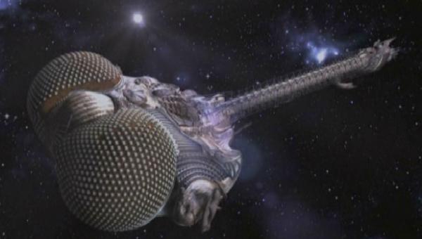
|
|
#
?
May 12, 2020 15:53
|
|


|
A couple more I feel should be in here Icarus II from 'Sunshine'  and the one from 'Heavy Metal' 
|
|
#
?
May 12, 2020 16:52
|
|


|
Squizzle posted:b5 had some ok ships, but nothing ever stuck out as having the distinct + attractive look that a good iconic ship should have. the white star�the shows closest thing to a hero ship�was a visual mess The rest of your post is good but I have to raise strenuous objection to this bit right here because: https://i.imgur.com/reEjqWH.mp4  Starfuries are awesome. Lemniscate Blue fucked around with this message at 22:52 on May 12, 2020 |
|
#
?
May 12, 2020 22:48
|
|

|
Lemniscate Blue posted:The rest of your post is good but I have to raise strenuous objection to this bit right here because: Squizzle posted:im here to drop a hard truth you folks might not like but will see the truth of: starfuries are just uglier gunstars
|
|
#
?
May 13, 2020 00:13
|
|

|
Death Blossom was something that one experimental Gunstar could do once, and it had to stop in place to do it. Starfuries are designed to do it all day every day. Light years ahead of the competition!
|
|
#
?
May 13, 2020 01:18
|
|
|
Lemniscate Blue posted:Death Blossom was something that one experimental Gunstar could do once, and it had to stop in place to do it. And deathblossom also shorted out all their systems.
|
|
#
?
May 13, 2020 02:12
|
|
|
the thruster placement on the gunstar means it can maneuver like a starfury all day every day. death blossom is just telling the computer to dump everything left in the weapons system such that it obliterates everything inside the db radius  the gunstar, also, remains a million times better-looking
|
|
#
?
May 13, 2020 02:55
|
|
|

|
|
#
?
May 13, 2020 03:04
|
|
|
twistedmentat posted:The Vree, who used the saucer, were literally Greys, and yes, they did come to earth and abduct people for experiments in the past. I loved that little detail in the show. speaking of which, how are we not talking about the roci 
|
|
#
?
May 13, 2020 06:47
|
|

|
i get hell of homeworld vibes off the roci
|
|
#
?
May 13, 2020 07:30
|
|

|
WilWheaton posted:speaking of which, how are we not talking about the roci Because I couldn't find a good picture of it.
|
|
#
?
May 14, 2020 17:29
|
|
|
The Nostromo. I love the idea of a space big-rig towing a refinery that autonomously processes substances in-flight on long trips through space. Plus it's got a boss interior, and the lived in, retro-future computers and controls are extremely my jam. I like the look of a lot of the ships in the X-wing/TIE fighter games but there are too may to post in one sitting. Might post more later GAT-12 Skipray Blastboat. Kind of a dumb name but it looks cool.  Cloakshape Fighter.  C-ROC Gozanti-class Cruiser.  Freighter Type K. I've always loved freighter space ships. I really dig the cargo ship style design  Olympic Class Starship. Star Trek has some great ship designs but I've haven't been crazy about the Federation's designs save for the original Enterprise. I like the Olympic class because it breaks the mold of the saucer bow we are used to  Maschinen Krieger Falke. I've always really liked the visual design of Maschinen Krieger, but I don't know a lot about it. 
Linux Pirate fucked around with this message at 06:38 on May 15, 2020 |
|
#
?
May 14, 2020 19:08
|
|


|
Squizzle posted:the walker looked even better in concept art imo That's a rad starship. That's the Eiffel Tower.
|
|
#
?
May 15, 2020 04:49
|
|


|

|
|
#
?
May 16, 2020 05:07
|
|

|
Squizzle posted:the best b5 ship was ofc this baby I completely understand where you are coming from, but maybe apart from the human designs, none of the spacecraft are designed for realistic space combat. Realistic space combat happens at extreme ranges probably between armoured space submarines with high precision relativistic weaponry (also hyperspace cruise missiles). Came to post Lexx but will have to settle for this iconic contribution:  Not sure how many people are old enough to remember this. Such a simple yet great design.
|
|
#
?
May 16, 2020 11:28
|
|

|
Jinx posted:I completely understand where you are coming from, but maybe apart from the human designs, none of the spacecraft are designed for realistic space combat. Realistic space combat happens at extreme ranges probably between armoured space submarines with high precision relativistic weaponry (also hyperspace cruise missiles). Never played the first one, but I own it's latest successor  (that one isn't mine) I prefer the Mamba's design. It kind of reminds me of the speeders in Star Wars Episode II, but classier. It's a hot rod for space, but not just a jpeg hot rod. 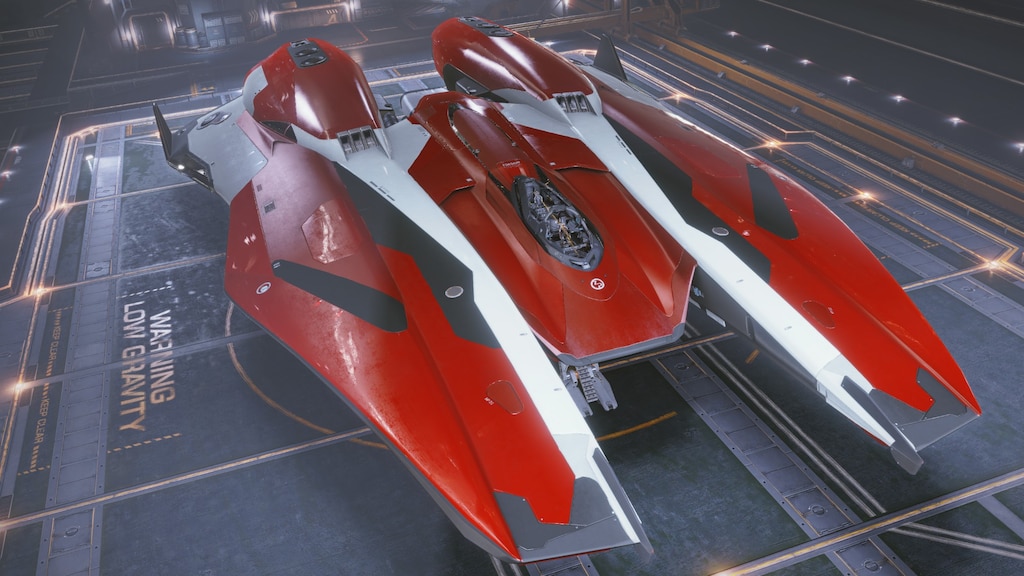
|
|
#
?
May 16, 2020 11:47
|
|


|
  The Tiger's Claw from the original Wing Commander.  It's hilarious and the idea of building a space ship meant to deal with other space ships in space that is 75% runway is absurd if you think about it for even a second, but the degree to which they very intentionally did not think about it, and its design as literally just an aircraft carrier in space, is immediately emotionally indicative of the WWII-but-with-you're-fighting-evil-cats-who-fly-space-donuts nature of the game/series. You can't look at it and not immediately grasp the tone. They eventually tried to make it kind-of sort-of make sense by designing future carriers that were big giant edifices built around a runway to at least make it seem space-efficient, but it was always better when it was just completely, blatantly stupid. In fact, honorable mention for the Dralthi:  Perfect little space donut.
|
|
#
?
May 16, 2020 19:01
|
|

|
I always liked Talyn's design just a little bit more because of how streamlined it is but they did a great job on Moya too with the texture and overall shape that made it seem a bit more alive. Farscape is so underrated. We shall never see it's like again.
|
|
#
?
May 16, 2020 19:53
|
|


|

|
|
#
?
May 17, 2020 04:47
|
|
|
CarlCX posted:
I understand it's because of hardware limitations and the need to keep the polygon count and texture size down, but everything after Wing Commander 2 just looks godawful to me.
|
|
#
?
May 17, 2020 06:25
|
|
|
Gene Roddenberry's Andromeda got really bad as it spiraled out of control in its later seasons as Kevin Sorbo gained more and more control over it, but the Andromeda Ascendant itself is still to this day one of the most beautifully weird ships to ever grace a TV screen: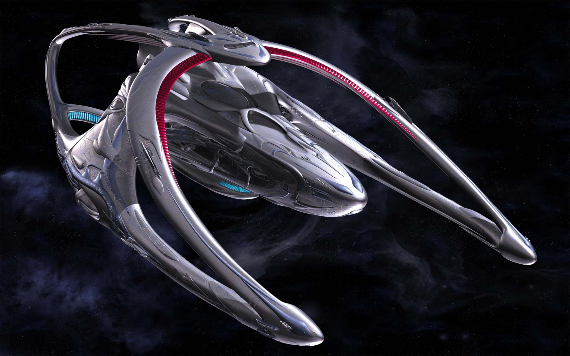 Design-wise that show really sold you on the notion that Earth joined an already established galactic community when humanity took to the stars and instead of taking over and forcing it conform to human design standards ala Star Trek, humanity got the gently caress out of the way and conformed the weirdass but well-established standards of the Commonwealth. The early seasons really sold you on the idea that humans and Earth aren't really a big deal... again, until Kevin Sorbo took over and fired all the executive producers who were trying to tell a real story. nine-gear crow fucked around with this message at 10:22 on May 17, 2020 |
|
#
?
May 17, 2020 10:17
|
|
|
I loved how over the top the weaponry in Andromeda was, too. Weren't the main guns basically black hole cannons or something?
|
|
#
?
May 18, 2020 04:12
|
|
|
Polaron posted:I loved how over the top the weaponry in Andromeda was, too. Weren't the main guns basically black hole cannons or something? it had bombs, plural, that caused a star to go supernova, as part of its standard complement
|
|
#
?
May 18, 2020 04:47
|
|
|
Tochiazuma posted:and the one from 'Heavy Metal'  Right before they touch down on Ego directly and everything looks insanely Heavy Metal-inspired (but y'know, with fewer gratuitous tits). The shot lingers directly on the ship, taking advantage of our pareidolia, so I refuse to believe it was a coincidence. ------------ My favorite ship though is without a doubt the ENT-C. This beautiful thing. I love the ENT-D's sleek coziness and the ENT-A's Analog-Cool Rectangles, but the ENT-C is the best of both.    Really the worst thing you can say about it is that it doesn't quite feel like a flagship, and I'd agree. It's almost kind-of scrappy, but with that ENT-D soft muscle that makes it seem like something you'd want to live on full-time, not just on a five year mission. If we're talking "anything's on the table" though, a GSV like this is the pro choice.
|
|
#
?
May 18, 2020 05:08
|
|


|
mind the walrus posted:My favorite ship though is without a doubt the ENT-C. The original Andrew Probert concept for the C really sold that concept better:   This is a ship that you can feel was the flagship of its era until the Galaxy class came along and outshined it across the board. So now it putters around in the background doing workmans odd jobs and quietly muttering resentful curses every time the glorified "space shopping mall" flies past on its way to a galactic peace conference, or to welcome a new world into the Federation, or wind up in some cool space orgy where half the crew fucks an energy being made of pure joy or whatever. Unfortunately, when it came time to put the C on screen, Probert's design was too complex to be built on the timeframe the production crew had so they cooked up the version that made it on screen: a collection of perfect circles and right-angles, aka the easiest shapes model on a 2-day timeframe 
nine-gear crow fucked around with this message at 06:12 on May 18, 2020 |
|
#
?
May 18, 2020 06:10
|
|
|
long before generations showed the B, it was assumed generally that it was an excelsior class. probert created his prototype C design by laying the outline of a galaxy and excelsior one over the other, and drawing lines to connect corresponding structures on them, and using those as guidelines for what a sort of manually-derived average of the two would be
|
|
#
?
May 18, 2020 06:30
|
|
|
UNF https://www.youtube.com/watch?v=6YBO-sy2rRU
|
|
#
?
May 18, 2020 06:57
|
|
|
im a big fan of the ent-c as it appeared on screen, because the “lazy” construction—circles instead of flowy probert curves—really nicely evoke the original and refit enterprise. since the ep the ship appears in relies on the past being out of place, the stronger visual link to the classic series sells that idea, imo, better than a design more similar to the ent-d would
|
|
#
?
May 18, 2020 07:12
|
|
|
I like pretty much anything that looks like a Constitution refit. The Ambassador class does that for me.
|
|
#
?
May 18, 2020 07:15
|
|
|
I like anything that's at least 50% plus engines. I was a turbo nerd kid that was big on Starfleet manuals and cutaway diagrams, and it always bothered me when the engines and life support took up less space than the captains quarters. I'm more a Star Wars kid than Star trek, but that's one thing that Trek always got right.
|
|
#
?
May 18, 2020 08:43
|
|

|
Bogus Adventure posted:I like pretty much anything that looks like a Constitution refit. The Ambassador class does that for me. I love the refit (I think it's maybe the greatest starship design ever) but I like its sleekness. The Ambassador's a bit tubby in comparison
|
|
#
?
May 18, 2020 10:57
|
|


|
mind the walrus posted:
It's such a beautiful piece of fanart, though I might just be a huge sucker for the soft focus. There's also something really cool about how it's both sleek and anti-sleek - it has a very broad profile but has weird jagged elements to it all over.
|
|
#
?
May 18, 2020 18:57
|
|
|
Squizzle posted:im a big fan of the ent-c as it appeared on screen, because the “lazy” construction—circles instead of flowy probert curves—really nicely evoke the original and refit enterprise. since the ep the ship appears in relies on the past being out of place, the stronger visual link to the classic series sells that idea, imo, better than a design more similar to the ent-d would
|
|
#
?
May 18, 2020 20:09
|
|
|
mind the walrus posted:Leaning hard on the bright blue deflector and cherry red nacelles helps sell the bridge to TNG as well. I hadn't seen the original ENT-C art and it honestly does look much better as a conceptual bridge between the B and D, but I do prefer the C's overall look. Plus it's blue. It always bugged me that none of the ships in Star Trek had any color. bothered probert too. he designed the ent-d to be more blue than it was ever lit or shot. he also designed the maroon-and-orange ferengi marauder and the fuckin seafoam-ish green romulan warbird
|
|
#
?
May 18, 2020 20:50
|
|
|
I get that they wanted the Trek ships to look more naval and less like war vessels than Star Wars, BSG, or Flash Gordon... but it does feel like they leaned too hard into greys and whites instead of finding a middle ground with nice blocky stripes and stuff.
|
|
#
?
May 18, 2020 21:16
|
|
|

|
| # ? Apr 23, 2024 22:46 |
|
|
I've always thought the star trek ships had a terrible design, I like that blue one though
|
|
#
?
May 18, 2020 21:23
|
|