


|
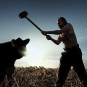
https://twitter.com/arianimation/status/1271128262240948224 This one was a pain in the rear end to make, but I really like how it turned out.
|
 #
?
Jun 11, 2020 18:27
#
?
Jun 11, 2020 18:27
|
|


|

|
| # ? May 8, 2024 02:01 |
|
|
all of these are so neat 
|
|
#
?
Jun 12, 2020 07:13
|
|
|
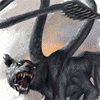
Raaaaarrr: It's a lino print! Could've been printed better! Still, I'll take it. Depicted is the 1964 version of Godzilla attacking Austin (TX), specifically the dirty sixth street area downtown. As I posted in another thread, I have zero idea why I wanted to make a print of that in particular, but... here we are.
|
|
#
?
Jun 14, 2020 02:44
|
|


|
mudskipp posted:Some seriously colourful & high contrast work in the thread since I last popped in, it's great! I really like this! I love the contrasts. The dark at the bottom works really well with the light sky. That�s harder to do than it should be. I really like Godzilla too. Great perspective HungryMedusa fucked around with this message at 03:15 on Jun 14, 2020 |
|
#
?
Jun 14, 2020 03:11
|
|


|
Went to a wine and paint thing with my mum where the theme was paint your pet. So I did. Acrylic on canvas: The cat in question: 
|
|
#
?
Jun 14, 2020 08:57
|
|

|
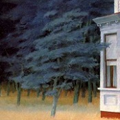
mudskipp posted:Some seriously colourful & high contrast work in the thread since I last popped in, it's great! This is really gorgeous, I love the colors but also just how... I don't know, 'clean' it is? The grass and leaves look so neat and orderly, but not in a way that makes them look unnatural! I really dig the style. I drew this over the last week  Acrylic pen, fineliner, gel pen I've committed to drawing maybe 30-40 more landscapes like this then making a coffee table book
|
|
#
?
Jun 16, 2020 06:35
|
|

|
Thanks! I think it's because it's individually all very simple in the mark making and range of colours. I've been pushing myself to opt for colour and contrast where possible, for a long time I couldn't imagine how people can use bold lines and colours like in your piece but I'm slowly convincing myself not to merge everything into a mild gradient! Bit stuck on my current piece but will post it however it comes out once finished, having this thread around is nice to look through in lieu of seeing any stuff in person for awhile!
|
|
#
?
Jun 18, 2020 14:52
|
|
|
https://twitter.com/arianimation/status/1274009280933289990 I improved the mechanism, they are a bit harder to set in but they are much more stable and turn more smoothly. Maybe at some point I'll try other things in addition to gears to get more kinds of motion, or maybe more 3D shapes.
|
|
#
?
Jun 19, 2020 17:09
|
|
|
Chernabog posted:https://twitter.com/arianimation/status/1274009280933289990 Motorised one. Linked to a camera+facerecognition. It turns the gears when people aren't looking at it.
|
|
#
?
Jun 19, 2020 20:00
|
|
|
That would be neat. I might try the motor at some point but I literally know nothing about motors or electronics so it seems like it would be more work as far as the learning process goes.
|
|
#
?
Jun 19, 2020 20:28
|
|
|
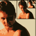
This is a painting that I've been working on: It's based on this photo that I took:  I'm trying to work on two things. The first is colors - I painted this with just red, yellow, blue, white, and black, because I'm trying to get better at mixing and matching colors. The second thing is not over blending, which I've read is a common mistake for novices. If anyone has any thoughts, especially on those two things, I'd appreciate any feedback.
|
|
#
?
Jun 20, 2020 15:26
|
|
|
Trippy llama DMT trip
|
|
#
?
Jun 20, 2020 15:48
|
|

|
CobwebMustardseed posted:This is a painting that I've been working on: I'm going to assume you are going for a realistic/semi-realistic style. My first advise would be that before your start getting into color you work on other more pressing matters. -First of all, your perspective is really off. Look at the slopes of the buildings, or the lines on the ground and they are going in entirely different directions. If you are interested in making paintings of buildings I'd tell you to focus on learning about perspective first. This picture is mostly in 1 point perspective which is actually pretty simple once you get the hang of it. -Another thing you should learn before you get into color is values. There are three aspects to color: value, hue and saturation. Value is how light/dark something is. Hue is the actual color. Saturation is how vibrant the color is, for example between pure red and pure gray. Value is arguably the most important because it comes into play with or without color and it is what helps everything get volume. If you can make a painting in black and white with good values you should have no problem jumping into color. The buildings in the photo are some of the darkest spots while in your painting they are some of the lightest. This makes everything look flat and non-dynamic. -A good rule of thumb is to avoid using pure white, gray or black. If you need a shadow make it a deep blue or purple. If you need a light make it a bright yellow or pink. This makes everything look more vibrant and interesting. If you look at the latest painting I posted here I actually broke this rule but only because the client didn't want it to look childish so I intentionally de-saturated the colors.
|
|
#
?
Jun 20, 2020 16:43
|
|
|
I got inspired by one of the goonArt discord emojis and made a thing.    
|
|
#
?
Jun 21, 2020 14:59
|
|

|
Crossposted from the daily drawing thread but maybe a better fit here. First and second design are mine. The girl(s) are a famous surrealist photographer. Beer coasters with polycrylic finish. Sorry for the slight blur.  
sigma 6 fucked around with this message at 08:45 on Jun 22, 2020 |
|
#
?
Jun 22, 2020 05:39
|
|

|
Trabant posted:Raaaaarrr: i love this and also now lino printing by extension. my 3 year old is obsessed with godzilla - would it be possible to get this stamped on a sheet of paper and mailed to me in houston? id like to frame it and put it on his wall!
|
|
#
?
Jun 23, 2020 01:46
|
|

|
Thanks! I'd be happy to do so, but need to be honest (mostly to myself) about two things: (1) I'm not exactly thrilled with the quality of the prints I've been getting, namely the uneven coverage. I doubt a kiddo would notice/care, but it does lead me to... (2) I don't think I'll do another round of prints for a week or two. If your son's still into Godzilla at that point, I'll definitely send you a print. Drop me a PM and I'll update you once I have something halfway decent ready to go.
|
|
#
?
Jun 23, 2020 06:53
|
|
|
Trabant posted:(1) I'm not exactly thrilled with the quality of the prints I've been getting, namely the uneven coverage. I doubt a kiddo would notice/care, but it does lead me to... Get thee a wooden spoon
|
|
#
?
Jun 23, 2020 14:22
|
|

|
Oh, I tried  Wooden spoon, crappy Speedball baren, copy press, bone knife -- I've never been happy with the results. Wooden spoon, crappy Speedball baren, copy press, bone knife -- I've never been happy with the results.At this point I'm reasonably confident that my problem is inconsistent/uneven ink coverage more than anything. Next time around I'll try to keep to multiple thinner layers, since that's apparently what works better with Caligo safe wash inks.
|
|
#
?
Jun 23, 2020 20:28
|
|
|
Another sketch of a Jordu Schell sculpt. sigma 6 fucked around with this message at 18:21 on Jun 24, 2020 |
|
#
?
Jun 24, 2020 09:25
|
|
|
sigma 6 posted:Crossposted from the daily drawing thread but maybe a better fit here. I love the coasters you sent me, man. Photos don't really do them justice as the texture, patina, and finish are amazing.
|
|
#
?
Jun 24, 2020 19:09
|
|
|
Chernabog posted:https://twitter.com/arianimation/status/1271128262240948224 What is the origin of this type of painting?
|
|
#
?
Jun 27, 2020 21:21
|
|
|
Mister Kingdom posted:What is the origin of this type of painting? Do you mean the origin as in the technique? I was inspired by Huichol art where they paste beads over a layer of wax, usually on small sculptures. Although I used silicon glue and "diamond painting" beads for this. If you meant the thing that's depicted, it is inspired on the "Ophanim" biblical angel.
|
|
#
?
Jun 27, 2020 21:56
|
|
|
Chernabog posted:Do you mean the origin as in the technique? The technique of using gears.
|
|
#
?
Jun 28, 2020 01:10
|
|
|
Oh, that. I started as an animator and wanted to make paintings that moved in some way so I came up with the gear concept. I started looking into woodworking to make the gears but I didn't have any of the tools or space for that so I shelved the idea for a few years. Then I started looking into 3D printing and it turned out to be exactly what I needed.
|
|
#
?
Jun 28, 2020 01:25
|
|
|
Album cover in progress
|
|
#
?
Jun 29, 2020 04:39
|
|
|
sigma 6 posted:Crossposted from the daily drawing thread but maybe a better fit here.
|
|
#
?
Jun 29, 2020 17:27
|
|
|
Zoben posted:Album cover in progress Looking great as always.
|
|
#
?
Jun 29, 2020 18:34
|
|
|
Zoben posted:Album cover in progress Just amazing 
|
|
#
?
Jun 29, 2020 18:58
|
|
|
Breaking bottles again. This is a miller lite 7oz
|
|
#
?
Jul 1, 2020 05:56
|
|

|
Zoben posted:I love the coasters you sent me, man. Photos don't really do them justice as the texture, patina, and finish are amazing. Glad you liked them. Each one is a little different and lately I can't seem to decide on how glossy I want the finish to be. Claeaus posted:Really like this one! It's like it's from some weird fever dream Sam & Max concept art. Thanks! This is a different run plus a couple others. No polycrylic though. 
sigma 6 fucked around with this message at 23:22 on Jul 1, 2020 |
|
#
?
Jul 1, 2020 23:18
|
|
|
those are cool
|
|
#
?
Jul 4, 2020 03:09
|
|
|
More progress
|
|
#
?
Jul 6, 2020 20:16
|
|
|
Zoben posted:More progress sick
|
|
#
?
Jul 7, 2020 00:33
|
|

|
Did another burn of Zoben's art today. So remember the Maya apocalypse "Baktun" back in 2012? Well... I guess it was supposed to be 2020. drat Mayan math. Definitely failed that course in school. 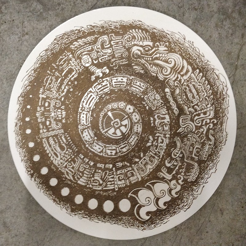 f f
|
|
#
?
Jul 8, 2020 01:29
|
|
|
sigma 6 posted:Did another burn of Zoben's art today. Please do not bring on the apocalypse with your awesome pictures.
|
|
#
?
Jul 8, 2020 01:30
|
|


|
Another one of my old design's burned to a 4x4 coaster. Original here.  HopperUK posted:Please do not bring on the apocalypse with your awesome pictures. "As an expert in such things, I believe a death trap awaits us." 
sigma 6 fucked around with this message at 23:28 on Jul 8, 2020 |
|
#
?
Jul 8, 2020 22:58
|
|
|
Been feeling a little down this week so I sketched and watercolored a mermaid portrait to cheer myself up. It didn't work, but at least I made a piece of art. 
|
|
#
?
Jul 9, 2020 19:40
|
|
|
Another ink study of a Jordu Schell sculpt. Here is a little progress shot.  and some more burning of op art. 
sigma 6 fucked around with this message at 01:44 on Jul 11, 2020 |
|
#
?
Jul 10, 2020 09:56
|
|
|

|
| # ? May 8, 2024 02:01 |
|
|
 9"x12" Acrylic Paint, Acrylic Marker, Fineliner and Gel Pen on black paper click here for a giant 600dpi 66mb scan (Not finished yet) Another astral projection from quarantine~ I'm trying to work out some charitable auctions with causes like Stop Killer Robots to help good organizations and get myself some more exposure  Then I want to take all of these and make a coffee table book where they're accompanied by like, fictional almanac pages about these places Then I want to take all of these and make a coffee table book where they're accompanied by like, fictional almanac pages about these places
deep dish peat moss fucked around with this message at 02:49 on Jul 14, 2020 |
|
#
?
Jul 14, 2020 02:46
|
|