|
made a little zombie man or something
|
 #
?
Jul 8, 2020 05:40
#
?
Jul 8, 2020 05:40
|
|


|

|
| # ? Apr 25, 2024 07:30 |
|
|
I'm stuck waiting for some issues to get ironed out with GMS2.3 but until then I'm 100% back on my poo poo
|
|
#
?
Jul 9, 2020 13:15
|
|

|
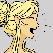
Mmmn I really like the way she turns into, and sits down on, that right hand; that's a good punch.
|
|
#
?
Jul 9, 2020 13:55
|
|
|
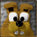
little bird
|
|
#
?
Jul 14, 2020 23:31
|
|
|
I'm trying to figure out a bunch of palettes I can shift between, is there like an easy tool that lets me have a... color spreadsheet or something I can add rows and move things in?
|
|
#
?
Jul 15, 2020 07:11
|
|


|
   Totally inspired by shoehead in the gamedev thread. River Cityyyy let's go anothergod fucked around with this message at 01:04 on Jul 18, 2020 |
|
#
?
Jul 18, 2020 00:10
|
|
|
  Current Progress on stage 1 graphics for my game. I'm having the player go up the side of a building for the second half of the stage, but I felt it would be too boring if it was just one looping pattern for the whole bit. so, I made an entirely new section that pans over to see the side of it, while also allowing me to have a little parallaxed city in the background.
|
|
#
?
Jul 19, 2020 20:29
|
|
|
MikeJF posted:I'm trying to figure out a bunch of palettes I can shift between, is there like an easy tool that lets me have a... color spreadsheet or something I can add rows and move things in? If you find a good tool please post it. Aseprite's palette is pretty good, lets you move colours around and then you can export the palette as a png but I don't know if it supports palette subgroups which I would like because often in a project I will assign subsets for different classes or themes.
|
|
#
?
Jul 21, 2020 09:37
|
|

|

|
|
#
?
Jul 23, 2020 23:27
|
|
|
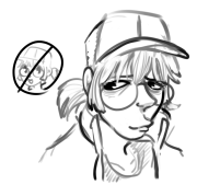
Hi, thread! So, I developed a game engine for ancient Macs with 1-bit-per-pixel black-and-white displays. I'm trying to come up with some expedient sprites and I've just started tracing some sketches trying to come up with some little 32x32 pixel characters. Any combination of pointers, links, harsh criticism, and validation would be appreciated because I simultaneously enjoy the hell out of this and feel like I have no idea what I'm doing.
|
|
#
?
Jul 24, 2020 04:00
|
|
|
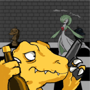
Lotta work went into this one
|
|
#
?
Jul 24, 2020 13:27
|
|
|
Stack Machine posted:Hi, thread! So, I developed a game engine for ancient Macs with 1-bit-per-pixel black-and-white displays. I'm trying to come up with some expedient sprites and I've just started tracing some sketches trying to come up with some little 32x32 pixel characters. I think they're completely valid. The vibe they give off is a little bit "strange" or "weird" which I'm not sure is intentional; but is good if you're going for that kind of vibe. It's mostly the asymmetrical lopsidedness, and the eyes could be construed as a little bit eerie, but it's all up to tone, really. There's no "right" way to do things, I could see these being perfectly servicable sprites in a lot of things, it's just up to what mood you want to convey, really. If you're trying to feel more "normal" then a bit more line cleanup and a change of eyes would be probably all that's needed. One of my favorite games of all time, OFF, has some really wonky sprites at times, but it's on purpose to give this eerie almost haunted vibe.  
Jewel fucked around with this message at 13:32 on Jul 24, 2020 |
|
#
?
Jul 24, 2020 13:30
|
|

|
Jewel posted:I think they're completely valid. The vibe they give off is a little bit "strange" or "weird" which I'm not sure is intentional; but is good if you're going for that kind of vibe. It's mostly the asymmetrical lopsidedness, and the eyes could be construed as a little bit eerie, but it's all up to tone, really. There's no "right" way to do things, I could see these being perfectly servicable sprites in a lot of things, it's just up to what mood you want to convey, really. If you're trying to feel more "normal" then a bit more line cleanup and a change of eyes would be probably all that's needed. Thanks so much for taking some time to provide some feedback. I think you've described some vague notions I had very succinctly. The story I want to wrap this around is about exploring the aftermath of unknown disaster so the idea that I can use the art style to help convey that sense of anxiety and dread is promising, but I don't want to do the equivalent of going full-on Battlefield Earth using dutch angles in every scene. I think I'll experiment with dialing back the eyes a bit.
|
|
#
?
Jul 24, 2020 17:57
|
|
|
 midboss, idk. need to figure out some hands or something.
|
|
#
?
Jul 25, 2020 07:48
|
|
|
Stack Machine posted:Hi, thread! So, I developed a game engine for ancient Macs with 1-bit-per-pixel black-and-white displays. I'm trying to come up with some expedient sprites and I've just started tracing some sketches trying to come up with some little 32x32 pixel characters. Very cool! My first thought was that having distinct, easily identifiable characters could be difficult when you can't use colors but it seems you had that in mind when making these.
|
|
#
?
Jul 25, 2020 08:16
|
|
|
Claeaus posted:Very cool! My first thought was that having distinct, easily identifiable characters could be difficult when you can't use colors but it seems you had that in mind when making these. My favorite platform is probably the game boy and I'm constantly amazed at how many distinct characters can be represented in 16x16 pixels at 3 shades of gray.
|
|
#
?
Jul 25, 2020 22:03
|
|
|
Stack Machine posted:My favorite platform is probably the game boy and I'm constantly amazed at how many distinct characters can be represented in 16x16 pixels at 3 shades of gray. I wish we got wonderswan stateside, because I think the 8 shades grayscale images look so good.
|
|
#
?
Jul 27, 2020 05:12
|
|

|
For a top down arpg, do y'all do animations for diagonal movement/attacks?
|
|
#
?
Jul 29, 2020 02:11
|
|

|
ButtWolf posted:For a top down arpg, do y'all do animations for diagonal movement/attacks? How Zelda do you want to feel?
|
|
#
?
Jul 29, 2020 02:43
|
|
|
I feel like diagonals would make it feel more modern, but seems like a ton more work. So its just kinda dealers choice?
|
|
#
?
Jul 29, 2020 03:01
|
|
|
I'm making some placeholder pixel art for a game project so I might as well share it here.   
|
|
#
?
Jul 29, 2020 21:41
|
|
|
This is looking a little better than placeholder art
|
|
#
?
Aug 1, 2020 21:40
|
|
|
Here's another sporadic attempt at roguelike graphics, which i got inspired to try after playing Caves of Qud and trying to put my own take on it (X2 size, 24x24 tiles): Started changing my palette again, though i think there might not be enough contrast and that it might be too desaturated/muddy
|
|
#
?
Aug 26, 2020 21:49
|
|

|
I need to get back to making some small profile animations for the dialogue sections in Kandria. Did the above as a sample for the thread I made on the game! I'd like to make a couple for each character so that the text can be matched up with an appropriate reaction or expression. Ash Crimson posted:Here's another sporadic attempt at roguelike graphics, which i got inspired to try after playing Caves of Qud and trying to put my own take on it (X2 size, 24x24 tiles): Yeah, it's a bit hard to make out the foreground enemies from the background elements. Maybe take some inspiration from the Necrodancer games, those do a pretty good job keeping the enemies visible, though they do use a much bigger palette.
|
|
#
?
Aug 26, 2020 21:59
|
|

|
Shinmera posted:I need to get back to making some small profile animations for the dialogue sections in Kandria. Thanks for the comment; your game looks interesting, will follow your progress! I'll give crypt a look! I've quickly re-did the palette for the units, whilst keeping the background's original palette, hopefully they pop out a little more, although i'm going to continue messing about with a more limited, contrasting palette; I'm trying/aiming to keep 4 colours per ramp, ending in a dark purple whilst re-using as many colours as possible but still keeping each colour identifiable, although i'll probably end up re-doing it again 
|
|
#
?
Aug 26, 2020 23:41
|
|
|
It's a nice desaturated palette. Try removing the black outlines from the tile elements, I think you will find that they still read and the character sprites will immediately pop to the foreground.
|
|
#
?
Aug 27, 2020 02:54
|
|
|
How do i do glass? I'm currently drawing a domed building with an indoor park. After a rough sketch I'm at a draw (hurr) on how to draw the glass roof. It's currently just blended with a non-opague-alpha-channel, but that feels like a cheat somehow. Any clues?
|
|
#
?
Aug 27, 2020 16:52
|
|
|
Adding a slight blue tint makes things appear more "glass-y". Also try to make the specular highlights sharp shapes per glass pane, rather than a smooth gradient. If you look at some photos of glass, you'll see that the contours are pretty strong. E: Also made two more animations for my game today.
|
|
#
?
Aug 27, 2020 17:04
|
|
|
Her pixel portrait is pretty similar to your sketches. Are you pixelating them, or do you just pay good attention to stay consistent?
Wipfmetz fucked around with this message at 18:00 on Aug 27, 2020 |
|
#
?
Aug 27, 2020 17:54
|
|
|
For pixel art I just draw directly in Aseprite.
|
|
#
?
Aug 27, 2020 18:00
|
|
|
Wipfmetz posted:How do i do glass? For me glass has both opacity and reflections. A lot of glass "looks blue" because it reflects the sky which is reflecting blue light. It also is opaque with whatever color the glass is --- usually some kind of white. And the second part of being opaque is that opacity occludes color and darkens whatever light is passing through. The different levels of opacity and reflection will affect the final outcome of the glass. Angles will affect either differently, and so curvature ends up being really cool because you end up visualizing the math through changes in color. Hope this helps.
|
|
#
?
Aug 27, 2020 20:07
|
|
|
Shinmera posted:E: Also made two more animations for my game today. As is it kind of looks like you're laying down the outlines and then moving immediately to shading inside them. The first thing I'd suggest is spending a little more time cleaning up the linework--you have a few spots where the lines have odd jogs rather than making smoother curves, which will tend to make the pixel grid more obvious. These can also be fixed pretty quickly:  There is also the issue of integrating the outline with the shading. That's not something you need to worry about with traditional art but in pixel art anywhere you have a sharp contrast in brightness the pixel grid will be more evident. That's something you can play with and it can work in a particularly stark, minimalist aesthetic, but when you're doing smoother shading with high color counts it tends to make the outline stand out and give things a crunchy look. That's where antialiasing becomes important--you can smooth those curves out by putting intermediate shades in strategic positions to downplay crunchiness. It also gives you more control over the perceived thickness of lines and lets you pack more detail into the same amount of space. I did a quick edit on the face, mostly just adding antialiasing, all using the existing color palette:  That might not capture the expression quite right but it's just a quick pass. As a general thing the contrast on your palette is a bit low, particularly on the hair. You might want to darken the darks a bit, which should help with conveying volume. You also have four completely separate palettes for four different brown ramps (skin, hair and jacket)--if you reuse some of the colors between them it can help with making it feel a bit more like a cohesive whole.
|
|
#
?
Aug 27, 2020 20:56
|
|

|
Scarodactyl posted:The animations on this are nice and convey character well, but there are technical details I think you'd want to address before spending more time on animations. Thanks a lot for the advice! I knew that I had to go back to fix the line art, I was pretty sloppy with it today. I'll also definitely have to re-evaluate the palette. Colour in general is something I'm not very comfortable with, even outside of pixel art. I'm not sure if I'm sold on the anti-aliasing, I honestly don't mind the crunchy look, but maybe I'll change my mind on that still. Hopefully I'll have a better day tomorrow to fix what I can.
|
|
#
?
Aug 27, 2020 22:10
|
|
|
 finished a new enemy. I've done lots of things for the game but most of them is miniscule things like UI and hit graphics and flares.
|
|
#
?
Sep 11, 2020 12:13
|
|
|
Turns out you were right, Scarodactyl! The anti-aliased version looks much better in the game: Not sure yet how well I'm doing at actually making things anti-aliased though. I also don't quite know how to implement your advice about sharing the three brown bands -- the things I tried ended up looking super wonky. On a side note: I'm currently looking to hire a pixel artist for the game, since I don't think I have the ability and time to do everything for the game myself. If anyone's interested, there's more information about it here: https://kandria.com/team-search.html
|
|
#
?
Sep 14, 2020 13:30
|
|
|
Sick. Not sure if you have sprite / time constraints but you could add some light flash on the hull and turret when the gun fires?
|
|
#
?
Sep 14, 2020 17:59
|
|
|
I totally burned myself out in my IRL job but I'm trying to get back on the horse
|
|
#
?
Sep 16, 2020 12:30
|
|
|
Scut posted:Sick. Not sure if you have sprite / time constraints but you could add some light flash on the hull and turret when the gun fires? maybe later. there's so much to do that right now I'm trying to just get each asset out the door as quickly as possible. now that I have a coder, I'm officially the bottleneck on production because they're working way faster than I can.  I still need a 1up icon but it's not as important right now. still gotta make more bullets and I've got ATLEAST an entire week's worth of work on animating the midboss. Shoehead: you really nailed the look you're going for, nice job! Diabetes Forecast fucked around with this message at 20:55 on Sep 17, 2020 |
|
#
?
Sep 17, 2020 20:52
|
|
|
Concept for a parallaxing sky level for a game I'm making. https://i.imgur.com/Zrc3sHa.mp4
|
|
#
?
Sep 21, 2020 21:03
|
|

|

|
| # ? Apr 25, 2024 07:30 |
|
|
Diabetes Forecast posted:maybe later. there's so much to do that right now I'm trying to just get each asset out the door as quickly as possible. now that I have a coder, I'm officially the bottleneck on production because they're working way faster than I can. you can always steal the bullets from tyrian!
|
|
#
?
Sep 21, 2020 21:07
|
|