


|
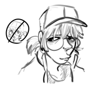
sigma 6 posted:Oof... I hope the Sailor Moon thing is a joke. Sorry to be a negative nancy but this seems like trolling. Maybe not ... but ... mentioning Manga and Leifeld in the same post. Ugh. I feel like I'm reading something translated from another language because I have no idea what you're trying to say. Is it that you don't get the joke? Maybe you should phrase what you're saying better. Basically, in the late 90s and early 2000s, the era of "How To Draw Anime/Manga" books written by out of touch white dudes and the one time scholastic hired a 13 year old to do a how to draw book. The worst of these was Peter Gray.  So each of us drew our own version but we'd put a spin on it, and since the GM said something about needing a thick neck I looked up Leifeld pictures and did his horrible muscle definition. Diabetes Forecast fucked around with this message at 11:09 on Sep 22, 2020 |
 #
?
Sep 22, 2020 05:26
#
?
Sep 22, 2020 05:26
|
|

|

|
| # ? Apr 19, 2024 06:02 |
|
|
I got it and laughed pretty hard, op
|
|
#
?
Sep 22, 2020 13:00
|
|
|
Diabetes Forecast posted:I feel like I'm reading something translated from another language because I have no idea what you're trying to say. Is it that you don't get the joke? Maybe you should phrase what you're saying better. Oh - I get it ... the joke is how bad anime and manga style is ... ha ha. Troll so funny. *rolleyes*
|
|
#
?
Sep 23, 2020 16:36
|
|


|
sigma 6 posted:Oh - I get it ... the joke is how bad anime and manga style is ... ha ha. Troll so funny. *rolleyes*
|
|
#
?
Sep 23, 2020 17:29
|
|
|
Neon Noodle posted:No the joke is how bad those how-to-draw books are. Worse than Horgarth? 
|
|
#
?
Sep 24, 2020 03:20
|
|
|
Hogarth's books are stylized to the point that they're worth very little for learning, but he knows what he's doing. There's no comparison at all with that page.
|
|
#
?
Sep 24, 2020 06:23
|
|
|
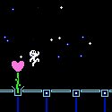
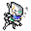
sigma 6 posted:Oh - I get it ... the joke is how bad anime and manga style is ... ha ha. Troll so funny. *rolleyes* You are remarkably unfunny. Please stop pretending to be dumb. Also don't you dare poo poo-talk Hogarth. For content, here's a thing from months ago where I was brainstorming for the design of the MC in my game, complete with my reference images and other garbage scribbles.  This of course lead to what I think is PROBABLY the best piece of pixel art I've ever made. 
|
|
#
?
Sep 25, 2020 09:01
|
|
|
As someone who has made fun of your big booty robots for many years,
|
|
#
?
Sep 25, 2020 13:15
|
|
|
Silly question time. I saw the tutorials in the OP. If I have absolutely zero art experience, much less pixel art, is there a good/better place to start? My goal is to literally make small pixel versions of my players' D&D party and maybe branch into some monsters if it goes well. Hopefully this doesn't sound disrespectful of artists, because I know absolute ton of talent goes into making small pixel art as well, as it takes a good eye to put something small like that into something cohesive and good looking. In all likelihood nothing much bigger than, say, a Final Fantasy 16bit era sprite. Edit: I am an idiot and meant to post this in the Pixel-Art megathread, but had this tab open. Saxophone fucked around with this message at 19:46 on Sep 27, 2020 |
|
#
?
Sep 27, 2020 19:42
|
|


|
Does anyone know of a good set of Procreate brushes that are grass/bushes block ins and textures?
|
|
#
?
Oct 1, 2020 01:07
|
|


|
Hi friends, Sebmojo and I are soliciting feedback as to how WE can improve CC for YOU! If that's something you'd like to weigh in on, you can go here: https://forums.somethingawful.com/showthread.php?s=&threadid=3942698
|
|
#
?
Oct 3, 2020 02:44
|
|
|
PriorMarcus posted:Does anyone know of a good set of Procreate brushes that are grass/bushes block ins and textures? https://gumroad.com/l/GStWM MattyB's free flora sets are pretty good.
|
|
#
?
Oct 10, 2020 10:35
|
|
|
Started some surface dev and it kinda veered into a stylized thing. Desert Gate 
|
|
#
?
Nov 11, 2020 20:19
|
|
|
I just stumbled on this prog, Realistic Paint Studio. It's not meant to be a super serious program but the brush/color engine is absolutely insane, I'm going to use it to do fancy note taking, it has an amazing fountain pen, but I also just had a fun playaround with the different mediums for a hoot 
|
|
#
?
Nov 11, 2020 22:40
|
|
|
  Working on a possible animation pilot for an idea I've fallen in love with. Storyboarding ideas and working out how the characters will look next to each other. Super enjoying how for once the ideas in my head are coming out like intended, especially the creepy mouth shots. At the very least it's a fun diversion while i try to heal my right hand. desperately need a new job that doesn't strain it so much. Diabetes Forecast fucked around with this message at 10:03 on Nov 13, 2020 |
|
#
?
Nov 13, 2020 09:58
|
|
|
perc2 posted:I just stumbled on this prog, Realistic Paint Studio. It's not meant to be a super serious program but the brush/color engine is absolutely insane, I'm going to use it to do fancy note taking, it has an amazing fountain pen, but I also just had a fun playaround with the different mediums for a hoot That's really really cool. THANK YOU! Kinda wanna check it out based on the price and video. This is also very cool and FREE Best thing about it is the liquid dynamics.
|
|
#
?
Nov 18, 2020 08:51
|
|
|
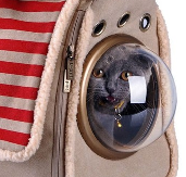
A catte I drew and the process by which I drew it (aka here are my favourite procreate pensets): 
|
|
#
?
Nov 20, 2020 14:51
|
|
|
sigma 6 posted:That's really really cool. THANK YOU! Kinda wanna check it out based on the price and video. There's a free trial which is definitely worth checking out
|
|
#
?
Nov 20, 2020 18:24
|
|
|
ATTENTION, ATTENTION The upcoming Winter update for Clip Studio allows you to post timelapses; it has an updated brush engine,  and consequently, lets you IMPORT PHOTOSHOP BRUSHES and consequently, lets you IMPORT PHOTOSHOP BRUSHES https://twitter.com/clipstudiopaint/status/1331509631307239425 Now just give me liquify pleeeeeaaaasssseeeee
|
|
#
?
Nov 25, 2020 10:20
|
|
|
One of my friends bought themselves a drawing tablet, but it's still sitting unopened. I'm pretty sure they don't have a drawing program, so I kinda want to get them one for christmas. I saw https://realisticpaint.com/index.html and clipstudio.net/en/ on this page, would either of these be good for someone who's only done physical drawing/painting?
|
|
#
?
Nov 26, 2020 01:20
|
|
|
I'd recommend Clip Studio over Realistic Painter, but they're also not really necessarily competing with each other. Clip Studio is a fully featured illustration suite, while Realistic Painter, for better or worse, actually emulates painting in real life, down to simulations of the physics of paint and brushes, which isn't really a concern for most digital painting programs. The latter is done well, but doesn't really give you a good handle on what you can achieve with digital painting, and generally just raises the question of why you'd want to use a program to accomplish results similar to things you're already doing in real life. Also, Clip Studio is on sale for a hefty discount this week. Edit: Other okay alternatives: Autodesk Sketchbook and Krita are free, Paint Tool SAI is cheap. I'm not into them but they do an ok job. Argue fucked around with this message at 05:07 on Nov 26, 2020 |
|
#
?
Nov 26, 2020 04:51
|
|
|
Argue posted:ATTENTION, ATTENTION Where do they mention thise changes and when is the update gonna drop?
|
|
#
?
Nov 26, 2020 22:03
|
|
|
Argue posted:I'd recommend Clip Studio over Realistic Painter, but they're also not really necessarily competing with each other. Clip Studio is a fully featured illustration suite, while Realistic Painter, for better or worse, actually emulates painting in real life, down to simulations of the physics of paint and brushes, which isn't really a concern for most digital painting programs. Yeah I was keen to stress it's not a serious program but is a lot of fun, and you can make fancy notes for studying with it
|
|
#
?
Nov 26, 2020 22:12
|
|
|
bltzn posted:Where do they mention thise changes and when is the update gonna drop? It's at the end of that video in the embedded tweet; I thought it was just a sale video and would have missed it too had I not seen some violently excited reactions from Twitter. The update drops "Winter 2020" so that basically means it could be as early as tomorrow or as late as 3 months from now.
|
|
#
?
Nov 27, 2020 08:04
|
|
This thread looks a little slow, but I wanted to post an OC I finished drawing yesterday  
|
|
|
#
?
Dec 27, 2020 23:13
|
|
|
Which of the existing digital painting programs on the desktop, if any, have a feature similar to how procreate can display an image tiled, so that you can make seamless images? I'd like to start making my own textures and brushes, but it's a real pain to test if my images are seamless with Clip Studio and--as far as I can tell--Photoshop. Procreate does the tiling part well, but I'd very much prefer to do this on the desktop if I can. There's programs on desktop for making seamless textures, but they're very oriented towards making textures for 3d models, and I'm not sure they'd have good painting tools on their own.
|
|
#
?
Jan 30, 2021 16:50
|
|
|
I'm working on this promo image for the Strega project, and this may very well be the most complex piece I've ever attempted. I'm so excited that I'm getting really focused between two projects and see myself actually making headway on them. I hope that when this is done I can use this to drum up interest in my work, especially once I get more storyboarding done.
|
|
#
?
Feb 12, 2021 14:18
|
|
|
Anyone else use Verve? It's a free program with amazing capabilities. However, the UI actively hates you. It operates on space logic and absolutely nothing is labeled. However! https://www.youtube.com/watch?v=-QPwOpQ6fko&t=641s Yet, it's easily the most paintlike painting program I've ever used and if things were labeled in a way I could understand I would easily never use anything else. You can bang out a painting sketch like you would with your real paints in no time at all. 
Pick fucked around with this message at 22:36 on Feb 13, 2021 |
|
#
?
Feb 13, 2021 19:23
|
|
|
That looks like a better UI than ArtRage's super terrible one, I need to try this out.
|
|
#
?
Feb 28, 2021 23:14
|
|
|
Here is essentially my first try at painting (Photoshop). I didn't have a clear vision of what I wanted to do, so I think that's a big problem, but what else do you notice that sucks? If you want to compliment something, that is welcome too, but I want to get better at this. 
|
|
#
?
Apr 1, 2021 07:58
|
|

|
 A really rough paintover from a beginner 1. Always set down a perspective grid. In your painting, your character is not grounded in the plane and has a weird perspective where they're too short, and the feet are showing. You can't see the top of a guy's feet so close to the horizon at that distance. Likewise, the bank of the river is "pouring over" because it's not following the lines of perspective. You can't see such dramatic turns in the opposing bank from the viewers point, so the bank should be straighter. I've also "stretched out" the near bank to work better with the way the perspective grid recedes. 2. Values - you need to go darker with your values, they're very constricted. It's a difficult scene to paint because it's got an overcast feel although by the sky, you should have a stronger light source from the sun. The tree should cast a shadow, and the bushes and leaves should be way darker underneath, because they aren't really being lit up from behind (apart from weak bounce light). The bushes on the other side are too close in value to the trees behind so they kind of get lost. If you make your painting black and white just to isolate values you'll see what I mean. 3. Hard edges - zoom in on my paintover of the trunk and compare to yours. Two issues - you're using the cut select tool which creates a pristine, unpainterly edge and makes the tree look very flat, and secondly you aren't giving it any form, a trunk is a 3-dimensional object and so try to simplify and paint it as if it were a long stretched out cube, like a crude 3d model of a tree, rather than the smooth cylinder effect you're going for. There are practically no hard edges in your painting, when in reality you want pretty much most of your painting to use hard edges (see example below) 4. Too much detail - To make a successful composition you really want to bring only one or two parts of it into sharp focus - but in your case, there's microscopic textural detail on every part of the tree, the grass, the bushes. Bushes on the other side of the bank should be largely indistinct and modeled as more solid, three dimensional masses. Save tiny areas of your painting for those precise details, like a ripple of sunlight on the water, etc. Try and be bold and gestural elsewhere. Always think about trying to paint everything as a 3d-dimensional solid mass on a perspective grid, then add detail sparingly after. Check out this example, it's all hard edges and brush strokes - there is no 'grass brush' or 'spray brush' in use, just textural, bold marks of paint. There's a decent range of value, the forms are just simple brushstrokes. Positives: * I really like the ominous, dark trees in the distance * The water has a nice glowing, mysterious quality * The composition is pretty solid and it reads well when zoomed out Nice one!!
|
|
#
?
Apr 1, 2021 17:28
|
|
|
Thanks! Lessons learned for the next one.
|
|
#
?
Apr 1, 2021 19:46
|
|
|
I published a book so I posted some art I made for it while working on it. I got the cover done by a pro artist though cause gotta put best foot forward. https://twitter.com/Ccs1989Scott/status/1382454257291554828 https://twitter.com/Ccs1989Scott/status/1382454503249698825
|
|
#
?
Apr 16, 2021 19:02
|
|

|
it wouldn't be the first session of a new dnd game if I didn't frantically, the morning of, hammer out some character art I will be tried before the hague for my crimes against the add glow layer, and rightfully so 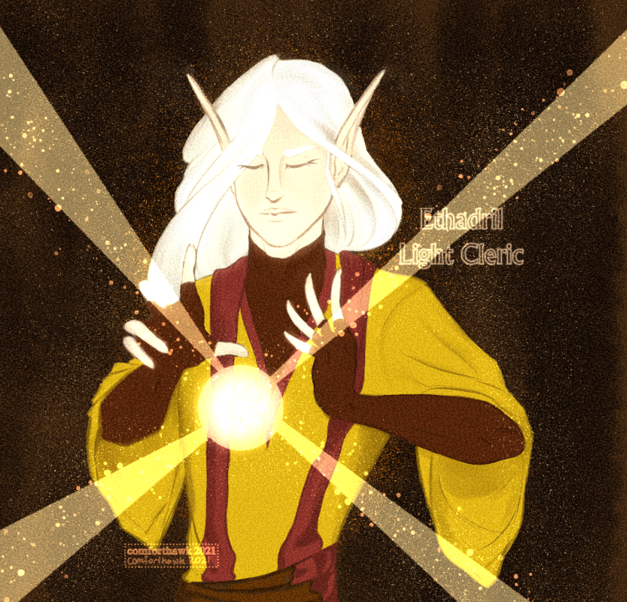
|
|
#
?
Apr 26, 2021 14:16
|
|
|
perc2 posted:
This was an excellent, valuable, and specific criticism. I appreciate your effort post.
|
|
#
?
Jun 16, 2021 03:13
|
|

|
Hey I've been scouring the forums, and the next at large for advice on my comic, and help in general. I'm a new artist, I started drawing about 18 months ago, but I didn't start taking it seriously until december, when I started spending an hour or two doing studies every day. I've fallen off that wagon a bit, because I learned that taking a break when doing intense practice is actually really helpful. My webcomic is in my avatar, but I have the latest page here, and was wondering if I could get some critique or feedback? I'm pretty thick skinned, and can handle it. Though in my experience people who say that generally can't I really can, and every piece of advice I got from a new artist has helped me grow so much. I'm crossposting this to the comic art thread as well, so yeah! Let me know what you think! Specific criticism I'm looking for (besides general things that you think I might be missing entirely!) Ways I can tighten up the style I'm going for, whether the textured canvas works well or not, thoughts on the textured multi-colored lines. Brushes that might do the same thing or better! The one on the left is the size I upload at, and the size on the right is my original working size.  
|
|
#
?
Jul 17, 2021 13:17
|
|

|
My art is a combo of digital and physical, is there an appropriate thread for that? I found the physical, found the digital, trying to find where I'm allowed to post. edit: posted in the "proud of" thread... seemed right. caldrax fucked around with this message at 20:49 on Aug 12, 2021 |
|
#
?
Aug 12, 2021 20:27
|
|

|
Boba Pearl posted:Hey I've been scouring the forums, and the next at large for advice on my comic, and help in general. I'm a new artist, I started drawing about 18 months ago, but I didn't start taking it seriously until december, when I started spending an hour or two doing studies every day. I've fallen off that wagon a bit, because I learned that taking a break when doing intense practice is actually really helpful. My webcomic is in my avatar, but I have the latest page here, and was wondering if I could get some critique or feedback? I'm pretty thick skinned, and can handle it. Though in my experience people who say that generally can't I really can, and every piece of advice I got from a new artist has helped me grow so much. I'm crossposting this to the comic art thread as well, so yeah! Let me know what you think! So I liked what you had going on in the dialogue. The art, it shows promise but you just started and it takes years to develop your identity as an artist and you need that in order for the art to stand on its own. The background, where are they exactly? Does it tie in to the story they are walking in a hollow void? You have characters, give them something to stand on
|
|
#
?
Aug 27, 2021 09:40
|
|
|
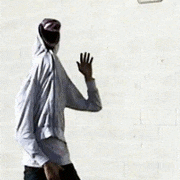
DickButt Shitlord posted:? That was something I really struggled with for awhile, and I think I've been doing better grounding my characters, from the last two weeks here's some more recent stuff I've been trying. I've grounded them more, but definitely do a mix of featureless voided and grounded. I tell myself "Oh it's just a wall" but honestly, I need to do more to ground them. Here's some stuff from the past two weeks.     If you click the blue link in my avatar, you can see all of them if you want to see more, people I think tend to be really polite, so they don't want to point out a lot of the glaring flaws, but I'm always happy to here more on how I can improve.
|
|
#
?
Aug 27, 2021 10:22
|
|
|

|
| # ? Apr 19, 2024 06:02 |
|
|
Boba Pearl posted:That was something I really struggled with for awhile, and I think I've been doing better grounding my characters, from the last two weeks here's some more recent stuff I've been trying. I've grounded them more, but definitely do a mix of featureless voided and grounded. I tell myself "Oh it's just a wall" but honestly, I need to do more to ground them. Here's some stuff from the past two weeks. Good work, just keep going and don't let anyone get you down. Remember that the environment is a character just as much as your characters are. They are equal, two sides of a coin etc. They can reinforce the traits of the other. Like complimentary colors I suppose Oh and interesting characters tend to be a total product of their environment, or a subversive driving force that changes the environment around them DickButt Shitlord fucked around with this message at 11:25 on Aug 27, 2021 |
|
#
?
Aug 27, 2021 11:23
|
|