


|
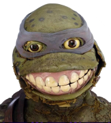
I really should be posting more. Here is a thing I did based off of the original gundam anime. Been in a slump lately so I was glad to have this idea.
|
 #
?
Mar 31, 2021 16:29
#
?
Mar 31, 2021 16:29
|
|


|

|
| # ? Apr 19, 2024 18:18 |
|
|
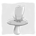
 Some small sketches for stamps.
|
|
#
?
Apr 1, 2021 01:52
|
|


|
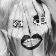
readingatwork posted:I don't know why I did this... Because it's beautiful.
|
|
#
?
Apr 1, 2021 09:25
|
|


|
I wrote a book https://twitter.com/_MagicScience_/status/1377616035101179910
|
|
#
?
Apr 1, 2021 14:49
|
|

|
It's Poisson d'Avril in France, everybody!
|
|
#
?
Apr 1, 2021 21:37
|
|

|
Drag Queen Aquaria. Featuring the return of my nemesis: Hair
|
|
#
?
Apr 3, 2021 00:57
|
|
|
 I'm trying to increase my painting skills.Currently painting this with a reference. Anyone who can spot any glaring mistakes I'm making that I can easily fix? Or is it just a matter of "keep doing what you're doing until you can do it less crappy"?
|
|
#
?
Apr 3, 2021 12:59
|
|
|
Claeaus posted:
Feels very flat for some reason. I feel like a value study is what is needed and then paint color over it... however... that probably doesn't sit well with you since you are so far along. Basically a value study will give you a sense of depth before adding color. The lighting appears flat and the style kind of impasto / impressionist. Consider atmospheric perspective. Things farther away should be hazier and things right next to the camera should be razer sharp. This site might help although it is geared towards digital painting but the tips / tricks pretty much all apply here. http://androidarts.com/art_tut.htm For content: A "shady dawg". 
|
|
#
?
Apr 3, 2021 19:26
|
|

|
sigma 6 posted:Consider atmospheric perspective. Things farther away should be hazier and things right next to the camera should be razer sharp. Additionally, depending on the distance and the "thickness" of the atmosphere, things further back may have their colors shifted, frequently in a cooler direction. Like how mountains look blue in the further distance, even if they're covered in foliage or stone that isn't remotely blue up close.
|
|
#
?
Apr 3, 2021 21:28
|
|

|
Things need to get paler and bluer as they go backwards. Throw in some strong darks at the front if possible. That is everything I know. e: look here's the watercolour I did today. Following a tutorial and I'm not saying it's great but look at the lampposts - they're not all the same darkness. If they were, your eye would see them as flat. 
|
|
#
?
Apr 3, 2021 21:36
|
|


|
Claeaus posted:
Probably the easiest thing to fix would be the building on the left. It's basically the same shade throughout and making it and the rest of the image feel flat. Besides trying to do something to that building to fix it, it's very much "keep doing what you're doing until you can do it less crappy". Other things to look at in the scene are the trees as well. In the painting they all have a uniform color and just diminish in size. In landscape, color tone/temperature is important. Cooler tones feel as if they're receding and warmer tones will appear to advance towards you. Here's a decent little blurb about it. An important thing to keep an eye for is color analysis, meaning that what your brain infers the color to be isn't necessarily what is actually there. It's important to try and draw/paint what's actually there, not what you think is there. This also applies to basic life-drawing as well and will help you build good fundamentals to help you abstract and improvise later. Basically keep at it and keep making mistakes and learn from them.
|
|
#
?
Apr 3, 2021 22:33
|
|
|
Thanks everyone! I'll see what I can do.quote:[...]the style kind of impasto / impressionist Also, here's a dinosaur with shoes because I couldn't get the feet to look good 
|
|
#
?
Apr 4, 2021 08:33
|
|
|
For a split second I thought it waa "crocs on crocs" .... then I realized ... that's no croc or alligator. That's a dino!
|
|
#
?
Apr 4, 2021 12:30
|
|
|
I'm trying to get better at drawing realistically from observation. This is a still life I've been working on the last couple of days.
|
|
#
?
Apr 4, 2021 15:47
|
|

|
Haven't really managed to draw recently. Somehow the motivation is just lacking, and it's stressing me out 
|
|
#
?
Apr 4, 2021 23:01
|
|

|
NAG posted:Drag Queen Aquaria. Featuring the return of my nemesis: Hair I don�t know if you�ve seen these before, but here�s a couple of blog posts that might help you think about how to render hair. https://gurneyjourney.blogspot.com/2008/04/hair-string-mop.html?m=1 https://gurneyjourney.blogspot.com/2008/04/hair-ribbon-secret.html?m=1 Hair is one of my favorite things to draw, it�s really fun once you get the hang of it. Just trying to spread the joy
|
|
#
?
Apr 5, 2021 00:21
|
|

|
more NES Zelda maps Gif version: 
|
|
#
?
Apr 5, 2021 01:07
|
|
|
que sera sera posted:I don�t know if you�ve seen these before, but here�s a couple of blog posts that might help you think about how to render hair. These are great thank you!
|
|
#
?
Apr 5, 2021 01:33
|
|
|
que sera sera posted:I don�t know if you�ve seen these before, but here�s a couple of blog posts that might help you think about how to render hair. These look great, thank you so much!
|
|
#
?
Apr 5, 2021 02:15
|
|
|
HopperUK posted:These are great thank you!  there's an incredible amount of info about every traditional medium there is, as well as generally applicable posts like that one. he's still updating even! i accidentally linked the mobile site, so here's the web version with the handy index on the side. https://gurneyjourney.blogspot.com/?m=0
|
|
#
?
Apr 5, 2021 02:30
|
|
|
que sera sera posted:
Oh he's *that* guy! I've had his books on my wishlist for ages. Might have to nab em.
|
|
#
?
Apr 5, 2021 03:29
|
|
|
skull study that was garbage cause it looks like leatherface's skin mask. art man on youtube told me to do random lines then turn into shapes to learn form and shading. should get a better phone.  Regardless of crappiness, I think I am getting better and having fun.
|
|
#
?
Apr 5, 2021 03:51
|
|

|
ButtWolf posted:Regardless of crappiness, I think I am getting better and having fun. That's all that matters! Did some quick painting using only red, black and white. Accidentally made the bird fat and also I gave him wonky wings. But for 1 hour I'm happy with it. 
|
|
#
?
Apr 5, 2021 16:23
|
|
|
Claeaus posted:That's all that matters! I love this spherical cardinal.
|
|
#
?
Apr 5, 2021 16:32
|
|
|
first time poster. here is a beatnik type guy i want to make a comic for. i want to do some model sheets/turnarounds for him, but he has such a weird, stylized lil tictac head i don�t know how to draw him at other angles. break it down into shapes, right? also, here�s his boyfriend: 
|
|
#
?
Apr 5, 2021 18:28
|
|
|
Welcome!  I felt the summer spirit today
|
|
#
?
Apr 5, 2021 23:33
|
|
|
ButtWolf posted:
This looks really cool and seems like a fun way to shade better. Did you have any plan or was this all freeform after putting in random lines? I've been working on this for a couple of days. Really struggling trying to get the fabric look right. 
|
|
#
?
Apr 7, 2021 15:21
|
|
|
|
|
#
?
Apr 7, 2021 16:15
|
|

|
gurragadon posted:This looks really cool and seems like a fun way to shade better. Did you have any plan or was this all freeform after putting in random lines? Thanks. I just chose a light direction and started shading. Its really good practice. Also, fabric is the devil.
|
|
#
?
Apr 7, 2021 22:57
|
|
|
gurragadon posted:This looks really cool and seems like a fun way to shade better. Did you have any plan or was this all freeform after putting in random lines? I think that actually looks really nice - the one bit that sticks out is the curve at the top right of the basket, where the fabric comes around in a circle. There's a really hard line following the curve of the circle and the shadow to the right of it looks kinda flat - is it really all one tone? Varying that darkness a bit might give more of an impression of the fabric falling away. I really love the linework on the wicker. Looks lovely.
|
|
#
?
Apr 8, 2021 02:44
|
|
|
PSA: Based on a discussion with some folks, I made a place where people can post their work for goons to peruse and hopefully commission art. The other purpose of the thread, and the thing that prompted me to ask people about it, was that I would like a place to point goons who would like to request forums art (like gang tags, avs, banners--things specific to SA). No one has to accept such a request, but at least I would have a central place to point people. Anyway here is the link, hopefully this is in some way useful to someone! https://forums.somethingawful.com/showthread.php?threadid=3964463
|
|
#
?
Apr 8, 2021 04:07
|
|
|

|
|
#
?
Apr 8, 2021 08:38
|
|


|
Finished my second attempt at an animation. https://i.imgur.com/dPgItaX.gifv
|
|
#
?
Apr 8, 2021 18:37
|
|


|
That animation rules! Got a solid proof of concept for this thing done! 
|
|
#
?
Apr 8, 2021 20:57
|
|
|
dog nougat posted:That animation rules! This series of yours is consistently excellent! Love this lil guy. Here's Aquaria en el agua. Did my best to split the strands of hair into ribbons and had to fiddle with the water surface a lot, but I think it was time well spent. 
|
|
#
?
Apr 8, 2021 23:34
|
|
|
NAG posted:This series of yours is consistently excellent! Love this lil guy. This is amazing except one thing: their left nipple is too dark and opaque. That lil foam/variance shoupd be dulling it, no?
|
|
#
?
Apr 9, 2021 05:40
|
|
|
NAG posted:This series of yours is consistently excellent! Love this lil guy. Thanks! Wish I knew where the hell I was going with it. My work feels indeterminate and kinda aimless. Like there's too many ideas for weird lil stories in my head and I get pulled in too many directions at once. Did some more work on the shrimp walker suit thing. Sci-fi Steampunk Space Shrimp.  Still a work in progress, but I need to take a break from this. There's not really anyway to come up with a shorthand for the filigree/arabesque in gothic architecture, so it's super time consuming. Dude's walking around the scifi-art-deco-gothic city on the home world of the rat papal empire. Not sure what the hell the shrimp home world is like. Most certainly a water world, with weird lil underwater sand castles.
|
|
#
?
Apr 9, 2021 23:50
|
|
|
I'm dumb
dog nougat fucked around with this message at 01:09 on Apr 10, 2021 |
|
#
?
Apr 10, 2021 00:21
|
|
|
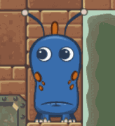
One of my OCs! 
|
|
#
?
Apr 10, 2021 18:05
|
|
|

|
| # ? Apr 19, 2024 18:18 |
|
|
 Got some more work done on this today. Decided that I should just ditch the gothic portion of the architecture moving forward. Feels disjointed and a bit out of place.
|
|
#
?
Apr 11, 2021 03:34
|
|