


|
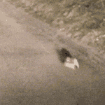
My pet peeve, speaking of downtown Toronto, is that it's rare to see the CN Tower drawn correctly. It's like artists are asked to draw the Space Needle. From memory.
|
 #
?
Sep 22, 2023 22:35
#
?
Sep 22, 2023 22:35
|
|


|

|
| # ? Jun 18, 2024 17:04 |
|
|
If you think comics artists are bad with North American geography, they're even worse about other countries. Most of the time, I don't blame them, it's not exactly an easy job.
|
|
#
?
Sep 22, 2023 22:55
|
|
|
If they drew a parking lot they will pretty much capture the look of Manitoba.
|
|
#
?
Sep 22, 2023 23:59
|
|

|
Yeah, it's not like there's tons of photos available at the click of a button. I'm still amazed at the poo poo a lot of the older, classic pencilers pulled off given how hard it was to access reference material. All they had back then were magazines, newspapers and poo poo they culled from a library maybe. Even Xerox machines weren't readily accessible. Or cheap. Probably one of the main reasons that almost all Marvel poo poo was set in NYC.
|
|
#
?
Sep 23, 2023 00:09
|
|

|
 Detective Comics #12 (1938) Pencils/Inks: Bill Ely  Lightning Comics #6 (1942) Pencils/Inks/Colors: ?  Lightning Comics #6 (1942) Pencils/Inks: Harry Anderson Colors: ?   Metamorpho, The Element Man #5 (1966) Pencils: Joe Orlando Inks: Charles Paris Colors: ?  Dazzler #2 (1981) Pencils: John Romita Jr. Inks: Alfredo Alcala Colors: Ken Klaczak  Radioactive Man #1 (1993) Pencils: Steve Vance (layouts) and Bill Morrison (finished art) Inks: Bill Morrison (finished art) Colors: Cindy Vance
|
|
#
?
Sep 23, 2023 05:20
|
|


|
Grendels Dad posted:Sure, maybe while they are at it, they can learn how to draw German towns that don't consist of medieval roads and torch-lit half-timbered houses. Sure, but it isn't much fun if the angry villagers have to extinguish their torches and be very careful with their pitchforks as they take excellent, timely, and convenient public transit to the stop nearest the mad scientist's castle.
|
|
#
?
Sep 24, 2023 03:14
|
|
|
Animal-Mother posted:Sure, but it isn't much fun if the angry villagers have to extinguish their torches and be very careful with their pitchforks as they take excellent, timely, and convenient public transit to the stop nearest the mad scientist's castle. You are living in the past, Animal-Mother. Germany has made a lot of progress, our public transport hasn't been timely or convenient in a long time.
|
|
#
?
Sep 24, 2023 12:35
|
|


|
BiggerBoat posted:Yeah, it's not like there's tons of photos available at the click of a button. A little bit later down the road, but I remember Marvel making a big deal about sending Chris Claremont, John Romita Jr, and Dan Green to Paris for Uncanny X-Men #200. It was all over the Bullpen Bulletins about how they wanted to not only do a promo tour, but to make sure they got all the details, architecture, and geography as accurate as possible. It was a cool touch to show they really wanted that issue to seem important enough to send the creative team overseas.
|
|
#
?
Sep 25, 2023 03:27
|
|
|
Kevin Palpatine posted:downtown Toronto: To hear my wife talk about the time the plows covered her car on the DVP, this is accurate
|
|
#
?
Sep 25, 2023 17:52
|
|


|
Phy posted:To hear my wife talk about the time the plows covered her car on the DVP, this is accurate Was she... parked on it? I know we joke about DVP standing for Don Valley Parking lot but we don't mean it literally.
|
|
#
?
Sep 25, 2023 18:26
|
|
|
Car trouble of some kind, can't remember exactly what, but she was over on the shoulder when they came by. E: also might have been the 401 instead of the DVP. It's been a while since she brought it up. I know for sure it wasn't the Gardiner since she didn't express fears of falling through the bridge deck/getting brained by spalled concrete Phy fucked around with this message at 19:01 on Sep 25, 2023 |
|
#
?
Sep 25, 2023 18:59
|
|
|
Terry Moore posts a lot of these videos of pencil work with commentary over it, it's great stuff because he talks about technique and things like why he uses specific pencils and whatnot. It still seems pretty wild to me that he practically never lines out the skeleton at all, he just draws the outline and does a whole lot of erasing and re-drawing. Also that he never touches digital art tools at all, everything he does is very traditional pencil and paper -> ink. https://twitter.com/TerryMooreArt/status/1707393526932103278
|
|
#
?
Sep 28, 2023 22:36
|
|

|
Thanks for posting that. I love seeing the process of artists. It really helps me get better at drawing too
|
|
#
?
Sep 29, 2023 06:40
|
|


|
Who wants to own the greatest comic cover of all time? https://twitter.com/ctropes/status/1710516582240415969?s=46&t=2Vl5mZOAuXyv2LbW1v-6cQ
|
|
#
?
Oct 7, 2023 15:50
|
|
|
I thought that was for an ad, not a cover
|
|
#
?
Oct 7, 2023 15:59
|
|

|
thetoughestbean posted:I thought that was for an ad, not a cover Nope, it was for Captain America #1 from the Heroes Reborn line. I still have the first four orfive isdues, the art is atrocious.
|
|
#
?
Oct 7, 2023 16:10
|
|
|
Joe Fisto posted:Who wants to own the greatest comic cover of all time? It belongs in a museum!
|
|
#
?
Oct 7, 2023 17:49
|
|
|
Joe Fisto posted:Who wants to own the greatest comic cover of all time? I have twitter embeds off so my first thought was legit "is someone selling the original The Transformers #5?" 
|
|
#
?
Oct 7, 2023 19:00
|
|
|
Phy posted:I have twitter embeds off so my first thought was legit "is someone selling the original The Transformers #5?" Well, when it comes to big, protruding chests you were pretty close actually.
|
|
#
?
Oct 7, 2023 19:48
|
|
|
That's always in my mind as one of the coolest (if not THE coolest) comic covers I've ever seen, and I don't even like Transformers that much.
|
|
#
?
Oct 7, 2023 20:09
|
|

|
Lobok posted:Well, when it comes to big, protruding chests you were pretty close actually. Lol I didn't even think of that, good call
|
|
#
?
Oct 7, 2023 21:05
|
|
|
However, cap is the one with his head positioned like a digger's cockpit.
|
|
#
?
Oct 7, 2023 23:22
|
|

 A lovely map of Middle-earth, from the European Lord of the Rings comics by Luis Bermejo.
|
|
|
#
?
Oct 9, 2023 09:17
|
|
|
 Journey into Mystery #70 (1961) Pencils/Inks: Steve Ditko Colors: Stan Goldberg  Journey into Mystery #71 (1961) Pencils/Inks: Steve Ditko Colors: Stan Goldberg  Journey into Mystery #72 (1961) Pencils/Inks: Steve Ditko Colors: Stan Goldberg  Journey into Mystery #75 (1961) Pencils/Inks: Steve Ditko Colors: Stan Goldberg  Journey into Mystery #76 (1962) Pencils/Inks: Steve Ditko Colors: Stan Goldberg  Journey into Mystery #77 (1962) Pencils: Jack Kirby Inks: Dick Ayers Colors: Stan Goldberg  Journey into Mystery #78 (1962) Pencils/Inks: Joe Sinnott Colors: Stan Goldberg  The Many Ghosts of Doctor Graves #48 (1974) Pencils/Inks: Tom Sutton Colors: ?  Dazzler #3 (1981) Pencils: Alan Kupperberg Inks: Armando Gil Colors: Bob Sharen
|
|
#
?
Oct 11, 2023 01:20
|
|
|
Darthemed posted:
These would all be sick oversized avs
|
|
#
?
Oct 12, 2023 02:22
|
|

|
Back in the 90s Keith Giffen did some books with this really odd and unique art style. I dug it. This might not be the best example, but I didn't find too many on google images. 
|
|
#
?
Oct 12, 2023 02:36
|
|
|
Dig the style, but what a nightmare for the colorist.
|
|
#
?
Oct 12, 2023 03:07
|
|
|
Joe Fisto posted:Back in the 90s Keith Giffen did some books with this really odd and unique art style. I dug it. This might not be the best example, but I didn't find too many on google images. That cover art certainly takes a bit of work to unpack.
|
|
#
?
Oct 12, 2023 05:35
|
|
|
I loved that art but the computer lettering was an eyesore in that book. Wish Keith would�ve lettered it himself, and also do more books in that style. His Images Of Shadowhawk book was great.
|
|
#
?
Oct 12, 2023 18:36
|
|
|
I feel like I'm alone in never really digging Steve Ditko. He has his moments here and there but I think my main issue with his stuff is that it's all drawn like a play. Ground level 90 degree angles, not much in the way of depth or visceral action and really kind of boring compositions. He doesn't crop or variate the size of his panels nor use dynamic perspective and everything looks like it takes place on a small stage. I don't think his line work, use of contrast, suggestion of motion/action or even his panel by panel storytelling are anything particularly compelling either. I mean, he's fine in as much that I can read a page and know what's happening but there's nothing that really snaps and his...rhythm (?), I guess, is a bit dull, especially compared to his contemporaries like Jack Kirby or Steranko where the character's movement jumps off every page. Almost everything looks "flat" to me and he's not much on backgrounds either I've tried with Ditko (and it took me a while to appreciate Kirby) but I think he's a little overrated.
|
|
#
?
Oct 13, 2023 01:13
|
|
|
BiggerBoat posted:I feel like I'm alone in never really digging Steve Ditko. Ditko was at his best when establishing the look for Doctor Strange comics, I think. I do agree that his other work isn't as interesting in comparison to Kirby and Steranko. 
|
|
#
?
Oct 13, 2023 08:35
|
|
|
Agreed completely on Ditko, but with the caveat that sometimes his simplicity is a nice contract to Kirby or Steranko who could struggle to find points of focus in their full-page/splash compositions as a necessary sacrifice to get that sense of motion.
|
|
#
?
Oct 15, 2023 13:02
|
|


The depiction of Ragnarok in Valhalla.    Valhalla #15 - The Vala's Visions (2009) (Unofficial translation) Art: Peter Madsen Coloring: Jonas Sonne
|
|
|
#
?
Oct 25, 2023 18:58
|
|
|
So I bought this: https://www.amazon.com/dp/1684053374?psc=1&ref=ppx_yo2ov_dt_b_product_details But... it doesn't have this in it:  I bought the wrong Bernie Wrightson Frankenstein? 
|
|
#
?
Oct 31, 2023 01:06
|
|
|
Animal-Mother posted:So I bought this: https://www.amazon.com/dp/1684053374?psc=1&ref=ppx_yo2ov_dt_b_product_details Yea I did the same but it also has Kelley Jones so I am okay with it.
|
|
#
?
Oct 31, 2023 01:13
|
|
|
Animal-Mother posted:So I bought this: https://www.amazon.com/dp/1684053374?psc=1&ref=ppx_yo2ov_dt_b_product_details A shameful omission. God drat that book is beautiful
|
|
#
?
Oct 31, 2023 10:53
|
|
|
Some seasonally-appropriate art from Martin Simmonds in the new Image Dracula book. 
|
|
#
?
Oct 31, 2023 15:25
|
|
|
 Strange Tales #157 (1967) Pencils/Inks/Colors: Jim Steranko    Goosebumps: Terror Trips (2007) Pencils/Inks: Jamie Tolagson    Goosebumps: Slappy's Tales of Horror (2015) Pencils/Inks: Jamie Tolagson Colors: Jose Garibaldi Happy Halloween!
|
|
#
?
Nov 1, 2023 00:53
|
|
|
Those Goosebumps illustrations are sick as hell!
|
|
#
?
Nov 1, 2023 11:31
|
|

|

|
| # ? Jun 18, 2024 17:04 |
|
|
 I guess spiders don't have bones so maybe this makes sense.
|
|
#
?
Nov 3, 2023 15:15
|
|