|
sigma 6 posted:The roughness of the specularity (though it is not clearly defined as specularity) seems to be the key in the metal shader. Anisotropic will give lines not unlike the lines on a vinyl record record. I am going to continue experimenting but it seems like some keyshot artists use metal, some use leather, some use plastic, and some tweak translucent materials until they get what they want. In my experience, in the last couple of years, anisotropic tends to get the best result but again... more experimenting is in order. Finally Luxion has acknowledged via email that there isn't enough information out there. It looks like it's just a standard PBR shader. If you want to experiment, you should just try and get Vray tutorials that explain how to do realistic hair and go from there. The stuff that will be the most useful is a way to map a gradient along the splines in keyshot to drive the alpha and bleached tips. Besides that, The second render, to me, looks like it's the most realistic.
|
|
|
|

|
| # ? Apr 16, 2024 08:15 |
|
Vray has 2 different custom hair materials, i dont think a tutorial will translate. good reading though. https://docs.chaosgroup.com/display/VRAY3MAX/Hair+Material+%7C+VRayHairMtl https://docs.chaosgroup.com/display/VRAY4MAX/VRayHairNextMtl the links to the research papers they are based on are at the bottom of the page. for what it's worth, i also thought 2 & 3 looked a lot more like hair than the others. I would have said the bottom one looks the least like actual hair.
|
|
|
|
Interesting you guys are picking out the metal vs. the anisotropic (which I prefer). Probably didn't help that I changed the colors in the last one. I will look at the research paper and make a version with some opacity ramps and normal maps. Luxion sent me some fur shaders to try out so I will pick those apart as well. If anyone is interested in them I can share them. Just looks like a lot more tweaking / experimenting is what is needed but it is worth noting (as I pointed out to Luxion) that most major renderers now come with a hair shader built in. Including Arnold and Vray it seems. Cursory look at those Vray docs and it looks like there are a LOT more settings and info. Thanks again. Might be too much but I will try to emulate as much as possible. EDIT: Meh - the keyshot "Fur material" they sent which works with Keyshot 7 is just a tweaked velvet shader with the roughness set to .5... Lame. I couldn't try out the other one because I don't have Keyshot 8. At least they acknowledged there wasn't enough documentaton and requested their team do some kind of tutorial. We'll see if that happens or when. *sigh* EDIT 2: Took a break from hairballs to tackle this dragon. Getting closer to finish the detailing but I am not sure how I feel about the horns. Ridges need a lot of fixing but I meant the number, arrangement, and posing of the horns. Thinking about adding small horns or nubs on the zygomatic arch and / or chin. Also - the scales don't match between the head and neck and that's kind of hard to ignore.  hmmm...  Double hmmm....  VVV That's adorable. lol VVV sigma 6 fucked around with this message at 16:36 on Jun 23, 2019 |
|
|
|
A stupid idea and a quiet weekend The Pugasus 
|
|
|
|
Haha I love it. I feel like that kinda character could be good rigged up and out in some short animated clips to rack up YouTube views.
|
|
|
|
I feel like most of the time when I post on polycount asking for feedback nobody responds, does anyone have suggestions on getting more/better critique online?
|
|
|
|
Does anyone have any tips on finding freelance work outside of just the Polycount jobs board?
|
|
|
|
I got some work when I freelanced by haunting Reddit's GameDevClassifieds sub, but my best client was from Twitter followed up with good old-fashioned face to face networking at a conference.
|
|
|
|
Cross posting this from the game making thread but it probably fits here or maybe the daily doodles thread. Starting to try out sculpting in VR. No real sculpting experience to speak of but it seems pretty cool to me so far. I got a Rift S the other day with the intention of using it for game design and just general messing around in VR. I'm not much of an artist but Oculus Medium is fun. You can get pretty decent results with just default brushes and stamps. After a couple of wavy blobs and whatnot I figured I should try something more than a doodle. First sculpt: Mermaid Medusa...Merdusa I guess? Don't know exactly. Didn't have much of a plan but this is what came out.  Really enjoying it, and looking forward to doing more.
|
|
|
|
|
Kanine posted:I feel like most of the time when I post on polycount asking for feedback nobody responds, does anyone have suggestions on getting more/better critique online? Forums, on average, are dead when it comes to honest critique. It's all about pushing your brand "Art of X" now.
|
|
|
|
This isn't 3D art specific, but in general if you want feedback on a voluntary basis it's best to ask about a specific facet of the work. If I'm not obligated to provide criticism, when someone asks for general feedback, there is a lot of inertia to overcome to get myself moving. It's a lot easier if I'm asked to provide feedback on something specific- my attention is directed, and it's a smaller task than an overall criticism, so I'm more likely to commit to it if I think it's only going to take 5 minutes. Once the door is opened and you have someone's attention, it's easier to keep the conversation going.
|
|
|
|
Around 10-15 years ago the quality of help and discussions on forums was a world away from where it is today. cgtalk gets a near weekly (or did until i stopped bothering to go on it) 'i want to make a 5 minute short film, what software do i need to learn to make stuff like this and how do i do it' while posting a clip from the avengers. A good friend just started a podcast called 'wrong loving question', which poses that (unsurprisingly) the shift is a result of the way the questions are being asked rather than a lack of people willing to help. https://www.buzzsprout.com/372026 forums have died in general - and unfortunately suddenly asking the 'right' question will only go so far if nobody else is also asking the right questions to foster the growth of a community again. cubicle gangster fucked around with this message at 16:09 on Jun 28, 2019 |
|
|
|
Hah, I saw the wrong loving question guys at a thing I was at earlier this month! Liked what they went over, and they brought up some good points about teaching younger/newbie artists.
|
|
|
|
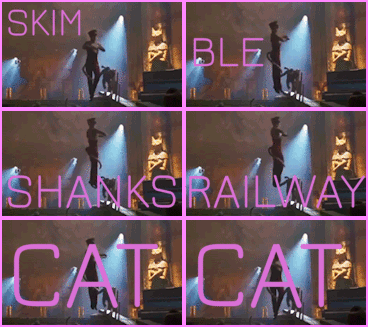
This should probably be for the digital art thread but it's an art dome entry so I am hoping for critique before final submission. vs.  Kinda thinking handwriting in marker or something instead of the formal font. Really unsure about the cornea going all the way around the eye and giving it a beachball effect. Also the moon "fade" kind of competes with the eye texture although the original concept was a moon kind of turning into an eye....dunno if any of it works anymore. "That's no moon..."
|
|
|
|
I like the first one that looks like a stack of polaroids. There is a dark line at the bottom of the eyeball, its the ground reflection from a really sharp angle, but it looks like an alpha blending error or a stroke outline. The sky reflecting on the top looks natural but the bottom keeps catching my eye. Have you tried just painting that part out? Maybe just erode the alpha inward a bit.
|
|
|
|
The font and text treatment looks much better in the first one. handwriting might look good too. I think making the eye realistically reflective is whats giving you trouble. the reflection doesnt make sense for a moon - it's reflecting the ground as if it's only 100ft above it. Did you try a realistic moon which has a huge crater that mimics the iris pattern?
|
|
|
|
bring back old gbs posted:I like the first one that looks like a stack of polaroids. There is a dark line at the bottom of the eyeball, its the ground reflection from a really sharp angle, but it looks like an alpha blending error or a stroke outline. The sky reflecting on the top looks natural but the bottom keeps catching my eye. Have you tried just painting that part out? Maybe just erode the alpha inward a bit. Ah - the moon layer doesn't quite line up with the bottom of the eye. I see what you mean now. Or do you mean on the far left side angling up? It is an HDR of a sunset so it is actually the sun reflecting in the eye. Not sure how much it works only because the overall color scheme and tone is more like dusk. cubicle gangster posted:The font and text treatment looks much better in the first one. handwriting might look good too. I agree about the reflectivity. The "cornea" effect isn't helping the "moon effect" ... Not sure what you mean about the last part. I mean, I think I understand what you mean but I am not sure how I would find a moon with craters that looked like the iris of an eye. Although this one might qualify... 
|
|
|
|
I second the above. The sans-serif looks great right now honestly, you could play with it more but I�d stick with its essence. Handwritten could be interesting, but I think anything other than neat allcaps might overwhelm the rest of the image. For craters - I�m pretty sure there are some nutty photos of Callisto out there that you could color-edit the hell out of too. Consider: https://en.wikipedia.org/wiki/Valhalla_(crater) (though this is the opposite pattern I suppose.) maybe Io even? Some of those outer solar system moons are weird enough to give you a lot to work with.
|
|
|
|
I figured cubicle meant a big exaggerated crater the size of the iris and either a smaller deeper crater or mesa sticking up acting as the pupil. but thats a pretty big thematic redesign as for the outline thing, I meant literally just the darker line you see at the bottom/leftish edge of the eyeball. I don't think its your layers being misaligned, just the ground reflection showing up too strongly. You could just paint it out in photoshop to avoid re-rendering, clone from the colors slightly above the line and see if it helps or doesn't
|
|
|
|
bring back old gbs posted:I figured cubicle meant a big exaggerated crater the size of the iris and either a smaller deeper crater or mesa sticking up acting as the pupil. but thats a pretty big thematic redesign yeah that is what i meant. Doing a zbrush sculpt of a giant crater that lines up with the iris you have now, with the slopes of the crater having the iris pattern sculpted in. You might not even need to sculpt it - just use the eye image you have now as a displacement map in combination with the moon diffuse texture.
|
|
|
|
cubicle gangster posted:yeah that is what i meant. Doing a zbrush sculpt of a giant crater that lines up with the iris you have now, with the slopes of the crater having the iris pattern sculpted in. Definitely works a lot better without the reflective cornea. Handwriting feels more 80's to me too.  Quick stab at sculpting a moon crater texture with the existing iris. 
sigma 6 fucked around with this message at 07:17 on Jul 1, 2019 |
|
|
|
That looks cool. Would be a lot of work to refine it and get a super clean z-brushed version though, yeah. Here's one we finished a little while ago, client just posted it today. Final image was 10k high. Helped massively by all the detail work we'd already completed for the 50 other images, animations and VR. Would've been a hugely unreasonable amount of detail to implement had it been the only image or part of a smaller set. 100% cg - the only thing that isn't rendered is the hand painted highlight / shadow on the seafoam.  and a full res crop -  I've been having a great run on my personal project recently too - i'm about 2/3rds done with the 3d, a little over half way including postwork and fx. Building up a bit of momentum now after a couple month break early on when the to-do list was growing faster than I was taking things off it. cubicle gangster fucked around with this message at 20:39 on Jul 1, 2019 |
|
|
|
This is random but I wanted to share my friend's work. Mostly because of the workflow. He sculpts using Gravity sketch in VR then renders with the new NPR (toon shading) in Zbrush. Pretty cool stuff. There is an HTC Vive at the local hackerspace and it makes me really want to play with sculpting in VR. For only 30 bucks on Steam it seems like a pretty cool approach. A little closer maybe? 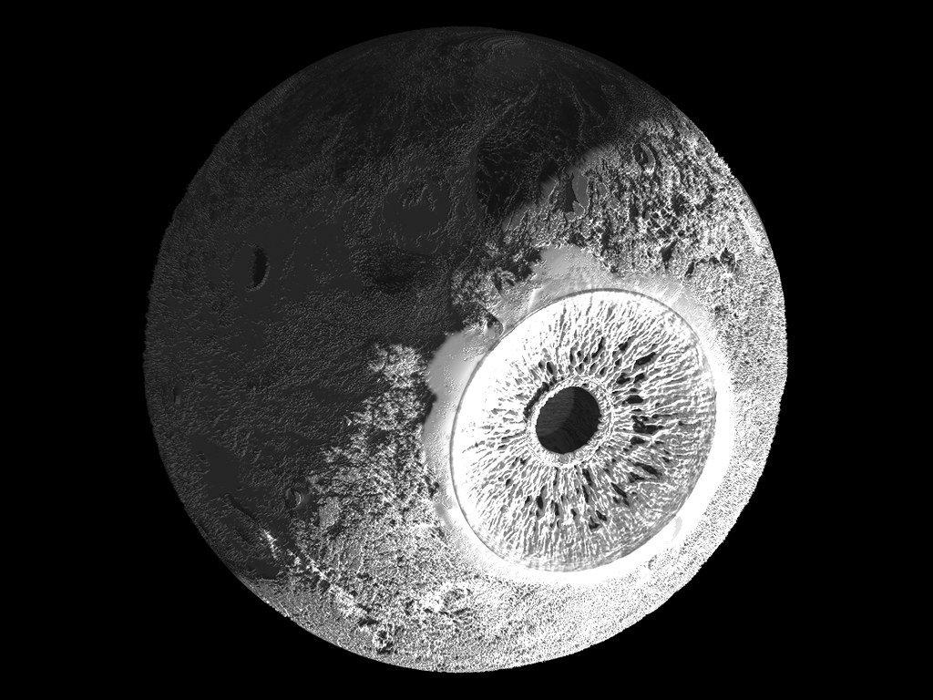 and one with the iris colored, although I am not sure it is any better. 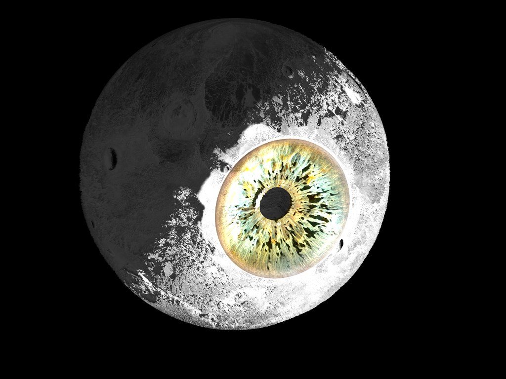 Definitely think I might like the other font but the moon looks a little better. Maybe too detailed given the distance? Too much blur or damaged polaroid effects? gah. 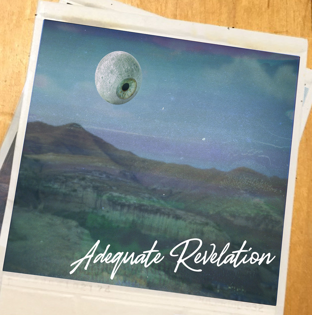 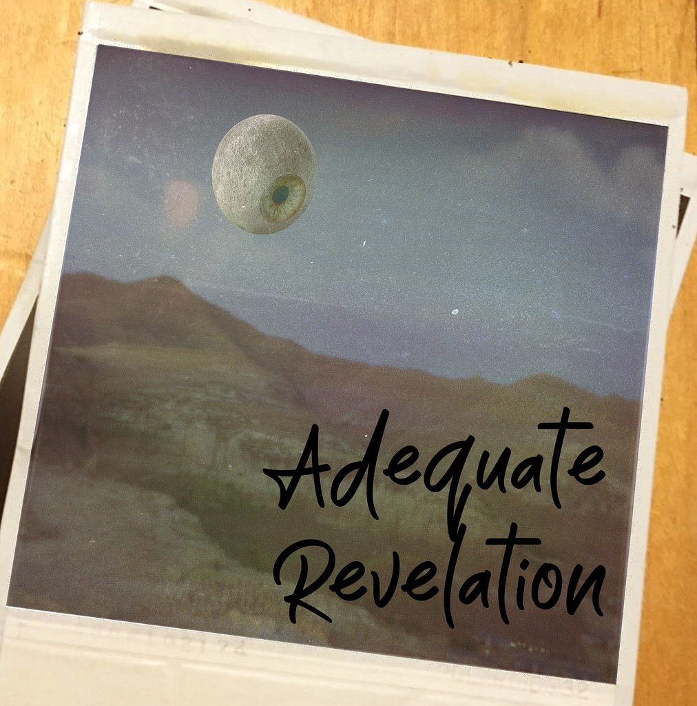 cubicle gangster posted:Here's one we finished a little while ago, client just posted it today. Final image was 10k high. ....jeebus. sigma 6 fucked around with this message at 07:33 on Jul 3, 2019 |
|
|
|
Are there any good resources out there for learning how to do medical-oriented stuff in V-ray? I'm new to high-level rendering and suck rear end at doing anything with SSS or complex lighting. Examples:     
|
|
|
|
Looks pretty much like sss, fresnel and translucency all mixed a little. Nothing to do except practice rendering that stuff!
|
|
|
|
lots of fog and DOF too, which you can get for 'free" in post with a depth pass
|
|
|
|
do everything in post.
|
|
|
|
Most of those materials are pretty simple and vray has great presets for them. alsurface shader & scatter volume in a vrayblend are what you should be using, not the standard vray material. Those material examples dont look particularly intense - theres a falloff map in the diffuse and a touch of SSS, but it's all geometry doing the work. The lighting is super basic too - they probably have a hdri offering a desturated overall light with some subtle direction, then it's a gentle rim & fill lights to pick up highlights & make the SSS properties show up. LOTS of post. there's been a shitload of color shifting, massaging and overlays over every one of those. cubicle gangster fucked around with this message at 23:44 on Jul 10, 2019 |
|
|
|
Someone here a while back suggested I put a design on a t-shirt, around the same time someone else did too. I just wanted them to know that it helped inspire me to actually do so, and for the first time in my life make some money off something I have done creatively. It's also given my "art" a purpose, as for so long it was just purely for experimenting with the renderer (because god knows I'm terrible at modelling), but now I can direct it. I don't think I'll ever make much money but I dream big, and the hobby is actually healthy for me.. I used to do it for a while but get disheartened, probably because the results only ended up with a couple twitter likes and nothing else, but now maybe more like a few twitter likes. And maybe one day another t-shirt sale, or maybe even a print or commission. But I'm enjoying it a lot more now, and learning about the printing and manufacturing side of things is also very interesting regardless. I think I'll end up blowing all the profits I made with the initial burst of sales testing out other things that will remain undesirable, but we will see. I can only keep putting my mind and heart into designs and hoping someone will find them interesting enough to want to pay to have them in their life. https://twitter.com/rodtronics/status/1148996573394690048 https://twitter.com/rodtronics/status/1148919621384204288 https://twitter.com/rodtronics/status/1145488498914291712 https://twitter.com/rodtronics/status/1143477735634771979 https://twitter.com/rodtronics/status/949241744939298817 My gimmick is that I try to mostly only render the word rodtronics because then it would be quite worthless to copy and reproduce.. It comes at the cost of making the artwork worthless in the first place unfortunately but that's a cost I am willing to sacrifice for my brand. e: but mostly wanted to say thanks, and shamelessly gloat about doing something I am proud of echinopsis fucked around with this message at 18:48 on Jul 10, 2019 |
|
|
|
i told you in the drat yospos thread that i will buy one only if it has RODTRONICS on it i need to display the brands with which i engage
|
|
|
|
Sagebrush posted:i told you in the drat yospos thread that i will buy one only if it has RODTRONICS on it It's a frustratingly long process my friend.. I ordered a sweatshirt around the same time I started the shop, and it only arrived yesterday, just in time for me to discover I do not approve of the sweatshirt stock itself. I want to be happy with the products I am selling to the masses, and this means settling on some designs but also, waiting 10-20 days for samples to arrive here in NZ, so I can be happy with them (design after printing, but also the material and cut) before I offer them. I learned black backgrounds to images like:   are terrible for printing. Someone has already brought one, before I received my sample.. They are content with it (I asked, am happy to fix problem if they have one), but I am not, so I have pulled the listings. We are getting there, I just would like to have some pride in my work.
|
|
|
|
bring back old gbs posted:lots of fog and DOF too, which you can get for 'free" in post with a depth pass This. Zdepth passes are invaluable once you get used to using them.
|
|
|
|
echinopsis posted:Someone here a while back suggested I put a design on a t-shirt, around the same time someone else did too. Oh, I think that was me. Thanks for reminding me, I ordered one now. Great to hear it gave you a kick in the rear end in the right direction!
|
|
|
|
something like the first one on a t-shirt please (helvetica is absolutely more appropriate for this electronics-textbook-cover design)
|
|
|
|
Sagebrush posted:something like the first one on a t-shirt please Absolutely, I just need to figure out how to make near-black and fuzz look good on a print coz it�s not as easy as I thought lmao gently caress tho making it look like a book is genius
|
|
|
|
SubNat posted:Oh, I think that was me. Thanks for reminding me, I ordered one now. thanks man!! that�s fuckin epic. look at me being a grown up and earning a living
|
|
|
|
Thanks for all the tips guys. Gonna be practicing for a long while until I get it right. I was feeling pretty lost so I bought this tutorial pack for more than half off to supplement. Link if anybody new like me is interested: http://mographplus.com/product/the-ultimate-introduction-to-v-ray-for-3ds-max/
|
|
|
|
Putty posted:Thanks for all the tips guys. Gonna be practicing for a long while until I get it right. Nice, Cubicle gangster sent some stuff viscorbel used to do as tutorials my way and it was a very good resource if you're looking for more stuff. His website is locked off at work it seems so you can check this out : https://en.calameo.com/subscriptions/3584761
|
|
|
|
I'm missing around in blender using a volumetric shader to make most, but it doesn't seem to be resecting the edges of the cube. It looks fine the ever render window, but once I try and reader it out properly it fills the screen with fog. Anything obvious I'm missing.
|
|
|
|

|
| # ? Apr 16, 2024 08:15 |
|
Putty posted:Thanks for all the tips guys. Gonna be practicing for a long while until I get it right. what version of max & vray are/will you be using? It looks like that series was made for older versions of vray as they have the links for whats new in 3.5 and 3.6. Next has a few more differences, mostly to GI and sampling. DMC sampling is different, but much, much easier to control. The IRmap is outdated now as LC/BF is much faster than it used to be. most materials are still very similar but the vray mat layout has had a minor layout overhaul. This series seems to be missing the alsurface material - https://docs.chaosgroup.com/display/VRAY4MAX/VRayALSurfaceMtl Everything else seems pretty relevant. it's also worth skimming the help files like a book - you wont remember everything, but you will remember where to find it when you forget. They have loaded it with interactive sliders showing what parameters do now too.
|
|
|


