


|
I need to ask a question on vray: I'm finally playing around with this software over here and I'm mostly getting the hang of this except I can't seem to get my glass right. I've tried looking at the tutorials on the vray site and I've tried playing around with the settings but I'm only getting a "reflection" of the vray sky on this glass facade: here's the render and the glass material settings. as far as I can tell, I set it up the way vray said to with black as the diffuse, white as a refract, but I'm not getting what I thought I'd get - "clear" glass. 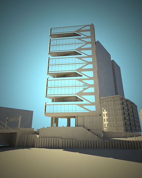 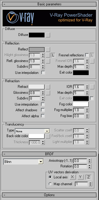
|
 #
¿
Jun 30, 2008 03:17
#
¿
Jun 30, 2008 03:17
|
|

|

|
| # ¿ Apr 25, 2024 18:28 |
|
|
ok, let's see here. I'm only taking baby steps over here because I don't have enough time right now to sit here and focus on this... I followed heintje's suggestions first. I applied a falloff map to the material. Then I followed cubicle gangster's suggestions. (except for a bump map) So I now have a falloff set on the reflect map. I'm a little unsure as to the falloff type. I assumed Towards/Away because the view is sort of getting further away as you look up... Should it be fresnel even though the main material has fresnel reflection checked?? For some reason my glass looks "too" translucent with not enough glossiness or reflectivity. And I'm back to not understanding what it is that I'm doing wrong... I've included my settings again for reference.. the material settings are just as cubicle gangster recommended. 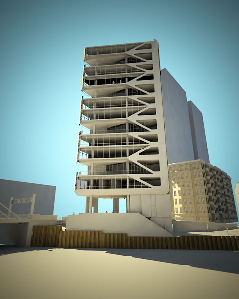 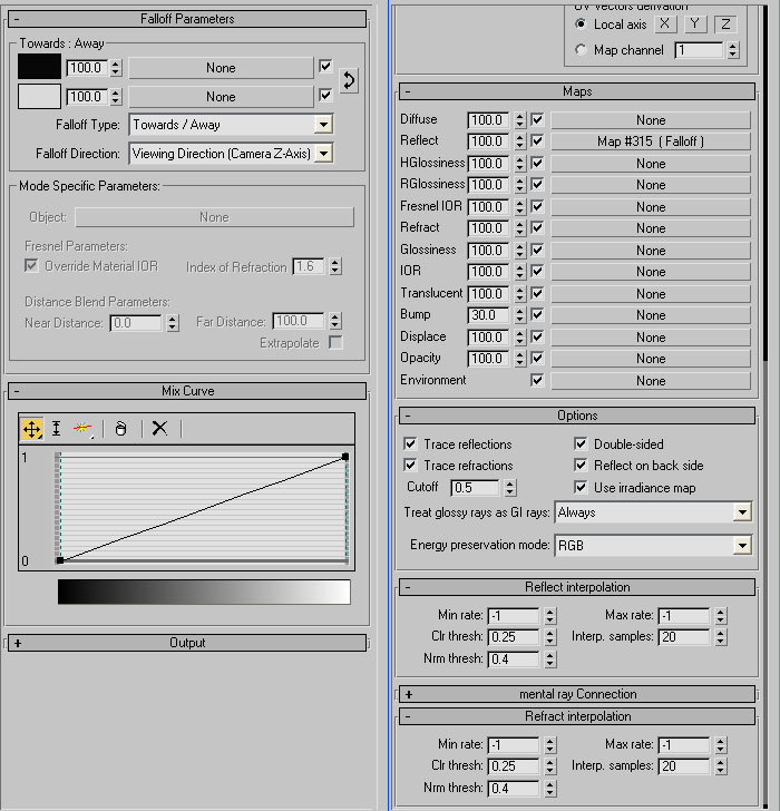
ajrosales fucked around with this message at 20:00 on Jul 2, 2008 |
|
#
¿
Jul 2, 2008 19:57
|
|
|
I'm in the process of experimenting with a number of different ideas, both architectural and sculptural. This is my latest quickie I churned out using Rhino V5 and 3ds Max rendered with Mental Ray. I call it "Widget". I'm going to be upgrading to VRay soon so hopefully I'll be posting some more ideas when I get it... 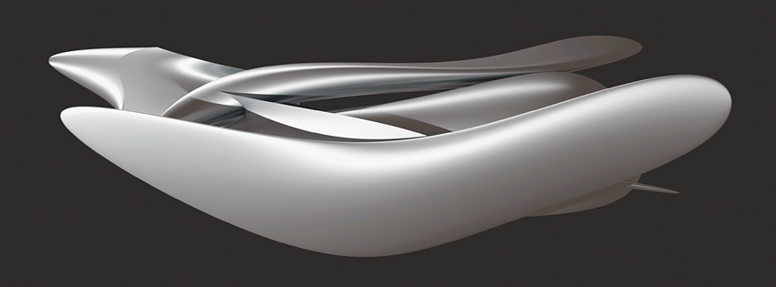
|
|
#
¿
Dec 29, 2012 08:56
|
|
|
french bulldog sculpt zbrush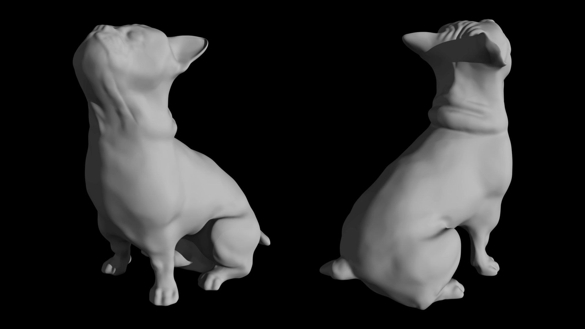 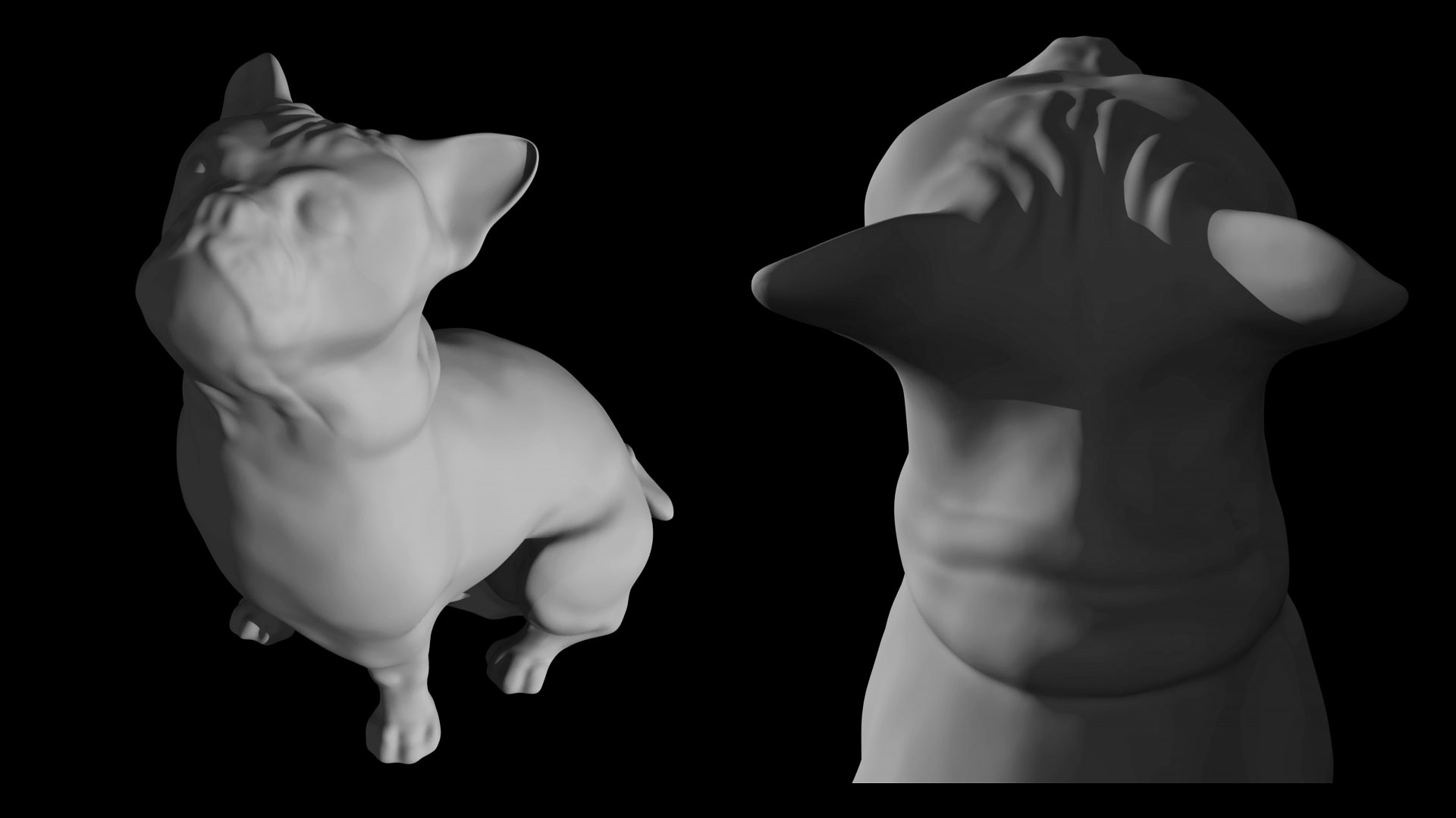 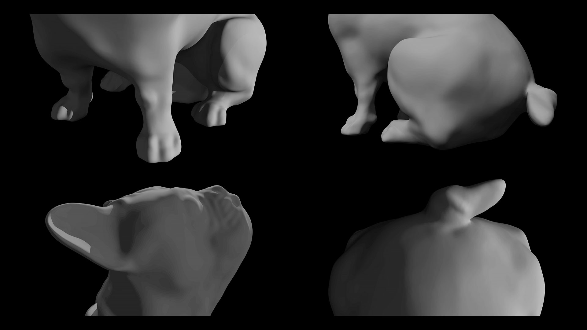
|
|
#
¿
Jan 21, 2016 10:18
|
|
|
an abstract render (maya / mental ray) I call it "ovalina" 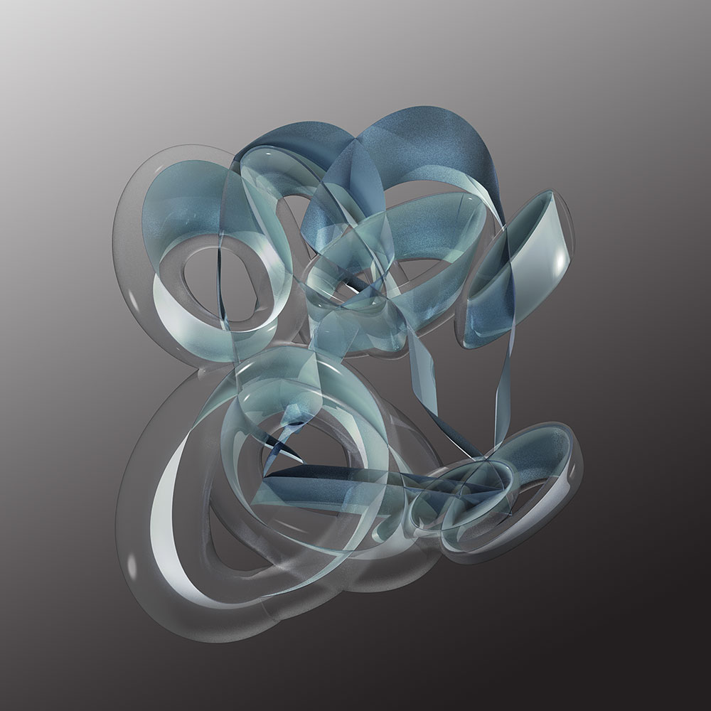
|
|
#
¿
Nov 26, 2016 22:13
|
|
|
The Gasmask posted:This is giving me flashbacks to the last couple years of Autodesk installers. All you need to do is make a wireframe fade from the right side and a lighter background and the market will be yours. haha... well, the thing about those Autodesk splash images that is interesting is that they are usually either biomorphic or they attempt to generate a geometry that has "flow" - I think they believe they are being sophisticated about the geometry when it's twisted and organic. This isn't organic at all - in fact, it was actually modeled in Rhino and then rendered in Maya. I think it's more geometric, to be honest. I think the geometry of it is not quite as "natural' in it's appearance as some of that stuff. But I get where you're coming from. ")
|
|
#
¿
Dec 2, 2016 18:33
|
|
|
this is an idea I only partly completed - it was more of a sketch of an idea... just to see what happened. I'll probably mess with it more later, to finesse the geometry more and ramp up the complexity. The scale was wrong on purpose. ghostship #1 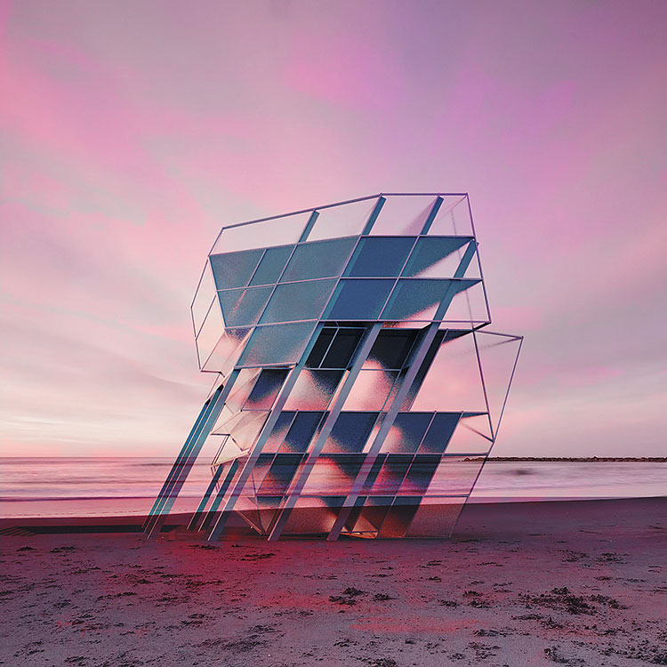
|
|
#
¿
Dec 13, 2016 11:13
|
|
|
an experiment in ripped mesh manipulation...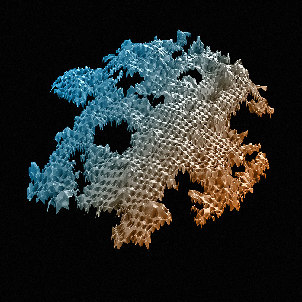 and a closeup of the same model... 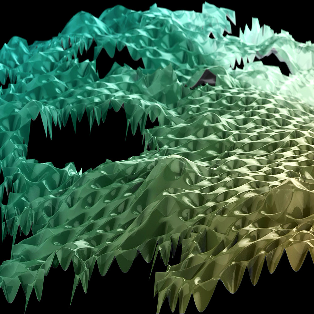
ajrosales fucked around with this message at 10:30 on Jan 4, 2017 |
|
#
¿
Jan 4, 2017 07:50
|
|
|
more mesh manipulations. this time it's topological... http://www.ajrosales.com/images2016/ripped-V2-test-7-composite-web.jpg edit: for some reason I can't get this image to appear inline using the [img] tags - not sure why... if anyone might know what is going on here I'd appreciate being clued in. scratching my head.
|
|
#
¿
Jan 20, 2017 10:38
|
|
|
my first try at a really elaborate animation (beauty / occlusion / depth passes) 4800 frames at 30fps and lots and lots of keyframing in maya and after effects... https://www.youtube.com/watch?v=GBtMHuNUeZ8
|
|
#
¿
Feb 1, 2017 12:11
|
|
|
this is something I'm working on - a beach house I am designing (in progress). anybody have any comments on this render or things I could do to tweak it? I'm using Maya, Mental Ray (I don't have Vray), the Sun + Sky settings, a Depth Pass and (edit:) an occlusion pass. I considered the idea of blending in an HDRI pass but I'm not sure about that. I don't usually use many other pass types besides (perhaps fog) so I'm asking to see what other's opinions are. The goal here is not "super realism". The goal is something that looks realistic but still has a bit of a "dreamy character" to it so that is has some charisma in some way. But I wouldn't mind adding in an extra sense of detail. I do not know why, but I cannot directly place images on SA anymore so here's a link to it. http://ajrosales.com/images2017/CAM_FOUR-H-HIRES.jpg ajrosales fucked around with this message at 19:08 on Apr 24, 2017 |
|
#
¿
Apr 24, 2017 17:58
|
|
|
Elsa posted:Hey cool! What strikes me as maybe detracting from the detail is the very diffuse light from the overcast sky look. Maybe also try putting it in a darker/later in the day setting with lighting from fixtures in the scene. Like the pool perhaps. It looks cool so far Thanks. I think I see what you mean. I was kind of enjoying the "misty" feeling the render had. I forgot to mention that I did add an occlusion pass to give it extra shading depth. And I did add a bit of noise to the final composite to make it look more organic. I was trying to avoid having to do more accurate internal lighting so that I could let the drawings of the floor plans speak to that instead. Right now I just have a few area lights inside the building to make it seem like there's something inside there. I suppose I could try brightening them a notch or two but I was actually trying to focus on the exterior more than the interior. ajrosales fucked around with this message at 19:11 on Apr 24, 2017 |
|
#
¿
Apr 24, 2017 19:08
|
|
|
ah.. yeah I hadn't considered that. that might help a bit - I'd have to investigate that. yes there is a pool. and btw I was hoping to make it look more like a saltwater pool so that it isn't so blue and distracting to the render. I was wondering if it looked too opaque though. it might be ok.
|
|
#
¿
Apr 24, 2017 19:32
|
|
|
Handiklap posted:One thing that's getting to me is the water, but I guess it depends on the look you want. I'd scale up & tone down your bump/displacement on it, or maybe get some light sparkling off the surface. It feels like with your sun angle, we should be seeing something on the crests of the ripples. As is it feels more like acrylic than it does water. Maybe adjust your main light or add in some rim lighting to give us some highlights on the edges of things, even if they're real subtle. you're right. the bump map has too much amplitude and the waves seem small. I think those are all good suggestions. I'll try to work some of those lighting ideas into the revisions...
|
|
#
¿
Apr 25, 2017 00:14
|
|
|
latest revision... well, there's definitely some improvement after incorporating some of those comments... I like the overall aura of this better. I'm not sure I totally solved all the issues with it but I have to move on. I ended up rendering an HDRI pass and blending it into the mix. It helped with a lot of the specular reflections and refractions on the materials. The scene feels softer now as a result. http://ajrosales.com/images2017/CAM_FOUR_SUNNYD.jpg
|
|
#
¿
Apr 25, 2017 18:45
|
|
|
hmm. a few things: I think you're getting fooled by the perspective with the height of the people. the camera is a little high and the doors are actually oversized and the handles are in the right position. I think if the people were closer to the door it wouldn't appear that way. those white shapes are "succulent plants" I added so that it didn't look like a blank patch of sand there. I suppose I could make them gray like the other plants? chainlink: yeah I know.. maybe I can superimpose a finer mesh or something to make it look a little nicer. maybe a frame would help too... ajrosales fucked around with this message at 21:33 on Apr 25, 2017 |
|
#
¿
Apr 25, 2017 21:24
|
|
|
Mr Shiny Pants posted:I like it a lot, the ripples in the pool are not to scale for my taste though. It looks like a shrunken ocean, the rest is very nice. I totally understand. Maybe I'll nail that better next time. I'm not used to rendering water. the finished product is here, with another render and a few drawings... http://ajrosales.com/stripe-house
|
|
#
¿
May 4, 2017 02:36
|
|
|
felt a little bored so I made this: it's missing a normal map but oh well... 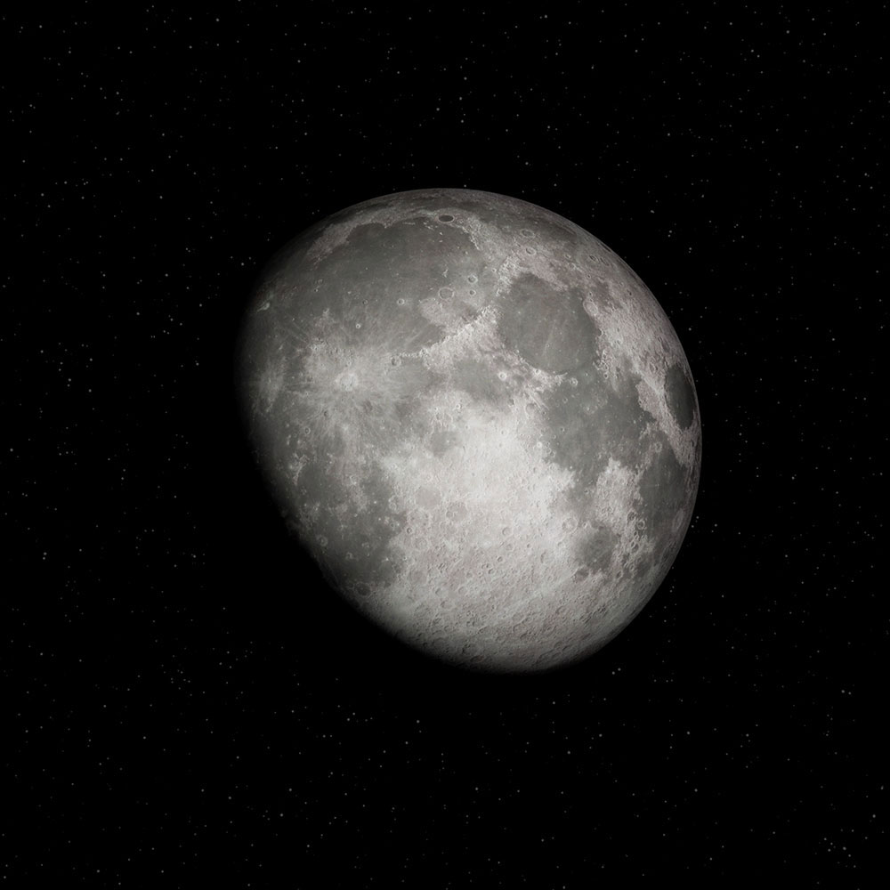  full res version here: http://ajrosales.com/images2017/MOON-V1.jpg
|
|
#
¿
May 4, 2017 07:48
|
|
|
ImplicitAssembler posted:pedant mode: With that framing and that exposure, you wont see any stars. yeah - I toned them down... I was trying to take into consideration that the brightness of the moon was controlling the "exposure" of the image? I guess I was thinking that if I made the stars subtle it would look more realistic, and not hyper-digital with shiny pixel stars...
|
|
#
¿
May 4, 2017 08:13
|
|
|
another space scene. I worked on an earth today, and placed it in a scene with accurate sizes and distances between the two bodies...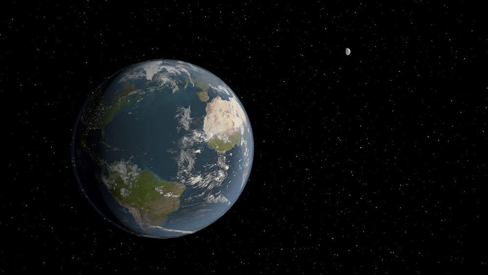 higher res version here: 1920x1080 http://ajrosales.com/images2017/EARTHCAM-1-COMPOSITE-2.jpg
|
|
#
¿
May 5, 2017 02:46
|
|
|
a couple more angles: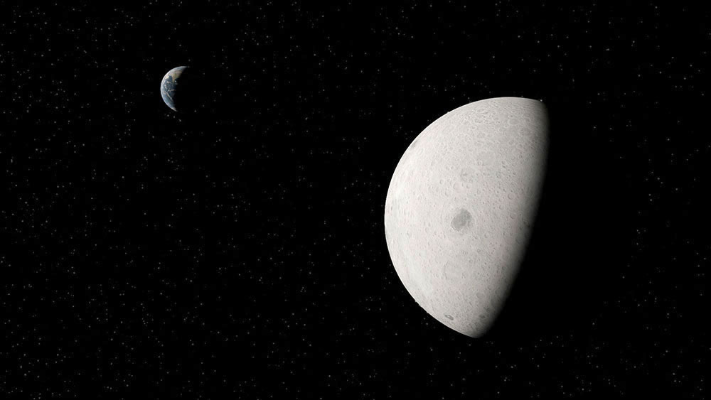 http://ajrosales.com/images2017/MOONCAM-1-COMPOSITE.jpg 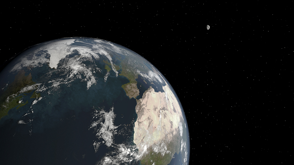 http://ajrosales.com/images2017/EARTHCAM-2-COMPOSITE.jpg
|
|
#
¿
May 5, 2017 05:34
|
|
|
needs a shag toilet cushion...
|
|
#
¿
May 7, 2017 00:36
|
|


|
something new I'm working on... the first complete view I've generated from it. it's an orbiting "moon base" that's going in my space renders (eventually) but this is as much as I'm willing to reveal at this point. not only am I designing the exterior and interior of the "ship" but I am designing a complementary font as well. This is turning out to be quite a tricky exercise overall. The exterior needs a little more development before I can render it. 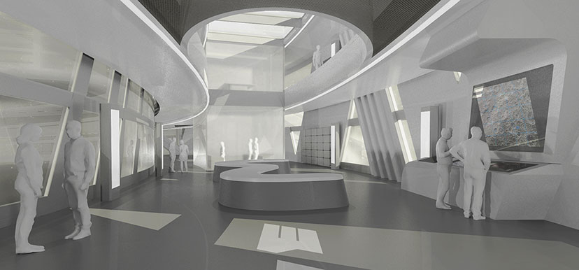
|
|
#
¿
May 13, 2017 09:12
|
|
|
well, I started out with the idea of re-designing and incorporating a NASA logo into my design (which will be featured on the outside of the ship) I spent several hours coming up with a concept for just those three letters and how they looked together when they formed the word "NASA". I then started expanding the idea by working on other letters and some numbers here and there during the design process. I've only done about 10 letters so far and I've noticed that I may need to revise a couple things when I get more letters done - taking a look at a group of letters together changes your perspective on how successful the idea is. I'm not sure I'd actually create a real, usable computer font (maybe) but the way I've been treating the letters is through the their design as vector outlines. I'm using Rhino to help "draft" them since they involve precise angular relationships between edges. It's a fun side project but it's also a little demanding.
|
|
#
¿
May 13, 2017 17:34
|
|
|
I guess I'll have to see where it leads. I feel like there is something completely different about designing a logo vs designing a font. The stylized nature of the logo letters seems to work well together but I'm having a harder time translating the effect to the entire alphabet.
|
|
#
¿
May 13, 2017 20:40
|
|
|
ok. I finally finished my spaceship and font. actually, it is a moonbase. I revisited my earth and moon renders too (added a normal map for the moon which made everything pop a bit more). anyway, here it is, there's a lot more imagery on the project page: http://ajrosales.com/quo-orbiting-lunar-base 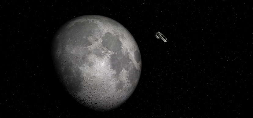
|
|
#
¿
May 20, 2017 18:11
|
|
|
I just did another wiggle: http://ajrosales.com/wiggle-pavilion 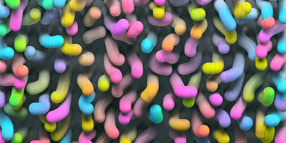
|
|
#
¿
May 24, 2017 19:22
|
|
|
Just finished a parabolic structure: http://ajrosales.com/parabolic-shell 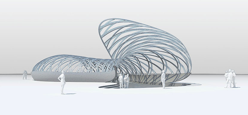
|
|
#
¿
May 28, 2017 20:11
|
|
|
a new thingy I've just completed... a conceptual office building design. http://ajrosales.com/aeon-office-building 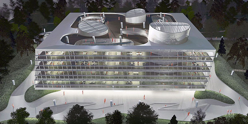
|
|
#
¿
Jul 19, 2017 18:09
|
|
|
wow that's pretty neat. I agree that they need to make this tool more widely available...
|
|
#
¿
Jul 22, 2017 19:56
|
|
|
something I worked on over the last two days - a continuation of an experiment I was doing earlier in the year called "Ripped", so this is "Ripped (Two)"... http://ajrosales.com/ripped-two 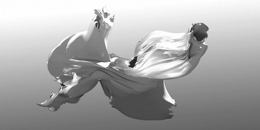
ajrosales fucked around with this message at 08:55 on Oct 22, 2017 |
|
#
¿
Oct 15, 2017 07:10
|
|
|
yet another new thingy: a competition entry for a "toxic waste" marker system for future generations. http://ajrosales.com/a-black-mass-warning-of-nuclear-waste 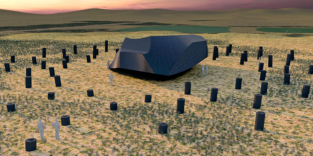
|
|
#
¿
Oct 22, 2017 21:43
|
|
|
Question: Super-realistic 3D seems to be the focus of this thread. Isn't there more potential to the technology than this?
|
|
#
¿
Nov 5, 2017 06:53
|
|
|
Texture mapping, particle simulation, toon shading. Ok. I'm talking about abstraction, not just creative character development. I guess I'm wondering about artists that are not trying to achieve realistic or even semi-realistic images with this technology. This is a real question, not a hot dog.
ajrosales fucked around with this message at 08:14 on Nov 5, 2017 |
|
#
¿
Nov 5, 2017 08:02
|
|
|
I've seen SVUfan's work in the thread. I guess I was wondering about outside sources people might be aware of ... not just contributors.
|
|
#
¿
Nov 5, 2017 16:17
|
|
|

|
| # ¿ Apr 25, 2024 18:28 |
|
|
why is it a weird question? there are intelligent people here who have probably come across some examples.... as to why I was not interested in "contributors" - I was hoping to expose myself to something new. This seemed like a group of people that could do that. I read the thread regularly. ajrosales fucked around with this message at 21:54 on Nov 5, 2017 |
|
#
¿
Nov 5, 2017 21:52
|
|