

|
Hyperactive posted:Why you are wrong about We3: While that makes that spread a good action scene for We3, it's still not a great generalized "how to do good action scenes" thingy.
|
 #
?
Feb 11, 2011 16:18
#
?
Feb 11, 2011 16:18
|
|


|

|
| # ? Apr 18, 2024 19:29 |
|
|
Hyperactive posted:Why you are wrong about We3: That's nice for the animals. That's also not what the discussion is here. We are specifically looking for examples of good action scenes. These pages might work within the specific context of the comic, but giving an example of an action scene that only works within it's particular framework isn't very helpful, particularly when the specific kitty time dilation isn't mentioned at all. This page, removed from it's context, doesn't work very well. I had to go back and look at each page several times to figure out what was actually happening (beyond the overall "guys are getting killed I guess"). Now I'm hardly a newcomer to comics who doesnt understand their visual language, and if I'm getting confused it means, plain and simple, that this is not conveying it's meaning successfully. It may well succeed within the context of the comic, but as a standalone example of an action scene as a learning aid it's kind of poo poo.
|
|
#
?
Feb 11, 2011 16:23
|
|
|
Furikku posted:While that makes that spread a good action scene for We3, it's still not a great generalized "how to do good action scenes" thingy.  ," territory, so I wanted to point out, no, actually, they know a few squats. ," territory, so I wanted to point out, no, actually, they know a few squats.ShineDog posted:This page, removed from it's context, doesn't work very well. quote:It may well succeed within the context of the comic, but as a standalone example of an action scene as a learning aid it's kind of poo poo.
|
|
#
?
Feb 11, 2011 16:51
|
|

|
Hyperactive posted:It is really not that complicated? It performs exactly what it was intended to: expands the time it takes to experience a split second. You shouldn't even need to be told that's what it's trying to do, it's obvious from the fact that it methodically forces you to spend time examining a moment that happens in a blink of an eye. Theres nothing methodical about that layout, theres nothing to lead your eye through that cluster of panels, and it entirely breaks the flow of the action with the animal leaping through the jeep. Also the panels are tiny and very zoomed in, so theres little sense of space or movement in them. I really think theres a nice dynamic picture in the background and then some little boxes to ruin that. Also, someone mentioned it mimics quick cutting earlier, and I think thats right, it does. Problem. Quick cutting like that tends to be used to condense a period of time, to make things seem fast and chaotic. Jumping around from place to place to throw the viewer off balance with brief, glimpsed moments of a period of chaotic action. The thing is, we dont have a period of time to glimpse moments from here, we have a single moment spread out. I can't think of a single instance of cinematic time dilation where the camera jumped around. Dragging a moment of time out also means dragging the camera cuts apart as well. Look at any bullet time scene. So yeah, perhaps if this was an extended scene of slaughter those panels would work for me a little better, but it's a fast, sweeping action scene with a schizophrenic slowmotion camera, so instead of having an action scene in slow motion, the impression is of a short scene that took a while, rather than a short scene in slow motion. (Also, I don't think this is derailing. We are debating the merits of this guys technique, surely the very opposite of a derail, please fight me on this, because maybe I'm wrong and can learn a thing.)
|
|
#
?
Feb 11, 2011 17:16
|
|
|
I think it's a good page because it performs exactly the job Quitely intended it to do, and it does it quite well in my opinion. It conveys that there is a lot of chaotic action going on, and it allows the reader to parse it however they wish, either skimming over the page to get the gist of it or examining it slowly to get the details. The idea of the smaller panels being overlayed on the more fluid, dynamic image is that those smaller things are going on at the same time as the dog is jumping through the truck. They come across as snapshots, just capturing a moment in time during a fast-paced scene. They also read left-to-right as a timeline, so it's not like they're jumbled and out of order. I guess if you don't like the page, then different strokes, but I'll gladly read any work of Quitely's in the future. And if you didn't get what was going on upon first reading the page, well I had no problem understanding it. Maybe you just need more reading comprehension? Here's another page of another action scene from We3. I'm curious how much you guys will just loving hate this one.  Quitely! 
McGravin fucked around with this message at 17:31 on Feb 11, 2011 |
|
#
?
Feb 11, 2011 17:29
|
|
|
McGravin posted:I think it's a good page because it performs exactly the job Quitely intended it to do, and it does it quite well in my opinion. It conveys that there is a lot of chaotic action going on, and it allows the reader to parse it however they wish, either skimming over the page to get the gist of it or examining it slowly to get the details. I think my problem is that there isn't a lot of chaotic action going on. There is a short burst of action and it's being made to look like a lot of different things, and while decompressing the action to show us whats happening in detail is no bad thing, I think this wildly overdoes it. [/quote] quote:The idea of the smaller panels being overlayed on the more fluid, dynamic image is that those smaller things are going on at the same time as the dog is jumping through the truck. They come across as snapshots, just capturing a moment in time during a fast-paced scene. They also read left-to-right as a timeline, so it's not like they're jumbled and out of order. Lets not go here. quote:
I think it's much better, but I did initially take the continuity wrong, particularly between the first and second panels where I wondered how he got from A to B before realising it wasnt the same guys head. I think it's a decent idea, I'm just not a fan of him working so hard at a stylish layout that he's hiding whats happening from the viewer. (Middle action panels specifically)
|
|
#
?
Feb 11, 2011 17:42
|
|
|
I don't think those pages are any good for any action scenes except for the ones in We3, since there's that time thing you have to take into consideration. However, it's a pretty strong argument for thinking about showing other things than 'my hero is punching guy a and b' in your fight scenes. I think lots of action scenes fall into the cookie cutter trap, even if the rest of the comic is so unique in its premise.
|
|
#
?
Feb 11, 2011 17:55
|
|

|
They're interesting sequences, but they feel a little too "meta" for my taste. I prefer more straightforward and simpler approaches.
|
|
#
?
Feb 11, 2011 17:58
|
|
|
McGravin posted:Here's another page of another action scene from We3. I'm curious how much you guys will just loving hate this one. Looks pretty cool to me, but on my first viewing, it does not give any sense of chronology. My initial inclination is usually to read from left to right. However, the panel layout here makes it look like I am either looking through a window, or at a tank. The result is that, at a glance, it feels like all the panels are happening at the same time. But when I look at it closer, it looks like I should be reading it one panel at a time after all, presumably left to right. I honestly like what I see, but to someone like me, who hasn't seen a panel composition like this before, it is extremely unclear. I am still not absolutely certain that I am reading it correctly. And it isn't some actiony "whoa a bunch of poo poo happened at the same time really fast" kind of confusion, it is a confusion like when you are reading something in Spanish, and you aren't sure if you have read it correctly because your spanish sucks. So I would say these are bad examples of how to compose panels clearly. But again, I don't think anyone is saying these are bad pages in context. I think it looks kind of cool and all, it's just that viewers like us, who are unfamiliar with this comic's conventions, don't know what the gently caress is going on.
|
|
#
?
Feb 11, 2011 18:11
|
|
|
Re-found all the Action! posts on the Consequential Art blog. As for Quietly, he's getting very experimental here, and sometimes it works, sometimes it doesn't. The first example would be horrible if it went on the same way for several pages, but it looks like an obvious set piece -- the violence equivalent of a centerfold. I got that it was meant to be dissecting a few seconds, and the context (how the animals experience time differently) supports that. But the little snapshots do make the background image hard to see, and the way they're ordered in neat rows comes off as weird more than chaotic. The cat version works better for me. This wouldn't be how I'd want to handle most action sequences. However, Quietly is twisting conventional rules to deliver a very specific type of action and accomplish very specific goals -- showing violence from an alien perspective that the reader can still understand -- and that's worth learning from.
|
|
#
?
Feb 11, 2011 18:18
|
|
|
Hyperactive posted:It's pointed out in a couple places prior to those pages how animals experience time differently than we do; perhaps especially these animals due to their enhancements. So it works in context? That's fine. I already said the art was competent, and if it's meant to demonstrate that these cats in armour see time in a ridiculous manner that's a-okay. But I'm assuming that the person asking about drawing action sequences didn't ask "how can I draw action sequences assuming my characters are a direct rip off of an easily-identifiable source." Hyperactive posted:The tenor of the conversation seemed to me to veer toward, "Heh, Morrison and Quietly don't know squat I assure you that's not the case. Given context those panels make more sense, but as an example for Comic Shop Talk it was poor. If it's about "look at this artist doing rad poo poo" then it should be in BSS Derailed or whatever the other BSS threads there are for "pages where heh anyone who knows their comics won't need me to tell you the context" get posted. Otherwise it doesn't belong in a thread where someone was asking for general techniques. Giving them pages like the one linked will just inspire cargo cultism, and that doesn't end well.Additionally, the second example posted is a perfectly adequate one.
|
|
#
?
Feb 11, 2011 18:21
|
|


|
Before we get too far into the territory of dissecting specific action sequences, I just want to throw out my favorite action sequences come from Berserk. I'm away from my desktop right now, so I will come back and post a couple of my favorite scenes, but I have always liked the clarity that Miura is usually able to bring to most of his action sequences. I say usually because there are a few confusing fights, but overall the speed and impact of his action sequences are incredibly well rendered. Berserk is also a very good example of how to do speed lines well.
|
|
#
?
Feb 11, 2011 19:39
|
|

|
Hyperactive posted:Gonna disagree; not gonna get anywhere doing so; not gonna keep derailing; carry on. Throwing up your hands in the name of "we're derailing the thread" (that's specifically about the guts and bones of comics) when you decide you don't agree with someone isn't conductive to good discussion. I've read We3 multiple times, I love it, I think it's fantastic and very well-done. The action scenes are impeccable in the context of the book. As general examples of action scenes, they're dangerous because those scenes are very tailored to the constraints and needs of We3's story. inkblot posted:Before we get too far into the territory of dissecting specific action sequences, I just want to throw out my favorite action sequences come from Berserk. I'm away from my desktop right now, so I will come back and post a couple of my favorite scenes, but I have always liked the clarity that Miura is usually able to bring to most of his action sequences. I say usually because there are a few confusing fights, but overall the speed and impact of his action sequences are incredibly well rendered. Berserk is also a very good example of how to do speed lines well. I don't completely agree, actually. Berserk lays on the black ink very heavily. You get a sense of speed and action, but when Guts is ripping through hordes of mooks at once, distinction gets sacrificed. IMO the 1v1 fights in Berserk are better about that. I stopped reading a bit before the Emperor arc so I'm not sure if Miura has changed in that aspect any. Vinland Saga is my personal example of clear, crisp action. So here are some pictures! All linked for absolutely huge though. Panels are read from right to left, by the way, but I had a brain fart during editing and placed the pages from left to right. Sorry. edit: Violence warning. http://i.imgur.com/i5Fsy.jpg http://i.imgur.com/NF0so.jpg http://i.imgur.com/fywIT.jpg http://i.imgur.com/fTfOI.jpg http://i.imgur.com/1Sww7.jpg
|
|
#
?
Feb 11, 2011 20:42
|
|
|
I was about to say, if you want really strong action, look to manga. You don't have to go as over the top with speed-lines or ridiculous, silly moves, but given that the most popular manga's are battle manga's, many series have nearly perfected drawing fast dramatic action. Fairy Tail is mostly bullshit magic fights, but when it does one on one action it's very crisp clear and powerful: (Read right to left, obv.)  The white backgrounds make some panels easy to take in, breaking down the action, whereas the busy, 'speedline' background panels seem more fast and fluid. It's a nice way to pace a fight scene and emphasize the important hits. Fearian fucked around with this message at 21:23 on Feb 11, 2011 |
|
#
?
Feb 11, 2011 21:06
|
|


|
Yeah, most of my fave action stuff is from Japanese stuff, since their stylistic conventions allow for awesomely exaggerated action that doesn't look TOO cartoony (most of the time). I always felt like Japanese comics tended to feel more dynamic and motiony than most US comics I've seen. EDIT: Though thinking about it more, that may partially just be because we're not seeing most of the utter crap from there, so yeah.
|
|
#
?
Feb 11, 2011 21:49
|
|
|
Furikku posted:that may partially just be because we're not seeing most of the utter crap from there, so yeah. Kubo Tite begs to differ 
|
|
#
?
Feb 11, 2011 22:17
|
|
|
Unconventional Oven posted:I was looking at mac's renovated modbook, but they are far more expensive unless you already have a mac book, then it's a sweet deal.
|
|
#
?
Feb 11, 2011 22:56
|
|

|
Kubo's true calling was... fashion design. Samura tends to have nice panel and camera angle variation in his action scenes, but he's not perfect. His loose style and love of graphite can occasionally be a problem. Sketchy lines with no weight variation + low contrast + lots of action lines = what the hell is going on in this panel. But I always thought this was a cute sequence, though (read left to right):  Click here for the full 630x958 image.  Click here for the full 630x939 image. I need to get over my fear of covering things up or having people going off the page.
|
|
#
?
Feb 11, 2011 23:16
|
|
|
Regarding Illustrator vs. MS: If you don't think Illustrator is doing a good job following your strokes, you can mess around with the Fidelity and Smoothness sliders by double-clicking the Brush or Pencil tool icon. In my experience a Fidelity of 0.5 pixels and Smoothness of 0% allows me to be as detailed as I like at any zoom level.
|
|
#
?
Feb 12, 2011 06:20
|
|
|
quote:So it works in context? That's fine. I already said the art was competent, and if it's meant to demonstrate that these cats in armour see time in a ridiculous manner that's a-okay. But I'm assuming that the person asking about drawing action sequences didn't ask "how can I draw action sequences assuming my characters are a direct rip off of an easily-identifiable source." It's a good example because it makes you think about representing time and action in novel ways. quote:Throwing up your hands in the name of "we're derailing the thread" (that's specifically about the guts and bones of comics) when you decide you don't agree with someone isn't conductive to good discussion. I'd rather throw up my hands in the name of derailing, which is exactly what the really annoying back and forth would devolve into, than waste a lot of everyone's time. Sorry!
|
|
#
?
Feb 13, 2011 23:50
|
|
|
Hyperactive posted:It's a good example because it makes you think about representing time and action in novel ways. I think it is a little more advanced than the 101-level discussion I think was intended? Like it is a good action page for its context, and it is a good example of "thinking farther than the basic level" action, but I do not think it's a good example for "How do I make my standard fight scenes not completely terrible?" It seems to me one of those situations where "you have to know the rules before you break them."
|
|
#
?
Feb 14, 2011 00:41
|
|
|
Hyperactive posted:I'm so baffled by the "these aren't good action pages" position that all I can contribute to the discussion is, "What? Are you blind?" Yeah that is also my take on it. They're confusing? For reals? Oh well.
|
|
#
?
Feb 14, 2011 01:25
|
|

|
Hyperactive posted:Oh my god. Really? Those pages are an illustration of how the animals in them perceive time differently than what we're use to, but that's by no means the only reason to do a page like that. Playing with space and time and how they are represented visually is the whole point of a comics page. Nobody's saying they aren't good action pages, they're saying they aren't good action pages to start an absolute beginner with when looking at how action pages are handled. Because they're advanced. Which is a way of saying how good they are. I like you but you're being kind of obtuse about this and I'm not sure why. I'd love to make an analogy about how you wouldn't teach a kid to read with [sophisticated novel], but I think that would just invite further argument about how these pages don't equate to [sophisticated novel] because x, y, z and furthermore... These seem to be very suited to the story that they're telling. However, they're a rather complex solution to a rather complex storytelling problem, and therefore maybe not a good example for lesson number one in "how to draw action." A simple dude punching another dude or a chase scene with no time/perception element to illustrate might have been better. To start. For beginners. Suggesting that we not try to teach a kid to read with [sophisticated novel] doesn't mean that [sophisticated novel] is bad. It just means that [simple novel] might be better for a beginner. Because it's simpler. I've tried to make that obtuseness-proof but I probably didn't succeed, so my apologies in advance.
|
|
#
?
Feb 14, 2011 01:54
|
|
|
hey here's a fun action page i did once (it contains some spoilers i guess!! if you particularly care about that/haven't read this far yet) http://www.deadwinter.cc/page/333.html i tried to capture a chaotic action scene with a main focal point around it and still have some sort of sequential flow. vvv thank you kindly!! Reiley fucked around with this message at 03:33 on Feb 14, 2011 |
|
#
?
Feb 14, 2011 02:24
|
|

|
Reiley posted:hey here's a fun action page i did once (it contains some spoilers i guess!! if you particularly care about that/haven't read this far yet) http://www.deadwinter.cc/page/333.html i tried to capture a chaotic action scene with a main focal point around it and still have some sort of sequential flow. I have always really liked that page. It took me a while to get the diving for the shotgun part, but its frenetic feeling was a good climax from the huge tension between Ron and...well, pretty much everyone else. I like the action in Dead Winter a lot, and it says a good deal about your paneling and layout skills that you can keep the action sequences readable but still pull of crazy stuff like the bullet-hole motif, Reiley.
|
|
#
?
Feb 14, 2011 03:23
|
|
|
inkblot posted:I have always really liked that page. It took me a while to get the diving for the shotgun part, but its frenetic feeling was a good climax from the huge tension between Ron and...well, pretty much everyone else. I like the action in Dead Winter a lot, and it says a good deal about your paneling and layout skills that you can keep the action sequences readable but still pull of crazy stuff like the bullet-hole motif, Reiley. See, I like this. I've always thought that in a medium that is inherently still it's incredibly important to do everything in your power to bring across a sense of movement, and while this page is maybe just a little busier than I'd like most of these panels are as dynamic as all hell. Every one is fun to look at.  [ [A quitely image from we3 that I dig. The top half. Eh, not so much, I'm really not a fan of these tiny panels because I feel they are still robbing the page of it's dynamism and I feel that a steady camera that's showing smaller changes conveys bullet time style time expansion FAR better than the camera jumping around. (Fast jumping cameras tend to be used for time being compressed, hence why I think that of the quitely images posted earlier the timeslice one is far more effective) Anyway. The wall pounce? Yes. This is very cool. Shaping your panel borders to help convey movement is a fantastic thing that everyone should do, and seeing a page where it all sits together like that just reinforces how much I dislike the micropanels. Also, I didn't even realise it untill I was looking up his images today, but when I mentioned the Authority's art fuckup a page or so back, it was actually Quitely. It's an ok comic by Ellis that I read when I was in my "I really like Warren Ellis" days, which have faded a bit (Docktor Sleepless is so bad) and it had decent if somewhat generic comic book art starring characters who looked like this.  Click here for the full 600x918 image. (It's one of those "alternate takes on classic characters deals, yeah, but the scale of the comic was quite impressive.) Anyway, Quitely took over and then they looked like this. I didn't actually know it was him until today.  Click here for the full 1600x1200 image. They all have the same face, and that face has melted. ShineDog fucked around with this message at 04:51 on Feb 14, 2011 |
|
#
?
Feb 14, 2011 04:04
|
|
|
ShineDog posted:That's a good one, too, but you seem to have misplaced the link to the full-size image, so here it is for the folks at home.
|
|
#
?
Feb 14, 2011 05:27
|
|
|
Hyperactive posted:Oh my god. Really? Those pages are an illustration of how the animals in them perceive time differently than what we're use to, but that's by no means the only reason to do a page like that. Playing with space and time and how they are represented visually is the whole point of a comics page. People have already said what I was going to say, but just to clarify it's also my take on this whole thing: the whole issue I took with that page is as a learner's example of decent action scenes. It's like someone asking you the best temperature to bake a cake at and you showing them a completed cake and wondering why they go "that's nice, but it's not helping." There's learning by example, and there's just confusing the gently caress out of people.
|
|
#
?
Feb 14, 2011 11:15
|
|
|
I think the problem with presenting We3 pages as examples of good action sequences is that Morrison and Quitely are doing some pretty advanced poo poo there. Your average artist looking for pointers on how to draw an effective action scene isn't going to be able to get much out of it. It's like being approached by someone interested in starting a new exercise regimen and directing them to videos of Olympic gymnasts. The We3 pages that were linked are all awesome, and the fact that they're not 100% immediately transparent as to what's going on actually enhances them. It doesn't mean they're badly-constructed or hard to understand; it means you need to PAY ATTENTION. They're the best example I can think of of doing Matrix-style action in comic form. By chopping the action up so finely and crisply, it's slowed down to a crawl for the reader. By making the reader stop and examine a two-page action spread in detail, Morrison and Quitely are blowing out an event that would otherwise go by in a split-second. It's pretty genius, in my little opinion.
|
|
#
?
Feb 14, 2011 22:47
|
|
|
I have to admit that with the foreknowledge that the cats have advanced time dilation, the original comic is a lovely idea of the chaos we'd observe with their eyes. But that's once again showing the icing on the cake instead of giving a temperature guideline or amount of flour.
|
|
#
?
Feb 14, 2011 23:22
|
|
|
Reiley posted:http://www.deadwinter.cc/page/333.html i tried to capture a chaotic action scene with a main focal point around it and still have some sort of sequential flow. I really enjoyed that page, but for me it's chaotic action with absolutely no sequential flow. I have no idea how or what order to look at them in. I might go around in circles or move in or out along a spoke. There's certainly a sequential story in there that you can decipher, but to me that's not "sequential flow". It's anti-flow. There's nothing wrong with it! I think the page works fine, and everything, it's just if you're using those words like I use them, that's not what that page accomplished for me. It reminds me of this pair of pages in the first Scott Pilgrim book, which are actually going for a totally different effect, but have a similar issue. 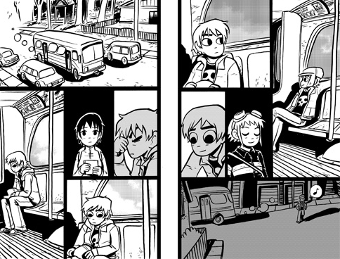 Generally the circular/spiral vibe can make it difficult to know for sure which order to go around the circle, and when to go into the middle. Clearly in the Dead Winter strip that's intentional. I assume it's intentional in the Scott Pilgrim as well, althought maybe not, especially it's not actually an ambiguous spiral/circle (standard reading order rules works for both pages). But because of the semi-spiral construction (you just have to move one panel border to get a spiral) and the black background at the center, at first glance I tend to spiral around endlessly. Also, it's not action, but hey.
|
|
#
?
Feb 15, 2011 11:29
|
|
|
nothings posted:I really enjoyed that page, but for me it's chaotic action with absolutely no sequential flow. I have no idea how or what order to look at them in. I might go around in circles or move in or out along a spoke. There's certainly a sequential story in there that you can decipher, but to me that's not "sequential flow". It's anti-flow. Now you have mentioned it I can totally see the problem there, but it's interesting that I've never had a staircase issue there. You haven't included the page split in that scan though, and I think in practise that splits the page enough to keep the page flow, for me, as intended. Did you read it in a digital format, because as you've displayed it there it totally does a staircase. Speaking of page splits, 2 page spreads in printed media gently caress with me constantly. Bendis does this at the drop of a hat, and god drat if I dont instinctively go down a line at the page boundary, only for the conversation to stop making sense (Particularly because he does 2 page spreads but puts the panel border in the middle so you don't know the mistake you are making untill you've hit it - He does it for his trademark long conversations a lot.). Never mind that putting the art across the page split might work in your 20 page comic book, once it's collected in thick trades you find the deep crevace between pages eats important words and art. It's part of what encouraged me to go landscape on my comic, because I can see the widescreen appeal of the two page spread, but once it hits print I think it looks like rear end far too often. Also Octopus Pie looks so loving good like that. ShineDog fucked around with this message at 12:04 on Feb 15, 2011 |
|
#
?
Feb 15, 2011 11:59
|
|
|
nothings posted:Pilgrim Layouts. O'Malley said that it wasn't intentional. He was still trying to figure out how to panel comics for the first books and even calls himself out on it in his blog. He admits that he is still learning and that sometimes his panel layouts are.. really awful, and all over the place.
|
|
#
?
Feb 15, 2011 21:50
|
|
|
ShineDog posted:Now you have mentioned it I can totally see the problem there, but it's interesting that I've never had a staircase issue there. You haven't included the page split in that scan though, and I think in practise that splits the page enough to keep the page flow, for me, as intended. Did you read it in a digital format, because as you've displayed it there it totally does a staircase. No, I meant that each page independently exhibits a problem--you're right it's worse with both combined, but that's not what I meant. Each page has the panels arranged around a central black panel, and if you shifted one panel border it would put them in a sort of fan-blade (or like a box with folded flaps in an endless loop) circle. The panel borders aren't shifted, so it's technically ok, but I found it easy to misread anyway. (I've never encountered this "staircase" term, so I'm not sure what that means.) PicklePants posted:O'Malley said that it wasn't intentional. Ah, ok. I read his blog so I may have seen it if he said it there, but I don't remember it. (In fact I got that picture from his own post comparing those final images to the thumbnails.)
|
|
#
?
Feb 16, 2011 11:22
|
|
|
nothings posted:No, I meant that each page independently exhibits a problem--you're right it's worse with both combined, but that's not what I meant. Each page has the panels arranged around a central black panel, and if you shifted one panel border it would put them in a sort of fan-blade (or like a box with folded flaps in an endless loop) circle. The panel borders aren't shifted, so it's technically ok, but I found it easy to misread anyway. (I've never encountered this "staircase" term, so I'm not sure what that means.) You know I was going to draw an explanation of what I thought you meant, but it just makes me look like a completely loving crazy person. Please ignore me. Oh gently caress it.  Like going down a flight of stairs. go along, go down, back the other way, repeat. I've seen this used effectively once ever, and it was by someone here. ShineDog fucked around with this message at 13:13 on Feb 16, 2011 |
|
#
?
Feb 16, 2011 13:03
|
|
|
ShineDog posted:So he puts on his hat, takes it off, and puts it back on to get off the bus? Edit: vvv Right, I know. I'm just saying that the panels don't make sense when read in that order, so even though it looks like that was the order intended, it can't be. McGravin fucked around with this message at 13:47 on Feb 16, 2011 |
|
#
?
Feb 16, 2011 13:22
|
|
|
McGravin posted:So he puts on his hat, takes it off, and puts it back on to get off the bus? No, I didnt read it like that, I just thought thats what he meant when he was talking about it. Looking at it in detail makes me realise it was a loving crazy thing to think. It was more of a discussion about the panel flow rather than what was actually happening though, in particular that flipped symmetry between the panels.
|
|
#
?
Feb 16, 2011 13:31
|
|
|
I thought those two SP pages were totally fine. It just depicts Scott progressing from a world revolving around Knives (full of guilt and remorse) to one revolving around Ramona. Of course, in the printed version, the break in pages helps, but really these panels aren't really trying to tell a story, so any structural failings don't greatly matter.
|
|
#
?
Feb 16, 2011 16:37
|
|


|
I think the best way to read those two pages is to notice that every panel on one page is reversed on the next page.
|
|
#
?
Feb 16, 2011 19:38
|
|
|

|
| # ? Apr 18, 2024 19:29 |
|
|
Brannock posted:I think the best way to read those two pages is to notice that every panel on one page is reversed on the next page. Wow, somehow I had totally missed that. Sheesh.
|
|
#
?
Feb 17, 2011 07:23
|
|