


Steve. Motherfucking. Ditko. To me it's almost criminal how obscure Ditko is compared to his early Marvel contemporaries. Lee and Kirby are household names, but Ditko gets a lot more blank stares, even though he designed Marvel's most popular superhero and plotted out and drew some of Spidey's most memorable stories. That's Eternity up there, a creation of Ditko's for the Dr. Strange book. To me the design is as iconic, larger than life and awe-inspiring as Kirby's amazing Galactus, and he always framed the panels to convey the importance of the character. I mean the guy is literally the entire universe personified, and look how awesome he is. Look at how awesome the composition is there.  These 3 panels of the Scorpion's first story are more iconic and interesting to me than anything anyone else has ever done with the character. The text plays a part there but look at the dramatic buildup of the panels, getting closer and closer to a truly chilling inhuman face. 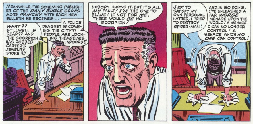 From the same issue. I genuinely have yet to see anyone in comics who could match the expressiveness of Ditko's characters. They all seemed so vulnerable and lost, and their exaggerated motions and detailed, heavily-lined faces created a feeling that reminds me most of german expressionism. It exposed something naked and human in them that triggers immediate empathy, a sense of knowing exactly how they feel. A lot of his best work, visually is this type of "mask of sanity crumbling" scene, and again his sense of visual progression served to heighten the drama as his expressive art made us feel the mounting desperation of the characters. Lastly, some of my all-time favorite Ditko art comes from his Mr. A era. While the narration and dialogue tended to veer into the manifesto style of gigantic walls of text, and the opinions expressed within were often shockingly extreme or simply impossible to follow, the visual experimentation used to convey Ditko's personal worldview is by far some of his most fascinating and technically proficient work. I mean, what can you add to a spread like this?  In short, I love Ditko, and you should too.
|
|
 #
¿
Jun 22, 2011 22:48
#
¿
Jun 22, 2011 22:48
|
|


|

|
| # ¿ Apr 23, 2024 09:17 |
|
|
It's really to his credit that I recognize almost every dead person on that two-page spread, even though only a few are named. If that spread had been done by, say, John Romita Jr.(though he's a great artist in his own right), I'd have no idea who any of them are supposed to be except the ones with obvious visual cues like Kaine and the masked ones.
|
|
|
#
¿
Jun 25, 2011 22:23
|
|
|
I too love still frames of anime.
|
|
|
#
¿
Jun 28, 2011 11:04
|
|
|
Yikes. That is not a match made in heaven. JrJr's exaggerated blocky style doesn't need a colorist working his hardest to make his linework less bold and his shapes flatter.
|
|
|
#
¿
Sep 18, 2011 01:38
|
|
Malachite_Dragon posted:I'm... really not sure what to think about Lady Red Skull there. That's a real character FYI.
|
|
|
#
¿
Sep 20, 2011 13:54
|
|

|
I think horrible print quality, especially when it comes to colors, has a lot more to do with how old artwork holds up. I mean we're talking Archie-level "you can see the pigmentation dots" awfulness here. Such a drat shame that print quality was so dire back when you had some of the cleanest and most amazing comic book artists working in the industry. Marvel recently printed some unpublished Ditko comic but the colorist tried to make it look "modern" and it was like watching some dude pee on the Mona Lisa.
|
|
|
#
¿
Oct 16, 2011 22:22
|
|
Breetai posted:That being said, have you seen the recolour of The Killing Joke? No, it really isn't.
|
|
|
#
¿
Oct 17, 2011 09:03
|
|
Happy Hippo posted:I beg to differ. Killing Joke's original colors were distracting, loud and garish and contrasted horribly with Bolland's pencils. The new coloring is nice and subdued. YOU CAN DIFFER IN HELL!!! I mean... I fundamentally disagree with the very idea of altering older comics to fit modern sensibilities on its face (outside of color restoration work and things like that), so I may have a bit a bias here, but to me the Killing Joke reprint is especially egregious because it's so lazy. The colors used are what you'd see in a modern DC comic, making it indistinguishable from any modern print. Which is very bad, because that means whoever did the work just used the techniques that are popular now, without putting any thought into the context of the original comic or the color choices of the original work. It's absolutely no different than if they'd changed the dialog to be "more modern" in the 90s and had everyone talking in outdated slang. It may "look good" today (it doesn't, it looks bad) but it's going to be dated tomorrow, because it was just a generic coloring effort that treated the work just like any of the forgettable modern crap DC spews out on a weekly basis. More than that, though, I really think all the muted colors and the high use of greys just clashes horribly with the pencil work and the mood of the comic, and looks really bad. I get the same feeling looking at it than I do looking at people who took those Diablo 3 screenshots with vibrant palettes and colors and greyscaled everything and tagged it "Necromancer's choice" while calling the original artists faggots. It's a shallow attempt to match the dark tone of the story through a muted dark palette that completely ignores the power of striking color contrasts and the way it works into the theme of the story. It adds nothing and detracts badly from the work. It's unimaginative, unnecessary, and disrespectful to the original colorist to boot.
|
|
|
#
¿
Oct 18, 2011 03:01
|
|
Ka0 posted:Ramos' style reminds me of Madureira. I write this in the most negative sense possible. I agree, but I feel Madueira has a much better grasp on the fundamentals.
|
|
|
#
¿
Oct 21, 2011 04:47
|
|
Geekboy posted:You keep moving the goal posts because you're the only one saying things that are "demonstrably" wrong. I'm saying it. Humberto Ramos is a demonstrably bad artist that draws badly and gets paid to draw badly and if you like his bad drawings you have bad art fundamentals and bad taste. The main reason most people aren't saying anything is that there will always be retards that will incessantly defend lovely art with "THAT'S MY STYLE" and it's a tango we've all danced way too many times so at the first sign of people trying to write off lovely fundamentals as an artistic choice we just let out a very long and tired sigh and give up. Heresiarch is apparently more patient than the rest of us, or more stubborn.
|
|
|
#
¿
Oct 24, 2011 05:00
|
|
JackDarko posted:Why you gotta be so mean man, you act like your an opinion is a fact. Don't go around calling people retards, that isn't nice! War embitters a man, JackDarko.
|
|
|
#
¿
Oct 24, 2011 05:22
|
|
SkellingTon Loc posted:Not a good storyteller imo, but he's a great artist. Yeah that's a pretty important distinction to make when it comes to comics. It's like the difference between a concept artist and a designer. I can think of so many comics where an important moment's muddled by the artist failing to convey an emotion or interaction in a clear way.
|
|
|
#
¿
Nov 20, 2011 21:56
|
|
Dr. Hurt posted:Was this supposed to be Marvel's response to Goosebumps or something? Because that's one tagline away from being something RL Stein shat out in the 90's. Chillers was a 70s black and white horror mag Marvel put out, iirc. Marvel's non-superhero mags were all pretty amazing, it's a shame all of it died. And it's an even bigger shame some of it got relaunched as... that.
|
|
|
#
¿
Dec 13, 2011 20:34
|
|
Madkal posted:If you read his Dark Knight Strikes Again you will notice that as the book goes on his artwork gets a lot more....abstract. Is this where we got some hilarious post explaining that it was on purpose, and that Miller's deconstructing his own work? Because I love those.
|
|
|
#
¿
Dec 30, 2011 06:58
|
|
Dr. Hurt posted:No it's because of 9/11. Seriously. Oh I know, I just think it was really funny to see all the posts talking about the "symbolism" and "deconstruction of his previous works" Miller was putting in DKSA when it was obvious it was simply incoherent because of incoherence, not some high minded artistic intent.
|
|
|
#
¿
Dec 30, 2011 09:04
|
|
Gorilla Salad posted:I'm not going to defend that work, but I absolutely love the art in Sin City. Sure the stories were all the traditional Miller fare of Jerks and Whores, but I'm such a sucker for noir that I still enjoy the books. I'd never suggest Miller never produced good material, he was one of the greats, I was simply talking about defending the bad recent stuff.
|
|
|
#
¿
Dec 30, 2011 13:52
|
|
Spaceman Bill posted:Skottie Young is great. If I can find it I'll upload the Mr. Freeze he drew me. You're not sure where it is? Just how much art do you own?
|
|
|
#
¿
Jan 2, 2012 16:47
|
|
OldMemes posted:I've just sent you one That's the lame dinosaur from the third movie, right? The one that was EVEN MORE badass-er than a T-rex.
|
|
|
#
¿
Jan 2, 2012 20:24
|
|
")

|
They're the same guy, though. Sure, Peter David and his artist salvaged the character to the point that it might as well be a new guy, but it's not. They even had Shatterstar acting all one-dimensional and looking more like his ridiculous 90s design in the alternate universe Maddrox just visited.
|
|
|
#
¿
Jan 18, 2012 03:33
|
|
bobkatt013 posted:It is still the awesome Jamie one Hasn't been awesome for a while now.
|
|
|
#
¿
Jan 28, 2012 08:39
|
|
|
Those covers seriously made me embarrassed to be buying comics back in the day. "No, I just enjoy the story! There's nothing creepily sexualized about the interior art at all!"
|
|
|
#
¿
Feb 2, 2012 19:43
|
|
|
I miss when people used to draw Red Sonja like a warrior instead of like a bikini model who's cosplaying as a swordswoman.
|
|
|
#
¿
Feb 8, 2012 21:26
|
|
redbackground posted:2nd Legend down. Basically, her navel was covered. Maybe Lurdiak knows of more a more "warrior" look that still didn't have fully exposed legs, though? I meant her body type, not how she dresses. She's the original chainmail bikini lady, but she used to look like she could beat people up.
|
|
|
#
¿
Feb 9, 2012 05:04
|
|
|
I'm more concerned with the fact that he's ramping off what appears to be a black neo-nazi.
|
|
|
#
¿
Mar 20, 2012 16:12
|
|
Rhyno posted:People are bitching about the recoloring even though the original creators signed off on it and are heavily praising it. Don't make me invoke George Lucas. Happy Hippo posted:I prefer the new coloring in Killing Joke. I'm sorry about your blindness.
|
|
|
#
¿
Apr 9, 2012 00:32
|
|

Rhyno posted:G-Mo and Quietly are a far cry from Lucas. I was just making a point that authorial approval of changes doesn't mean they're necessary changes or good ones. It's an empty appeal to authority.
|
|
|
#
¿
Apr 9, 2012 06:08
|
|
|
Writing ain't so hot either.
|
|
|
#
¿
Apr 19, 2012 11:09
|
|
|
They really don't, though.
|
|
|
#
¿
Jun 3, 2012 22:31
|
|
Mister Roboto posted:I don't troll. The SFC comic is funny and a good take-that at the comicbook industry and the silly female poses. I'm not disputing that--I said it was overplayed since it gets posted a lot whenever anything remotely related to comicbook females is mentioned. Especially as it's just that: a joke, and hardly the solution or the witty commentary to end sexism. This is like when people started saying jokes about Bush were played out 6 months into his presidency.
|
|
|
#
¿
Jun 12, 2012 22:01
|
|
Lobok posted:I for one would love a character who gets spider powers and decides to take up wrestling. He'd probably have a flashy costume and everything. There was, he was called Spider-man.
|
|
|
#
¿
Jun 26, 2012 17:38
|
|
|
Seriously, absolutely nothing in that page needs a "wide open action shot". Huge extravagant panels are why the 22 page format no longer works in modern comics.
|
|
|
#
¿
Jun 27, 2012 21:49
|
|
|
I think he hates drawing well.
|
|
|
#
¿
Jul 26, 2012 17:28
|
|
|
I totally think the artist is bad, I dropped FF after two issues even though I loved the writing.
|
|
|
#
¿
Jul 26, 2012 17:50
|
|
mind the walrus posted:\/ \/ \/ \/ What part of "Kordey was forced to draw these in the span of week" don't people get? Yes it's poo poo-looking in many real ways but for gently caress's sake when context is taken into account the man performed minor miracles. It's all about perspective dudes. I don't think anyone would be forcing the issue if several posters hadn't popped up to try to say it doesn't count as bad because they like the artist. "He had to rush it" is fine, "you're wrong for saying it's bad because you don't GET IT" is stupid.
|
|
|
#
¿
Jul 30, 2012 00:06
|
|
redbackground posted:Because the Joker has probably managed to destroy more lives on planet Earth than all of them put together. By that logic, real life prison inmates should be terrified of white collar criminals.
|
|
|
#
¿
Aug 13, 2012 06:16
|
|
Madkal posted:Joker would be a white collar criminal if he stole your life savings (while spraying your entire family with a laughing gas that would make them die with a smile). Well, he mentioned ruining lives. Besides, of course Joker doesn't steal people's savings, he's not a monster.  Arkham Asylum: Living Hell #1, Ryan Sook. Love that monobrow.
|
|
|
#
¿
Aug 13, 2012 08:06
|
|
|
I was puzzled about the guy smashing bricks near Joe and Sean until I realized it was meant to be SF1 Ryu with his shirt off. I recognized the cyborg, but only because of... a certain... street fighter... flash video... Also, bonus points for the "Oh! My car!" guy way in the back near Blanka smashing a car. Really just an excellent, fun piece of art.
|
|
|
#
¿
Aug 19, 2012 05:09
|
|
Mister Roboto posted:Yeah, it's a testament to how, in comics, we recognize characters' outfits far more than their faces. Take Guy in the upper right, it took me a while to realize he had his Final Fight gi unbelted and that's why it looked strangely like a vest. Well he's got his SF1 design and art style, which has a very different face and haircut than what we think of as Ryu. Just like how everyone from Final Fight 1 is slouchy and has more muted colors, everyone is drawn in their appropriate art styles, which is pretty neat. Dig on Sakura abandoning SF Alpha Ryu for the much more iconic SF2 design!
|
|
|
#
¿
Aug 19, 2012 05:14
|
|
Internet Wizard posted:The last two panels are the only ones that bother me, because the Surfer is clearly stationary at that point. It looks like he hit one roof so hard he teleported to a second, completely different roof. I dunno man, it looks like he's still falling to me.
|
|
|
#
¿
Aug 30, 2012 01:59
|
|
|

|
| # ¿ Apr 23, 2024 09:17 |
|
TwoPair posted:Holy poo poo, Steve Dillon's art on Avenging Spider-Man #11 is atrocious. I just cannot stand those faces. A page, for reference: The worst part about the hideous Dillon art in this issue is that the writing is wonderful and emotional, and Dillon's art just completely wrecks it. To add insult to injury, the cover had art by Chris Samnee, who would have been a wonderful fit for the issue.  Look how pretty that is!
|
|
|
#
¿
Aug 30, 2012 16:32
|
|
