|
theHUNGERian posted:I really like this one. Nothing fuzzy about it. I don't know what it is so it's hard to judge whether or not it's cliche. The pattern is strong but the shallow DOF doesn't work here, in my opinion, because the whole image is about the strong vertical lines.  Cafe outside of Angkor Wat in Siem Reap, Cambodia.  The Golden Temple, Kyoto, Japan.
|
|
|
|
|
| # ? Apr 25, 2024 14:51 |
|
theHUNGERian posted:
I like it. Agreed on the depth of field comment above. I also think it might work better with the non-uniform bits on the left and right cropped out so that only the shaded section in the middle stands out.
|
|
|
|
Yeah, I redid it with a wider DOF and it's definitely better.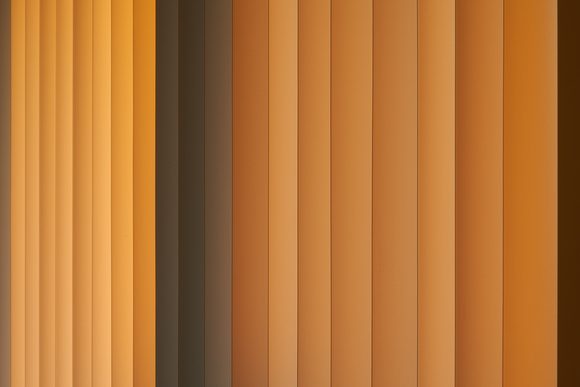 TsarAleksi posted:
Where are the people? When I visited, the place was fuckin' packed.
|
|
|
|
TsarAleksi posted:
One of the more tasteful processing jobs I've seen on that location. Nicely done. Also yeah, where are all the people? When I went the place was swarming. --- Not sure whether to go with the photoshopped out power lines or not on this one. Had to hold my camera up over a wall to get this shot! 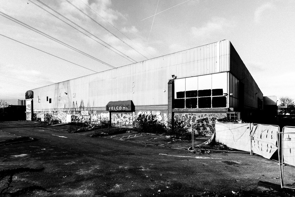 
|
|
|
|
I like with the power lines. Their perpendicularity to the building and the way they lead the eye to it are pretty cool, I think. They also make that quadrant of the frame more interesting without cluttering it.
|
|
|
|
President Beep posted:I like with the power lines. Their perpendicularity to the building and the way they lead the eye to it are pretty cool, I think. They also make that quadrant of the frame more interesting without cluttering it. Agreed. They also interact in an interesting way with those jet trails.
|
|
|
|
theHUNGERian posted:Where are the people? When I visited, the place was fuckin' packed. You can see some people when you zoom in but most people observe Kinkakuji from that location, so just put the camera up near the pond and voila, no people.
|
|
|
|
theHUNGERian posted:Yeah, I redid it with a wider DOF and it's definitely better. To my right and left! And there were some in the trees as well but I toned the bright colors down so they blended in and didn�t distract, and took care of the reflections with heal/clone.
|
|
|
|
 I went to Edinburgh recently and was playing around with some long-exposures. There's a place called Camera Obscura, a optical illusion museum. This particular room had mirrors and a series of colored LEDs that slowly shifted around the room. The effect was a series of orderly, colorful dots that gradually moved around the room in slow waves. I used a 3 second exposure and got some fun ones.
|
|
|
|
Nigel Tufnel posted:One of the more tasteful processing jobs I've seen on that location. Nicely done. Also yeah, where are all the people? When I went the place was swarming. I'll be the dissenter and say that I think the one without power lines is better; to me they throw the balance of the image off. I think this is an interesting image (in either version) and there is a lot to look at that is well displayed. I'm a bit unsure about what appears to be added grain; I see the intent but it's a bit too artificial looking I think. Also, you're losing a lot of detail in the shadows, you might try playing with bringing that out to strengthen it. 
|
|
|
|
I don't know enougth to say much other than that this is great. 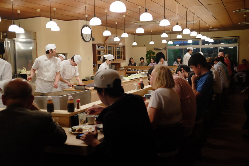 Tonkatsu by b h, on Flickr Tonkatsu by b h, on FlickrI like the lighting and the postures of the two chefs on the left. I'm not sure about the guy with the cap being so central and blocking the view of the other chef though. I also think the focal plane is maybe 1m to far away, and the lights in front of the clock annoy me. 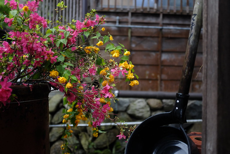 Untitled by b h, on Flickr Untitled by b h, on FlickrNot terribly exciting but I was satisfied with the colours and the gardening implement on the right makes it marginally more interesting than other photos of flowers I have taken. Both are SOOC, I tried editing them but didn't think it added anything. Any suggestions appreciated. distortion park fucked around with this message at 20:53 on Jan 29, 2019 |
|
|
|
TsarAleksi posted:I'll be the dissenter and say that I think the one without power lines is better; to me they throw the balance of the image off. I think this is an interesting image (in either version) and there is a lot to look at that is well displayed. I'm a bit unsure about what appears to be added grain; I see the intent but it's a bit too artificial looking I think. Also, you're losing a lot of detail in the shadows, you might try playing with bringing that out to strengthen it. Thanks for the advice. I'm a big fan of Moriyama and his ilk so I like my blacks super crushed and my images nice and grainy. It has to serve the image though and I'll experiment with pulling it back and see how it looks. Also obs your shot is amazing. pointsofdata posted:
To me the restaurant shot is a snapshot. It's too cluttered and the subject is unclear. I can see you were on the X100 so no zoom available but it would have been better to move / zoom until the chefs were dominating the frame and then waited for that old 'decisive moment' when there was some kind of interaction. Flower shots aren't my think but I thought this picture on your Flickr could have had potential: 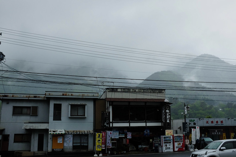 Very moody atmosphere but for me the car in the lower right ruins it and I would have wanted you to get straight on to the buildings with the mountain in the background (I accept this may not have been possible with your fixed focal length).
|
|
|
|
Nigel Tufnel posted:Thanks for the advice. I'm a big fan of Moriyama and his ilk so I like my blacks super crushed and my images nice and grainy. It has to serve the image though and I'll experiment with pulling it back and see how it looks. Thanks for the feedback - I agree completely with the problems with the buildings/mountains shop. It looked good in the camera but it definitely needed to have been straighter and possibly from a slightly higher perspective. 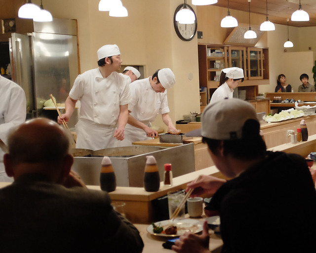 cropped by b h, on Flickr cropped by b h, on FlickrI tried cropping the restaurant one and I agree that being less busy helps, although it does make it more obvious that there isn't actually much of interest happening.
|
|
|
|
pointsofdata posted:I tried cropping the restaurant one and I agree that being less busy helps, although it does make it more obvious that there isn't actually much of interest happening. Yeah something that comes with time is knowing which shots you were excited to take (and so ascribe meaning to) but actually are poor photographs in terms of composition, exposure etc. God knows I�ve taken, and will continue to take, hundreds of shots where I was excited because the location has hard to get to or I faced a fear and photographed a stranger etc; only to realise that my personal connection to the photo is stopping me from seeing that it isn�t actually a good image. Few famous photographers talk about their �hit rate� of bad to good photos but I�ve heard pros say that, when doing street for example, they�d be happy with one good shot for every 100 they took. Look at Cartier-Bresson�s contact sheets. He often took 5-10 photos of one scene to get the perfect single image. You rarely see all the misses that lead to the hit. Only thing you can do is practice! 
|
|
|
|
There was a Scott Kelby lecture on YouTube that's been taken down for some reason that covers this, he basically took the room through photographing a few situations and showing the raw images sooc and going over why they were thrown out and how he adjusted the composition until it became the image he wanted. The shots were nothing spectacular, but it was a good insight into someones approach in a scene, and he admitted that he was committing a cardinal sin by seeing just how bad some of the photos he takes are rather than just the finished piece.
|
|
|
|
Nigel Tufnel posted:Yeah something that comes with time is knowing which shots you were excited to take (and so ascribe meaning to) but actually are poor photographs in terms of composition, exposure etc. Dig up a decent youtube landscape channel, after a million videos of them talking about walking around for 30 minutes trying to find a perfect composition only to bitch about the light and go home with a picture they hate, you'll start to get better about letting bad shots go. I still machine gun pictures, not with the hope that one of them turns out, but more like a scouting exercise in case I get a chance to return.
|
|
|
|
Nigel Tufnel posted:Yeah something that comes with time is knowing which shots you were excited to take (and so ascribe meaning to) but actually are poor photographs in terms of composition, exposure etc. Honestly I think for street, 1 out of 100 is probably a generous number, it might easily be a lot less than that, or you can spend all day in some awesome place shooting pictures and have nothing awesome at the end of it no matter how badly you want it to come out and be amazing. And the machine gunning thing is critical, I know I've had a few times where I tried to be conservative and only shoot really special stuff and the result was just getting crap and being disappointed. The restaurant shot to me seems to have potential in terms of subject but as the other commenters noted, the moment just seems to be missing and it looks like what it is -- a chef in a tonkatsu shop. Here's one I'm a bit conflicted on in the same vein, I can't tell if I'm suffering from the same issue where I like it for where I was rather than what it is... 
|
|
|
|
pointsofdata posted:Thanks for the feedback - I agree completely with the problems with the buildings/mountains shop. It looked good in the camera but it definitely needed to have been straighter and possibly from a slightly higher perspective. The wider crop is a much better picture. I don�t think two stressed out chefs in a crowded restaurant is a bad subject in a photo, but two stressed out chefs without context is. The lightning makes them stand out enough that it�s immediately obviously that they are the subject, and the crowd adds a lot of context to the picture. eternity test fucked around with this message at 18:32 on Feb 1, 2019 |
|
|
|
TsarAleksi posted:Honestly I think for street, 1 out of 100 is probably a generous number, it might easily be a lot less than that, or you can spend all day in some awesome place shooting pictures and have nothing awesome at the end of it no matter how badly you want it to come out and be amazing. And the machine gunning thing is critical, I know I've had a few times where I tried to be conservative and only shoot really special stuff and the result was just getting crap and being disappointed. Overall, I like the picture and think it's really good. However, while I really like the framing of the dark corners, it feels too weighted at the bottom and sides, so I think I might it a little more if it were cropped a little bit maybe? Though, the more that I think about it, maybe the dark slenderman on the right 1/3-line is actually what's distracting me rather than the dark sides. I think that might be what feels off and is drawing my attention to the right pseudorandom fucked around with this message at 07:26 on Feb 2, 2019 |
|
|
|
Another bear photo from me. Any criticism appreciated. TsarAleksi posted:Here's one I'm a bit conflicted on in the same vein, I can't tell if I'm suffering from the same issue where I like it for where I was rather than what it is...
|
|
|
|
InternetJunky posted:Another bear photo from me. Any criticism appreciated. Is the background blurred because you had to use a telephoto to get the shot? The out of focus parts on the right and horizon distract from the bear and pull my eyes away from it. I would recommend a tighter crop on the bear but I like the composition, just not the out of focus parts. I'm not sure if there's any way around it but that's my initial reaction. Really cool shot though.
|
|
|
|
I'd experiment with a panoramic crop. I get the reasons for framing like you did, but it's not working. The zero-detail sky is not doing anything for you.
|
|
|
|
InternetJunky posted:Another bear photo from me. Any criticism appreciated. Thanks for that comment, I�m glad the impression I liked is carry through. I think I might try a slight crop or other edit as pseudorandom suggested. This shot is from an indoor market in the old city of Ho Chi Minh City (aka Saigon). I really like the bear here but I think I agree that it should be larger in the frame. At a minimum consider editing out the blob of driftwood in the background, it�s detracting from the negative space quality of the background.
|
|
|
|
Landscape, please critique.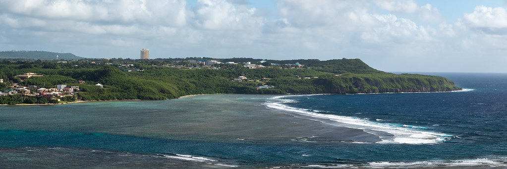 With panos I have a lot of trouble figuring out where to cut it off, and I have an alternate with a much smaller crop, but then I feel like it's almost claustrophobic compared to the actual view in the location? Most of the interesting shapes/contrasts are over on the right anyways. I wish I could get more space at the bottom but it runs into the tops of some houses which are really distracting. 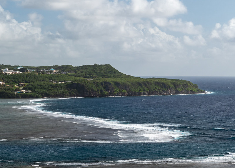 Agree with all the more panoramic crop statements, but also maybe pull the frame down a bit. The pattern of rocks in the sand is more interesting than the empty sky even with the shallow dof and it would give the bear a little more space. Sleepytime posted:Is the background blurred because you had to use a telephoto to get the shot? local man mauled by bear trying to shoot it with a 50mm f/.95, news at nine
|
|
|
|
xzzy posted:I'd experiment with a panoramic crop. I get the reasons for framing like you did, but it's not working. The zero-detail sky is not doing anything for you. TsarAleksi posted:I really like the bear here but I think I agree that it should be larger in the frame. At a minimum consider editing out the blob of driftwood in the background, it’s detracting from the negative space quality of the background. Atlatl posted:Agree with all the more panoramic crop statements, but also maybe pull the frame down a bit. The pattern of rocks in the sand is more interesting than the empty sky even with the shallow dof and it would give the bear a little more space. Tighter crop:  2:1 pano crop with oof driftwood removed  Any preference as to which works better? Atlatl posted:Landscape, please critique.
|
|
|
|
I like the first crop, IJ. Looks more intentional.
|
|
|
|
InternetJunky posted:Thanks for the feedback. I played around with a closer crop and a 2:1 crop, both which I think are better than the original but I'm finding I need a sliver of sky in there at least otherwise there's no horizon and the slope of the beach makes for a confusing scene. I prefer the first. The second doesn�t add anything to the photo and I don�t think justifies that composition. However this is just on my phone - printed or viewed large perhaps the lines in the ground would be interesting enough to go with that crop. I just think the first suits the subject better and there�s not much else to feature in terms of the background. rio fucked around with this message at 03:35 on Feb 4, 2019 |
|
|
|
TsarAleksi posted:
I quite enjoy this shot, I'd even like to see a wider crop ratio where you drop the top most skylight and some of the negative space in the foreground. 
|
|
|
|
Yeast posted:I quite enjoy this shot, I'd even like to see a wider crop ratio where you drop the top most skylight and some of the negative space in the foreground. What's this look like with a little bit of the red channel taken out? I'd like to see it like half a stop taken out of it too. I bought a 35mm 1.4 for my x-h1.   
nerdrum fucked around with this message at 06:48 on Mar 1, 2019 |
|
|
|
Hello all, new to the thread. I really like the third portrait above. I like her thoughtful expression, and I like the soft tones of the black and white. Portrait photography is far from my strong suit. I found a Sandhill Crane having a bath the other day and got a few shots I rather like. Here's one: 
|
|
|
|
whoisjasonk posted:Hello all, new to the thread. Nice, but do you have more room to recrop to give the bird more space?
|
|
|
|
jarlywarly posted:Nice, but do you have more room to recrop to give the bird more space? Thanks! Yeah, I wish. I had nothing left on the left of the frame, so I cropped in the right and top to at least give it *some* semblance of balance. Even if that balance is "no breathing room." I 100% agree with and appreciate that critique though.
|
|
|
|
TsarAleksi posted:Honestly I think for street, 1 out of 100 is probably a generous number, it might easily be a lot less than that, or you can spend all day in some awesome place shooting pictures and have nothing awesome at the end of it no matter how badly you want it to come out and be amazing. And the machine gunning thing is critical, I know I've had a few times where I tried to be conservative and only shoot really special stuff and the result was just getting crap and being disappointed. I really dig this one, and I think it does a good job of telling a story through the details and the general mood of the shot. The only thing that is slightly bugging me is that it looks like it's really close being a perfectly balanced Kubrick-esque center-framed shot, but it's just slightly off, which sticks out to my brain for some reason. nerdrum posted:What's this look like with a little bit of the red channel taken out? I'd like to see it like half a stop taken out of it too. I like the colors in this one a lot, and the vivid blue adds a nice pop - though it might almost be too vivid? The bokeh on the left draws my attention away from her face, which I think might be happening because the face looks a little flat - the lack of any interesting shadow or highlights makes my eye wander a bit. Maybe some subtle bounced lighting would help? I'm pretty new to this so I have no idea if this is helpful. Still, I like it quite a bit - the overall color, composition, and the shallow depth of field gives it an intimate vibe. Here's a couple of mine. Not fully happy with either of them, but I can't really put my finger on why.  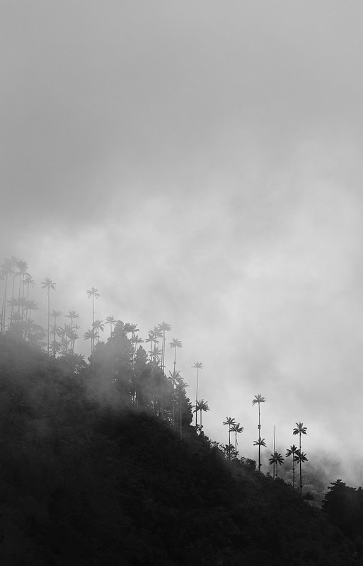
|
|
|
|
I really enjoy the simplicity of this picture, but the fog is a little disorienting after observing for awhile. Maybe play around with clarity or even contrast? Here are a few of mine. Reflections:  I snapped this at the Tenn Aquarium last month. The lights from the exhibit danced across this little guy's shell. thestarvingwannabe fucked around with this message at 16:23 on Jun 9, 2019 |
|
|
|
whoisjasonk posted:Thanks! Yeah, I wish. I had nothing left on the left of the frame, so I cropped in the right and top to at least give it *some* semblance of balance. Even if that balance is "no breathing room." If you have Photoshop, then you can try extending the frame on the left with the crop tool (make sure that content-aware is also selected). I've done that with a couple of shots, and it helped.
|
|
|
|
ZakAce posted:If you have Photoshop, then you can try extending the frame on the left with the crop tool (make sure that content-aware is also selected). I've done that with a couple of shots, and it helped. Gonna try that! Meanwhile, I got to try my hand at motorsport photography for the very first time on Thursday. Tried some unusual-for-me processing. Here are some results: Formula Mazda  Audi RS5  Audi TT-S  Formula Mazda (again) 
|
|
|
|
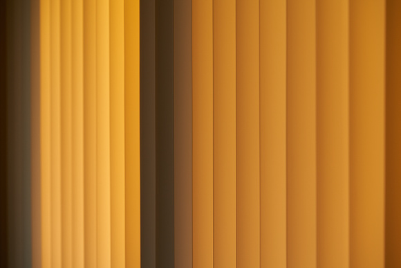
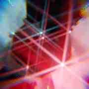
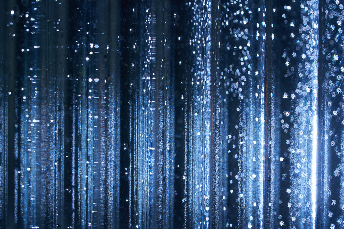 I like the color and the abstract feel. I do not like: -the handful of lines of orange/red -the not perfectly vertical lines on the righthand side I am undecided on the imperfect out of focus circles. They don't bother me too much on the left, but the ones on the right are more bothersome.
|
|
|
|
You could desaturate the red/orange bits, other wise I really like it, it provokes a nice cognitive delay between seeing it as purely abstract then actually working out what it is.
|
|
|
|
jarlywarly posted:You could desaturate the red/orange bits, other wise I really like it, it provokes a nice cognitive delay between seeing it as purely abstract then actually working out what it is. Agreed. I like the red/orange bits.
|
|
|
|

|
| # ? Apr 25, 2024 14:51 |
|
whoisjasonk posted:
I don't have much to add but I think it's good to experiment and try new things - if you enjoyed it absolutely go back and do more. I think the processing is overdone, especially on the first one. The grass color in the last one looks more natural compared to the first, and I think you can still get the contrast with the green and the red without having the green so intense. If it's overexposed from panning to capture the motion, I'm sure there are ways to compensate for that.
|
|
|


