


|
Does anyone know of a font at least vaguely similar to the SGT PEPPERS / CLUB BAND on the drum here?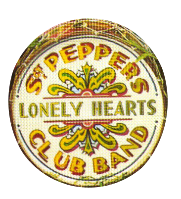 I am trying to do my own version (so need extra letters too), and have fought with moving the letters around in Gimp, including drawing shadows in on the opposite side after cutting/pasting from the bottom words, and tried making new letters with what's already there (like R to D), but it looks rubbish. I am also pretty sure (though not certain) that the drum from the album cover (above) was hand-painted, in which case I've looked for a best match. There are two very similar typed versions that look close to the original (but don't quite seem to be the same - look at the B in BAND). If anyone knows what these are, or knows of a better match to the original, I'd be very grateful:  
|
 #
¿
Mar 19, 2013 01:46
#
¿
Mar 19, 2013 01:46
|
|


|

|
| # ¿ Apr 25, 2024 03:22 |
|
|
I'll give it a go. I've never edited a font before, though. If anyone recognizes the font on the two bottom images in the post then that'd work too
|
|
#
¿
Mar 19, 2013 18:44
|
|
|
Suspicious Dish posted:FangSong. Comes with Windows. I always thought it was Ming Liu, never bothered to check though. Learn something new ever day!
|
|
#
¿
Apr 8, 2013 18:31
|
|
|
bigbigtruck posted:Lost Type's OIL CAN might work: http://www.losttype.com/font/?name=oilcan Ah, that would have been lovely. Seems like a pretty good match. As it was I took a font and offset the letters in Paint, so for example the C is just typing C twice, and then overlaying with a horizontal offset. Then I did the same thing with a horizontal and vertical offset to create the "shadow" I can't remember the font I used, but I think it was a standard Windows one, and I think I used the Bold version. 
|
|
#
¿
Apr 9, 2013 16:30
|
|
|
Fayez Butts posted:Can you do type along a path in Gimp? Cause that will treat you a lot better than Paint I used Gimp (you can't rotate things other than 45 or 90 degrees - I forget which - in Paint), and I've used typing along a path in the Corel equivalent of Photoshop (but after learning that, I sadly no longer have access to it). But the way Gimp seems to handle both fonts and paths irritates me - I read several guides and couldn't get it to work. I'm sure I was just missing something glaringly obvious, but the quickest and most stress-free way for me to sort it was: create the letters in Paint in two colours, open each as a layer in Gimp (sorting out transparency), position them over each other with the adequate "drop shadow" offset, --> merge down, select individual letter and paste into drum image as a layer, rotate and space by hand. As you can tell from the text, it didn't need to be flawless in execution.
|
|
#
¿
Apr 9, 2013 17:03
|
|