


|
Scut posted:These are calling out to be made as paper wargaming standees. Way ahead of you - we're working on a customizer for the website now. It'll be able to accomodate all the GMS weapons from Lancer, so players can use them as Everest stand-ins or NPC mechs, whatever! We're still figuring out if there's a way to incorporate color into the customizer, like with a multiply layer or something. 
|
 #
?
Jan 4, 2020 02:06
#
?
Jan 4, 2020 02:06
|
|


|

|
| # ? Apr 18, 2024 16:57 |
|
|
Sick. Any way to add a toggle for a stroke outline on each attachment? It would be a simple way to make each loadout readable at a glance.
|
|
#
?
Jan 4, 2020 02:51
|
|

|
Not sure about the outline for each part, but I have been busy!
|
|
#
?
Jan 8, 2020 08:02
|
|
|
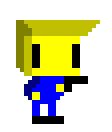
McKilligan posted:That is absolutely money. Major Armored Core vibes. Amazing work. Scut posted:These are calling out to be made as paper wargaming standees. That's literally what they're for! ") McKilligan makes insanely cool monster artwork McKilligan makes insanely cool monster artwork
|
|
#
?
Jan 8, 2020 08:21
|
|


|
MECH FABRICATION FACILITIES: ONLINE
|
|
#
?
Jan 9, 2020 06:31
|
|
|
Some bits and bops I've been working on:   I'm not terribly happy with this one, particularly in the middle. Still trying to figure out what to do with it.   
|
|
#
?
Jan 9, 2020 14:11
|
|

|
Nice. It looks like Sonic's been run through a Ristar filter.
|
|
#
?
Jan 9, 2020 14:22
|
|


|
Mechs! The IPS-N Nelson, Blackbeard, Drake and Lancaster    
McKilligan fucked around with this message at 12:45 on Jan 21, 2020 |
|
#
?
Jan 15, 2020 10:23
|
|
|
I took my building tile set and expanded on it a little.. 
|
|
#
?
Jan 17, 2020 15:27
|
|

|
Working on some new-new sprites for Moon Fields. This is me playing around w/ the regular sized human templates. Please crit or advise whatever you see! This is the second time I'm attempting to do this 16x16 to 20x20 increase because the first time just didn't look very good. I ended up redoing all 25 characters before realizing it wasn't working, and it was a huge waste of time. It looks funny in rotation because the head reads correctly, but the side directions are just flipped. You get weird hand/feet rotations, but I'm ok with it.       I'm 80% into these. The simple men's hair like the Caesar and Short Part are fine. I really like how the more iconic Oxhorn/Hawk/Flatttops all worked out. The afro looked great to me when I was working on it, but clearly it is terrible. It reminds me of Pig-pen from Peanuts.
|
|
#
?
Jan 18, 2020 11:56
|
|
|
The afro doesn't look too bad, to be honest? It's just that the stray pixels seem to indicate sweating or something.
|
|
#
?
Jan 18, 2020 12:22
|
|
|
anothergod posted:Working on some new-new sprites for Moon Fields. This is me playing around w/ the regular sized human templates. Please crit or advise whatever you see! This is the second time I'm attempting to do this 16x16 to 20x20 increase because the first time just didn't look very good. I ended up redoing all 25 characters before realizing it wasn't working, and it was a huge waste of time. There only problem with the afro is the the lighting/shading doesn't reflect the shape - makes it appear flat. Just make the light blue into a circular highlight like you did for the sixth haircut.
|
|
#
?
Jan 19, 2020 00:28
|
|
|
This all looks fantastic. Very inspiration. Going to put a Pico-8 on the new Raspberry Pi and use those tools to get busy. Probably will use 8x8 tiles, just to get my beak wet.
|
|
#
?
Jan 21, 2020 22:43
|
|

|
Could I get some feedback on this? This is my first real attempt. I got tired when animating the craziness of the beams so it looks like garbage. Are the colors and general form ok? Be as harsh as you wish. T. Hanks
|
|
#
?
Jan 23, 2020 07:06
|
|
|
ButtWolf posted:Could I get some feedback on this? This is my first real attempt. I got tired when animating the craziness of the beams so it looks like garbage. Are the colors and general form ok? Be as harsh as you wish. Not clear how the cross guard would stop other beam swords.
|
|
#
?
Jan 23, 2020 12:44
|
|

|
leper khan posted:Not clear how the cross guard would stop other beam swords.  The hilt looks pretty good to me, the beams look too tidy (as you said). They shouldn't be pointy - it kind of looks like one of those collapsible plastic lightsabers.
|
|
#
?
Jan 23, 2020 13:35
|
|

|
ButtWolf posted:Could I get some feedback on this? This is my first real attempt. I got tired when animating the craziness of the beams so it looks like garbage. Are the colors and general form ok? Be as harsh as you wish. Try adjusting the colours so that there is a bigger jump between the value (darkness / lightness) of each. There's a lot of single pixels floating, which is not necessarily a bad thing depending on your aesthetic but I think they might look better if worked into clusters.
|
|
#
?
Jan 23, 2020 15:43
|
|
|
Scut posted:Sprites look good. I might suggest reducing the contrast of the terrain tiles so that the sprites will automatically be easier to spot. Thanks for the advice, tried to change the background tile colours so hopefully the spritres will be more readable and pop out more, same with terrain items like the trees, bushes and walls.:  UI is really basic because of the size limitations.
|
|
#
?
Jan 27, 2020 00:14
|
|

|
Pilchenstein posted:That's how it looks in the film because reasons Scut posted:Try adjusting the colours so that there is a bigger jump between the value (darkness / lightness) of each. There's a lot of single pixels floating, which is not necessarily a bad thing depending on your aesthetic but I think they might look better if worked into clusters. I'm not sure what you are saying here. Do you have an example? I'm not a traditional artist, so general concepts do not occur to me. leper khan posted:Not clear how the cross guard would stop other beam swords. Thanks everyone!
|
|
#
?
Jan 27, 2020 01:25
|
|
|
ButtWolf posted:I'm not sure what you are saying here. Do you have an example? I'm not a traditional artist, so general concepts do not occur to me. Try this: look at your picture and then squint your eyes, notice how some of the colours seem to disappear into their neighbor? That's because they values are too similar. Value is how light or dark a colour is, regardless of hue. I've attached a visual to what I'm talking about. Your original colours are on the left. In this case the hue I'm using is your red from the lightsaber, arranged by value with the lightest at top and lowest at bottom. Notice how similar they are? Next I've selected greys that approximate the reds in value, and then selected new greys that push the value ranges out to increase contrast, finally with a new light red and dark red that will read to the eye easier. Sidenote: I didn't do any hue shifting to keep this simple but as a next step it's often a good idea to shift your brighter colours into a warmer hue and your darker colours into a cooler hue. So the light red would get shifted towards the orange spectrum, the dark would shift towards the purple / magenta. Scut fucked around with this message at 21:57 on Jan 27, 2020 |
|
#
?
Jan 27, 2020 21:52
|
|
|
Scut posted:Try this: look at your picture and then squint your eyes, notice how some of the colours seem to disappear into their neighbor? That's because they values are too similar. Value is how light or dark a colour is, regardless of hue. Awesome. This helps immensely.
|
|
#
?
Jan 28, 2020 02:22
|
|
|
It's been a hot minute since I put together an animation from a Gradius game. I have such a dumbass hobby.
|
|
#
?
Feb 1, 2020 13:21
|
|
|
Star Man posted:It's been a hot minute since I put together an animation from a Gradius game. I have such a dumbass hobby. It's an original hobby. Keep posting man
|
|
#
?
Feb 2, 2020 18:11
|
|
|
I've been doing a lot of mock assets lately for a fake game I'll probably never actually make so I might as well share something I've been staring at this animation in particular for so long that I can't tell anymore if there are any obvious flaws I'm just completely overlooking because I'm used to them at this point. pixel art is hard!! but it's fun too
|
|
#
?
Feb 7, 2020 02:36
|
|

|
Eye see you!
|
|
#
?
Feb 7, 2020 02:55
|
|
|
romanowski posted:I've been doing a lot of mock assets lately for a fake game I'll probably never actually make so I might as well share something The animation is top notch, but the coloring is a bit off and killing some of the readability. Take for instance the face and arms --- the shadows are soft and so it all looks like skin. But the sword (bostaff?) is shaded in the same way so it reads fleshy in a bad way. And the waistline is totally sharp w/o any antialiasing indicating something seemingly more metallic than the weapon. I could assume she's showing midriff, but it's not the same rendering method as the rest of the skin, so... I can't tell exactly what I'm looking at. I think you'd benefit a ton from condensing some of the more similar colors and then getting either different colors or highlights to make certain objects pop. One of the benefits of high frame counts w/ metal objects is that you can go for weird lights/reflection/shadow and do a lot of fun highlighting as the object moves. Edit: if you're looking for a quick fix I'd condense the similar colors into one ramp, remove the anti aliasing on the sword, and then if it's a belt keep it and if it's not a belt add some soft shadows as she rotates her waist. anothergod fucked around with this message at 00:44 on Feb 8, 2020 |
|
#
?
Feb 8, 2020 00:38
|
|
|
Playing with parallax scrolling and color blending tricks to get convincing looking clouds for a side-scroller.
|
|
#
?
Feb 17, 2020 00:21
|
|

|
Harold Krell posted:Playing with parallax scrolling and color blending tricks to get convincing looking clouds for a side-scroller. Looks good. What are you using? Can something like this be achieved in Aseprite, for example? Edit: Just a personal thing, I don't think I would use cyan colors for clouds. I'd go with blue-grey colors, but that's just me.
|
|
#
?
Feb 17, 2020 00:42
|
|
|
SGR posted:Looks good. What are you using? Can something like this be achieved in Aseprite, for example? Probably! I draw in MSPaint since it's able to get the job done. Then, I copy my drawings over to GameMaker Studio 2 and use a background manager object that I created for the game to adjust the speed and depths of the layers. You can probably get the same results without coding in something like Photoshop or Flash (if that still exists).
|
|
#
?
Feb 17, 2020 00:52
|
|
|
Harold Krell posted:Playing with parallax scrolling and color blending tricks to get convincing looking clouds for a side-scroller. Perfect
|
|
#
?
Feb 18, 2020 12:58
|
|
|
Ended up making a bunch of new sprites and enlarging the tiles to 24x24, which led me to making even more and trying to improve the uh, "style?" i have, landed on two I'm happyish with but the bigger one looks like a giant when placed in context with the tiles. I do like the look of the bigger one (influenced by some of Jtangc's work: https://twitter.com/jtangc for example) but im wondering if it'd be better to ditch the 24x24 constraint and go to 32x32 or try to shave a few pixels off the sprite, whilst still making it look taller? I wish i wasn't so obsessed on trying to perfect sprites, I'm hitting that, I'd like to do different stuff but it seems so intimidating atm Not sure if it's been posted before, but there's also this website that might interest people here: https://www.retronator.com/ has some news and good examples of game-dev focused pixel-art
|
|
#
?
Feb 24, 2020 23:24
|
|
|
You have several viable styles in that timeline. Nothing wrong with iterating and tweaking. I would suggest seeing what you can do with visual hierarchy. Push up contrast on things like faces, push down contrast on things like feet. The human eye tends to gravitate towards the 'face' of something first. The terrain looks good but fights for attention against the sprites. Switching to blank tiles of solid colour, with the occasional textured tile thrown in will clean up the space and give the viewer the information they need to understand what is grass and what is gravel etc.
|
|
#
?
Feb 26, 2020 17:27
|
|
|
 It's not really for anything, I like spending hours drawing ugly mechs once in a while.
|
|
#
?
Feb 26, 2020 17:28
|
|
|
It drives me loving crazy that Aseprite doesn't have features like nudge or being able to manually input in values to set the XY coordinates of a selection on a layer.
|
|
#
?
Feb 26, 2020 21:24
|
|
|
Couldn't agree more. It's probably more glaring than it should be because the rest of the program is so drat nice to use. I would love it if they implemented GIMP's selection adjustment, where single-clicking inside the selection toggles the mode to stretch and move just the selection box and it gives big handles to make it easy.
|
|
#
?
Feb 26, 2020 22:22
|
|
|
I joined their Discord to ask if the features exist and I'm just missing them, but they all just told me to write a script to do that. loving computer people.
|
|
#
?
Feb 26, 2020 22:34
|
|
|
...Aseprite does have nudge, though?
|
|
#
?
Feb 26, 2020 23:35
|
|
|
Then enlighten me on what it is. I'm a Photoshop kid and just want to use my arrow keys.
|
|
#
?
Feb 26, 2020 23:52
|
|
|
It is the arrow keys. e: is it possible you're using an old version of Aseprite or something? Olive! fucked around with this message at 00:01 on Feb 27, 2020 |
|
#
?
Feb 26, 2020 23:58
|
|
|

|
| # ? Apr 18, 2024 16:57 |
|
|
Mimics!
|
|
#
?
Feb 27, 2020 09:21
|
|