|
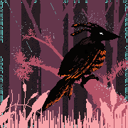
Lovely. It looks as if it could be modified into a tileset.
|
 #
?
Nov 19, 2018 14:19
#
?
Nov 19, 2018 14:19
|
|


|

|
| # ? Apr 24, 2024 08:01 |
|
|
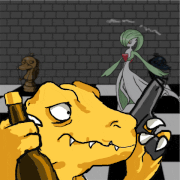
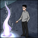
Yeah, and if it were I'd love to play that game. Some more odd Deltarune fanart.
|
|
#
?
Nov 19, 2018 19:29
|
|

|
'Destroy him, my robots.'
|
|
#
?
Nov 27, 2018 21:13
|
|
|

|
|
#
?
Nov 30, 2018 17:23
|
|
|
1 - Scut, your palettes and color choices are A++. I always want to do cool color ramps like that, but I get scared a lot. I also stick to a palette really hard and very rarely deviate. 2 - What tools do people here use for pixel art? I got Aseprite and I love it, but I am looking for something more robust for making tiled pixel art like Pyxel Edit. AFAIK Aseprite's tiling tools only go as far as duplicating one tile in the cardinal/diagonal directions. Pyxel Edit's ability to make a tile map and edit one tile to effect all tiles globally seems like it's way better than Aseprite. I don't know what the rest of the field looks like, but I'm open to suggestions as well.
|
|
#
?
Dec 3, 2018 21:45
|
|
|
The work I've been posting for Infinite Sustain is mostly using a palette I found online. I'm pretty sure it started at around 20 - 24 colours and I've expanded it with a few. I've made my own palettes in the past and I think I'm decent at it but I would strongly recommend trying out palettes that you find. Pixel artists and video games are an obvious source but also posters, film and animation are a great source of inspiration and sampling. Not every palette needs to be general purpose, but what is usually more important is to have a good grading of values (how 'bright' the colours are) from darkest dark to lightest light. When I'm making a palette I prefer to work in an HSV scale rather than RGB because it makes it easier to control my saturation and value. One of my favourite things is a trick I learned from the Commodore 64 palette; use greys as neutral bridges between two swatches. Adding a grey onto an area of warm tone cools it down, while placing it onto a cool region will make the grey appear warmer. I don't really do dithering but I know greys are a great tool to expand the effective size of a palette with dithers. The grey tones will also act as good milestones for spreading your palette evenly, and you can use them as a neutral starting palette when roughing out a drawing. As for tools, I'd say you are fully equipped with Aseprite and Pyxel Edit. They are all I use now. Aseprite for sprites and paint-like operations and Pyxel for tilesets. If you post your work on Twitter I recommend the LoSpec pixel art uploader because it makes posting crisp pixels to twitter fool-proof.
|
|
#
?
Dec 4, 2018 16:16
|
|
|
God, the Commodore 64 palette and all the good art made with it blew up what I understood about pixel art. Working on a logo inspired by Z1's cartridge. 
|
|
#
?
Dec 6, 2018 07:35
|
|
|
Rotary wing drone
|
|
#
?
Dec 7, 2018 22:13
|
|
|
 This is what I'm upta atm. I needed another break from the other game.
|
|
#
?
Dec 8, 2018 18:52
|
|

|
Shoehead posted:
This looks nicely unified.
|
|
#
?
Dec 9, 2018 15:09
|
|
|
I can get down with Red Dead Zelda DX
|
|
#
?
Dec 9, 2018 20:03
|
|
|
 This is about 32px too tall to be NES size, but even then I'm surprised at how tall that screen is. Cv is proving to be a little harder than Zelda, so we'll see how far this one goes. The marble in the second part of this stage is pretty hard, and the tiles are actually 8x8 instead of 16x16... Lots of messiness all around
|
|
#
?
Dec 11, 2018 17:02
|
|
|
I will never stop sneering at the NES palette but y'all make it look pretty good I must admit.
|
|
#
?
Dec 11, 2018 18:56
|
|
|
You talking to me? That's not the NES Palette... I definutely don't like to follow those rules lol
|
|
#
?
Dec 11, 2018 22:37
|
|
|
Hah. Okay my mistake.
|
|
#
?
Dec 12, 2018 01:53
|
|
|
anothergod posted:I can get down with Red Dead Zelda DX Yeh? 
|
|
#
?
Dec 12, 2018 12:39
|
|
|
https://twitter.com/BITSOFCROM/status/1073323869178658817
|
|
#
?
Dec 15, 2018 02:50
|
|
|
I believe that's what the kids refer to as "aesthetic". Well done!
|
|
#
?
Dec 21, 2018 19:01
|
|
|
Was being brought on to try and help remake some freeware shmup from 2002 or something, though I don't know what's going to happen with it at this point. I'll find out soon enough. Anyway, old sprite:  and my redo:  
|
|
#
?
Dec 21, 2018 20:18
|
|
|
Rarely am I into super faithful remakes, but that looks both very faithful and very good.
|
|
#
?
Dec 22, 2018 17:31
|
|
|
anothergod posted:Rarely am I into super faithful remakes, but that looks both very faithful and very good. To be honest, I ended up taking alot of liberties in spaces that were incomprehensible or just REALLY ugly on it. Namely, some spaces i just added alot more meaty muscle gunk where there was none, and getting rid of that awful front wing bit. If I were kept on to do more of these things, total redesigns would have been in order, as there's sprites in much worse condition than this one was.
|
|
#
?
Dec 22, 2018 20:05
|
|
|
Heh, yeah, a few places were gibberish. I'm glad you cleaned it up. Has anyone here sold art asset packs? I just released my first pixel art pack on itch.io, and a lot of people have been asking me about my CC-BY-SA4.0 license. All of them have asked me if "I'm sure I want to use that license", so... I'm wondering if anyone here's got insight on if I do, haha.
|
|
#
?
Dec 24, 2018 19:33
|
|
|
anothergod posted:Heh, yeah, a few places were gibberish. I'm glad you cleaned it up. If you don�t want people to use your stuff, it�s not a bad one. Probably you want something that will let them use it commercially if you�re selling it to them. IANAL, but I won�t touch CCbySA stuff at all. Because the terms are obviously not reasonable for what I would want them for.
|
|
#
?
Dec 24, 2018 21:01
|
|

|
By-SA faces some real difficulties in interpretation. A reasonable interpretation is that only direct derivatives of the assets themselves have to be released under the same license, but there is some fear that it might work out to requiring the entire project or any touching assets to be released under the same license, which would be a huge mess. When I was making openly licensed game art I gave up and licensed it CC-By (and OGA-By to avoid concerns about the anti-DRM clause in CC-By).
|
|
#
?
Dec 24, 2018 22:16
|
|
|
hello pixel art thread. i do more "adventure game background" style pixel art but i could use a critique right now
|
|
#
?
Dec 28, 2018 07:50
|
|

|
Idk I have no critique really. It's a little low contrast maybe and some of the details are lost unless you're looking for them but I'm reaching. Perspective and tone are cool as hell. I like how smoggy it is outside and how clear the air seems to be inside. Architecture looks nice.
|
|
#
?
Dec 28, 2018 16:27
|
|

|
I'd say extend the dithering over the buildings to really sell the smog but that sounds like a huge pain in the rear end.
|
|
#
?
Dec 28, 2018 16:28
|
|
|
Al! posted:hello pixel art thread. i do more "adventure game background" style pixel art but i could use a critique right now The background is good but the foreground is really lacking contrast / dynamic range. It is difficult to make out the roof and windowframe forms yet I can see art down in what appears to be a dim room popping out.
|
|
#
?
Dec 28, 2018 16:39
|
|
|
I like it! I think I'd like to see more contrast in the foreground and less in the cityscape. I dig that you can see the art inside!
|
|
#
?
Dec 29, 2018 03:17
|
|
|

|
|
#
?
Dec 31, 2018 19:00
|
|

|
Working on a game?
|
|
#
?
Jan 1, 2019 15:00
|
|
|
Nah, it was just a mockup for the Pixelation secret santa 15 coloursss
|
|
#
?
Jan 6, 2019 15:27
|
|
|
Neat.
|
|
#
?
Jan 8, 2019 21:43
|
|
|
Heyyy I made a knight. Edit - tweaked a few things, improved the helmet. And made an Orc!  
McKilligan fucked around with this message at 07:24 on Feb 22, 2019 |
|
#
?
Feb 21, 2019 05:46
|
|

|
Knice knight! You have some banding on the sword, as well as some broken highlights across the armor. You couls probably get a generally brighter, more metallic look by using some of the whites from the sword for highlights. I am on mobile now but I'll try to remember to pull it up tomorrow with some more specific technical points if you'd like.
|
|
#
?
Feb 21, 2019 06:31
|
|
|
Please do! I'm always looking to improve, and there's always another little trick to learn.
|
|
#
?
Feb 21, 2019 07:45
|
|
|
McKilligan posted:
Those look really nice. Way better light sourcing than on the previous draft. I really love Cogmind's sprites and it has got me hankering for quickly read roguelike art that can be colour swapped easily. 
|
|
#
?
Feb 22, 2019 23:34
|
|
|
Alrighty. First, here are a few example of banding on the sprite. Banding is basically lining up bands of progressively lighter colors, forming these stairstep patterns. While at first it seems like this should make thing smoother, it actually means that the seams between the same-colored clusters of pixel all line up, and paradoxically make it look less smooth. It also generally gives you a blurry messy look. Antialiasing is better placed just in the corners you want to smooth, not across the entire transition between lighter and darker colors. Other general thoughts: some areas of the sprite are kind of messy. This is partially caused by using black lines to convey fine details--black outlines are useful for separating major elements (particularly foreground from background) but generally when used on finer details they make things messier and tend to flatten the sprite as well. One area like that is the detail on his left (our right) pauldron. You can convey a lot more intricacy there if you show most of it with shading.11 You have a number of spots where a highlight is 'broken', that is you have a highlight which is interrupted by darker pixels. example:  Generally it's best to avoid this if not strictly necessary, since it tends to make things look more noisy/messy. Here's an edit where I poked at a few areas. Some are more poked at than others, take everything with a grain of salt as per usual. 
|
|
#
?
Feb 22, 2019 23:49
|
|
|
Dang, that looks much improved! I particularly like the new flat angle of the top of the helmet and the lion emblem. I'm also on mobile atm but I'm going to overlay yours in the original so I can get a better look at all the particular changes you've made.  Edit - Just did the overlay. Man, I've got a lot to learn - the gauntlets and lion especially are absolutely drastic improvements, as well as tons of little shading adjustments all over the armor. The sword, just...daaaamn! Thanks again for the breakdown, I'll try and use all this going forward. Double Edit - Orcish Horde, first pass. I'll come back to them with fresh eyes in a bit and see how they can be improved, there's certainly a few rough areas that need attention, but I'm pleased with the overall progress so far. I'm planning on making a ton of different orcs with varied builds, weapons, ranks, etc. I'm hoping to finish 1-2 a day.             
McKilligan fucked around with this message at 07:25 on Mar 2, 2019 |
|
#
?
Feb 23, 2019 00:55
|
|
|

|
| # ? Apr 24, 2024 08:01 |
|
|
McKilligan posted:Dang, that looks much improved! I particularly like the new flat angle of the top of the helmet and the lion emblem. I'm also on mobile atm but I'm going to overlay yours in the original so I can get a better look at all the particular changes you've made. Those orcs are sick
|
|
#
?
Feb 28, 2019 23:41
|
|